Switch Theme:

I'm painting an Imperial Fist - looking for input  [RSS] Share on facebook Share on Twitter Submit to Reddit
»
Author Message
Advert


Forum adverts like this one are shown to any user who is not logged in. Join us by filling out a tiny 3 field form and you will get your own, free, dakka user account which gives a good range of benefits to you:
  • No adverts like this in the forums anymore.
  • Times and dates in your local timezone.
  • Full tracking of what you have read so you can skip to your first unread post, easily see what has changed since you last logged in, and easily see what is new at a glance.
  • Email notifications for threads you want to watch closely.
  • Being a part of the oldest wargaming community on the net.
If you are already a member then feel free to login now.


Made in de
Huge Bone Giant


To begin with the fine gentleman I'm asking about:


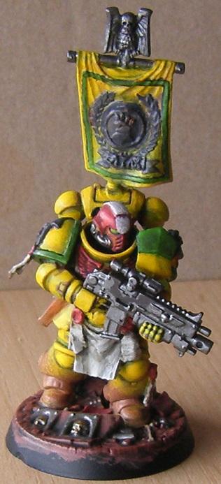
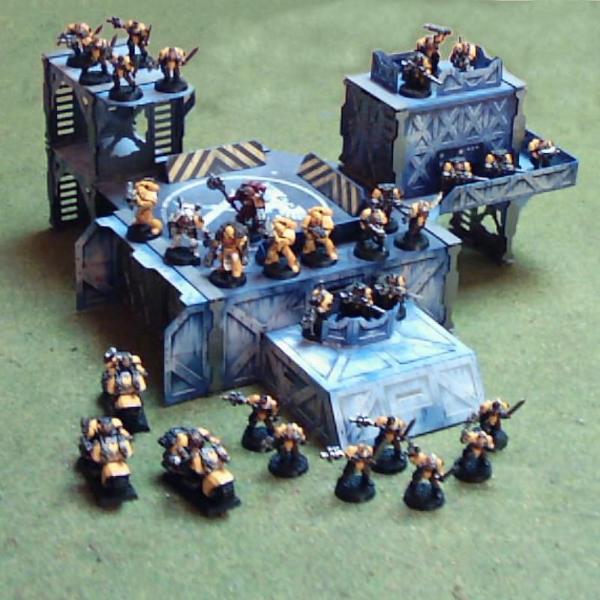
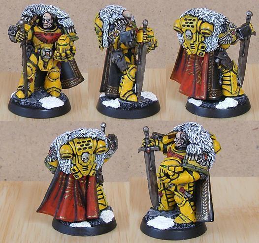
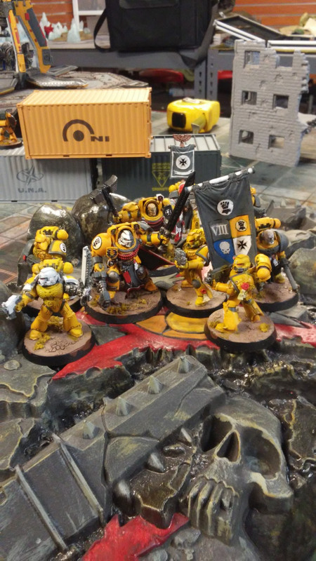
The sergeant is my test model and hopefully the first of a modern Imperial Fists army. I haven't had an army's worth of these guys since 3rd ed:


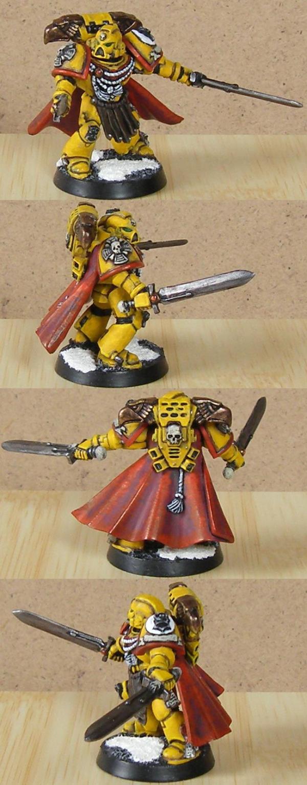
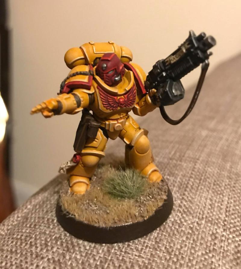
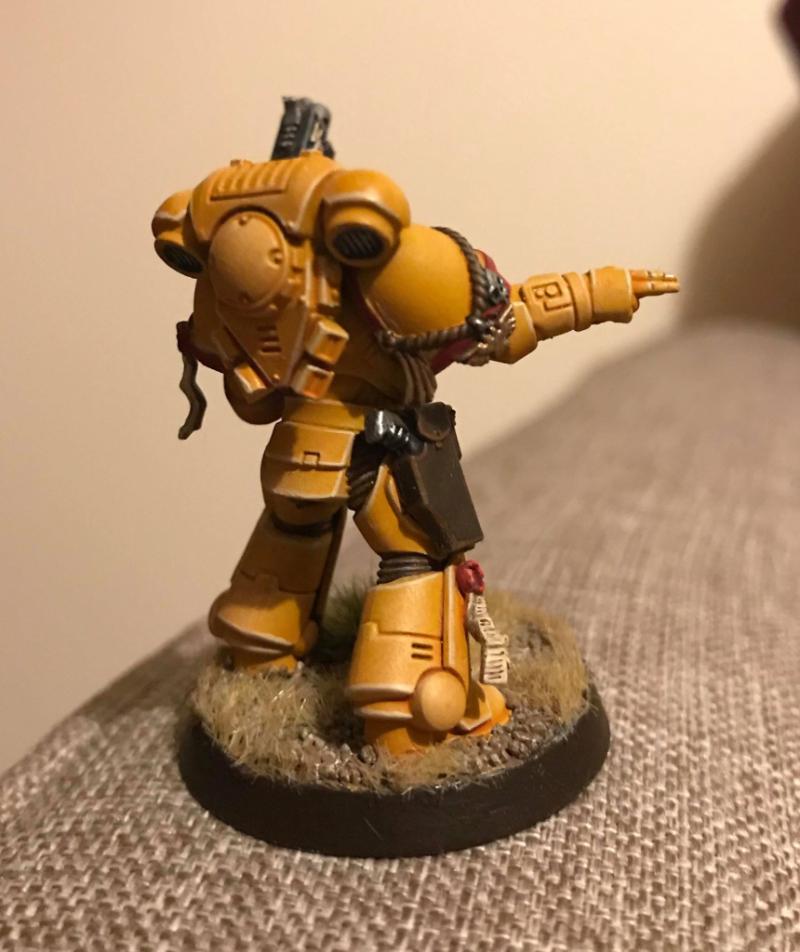
I did the occasional character since then. Captain Eshara for instance, after reading Storm of Iron:


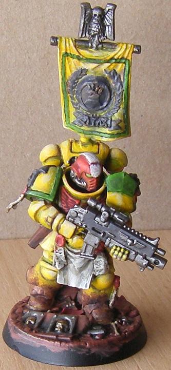
Some time later I did Captain Taelos as part of a short-lived effort to create a battle company based Imperial Fists army. That would have been sometime in 5th ed, as you can probably tell from the auxiliary grenade launcher:


On to the point:

I think I'm happy with the way the yellow has turned out and the red chest eagle and green company markings work for me as well. What I've always struggled with is how to shade the recesses on golden yellow armor, though.

Those 3rd ed models have very faint recesses and highlights, the former of which are based on the vivid orange basecoat they received. That was the height of what I was able to achieve at the time, so maybe it stuck with me for all the wrong reasons, but when I think back that was the nicest shade of yellow I ever achieved. I don't know if this is bias or not, though.

Captain Eshara got a different treatment when I got a little better. I believe the model is still basecoated with orange to get a nice yellow tone on the surfaces, but received brown recesses. No idea if that was a wash or watered down paint like Graveyard Earth or a predecessor of it, but while I missed the orange "glow" I was used to, it did give the model more depth and contrast.

Captain Taelos was from an era when I experimented with a number of things and is added to this post for contrast. If you asked me today, I'd say he's a downgrade from earlier attempts. I gave dark recesses and stark contrast a try at the time, and can say today that it turned out not to be my thing, so I'm happy I have moved on from that. It also appears to me that the model is basecoated brown and the yellow suffers for it. On this model, I am much happier with the ornamentation than the main colors that should define an Imperial Fist.

Now I'm painting Sergeant Aiax and I went with a combination of the first two approaches, Steel Legion Drab to get brown recesses and Jokaero Orange as a basecoat for the yellow areas and shallower recesses on the banner..Basically the model was primed black, got a solid layer of Dryad Bark and was then drybrushed Steel Legion Drab and selectively stippled Jokaero Orange. Then I tried to layer on Yriel Yellow and blend as well as I could.

I'm not really sure what kind of comments I'm looking for. I guess I'm asking if this approach seems sound or if there is a better color to paint the recesses with, that goes better with a golden yellow or achieves a different effect or something. I'm not inconsistently happy with the model, but on occasion I think it's missing something. Not sure what or if it's just my imagination or the half painted state I'm in.

Nehekhara lives! Sort of!
Why is the rum always gone? 
   
Made in gb
Storm Trooper with Maglight


United Kingdom

I'm not entirely sure I completely understand what you're asking for, but I'd like to share my own method of doing Fists as it has worked exceptionally well for me and I'm very happy with it. It also features a more 'golden yellow', rather than colder tones, which seems to be what you're after.

This is the latest GW method shown on their YouTube channel incase you want to check it out.

If you prime them using the Averland Sunset spray you can then lightly drybrush the entire model with Hexos Palesun. Then douse the entire model - and I do mean the entire model - with Casandora Yellow. Once that's try, edge highlighting with Ushabti Bone to finish off. This leaves you with a very warm yellow tone and some good shading with the edges picked out nicely. I sometimes do a second wash of Casandora Yellow just to add an even more orange-tone.

If you round that off with Rhinox Hide (then highlighted with Doombull Brown) painted into the undersuit areas you get a Fist that, to me, looks very effective with some nicely toned warm yellow armour and stark contrast provided by the dark brown in the undersuit. I think this approach works better than very stark recesses all over the model - but that is a personal thing of course. There may be areas of the armour where you'd prefer a more noticeable contrast in the recesses. Some selective Agrax Earthshade put into such recesses as you deem appropriate might then be a good progression?

I've attached a photo of one of my IF Sergeants done using this method for you to check out.

Forgive me if this isn't really what you were looking for, like I say I was uncertain if the information I'm providing is relevant but as someone who spent years struggling over IF schemes before finding one I loved, I thought it worth sharing.

Spoiler:


This message was edited 1 time. Last update was at 2019/02/10 11:30:52


Made in de
Huge Bone Giant


Thanks for the comment. Looks nice, and yes, I think it's actually relevant. Specifically the part about highlights:

 Oppl wrote:
If you prime them using the Averland Sunset spray you can then lightly drybrush the entire model with Hexos Palesun. Then douse the entire model - and I do mean the entire model - with Casandora Yellow. Once that's try, edge highlighting with Ushabti Bone to finish off. This leaves you with a very warm yellow tone and some good shading with the edges picked out nicely. I sometimes do a second wash of Casandora Yellow just to add an even more orange-tone.


I think I may have been looking in the wrong place for what felt wrong about the model. I gave some area highlights of Flayed One Flesh a try and I have a much better feeling about the model:


Mind you the camera bleached it out a bit - no good light today.

I think the other colors got a wider range from shade to highlight than the yellow, leaving it a little flat as a result. I stopped with Sunburst Yellow (no idea what the modern equivalent is as my old pot is still good), but that doesn't give it enough depth.

Nehekhara lives! Sort of!
Why is the rum always gone? 
   
Made in ca
Regular Dakkanaut


Yellow can be tricky to paint. My first suggestion is thinner paint and more practice blending. Use a combination of yellow Wash and black ink for panel lines blend them together for the best results You're going to need at least 2 yellows over an 50/50 yellow- orange base coat. 4 would be better. I used P3 paint here with a combination of yellow wash and black ink at different gradients. Yellow gets chalky easy so after every coat shave off or scour the model with a toothbrush. up I've heard a wet pallet midigates the chalky quality of yellow.

Small thin milky layers of yellow build up slowly over a darker yellow. Takes forever results are worth it.

This message was edited 2 times. Last update was at 2019/02/10 16:47:16


Made in de
Huge Bone Giant


Thanks for the input. I certainly intend to practice blending. I've really only been doing that for a bit.

You'll find that I am not a fan of smooth paint, though, Nothing beats a good texture. This whole thin layer business passes me by completely.

Nehekhara lives! Sort of!
Why is the rum always gone? 
   
Made in ca
Regular Dakkanaut


 Geifer wrote:
Thanks for the input. I certainly intend to practice blending. I've really only been doing that for a bit.

You'll find that I am not a fan of smooth paint, though, Nothing beats a good texture. This whole thin layer business passes me by completely.


Well you're not painting on canvas in 2D so you're not going to need texture which is a sure fire way to distract from detail.. You're paint does look very thick very thick. And every technique I've ever read is about thinner paint to bring out the details of the models. I have no advice for you to paint textured paint on miniatures. It's not done ever. That's why an airbrush is one of the most favored tools due to Thin paint to preserve detail. So I'm geniniually surprised that you're not aware of thinning your paint.

Most advice I've read on-line is that your paint should be at a a nearly milk like viscosity before painting with a brush And there are a lot of reasons why you should use thinner money being one..

Here is an example of thin paint looking good.


This message was edited 5 times. Last update was at 2019/02/11 17:15:10


Made in ca
Frenzied Berserker Terminator


Canada

I'll chime in with my two cents as I've recently started painting a yellow army.

I did mine with black primer, then MF brown. Then I did three coats of Averland Sunset. All these were very thin coats and I just did the entire model. I then gave the model an all over wash with a very dark brown mix of Mournfang and Abbadon black. Then when they dried I did all the details and panels in black, which was watered down to a wash consistency. At this time I also did the squad markings as they are in black as well. Then I went and did all the other details like weapons and ribbons, filling in the right shoulder with white to prepare for the freehand, and eye lenses, insignia and that sort. Now I still need one more coat of Averland to brighten the yellow back up but I like to save that final coat til last so that way any mistakes from the detailing step can be erased easily. I won't go into the highlights/final steps because I have a very different approach and style. Let's just say I'm inspired by John Blanche. But that should get you a nice warm yellow that can then be highlighted up to a bright bold yellow suitable for the Fists.

Now about thinning paint....

Everyone says 'milky consistency' and that can seem odd, so literally pour some milk on a clean palette and "paint" a little bit with it to see what it looks like on the brush and how it moves around on the plastic. Obviously don't paint anything with it and clean your stuff up after, but this is the best way to grasp what a 'milky consistency' really is. I had to do it to really understand what it meant. Now, side effect of painting with such thin paint is that it tends to run everywhere and can spill over into recessed areas, let that happen too much and you're going to end up with the same problems as you would with too thick a paint! Unfortunately the only cure is better brush control, fortunately we don't need to do this with every colour every time. Only the colours which have poor coverage need this extreme treatment, such as yellow, white and red. This is because you cannot gain even coverage with just two coats and so the idea is to do more and thinner coats. This can also be a stylistic choice as well, but in reality most paints can and will go on with considerably less thinning. Obviously you don't want to use it right out of the pot, but I have found that you can get smooth coverage with about half as much water as you would need for the milk consistency.

The only time you should be using paint straight from the pot is when you are drybrushing. This is because the extra moisture in the paint will actually dampen the brush and cause streaks.

TLR, thinning paint is something you have to experiment with to achieve your desired results, whatever they may be, but it is definitely required for virtually any paint.


Gets along better with animals... Go figure. 
   
 
Forum Index » Painting & Modeling
Go to: