Comments:
 |
Serf2Sovereign
2019-08-10 09:38:22

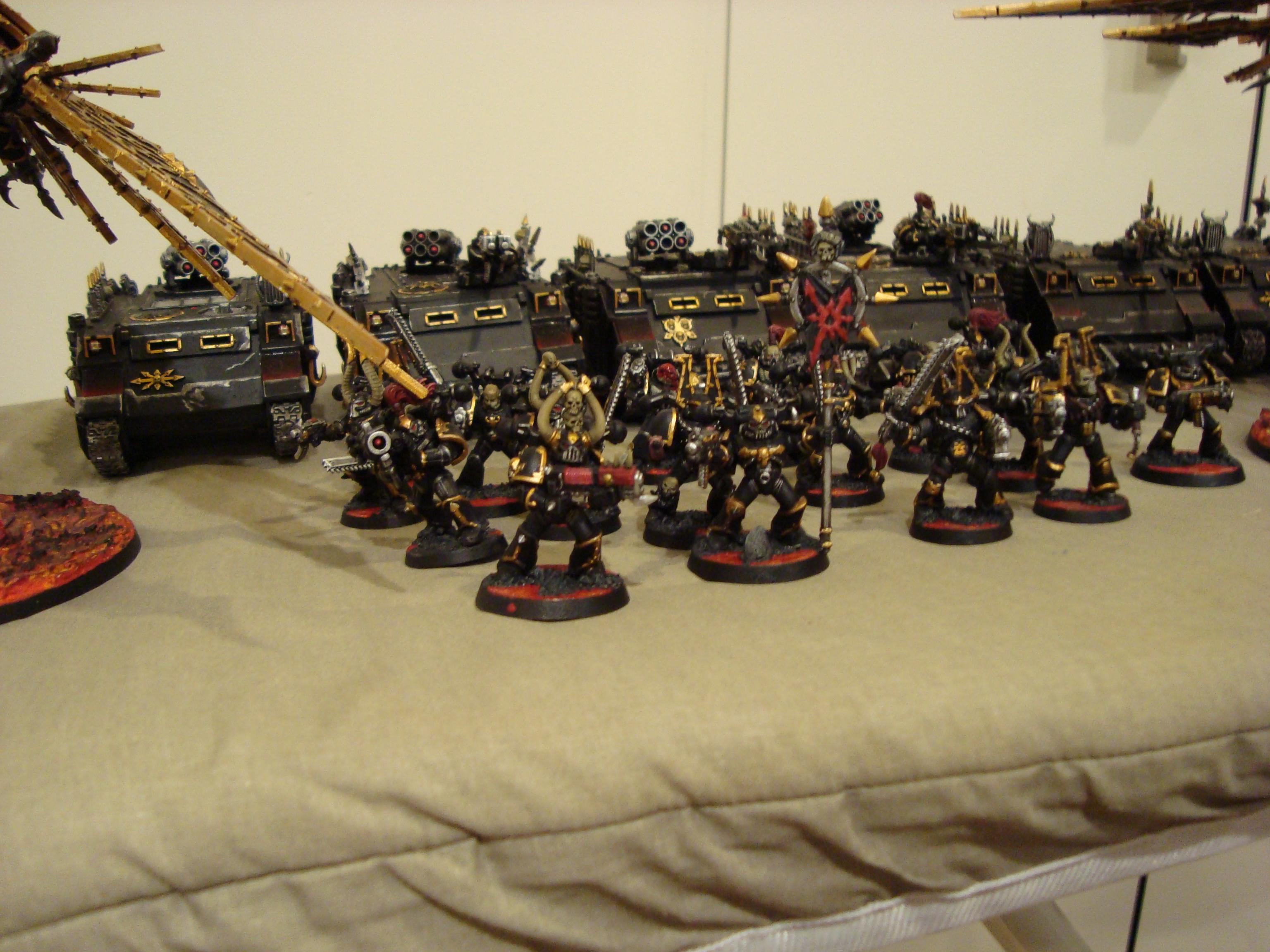
Looks super consistent among the different figures! You may want to try dry brushing the larger fields of black (Marine thigh cuisses, front glacis of the tracked vehicles). I think contrasting gradients look great for when one piece of armor meets another. (like a black to red downward gradient on the cuisses, red end butted against the black end of another gradient on the knee/shin greave, This gets more of a battle seasoned look.
If you are going for fresh, rookie troops, the pristine body armor looks good. You could add fresh "bumper numbers" to the tracked vehicles where you just make up a series of short alpha-numerics in order of the line of vehicles. Decals make the lettering way easier. You can also weather decals by dry-brushing on top.
|
|
|
Serf2Sovereign
2019-08-10 09:38:35
Only other thing I would note is maybe doing a two or three tone scheme on the battle banner. Some ink or silver dry-brush hilights would make the banner "pop" more. Battle banners are meant to stand out of the group.
Cool factor for the paint scheme is solid. Could add custom bits for flare/ one-of-a-kind factor on individual models.
Thanks for the pic! |
|
 |
StormX
2019-09-05 11:55:46
Thanks!, yeah i would do them alot differently if i could do them again, i agree with what you are saying. Thanks heaps for the advice i appreciate it alot.
Storm. |
|
You must be logged in to post comments.
|
| Image Details: |
| Resolution: | 3072x2304 |
| Uploaded: | 2019-05-15 09:39:24 |
|
|