Comments:
 |
TimmieBear
2011-01-26 20:44:09

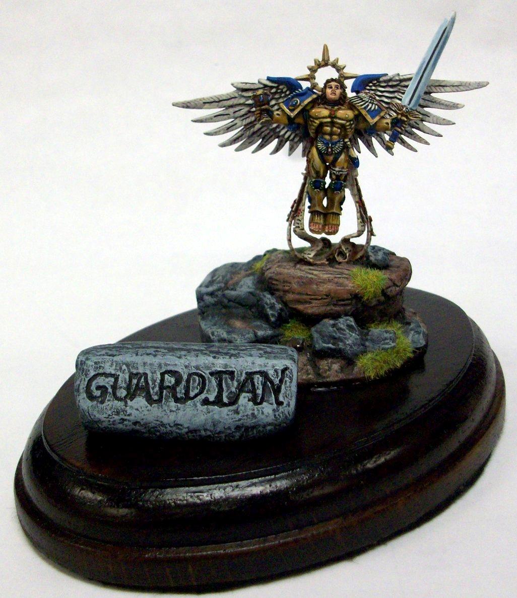
please this is one of my best so far and i would love some input |
|
 |
Drakeslayer
Painting 7/10, Coolness 5/10 @ 2011-04-09 16:25:42
not bad... I like the way you've used the non-metallic scheme to it. Although I'm not sure about the blue; why didn't you do it RED!!! |
|
 |
Kreedos
Painting 5/10, Coolness 6/10 @ 2013-01-09 06:26:02
Your painting is very thick, you could stand doing a few less coats, or thinning down your paints and progressively building color.The black lines on the white wings doesn't look good and pulls the eye to it. Instead, a nice sepia wash then a few dry brush coats would have done wonders on the wings. I also agree with the above poster, you should have done the accents red, and then used a black wash the blue is too bright compared to the rest of the model, it throws off the contrast of the grey/green/brown earth tones you used in your display board, and the dimmer tones used in his armor and flesh. |
|
|
TimmieBear
2013-11-05 03:50:43
The Blue was needed in this piece because it was a gift to some one in the us navy which their colors are Blue and gold. I agree with the thicknes it is something I am strugling with and this was my first attemt at nmm. If you look at my old pieces youll see ive come very far as they are an elementary level paint at best. |
|
You must be logged in to post comments.
|
|