|
|
 |
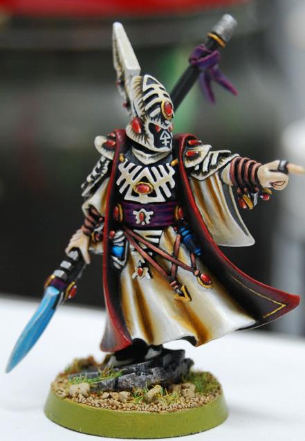
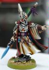
Eldar Farseer | Created by anticitizen013 |
| Paintjob Rating: 9.03 | Number of Views: 19586 |
| Coolness Rating: 8.57 | Number of Votes: 122 |
|
|
Image Description:
A model that I decided to randomly paint one day. I spent a bit of time on this one, and I think the end result is pretty decent. In retrospect I could have done his helmet and the gems better. Sadly, the model suffers from "retarded eye syndrome" due to mould lines. I noticed this only after I started painting his eyes. Clearly I was sleepy at the time otherwise I would have noticed it sooner (I hope). |
|
Comments:
 |
aunshova
Painting 9/10, Coolness 8/10 @ 2009-02-03 22:23:23
wow |
|
 |
Metsuri
Painting 8/10, Coolness 6/10 @ 2009-02-04 06:18:47
Cool Farseer. As you said the light on the gems is inconsistent and the chest plate lacks depth as do the gold parts.
There are too many different colors too, the fig would be more striking with less. The purple and reddish brown are not needed in my opinion.
On the whole great effort, the comments are only due to you asking for critique. |
|
 |
yakface
Painting 9/10, Coolness 8/10 @ 2009-02-04 09:34:54
Overall I think its a great looking model, although I agree that the helmet is the one thing that pulls me out a bit. Beyond how you painted the helmet (which I don't particularly like) I think the model overall would have benefited from having the helmet painted a different color other than white/bone to really give a nice overall contrast. |
|
 |
anticitizen013
Painting 10/10, Coolness 10/10 @ 2009-02-04 14:57:56
Thanks for the comments guys! Gems are definitely something I need to work on. Practice makes perfect, though. I wanted to try a wide range of colours to give it more of the "look at me, I'm an HQ choice" feel.
As for the style of helmet/armoured areas, I got the idea from the Dark Eldar Codex (which page escapes me) and it was done so very well. I tried to emulate it and failed on the helmet, but the plates on the arm look worlds better. If I were to paint this model again, most of it would stay the same, but I would change the colour of the armour plates & helmet, etc.
Thanks again for the comments guys, much appreciated! |
|
 |
Schepp himself
Painting 7/10, Coolness 6/10 @ 2009-02-25 19:08:23
I for one like the helmet scheme more than the traditional eldar contrast style.
Nice work!
|
|
 |
AlphaSarge96
2009-08-14 20:53:25
Awsome. I have to steel that clour scheme |
|
 |
joker8911
Painting 9/10, Coolness 9/10 @ 2010-10-09 18:50:21
I think its pretty awesome, i have noticed some of the eldar models are made with dodgy eyes. |
|
You must be logged in to post comments.
|
|
|
|
|
|