Comments:
 |
legoburner
Painting 8/10, Coolness 7/10 @ 2009-03-18 19:23:56

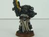
Great use of colours in the highlights, but (from the picture quality) it really looks like you should thin your highlights more - at least 30-50% more water in the mix, then they should look a lot smoother and blend more cleanly. |
|
 |
Shortbus
2009-03-18 19:41:45
I agree, I do need to be more patient and use thinner paint in more layers, especially on the lighter colors.
Thanks for the tip! |
|
 |
willydstyle
Painting 8/10, Coolness 8/10 @ 2009-03-18 19:50:11
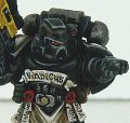
I think Legoburner is right... but at the same time, this is the best shading of a black model I've seen. It looks black, and yet has discernible highlights and shading that look [i]right[/i]. |
|
|
Shortbus
2009-03-18 20:09:42
I'm fairly happy with the black armor part of the model but I think legoburner was referring to the lighter colors of the model (white and yellow areas) which I agree are rather rough looking because I didn't thin the paint enough.
Thanks, willydstyle, for the compliment. :) |
|
 |
Ifalna
Painting 7/10, Coolness 7/10 @ 2009-03-18 22:13:03
Going to state what was already said, a little thinning on the highlighting would look great. Also, when it comes to black, I always found if you put a 1/2 water blue ink wash over the black before you start highlighting it up, the black looks well, it looks an awful lot blacker! You can really darken down a black model even futher by trying it out, and you might really like the result. |
|
|
Shortbus
2009-03-19 01:41:10
Thanks Ifalna, that is the method that I would normally use for painting a black surface, but what I am trying to convey (and dosen't translate well through pictures) is the look of very old black armor by using more browns in the process to give it a patina'd look.
I agree about the final highlights and will be concentrating on keeping the grey paint thinner than I have been. |
|
 |
yakface
Painting 7/10, Coolness 7/10 @ 2009-03-19 05:54:34
I do agree with the above statements although I think in some cases when we look super-close at a model like this bold highlights look a bit strange but when seen on the tabletop from a distance a highlight like this probably looks great. So if this is mainly for tabletop use, I wouldn't worry too much about spending more time on blending out your highlights unless you're really looking to win some sort of painting award. Good job overall! |
|
 |
Metsuri
Painting 6/10, Coolness 6/10 @ 2009-03-19 08:39:32
Great work on the scrolls, but the thick highlights are really obvious from this close up. This probably looks great on the table top. Black is tricky to highlight so that it doesn't appear gray. |
|
 |
Anung Un Rama
Painting 7/10, Coolness 7/10 @ 2009-03-19 09:33:21
Looking good. I've seen grey on black highlights done which were far worse than this (mine included).
The lincloth looks pretty good too. |
|
|
Shortbus
2009-03-20 02:31:44
Thanks folks! I just finished up a flamer marine using very little paint at all, I'll take some pics tomorrow when the light is better. |
|
 |
allibator
Painting 7/10, Coolness 9/10 @ 2012-08-17 18:20:30
i think the effect of the highlighting here is awesome in a less conventional way. to me it looks like it's animated or like living artwork. hard to explain, but kudos! i really like this a lot. |
|
You must be logged in to post comments.
|
| Image Details: |
| Resolution: | 800x600 |
| Uploaded: | 2009-03-16 19:07:19 |
|
|