Comments:
 |
willydstyle
Painting 7/10, Coolness 6/10 @ 2009-03-23 06:07:12

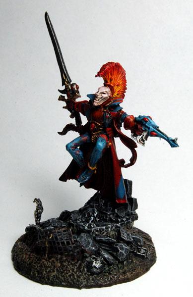
I would say that the color scheme works just fine. It's not as "wild" as a lot of harlequins I've seen, and the red and blue are both fairly subdued hues that match up well. I really dig the blending in the hair, but the paint on the pants legs looks kind of splotchy... is it a dry-brushed highlight layer? |
|
 |
daszer
2009-03-23 07:33:53
Cheers - know what you mean about the pants - I tried to go for the faded diamonds as per some of the golden demons but obviously not with as good results. Think I'll go for inks for the fading next time. |
|
 |
Metsuri
Painting 6/10, Coolness 6/10 @ 2009-03-23 09:42:35
Nice contrast going with the base and the harlie, the color explosion of harlie is transferred well. The colors on the harlie on the other hand appear to be somewhat messy, the patterns in his pants don't separate enough from the base color. The gems could also have another highlight. I think you would have done better by limiting the colors a bit, but its striking as it is. |
|
You must be logged in to post comments.
|
| Image Details: |
| Resolution: | 389x600 |
| Uploaded: | 2009-03-18 20:58:58 |
|
|