Comments:
 |
Metsuri
Painting 6/10, Coolness 5/10 @ 2009-05-26 06:14:29

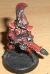
The free hand on the helmet is great, but the thick lines on the armor and gun don't fit the fig. Great concept! |
|
 |
Yggdrasil
Painting 6/10, Coolness 4/10 @ 2009-08-11 19:13:14
Free hand symbol's a great feature!!! Wish I could do the same! |
|
 |
Savnock
2009-10-21 03:54:52
Wow, that freehand is indeed great. Is that brush work, or a paint pen? |
|
 |
wyomingfox
Painting 6/10, Coolness 6/10 @ 2010-06-16 16:48:37
The freehand and blending on helmet are real good but the thick, non-blended highlight on the armour plates are ruining the effort IMO. |
|
 |
archont
2010-10-02 00:07:24
^^ sorry guys, this was a WIP-shit, in the "there are 5 images in this gallery" box right beneath the picture there's a link to the same guy with finished blending and black tribals all over his armour! :) xD
edit: Brushwork, I tend to use GW-fine-details for the priming and rough blending on my minis, and another fine-detail with about 80% of the brushes stripped for freehands and the like |
|
You must be logged in to post comments.
|
|