Comments:
 |
Big Mac
Painting 8/10, Coolness 8/10 @ 2016-03-01 05:20:07

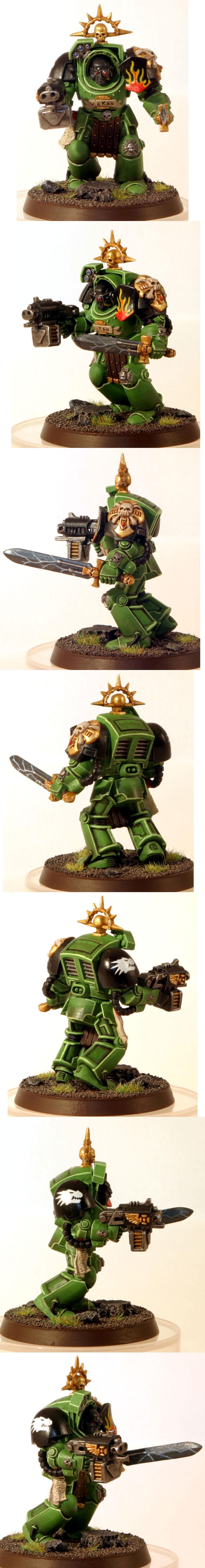
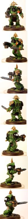
The lightning on the sword and the scribble of text on the seal looks off; text should be more vertical with breaks instead of horizontal lines across, I personally left them blank as doing it to look right is quite difficult; the lightning effect on the sword suffer from same line thickness, as lightning breaks outward, the lines should be thinner, couple concentrated areas should have more highlight. |
|
You must be logged in to post comments.
|
|