Comments:
 |
Decaius
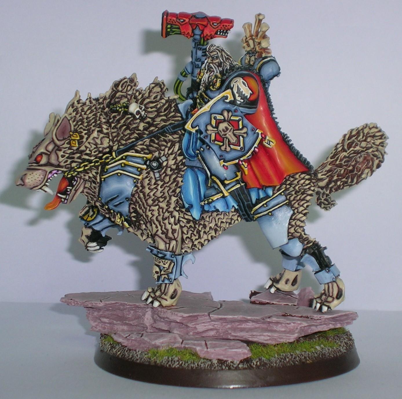
Painting 9/10, Coolness 10/10 @ 2012-05-03 19:01:49

I say it again: I really like your kind of graphic style of painting! |
|
 |
Adanis
2012-05-09 00:40:05
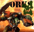
The model overall is good, but I don't like the excessive contrast in the fur. The comic book feel looks much better on the tyrranids. |
|
 |
Caboose
2012-06-13 23:01:05
I disagree. The graphic/comic book style doesn't look good at all. While it probably takes a lot of work to achieve, it looks rudimentary. You probably have the talent to execute some good shading, blending, and highlighting, which would make it look 10 times better. Its only my opinion, take it with a grain of salt, but the outlining look just doesn't look any sort of good to me. |
|
 |
yourmovecreep
Painting 9/10, Coolness 9/10 @ 2012-06-14 08:52:34
It defines your style, looks clean, is eye catching and skillfull, take my opinion with another pinch - dont change it I like it a LOT.... (Picasso V's Constable, its a matter of taste) |
|
barnesy808
2015-04-23 14:31:26
This, to me, is the cell-shading technique...normally reserved for comics, but applied to a 3D format here. I think it's badass. |
|
 |
Orky_nman
2015-04-24 02:58:21
I don't care for it, I like it on your nids better. The coloration(and perhaps the angle) of the wolf head in particular make it look rat like or scaven-ish. The limbs of the wolf look skeletal. |
|
 |
Januine
Painting 5/10, Coolness 4/10 @ 2015-04-24 05:12:14
not a fan. The few areas when there was some blending done are cracking but the overall 80's cartoon thing.... just not my cuppa tea. That said, I do prefer it to the pinky purple tyrannids |
|
You must be logged in to post comments.
|
|