Comments:
 |
Metsuri
Painting 7/10, Coolness 6/10 @ 2010-01-14 06:01:26

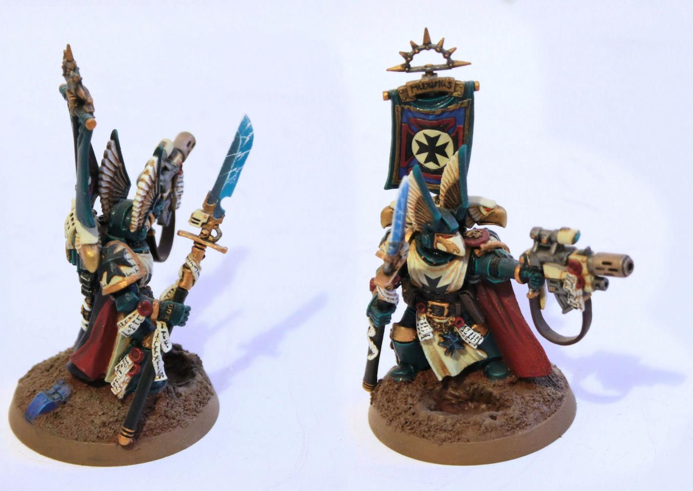
Good paint job and nice selection of colors. The red areas could use another layer of highlight near the edges to tie them visually with the armor. The section of cape, which is visible on the front of the mini is a bit flat. The gold could also use a thin highlight with silver along the edges. The effect on the blade is looking good and the fig is looking really nice. |
|
 |
grayspark
Painting 10/10, Coolness 10/10 @ 2010-04-02 21:31:20
I like it alot!!! |
|
 |
sgtsmg
2010-04-26 11:44:19
Epic chapter colour scheme and this guy is just awesome |
|
 |
Loricatus Aurora
Painting 8/10, Coolness 9/10 @ 2010-08-18 10:42:32
Lovely work! That blade in particular looks outstanding. |
|
You must be logged in to post comments.
|
|