| Poll |
 |
|
|
|
| Author |
Message |
|
|
|
|
|
Advert
|
Forum adverts like this one are shown to any user who is not logged in. Join us by filling out a tiny 3 field form and you will get your own, free, dakka user account which gives a good range of benefits to you:
- No adverts like this in the forums anymore.
- Times and dates in your local timezone.
- Full tracking of what you have read so you can skip to your first unread post, easily see what has changed since you last logged in, and easily see what is new at a glance.
- Email notifications for threads you want to watch closely.
- Being a part of the oldest wargaming community on the net.
If you are already a member then feel free to login now. |
|
 |
2011/10/16 03:27:52
Subject: Which shade is more pleasing to the blood god?
|
|

Dakka Veteran
|
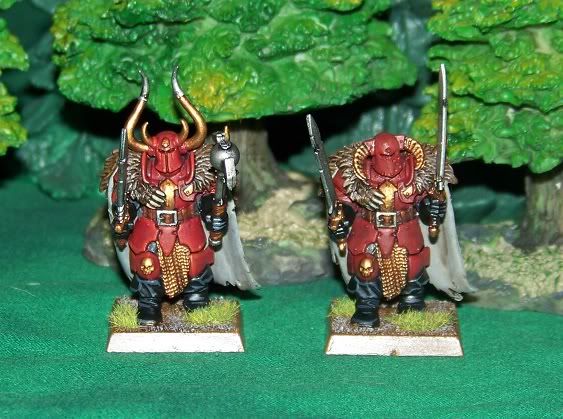
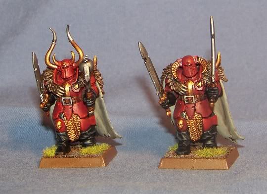
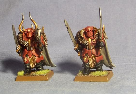
I whipped up some test models for my Warriors of Khorne unit. I cant decide which I like better. Hopefully the differences show up well enough in these photos. I used the same main body for both so the comparison would be better
So, ceteris parabis, which shade of armor looks better? The one on the left wwas washed in Baal Red and highlighted with Blood Red/Blazing orange mix. The one on the right was washed in Devlan Mud and highlighted with blood red.
Here are some photos in various light.
|
|
This message was edited 1 time. Last update was at 2011/10/16 03:33:01
Glory is fleeting, but obscurity lasts forever. 
Considering also your duty as a warrior you should not waver. Because there is nothing more auspicious for a warrior than a righteous war.
|
|
|
 |
|
2011/10/16 03:31:21
Subject: Which shade is more pleasing to the blood god?
|
|
Stealthy Warhound Titan Princeps
|
I honestly cannot tell the difference.
Nice models tho.
|
|
|
|
|
2011/10/16 03:35:42
Subject: Which shade is more pleasing to the blood god?
|
|
Smokin' Skorcha Driver
|
IMHO, the one on the left looks slightly more vibrant. almost looks like blood that has almost finished drying.
|
"Friglatt Tinks e's da 'unce and futor git, but i knows better. i put dat part in when i fixed im up after dat first scrap wid does scrawn pointy ears and does pinkies." Dok chopanblok to Big Mek Dattrukk.
Victories against:  2 2  2 1 2 1 1 1 1 1  2 2  3 3  1 1  2 2
Died havin fun wid: 3  2 1 2 1  4 2 2 2 4 2 2 2  5 1 5 1
|
|
|
|
|
2011/10/16 04:30:52
Subject: Which shade is more pleasing to the blood god?
|
|

Been Around the Block
Taipei
|
I am not the blood god, but I agree with Dattrukk, left looks better.
Sometimes the picture does not truly show the models proper, so keep that in mind to our opinions.
|
|
|
|
|
2011/10/16 05:17:30
Subject: Re:Which shade is more pleasing to the blood god?
|
|
Fresh-Faced New User
|
I personally like the left one because the red seems slightly brighter and more crisp.
|
|
|
|
|
2011/10/16 05:52:05
Subject: Which shade is more pleasing to the blood god?
|
|

Pulsating Possessed Chaos Marine
UK
|
Prefer the one on the left 'cus you can see the highlights better.
|
|
|
|
|
2011/10/16 09:26:20
Subject: Which shade is more pleasing to the blood god?
|
|

Dipping With Wood Stain
|
Against popular opinion I like the one on the right. The left one seem a tad to bright and clean for a howling mad warrior of chaos.
Cheers,
IK-Painter
|
|
|
|
|
|
2011/10/16 17:17:48
Subject: Which shade is more pleasing to the blood god?
|
|
Dakka Veteran
|
Thanks for the input. I think I will go with the lighter one as the votes leaned that way and I feel like it shows up a little better when viewing the models from a few feet away.
|
Glory is fleeting, but obscurity lasts forever.
Considering also your duty as a warrior you should not waver. Because there is nothing more auspicious for a warrior than a righteous war.
|
|
|
|
|
|
|