Switch Theme:

Wehrkind learns to paint flesh better, faster, stronger, and blendy...er.  [RSS] Share on facebook Share on Twitter Submit to Reddit
»
Author Message
Advert


Forum adverts like this one are shown to any user who is not logged in. Join us by filling out a tiny 3 field form and you will get your own, free, dakka user account which gives a good range of benefits to you:
  • No adverts like this in the forums anymore.
  • Times and dates in your local timezone.
  • Full tracking of what you have read so you can skip to your first unread post, easily see what has changed since you last logged in, and easily see what is new at a glance.
  • Email notifications for threads you want to watch closely.
  • Being a part of the oldest wargaming community on the net.
If you are already a member then feel free to login now.


Made in us
Fixture of Dakka


Lancaster PA

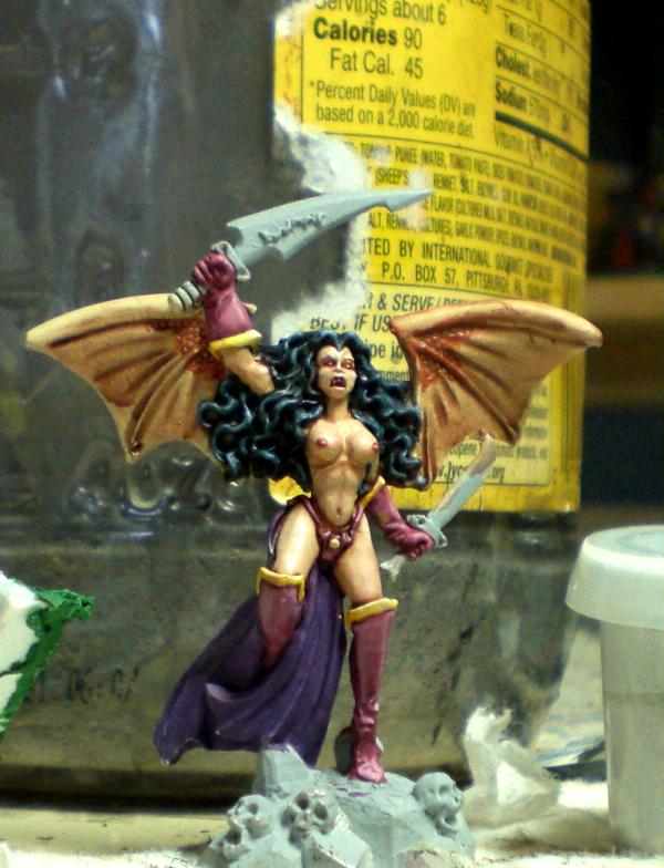
Something occurred to me recently while working on the Traitors of Fornax VII. I had gotten to my unit of storm bitches, and was working on a test model when I gazed upon a few square inches of flesh tone paint and realized that I had no idea how to properly blend skin tones. Sure, I could paint a mean face, and quickly, but that is a small area with rather sharp detail. Highlights are fairly easy to place and execute. Not so with largely flat or evenly curved surfaces like a butt cheek or thigh.
To make things worse, I realized just how orange the GW flesh tones really are when viewed en masse like that. Vallejo's flesh tones were a bit better, but didn't leave much reasonable room for easy blending. Despite having 1,000 different shades of brown from the Vallejo paint kit, I had no idea where to start and how to do things. It was rather intimidating all told.

So, I thought back to my college days when I had friends that had paint on their clothing and few job options and asked myself "What would they do?" As it turned out, I didn't have any ganja around the house, and it was way too cold to go wandering the streets asking if people had "seen my bud." So I thought "What would they do next?" and I remembered that there are wheels with all sorts of color on them. I would make a chart of every vaguely skin looking color I had, and match it to the vast collection of character art and porn I had downloaded over the years. Finally, a socially acceptable use for all those pictures of women in scale mail bikinis! Four hours and a massive head ache from staring at pixels later, I had pages of notes on different color scales and transitions for a variety of pictures with interesting skin tones.

I learned a lot, not the least of which is how EVERYTHING seems to have Brown Violet in it, and this blog is going to track my progress as I put these notes to work and become a better painter. I have a small pile of mostly naked Reaper demons I picked up a while back on sale, and since I am not terribly likely to start a Demon army I figure they will be excellent candidates for practicing different color combinations.

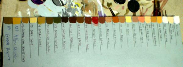
First off, here is the color stick/wheel I made. Basically all I did was cut off the back of a cereal box and spray painted it with my usual primer. I then made 1/2 inch bands, and got my wife to write the name of each paint color I was going to add so that I would have a reference. Note her lovely handwriting next to my meandering scrawl on the two I added later. I then put a dab of paint in each section and painted it out, and 45 minutes of drying time later, I was ready.


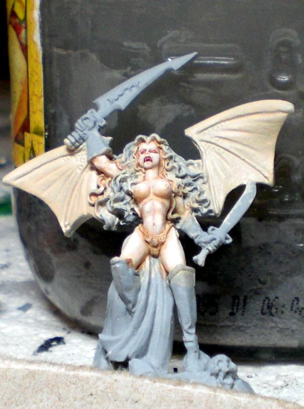
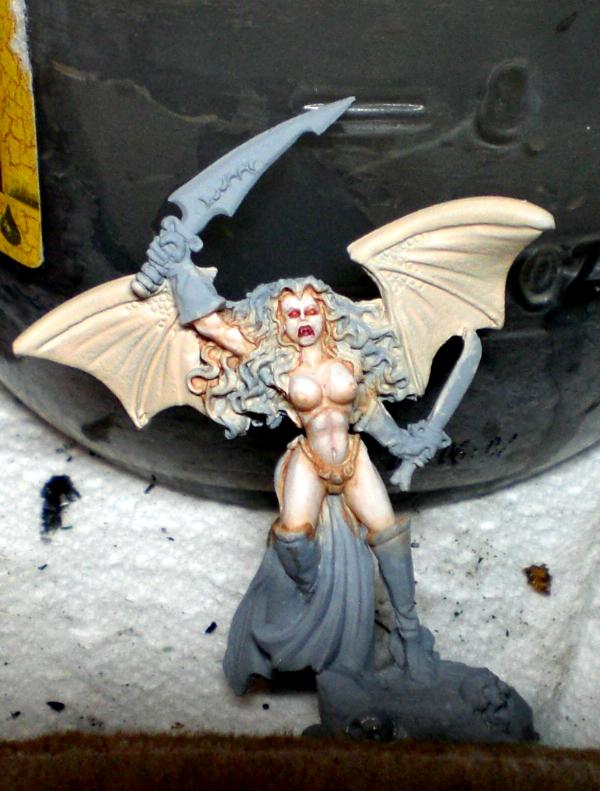
After sleeping so my eyes would clear up and having weird dreams, I sat down and got to work on the first demon. (Ignoring the 20+ Imperial guardsmen I should have been finishing.) The color scheme I used was as follows, from dark to light (all color names are Vallejo unless specified):

Brown Violet
Brown Violet + Ivory
Light Flesh
Light Flesh + Ivory

The lips (what little there are) are done with:

Mahogony Sand
Saddle Brown + Light Flesh

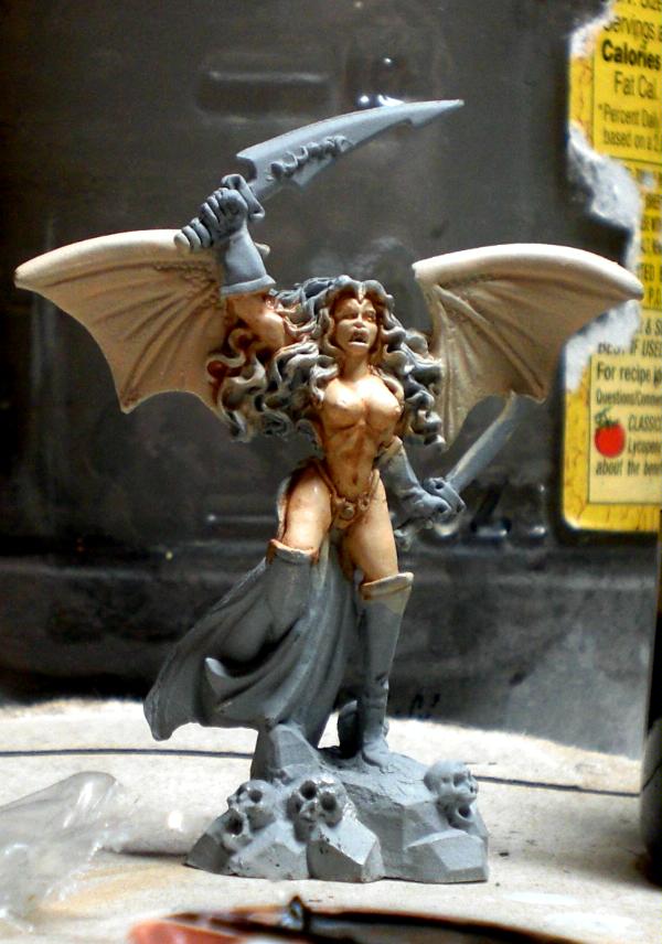
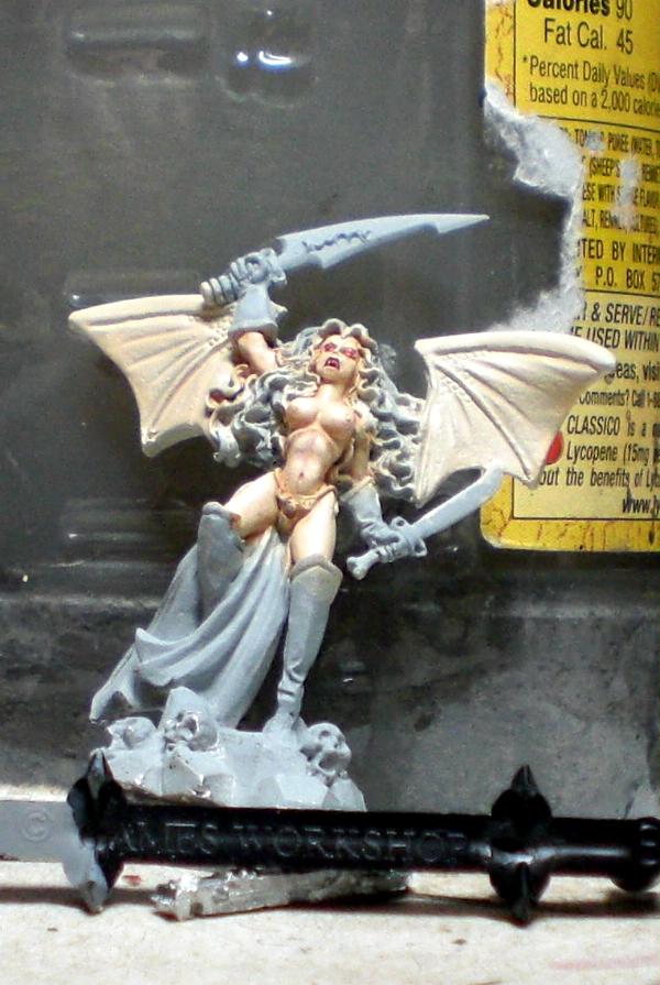
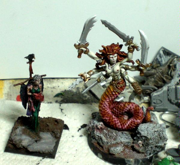
Here is the result (along with a Nurgle Sorceress that I started work on a few weeks back, for no good reason.)


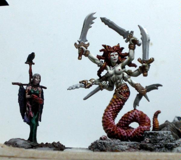
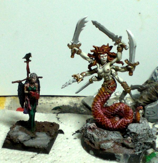
Also, the greyish abortions in her hands are my attempts at non metallic metal... not very good at that.

All in all, I am quite happy with how she is coming along. I think I overdid the light flesh and ivory a little, but every layer just kept looking good, so it was hard to stop. I probably should have started with light flesh and added in the shadows and highlights as opposed to starting from dark and working up to lighter like I would normally do. The green green tinted skin looks a little odd, but is rather appealing I find for a slightly "other worldly" look. I think that being more careful with the dark color would alleviate that somewhat.

At any rate, this is model one. As I finish up guardsmen and vile traitors alike I will be rewarding myself by painting different variation models like this, and will update as appropriate. Comments and Criticisms very much appreciated!


Woad to WAR... on Celts blog, which is mostly Circle Orboros
"I'm sick of auto-penetrating attacks against my behind!" - Kungfuhustler 
   
Made in au
Morphing Obliterator


rAdelaide

Mate - they are awesome skin tones, and I applaud the organised way you went about improving your painting. Dont discount the NMM (its pretty good), but my fav part of the main model here is the scales. brilliant work with the varying colours and the lighter scale patterns to make a very realistic effect.

I need to work on my blending - any tips?
   
Made in gb
Brainy Zoanthrope


UK

Amazing... looks airbrushed they're blended so well!

_ ▲ _
*ENCLAVE* Approves of the above post.
terribletrygon wrote:Almost no one has been killed over video/war games. Except for MMORPGs, but that's just natural selection.


Made in us
Fixture of Dakka


Lancaster PA

Aromasin: Thanks, though part of that is that cameras are very forgiving to layering techniques. The blending isn't quite as smooth in person.

Darkkt: The things that have been helping me are Blending Medium / Extender and Flow Aid. Liquitex makes both. The former keeps the paint from drying before you can mix it on the model a bit, and the flow aid helps it come off the brush in nice amounts even though it is thin. You could probably get by with just the extender in a pinch. What I have been doing is putting all 3-5 colors I intend to layer to from darkest to lightest in the bottom of bases (my pallets) with the extender, and systematically add each to the model as I go, leaving a little showing from the previous layer. While it is wet I sort of drag a little into the preceeding color with the brush. Depending on how different your colors are from each other though, and how thin the layers of paint, you might not need to do it.
One last thing with it, that I didn't do here but I often do, is put a thin wash of the base dark color over the area. This tends to REALLY pull the layers together and smooth them out. I find that I can get away with some rough ass highlighting if I can put a bit of GW wash over them, or the like.


Woad to WAR... on Celts blog, which is mostly Circle Orboros
"I'm sick of auto-penetrating attacks against my behind!" - Kungfuhustler 
   
Made in au
Morphing Obliterator


rAdelaide

Excellent, thanks for the tips!
   
Made in us
Fixture of Dakka


Lancaster PA

Ok, didn't get much done over the holidays, but I am back, and this time with a really ugly model...

So, this time I wanted to use a more natural scheme, and do it a little lighter. With the Maralynth I did it in my normal "start dark, get lighter" method, typically what one would do with cloth or whatever. I found, however, that it resulted in both a darker model than it should have been, with too much of the darkest color everywhere, and also much lighter, with so many layers of the lightest color it was hard to stop. In other words, there was hardly any mid range color. So this time I started out with my middle range, and purposefully added the darker color just where I wanted.

The color set was this:
Cork Brown
Testors Skin tone
Ivory

I also added a very thinned down ogryn flesh wash to tie the layers in a little. I also wanted to add a little tiny bit of color to what turned out to be a rather papery looking skin tone.

So, first pic with a bunch of layers of Testors with a thin Cork wash and some more focused cork spots.


Next I highlighted up with straight Testors and then Testors with Ivory mixed in.


After that, the ratio of Ivory to Skin tone got larger and larger, until it was straight Ivory highlights.


As an amusing aside, you can see my camera readjusting to the different color differentials, seeming to pick up more cork color in the last few.
Finally, a thin wash (and some painting on the gloves and boots etc.)


Note that I didn't finish the wings or loin cloth thing. I kind of lost interest once the skin was done, since it really is sort of an ugly model. Never thought I would say it, but there is way too much unbroken skin up top, so it is sort of dull to look at. Granted, the Slaaneshi pink gloves and boots might not be helping either.

Anyway, let me know what you think! C&C welcome.


Woad to WAR... on Celts blog, which is mostly Circle Orboros
"I'm sick of auto-penetrating attacks against my behind!" - Kungfuhustler 
   
 
Forum Index » Dakka P&M Blogs
Go to: