| Author |
Message |
 |
|
|
|
|
Advert
|
Forum adverts like this one are shown to any user who is not logged in. Join us by filling out a tiny 3 field form and you will get your own, free, dakka user account which gives a good range of benefits to you:
- No adverts like this in the forums anymore.
- Times and dates in your local timezone.
- Full tracking of what you have read so you can skip to your first unread post, easily see what has changed since you last logged in, and easily see what is new at a glance.
- Email notifications for threads you want to watch closely.
- Being a part of the oldest wargaming community on the net.
If you are already a member then feel free to login now. |
|
 |
2010/09/24 02:47:27
Subject: Finally a look at my Khorne Herald. Critique Wanted.
|
|

Fresh-Faced New User
|
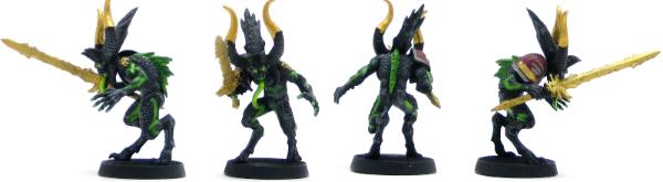
I really love this model. I put the shoulder pad on him to represent the 3+ armor ironhide gets you if you buy it for your herald. I love how it fits the model perfectly. On another note this is the first picture taken with the new light box I just made my self. Please vote even if it's a low score.
|
|
This message was edited 3 times. Last update was at 2010/09/24 03:34:14
|
|
|
 |
|
2010/09/24 04:19:18
Subject: Finally a look at my Khorne Herald. Critique Wanted.
|
|
Trigger-Happy Baal Predator Pilot
|
They are very unique and i like them better than your normal red ones. But the sword is way too plain and some basing willl help the mini alot
|
Check out my Newbie Blog
http://an00bisra.blogspot.com/
Check out my youtube channel
http://www.youtube.com/user/an00bisRa1?feature=mhee
 “The Roots of Violence: Wealth without work, Pleasure without conscience, Knowledge without character, Commerce without morality, Science without humanity, Worship without sacrifice, Politics without principles” “The Roots of Violence: Wealth without work, Pleasure without conscience, Knowledge without character, Commerce without morality, Science without humanity, Worship without sacrifice, Politics without principles”
|
|
|
|
|
2010/09/24 04:24:56
Subject: Finally a look at my Khorne Herald. Critique Wanted.
|
|
Khorne Veteran Marine with Chain-Axe
|
I like them, definately a change from red ones. My suggestion would be to do the handle and crossguard in an extra color and pick out some of the detail. Right now the single color on the sword just doesnt look right. Maybe a slight wash on the horns to have it blend in with the body a bit. They look too "clean" when compared to the rest of the body.
Also how did you paint the sword. Just straight gold or did you an undercoat of something. I plan on my khorne deamons to be a goldish bronze and I like the bright gold you used for the sword.
My $.02
|
Refer to Page 5
PLAY LIKE YOU GOT A PAIR!!
 World Eaters 5000 pts World Eaters 5000 pts |
|
|
|
|
2010/09/24 04:30:31
Subject: Finally a look at my Khorne Herald. Critique Wanted.
|
|

Stalwart Space Marine
|
I'm with an00bis.
Great concept but the sword has no depth. I would run either a leviathan purple or badab black wash over that and the horn tips, then go back and highlight again.
I would probably do the same with the base of the spine fin as well to give it some depth and contrast.
Also with the shoulder pad, maybe (If it's not glued on 100%) if you have the option, swap it off with something either a bit more demonic or khornate (Possessed shoulder pad or Berzerker one from Ebay would look ace) in the black/green/gold scheme you have now. Or even just heavily washed gold.
I would probably give it a 6 now but with those details (and having it properly based) up to 8. I really like the concept and colour choice, looks very demonic.
Nice work mate.
|
|
|
|
|
|
2010/09/24 11:47:27
Subject: Finally a look at my Khorne Herald. Critique Wanted.
|
|
Fresh-Faced New User
|
redscorps wrote:I'm with an00bis.
Great concept but the sword has no depth. I would run either a leviathan purple or badab black wash over that and the horn tips, then go back and highlight again.
I would probably do the same with the base of the spine fin as well to give it some depth and contrast.
Also with the shoulder pad, maybe (If it's not glued on 100%) if you have the option, swap it off with something either a bit more demonic or khornate (Possessed shoulder pad or Berzerker one from Ebay would look ace) in the black/green/gold scheme you have now. Or even just heavily washed gold.
I would probably give it a 6 now but with those details (and having it properly based) up to 8. I really like the concept and colour choice, looks very demonic.
Nice work mate.
The idea was that he stole the armor from a marine.. in particular a gray night. I wanted it to look stolen and like he ripped it off a marine. I will try with the washes on the horns and sword. Automatically Appended Next Post: Fallenbourne wrote:I like them, definately a change from red ones. My suggestion would be to do the handle and crossguard in an extra color and pick out some of the detail. Right now the single color on the sword just doesnt look right. Maybe a slight wash on the horns to have it blend in with the body a bit. They look too "clean" when compared to the rest of the body.
Also how did you paint the sword. Just straight gold or did you an undercoat of something. I plan on my khorne deamons to be a goldish bronze and I like the bright gold you used for the sword.
My $.02
Used brazen gold with only black primer underneath.
|
|
This message was edited 1 time. Last update was at 2010/09/24 11:47:49
|
|
|
|
|
2010/09/24 12:16:24
Subject: Finally a look at my Khorne Herald. Critique Wanted.
|
|
Dakka Veteran
Brisbane, OZ
|
The sword is way plain, but the rest of the model is fairly striking. I'm generally not a fan of yellow so I can't really comment.
|
Son can you play me a memory? I'm not really sure how it goes... |
|
|
|
|
|
|