| Author |
Message |
 |
|
|
|
|
Advert
|
Forum adverts like this one are shown to any user who is not logged in. Join us by filling out a tiny 3 field form and you will get your own, free, dakka user account which gives a good range of benefits to you:
- No adverts like this in the forums anymore.
- Times and dates in your local timezone.
- Full tracking of what you have read so you can skip to your first unread post, easily see what has changed since you last logged in, and easily see what is new at a glance.
- Email notifications for threads you want to watch closely.
- Being a part of the oldest wargaming community on the net.
If you are already a member then feel free to login now. |
|
 |
2012/11/24 12:06:36
Subject: Iyanden Wave Serpent
|
|

Fresh-Faced New User
|
Hi 40k fans !
I am new here and I would like to say big Hello to you all 
I am working on my Eldar Iyanden army.. trying to get the best yellow color, so I would like to know what do you think about my Wave Serpent I have painted yesterday.
Should I make it more yellowish or leave it as it is now?
Here is link to my gallery:
http://www.dakkadakka.com/gallery/images-54692-30333_Iyanden%20Wave%20Serpent%20Test.html
Every comment will be helpful.
Thanks for your time !
|
|
|
 |
|
2012/11/24 12:11:17
Subject: Iyanden Wave Serpent
|
|

Elusive Dryad
|
I like the muted yellow, many Iyanden are too bright and cartoony.
|
|
|
|
|
2012/11/24 18:18:24
Subject: Iyanden Wave Serpent
|
|

Gargantuan Gargant
|
Welcome to Dakka, Gutor. Personally, I like a darker yellow. It also gives you room to play with lighting without your highlights turning overly white or pastel. I might try to work in more of a midtone, though. You have a number of upward facing areas that are predominantly in shadow, judging by the color. Lengthening the gradient will let you keep the full range of color but make more sense, visually. The panel to the right of the cockpit (well, the pilot's right. Our left.), for example, has lovely highlights on the edges, but it doesn't make sense for the middle to be so comparatively dark. Another dusting of yellow to stretch those transitions and brighten the face (not too much, but it should be brighter than recesses or vertical surfaces, right?), I think, would take the effect from "good" to "great." One more thing, unrelated to the painting - you're generally better off posting pics directly in the thread. You tend to get more responses if people don't have to click through to a gallery (let alone another website - lots of people have issues with web filters at work, beyond not wanting to expend the effort). For the lazy  :  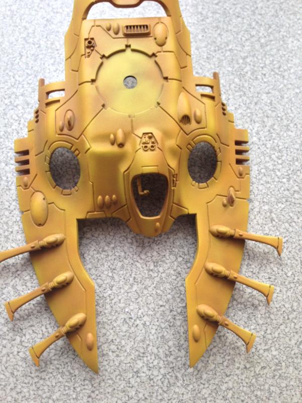
|
|
This message was edited 1 time. Last update was at 2012/11/24 18:19:23
The Dreadnote wrote:But the Emperor already has a shrine, in the form of your local Games Workshop. You honour him by sacrificing your money to the plastic effigies of his warriors. In time, your devotion will be rewarded with the gift of having even more effigies to worship.
|
|
|
|
|
2012/11/24 21:36:34
Subject: Iyanden Wave Serpent
|
|
Fresh-Faced New User
|
Thanks for replies guys.
oadie, You mean that horizontal surfaces should be a little bit brighter than highlights done on the edges, whereas all vertical surfaces should be darker as it is done now, right?
I'll try to do that you suggest
|
|
|
|
|
2012/11/25 01:40:13
Subject: Iyanden Wave Serpent
|
|
Posts with Authority
South Carolina (upstate) USA
|
Looks more like like a desert camo scheme for a Middle Eastern tank, than Eldar. Good job on it though.
|
Whats my game?
Warmachine (Cygnar)
10/15mm mecha
Song of Blades & Heroes
Blackwater Gulch
X wing
Open to other games too
|
|
|
|
|
2012/11/25 02:23:20
Subject: Iyanden Wave Serpent
|
|
Gargantuan Gargant
|
Gutor wrote:oadie, You mean that horizontal surfaces should be a little bit brighter than highlights done on the edges, whereas all vertical surfaces should be darker as it is done now, right?
Yeah, horizontal surfaces should be brighter than vertical ones. Whether you want them brighter than the edges is up to you, though.
There is one school of thought regarding color modulation in the military modeling world that separates gradients by panel, making them brightest in the center and darker near the edges (separated by even darker panel lines). The effect is pretty cool looking, but it's a lot harder to pull off with something like an Eldar tank, thanks to the large panels and all the various curves found within each one. If you ignore those lines and simply look at the physical object, horizontal surfaces would be brighter than rounded corners, assuming the light is coming from above. If you go by conventional mini painting wisdom, though, many of those curves are "edges" and would therefore receive highlights.
Personally, I'd keep your "edges" brighter, like they are now, just lightening the yellow on horizontal surfaces, slightly (while leaving your darker shading in recesses, even horizontal ones like around gems and vents, for contrast). Like I said, though, it could really work either way.
|
The Dreadnote wrote:But the Emperor already has a shrine, in the form of your local Games Workshop. You honour him by sacrificing your money to the plastic effigies of his warriors. In time, your devotion will be rewarded with the gift of having even more effigies to worship.
|
|
|
|
|
2012/11/25 10:57:49
Subject: Re:Iyanden Wave Serpent
|
|
Fresh-Faced New User
|
I was working a little bit, but not too much in order not to overdo it..
Here is final effect:
|
|
|
|
|
2012/11/25 18:27:30
Subject: Iyanden Wave Serpent
|
|
Gargantuan Gargant
|
Looks good to me. 
|
The Dreadnote wrote:But the Emperor already has a shrine, in the form of your local Games Workshop. You honour him by sacrificing your money to the plastic effigies of his warriors. In time, your devotion will be rewarded with the gift of having even more effigies to worship.
|
|
|
|
|
|
|