| Author |
Message |
 |
|
|
|
|
Advert
|
Forum adverts like this one are shown to any user who is not logged in. Join us by filling out a tiny 3 field form and you will get your own, free, dakka user account which gives a good range of benefits to you:
- No adverts like this in the forums anymore.
- Times and dates in your local timezone.
- Full tracking of what you have read so you can skip to your first unread post, easily see what has changed since you last logged in, and easily see what is new at a glance.
- Email notifications for threads you want to watch closely.
- Being a part of the oldest wargaming community on the net.
If you are already a member then feel free to login now. |
|
 |
2016/12/03 22:07:11
Subject: Getting back into painting - looking for critiques of my IG scheme
|
|

Fresh-Faced New User
|
Hey all,
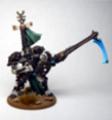
I recently purchased a bunch of IG and have painted up a command squad, some shock troops, and am finishing off the arms for some scions.
What does everyone think of my colour scheme? I've had some 4channers tell me it looks like my guys pants are made of stone, so I don't want to paint a whole army only to realize the scheme sucks after sinking tonnes of hours into it.
EDIT - Sorry for the crusty picture quality, I only have a phone camera and an LED desk lamp to work with.
|
|
This message was edited 3 times. Last update was at 2016/12/03 22:09:35
|
|
|
 |
|
2016/12/04 02:01:07
Subject: Getting back into painting - looking for critiques of my IG scheme
|
|

Powerful Phoenix Lord
|
I'll be honest...dark green and grey don't really pop. While it may look a bit realistic (considering how toned down camouflaged troopers are supposed to be) it looks awfully boring. What were you planning for the bases?
That being said - these are you figures. In the end, who cares what other people think? If you like them, go for it.
Since you're asking for opinions though - I think it looks really dull. It may also be really dull to paint if you need to paint 100+ figures.
|
|
|
|
|
2016/12/04 02:03:08
Subject: Getting back into painting - looking for critiques of my IG scheme
|
|
Decrepit Dakkanaut
|
I quite like it. Very realistic, and executed well enough that it looks great.
|

Peregrine - If you like the army buy it, and don't worry about what one random person on the internet thinks.
|
|
|
|
|
2016/12/04 02:50:04
Subject: Getting back into painting - looking for critiques of my IG scheme
|
|
Fresh-Faced New User
|
 Elbows wrote: Elbows wrote:I'll be honest...dark green and grey don't really pop. While it may look a bit realistic (considering how toned down camouflaged troopers are supposed to be) it looks awfully boring. What were you planning for the bases?
That being said - these are you figures. In the end, who cares what other people think? If you like them, go for it.
Since you're asking for opinions though - I think it looks really dull. It may also be really dull to paint if you need to paint 100+ figures.
I know that bright flashy colours are the standard (at least, based on the paint jobs i've seen at my local gaming shop), but based on my personal tastes, I wanted to aim for something realistic looking, even if it didn't quite stand out like your average Space Marine scheme would. I probably should have phrased my question as "how well did I replicate an urban camouflage colour scheme".
Thanks though, you did call it realistic, which is what I was aiming for so at least I've accomplished that.
|
|
|
|
|
2016/12/04 04:39:58
Subject: Getting back into painting - looking for critiques of my IG scheme
|
|
Poxed Plague Monk
|
Not sure on the green. Looks like some one is wearing urban cammies with woodland armor and gear. Maybe a dark gray/ dark blue/ black to tie the look together?
|
Cats are like greatness, Some achieve cats and some have cats thrust upon them.
William H. A. Carr
Cats are intended to teach us that not everything in nature has a function.
Unknown |
|
|
|
|
2016/12/05 02:24:16
Subject: Getting back into painting - looking for critiques of my IG scheme
|
|
Hardened Veteran Guardsman
|
I quite enjoy toned down color schemes. This one is very well done
|
"We have lost the element of surprise, and they do not fear us. Perhaps they will appreciate our devotion to the Emperor and our ruthless efficiency." |
|
|
|
|
2016/12/05 04:49:39
Subject: Getting back into painting - looking for critiques of my IG scheme
|
|
Ambitious Space Wolves Initiate
|
I really like the grey colour on your minis. Look like a cool camo pattern. 
About the green, I agree that it makes your minis look more realistic. But, did you think about a winter pattern ? I think your grey and a white armour could be really cool.
|
|
|
|
|
2016/12/05 06:28:49
Subject: Re:Getting back into painting - looking for critiques of my IG scheme
|
|
Pewling Menial
|
Adding some colours into the fatigues could really help the models stand out on the table, some lighter grey/blue or white dots for a nice dark winter-isk camo.
|
|
|
|
|
|
2016/12/05 10:37:41
Subject: Getting back into painting - looking for critiques of my IG scheme
|
|
Thunderhawk Pilot Dropping From Orbit
|
I like the realistic color scheme it looks good.
For future painting, try your luck with the airbrush on vehicles. I airbrushed a titan and some rhinos to great effect.
|
|
|
|
|
|
|
|