I think you need much more contrast and you're going the wrong way. You should consider a dark backdrop with your red letters forming the frame, but take the center of the letters much more into white (or orange/yellow depending on the effect you want).
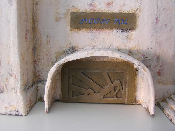
I only have example pictures in blue...
... but I think you're suffering from the same problem the sign in the first picture has. It's the shade of blue I wanted for it, but if you step away from the terrain piece even a little it becomes a lot harder to read. The billboard on the other hand got a blue that's a lot more whitish and is a lot easier to read, even from afar, while the letter frame preserves the original color to a degree and gives it its blue appearance.


 Heresy World Eaters/Emperors Children