Firstly, congratulations to all those who completed a piece. Good job all.

To those that didn't quite finish, I hope you will continue with the model and finish it one day.

Congratulations to Cam' for the win, Tek' and Guilden' for the People's choice, and to TerrainWalker for the high honour or joining the ranks of the League. (Higher power, me.

).
As I only served as a consultant judge for this round, I don't have lengthy notes on your models. But I will share some notes here, on the fly; they won't be terribly long as typing takes me a long time (Dyslexia).
In no particular order (well actually in the order they appear in the round-up post):
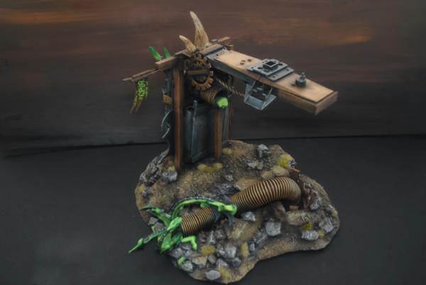
KINGPIN54
Great use of sprue (as dear to my heart it is). Nice way to mould it to shape.
I feel that it could use something more though; either some more modelling by carving the ends of the sprue do they don't end in the recognisable rounded shape, or adding something like hot glue to make the whole more of a web-like structure. Or, more in the painting side. The colours you have chosen make it look more like a metal cage and less a magical portal. Also, choosing more colourful, "portal-like" colours, would have given the whole model a bit more of this mystical "pop" we modeller's talk about; it's all a bit monochome with the black marble.
Talking of the black marble, that looks nice. Very effective.
Good use of parts to give the model some chaos flavour.
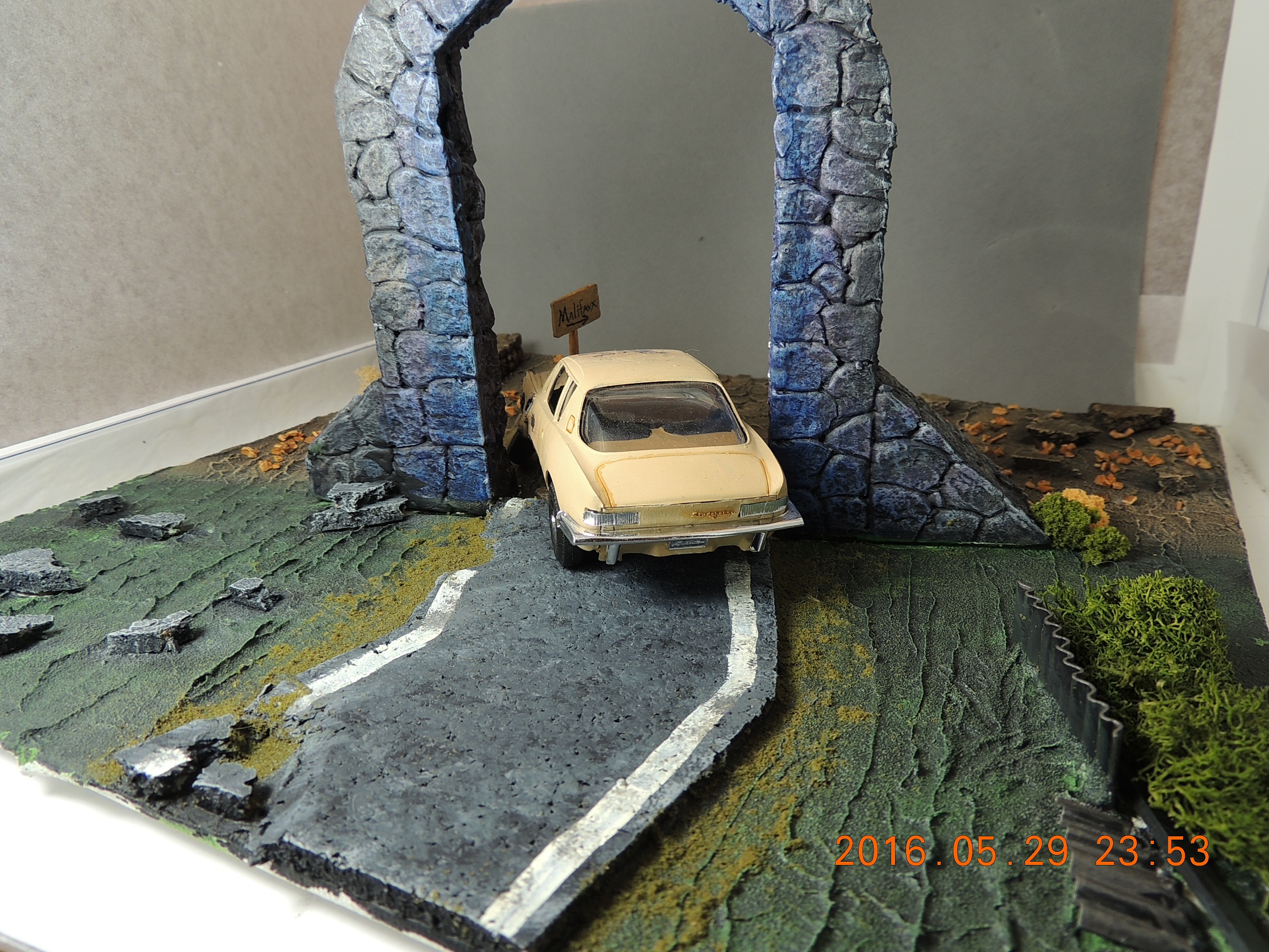
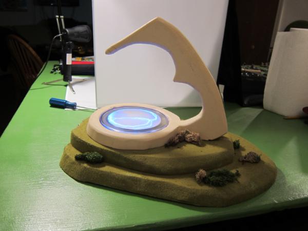
Guildenstern
Great concept. I do like a model with a Jekyll and Hyde transition. Very fun.
The texture on the arch looks great.
The blue on it, could do with some minor additions: I'm assuming you are going for a glow and not a staining (although, as staining goes, it works... you can tell I'm thinking as I type), for painting
OSL ...
***Big disclaimer: I have yet to manage an
OSL effect that looks good, let alone "right". Do as I say, not as I do.

***
...The effect on the surrounding objects (the arch in this case), the "light" will make the surface lighter than it is normally. The way to do this is paint on white first, either dry-brushed or airbrushed, and then glaze over the white with the glow colour. This makes it look less like a stain and more like the light is falling on the surface.
However, what is really missing in your
OSL, is the glowing object. There's a couple of things I can think of now that would sell it nicely:
Fit a piece of clear plastic into the archway. You could leave it clear and the glossy surface would do the job. Or you could paint tendrils, stars, Portal-like things on it so that they float in space (these are the glowing objects, and the
OSL on the arch would have to vary in brightness depending on proximity to these objects). The problem with this is how difficult it would be to cleanly cut around the car.
Or, use wire to create electrical arcs within the plane of the arch, and these act as the glow source.
Also, if the glow is casting on the arch, it should also be on the car and the ground around the arch.
Going back to staining. This requires none of the effect on the car or surrounding area. It doesn't need to be brighter nearer the source, or anything I've mentioned above (which is why I think it's a possibility). I also like the idea of an invisible barrier/portal, with the change in the surroundings showing the effect rather than the "typical" glowy portal thing.
What this could do with, would be darkening the stained area; Like wet things becoming darker. Instead of adding the blue as a dry-brush, add it as a wash that will only tint the high points of the rock surface, but pool into darker and stronger-coloured areas in the recesses. Also, making it darker would avoid any confusion about whether you are using
OSL or not.
Going back to the rest of the piece now, I like the change from green to brown that you have mirrored in the plants as well as the ground.
I like how the road changes from tarmac to stone too.
Good idea on the ground texture.
A couple of things to add though: Where the ground meets the other things (road, arch, fence) it could do with some extra dirt build-up and/or some grass. The arch and tarmac road look a bit too much like they are "on" the ground, rather than part of it. In contrast, your stone road merges nicely with the ground. I can see that you added flock about the tarmac, this is good. I just feel that the ground could come up to meet the edge of the road a bit more.
Also, where the ground meets the metal fence, If you changed from green to "mud" paint, and maybe added some other patches of mud about the area just to break up the green a bit. But this is a tricky balance point as you don't want to effect the contrast between the green half and the brown half. Maybe just a sprinkle of flock along the bottom of the fence instead.
And finally, the car. Nicely done. Damage works well.
The scratches are good in their shape and placement. Just one minor addition to the painting of the chipped paint areas: Add an undercoat layer. Use exactly the same technique you have used, don't change anything, just add a step to the process.
At the boundary of paint to damaged metal, you want it to go Paint - undercoat - clean metal - dirty metal
I'm going to make some assumptions about how you painted this, but bare with me, You have painted the car surface clean (the yellow), then you paint on the scratches/chips with metallic and then you have weathered it with washes etc for the rust and depth of dents.
Instead of adding the chips and scratches (paint brush or sponge) with metallic paint, use the undercoat colour. The colour itself doesn't have to be what you used to actually undercoat your model, it's what was used "in universe" to undercoat the car; this can be white/light grey, typical grey primer, anti-rust red, or anything else. For best effect, use something that will contrast with the models "clean" colour and the metal colour. You are only going to have a fine line of this colour showing, so it's needs to stand out a bit.
Once you've done this layer, then add the metallic paint within these areas but making sure to leave a thin boundary of the undercoat between the metal and clean paint.
Then you can carry on as normal adding brown and black to make the metal areas rusty and dented. You seem to have done these well.
You can take this further by not using metallic on every chip. Leave some of the smaller chips/scratches as the undercoat layer and this will look like the paint has chipped off, but not the primer
And one last thing on the car; The front half could do with looking dirtier. It's scratched and dented, but the yellow between these bits looks every bit as clean as the rear of the car. With the sharp contrast between the green grass and the brown mud of the two halves of the board, the car could do with a sharper divide.
I'm supposed to be keeping these short, that'll do for now.
Camkierhi
Actually, Cam'. There really isn't much I can rip into on your's...
There's lots going on, big and small.
I, as you well know, like little details. I like how you've added a tide mark inside the egg tower. I like the Verdigris too.
A scattering of plants, another thing I'm always telling people to add.
Nicely textured wood. Again dear to me heart.
Tentacles! Need I say more.
The tree looks pretty good with the foliage added. It might still look a bit too much like twisted sprue from some angles, but mostly good.
The mud and dirt is nicely varied in colour and texture.
The water is nicely done.
The portal is good and swirly, colour and texture.
The only thing I'm not too fond of, is the eye. It's a bit disjointed. It could do with something to make it more than just a floating eye; a bulge in the surface, eyelids, more tentacles caressing the surface, put it on a stalk, or just blend it in to the surface a bit more (painting-wise).
A worthy winner.
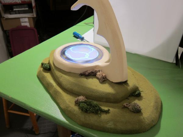
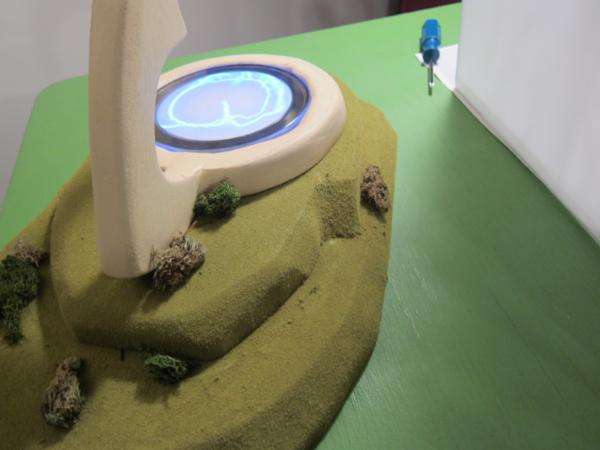
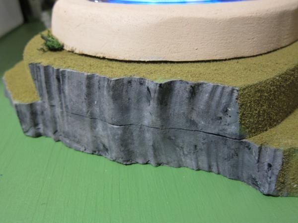
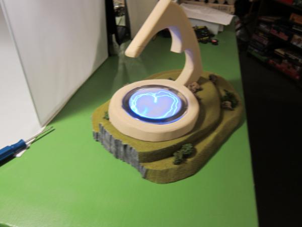
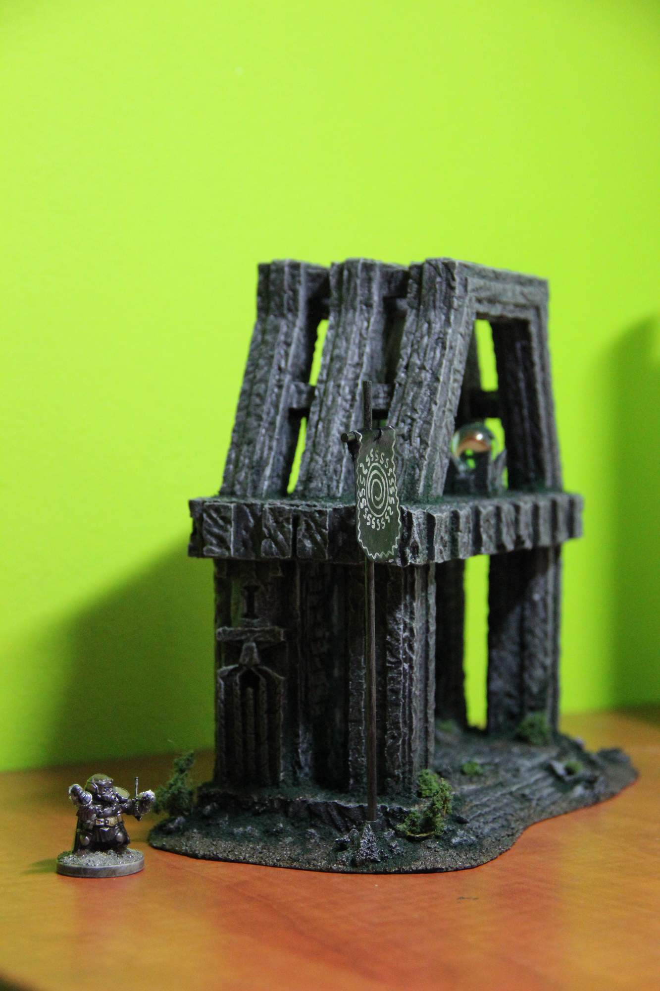
Nevelon
Nice design and good show pushing outside your comfort zone. Done well handling the foam.
The scattering of bushes is nice and natural, but the grass between them is a bit too uniform. A bit more variation in colour and texture would break it up nicely and make it look more natural.
As good a job you have done making the structure a nice smooth surface, it could do with some added shapes to break up the flatter areas. Have a look at what
GW does with it's larger Eldar structures; while I think they do get a little carried away with the number of bumps, somewhere in-between the two would help. And maybe an access hatch or two.
Also, just a thought, maybe the addition of two much smaller "spires" could be added opposite the large main spire you have, spaced apart but not as far as to make all three evenly spread. Think of the larger being a thumb and the other two being small fingers, with the portal being the palm. Not better, just different.
Great use of the electro-screen thingy.
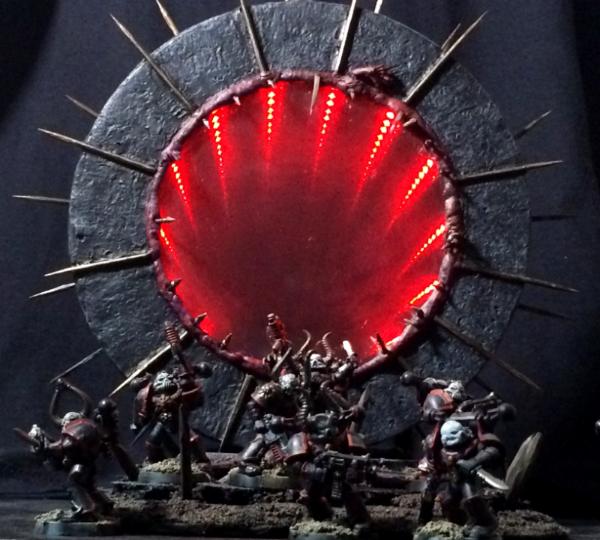
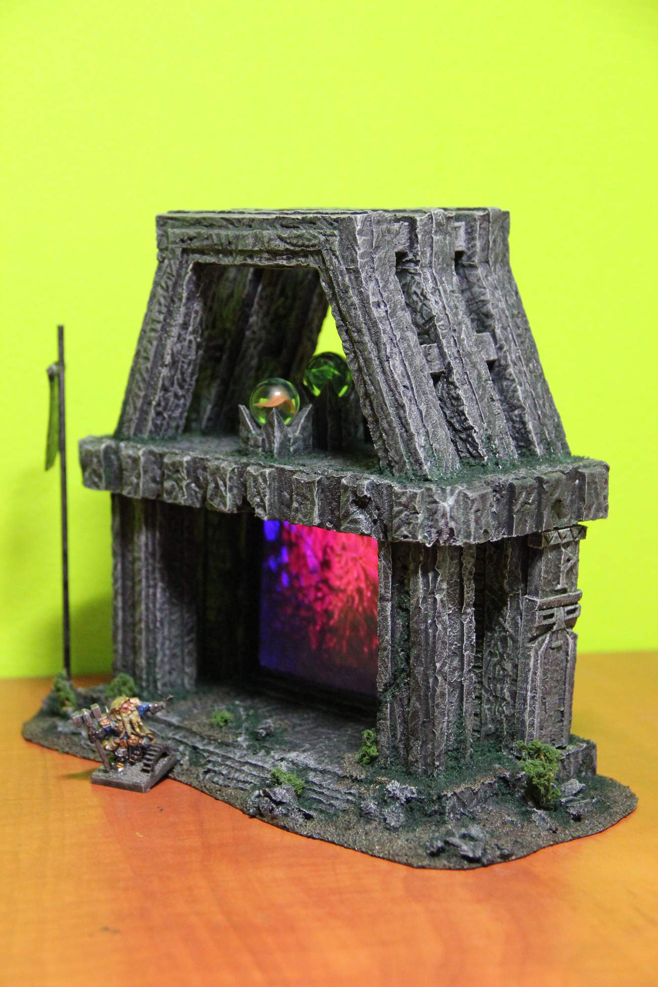
TheEyeOfNight
I love the effect on this one. Really works well.
The contrast between the red lights and the darkness of the rest of the model works well also.
Quite probably this doesn't need added plants.

The base is nicely textured in itself and the added skeletons are good.
Nice design on the rear of the portal too.
Terrainwalker
Very nicely detailed piece, great design.
The mud and rocks, as is the rest of it, are well painted.
The patches of grass are well placed, but could use some variation in length to add to the realism.
Good use of parts to create the whole.
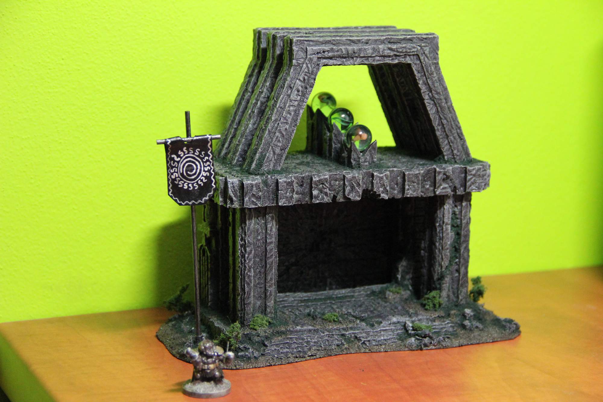
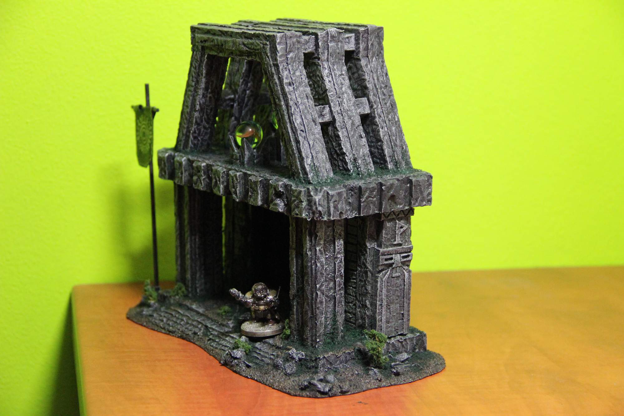
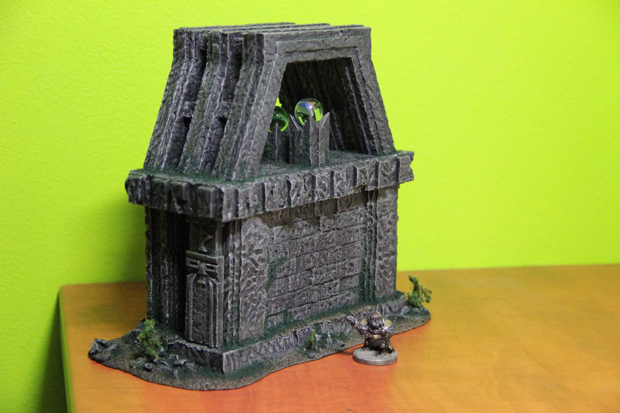
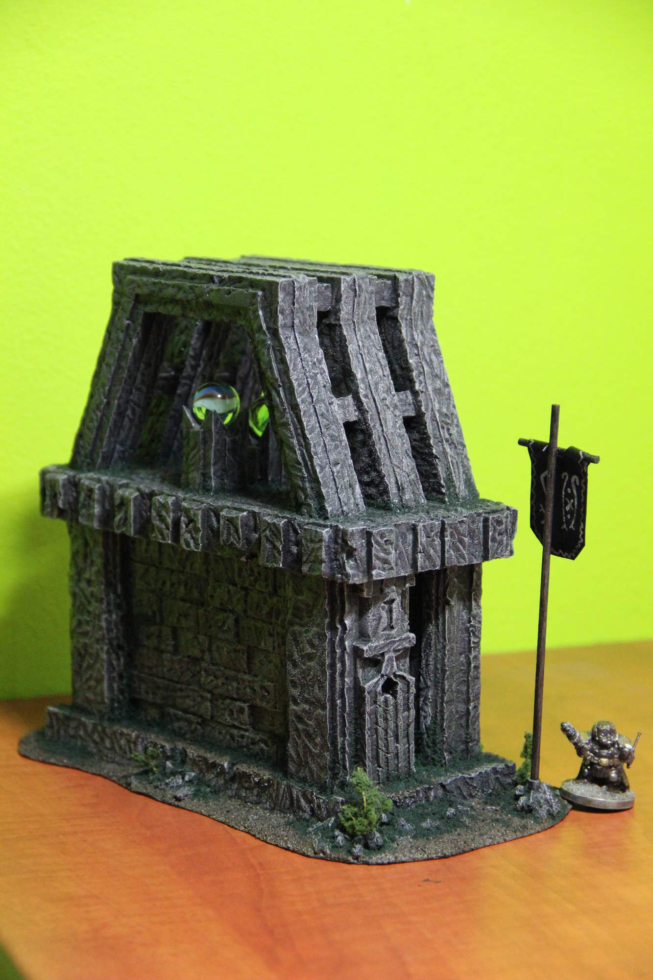
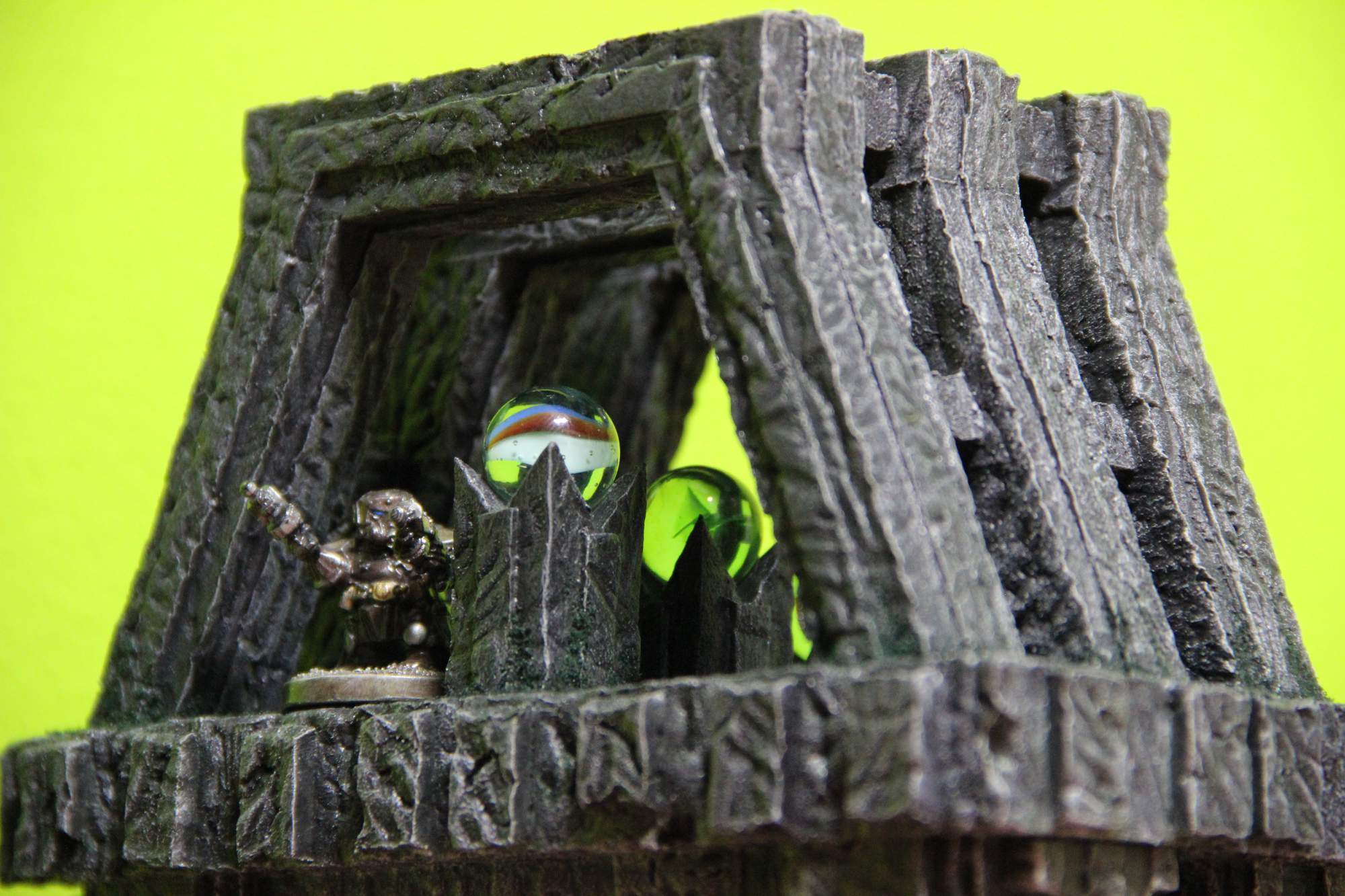
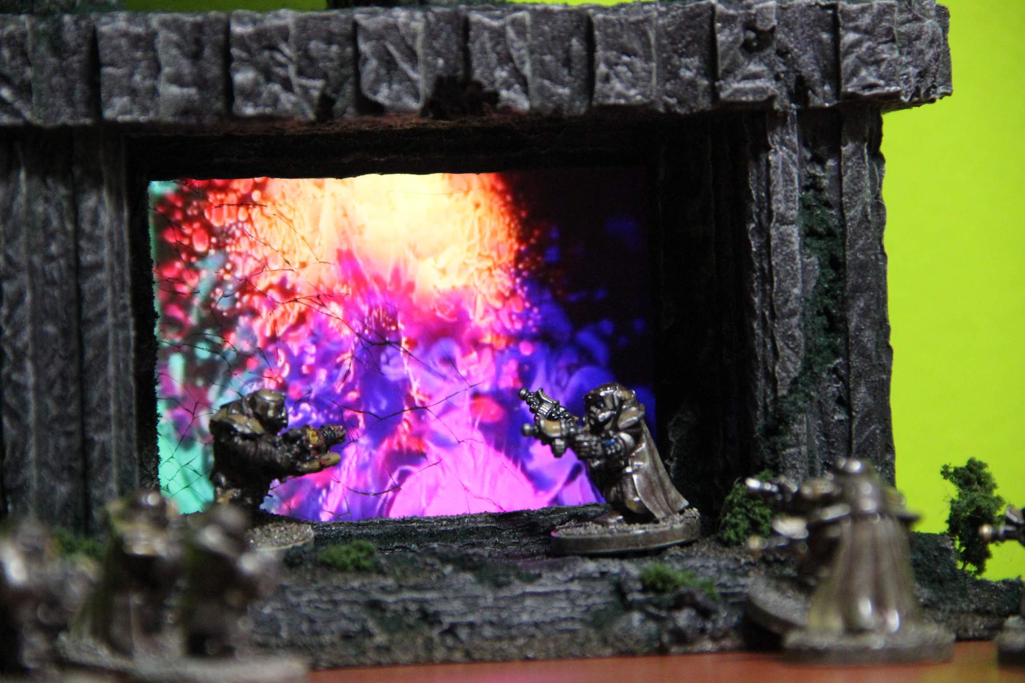
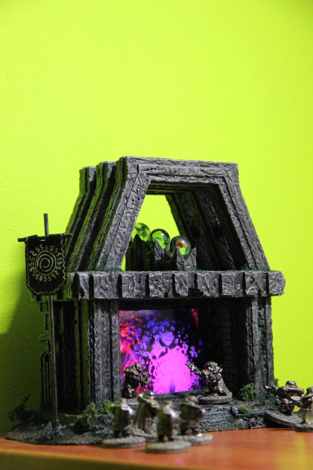
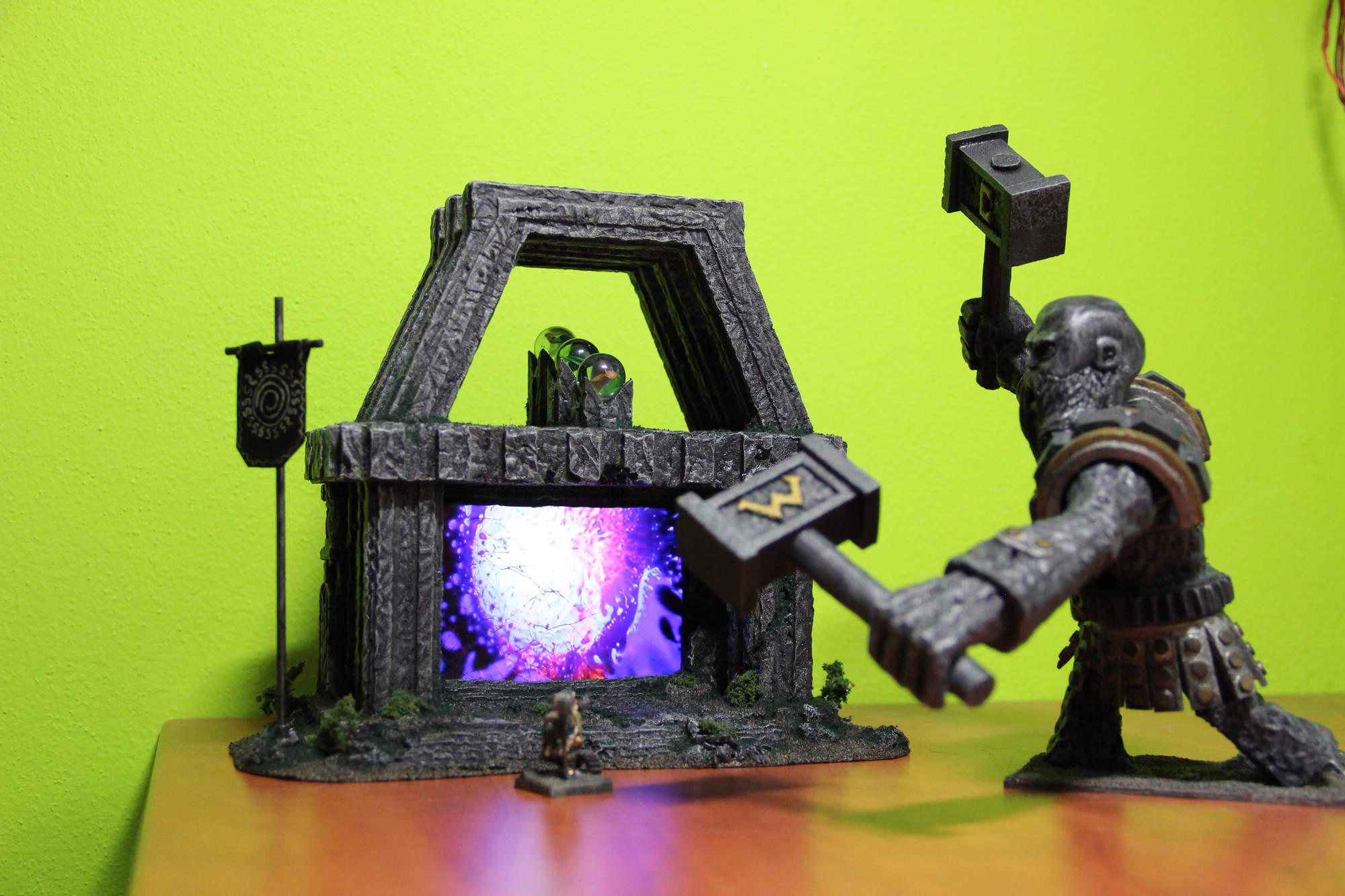
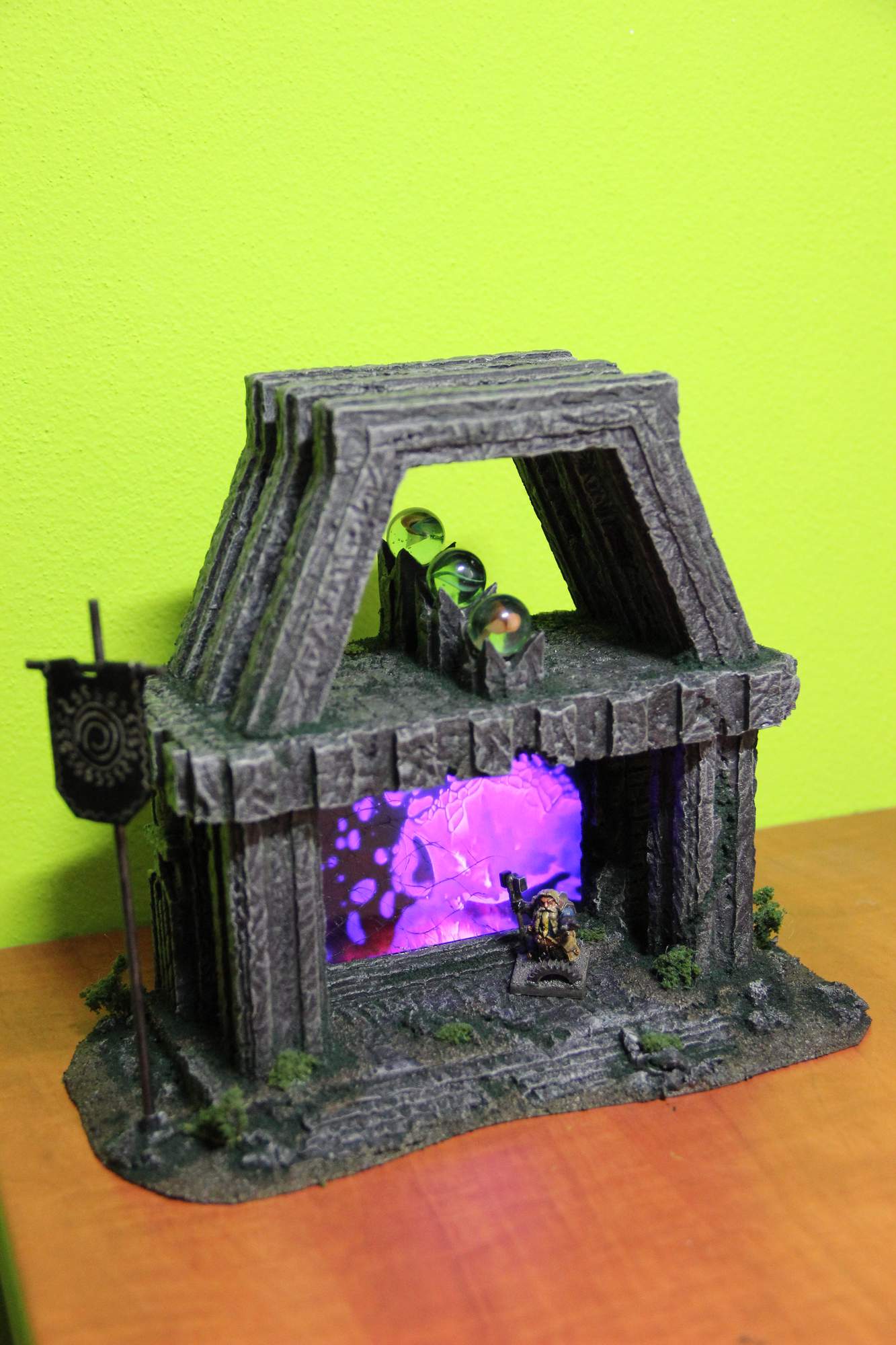
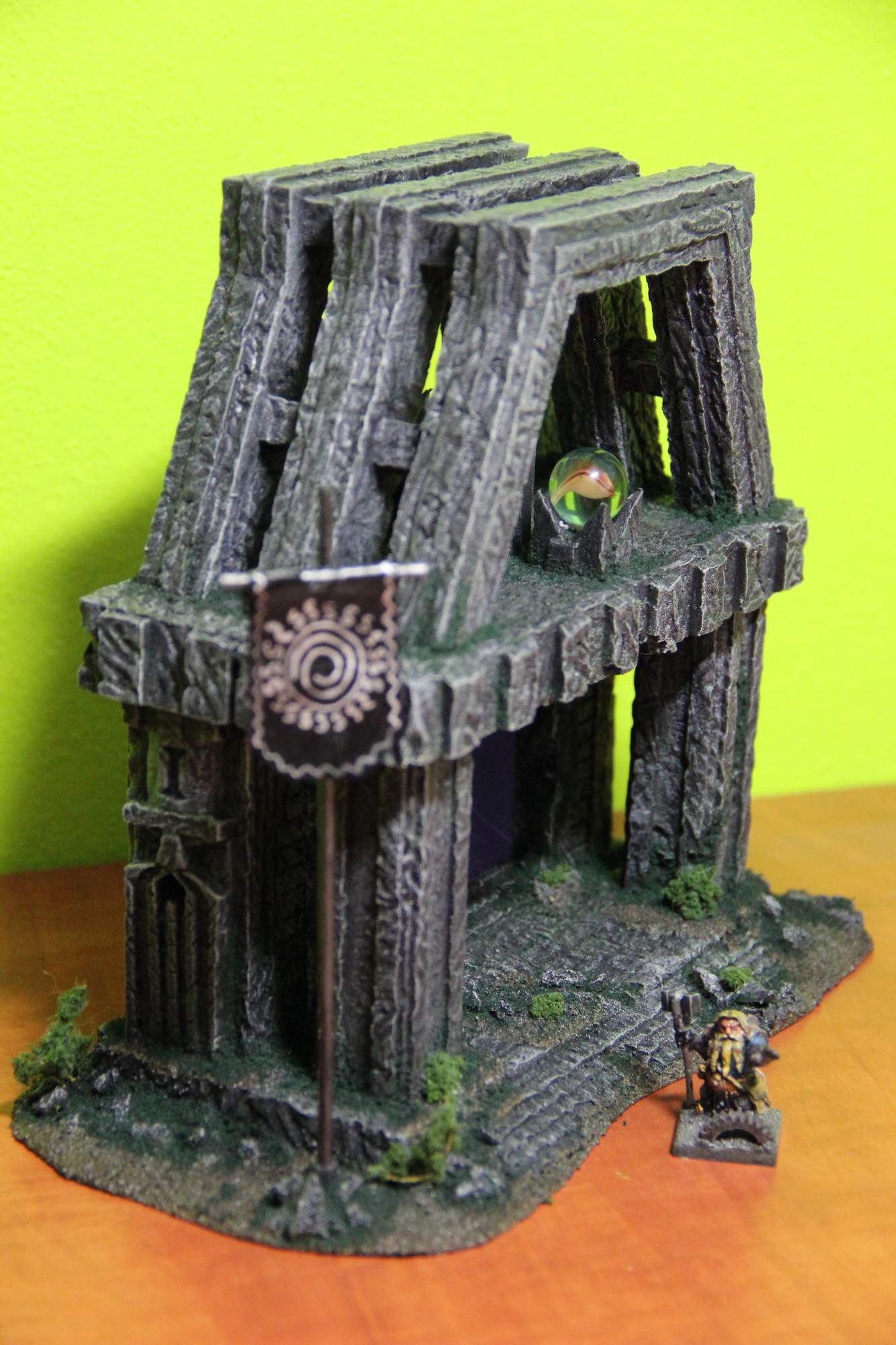
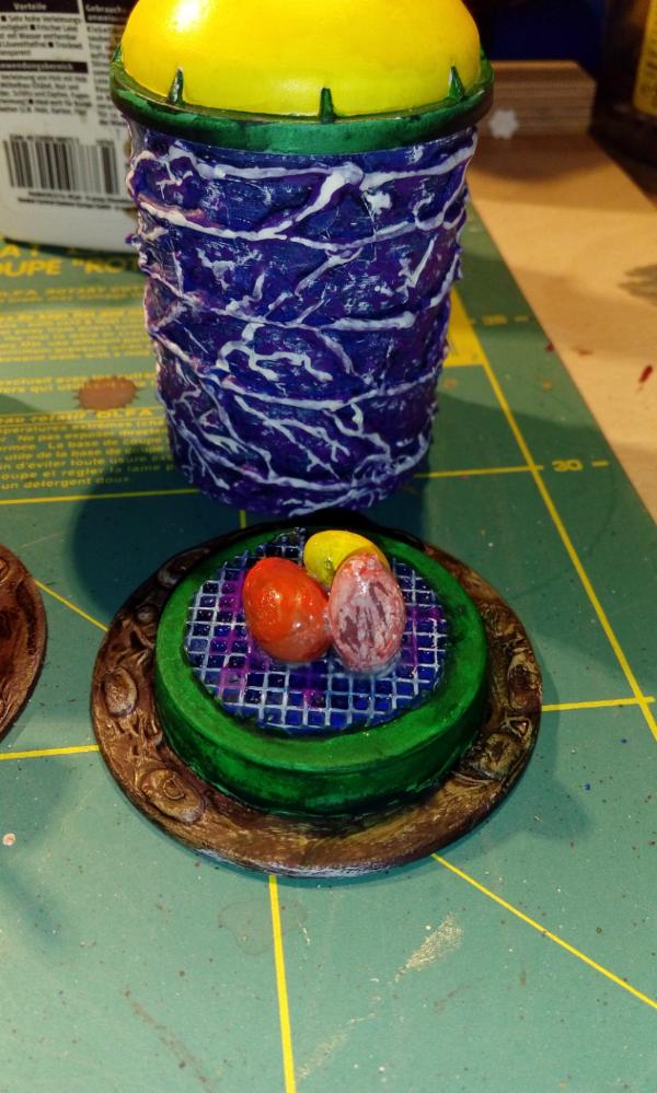
Tek Thornison
Overall, I love this piece. You had my vote.
There are scattered plants, and grass growing in crevices.
Nice variation in texture on the base.
The design is cool, and the carved faces really help break up the straight lines.
The use of the broken phone is good, and including a hole and pokey-stick hidden in plain sight are great ideas.
Only thing I can see to improve is the marbles; they still look like marbles. Maybe a good layer of gloss varnish, polished up really well, and then have them placed with the inner swirly bits aligned vertically, then they may look like orbs of contained magical fire. Good idea, none-the-less.
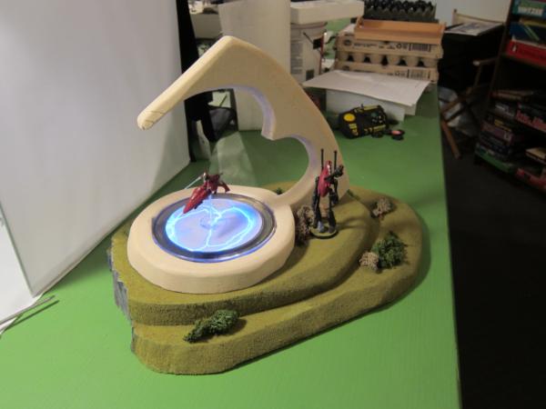
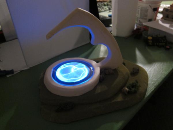
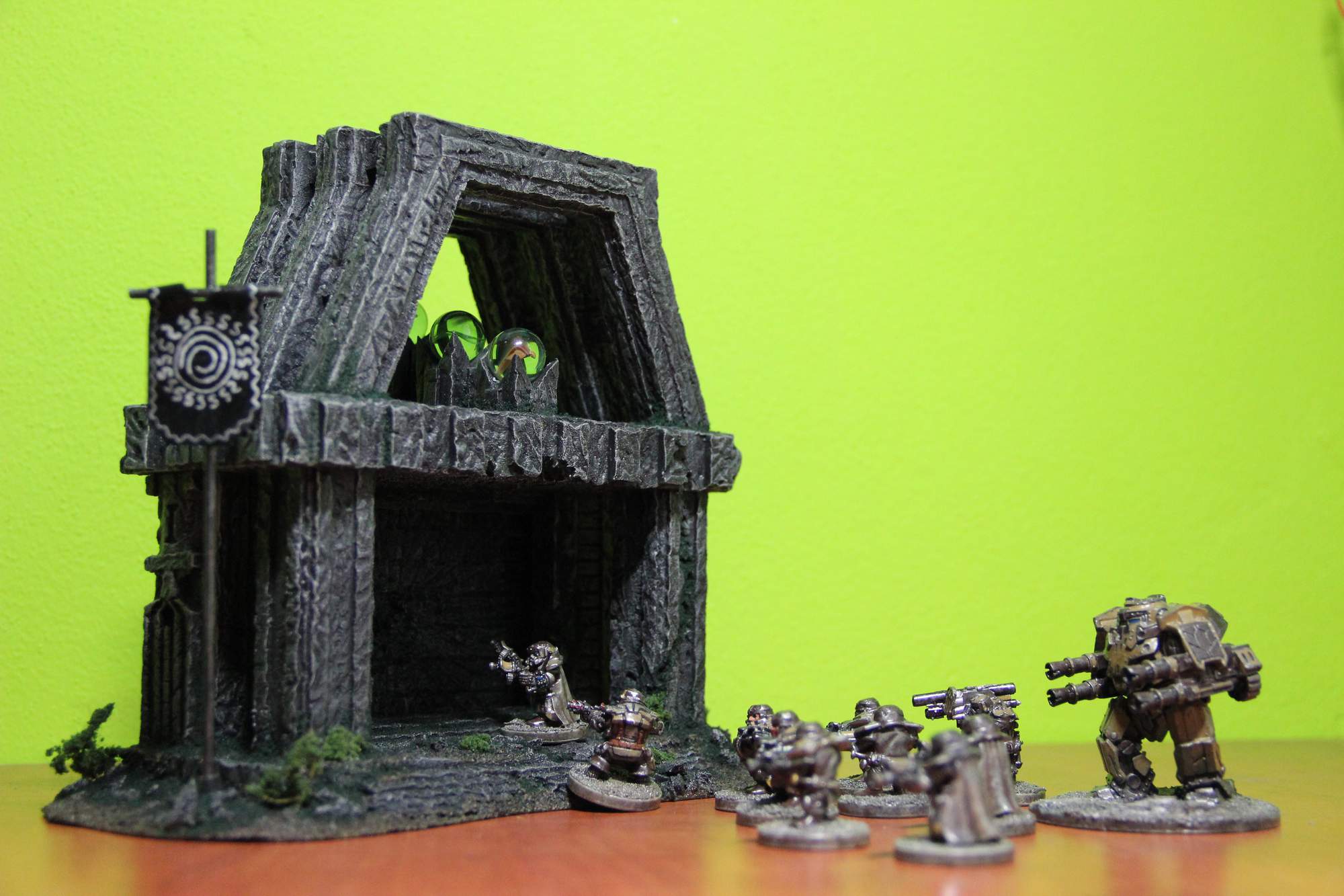
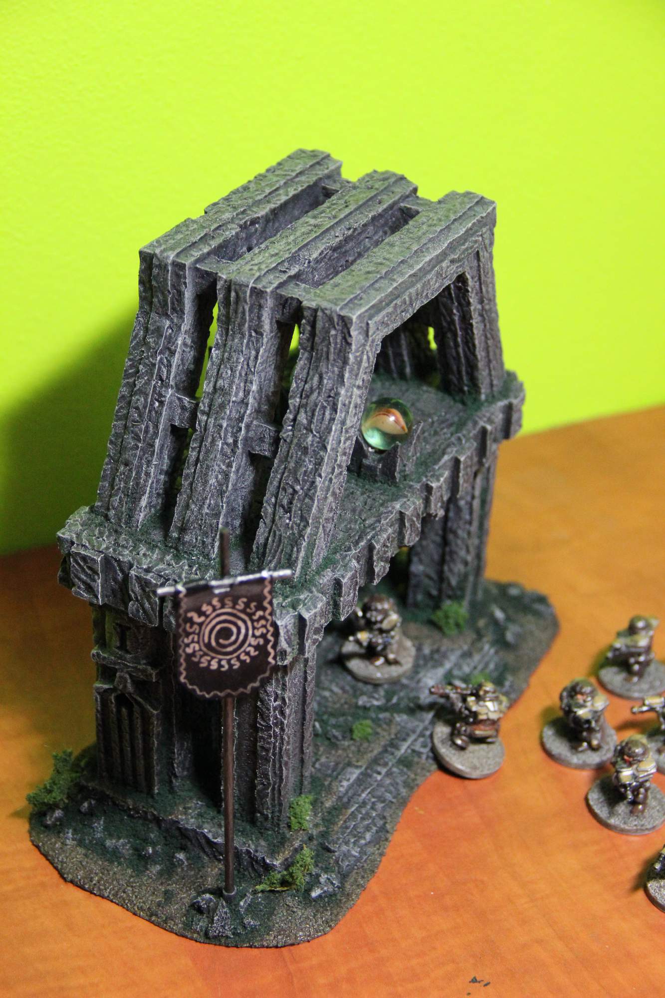
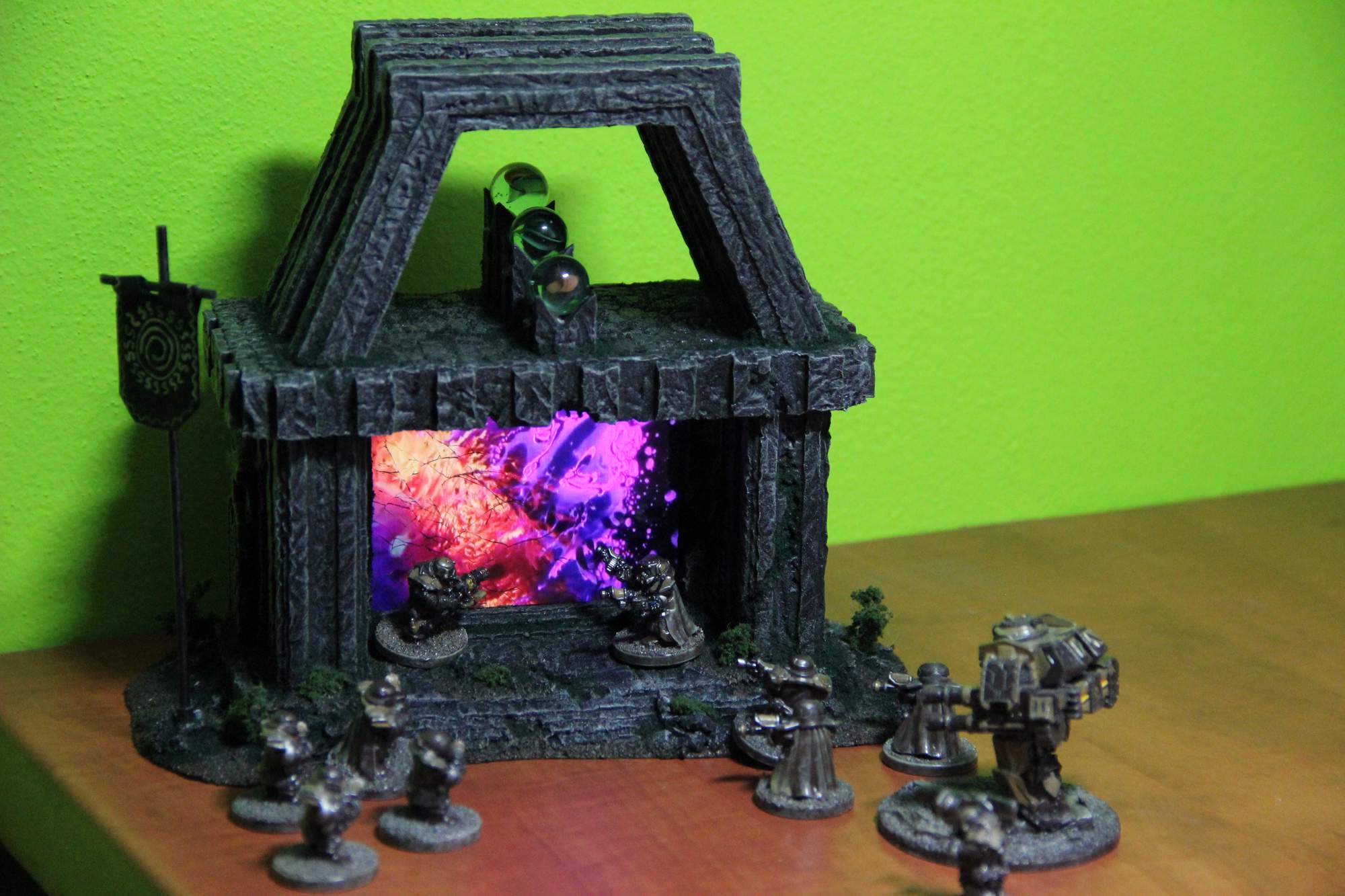
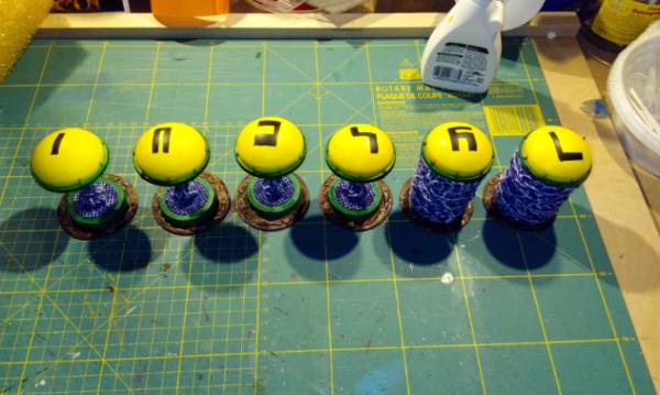
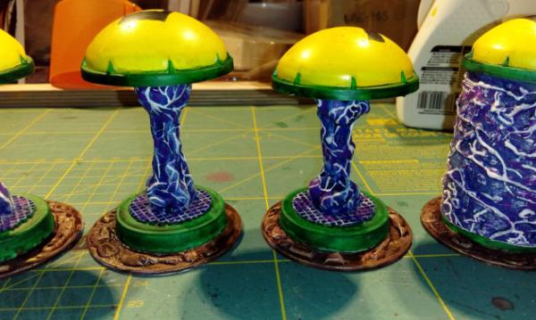
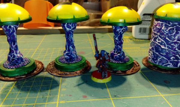
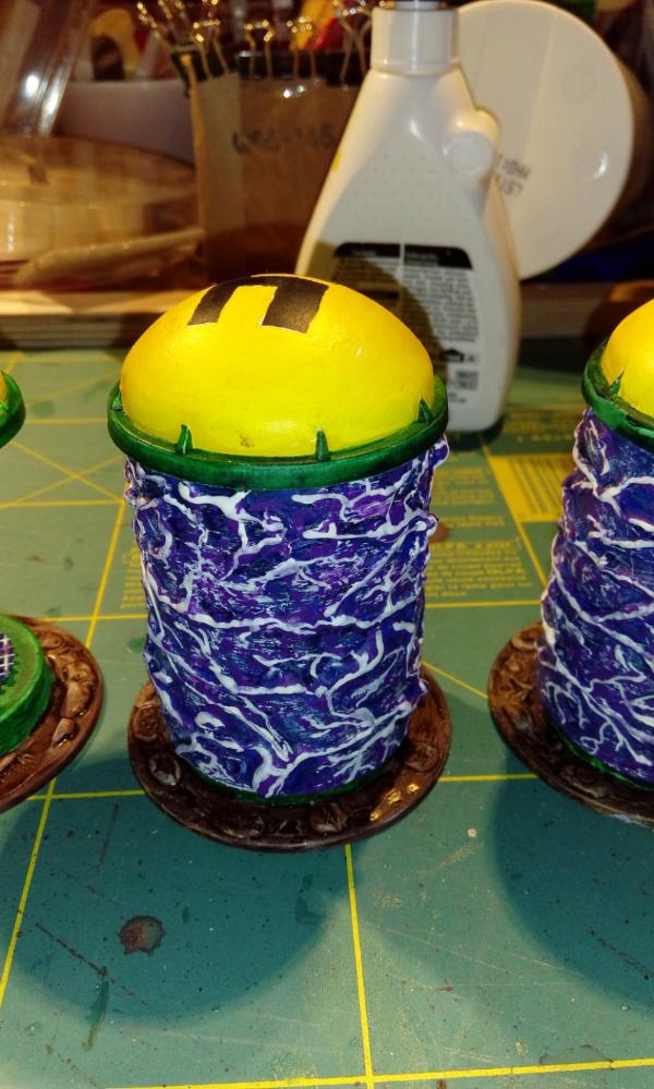
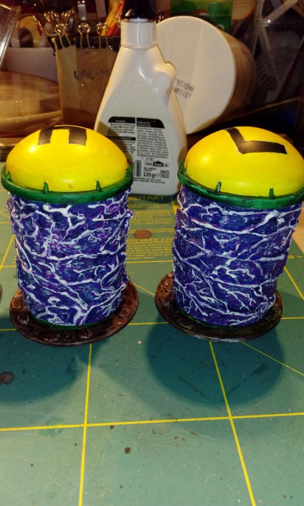
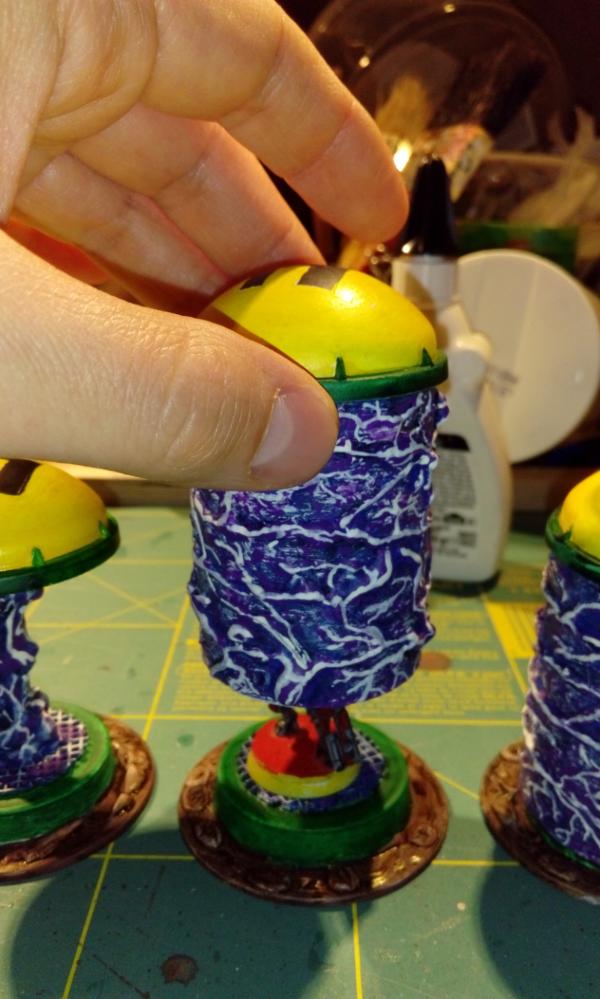
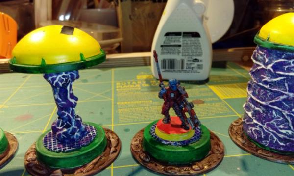
Viktor von Domm
Fun idea, Vik. and very game-central / playable.
Nice designs too.
I like the variation between the "empty" and "full" portals, and that the full ones can house a model.
The swirly portal-ness is nicely textured, but the painting could do with a few more layers between the purple and white. The white is a bit too stark to cover the whole of each tendril. If you could get that same area (the white face of the tendril) to blend from a pink/purple at the edges to a fine line of white in the centre, they would look excellent.
Annnnnnnnnnnnnnnnnnnnnd, I'm done. That's only taken all afternoon.
Again, well done everyone. Lots of fantastic ideas, and good to see so many of you pushing the boundaries.
Good luck in the next round.


 thanks to one and all, finished or otherwise.