25663
Post by: Behind th Mask
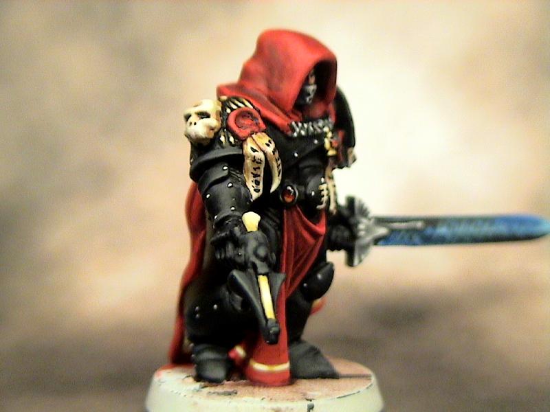
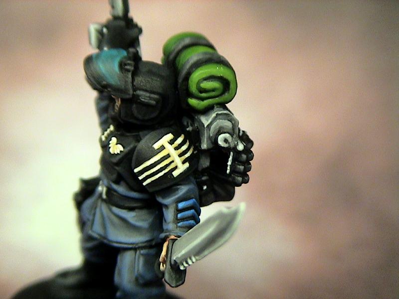
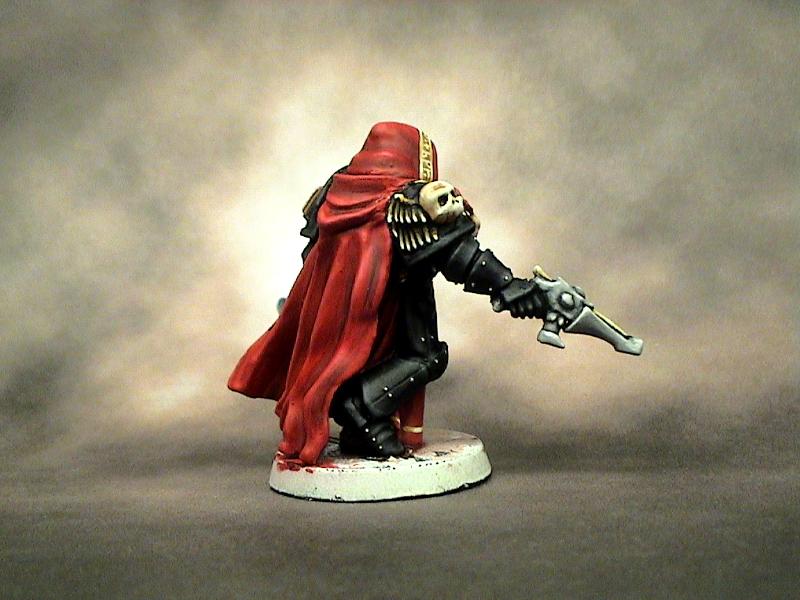
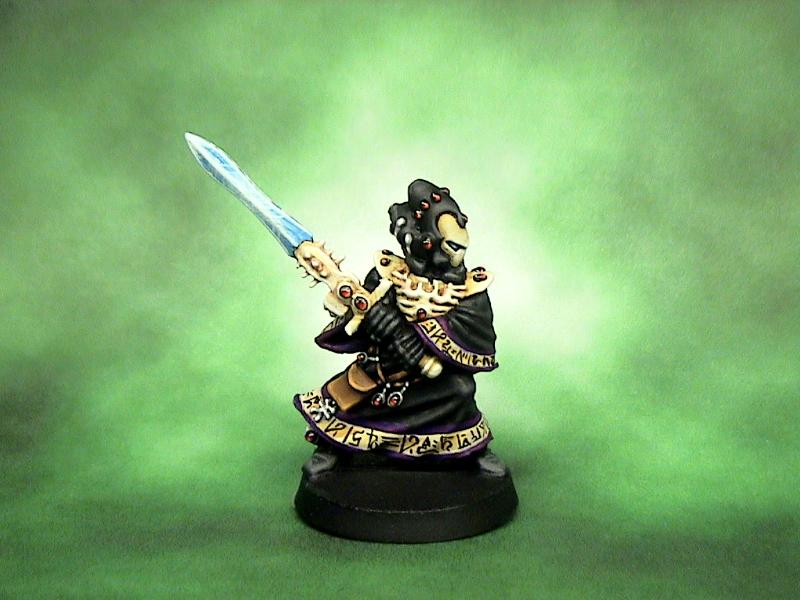
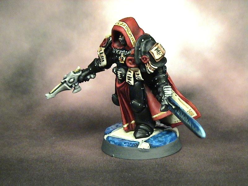
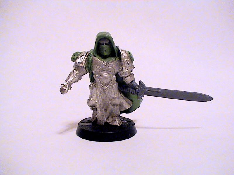
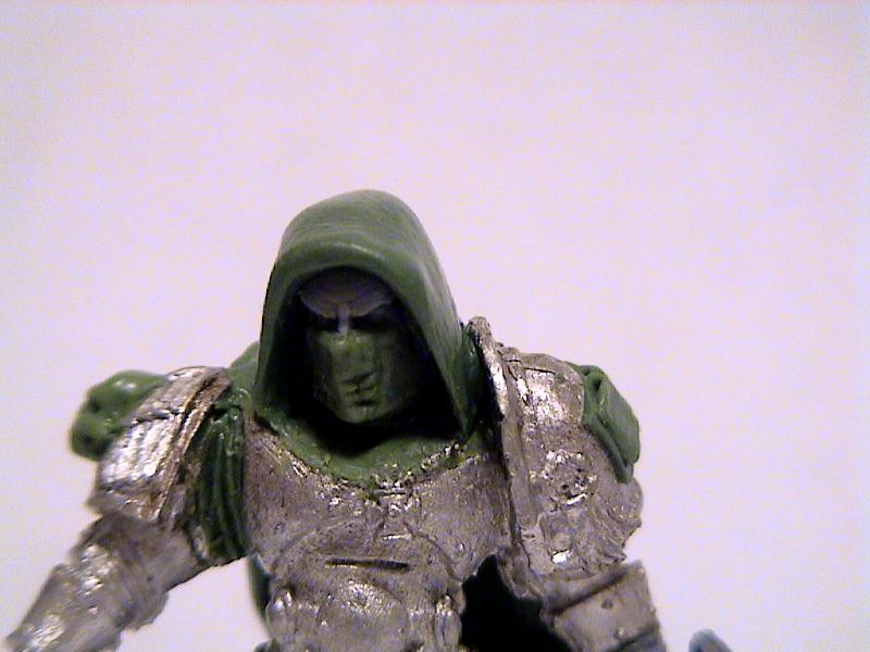
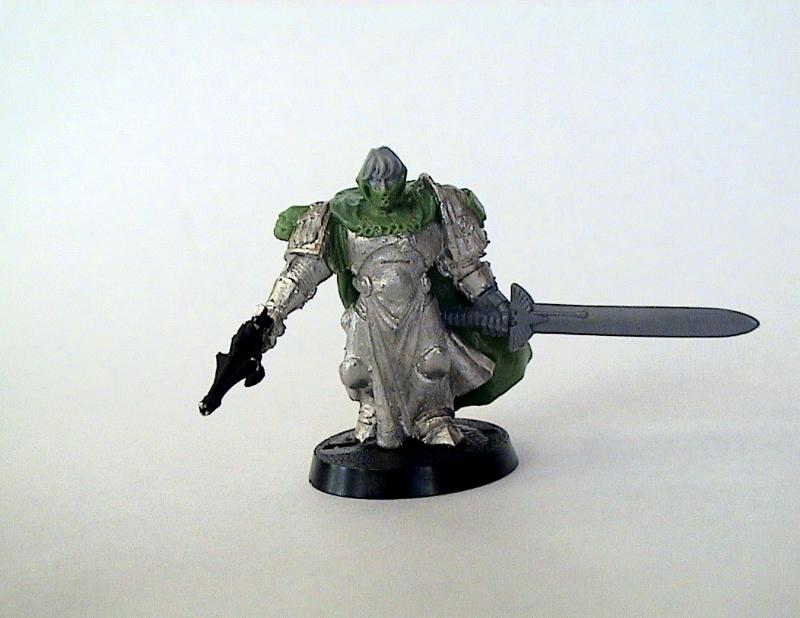
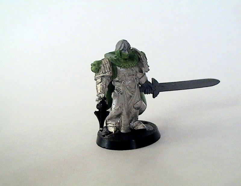
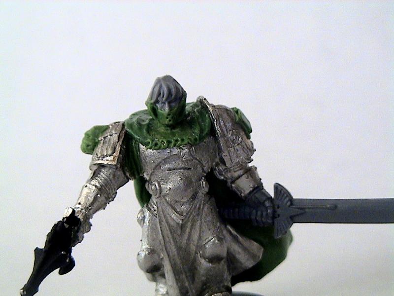
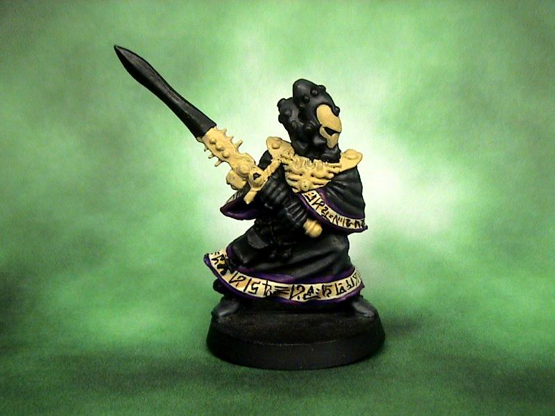
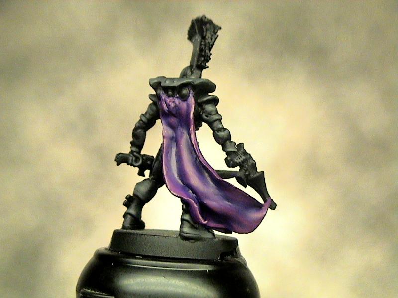
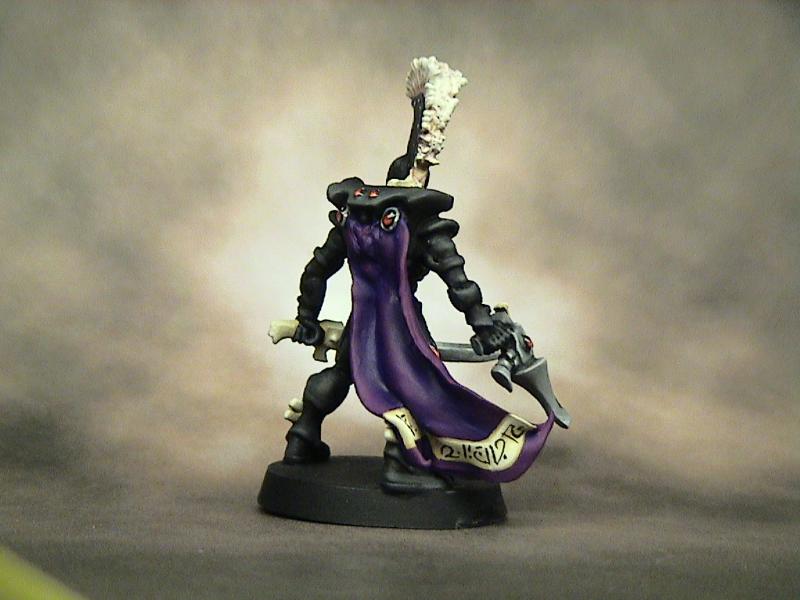
My cousin and I (mostly him, I just give feedback and suggestions) have been working on some solid rules for =I=munda, Click Here to Check out the IN PROGRESS thread . We have a bit of a ways to go, but I really like how they are coming along. So in light of the progress I decided to raid my bitz box and work on my inquisitor. Unfortunately most of my bitz are inaccessible at the moment, so I had to make due with and old chopped up emperors champion body, a choas space marine head, and Green Stuff. Here are the WIP pics at the moment, I still have some work to do, but I thought I would share some pics.

I am going to be running a Radical Ordo Xenos warband with Eldar characters mixed in. I can't wait for the rest of the rules to get posted. I think that most people will enjoy what we have come up with.
8666
Post by: Joyous_Oblivion
Good greenstuff work, but his head looks gigantic...
Looks like the proportions you'd see on a dwarf, not a human/space marine.
25663
Post by: Behind th Mask
LOL I posted that on the description of the pic in my gallery. The angle of that shot exaggerates it quite a bit, but it looks better in person. It's the horrible proportions of the Emperor's Champion model. I still have some work to do on it and I am hoping with painting, I can balance it out a bit.
32540
Post by: Timonth
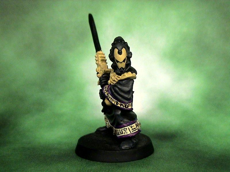
Oh my Emperor! That guy looks só bad-ass, i love it haha! "Hello, I have a huge sword. I'm going to hurt you now."
25305
Post by: Zain60
Great work on the GS. I would suggest (I know it's a ton of work) cutting him at the knees and waist a la true scale to re-scale his body a bit. Unless this is truly just an optical illusion and the proportions are right.
I did, however, play the Emp Champ models a long time ago and they were sculpted horribly small.
17808
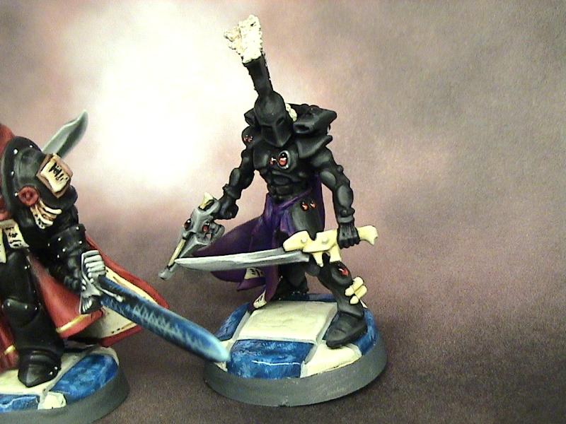
Post by: oadie
I think you've made an incredibly badass, true-proportion, but completely out of scale Squat. Minus the beard. And about 50 pounds, all of which came off his waist.
The actual sculpting looks good, though. If you can fix the scale issues, you'll have a very nice model to paint up (hopefully) equally nicely. 
25305
Post by: Zain60
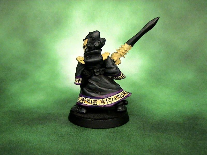
I don't think we have to worry about his painting if you've seen his work. However, I agree there could be scale issues for this to be a truly great creation. Of course, none of that is due in any way to the sculpting you did or the swaps. It's the rest of the body.
11892
Post by: Shadowbrand
Awesome, Awesome conversion. 
25377
Post by: Cake Farts
Nice work.
25663
Post by: Behind th Mask
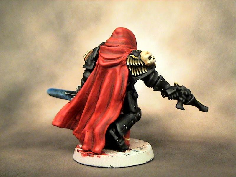
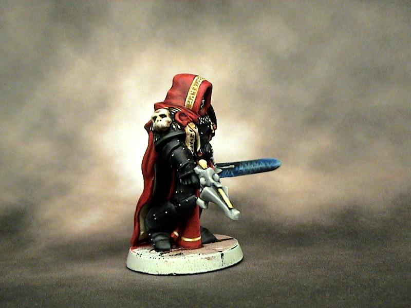
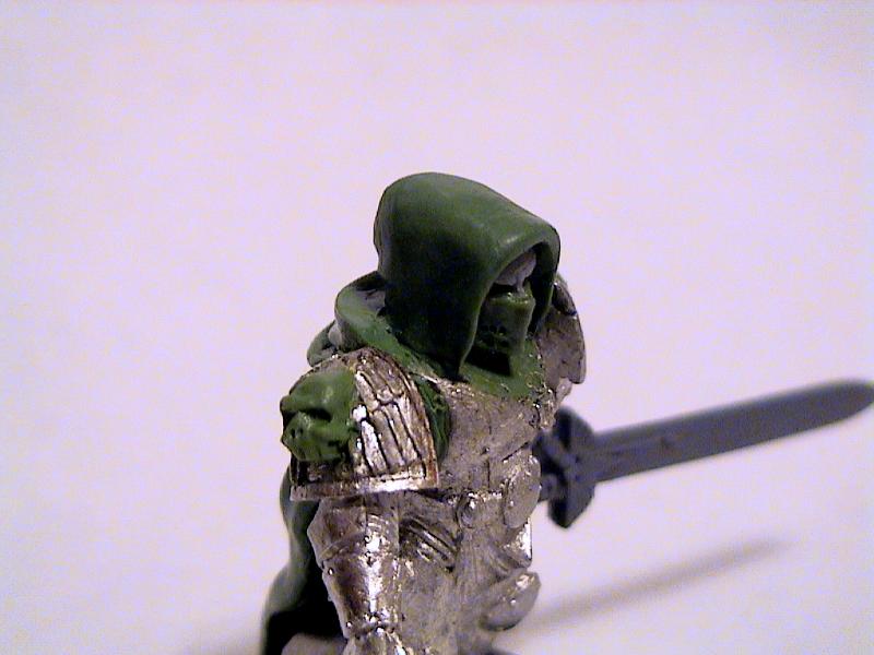
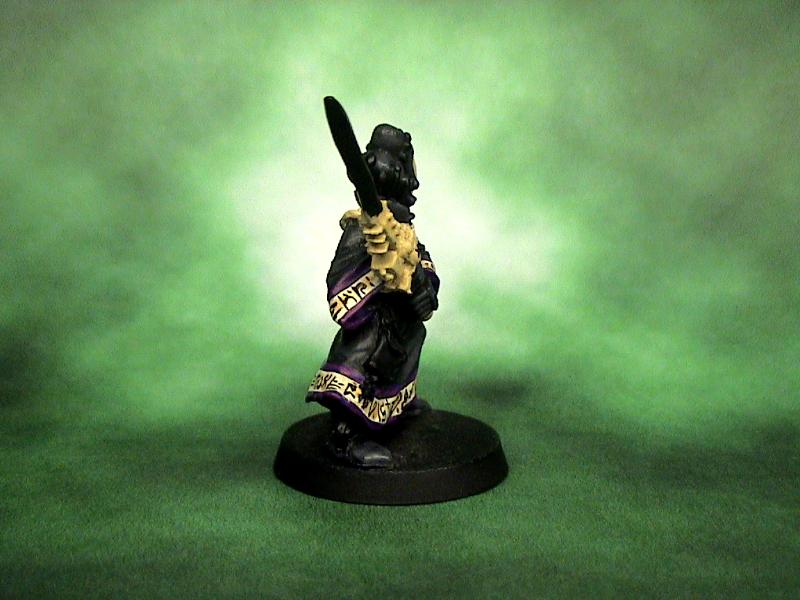
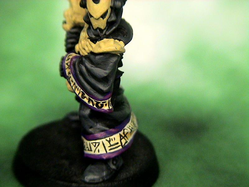
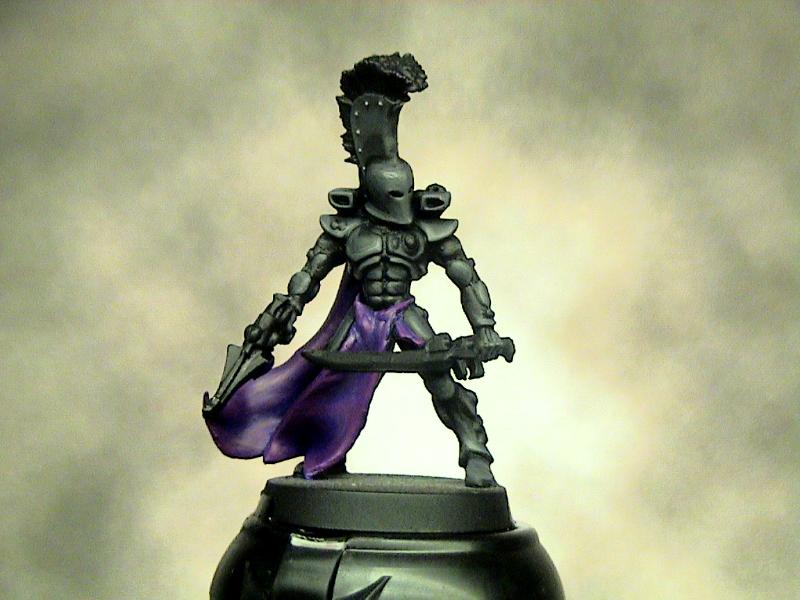
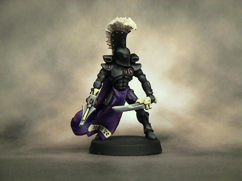
Yeah I'm debating on chopping the head off and adding an Eldar head, then re-sculpting the hood. I checked it last night and it's like 30% smaller than the Chaos head.
25663
Post by: Behind th Mask
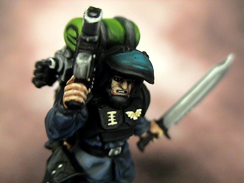
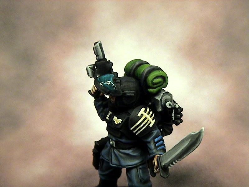
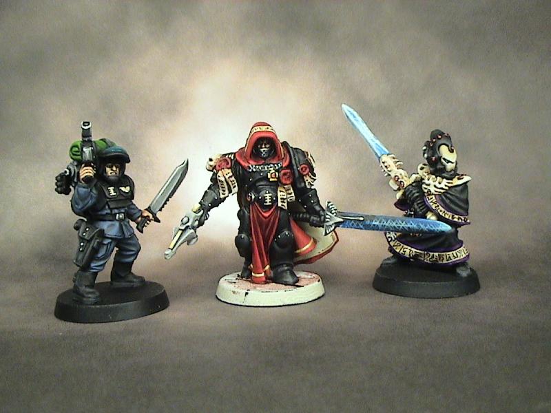
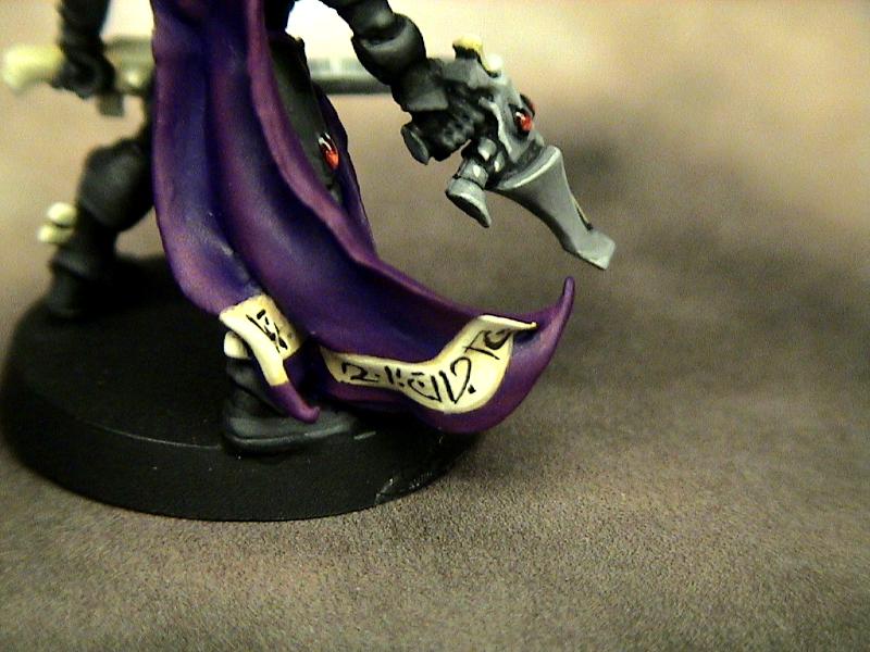
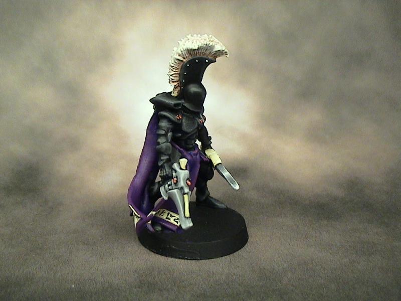
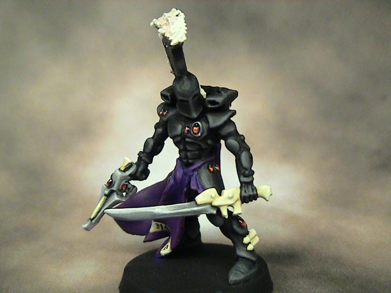
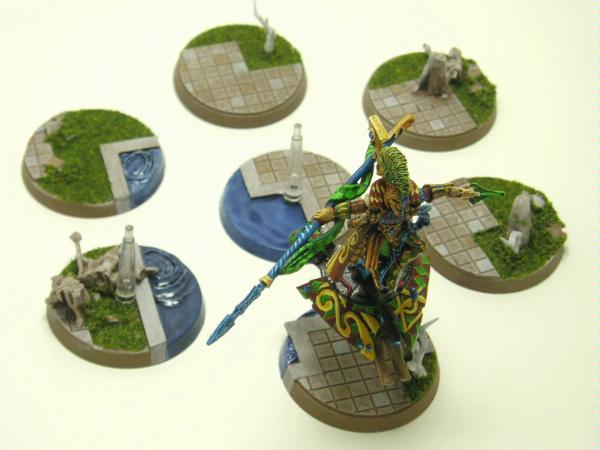
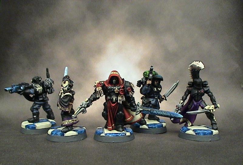
Alright, so I cut the original head off and replaced it. I am still working on the model but here are the updated pics. I will be adding a hood to it when it dries.
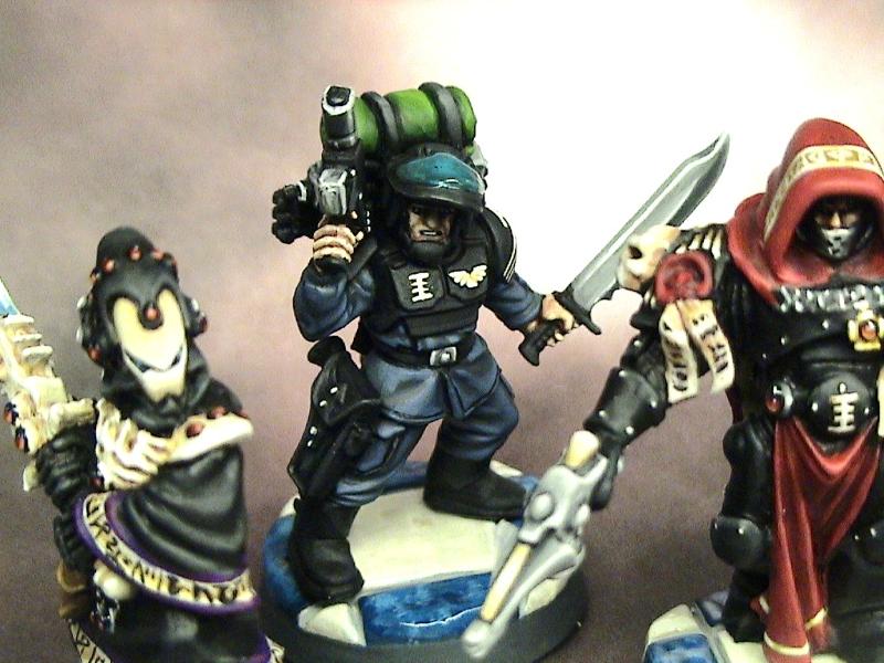
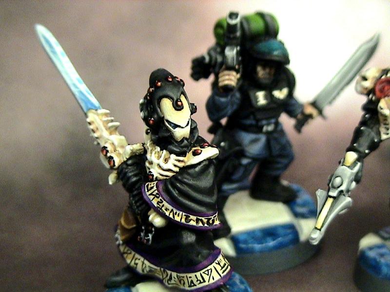
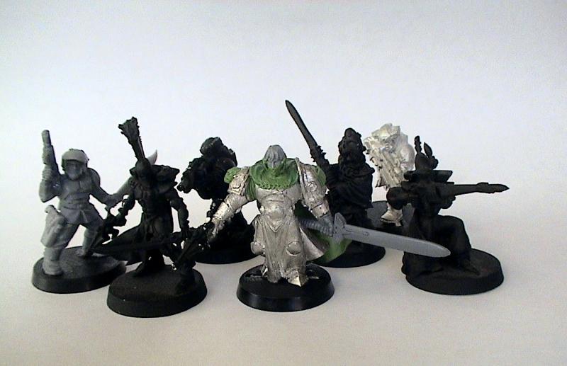
Here is a quick preview of the warband I intend to use ....
(From Left to Right) Vet. Guard Quarter Master; Eldar Dire Avenger; Vet. Guard; (Radical)Ordo Xenos Inquisitor; Eldar Warlock; Vet. Guard; Eldar Ranger
4600
Post by: DeathGod
I'm not convinced you needed to swap the head... the old head had more character to it. But done is done, and the new head looks fine.
The chain for the cloak is mega-pimp, good job!
Edit: Oh, and I;m the cousin, I'll give people an internet nickel if they post some constructive comments in our =][=munda thread...
34119
Post by: neil101
nice work the cloak looks very animated , and i agree, the chain mail looks ver effective , personally liked the hood also but the size of the new head makes the armour look more intimidating. not reall sure what =I= munda is but from what i can gather its necromunda and Inquisitor @28 mm ?
18499
Post by: Henners91
I preferred the old head :(
It was the hood that made it look bulky, but hey... these are heroic miniatures!
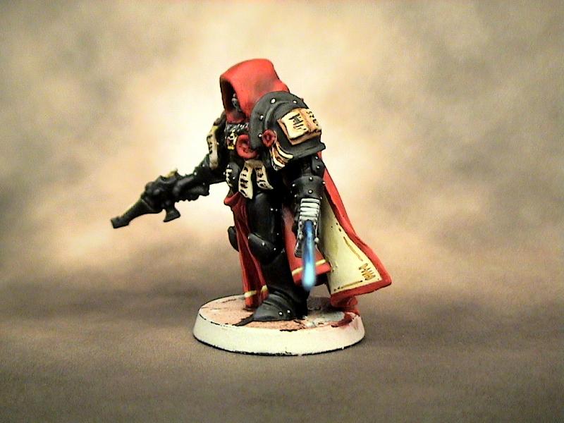
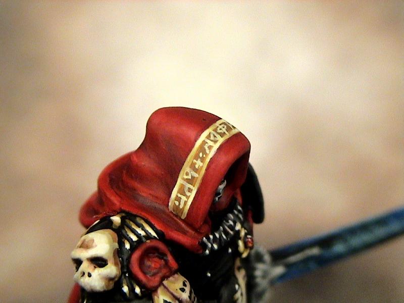
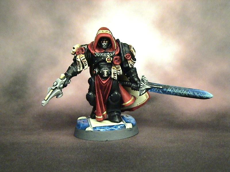
25663
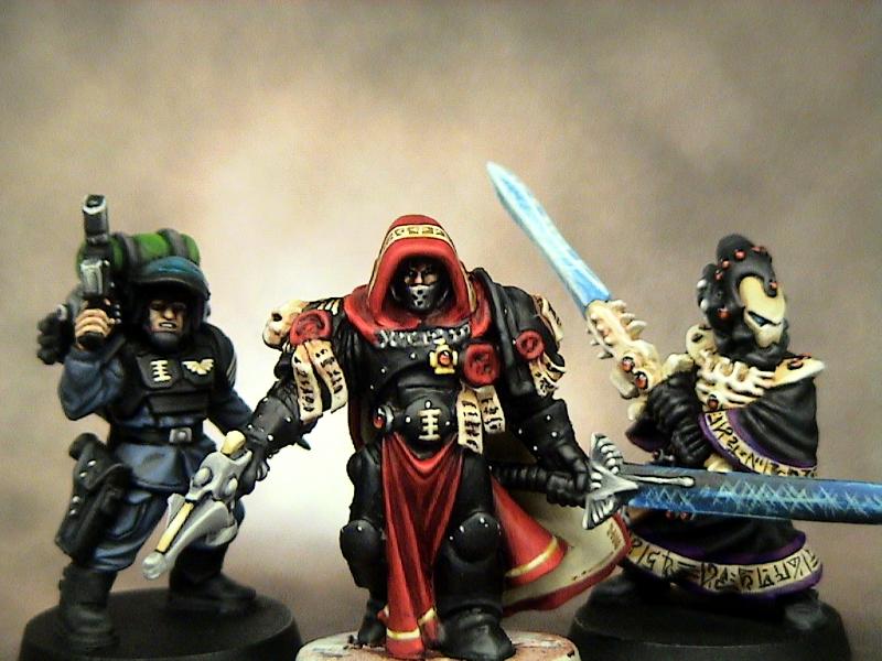
Post by: Behind th Mask
34119
Post by: neil101
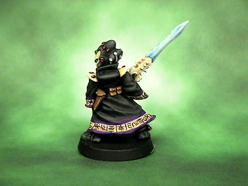
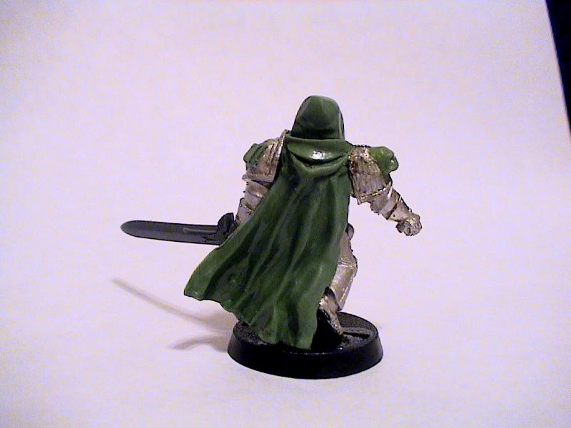
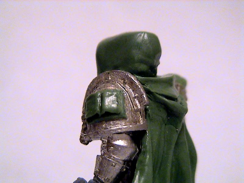
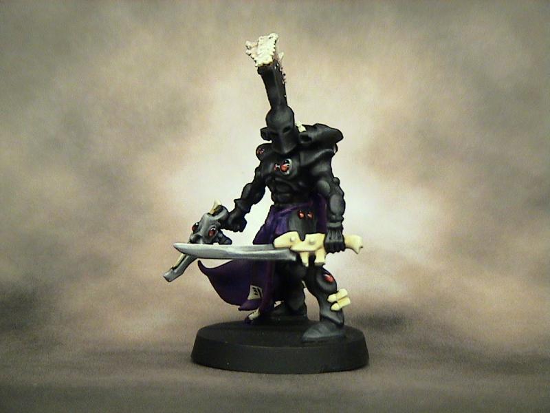
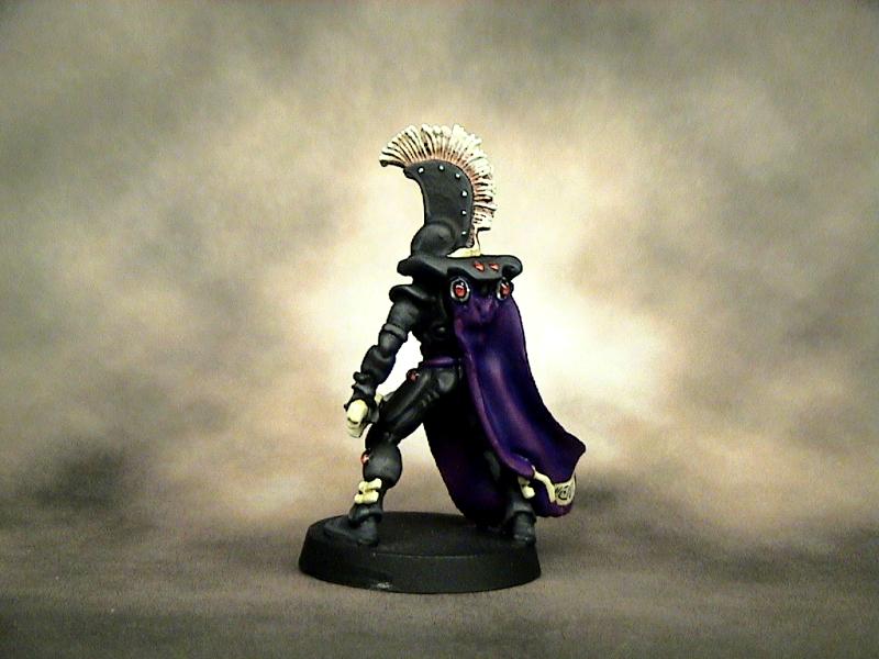
hey hood is back , looks better like this good work , and on the purity seals!
18894
Post by: tekk_45
Inquisitor looks pretty killer. Your green stuffing skills are pretty amazing. I will be watching to see how this progresses.
29151
Post by: HF Izanagi
I bow to your mastery of green-fu, sir. m(_ _)m
At first, I wasn't sold on the head-swap, the original sized head too large with the hood. But when you added that hood to the new, smaller head, plus the purity seals?
Kudos, and very inspiring, man!
25305
Post by: Zain60
Mask,
Awesome work. You managed to capture what you had the first time in oodles of menace and cool factor, and fixed the scale. The cloak, cowl, and chain links are masterfully done.
I can't wait to see that thing painted.
23589
Post by: Sageheart
it looks really bada*s LOve it!
25663
Post by: Behind th Mask
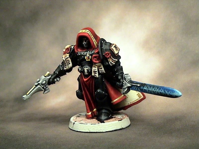
Thanks for the feedback guys, I still haven't decided on a paint scheme..... I am kinda stumped on it for the moment. I am thinking white/bone armor with dark red accents and cloaks. It Might look good NMM Gold and dark red too. My NMM Gold skills are probably my weak point, I am pretty good getting a chrome/silver look with greys, but the gold still isn't 100 percent for me yet (nothing ever is for me though, I am a true perfectionist).
25305
Post by: Zain60
Consider the feel of the model for the scheme. Exotic, mysterious, effective, and the coolness of having wargear/effects most other imperial forces would scoff at. I would say (and I don't say it often) perhaps a darker model with eye catching accents much like a Mechanicus paint job would be.
How about weathered deathwatch style armor with an Eldar-made stealth-cloak The mask, pistol, sword, purity seals can make the model. I just think that the details will be minimized if the armor is shiny and gold, even if beautifully executed.
25663
Post by: Behind th Mask
Very true. My cousin suggested black armor. I might go black or dark grey with red and bone/white accents. I do want it to look like he has been highly influenced by the Eldar. My fluff for him is going to date back to the Eye of Terror campaign, so it would make sense to have him teamed with Ulthwe. I am thinking that I will add some of that influence on the scheme.
4600
Post by: DeathGod
DEE-MANNED MOAR PICTS!!!!
Guess, this guy keeps texting me, taunting me by telling me how pretty his blending is... HELP ME FORCE HIM TO POST!!!
17244
Post by: The Good Green
How about some small nod to the harlequin, like a spade or a couple diamonds as an insignia somewhere (his lion cloth maybe)? Might be too much, but it's a thought, I guess. -oo, maybe the ribbon on one of the seals!
He looks good, rather intimidating for a short guy. 
10054
Post by: Death Gear
I like it cant wait to see it painted
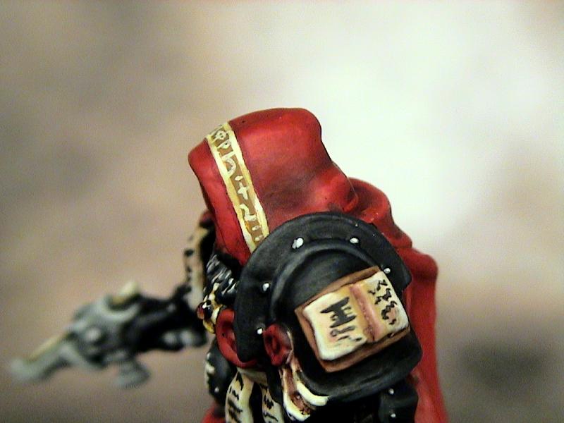
25663
Post by: Behind th Mask
33943
Post by: Dragosanii12
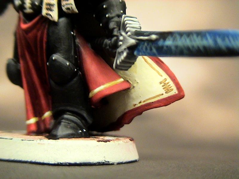
An excellent model, very nice sculpting and lovely shading on the bone areas, nice technique on the sword also, alround 9/10 and onbly because its a WIP.
25663
Post by: Behind th Mask
Thank you for that compliment !!! I am a little disappointed on how the sword came out, but I am a perfectionist so nothing is ever good enough in my eyes. You just put that subject to rest for me, so thank you.
29151
Post by: HF Izanagi
Absolutely beautiful. Great paint-job on your Inquisitor!
34119
Post by: neil101
congratulations the black suits the model. and nice details, how you going to paint the base?
25663
Post by: Behind th Mask
I am going to put him on a 40mm, and I am thinking of making look like marble flooring, or something of that sort. I am going to make a small display base for the whole warband, so that will be another factor I will deal with.
32193
Post by: PDH
Hi
Really impressive sword. I am jealous of your black armour....very nice. The face in the hood looks great too.
The only thing I would change is the colour of the shuiken pistol, to me it looks like an extension of his arm...not a xenos weapon.
Anyway I am excited to see what you have in store for the rest of the warband.
Thanks for sharing
Peter
25663
Post by: Behind th Mask
I am happy to hear another compliment on the sword, it is the only part of the model I am not pleased with. I feel I could have made the blending a lot smoother. But I will put it to rest. I agree with the pistol comment. I am going to be painting the Eldar in a Ulthwe scheme so I painted the pistol that way. That now seemed a bad idea, I should have reversed the colors. made the gun bone with a black barrel. I might change it, that is an easy fix.
As for the rest of the warband, .... I will have pics up soon. I am almost finished with the Quarter master so that should be up in a couple days.
18894
Post by: tekk_45
I dig the inquisitor.
25663
Post by: Behind th Mask
32193
Post by: PDH
I was right to be excited.
That is effective. I really like him, the colours really are spot on. The back pack it very interesting...nice use of the grenade launcher ammo drum but for the life of me I cannot work out what you've used for the top half.
As for the Inquisitors gun....it is an easy fix 
Keep it up I'm enjoying this.
Oh btw what is the Eldar henchman's motivation for working with your Inquisitor?
Peter
19366
Post by: Grimm
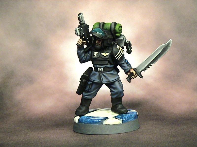
The painted pics are great. This is excelent stuff. I think the guardmans knife is beautiful.
15358
Post by: Vitruvian XVII
Thats some lovely painting there!
Might i suggest a gloss (with varnish or PVA or something) of the visor? It should reinforce the effect a bit more.
29374
Post by: syanticraven
Behind th Mask wrote:Thank you for that compliment !!! I am a little disappointed on how the sword came out, but I am a perfectionist so nothing is ever good enough in my eyes. You just put that subject to rest for me, so thank you.
If you want the Etches to look less then why not try a blue wash over?
Also Amazing model my friend, looks great in all aspects.
34119
Post by: neil101
Wow , i can see you have a distintice style, to your work, the blacks are very black and the colours still pop, your painting si wonderfully detailed, without being ,washy, if get what i mean. the style reminds me of a cartoon almost quite graphical, and VERY clean!!
and the design is great also, loving the sci fi visor, . jealous of your painting skills ;-(
25700
Post by: Space_Potato
Very, very nice work!
I love the guardsman, he just screams "packrat" to me - like he picks up and keeps damn near everything, because it might be useful in future
Keep up the amazing work!
S_p
25875
Post by: kingjayko
sweet gs, makes the most beautiful stuff....
carry on like that 
32523
Post by: R3DM0H4WK
i have to admit i went into this thread not expecting much.... Holy Hell was i wrong! that is some of the most amazing greenstuffing i have ever seen! and the painting is awesome it looks like they were pulled straight out of a comic book! A+ keep it up!
25663
Post by: Behind th Mask
Thanks for all of the feedback guys .... it keeps me motivated .
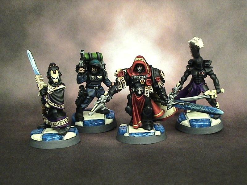
PDH: The top half of the pack is green stuff, I just sculpted it on. As for the motivation for the Eldar, I don't have all the details worked out yet, but I am going back to the Eye of Terror campaign for this one. I was thinking that during the Ulthwe assistance to the Imperium, this Inquisitor worked closely with the seer councils. One Farseer felt that he showed an unusually high psychic potential for a human, also the Inquisitor showed a great curiosity in the Eldar tactics and technology. The Farseer then dispatched a Warlock to assist this inquisitor and help him reach his psychic potential (at least that is what the Inquisitor thinks, who knows what the Eldar Farseer really has in mind. For all we know the Farseer could be influencing the Inquisitors every thought, and is using him to carry out his own agenda without having to lose his valuable resources). That's just a quick rundown, I will work on the greater details here and there and update on this thread.
Grimm: Thanks man, I am pleased with it too.
Vitruvian: Thank you for pointing that out.... I love adding small details like that, I can't believe I missed that one, I will add that tonight.
Syanticraven: That might work, I will ponder that for a bit.
neil101: I do tend to have a cartoony/comic book style. Thanks for diggin it, ... the visor is actually a Kroot shoulder pad. I thought it would add a little flavor to the model.
Space_Potato: That's exactly what I was going for, thanks for reassuring me.
kingjayko: Thanks sir, .. will do ...
R3DM0H4WK: Thanks for the excellent grade!! I'll try to keep things lookin' good.
17244
Post by: The Good Green
You've got such skill. You're painting on both the inquisitor and guardsman is superb. I can't wait to see the eldar painted.
25663
Post by: Behind th Mask
Thanks Good Green, ... I am starting the Warlock next. I just touched up the Inquisitor a bit so hopefully I'll get the Warlock started tonight.
29449
Post by: weetyskemian44
I want to see more - they are smooth
30532
Post by: Zefig
Those are looking pretty incredible. The first inquisitor looks amazing, from the color scheme to the pose to the details, just everything. The quartermaster's looking great too. For whatever reason, I'm really digging the way you did the =I= on his pauldron. On top of how good everything is, of course.
25663
Post by: Behind th Mask
29279
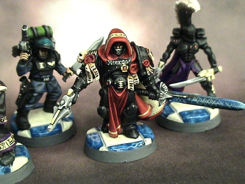
Post by: jackanory
I like the runes! Funnily enough the one at the very top of the head, in the middle, looks like the Chinese character (also used in Japanese) 中, which means middle.
Your colours come out really vibrantly but they're never garish, which is a good achievement.
32193
Post by: PDH
The Inquisitor looks even better now: Shuriken pistol stands out and the runes on his hood give it that pop.
As for the Quarter Masters back pack....it looks like you bought it....so I applaud your skills with the gs.
Peter
25663
Post by: Behind th Mask
PDH: Thank you for the comment on the pistol, I think he does look better now. I also thought "since I'm doing the gun, I might as well try the hood effect I was thinking of" so again, thank you for the suggestion, it looks loads better.
Jackanory: That is absolutely fantastic. The irony couldn't have been scripted better. I chose that rune because it just seemed to fit there, like that was where it needed to go. I got a real kick out of the fact that it means "middle" in both Chinese and Japanese, thank you for that.
I also have to give credit to Zain60, I adorned his hood with Eldar runes from your suggestion, .... hope you like it.
28314
Post by: Tobber1202
This is pretty impressive!
i'll keep watching this, closely ^^
13537
Post by: vinsal
Very nice stuff. I can't wait to see them based up. They both look very characterful.
23589
Post by: Sageheart
your models are amazingg!!
25663
Post by: Behind th Mask
Sage, Vinsal, Tobber: Thank you for the compliments, I will try not to dissapoint.
29151
Post by: HF Izanagi
Wow.. definitely a unique painting style! I like it! I also agree with breaking up the black by coloring the shuriken pistol a different color.
And absolutely fantastic freehand- any tips?
224
Post by: migsula
I like them. Very classic feel. Don't skimp on basing though - setting the scene makes all the difference.
I think that using black to tie together the group, instead of a color, might grow into a nice theme.
34119
Post by: neil101
Your Runes are great, that must of taken some time?
25663
Post by: Behind th Mask
HF Izanagi: The only tips I can give is to keep your freehand brush clean, the tip sharp, and the paint thin. Then it's all about a steady hand and brush control. I used a fine detail brush for it. Thank you for the compliments too.
migsula: Thank you, and I agree with the base comment. I am going to build a display base and transfer the models to other bases. I want to keep the whole warband consistent. I am going to use the black as the unifying color, hopefully it all comes together well.
neil101: Thanks, it took about 30 mins to do that little strip, glad you like it.
I am still working on the Warlock, work has been insane so I haven't got too far. I will have some pics up soon though.
Again, thanks for tuning in.
22687
Post by: MajorTom11
Wow, great work man! Scheme is tight and striking, but not overcomplicated, painting is nice and crisp. Looking forward to seeing more!
24028
Post by: Baconfat
Behind th Mask,
That mask and hood are incredible. What brand paint do you use, especially the red.
25663
Post by: Behind th Mask
MajorTom11: I will have plenty more to come. Thanks for the compliment.
Baconfat: The red paints are GW, I based the hood and cloak white, then painted the whole thing blood red. I then mixed in various amounts of red gore and shaded the recesses (adding more red gore for each layer i went deeper). That's how I got the deep red feel of the hood. It's the exact opposite of highlighting. when it comes to white and bone colors I (thanks to my friend Matt Sterbins) use P3 Marrow White and P3 Menoth White Base(equivalent to bleached bone), they cover like foundation colors. Feel free to PM me any time with questions, I will try and answer the best I can.
23589
Post by: Sageheart
What do you plan on making exactly? A whole army at this level, if so this is going to be even more amazing!
25663
Post by: Behind th Mask
Sageheart: This is a warband for =][=Munda , it will be around ten models. I do have an Eldar Exodite army that I painted at this level though ..... check it out in my gallery.
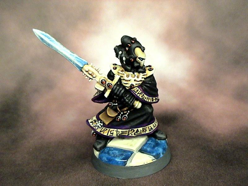
As for an update, ... I just finished some details on the Warlock and they look fantastic, I can't wait to post pics. I wasn't going to post any pictures until it was finished, but I might have to take some WIP pics and post them. Let me know if you want the WIP pics, if not I am just going to wait till he is finished.
15358
Post by: Vitruvian XVII
WIPs are always appreciated, its good to see how othres go about painting to a high quality!
23589
Post by: Sageheart
sorry totally missed that haha, its even in the subject! ahhh! 
26894
Post by: Regnak
Woah! Those are really nice... very crisp clean painting indeed. Looking forward to more.
30344
Post by: monkeytroll
Yeah, always enjoy WIP shots
25663
Post by: Behind th Mask
Alrighty guys and gals, .... here is the current WIP of my Warlock. I am not pleased with the highlights on the black part of the model, so I am going to paint them black and start over.
I will have more pics soon guys !!!
Thanks again for tuning in ...
15358
Post by: Vitruvian XVII
The trim looks v. nice, great freehand!
The black on the robes looks good imo, but the black armour could use some work (starker highlights?)
32545
Post by: Element206
great work with the green stuff...im most impressed with the cape!
25663
Post by: Behind th Mask
Vitruvian: Thanks, I do agree about the armor parts, They will come up a bit lighter.
Element: Thank you as well. I was pretty stoked when I finished, it came out better than expected.
I will be working on the bone parts of the sword, armor, and mask tonight. I am planning on highlighting them up to white, they should look smooth. It will also give the model a really good contrast to the black.
9506
Post by: Pfreck
Love the work you've done so far. Good to see someone else doing a Radical Ordo Xenos warband for =I=munda.
Looking forward to see more, the Warlock looks promising!
25663
Post by: Behind th Mask
23589
Post by: Sageheart
that warlock looks great! didn't expect an eldar model to work so closely with an imperial agent!
25663
Post by: Behind th Mask
Sage: I have a pretty good back story for this union. I will post it in the near future, it will be closely linked to the Eye of Terror campaign.
29279
Post by: jackanory
Dark!
Dark is good. One thing I'd question though is the tiny black line between the blade and the haft of the eldar's sword. Was that deliberate? To me it seems a little off...
15358
Post by: Vitruvian XVII
Warlock looks really good, the black armour looks much better and i love the paintjob on the blade!
20499
Post by: Foxtale
The warlock is really impressive!
Could I ask, how did you do the sword? If it's not too much trouble, a step by step would be amazing!
4670
Post by: Wehrkind
Very nice models man. Your cloth blending is lovely, and I really like the fact the bits of eldar kit are not candy colored. That shurikan pistol actually looks designed to kill someone!
The only crit I would offer is that the inquisitor, and maybe the eldar, need more sharp reflective highlights on their armor. Right now I think you have absolutely nailed the exact color and tone of black vulcanized rubber, which sort of makes me think his armor is made from rubber tubing and tires. I think a few brighter highlights would tell my eye that his armor is actually hard and shiny, or just hard. The hard lines and edges on the guardsman mitigates any issues on him, but the Inq seems to have much softer edges.
29151
Post by: HF Izanagi
Absolutely beautiful blade. Your painting style is definitely unique (and envied by yours truly). I also saw your Exodite army early-on my time at Dakka here... only put it together NOW that you're the painter of that army. Keep it up, your work is inspiring!
25663
Post by: Behind th Mask
jackanory: Thanks, I do tend to prefer darker colors. I did leave the black line on there deliberately, I wanted the union of the hilt and the blade to pop a bit more. I should have made it a dark blue, might have blended a little better.
Vitruvian: Thanks, the blade did come out nice. I have been trying to perfect that light crystal technique for awhile now, it's not quite where I want it to be, but getting close.
Foxtale: I will get you a step by step, don't have time right now, but I will PM you.
Wehrkind: I appreciate that man. As for the sharp highlights, the lighting where I take my pictures is sub-par. Even with a nice coat of Dull Coat the light reflects off the model too much, so some of the highlights (more so on the rounded edges, that's why they look better on the guardsman) get lost in that. I need to make a photo tent!!! In person the highlights look a little more dramatic.
HF Inzanagi: LOL, thanks man. My Exodites are my forever work in progress and I need to make some more models for them here soon. Thanks for saying my work is inspiring, that keeps me motivated.
7325
Post by: kinghammer
They look a lot better they have been Photoshoped. Just not the same in person...
J/K They are looking great
PS By the way before people start to jump my ****, i know him IRL.
Cheers
29279
Post by: jackanory
By the way I should mention that I really love all these models! I don't want my minor crit to detract from my praise!
18894
Post by: tekk_45
They look great! I especially like what you did with the warlock's cloak, the runes look real good.
4670
Post by: Wehrkind
Ahhh gotcha! I have the same issue a lot, mostly because I am too lazy to set up my photo tent when I want to snap a few pics!
Instead of building one, you might want to just search eBay a bit. I found mine with lights and a little carrying case for like 35-40$. Well, ok my wife found it, but I supervised Still, depending on how busy you are, and how much eBaying you can do at work, you can find some nice set ups pretty cheap. Much better you spend your time building and painting new models for us to look at!
25663
Post by: Behind th Mask
Kinghammer: K#$%E for the WIN!!! LOL ... see you this weekend !!!
jackanory: Crit will never distract, be as open as possible. I appreciate it all.
tekk_45: Thank you, I was nervous about getting those runes right in one try. Luckily it all worked out for the best.
Wehrkind: I will definitely look into that!! It is my pleasure to keep you all updated with new models. I will also try to keep improving on the skill so the minis get better as time progresses.
I started the Dire Avenger tonight, thought I'd put a couple WIP's up in the meantime... more will come, but for now here it is .... (please note: I made this model Four Years ago, so the sculpting isn't as far along as the more recent models. i just loved the pose and was happy to finally have a use for him).
4670
Post by: Wehrkind
Very interesting use of the Slaaneshi Lord's head. I really like the pose too, though the right arm seems to be a little farther forward than would be natural. It might be too late, but rotating it back a bit so that it was more in line with the leg (so the pistol is right about the knee) would make it perfect. This will be a great model either way though... I hate the normal cone head helmets
29151
Post by: HF Izanagi
Dude, you are on a warpath with these models! (and putting me to shame!) That guy is amazing! I love the Slaanesh lord, (one of the best models GW has put out in a while, minus it's teet-snake mount-ugh..) It speaks to me in away.. very 300-esque and ready to kick an emmisary down the water-well... THIS. IS. SPARTA!!!
9910
Post by: CommissarKhaine
Missed out on this thread for a while apparently :(. Brilliant work!
18894
Post by: tekk_45
 That is cool, the head works really well.
25305
Post by: Zain60
I haven't posted on this in a while, but I just wanted to say 'kudos' on all the beautiful work. The only thing I wasn't blown away by was the inquisitor's sword. I wasn't a fan of the hash style shine effect on it. However, the script/runes on his cowl, the warlock, and the uberclean highlighting and details on all of them are quite striking.
I think my favorite is the vet by a smidge, but the warlock/inq are tied for second very close behind. The clothing on the vet is masterfully executed, and the warlock runes are outstanding.
26800
Post by: Commander Cain
Nice work! The freehand on the farseers cape is very nice!
25663
Post by: Behind th Mask
Wehrkind: I see your point. I used the Eldar Storm Guardian arms and the pistol is a bit large, this is why the arm looks so lengthy. Thank you for the advice though, I appreciate the honesty.
CommisaarKhaine: Thanks for tuning in, I still love your "Squeeky Waaaagh". Good to see you in on this thread
tekk_45: Thanks, I love the Slaanesh lord head.
Zain !!!!!!!! - it's been awhile man. Hope all is well with you. Thanks for the Kudos, and I agree with you on the sword. I think I might repaint it, it still taunts me. I am not in the least pleased with it. I used the Guard model as a tester, I plan to paint an entire Guard in that scheme here in the future. I really like the way it came out.
Commander Cain: Thanks, it came out better than expected.
Well I finished the Dire Avenger this afternoon, and took some pics. I hope you all like them, I was more than pleased with the outcome. I will start painting the bases soon, so you all can see them 100% finished. Until then .... here are some more pics ....
Thanks again for tuning in .... I highly appreciate all the comments and criticism !!!!!!!!!!!!!!!
10347
Post by: Fafnir
Don't get me wrong, the Dire Avenger looks brilliant. But I'm not getty any actual... you know... Dire Avenger vibes from him. I mean, he's definetly unexplainable levels of badass... but not Dire Avenger badass.
25663
Post by: Behind th Mask
I can see that .... I made this model when 4th edition was released. He was the Exarch to my Kill Team, unfortunately, nobody played the Kill team scenarios. He was left unpainted and forgotten. When the =][=Munda idea arose, I thought it was time for my Exarch to be resurrected!! So he is armed with a Dire Sword and a Shuriken pistol, and he has a nice Slaanshey head that (in my fluff) predates "The Fall".
9910
Post by: CommissarKhaine
That's one very old exarch . it does explain the very sinister vibe he's got though.
29151
Post by: HF Izanagi
Lookin' good, man! The colors are simply done, but effective. The only thing I'd have to critique is that the helm and chest all black create a sort of "well" or emptiness- feels like there should be more color. No better ideas to provide, so don't take that too seriously. But the black is done well, nice and crisp. And regardless, he's still screams Spartan and has got my vote.
430
Post by: wolfshadow
Very clean paintjob. He looks like a badass.
25663
Post by: Behind th Mask
CommissarKhaine: Thank you for pointing that out, I probably should have written that better.  I meant the armor, not the actual exarch predates "The Fall". He would be Phoenix Lord status if he was that old LOL.
HF Izanagi: I'm hoping that when I do the base he will pop a bit more. I think the black base is kinda sucking the focus away from the model.
wolfshadow: Thanks man
25305
Post by: Zain60
Mask, I only have one suggestion, and that's perhaps a very slight coloring of the eye slit to give some 'feeling' to the eyes and I think it would break the void.
My first thought when looking at it though, was that the highlights were exceptional. Your black armor on him eclipsed even the Inquisitor at least in the pictures. I'm awestruck as usual!
Automatically Appended Next Post:
Add: I love that plume and head. Simple and super effective on that model as all your 'dragon knights' had. Regal but deadly feel.
25663
Post by: Behind th Mask
Zain - That is a really good suggestion. I might have to add a bit of green stuff to them, but it would make the mask pop really well. I will work on that soon.
I would also like to apologize for the lack of posting this past few weeks. I decided to paint all the bases before moving on to the other models. I haven't landed on the right one yet. I will probably post the three I like best later tonight or tomorrow and see what you all think.
23589
Post by: Sageheart
they only keep looking better! i don't like eldar models at all, def the reg eldars, but the two you just painted are great!
25663
Post by: Behind th Mask
Thank you Sage, .. I just finished three sample bases (I know they are fantasy, but that's all I had extra lying around) The official ones will be on circular bases. I am not sure which design I'm going to use. I used Epoxy Sculpt to make all the designs, I will probably make different variations of the final one for the models. I am leaning toward the two tone marble style, let me know what you all think.
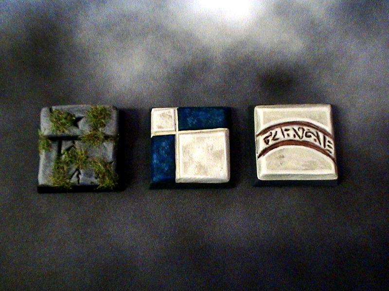
Stone
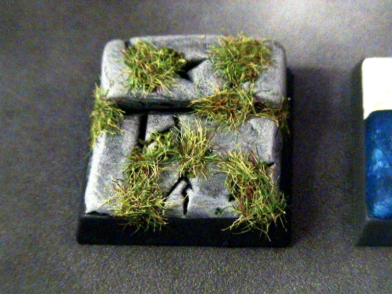
Two Tone Marble
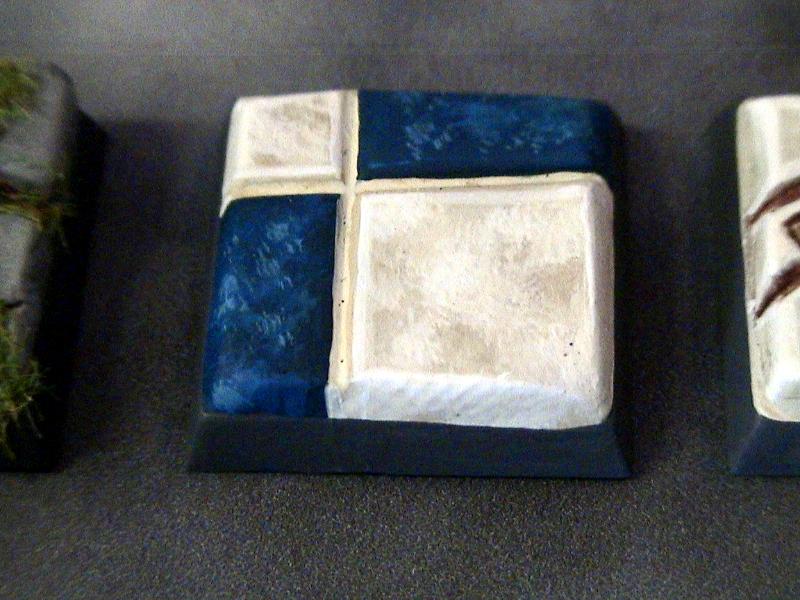
Eldar Temple
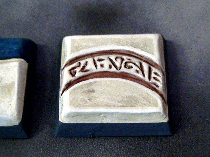
23589
Post by: Sageheart
these bases are awesome!
20499
Post by: Foxtale
As a unifying base, I'd say the stone looks great.
430
Post by: wolfshadow
Stone with grass. Looks very cool.
17244
Post by: The Good Green
The eldar looks great. I voted for the marble, I think it ties the warband together the best.
Check out this guys work for the bases as well.
Created by guynamedFleck
25663
Post by: Behind th Mask
Thanks for the replies guys .... Green, I have seen those bases and love them. Thanks for the suggestion, I was trying not to bite his style too much or I would have done something similar.
Foxtale and Wolf - Thanks for posting your choices .... I appreciate the feedback.
32193
Post by: PDH
Nicely painted Dire Avengers, though looking at the model I wouldn't have thought Dire Avenger. You've really nailed painting black.
As for the bases I think the two tone marble would look the best.
Peter
25663
Post by: Behind th Mask
Thank you PDH .... I am leaning toward the Two Tone. As for the black, I really appreciate the comment. I have painted a lot of Uthlwe models in the past so the practice has been beneficial. My friend Kyle (Kinghammer on dakka) deserves some credit though because he started me on the hobby eight years ago (he also coached me on painting black armor).
9910
Post by: CommissarKhaine
I voted two tone since it'll fit into a lot of environments. Nice job on the bases!
25663
Post by: Behind th Mask
Thanks CK ... That's the leading choice so far .... and BTW I still love your Squeeky WAAAAAGH!!! thread ... for those who haven't seen it CLICK HERE
9910
Post by: CommissarKhaine
I guess your choice is clear then .
and BTW I still love your Squeeky WAAAAAGH!!! thread ... for those who haven't seen it CLICK HERE
Thanks! Wish I could update more often, but work + kid + wife changing job is being harsh on the modelling time. At least I can come here and look at your minis!
29151
Post by: HF Izanagi
I dunno... I like both the Eldar base and the two-tone. But if I had to choose... er... yea, probably the two-tone, as it's neutral but a striking contrast(considering your Avenger here...).
Holy crap... guynamedFleck's stuff is off the wall!
30344
Post by: monkeytroll
Well, it was either the marble or the stone for me, marble just edged it.
29279
Post by: jackanory
Could you combine the stone with the two tone marble to create like a ruined marble flooring with weeds growing through?
I'm just a fan of apocalyptic scenes I think...
EDIT: Thinking about it you could combine all three so tht you'd have some areas with the two tone and then have the odd patch here and there with runes, but then have the whole shebang ruined...
25663
Post by: Behind th Mask
HF Izanagi - Thanks for the vote, and yes guynamedfleck's bases are stunning !!
Monkeytroll - it's looking like that's the one I'm going with.
jackanory - I put some grass on the test base and I'm not sure what I think yet.... I like the suggestion though.
Since the Marble is way ahead I am going to sculpt the bases tonight and hopefully get some painting done tomorrow morning. Thanks again for all the responses.
17244
Post by: The Good Green
I didn't mean the style of those bases so much as the way they make a single stage for the unit. As if they had a scenic movement tray to fit into.
I voted for the marble because I think it fits the eldar better than the grass and gravel and it fits the humans better than the eldar temple. I think you could use a combination of all three, however, in using the scenic movement tray effect to make it look like they are standing in and around a temple of sorts.
25663
Post by: Behind th Mask
ahhh I see .... Very good point. Sorry about the misinterpretation I do like what he did with them though, they look awesome.
25663
Post by: Behind th Mask
17710
Post by: Yggdrasil
Right now they look like they're in a palace or something close.
Grass would add a sense of "lost temple" of sort, so...
Adding grass seems a good idea to me, it depends on the mood you want to give to them : are they fighting among the ruins of a lost civilization, or are they stalking a corrupt noble & his mutant consorts?
Oh, in case I haven't said it already : your minis are really nicely painted!!!!
25663
Post by: Behind th Mask
That's what I was thinking. After I looked at them I thought they would look a little better in a ruined temple type setting.... and Thank You for the compliment.
9910
Post by: CommissarKhaine
They're lookign great, but very clean. It's definitely a unifying look, without detracting from the model. I think some (brownish) grass and maybe some scorchmarks would take these to the next level. Great work as always!
4670
Post by: Wehrkind
Looking sharp. A little mud and rubble, and maybe some grass and moss will really build a lovely little scene on each on. Plus you can drag a little mud up onto their boots to really place them there.
Great work man.
29151
Post by: HF Izanagi
The bases look great! I'd kill for a chess set painted up like this... maybe not the the point I'd eat human flesh, but yea, you get the idea.
I can't wait to see the rest of the gang! How many members are there for the team?
17244
Post by: The Good Green
The blue marble looks fantastic! It looks like the white might be blown out a bit in the pics.
The group looks great. It's probably just me, but I think the guardsman looks a bit nervous around all the xenos... or maybe it's cause of the ornate quality of their location. I like it , at any rate - very characterful.
23589
Post by: Sageheart
add a display base? thats what i would do, ythey are great now though! whats next!
32193
Post by: PDH
They look excellent together. The bases really bring out the group aspect (which helps the Eldarimperium collaboration). Really nice work
One small request....the thing that made Migsula, Northern and Hammer's Jade Vessel blog so spectacular (in addition to the models) was the addition of the battle reports. Are you and your cousin going to put a show on for us in here?
Looking forward to more members of the gang.
Peter
25663
Post by: Behind th Mask
Commisar & Wehrkind - I was going to add some rubble or grass, but my friend Matt suggested that I don't since the tiles are glossy. He kind of had a good point, so hopefully when I make a display base I can add some more details to it.
HF Izanagi - Thanks, at the moment I have seven models, but my entire warband will be nine. I have to make a warpseer and penitent witch to finish it.
Good Green - Thanks, yeah the white tiles are more bone color. The lighting and Ard' coat finish make them a bit bright in the pics. As for the Guardsman, I put him in the back for that reason. He's keeping his on them Xenos!!
Sageheart - I plan on that when they are finished. I have a Veteran guard (a Kasrkin model) all primed up and ready to go, I've just been too busy prepping for Christmas to get started on him. After that I will paint my Eldar ranger (converted out of a guardian model) and another Vet Guardsman. I will then build my Penitent witch and Warpseer.
PDH - I would LOVE to do some battle reports. If he gets his stuff together I will do some reports on here. I will run them through photoshop too so they look extra awesome. Here is one I did a while back CLICK HERE to check out the way I do them. The pictures look great when you enlarge them, but you have to back out not "X" out of them because they come up on the same tab as the site.
8745
Post by: Llamahead
When I first saw that Guardsman I thought it was a great cartoon not a model. You've got a really nice comic book vibe going with him. The black looks great and keeps the Eldar from seeming like clowns these look like they take battle seriously and dress practically for it. I think the problem with the Inquisitor's Sord is that the hatchures don't look like energy pulsing out from the point maybe painting them all resonating out from the power bar thingy on the sword rather than equally spread out would look better?
25663
Post by: Behind th Mask
It has been far too long since my last post! My apologies to all who have been keeping up with this thread. I was recently hired on at Battlefoam!!!! I am loving the job, but between employment at two places, it is hard to keep up on my projects. I just finished my Veteran Guard though, here it is ....

and here is the gang as it stands now .....
Sadly this will be the last update on this thread. The interest in =][=Munda has dropped and has been replaced with Spartan Games "Dystopian Wars". The models are fantasic and the game is pretty awesome. They are smaller in scale then 40k, here is an example of one of my Frigates (I am playing Empire of the Blazing Sun, which is Japan)
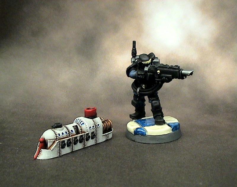
The game is Steam Punk themed and takes place on our world in the year 1870. In the game the industrial revolution happens about 100 years earlier and the world is at war. You should all check it out HERE
Thanks again for all the feedback I have received on this thread. If I do more with =][=Munda I will do it in a new thread. Be on the look out for my future projects that will include my Dystopian Wars fleet and my Space Wolves (coming n about two months, hopefully).
Thanks again for tuning in,
-The Man Behind the Mask-
9910
Post by: CommissarKhaine
Sad to hear I-munda dying down, loved your models :(
17710
Post by: Yggdrasil
Agreed, those were awesome...
32193
Post by: PDH
The final guardsman looks good. I do think its a shame you've moved on but I'll look forward to seeing your wolves.
Peter
23589
Post by: Sageheart
thats a pity, your models are beautiful and it is great to see some =I=munda gangs starting to get built up.
29151
Post by: HF Izanagi
Damn... that sucks to hear about droppin' the I-munda- your models were definitely a great benchmark in terms of quality. But I'll have to agree- it's a work of love, and time-consuming to boot just to be able to start. I'll be lookin' for your wolves, man!
|
|