10143
Post by: Slipstream
I can never understand how an artist can turn in a really detailed piece of work only for the effect to be ruined by proportion being out of whack by a huge margin. I am of course referring to the latest WD cover with the Grey Knight. Rather than him being a seven foot tall giant judging by the size of his head he is really small and probably knicked the armour when the GK was at the bathroom! It was the same with the recent Blood Angel (same artist?). There is just no way that the GK body would reach the armour's feet. So come on Artists for Gods sake get your proportions right and I'll stop giving you it in the neck!
21499
Post by: Mr. Burning
I dunno, Marines are supposed to be freakish monstrosities/genetically enhanced super beings.
Maybe the artists take is that GK's have freakishly long legs and model hosiery in their spare time?
40455
Post by: bushido
"Artists," implying that they aren't?
He may have taken the exaggeration a bit too far, but these aren't Iron Man suits. They have to stand up to more than a little small-arms fire.
36295
Post by: Hückleberry
I still think regardless of proportion(s) GW artists turn out amazing work. The artwork is what got me into the hobby and I know I would never be able to draw/paint anything close to that GK on the cover.
19370
Post by: daedalus

Derp? Automatically Appended Next Post: Honestly though, the reason why this is done is because in order to make someone a killer nine foot tall Space Marine with all their extra organs and superhuman strength, you have to give up on a few systems in order to make sure the body has enough energy to go to the 5 hearts and 41 kidneys they have. As a result, the reproductive systems were removed, and their brains were allowed to atrophy to the point in which that their heads appear somewhat shrunken now.
36883
Post by: Misguidance
Not to mention the fact that smaller brains makesthem easir for the Imperium to control. 
28659
Post by: dbsamurai
bushido wrote:"Artists," implying that they aren't?
He may have taken the exaggeration a bit too far, but these aren't Iron Man suits. They have to stand up to more than a little small-arms fire.
Lol you're right iron man CAN only tank a direct tank round to his face and then fall out of the sky impacting with sufficient force to leave a massive crater he must CLIMB out of XD oh and still not pulp the puny 'umie wearing it...
 Back ON topic I concur with the OP. As an amateur artist myself (I'm still called that cause I don't have enough gallery work...ugh) proportion is a major part of how we draw. It's a mockery of good art to then go and ruin those proportions. After all, drawing on your examples, the blood angels cover is full or disproportionate figures, where as the interior art is more reflective of a realisitc expectation of a super soldier, i.e. yea they're large but at 7 feet tall they don't look like either arnold schwarzenager or like someting I woulda drawn 10 years ago back in middle school. They're awesome pieces of work yea but the simple mistake in proportions makes the authenticity of the piece feel violated. It detracts from the realism, which is really what the art's there for. It's supposed to seem real enough that you can believe there are 7 foot tall super monks running around with burst fired RPG launchers. And a lot of the time, dating all the way back to RT, the art just seems...comedic...And for a supposedly "GRIMDARK" universe, comedy is not always what we want (just look at all the bio picks for every single blood angels unit. it's ALL gloom and doom.)
Of course on the other side of that coin, it may be that they're deliberately trying to mirror the older art. They could be trying to maintain some realism while still harkening back to the old days where space marine scouts looked like disco stu and imperial guard had land speeders...and to that I say. NO THANK YOU SIR!! 
677
Post by: precinctomega
The GK on the cover of White dwarf is by Clint Langley, I believe. Clint is a freelancer of considerable reputation, who has done a lot of work for the Black Library. This piece was originally used on the front cover of the Grey Knights Omnibus.
The art of GW is not intended to be a photorealist portrayal of the Dark Millennium. Rather it is attempting to convey an impression of the characters and their place within it. The small-head-big-body look of marines isn't because the artists don't understand proportion and anatomy: most of them have fine art degrees. Rather, they are using the artist's licence to portray the imposing build and stature of their subjects.
R.
36883
Post by: Misguidance
dbsamurai wrote: It's a mockery of good art to then go and ruin those proportions.
Actually, a lot of 'good art' (as can be seen inany national gallery or art collection) often does just this. Art is about an impresion of a thing- not always about the techniclities of proportion. Picasso, for example, pretty much ignored everythinga about 'traditional' art and si still regarded to be a master artist.
GW art is notoriosly wierd when it comes to proportions, but it does convey a good feel for the world it reprisnts. Space Marines are giant, brutish looking men wearing tin cans. Orks are also giant brutes, wearing less tin cans. Everything is exaggerated. Personally I think it works well.
34605
Post by: spireland
This is not just a problem with GW art. Comics have had this problem forever. I think its just a natural extension of dramatic license all artists/writers/filmakers take in their respective creations.
28873
Post by: Ruckdog
Proportion in GW's art (both the physical models and the 2D stuff) has always been pretty flexible as far as proportion goes...just look at your average guardsman model. I don't really see a problem with it, as I see the art as trying to capture the feel and emotional impact of the setting, as opposed to a realistic portrayal of human anatomy.
40455
Post by: bushido
dbsamurai wrote:It's a mockery of good art to then go and ruin those proportions.
Yeah, or...you know...it could be his style.
I'm sure an anime/manga artist understands full-well that a person's eye doesn't take up half his/her head. I'm sure a comic-book artist understands full-well that real women don't have 10-inch waists and that real men don't have shoulders that are 4 feet wide.
When someone's artistic vision doesn't conform to your own, it doesn't mean it's bad art.
38919
Post by: The_Stormrider
Hi everyone,
First time poster here and long time lurker. Thought I'd chime in. Not that I'm claiming that the cover artists are making these choices by design or accident but heroic scale does have some pretty lengthy history in art. As an example we are hopefully all aware of I would point to Michaelangelo's "David". The head and hands are quite large, and of course Michaelangelo spent years disecting corpses to learn about proportion and anatomy. As taken from a wiser source than myself:
Galleria dell'Accademia - Museum/Gallery, San Marco
"As Michelangelo well knew, the Renaissance painting and sculpture
that preceded his work were deeply concerned with ideal form.
Perfection of proportion was the ever-sought Holy Grail; during the
Renaissance, ideal proportion was equated with ideal beauty, and ideal
beauty was equated with spiritual perfection. But David, despite its
supremely calm and dignified pose, departs from these ideals.
Michelangelo did not give the statue perfect proportions. The head is
slightly too large for the body, the arms are too large for the torso,
and the hands are dramatically large for the arms. The work was
originally commissioned to adorn the facade of the Duomo and was
intended to be seen from below at a distance. Michelangelo knew
exactly what he was doing, calculating that the perspective of the
viewer would be such that, in order for the statue to appear properly
proportioned, the upper body, head, and arms would have to be bigger,
as they are farther away from the viewer's line of vision. But he also
did it to express and embody, as powerfully as possible in a single
figure, an entire biblical story. David's hands are big, but so was
Goliath, and these are the hands that slew him."
I think this is a fine example of considering the manner in which the models would be viewed and the advantages of heroic scale. I'm not certain how I feel about the art since they are highlighting the power of the armor at the expense of the marine. But ideal proportion isn't the only school of thought on sculpture and painting.
242
Post by: Bookwrack
Good lord do people love getting butt hurt over the littlest things. So we've got two whine-threads going about the WD cover now?
The proportions look completely fine to me, but then again I like the image of power armor as being something the wearer is literally encased in, with waldos, neural links, being used to transmit the wearer's movement to the armor because it's just that much bigger than the wearer.
11
Post by: ph34r
dbsamurai wrote:Lol you're right iron man CAN only tank a direct tank round to his face and then fall out of the sky impacting with sufficient force to leave a massive crater he must CLIMB out of XD oh and still not pulp the puny 'umie wearing it...
The ability for 2cm of material to dissipate the kinetic energy of a tank round without any of it transferring to the skull inside is quite impossible and simply an example of comic book logic.
36
Post by: Moopy
bushido wrote:dbsamurai wrote:It's a mockery of good art to then go and ruin those proportions.
Yeah, or...you know...it could be his style.
The first time I went to school, I was working on a painting that involved something on fire. The professor came by and said the fire needed to be fixed.
"But that's my style" I replied.
That pissed of the professor greatly, and I got a stern lecture about pulling that crap in front of the class.  
Of course there is style, and that comes with time- knowing how to really draw something well and making changes to it. When I see someone who is drawing/painting in a realistic manner, and I see something grossly out of proportion, it looks like a problem. Or worse a mistake. I don't care if that's "Supposed to be like that", if it LOOKS WRONG IT IS WRONG. There's plenty of examples of this in the GK codex, the worst offender being the Grand Master picture. Horribly tiny head that ruins the peace, which is doublebad because the artist took time to render other parts of the piece nicely, but the head makes you ignore the rest of the hard work.
40455
Post by: bushido
When you're a student and the instructor asks something to be a certain way, you do it or you get a poor grade. When you're a professional and as long as the client signs off on the piece, the cries of armchair critics are pretty meaningless.
What "ruins" a picture for one person could be completely irrelevant to another. Opinions are wonderful things.
36
Post by: Moopy
It's still a bad choice if the client signs off on it, but the end user doesn't like it. Those choices are made all the time, and products are pulled/ ad campaigns are dropped because of it. "Client sign- off" does not automatically equal a good call.
And yes, I agree that opinions will always be wide and varied.
5111
Post by: MikeMcSomething
Don't their bodies only occupy part of the armor? Like his real hands are only in the forearm of the power fist, etc.
5245
Post by: Buzzsaw
The_Stormrider wrote:Hi everyone,
First time poster here and long time lurker. Thought I'd chime in. Not that I'm claiming that the cover artists are making these choices by design or accident but heroic scale does have some pretty lengthy history in art. As an example we are hopefully all aware of I would point to Michaelangelo's "David". The head and hands are quite large, and of course Michaelangelo spent years disecting corpses to learn about proportion and anatomy. As taken from a wiser source than myself:
Galleria dell'Accademia - Museum/Gallery, San Marco
"As Michelangelo well knew, the Renaissance painting and sculpture
that preceded his work were deeply concerned with ideal form.
Perfection of proportion was the ever-sought Holy Grail; during the
Renaissance, ideal proportion was equated with ideal beauty, and ideal
beauty was equated with spiritual perfection. But David, despite its
supremely calm and dignified pose, departs from these ideals.
Michelangelo did not give the statue perfect proportions. The head is
slightly too large for the body, the arms are too large for the torso,
and the hands are dramatically large for the arms. The work was
originally commissioned to adorn the facade of the Duomo and was
intended to be seen from below at a distance. Michelangelo knew
exactly what he was doing, calculating that the perspective of the
viewer would be such that, in order for the statue to appear properly
proportioned, the upper body, head, and arms would have to be bigger,
as they are farther away from the viewer's line of vision. But he also
did it to express and embody, as powerfully as possible in a single
figure, an entire biblical story. David's hands are big, but so was
Goliath, and these are the hands that slew him."
I think this is a fine example of considering the manner in which the models would be viewed and the advantages of heroic scale. I'm not certain how I feel about the art since they are highlighting the power of the armor at the expense of the marine. But ideal proportion isn't the only school of thought on sculpture and painting.
I'm a little unclear why you quoted this particular part: the bolded part rather sharply undercuts what I thought was your point. That is, Michelangelo's David diverges from realistic proportions not because of fidelity to some "heroic style" per se, but because it is designed to look realistic to the viewer, given that the viewer will be far away.
My biggest problem with the space marine aesthetic is less to do with "proportion" itself, and more to do with the absolutely ghastly anatomy that so many seem to have. Seriously, look at the "realistic" sculpts by the Perrys in the LotR range, and the more realistic infantry in the Dark Eldar range, and the shortcomings of so many power armored figures stick out like a sore thumb... the one that I simply can't get past is the legs and pelvis. Seriously, you realize that space marines would need to have the hips and legs of an anorexic girl in order to possibly fit into their pants?
Uch...
34906
Post by: Pacific
You would think that to be the case looking at the GK picture, maybe two normal sized people inside with one standing on the other's shoulders, using pulleys to control the arms 
Totally agree with your point Bushido. But, in relative terms the fact that the GK picture (and it's predecessor the BA) have spawned multiple threads across the internet, the vast majority of it not being complementary. Art is very much a subjective thing, but that shouldn't make it immune to criticism. Some people may applaud Damien Hirst cutting a cow in half and putting it in a glass box, some will find some deep resonance or meaning with it and like it, but the vast majority thought it was crap and just laughed about it. If that is happening here, then you have to take the view that perhaps this direction isn't the correct one to take.
Furthermore, I think you could make a pretty good case for the quality of GW art having gone downhill over recent years. The cover of the BA codex would never have made the cut ten years ago, I certainly don't think, and the distinct lack of new artwork in new Codecies and Army books (spot the new art in the new O&G book for instance) makes it appear to me that it's just one other area of GW that isn't getting the funding it once did. Switching from pieces of artwork to photos on the covers of boxes was a complete fallacy to me, and completely underwhelms what was always one of GW's core conceptions of the hobby - that it is about art and imagination, taking the static models and rolling dice and building it up to something more within your imagination.
Who can forget the travesty of the incorrectly assembled Leman Russ on the box cover. While pretty amusing in one way, I think marked a low point for GW's presentation level.
36
Post by: Moopy
Since this is revolving around the topic of proportions here's a great resource from the sadly departed Andrew Loomis.
http://escapefromillustrationisland.com/2010/01/07/free-andrew-loomis-art-intstruction-downloads/
11
Post by: ph34r
Anyone want to post the cover for the WD for those of us who do not enjoy shelling out $10 a month for an advertisement? Is it the codex cover?
40132
Post by: ArbeitsSchu
Its not as bad as some of that John Blanche b+w ink-work he did for the plastic ork/gretchin version of 40k (I forget the version number.) THAT was truly awful, and made worse by the fact that Blanche is actually a great artist.
5245
Post by: Buzzsaw
Wow, I have to thank you, those are some fantastic reference items! Some real gems, and free!
On the topic of this thread, looking from the amazing illustrations in the Loomis books to the "art" in GW publications.... it just makes you sad.
40455
Post by: bushido
Pacific wrote:Furthermore, I think you could make a pretty good case for the quality of GW art having gone downhill over recent years.
The internet serves exactly two purposes: 1. To distribute an endless amount of porn. 2. To give people everywhere a forum to complain about any- and everything imaginable.
If it is to be believed, every form of entertainment has been "going downhill" since the beginning of time. But especially now that we can share our profound thoughts with our thumbs while we're supposed to be paying attention in class, or on the road, or at work. Cave paintings were the pinnacle of human culture and everything since has been a cheap money-grab perpetrated by evil corporations. 
9804
Post by: Ultrafool
Man when will people stop complaining about a freakin drawing. Of course his proportions are wrong because he is a 7-10ish super human with x amount of the same organ that is from a game you play with plastic toy soldiers. I hate when people bash on an artist when most of them don't even have the talent to draw a stick figure. Seriously guys its a picture or drawing or whatever.
25141
Post by: Chibi Bodge-Battle
Buzzsaw
it is a problem but not by much.
AFAIK the head is not increased by the same proportions as the rest of the marine.
So a true scale marine will look as though his head is freakishly small. You are also probably used to seeing a 28mm marine sculpt that is not only far too small comparative to a normal human, but the hands and head are way oversized. This is skewing your perception of what would be closer to accurate imho
Am very tired and will try and read the above posts more thoroughly later. But from what I have seen the comments about viewing statuary are correct.
9594
Post by: RiTides
If you think GW's bad, check out Privateer Press . I love 'em, but their proportions are more out of whack by far!
36
Post by: Moopy
Ultrafool wrote:I hate when people bash on an artist when most of them don't even have the talent to draw a stick figure.
A complete argumentative fallacy- being able to draw has nothing to do with the right to critique.
40132
Post by: ArbeitsSchu
Ultrafool wrote:Man when will people stop complaining about a freakin drawing. Of course his proportions are wrong because he is a 7-10ish super human with x amount of the same organ that is from a game you play with plastic toy soldiers. I hate when people bash on an artist when most of them don't even have the talent to draw a stick figure. Seriously guys its a picture or drawing or whatever.
But given the wide availability of the internet, and the huge variety of people who use it, there are also more than a few who have copious amounts of artistic talent or are well-tutored in art and art-history and who are very well qualified to say whether a piece of art has merit, or is in fact the scribblings of a talentless oik. Can I assume from your statement that you don't mind people who CAN draw bashing an artist?
Given the huge variety of people who have drawn Marines over the years, I will say this: some of them have definitely captured the essence of the marine better than others. The "pinhead" look is not one that screams "superhuman warrior". It is more reminiscent of that scene in Men in Black where the guys head opens up and there is a tiny pilot inside.
9804
Post by: Ultrafool
@Moopy
Mmm I guess your right, I went in rant mode. But when you have better understanding of drawing or art, you tend critique works in a lighter sense I guess. Meh what do I know, this guy drew a space marine and in my view, it looks good because I know that it takes skill to draw something like that very well.
Edit spelling.
34906
Post by: Pacific
bushido wrote:Pacific wrote:Furthermore, I think you could make a pretty good case for the quality of GW art having gone downhill over recent years.
The internet serves exactly two purposes: 1. To distribute an endless amount of porn. 2. To give people everywhere a forum to complain about any- and everything imaginable.
If it is to be believed, every form of entertainment has been "going downhill" since the beginning of time. But especially now that we can share our profound thoughts with our thumbs while we're supposed to be paying attention in class, or on the road, or at work. Cave paintings were the pinnacle of human culture and everything since has been a cheap money-grab perpetrated by evil corporations.
Haha yes fair point..
I will change that point then, 'quantity' instead of 'quality'. There is a lot less art being produced nowadays then there was previously, regardless of quality, and that's despite modern computer methods making design faster than it has been at any point previously.
9804
Post by: Ultrafool
ArbeitsSchu wrote:Ultrafool wrote:Man when will people stop complaining about a freakin drawing. Of course his proportions are wrong because he is a 7-10ish super human with x amount of the same organ that is from a game you play with plastic toy soldiers. I hate when people bash on an artist when most of them don't even have the talent to draw a stick figure. Seriously guys its a picture or drawing or whatever.
But given the wide availability of the internet, and the huge variety of people who use it, there are also more than a few who have copious amounts of artistic talent or are well-tutored in art and art-history and who are very well qualified to say whether a piece of art has merit, or is in fact the scribblings of a talentless oik. Can I assume from your statement that you don't mind people who CAN draw bashing an artist?
People who can draw or have knowledge of art don't bash, they critique in a intellegent way. Not "it has a small dumb looking head and its just plain stupid because the head makes everything look ugly", but say in what areas the artist can improve and yada yada.
36
Post by: Moopy
I do agree that there are better ways to critique someone's work.
Bad "It sucks because it's wrong."
Good: "It doesn't work because of xxx and yyy.", and then give suggestions and examples of how to make it better or point to other pieces (preferably not your own so you don't look like an egotist) where the idea does work. Suggestions that lead to solutions.
There are some who can't take critique because they're too wrapped up in their art- they take it as you are attacking THEM personally instead of commenting on their work. There are those who can't critique because they're too rude (I do not count being direct as being rude), or can't communicate their ideas effectively.
It's a dance where feet can get stepped on.
9804
Post by: Ultrafool
Moopy wrote:I do agree that there are better ways to critique someone's work.
Bad "It sucks because it's wrong."
Good: "It doesn't work because of xxx and yyy.", and then give suggestions and examples of how to make it better or point to other pieces (preferably not your own so you don't look like an egotist) on how it does work. Suggestions that lead to solutions.
There are some who can't take critique because they're too wrapped up in their art- they take it as you are attacking THEM personally instead of commenting on their work. There are those who can't critique because they're too rude (I do not count being direct as being rude), or can't communicate their ideas effectively.
It's a dance where feet can get stepped on.
100% true. Sorry if my intial post came out too strong.
25141
Post by: Chibi Bodge-Battle
The "pinhead" look is not one that screams "superhuman warrior". It is more reminiscent of that scene in Men in Black where the guys head opens up and there is a tiny pilot inside.
The pinhead look is based on the fluff as far as I can tell.
Okay you don't like true scale heads, but what is the objective criteria of your dismissal of the drawings?
ie why is it incorrect in terms of proportion and perspective?
FWIW I have already outlined a counter critique to your judgement.
In addition to that, the artist has chosen a worm's eye POV to emphasise the bulk and height of the marine, thus making the head appear smaller.
Chibi da Firenzi
Trompe l'oeuil skulls for the Emprah!
36
Post by: Moopy
Ultrafool wrote:
100% true. Sorry if my intial post came out too strong.
No worries.
36883
Post by: Misguidance
See, I actually think the art in GW publications has improved in recent years. I have High Elf books and Wood Elf books where head size seemed to bear norelation to anything at all- let along the body it was attatched to! In the 40K books poses were static or looked painful, heads and hands always looked too big, and while the designs might have been nice they lacked movement (at least for me- other people might have loved them, of course. Which is the main problem with any art- it's always so sunbjective...)
By contrast, the new art I have seen is dynamic and interesting, and while propotions may have been changed a little, it does not look jarring to me at all and fits better with the descriptions in the books.
At the end sof the day, though the internet would be empty if people didn't compalin about anything, so..... carry on.
36
Post by: Moopy
Chibi Bodge-Battle wrote:The "pinhead" look is not one that screams "superhuman warrior". It is more reminiscent of that scene in Men in Black where the guys head opens up and there is a tiny pilot inside.
The pinhead look is based on the fluff as far as I can tell.
Okay you don't like true scale heads, but what is the objective criteria of your dismissal of the drawings?
ie why is it incorrect in terms of proportion and perspective?
FWIW I have already outlined a counter critique to your judgement.
Ultimately it boils down this: if it looks/feels wrong, then it is wrong. It doesn't matter if that's the way, "it's supposed to be". I have heard this from a variety of artists and professors and I agree with them.
In this case we see a human and the regular human proportions instantly jump into our mind; this image recognition has been imprinted into us as babies. So when we see a human shape with an abnormal head, we instantly think something is wrong. Not only that, it's the first thing we see in the entire image- we zip right by all the other beautifully rendered armor. Example:
This feels right: 
This feels wrong: 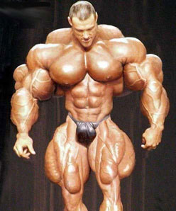
Now it doesn't matter that image 2 really exists, it simply feels wrong. And it's warning signs that as artist, we should be avoiding.
36883
Post by: Misguidance
Yeah, but to me the 1st pic looks like a human, and the 2nd one looks like a Space Marine with no armour on.
I dunno, maybe I just don't think of them as looking like 'normal' people, but when they hae bigger heads they look wrong. Smaller head +huge armour works better for me.
36
Post by: Moopy
I think #2 works great as a monster or a mutant- a great template for a villain because it has that "off feeling". I'd play that up because at that point the feeling is perfect for the subject: something should be "wrong" or "off" for the bad guy.
However, in the hero we see part of ourselves, and we do not like that warning feeling associated with us.
36883
Post by: Misguidance
Moopy wrote:I think #2 works great as a monster or a mutant- a great template for a villain because it has that "off feeling". I'd play that up because at that point the feeling is perfect for the subject: something should be "wrong" or "off" for the bad guy.
However, in the hero we see part of ourselves, and we do not like that warning feeling associated with us.
Ah- maybe that's the problem. I don't see Space Marines as the 'heroes' in any way shape or form. 40k is a world of villains in my eyes, even if someof them think they are the 'good guys.'
Edit: Actually, now I think about it that is especially true of Grey Knights- they do some pretty mesed up stuff in the name of the 'greater good'... 
9804
Post by: Ultrafool
#2 made me throw up in my mouth a little.
25141
Post by: Chibi Bodge-Battle
If it looks wrong it is wrong?
If only aesthetics were that simple.
36
Post by: Moopy
More specifically if it "feels" wrong, then it's generally wrong, and that idea should be avoided. For a lot of folks seeing a man with a pinhead feels wrong, and thus this thread was started. ;D
#2 feels wrong as the hero (unless you're Rob Liefield). However it feels great a monster.
WTF in this case means: What's This For? Hero? Thumbs down. Monster? Thumbs up.
I bet if you took the WD Blood Angel cover, converted it over to say a Word Bearer chaos marine, people would actually like it more because chaos is deformed.
6979
Post by: Nicorex
Pacific wrote:
Who can forget the travesty of the incorrectly assembled Leman Russ on the box cover.
Ahh not being a guard player, how is it incorrectly built? I was looking at the pics and they seem fine to me.
I wasnt realy happy with the last BA cover, but I guess having seen this GK art before on the Omnibus I was more used to it. plus on the Omnibuss its smaller and I think has less impact of proportion.
Ohh and paint number 2 green and give him some tusks I think he would make a great ork.
25141
Post by: Chibi Bodge-Battle
Moopy wrote:More specifically if it "feels" wrong, then it's generally wrong, and that idea should be avoided. For a lot of folks seeing a man with a pinhead feels wrong, and thus this thread was started. ;D
#2 feels wrong as the hero (unless your Rob Liefield). However it feels great a monster.
WTF in this case means: What's This For? Hero? Thumbs down. Monster? Thumbs up.
My love for my girlfriend feels wrong. I'm just not good enough for her. Therefore my love is wrong.
36
Post by: Moopy
it also means your a bad person. ;D
25141
Post by: Chibi Bodge-Battle
Maybe, but it also means your concepts are flawed.
Man with a pinhead was seen by people not fully engaging with the concepts of perception, perspective and misunderstanding the fluff.
SM = hummie pumped up to humungous proportions, therefore his head needs must be increased by the same percentage.
Why? There is no reason for this to happen.
A baby's head is proportionally larger than an adults.
The head/body proportion changes as the baby grows to adulthood, because the body is increasing in size from say 18" to six foot; whereas the head probably only doubles in size.
The body mass shift from human to marine is a similar jump in difference as a child entering school to being fully mature. However, the marine's brain is not increased afaik, and there is no need to make it bigger just to make it "feel" right.
Not sure if the brain would need to me made bigger at least not in direct proportion to the necessary increase in body size due to the extensive physiological change in becoming a marine.
Due to our CONDITIONING, the small head looks and feels wrong, but is in fact correct.
Anyone who has done life drawing and struggled with drastic foreshortening of the body, looking from the feet, will tell you that the instinct is to make the head bigger than it actually should when taking perspective into account.
The human head draws our attention and we prioritise it's importance, by drawing it bigger than it should be. This is a common error that has to be overcome by the student.
Feeling right or wrong has its place in aesthetics, but is not the only principle.
When you take into account the bigger bulk of the space marine, and the artist's POV as I mentioned. and the relative size of head to body in bulky power armour, pinhead feels right to me even if it looks weird due to our familiarity with HUMAN proportions.
Apologies for the long ramble, and I hope that it makes sense.
38919
Post by: The_Stormrider
@buzzsaw
I guess my point is that the heroic scale in the models was designed to highlight the intended portions of small models when viewed from the tabletop at distance. This has trickled down into the artwork at least in my opinion. As I mentioned I would be inclined to exaggerate the hero and not his armor. I guess I just wanted to add a different perspective to the common threads of...."wrong proportion always equals bad artist.
28942
Post by: Stormrider
Nicorex wrote:Pacific wrote:
Who can forget the travesty of the incorrectly assembled Leman Russ on the box cover.
Ahh not being a guard player, how is it incorrectly built? I was looking at the pics and they seem fine to me.
I wasnt realy happy with the last BA cover, but I guess having seen this GK art before on the Omnibus I was more used to it. plus on the Omnibuss its smaller and I think has less impact of proportion.
Ohh and paint number 2 green and give him some tusks I think he would make a great ork.
Look at the sponsons and front mounted bolter, tell me what you see.
34906
Post by: Pacific
Nicorex wrote:Pacific wrote:
Who can forget the travesty of the incorrectly assembled Leman Russ on the box cover.
Ahh not being a guard player, how is it incorrectly built? I was looking at the pics and they seem fine to me.
I wasnt realy happy with the last BA cover, but I guess having seen this GK art before on the Omnibus I was more used to it. plus on the Omnibuss its smaller and I think has less impact of proportion.
Ohh and paint number 2 green and give him some tusks I think he would make a great ork.
++Edited out my response, so if you follow Stormrider's suggestion, you can go through the emotional stages of surprise, followed by sadness (or maybe laughter) and then anger++ 
Chibi, you make valid points, and you've brought some interesting points to the discussion. I also think that it was obviously the artists intent to draw the proportions of the figure in such a way. By I honestly don't believe this is intended to be an abstract piece of art, especially in the modern era of artwork catering to the model design rather than visa-versa.
Furthermore, If we were to run a poll on here saying, "do you think this characters head is too small?", I would bet my mortgage on what the answer would be. Therefore, IMO it doesn't matter what the artist is trying to achieve, the fact is I would say, like that bloody awful weightlifting photo that seems to find its way onto the internet constantly, if 90% of the people who look at the photo say " lol, why the hell is that guy's head so small", then you have to feel that it's missed the boat somewhat.
It makes me think of those disproportioned pictures of cows and horses you sometimes see displayed, where the artist has made a mistake in basic proportion, but has painted it with immaculate detail. The impact of everything else is ruined, because your attention is first drawn to the one 'incorrect' feature. I know what you are saying about 'conditioning', but I still think it goes too far off the other end of the scale.
28942
Post by: Stormrider
I think some people are forgetting that every Grey Knight has a psychic hood, thus adding to his girth around the back of his head, remove it and it'll look a bit more realiststic (at least as real as it could be).
This issue wasn't half bad really, several articles about assembly & painting of the new Grey Knights, plus a fully painted and assembled Flesh Tearers army. Plus a battle report betwitxt Chaos Daemons and the Grey Knights to boot.
36
Post by: Moopy
@Chibi
What you say makes a lot of sense and you have excellent observations.
"Due to our CONDITIONING, the small head looks and feels wrong, but is in fact correct. "
Exactly, and this is my point. Because we have been conditioned to see something someway, it looks off when it's not. That feeling often makes people inherently not like a piece even if they can't put their finger on it. As artists, we should learn to avoid that feeling or use it to our advantage depending on the subject (see previous post examples). Since this is supposedly the hero, we have part of ourselves invested in the image and don't like it when things feel off.
So, even though the fluff would say it's right, we should avoid it since it feels wrong. I've seen many shadows that are a warm green, but if I were to paint them, people would think I'm nuts, so I avoid it.
25141
Post by: Chibi Bodge-Battle
If it was the artist's intention to convey something and an audience is incapable of perceiving that content, that does not make the work of art wrong.
Such a poll result may only reveal the ignorance of the voters .
 Automatically Appended Next Post: Automatically Appended Next Post: If you want to illustrate other peoples' perceptions of the world carry on as you are.
If you wish to be an artist paint what you see.
If you see green shadows paint the shadows green, and let us see how you see the world.
In all humility, I think that is the best thing I have ever said on the internet to anyone. I can give no more to you than that.
so I shall withdraw from the thread and bid you all goodnight.
34906
Post by: Pacific
I agree with you entirely (and very eloquently written by the way) but we are talking about a piece of mass-produced fantasy art designed to rope in consumers which will be used a handful of times and then lost amongst the myriad of other pieces, not a Gaudi or a Picasso
299
Post by: Kilkrazy
Exactly.
So long as the WD cover pulls in more punters than it annoys, it counts as a successful piece of commercial art.
You can't blame the artist for the appearance. He would have worked to direction by the art editor, who in turn would be instructed by reference material of the 40K background.
26020
Post by: tenclaw
Hero scale.
27720
Post by: Mark1130
I have 2 questions for the OP.
Why does everything have to be realistic? Why cant artists exagertae things?
I play this game and others to escape reality. Pic like the grey knights helps. If I wanted to see the correct size of a forarm, I'll look at a fitness mag. The style the artist used helps me imagine a 40k Human Space Marine and there sheer power and size.
I incourage GW to continue this kinda of art. It reminds me of the overall scale and power of the 40k Universe and it races.
40132
Post by: ArbeitsSchu
Ultrafool wrote:ArbeitsSchu wrote:Ultrafool wrote:Man when will people stop complaining about a freakin drawing. Of course his proportions are wrong because he is a 7-10ish super human with x amount of the same organ that is from a game you play with plastic toy soldiers. I hate when people bash on an artist when most of them don't even have the talent to draw a stick figure. Seriously guys its a picture or drawing or whatever.
But given the wide availability of the internet, and the huge variety of people who use it, there are also more than a few who have copious amounts of artistic talent or are well-tutored in art and art-history and who are very well qualified to say whether a piece of art has merit, or is in fact the scribblings of a talentless oik. Can I assume from your statement that you don't mind people who CAN draw bashing an artist?
People who can draw or have knowledge of art don't bash, they critique in a intellegent way. Not "it has a small dumb looking head and its just plain stupid because the head makes everything look ugly", but say in what areas the artist can improve and yada yada.
Clearly you never spent any time with Brian Sewell. (British Art Critic and complete posh-bitch and the very definition of pretentious.) I'm paraphrasing because I can't quite get his unique tone, but his response would certainly be "You could improve it by learning about proportion and giving him a bigger head." along with some cutting jibe in reference to some artist you never heard of, but feel you should have.
I should stress.. I have spent time with this man, and his peers. "Bash" is too brute a word for the razor-sharp snide commentary they employ, but if anything it is more painful than "bashing". Automatically Appended Next Post: @Chibi.. Moopy and others already covered some of the response, so i won't go over the same ground. However, I will add a few things.
It isn't just the head which is too small. Its the fact that in order for the rest of his limbs to reach the required parts of his armour to operate them, he would have to be incredibly oddly distorted, a little like the Cloners in Star Wars whatever-episode, with the long wavy necks and so on. Whilst it is true that the background says that Marines have a variety of extra organs, they do not have so many that the torso would be substantially larger, or any that might give them long tentacle-limbs or any of the other strange changes necessary for that marine to use his fingers.
Secondly, there are plenty of references to people other than marines using Powered Armour, and they aren't all bent out of shape. In fact some of them are very much IN shape..Sisters of Battle have power-armoured corsets! So it can't be the nature of the armour. Likewise, marine armour has never been described as operating like a Dreadnought - a pilot who "drives" a suit - so it seems unlikely that he physically doesn't reach to his fingers. Jes Goodwin scales a Marine as being 8ft to the top of his backpack, 7ft at the neckline. Even his version doesn't completely work..in fact its almost impossible to fit a man in a marine suit and make it look the same as the art/figures..but his depiction, by the use of proper proportions LOOKS like it might work.
I've never seen ANY fluff that suggested that Marines have teeny heads either. In other words, a fluff-based interpretation doesn't explain the sheer deformity of that style of Marine.
Even allowing for a worms-eye view, the marines physical proportions are still very wrong. There is nothing amiss with the artists rendering skills, or his colour-choice, JUST his use of proportion...which could have easily been avoided with a mild increase in noggin-size, and shaving an inch or two off the odd limb. Nobody is expecting Marines to be exactly human-shaped in proportion...the Arnold-body-builder example is probably closest, with all proportions increased to a larger size. Some degree of distortion is expected, this being "fantasy" art, with a long tradition of exaggerating certain attributes, but some of these marine pictures are an exaggeration too far.
And if I had to pick a GW artist who does draw Marines well, its Goodwin all the way. Gothic and the Eldritch is a beautiful book, with a full-sized drawing of a Marine in the back...but then GW artists have always been variable in quality.
36883
Post by: Misguidance
Mark1130 wrote: I play this game and others to escape reality. Pic like the grey knights helps. If I wanted to see the correct size of a forarm, I'll look at a fitness mag. The style the artist used helps me imagine a 40k Human Space Marine and there sheer power and size.
I incourage GW to continue this kinda of art. It reminds me of the overall scale and power of the 40k Universe and it races.
Amen.
Also, after spending the morning in my local GW, helping the blue-shirts herd the usual influx of hyped-up 11-yearolds, I can say that no-on in the store (including the gang of regulars who are not kids, I must add) has anything but good things to say about that cover. So... success achieved- at least in Portsmouth. No-one will be shunning the Grey Knights because they have small heads here! 
At the end of th day, though, I think this comes down to personal artistic preference, and there really is no right or wrong answer with that. Some people will like the art and takeit as it is, and some people will wince every time they look at it. Nothing has changed with that, and nothing WILL change with it. For as long as someone has a pencil to draw with other people will either like or dislike the work that they produce.
34906
Post by: Pacific
Fitness mag for a correct size of forearm? You mean like this?
or like this ?
(Sorry couldn't resist)
5269
Post by: lord_blackfang
ITT:
Art is objectively bad because I don't like it.
The cover sucks because the head is too realistic.
The cover sucks because the limbs aren't realistic enough.
25009
Post by: AdeptusAssfartes
[Deleted by Moderator].
36
Post by: Moopy
Mark1130 wrote:
Why does everything have to be realistic? Why cant artists exagerated things?
While not the OP, I'll chime in on this one.
Regardless of the genre, artwork works really well when you set up rules. You are visually telling the audience these "rules" through your art and they're accepting it. The rules could be: using a very tight color pallet, using strong value contrast, using specific compositional elements, etc. When you draw the vast majority of the art work realistically, you've set up another rule- you've set the audience's expectation for a realistic piece. Then you give them the out of proportioned head they say, "Huh" because you broke the rule. In this case it's magnified because the face is a primary compositional element that they eye goes to first.
That said, every rule can and has been broken and created great art because of it. However you have to be careful because it can be jarring to your audience; some people don't like broken rules. I think I said everything else in my previous posts in the discussion with Chibi, which I greatly enjoyed.
I don't take issue with the artist, but with the art director. If your boss tells you to paint something, you paint it.
3806
Post by: Grot 6
After seeing the Grey Knights in the flesh? YOU think that that painting is out of scale?
Your joking, right?
If your butt hurtover the painting, stay away from them at your local shop.
Wost thing I'm calling on GW these days is thier scale creep. That painting is picasso, compared to the minis.
Along with them being too out of scale, I don't mind saying that they are a power gamers wet dream.
Don't bother even putting down your minis as an opponent, because that painting isn't the only thing your going to be butthurt about....
3802
Post by: chromedog
May as well ask comics artists to pull their heads in and do anatomically correct art.
Ain't going to happen there, either.
Comicbookfanboys have accepted it as normal. Therefore the 'standard' has been redefined.
299
Post by: Kilkrazy
Grot6 and chromedog combine to make an interesting point about the proportions of the actual models.
40K is so widespread, among younger gamers at least, that the weird disproportion of GW's "heroic" figures has come to be seen as standard and realistic.
That's why there are always complaints of "this model wouldn't fit in 40K" whenever someone posts a picture of a model from an alternative manufacturer.
34906
Post by: Pacific
chromedog wrote:May as well ask comics artists to pull their heads in and do anatomically correct art.
Ain't going to happen there, either.
Comicbookfanboys have accepted it as normal. Therefore the 'standard' has been redefined.
I guess perhaps the common perception is then that this isn't 'comic book' art. The level of detail the guy has got with the picture is massively impressive, and while not photo-realistic, its pushing towards that end of the scale and away from abstraction.
There was an artist who did a series of Slaine comic books for 2000AD some years back, of digitially drawn art, but I'm not sure if its the same guy or just the same style. Because the other aspects of the art in that comic looked so perfect (and absolutely anatomically correct), it looks absolutely tremendous. But, while attempting realism, and where the human form is concerned, you could make an argument for correct anatomical proportions.
I think perhaps this is part of the reason why so many people are crying foul about this painting and previously the BA one. In the same way that so many people look at that god-awful weightlifter photo and comment that it must have been photoshopped. This piece has attempted to marry two conceptual styles together, and at least in my opinion has failed.
5056
Post by: Curis
ph34r wrote:Anyone want to post the cover for the WD for those of us who do not enjoy shelling out $10 a month for an advertisement? Is it the codex cover?
 Automatically Appended Next Post:
And also...
 Automatically Appended Next Post:
Compare...

34151
Post by: Bakerofish
if the IG were drawn in the same proportions then that would be a problem
but the IG are routinely drawn with more realistic proportions so this is a deliberate artistic direction
these professional artists are pros for a reason they know what the rules are. but sometimes it pays to know WHEN to break those rules too
6872
Post by: sourclams
With the full authority of my completely irrelevant credentials, I safely say that there is literally no tinyhead/huge body violation worse than the Grey Knight Grand Master pic in the 'unit fluff' section of the GK codex. It literally looks like a mutated midget piloting a giant GK Terminator battlemech.
6646
Post by: Morathi's Darkest Sin
ArbeitsSchu wrote:
Automatically Appended Next Post:
@Chibi.. Moopy and others already covered some of the response, so i won't go over the same ground. However, I will add a few things.
It isn't just the head which is too small. Its the fact that in order for the rest of his limbs to reach the required parts of his armour to operate them, he would have to be incredibly oddly distorted, a little like the Cloners in Star Wars whatever-episode, with the long wavy necks and so on. Whilst it is true that the background says that Marines have a variety of extra organs, they do not have so many that the torso would be substantially larger, or any that might give them long tentacle-limbs or any of the other strange changes necessary for that marine to use his fingers.
Secondly, there are plenty of references to people other than marines using Powered Armour, and they aren't all bent out of shape. In fact some of them are very much IN shape..Sisters of Battle have power-armoured corsets! So it can't be the nature of the armour. Likewise, marine armour has never been described as operating like a Dreadnought - a pilot who "drives" a suit - so it seems unlikely that he physically doesn't reach to his fingers. Jes Goodwin scales a Marine as being 8ft to the top of his backpack, 7ft at the neckline. Even his version doesn't completely work..in fact its almost impossible to fit a man in a marine suit and make it look the same as the art/figures..but his depiction, by the use of proper proportions LOOKS like it might work.
I've never seen ANY fluff that suggested that Marines have teeny heads either. In other words, a fluff-based interpretation doesn't explain the sheer deformity of that style of Marine.
Even allowing for a worms-eye view, the marines physical proportions are still very wrong. There is nothing amiss with the artists rendering skills, or his colour-choice, JUST his use of proportion...which could have easily been avoided with a mild increase in noggin-size, and shaving an inch or two off the odd limb. Nobody is expecting Marines to be exactly human-shaped in proportion...the Arnold-body-builder example is probably closest, with all proportions increased to a larger size. Some degree of distortion is expected, this being "fantasy" art, with a long tradition of exaggerating certain attributes, but some of these marine pictures are an exaggeration too far.
And if I had to pick a GW artist who does draw Marines well, its Goodwin all the way. Gothic and the Eldritch is a beautiful book, with a full-sized drawing of a Marine in the back...but then GW artists have always been variable in quality.
Thats my take on the situation pretty much spot on.
Of course everyone has missed the obvious conclusion, artist is a big Thrud the Barbarian fan.
10143
Post by: Slipstream
I never realised how serious this discussion could get! First off I actually like the painting in question but I think even allowing for artistic licence the head is way too small for the body. As far as I can make out his feet would just about reach the armour knees. What irritates me is that the artist has no doubt put a lot of time and effort into the painting only to spoil the finish with a small head! I'm sure that marines and Grey Knights would look truly imposing if they actually looked like they dominated the armour, a good comparison would be a toddler trying to wear an American football uniform in adult size: how would that be imposing?
40132
Post by: ArbeitsSchu
Those images above would be better scaled for a Dreadnought than standard power armour..or at a push Terminator armour.
34842
Post by: Mike Noble
In a lot of the art Sm head look too small, even with there helmets on. Personally, I prefer that look to the actual models, who may I remind you, aren't that great in terms of proportional realism either.
Also, if it was Terminator armor it would look fine, since that armor is so huge and bulky.
3802
Post by: chromedog
Pacific wrote:chromedog wrote:May as well ask comics artists to pull their heads in and do anatomically correct art.
Ain't going to happen there, either.
Comicbookfanboys have accepted it as normal. Therefore the 'standard' has been redefined.
I guess perhaps the common perception is then that this isn't 'comic book' art. The level of detail the guy has got with the picture is massively impressive, and while not photo-realistic, its pushing towards that end of the scale and away from abstraction.
There was an artist who did a series of Slaine comic books for 2000AD some years back, of digitially drawn art, but I'm not sure if its the same guy or just the same style. Because the other aspects of the art in that comic looked so perfect (and absolutely anatomically correct), it looks absolutely tremendous. But, while attempting realism, and where the human form is concerned, you could make an argument for correct anatomical proportions.
I think perhaps this is part of the reason why so many people are crying foul about this painting and previously the BA one. In the same way that so many people look at that god-awful weightlifter photo and comment that it must have been photoshopped. This piece has attempted to marry two conceptual styles together, and at least in my opinion has failed.
It isn't 'comic book' art?
It sure as hell isn't "high art" either. It is closer to "comic book art" than high art though and this is why I drew the parallel.
It follows the "superheroic" themes of comic books.
Nobody wants to play an "everyman" tabletop game when they can be a superhuman fighting machine.
Several noted '2000AD' artists (and writers) have worked on 40k over the years. Simon "the Biz" Bisley to name one (and he also did Slaine for several years). Biz isn't noted for his "accuracy" (not in Lobo anyway).
29194
Post by: Luco
bushido wrote: Cave paintings were the pinnacle of human culture and everything since has been a cheap money-grab perpetrated by evil corporations.
Sigged.
OT: It was drawn by a professional artist who knows proportions, he did it on purpose. Sorry you/I don't like it.
36
Post by: Moopy
sourclams wrote:With the full authority of my completely irrelevant credentials, I safely say that there is literally no tinyhead/huge body violation worse than the Grey Knight Grand Master pic in the 'unit fluff' section of the GK codex. It literally looks like a mutated midget piloting a giant GK Terminator battlemech.
Amen.
8305
Post by: Daba
The blood angel on the left (original art) makes it look like a midget is piloting a robot suit.
That's what these small head marines look like to me, which I find pretty funny.
Maybe I should write a fanfiction where there's some marine fighting but an Ork or Eldar goes and pops his head because it's the size of a tomato.
32016
Post by: hemingway
the fact that the head is small is a deliberate decision by the artist as part of his stylistic idiom.
he *knows* the head is too small. if you look at the photoshop the above poster made with the closer-to-scale head, the more 'realistic' head actually looks hokier than the original because it detracts from the grandiose, over the top nature of marines in power armour. it's by this same token that live action films based on anime characters often fall flat. oftentimes, mediums aren't directly transferable (think Calvin and Hobbes), so what looks fine on the cover of men's health looks silly on the cover of Conan the Barbarian--and vice versa.
criticisms revolving around things like proportion in a realm where proportion doesn't really apply to either the imaginative schema informing the universe or the suspension of disbelief as part of the artist-perceiver dialogue are kind of baseless and speak more to the limitations of the critic than to any failing of the artist.
40132
Post by: ArbeitsSchu
hemingway wrote:the fact that the head is small is a deliberate decision by the artist as part of his stylistic idiom.
he *knows* the head is too small. if you look at the photoshop the above poster made with the closer-to-scale head, the more 'realistic' head actually looks hokier than the original because it detracts from the grandiose, over the top nature of marines in power armour. it's by this same token that live action films based on anime characters often fall flat. oftentimes, mediums aren't directly transferable (think Calvin and Hobbes), so what looks fine on the cover of men's health looks silly on the cover of Conan the Barbarian--and vice versa.
criticisms revolving around things like proportion in a realm where proportion doesn't really apply to either the imaginative schema informing the universe or the suspension of disbelief as part of the artist-perceiver dialogue are kind of baseless and speak more to the limitations of the critic than to any failing of the artist.
@ the underlined. People do keep insisting that the fluff says Marines have tiny heads. It doesn't. People by extension are insisting that the fluff for Marines agrees they must be monstrously misshapen to fit the armour they wear. Again, it doesn't. (At least not the loyalists anyway.) If anything it opposes that view, and always has. Unless Space Marine scouts underwent some grotesque transformation I missed, they are always depicted as reasonably humaniform (allowing for the exaggeration of the scale and the "comic"-style.) and nowhere is it implied that they undergo some obscene Violet Beauregarde-style stretching process to get them to fit full power-armour.
I don't think anyone posting here has any objection to Comic Art, or the exaggeration within that style, nor do they even deny that GW art is a similar style. (Actually, its probably got more in common with High Fantasy art than Comic Art per se, but those two are clearly linked.) Readers understand that there is going to be bulking up and proportional tweaking when you draw a seven-foot uber-mensch. They even "get" that the artist chose (or was instructed) to render such a wee teeny pin-head. Many of us understand implicitly what "suspension of disbelief" is, and what happens when you screw it up.
I think the problem is that people object to the lengths to which this stylistic interpretation has been stretched (or shrunken) without fluff justification to such a ludicrous degree that it begins to turn into farce. Its a little mean-spirited to suggest that critics of the pictures just haven't understood them.
34906
Post by: Pacific
chromedog wrote:
It isn't 'comic book' art?
It sure as hell isn't "high art" either. It is closer to "comic book art" than high art though and this is why I drew the parallel.
It follows the "superheroic" themes of comic books.
Nobody wants to play an "everyman" tabletop game when they can be a superhuman fighting machine.
Several noted '2000AD' artists (and writers) have worked on 40k over the years. Simon "the Biz" Bisley to name one (and he also did Slaine for several years). Biz isn't noted for his "accuracy" (not in Lobo anyway).
I think you have misunderstood me a little chromedog (or more likely, my point was confusing and badly written)!
I was drawing a distinction between abstract art (thinking of 2000AD examples.. erm, Lobo, Lazarus Churchyard, those with a more surreal artistic style) and those which make an attempt to pass as realistic (Slaine, Button Man, even Judge Dredd for the most part).
So, the artist in both cases (with BA and GK) has made this beautifully piece of digitally rendered art, going into tremendous detail. Such a level of detail in fact that, were you to squint (and were marines to actually exist ^^) it would almost pass for reality. But, for one small factor - that small factor being the small head. Traditionally, artists designing characters in computer games have always said that accurately portraying the human body and facial expression is one of the most difficult things you can do. Because it is something we are so attuned to, we automatically point out something as being 'incorrect', or of incorrect proportion. The illusion of reality is shattered.
Now with Lobo or Lazarus Churchyard (you can think of a hundred other examples) such an attempt to mimic reality is not attempted by the artist, so you don't get the same feeling of 'well, thats wrong' even when arms grow out of Lazarus' head and stretch halfway across the page. The artist has set wider boundaries for them self in the context of the art style they are using.
Look at the picture below:

Similar method of digital art. Again, a stunningly well rendered piece of art. But, while Slaine is someone who wrestles grizzly bears in his spare time and could probably knock an SUV on its side, look at his proportions. Part of its attraction is the level of detail, that it accurately portrays how Slaine would look if he were real. But, shrink his head to half the size, and I would argue the illusion of reality (and therefore the efficacy of the piece of art itself) would be ruined. Note that there have been other, more 'abstract' portrayals of Slaine in the past, but in each case they have suited the medium the artist has used, and have seemed acceptable within that wider field.
I think that's all it comes down to really (all I am doing here is trying to explain why this and the previous BA art have spawned multiple threads across the internet). Ultimately any kind of art is subjective, and people will always enjoy the BA and now GK (in the same way I'm sure there are some people who still like the Nagash: Comedy lord of the Undead model, or the Ogre Cheerleader) but for most people the effect is ruined for this piece because something doesn't sit quite right with them, and the cause of that is the size of the head.
40455
Post by: bushido
Curis wrote:
That's more a problem with the design of the armor. For a person to actually fit in GW's power armor, their shoulders would have to be a couple feet wider (I'm talking the actual joint, not the bulk of muscle) and/or the armor itself would be very thin. There's a similar problem around the crotch and hips. If a GW marine tried to stand with his legs together, it would pop his hips out of joint. In your earlier photoshop comparison picture, there'd be no way that marine could put a helmet on. We're all arguing about genetically modified super-humans and how they fit into an artist's interpretation of completely impractical armor. It just doesn't work.
29194
Post by: Luco
I don't think they're in the armor the same way a medieval knight wears armor. I think they just link up the limbs to theirs and when they move the leg that is several feet below their real legs will move while the marine himself is mostly in the torso of the armor. Same for the arms. Also
6846
Post by: solkan
Except for the fact that GW's published plenty of diagrams and such illustrating that the armor is worn like a medieval knight's armor.
So there are legitimate grounds to complain that the cover looks bad in comparison to established artwork and proportions.
29194
Post by: Luco
perhaps they are in process of retconning it? Or seeing how opinion goes via sales and deciding on that?
Don't get me wrong, I like the more normal proportions, just offering an explanation as to what I think when I see the tiny head.
36
Post by: Moopy
hemingway wrote: if you look at the photoshop the above poster made with the closer-to-scale head, the more 'realistic' head actually looks hokier than the original because it detracts from the grandiose, over the top nature of marines in power armour.
That is a mater of opinion, I do not a agree. The only way to truly show how bulky and massive that suit of power armor is to put it next to a regular sized human, such as a guardsman.
hemingway wrote: criticisms revolving around things like proportion in a realm where proportion doesn't really apply to either the imaginative schema informing the universe or the suspension of disbelief as part of the artist-perceiver dialogue are kind of baseless and speak more to the limitations of the critic than to any failing of the artist.
Are you trying to start a flame war here? I really hope not, since this thread has been civil until your post. It's obvious you weren't reading Chibi & my discussion about the reasons behind our opinions.
Proportion has EVERYTHING to do with humans and marines in 40k, so that's a blatantly false statement with nothing to back it up. There is NO mention in the fluff of marines having pin heads.
Automatically Appended Next Post:
solkan wrote:Except for the fact that GW's published plenty of diagrams and such illustrating that the armor is worn like a medieval knight's armor.
So there are legitimate grounds to complain that the cover looks bad in comparison to established artwork and proportions.
Thank you.
38888
Post by: Skinnereal
Starcraft 2's intro shows a Terran Marine suiting up.
His hand goes nowhere near the end of the glove, and his fingers pull levers to make the glove move.
But, his feet are in the bottom of the boots, and his armour is bolted on.
Just for comparison . . .
6872
Post by: sourclams
The fluff in... pretty much everywhere depicts SM gauntlets being worn like gloves; i.e. fingers in the finger slots.
But yeah, the vid was neat.
|
|
