52654
Post by: Seb
So, currently building a GK army with a non standard paint scheme, so I thought I could update a thread with current WIP and realized minis - dearly hoping my paint-fu will improve over time!
Comments and advice on how to improve are most welcome!
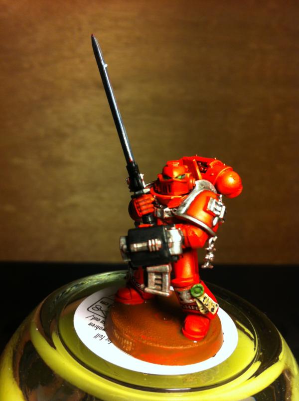
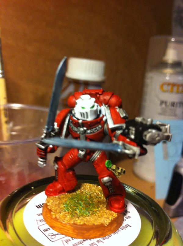
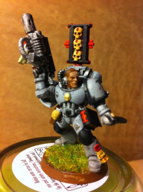
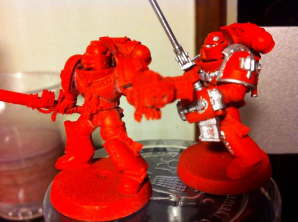
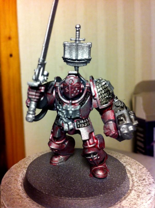
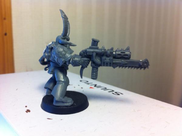
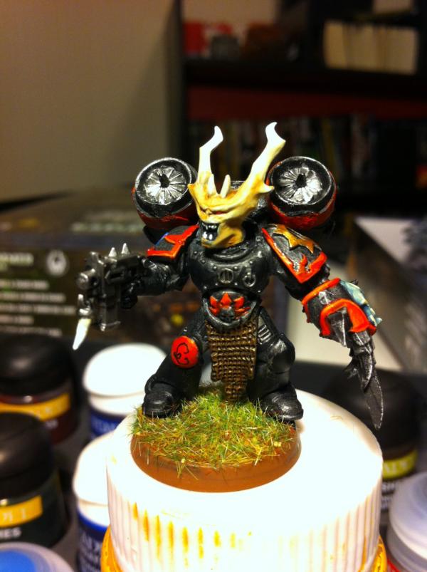
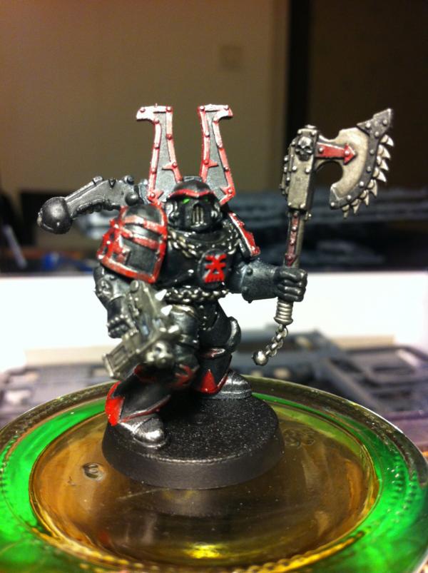
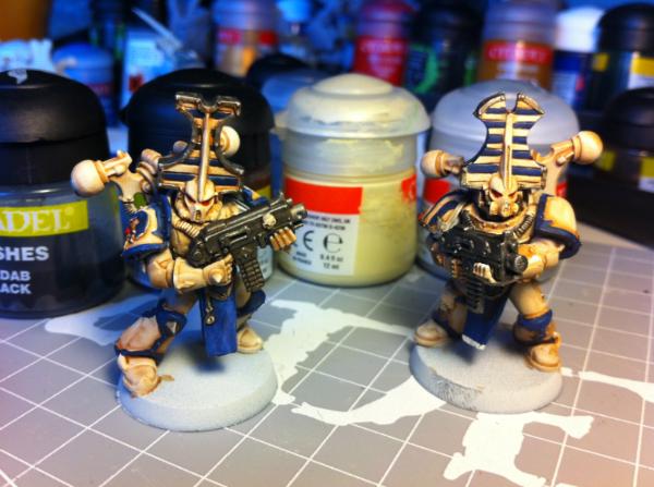
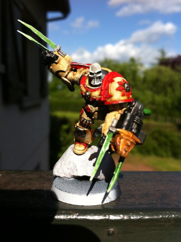
First - Standard GKSS guy
I know he's red. 
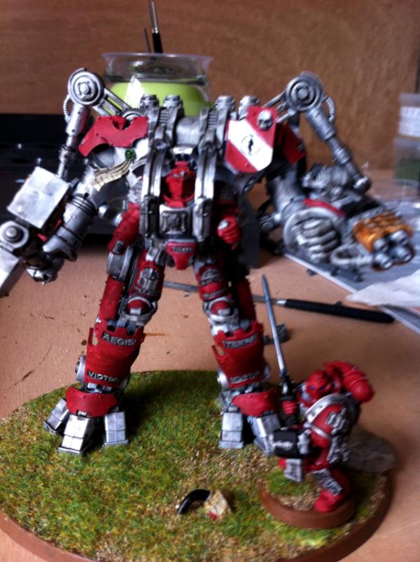
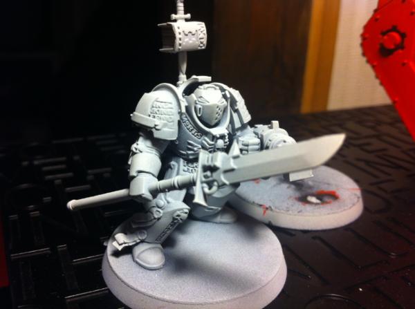
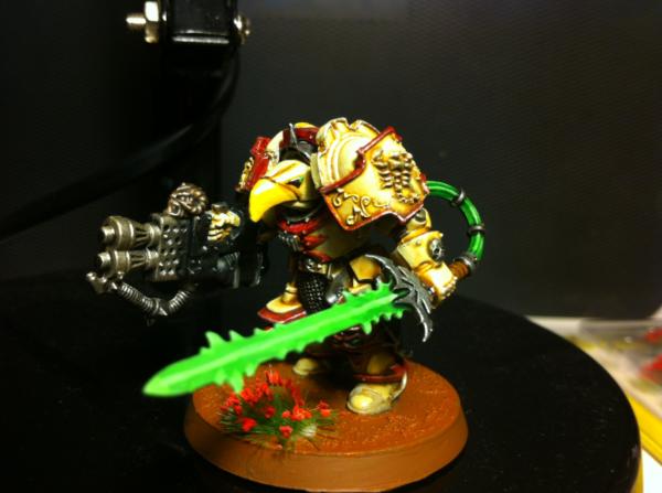
A full GKSS
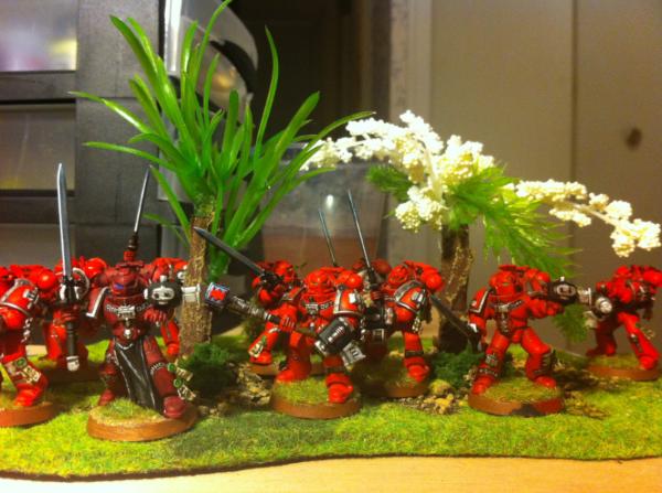
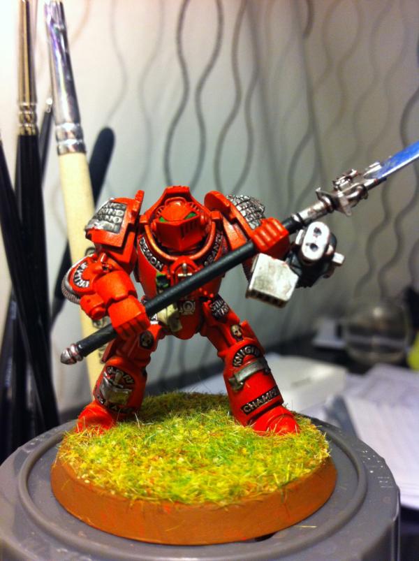
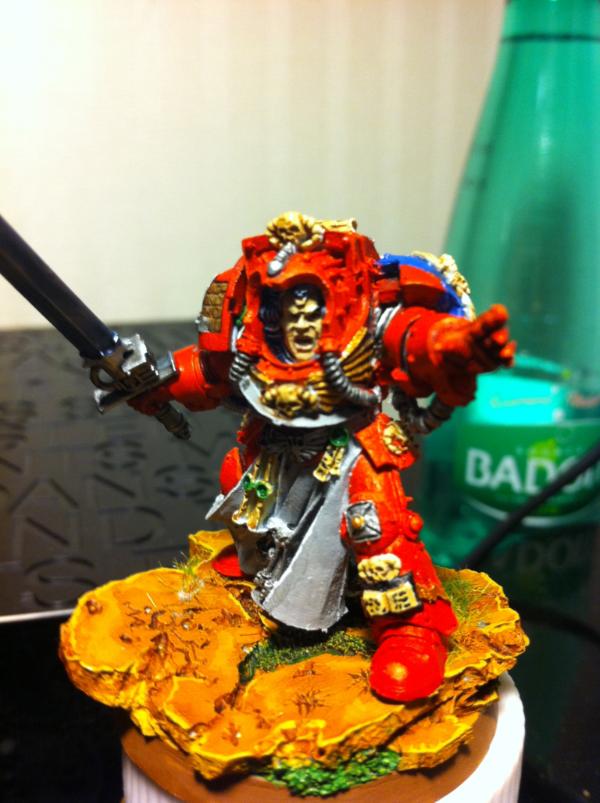
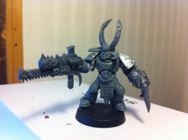
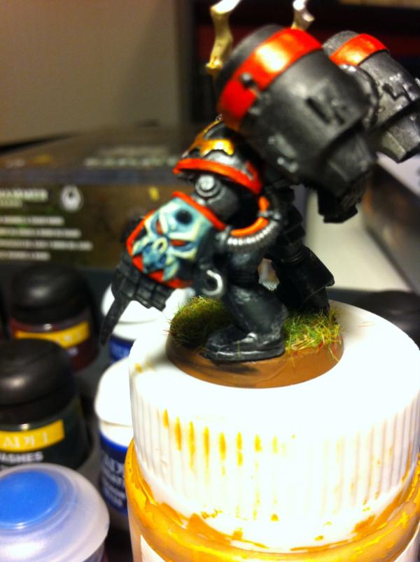
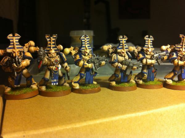
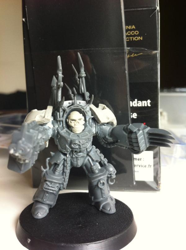
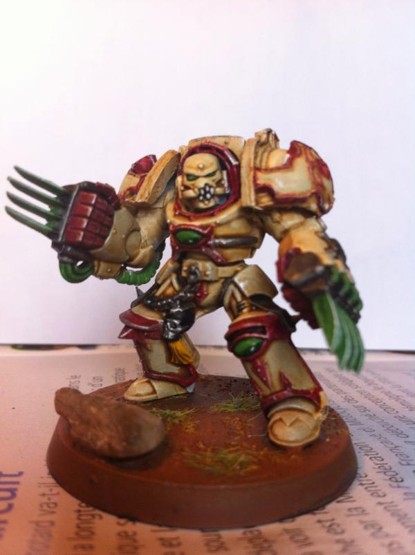
A GKT + group shot
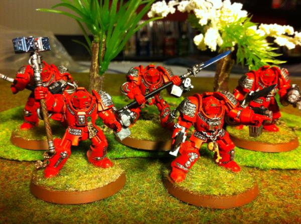
Purificators all have white helmets to differentiate them from GKSS
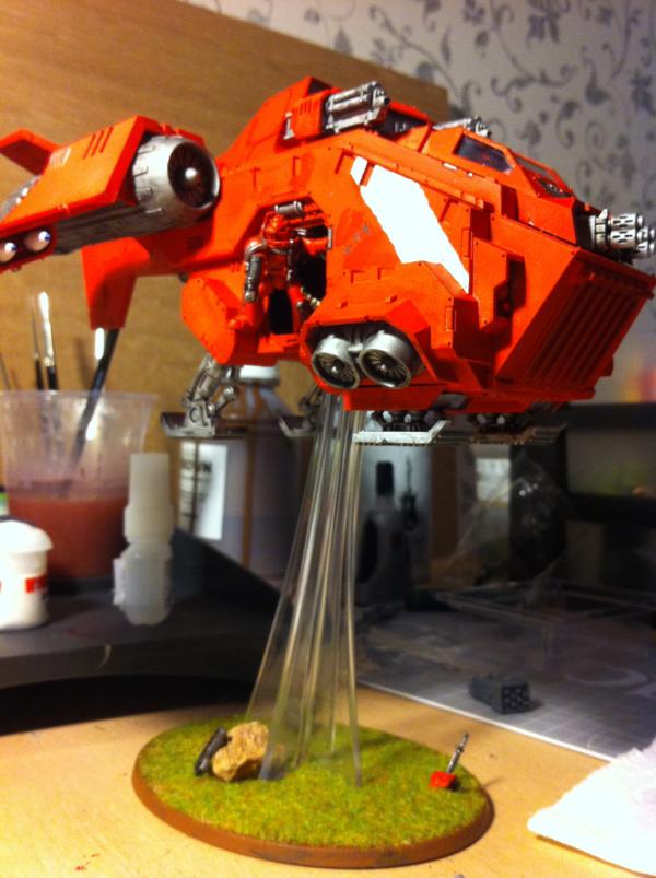
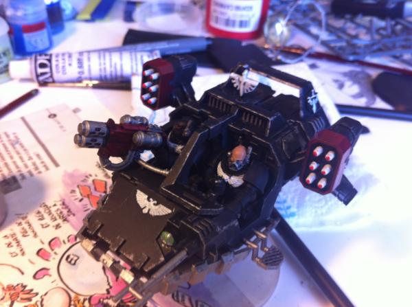
My infamous stormraven, with a pissed of crew member shooting at things
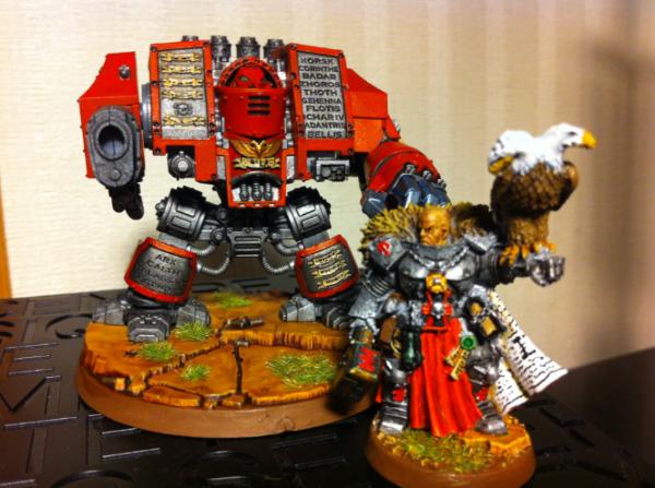
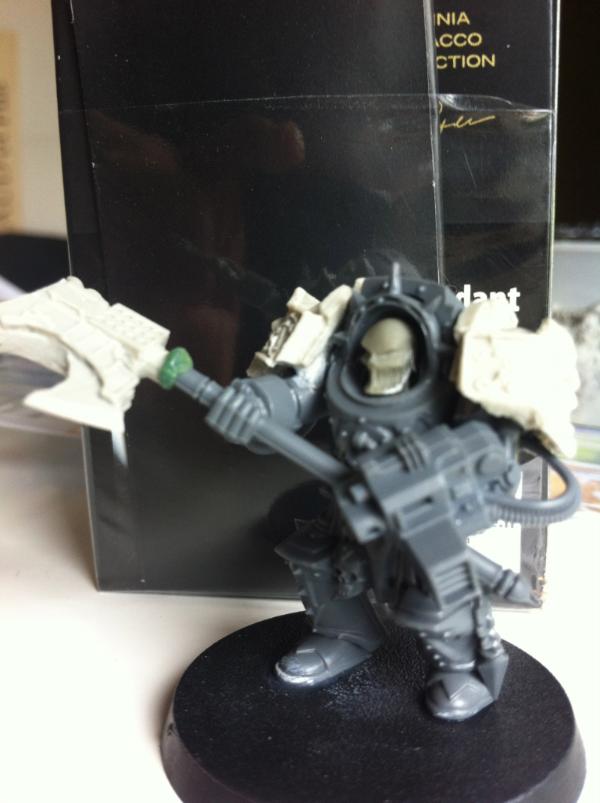
Coetaz and his big friend
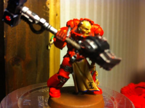
A librarian - not very happy how he turned out...
31320
Post by: Knightley
So much red! I am a fan of any GK force that isn't silver so yours is pretty awesome, how are you doing your metals? The reason I ask is they look quite bright as in some pictures they seem quite flat.
14674
Post by: serotol
you might not be the best painter, but the desing is awesome the color combination you used looks great, awesome looking termies. i love 'em.
52654
Post by: Seb
Knightley wrote:So much red! I am a fan of any GK force that isn't silver so yours is pretty awesome, how are you doing your metals? The reason I ask is they look quite bright as in some pictures they seem quite flat.
One some, I used mithril silver / washed badab black, on some (only the dread and Coetaz I think) I used an Army Painter metal primer (darker, like boltgun metal approximatively) and elaborated on it (badab black mostly). On power weapons, mithril silver / asurmen blue wash.
I am still struggling to find a way to paint power weapons in a good way.
One thing I also need to do is drill bolter holes !  Automatically Appended Next Post: Automatically Appended Next Post: serotol wrote:you might not be the best painter, but the desing is awesome the color combination you used looks great, awesome looking termies. i love 'em.
Thanks ! To GW credit, I used inspiration from a an offspin of the grey knights, called the exorcists, which main color is red.  http://wh40k.lexicanum.com/wiki/Exorcists#.TyyZ1yPTbJw
52654
Post by: Seb
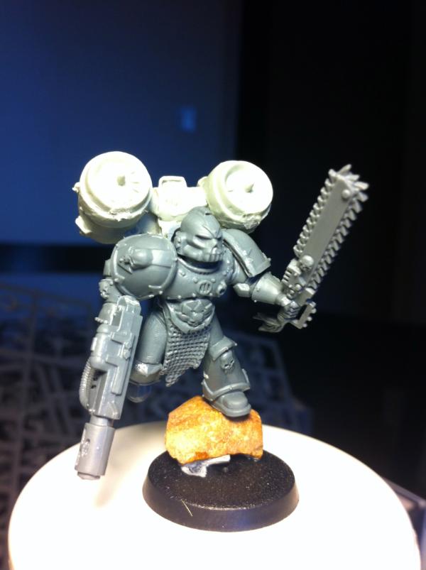
A Dread Knight - photo quality is crap, I need to retake one.
Converted inquisitor. Grey as a main color was a stupid idea, he looks like a space wolf.
52654
Post by: Seb
Update - no finished models though, only WIP. :(
Purifier justicar, still needs his base.
Primed model I use as a Justicar Thawn count-as:
Primes GKSS + First silver coat GKSS (you can see how the crispy red comes from, I am not that good) :(
 WIP
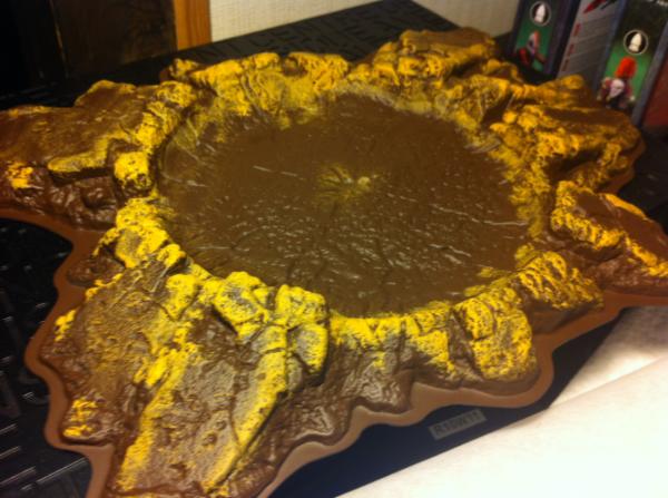
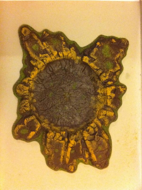
WIP on terrain - will mostly use those when my vehicules blew up.
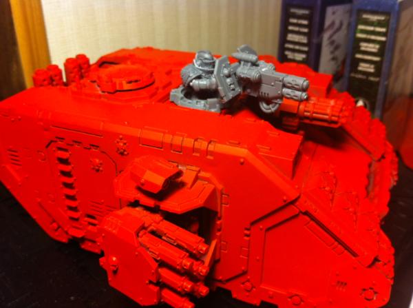
Rhino WIP - need a little more highlights but A LOT MORE weathering. It will be my first attempt at weathering - any tips / tricks appreciated!
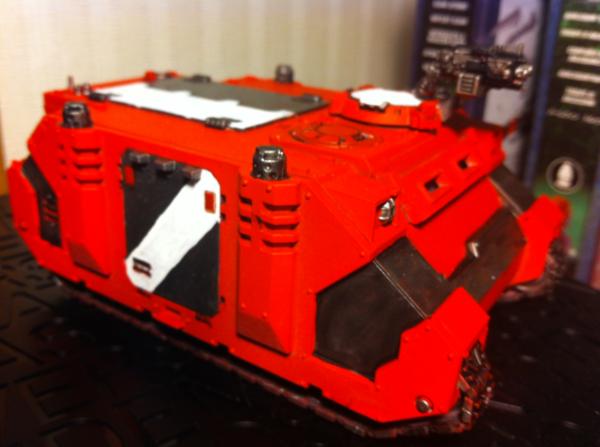
Primed LRC.
 Kinda need help here:
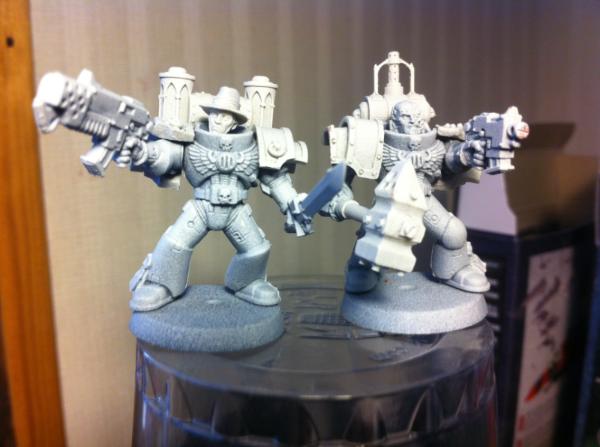
I am hesitating for the color scheme of my pals:
- Like the termis.
- Opposite (silver base, red scripts and shoulder lines)
- Black metal (I stole this one...)
47713
Post by: PapaPiggy
Its great to see all the red instead of a sliver. Any chance you own a huge blood angels army that you didn't want to play any more? Or maybe you where a blood angels player in a past life? Either way its looking great. you might want to wash the whole model with a black or dark red wash, just to tone down the red a little. The really bright red is ok but i think it would like better if it was a little darker. maybe use the base prim red as the high light and give it some shadows. Might make it a little easier on the eyes.
Great job, keep it up and keep posting.
52654
Post by: Seb
PapaPiggy wrote:Its great to see all the red instead of a sliver. Any chance you own a huge blood angels army that you didn't want to play any more? Or maybe you where a blood angels player in a past life? Either way its looking great. you might want to wash the whole model with a black or dark red wash, just to tone down the red a little. The really bright red is ok but i think it would like better if it was a little darker. maybe use the base prim red as the high light and give it some shadows. Might make it a little easier on the eyes.
Great job, keep it up and keep posting.
As a matter of fact, 15 years ago, I was an ultramarine guy. 
Good point on the wash, but I also want my guys to look crisp, and I'm afraid a black wash would end up dirty. 
47974
Post by: TheFatElf
Looking awesome Loving the idea!
52654
Post by: Seb
Quick update !
Actually flocked the crater:
Received my FW order !!
1st plague marine with his chainaxe.
52654
Post by: Seb
Hop hop hop !
Received my maxmini order, so I decided to build some funky inquisitors.
One with combi flamer / force sword. The other with NDH !
52654
Post by: Seb
Chapterhouse LC and shoulder pads ordered !
(Those are for my CSM army though, but I may update some on here!)
52654
Post by: Seb
Since Grey Knights deserves wothry adversaries, I finished assembling my FW Plague Marines.
TadaaaAAAA
This is also my first attempt at a dynamic pose... Not sure what to think of it.
C&C appreciated !
52654
Post by: Seb
Ok, so I played a bit with everything this WE, and I ended up thinking about a cool yet easy/quick scheme to use on my CSM.
The idea is ti have everyone on a bone/ivory base, and having the armour borders painted in according color (blue for TS, green for PM and so on).
I ended up with this test model for TS.
Any idea how to make this better? I find him a little bit too plain, but I am torn between complexity and easy/coherent paint scheme.
Thoughts?
44886
Post by: Arm.chair.general
Nice work, keep it up!
52654
Post by: Seb
Hop hop hop, regular marine !
Next up : plague marines.
What do you think about the pain scheme?
(ok ok, I know the paint job is quick and diry but hey, these are test models!) Automatically Appended Next Post: Ok.
I had a great idea. Like really great.
You need a specific pain scheme for paladins. At least I think you do. Just painting them like regular GKT with a book hanging over theirs heads don't do it for me.
So, I thought about a lot of option - like I was rambling on about: black paladins, white paladins and so on.
And I had th best idea ever: METALLIC RED PALADINS ! Just like my regular GKT, but with a meaner look. So I thought "Hey, what's the better way to do metallic red? Easy buddy: undercoat in metal (boltgun or something), and wash with read.
That.
Was.
A.
Mistake.
Behold.... THE PINK AVENGER !
So now, I really need a god idea for paladin. Since I had ivory covered with the CSM, why not ivory with red borders? But hey, that's my CSM main scheme!
Any brilliant ideas before I end up with a full Draigueen wing? (no offense, but that's not the look I want to give my army) :(
34925
Post by: Hologram
What wash are you using for that model? How many coats?
If you want a deeper red, try going for 75/25 Baal Red/Badab Black, and keep coating it. It'll probably take 2-3 coats, but it should turn around eventually, I would think. Its really easy to coat them with the Asurman Blue, but I haven't tried Red.
GL, I love the way the rest of the models have turned out so far. 
43474
Post by: Bounty
Seb wrote:And I had th best idea ever: METALLIC RED PALADINS ! Just like my regular GKT, but with a meaner look. So I thought "Hey, what's the better way to do metallic red? Easy buddy: undercoat in metal (boltgun or something), and wash with red.
That.
Was.
A.
Mistake.
Behold.... THE PINK AVENGER !
http://images.dakkadakka.com/gallery/2012/2/27/334664_sm-fethed%20up.jpg
So now, I really need a god idea for paladin. Since I had ivory covered with the CSM, why not ivory with red borders? But hey, that's my CSM main scheme!
Any brilliant ideas before I end up with a full Draigueen wing? (no offense, but that's not the look I want to give my army) :(
Perhaps mix a drop or two of red wash into the Boltgun BEFORE you paint it? I'm hoping to buy some red metalic paint i found in a teacher supply catalog with my tax return.
52654
Post by: Seb
Hologram wrote:What wash are you using for that model? How many coats?
If you want a deeper red, try going for 75/25 Baal Red/Badab Black, and keep coating it. It'll probably take 2-3 coats, but it should turn around eventually, I would think. Its really easy to coat them with the Asurman Blue, but I haven't tried Red.
GL, I love the way the rest of the models have turned out so far.
Baal red overboltgun undercoat. 1 coat.
I know that with the blue, they are good looking at the first coat... I'll try the 25/75 mix tonight !
47026
Post by: Garukadon
Can you post a pic of the spray can your using for your red? I love it!
34925
Post by: Hologram
Garukadon wrote:Can you post a pic of the spray can your using for your red? I love it!
Hedging my bet on Army Painter Pure Red.
50760
Post by: Minus
Hi Seb !
(bonjour, héhé)
For now, I have painted several models with "metallic colors", I mean painting a mini in silver and then wash it to taint the metal areas. I'm quite comfortable with this technic now, and I can give you 2 advices :
- one layer is definitely not enough. ^^
- if you can find some (or order it on a webstore) use ink first, and then Citadel washes. Inks contain more pigments, so they cover better.
I won't spam your topic with my images, but you can have a look at my gallery and/or my log you'll find several exemples of this technic.
I already painted purple, black, blue and red that way.
If you have any questions on how I did, let me know.
BTW, the tzeentch marine looks good, this ivory works pretty well with this strong blue.
55050
Post by: c9805222
Seb wrote:
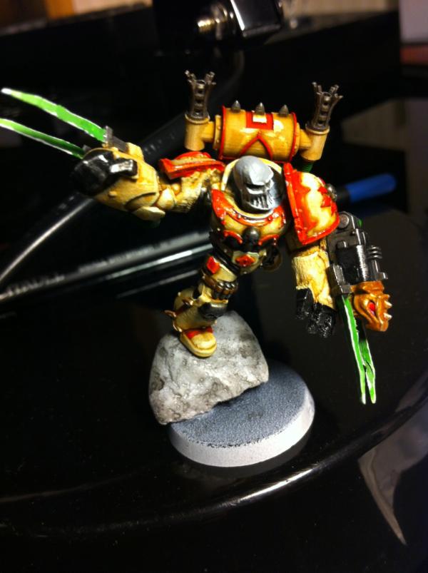
First - Standard GKSS guy
In this picture is the highlighting (orange bits) all down the models left hand side caused by your camera, lighting or painting? If its your painting then I'm not sure I can advise you. If its the lighting then that would be a good palce to improve the miniature...
for your first attempt at a dynamic pose (ref plague marine) he needs to either be jumping more (and bring that axe down in both hands onto something) or the leg in the air needs to go tothe ground, unfortuantely that would require cutting / rejoining the leg which again I cannot advise you on although i'm sure some helpful person can point out a tutorial for it. Currently he's doing a Wil 'E' Coyote off a cliff.
52654
Post by: Seb
Hologram wrote:Garukadon wrote:Can you post a pic of the spray can your using for your red? I love it!
Hedging my bet on Army Painter Pure Red.
And...... no.
Here it is, acrylic paint found in an art store:

Sprayed very lightly over a very light white undercoat.
Automatically Appended Next Post:
Minus wrote:Hi Seb !
(bonjour, héhé)
For now, I have painted several models with "metallic colors", I mean painting a mini in silver and then wash it to taint the metal areas. I'm quite comfortable with this technic now, and I can give you 2 advices :
- one layer is definitely not enough. ^^
- if you can find some (or order it on a webstore) use ink first, and then Citadel washes. Inks contain more pigments, so they cover better.
I won't spam your topic with my images, but you can have a look at my gallery and/or my log you'll find several exemples of this technic.
I already painted purple, black, blue and red that way.
If you have any questions on how I did, let me know.
BTW, the tzeentch marine looks good, this ivory works pretty well with this strong blue.
Mais complètement bonjour !
The only red I found in your gallery was the Kan. Is that the technique you're refering too? It looks like solid red to me. :/
I'll try more coats of wash to see what I can get to. Cheers for the tip !
Automatically Appended Next Post:
c9805222 wrote:
In this picture is the highlighting (orange bits) all down the models left hand side caused by your camera, lighting or painting? If its your painting then I'm not sure I can advise you. If its the lighting then that would be a good palce to improve the miniature...
for your first attempt at a dynamic pose (ref plague marine) he needs to either be jumping more (and bring that axe down in both hands onto something) or the leg in the air needs to go tothe ground, unfortuantely that would require cutting / rejoining the leg which again I cannot advise you on although i'm sure some helpful person can point out a tutorial for it. Currently he's doing a Wil 'E' Coyote off a cliff.
Of course the highlight is produced by my camera. 
I tend not to spend a lot of time on my regular guys. Nice trick I'll use for HQ though : taking very luminous pictures and use it for highlighting ! Cheers !
On the Nurgle jumpy guy, I am afraid I'll break more things that fix by touching him. The 2 handed axe is a good point though, that would add mementum - I know need to find a fitting arm !
54374
Post by: Chemical Cutthroat
That Thousand Son looks great. It's simple, clean, and completely fitting for the model. But I don't think it's going to work for the rest of the CSM units. It fits in with the motif of the Thousand Sons, but everyone else has such divergent schemes that trying to tie them all together with a common idea is going to be really hard.
The main hurdle being that your cosntant theme is such a large portion of their armor. If you were matching shoulderpads or had some other trick to tie the army together, that might work, but I don't think the scheme is going to transfer well to say... the Plague Marines. They can be really picky models when it comes to color choices.
47976
Post by: Mr. S Baldrick
Dude your stuff looks awsome, don't be down on yourself. With so many armies now days looking cookie cutter identical your stands out which is great. Keep it up the read works well, you should be proud of them. for thinking outside the box.
52654
Post by: Seb
Mr. S Baldrick wrote:Dude your stuff looks awsome, don't be down on yourself. With so many armies now days looking cookie cutter identical your stands out which is great. Keep it up the read works well, you should be proud of them. for thinking outside the box.
/ego boost
Thanks a lot.
Speaking about outside the box :
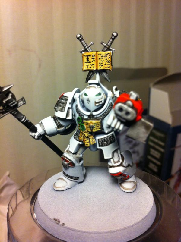
White test paladin. Thoughts ?
(I'll try a ivory / deathwing one next)
50028
Post by: leohart
I want to see the ivory deathwing paladin next please.
52654
Post by: Seb
Chemical Cutthroat wrote:That Thousand Son looks great. It's simple, clean, and completely fitting for the model. But I don't think it's going to work for the rest of the CSM units. It fits in with the motif of the Thousand Sons, but everyone else has such divergent schemes that trying to tie them all together with a common idea is going to be really hard.
The main hurdle being that your cosntant theme is such a large portion of their armor. If you were matching shoulderpads or had some other trick to tie the army together, that might work, but I don't think the scheme is going to transfer well to say... the Plague Marines. They can be really picky models when it comes to color choices.
Thanks.
That's a tricky point you raise though. I am now compelled to make a test plague marine model... Problem being the FW models do not have clean shoulders, so I'm afraid the ivory looking shoulders will look crap. :(
Maybe trying a concept like ivory armour bursting into brown/green bulbous whatever.
54374
Post by: Chemical Cutthroat
Yeah... and that could work if that's what you're going for, I would try and find a color of decay that gives a nice contrast to the ivory. Maybe skip your typical green and grime and go for a sickly blue or water-logged corpse sort of coloring... maybe going as far as dark blue-black ichor leaking from the wounds and the like. Still distinctly nurgle, but different enough to be interesting and unique.
52654
Post by: Seb
Chemical Cutthroat wrote:Yeah... and that could work if that's what you're going for, I would try and find a color of decay that gives a nice contrast to the ivory. Maybe skip your typical green and grime and go for a sickly blue or water-logged corpse sort of coloring... maybe going as far as dark blue-black ichor leaking from the wounds and the like. Still distinctly nurgle, but different enough to be interesting and unique.
Now, that's an idea.
Test model up after the ivory paladin.
54374
Post by: Chemical Cutthroat
Good luck!
34925
Post by: Hologram
That's a pretty sweet white Paladin, I like it. One of the smoothest all-white models I've seen in a while. Can't wait to see the ivory one!
55050
Post by: c9805222
Seb wrote:
Of course the highlight is produced by my camera.
I tend not to spend a lot of time on my regular guys. Nice trick I'll use for HQ though : taking very luminous pictures and use it for highlighting ! Cheers !
On the Nurgle jumpy guy, I am afraid I'll break more things that fix by touching him. The 2 handed axe is a good point though, that would add mementum - I know need to find a fitting arm !
Grey knight halberds (or just the arms) may be just the ticket here (or that hammer they have), I've used it for some of my assualt marines which you can view here http://www.dakkadakka.com/dakkaforum/posts/list/432357.page (shameless self promotion) also used the assualt marine legs for the dynamic poses you may want to consider that for the plague marine? enjoy and liking your work.
43474
Post by: Bounty
Seb wrote:Chemical Cutthroat wrote:Yeah... and that could work if that's what you're going for, I would try and find a color of decay that gives a nice contrast to the ivory. Maybe skip your typical green and grime and go for a sickly blue or water-logged corpse sort of coloring... maybe going as far as dark blue-black ichor leaking from the wounds and the like. Still distinctly nurgle, but different enough to be interesting and unique.
Now, that's an idea.
Test model up after the ivory paladin.
Ivory turns a deep yellow borwn with age. Perhaps in addition to the traditional color for the trim you could 'age' some of his surface.
52654
Post by: Seb
Test ivory paladin.
I must say I really like how it came out. Not very bloody knighty, but I think it looks great.
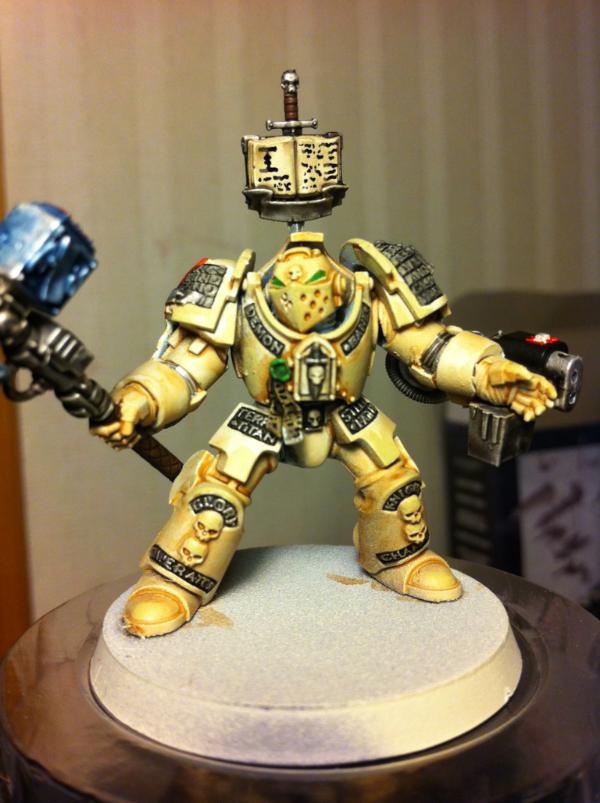
Thoughts ?
50028
Post by: leohart
I think it does look awesome. Was that Gryphon wash? Perhaps a darker wash (like devlan or badab) might go better with the black lettering.
52654
Post by: Seb
Ok so, here are our options !
White, pure and striking at the heart of chaos spawns.
Ivory, like above but darker and meaner.
Red, like the others GKT of my army, but they will end up with a book over the head.
Golden, a test model I did not finish.
Pick one and tell why !
55050
Post by: c9805222
Ivory or White
54374
Post by: Chemical Cutthroat
As much as I like the Ivory look, I like the Red better. It's bright, it's aggressive, it's thematic, and it's different. The Ivory looks good, and as much as I love that color for armor, it just reminds me too much of deathwing.
The white looks good too, but I think the red is a much more unique look. It's also a little more forgiving if you botch something up in the process, so I'm thinking of that too.
52654
Post by: Seb
Since all my GKT and most of my other stuff is redder than red, I tend myself to prefer the ivory one, though I need to find a little place for more red on it. Maybe the right pauldron will be entirely red.
34925
Post by: Hologram
Seb wrote:Since all my GKT and most of my other stuff is redder than red, I tend myself to prefer the ivory one, though I need to find a little place for more red on it. Maybe the right pauldron will be entirely red.
I think you should do the Ivory colored Paladins, with the red shoulders like the gold model.
Either way, they all look awesome.
43000
Post by: daxx367
Ivory looks the best. Maybe if you do a red wash over that even if its a light one?? Any way this all looks good keep up the good work!
52654
Post by: Seb
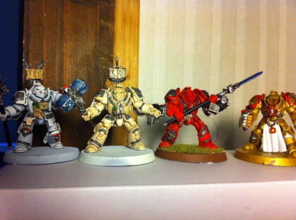
Hop hop hop : nearly final. I may or may not, paint the second pauldron.
Wadya think ?
47976
Post by: Mr. S Baldrick
I vote red with white helmets.
52654
Post by: Seb
Mr. S Baldrick wrote:I vote red with white helmets.
Crap. Valid and attractive suggestion.
50028
Post by: leohart
Ivory, red pauldron, white helmet.
52654
Post by: Seb
Ok, I like the ivory one with one red pauldron.
Now I am debating on Draigo. Red or ivory...
Oh the hesitation...
One a different subject, I am too seriously considering buying an airbrush. Automatically Appended Next Post: 
Final paint scheme !
Need to finish the squad and go on the plague marine !
43000
Post by: daxx367
Looking good its a nice change and it reminded me of the deathwing.
34925
Post by: Hologram
Looks good!
On the airbrush - do it. It gives you a really smooth basecoat and it takes up 1/100 of the time of painting manually.
52654
Post by: Seb
KITBASH ! !! ! !! !! !
Necromunda adeptus arbites + maxmini shield + GK falchion = A crusader !
I like it, it will go in my 7 DCA / 3 Crusader CC of death squad.
To be noted : I stole the idea of the adeptus arbites from another Dakkanaut, so props for the odea does not go to me. Automatically Appended Next Post: I may use the squad commander to build a custom inquisitor.
50028
Post by: leohart
Looks pretty sweet. I want to see the painted version.
24703
Post by: Norn King
I vote white.
52654
Post by: Seb
Ok, so I am going for ivory.
Anyone has a bright idea for the purity seals scrolls? The green stamp is fine, but the paper looks like the armour. :/
50028
Post by: leohart
Dheneb stone
or
Snakebite leather
34925
Post by: Hologram
Seb wrote:Ok, so I am going for ivory.
Anyone has a bright idea for the purity seals scrolls? The green stamp is fine, but the paper looks like the armour. :/
Base of Snakebite Leather, then light drybrush of Bleached Bone or Vallejo Bonewhite, then a really really light drybrushing of skull white.
52654
Post by: Seb
Ok, I got completely crazy about CSM, maybe my true nature going back on track...
Bought 2 of the new daemon possessed engines from FW, some termies and FW plague marines.
Even though I L O V E the GK models, I love originility even more. And every one at the FLGS plays GK.
OH THE CORNELIAN CHOICE !
54374
Post by: Chemical Cutthroat
I don't care what you paint, I just want you to paint!
Now maybe you can work on that Plague Marine color scheme that was being debated. I think it has some potential.
52654
Post by: Seb
Ok, first layer first wash.
What do you think ?
On the blue ichor, I wanted to blue wash the bone color and make little blue leaks along the armour openings / tubes.
Ideas ? Automatically Appended Next Post: (first afterthought : brown wash = win for PM. For regular CSM, I'll stick to black wash.)
54374
Post by: Chemical Cutthroat
See... I was thinking the armor was going to be a different color. Like... hmm... *brainstorms*
Alright. Skip the green. What I was thinking is that the armor was a pale color. A bone or other off-whitish sort of tone. And any gash or tear in the armor, you take and line with a bit of watered down black, just around the main point, then I would drip a dark wash... maybe the blue and the black mixed together, and drip it down the gashes and cracks in the armor.
OOooor... something else entirely, your call!
46982
Post by: MrMerlin
I really like your red knights, maybe they're slightly too red for my taste, but still great!
The white paladin..... he looks awesome! Thats the sheme I'd pick for sure!
Subd
52654
Post by: Seb
A few more washes afterwards.
Wadya think ?
54374
Post by: Chemical Cutthroat
I like the blue for the internals. I like it a lot.
I think it's at odds with the green though. But the green is well done too!
I think the blue bits need to be darker, at least towards the breaks in the armor. Skip the Badab Black and instead water down some Chaos Black a little and paint that on the bottom edges of the breaks, and a little inside them as well.
Maybe take the brush and drag some drips and runs down the armor with said black. That'll be your dark points, and then you can wash over that and blend the oozing into the darker color...
Not sure how time intense that will be, I have no Nurgle models to test on.
52654
Post by: Seb
Pictures pictures pictures !!! We all love pictures !
Received my order from Hightech miniatures.
First, the obliterators (or count as anyway).
And banners
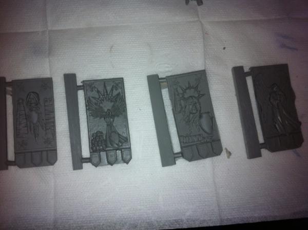
So, casting is almost too good to be true. No casting lines, whatsoever, details are fully visible, minis are cut clean. No sprue, so it's just glue and paint. Some details are incredibly fine. I do not know what plastic/resin they use, but it seems durable, unbendable and durable. I must say I am quite impressed.
I look forward to painting these guys and fielding them ! Automatically Appended Next Post: First one built !
54374
Post by: Chemical Cutthroat
Those are wild looking. Can't wait to see them painted.
50028
Post by: leohart
Have them painted, please. It does look really awesome.
52654
Post by: Seb
I'm so happy with this one I'll put it in the showcase area.
53347
Post by: Sasa0mg
What red do you use on your GK :O I really need to steal that color for my paladin apothecary xD
52654
Post by: Seb
You can find the photo of the acrylic paint I used bottom of the first page. It's very similar with blood red.
44290
Post by: LoneLictor
That flesh looks extremely disturbing, which I guess is a good thing for an Obliterator. Great job!
40808
Post by: decoste007xt
I love the schemes you did for your guys, I too am building a GK army and can't decide what color I would go for. I love the white one, and the red one a lot!
I was going to try making a Red GK, Bronze and White/Gold but seeing yours lets me know gold might be a bit too much for me, I used to have a hard time using lots of golds on my CSM and my Khorne.
Your red is incredibly Vibrant, far more vibrant than my Khorne came out, what kind of red do you use?
52654
Post by: Seb
decoste007xt wrote:I love the schemes you did for your guys, I too am building a GK army and can't decide what color I would go for. I love the white one, and the red one a lot!
I was going to try making a Red GK, Bronze and White/Gold but seeing yours lets me know gold might be a bit too much for me, I used to have a hard time using lots of golds on my CSM and my Khorne.
Your red is incredibly Vibrant, far more vibrant than my Khorne came out, what kind of red do you use?
Thanks for the compliments!
You can find the photo of the acrylic paint I used bottom of the first page. It's very similar with blood red.
Sidenote : Received chapterhouse order !
Stand ready for awesome conversions !! (at least I hope so)
54054
Post by: sam0
These are awesome I love the non standard colors
52654
Post by: Seb
Not a lot of time to paint at the moment, I thought I would update with a quick WIP on a Tzeentch lord / Sorcerer I'm on.
The daemon gauntlet is from the Terminator chaos lord box, I thought it could easily be used as a daemon or force weapon, as well as a regular PF. The combi melta could either be a real combi melta or the representation of any shooty powers I give to a sorcerer. What do you think? Acceptable on a game table ?
At the same time, working on a customer disk of Tzeentch I can use as a mount if need be. I want to be able to put the mini on it when needed, and be on foot when needed.
Any one having advice on how to make this look good will be greatly appreciated !
52654
Post by: Seb
Long overdue update !
Another plague marine test scheme. I LIKE. Thoughts?
A kitebash, can be used as raptor champion or a lash sorc /w jump pack or chaos lord with DW. Yes, I so love that PF that I could use it as a PF. Toughts?
Close up on the PF.
54374
Post by: Chemical Cutthroat
I think the Plague Marine looks good, but I would replace the green bits on the armor with a dark blue and see how that looks.
20018
Post by: Hyenajoe
Great job Seb!
So much good stuff here. I must say I have a preference for your CSMs though, especially your plague marines.
52654
Post by: Seb
Chemical Cutthroat wrote:I think the Plague Marine looks good, but I would replace the green bits on the armor with a dark blue and see how that looks.
I'll give a shot to something like necron abyss or something like dark. Maybe a good idea !
54374
Post by: Chemical Cutthroat
Necron Abyss is definitely a good call. Maybe with a highlight of Mordian as well.
22619
Post by: inmygravenimage
Hey, just found this. Nice work,
1) love the ivory gks, and it clearly works with your painting style
2) I like your kitbashes, they're characterful and crazy
3) Love the detailing on nurgleys, but I really feel the metalwork needs some corrosion. It all feels a bit shiny just now.
Great blog man - sub'd!
46982
Post by: MrMerlin
Those two are very nicely painted, especially the head of the second one! Great job!
34925
Post by: Hologram
Pro use of the dryad head (I think?) on the Raptor Champ.
40808
Post by: decoste007xt
Thats a posessed chaos space marine head.
44886
Post by: Arm.chair.general
Wow! Awesome looking Plague Marine!
52654
Post by: Seb
Arm.chair.general wrote:Wow! Awesome looking Plague Marine!
Thanks !
And Decoste's right, it's from the possessed pack.
Here's my last mini. Took a long time to get it done, and yet I'm not happy with it. Too much colours maybe. Thoughts ?
54374
Post by: Chemical Cutthroat
I think he just might be a little color ADD at the moment. There's nothing wrong with your painting, your technique is good. And the red and blue look good with each other.
I think if you tone down the green, maybe with a black or brown wash, (Maybe two) it will help tone it down and stop distracting the eye without you having to paint it a completely different color.
20018
Post by: Hyenajoe
I think your technique is good, but I agree there is something wrong with the colours.
For me it's the blue. I'm not sure it fits the red/orange armor plates. Perhaps something yellow/golden instead, or black?
54497
Post by: Nrljm
Change the blue to a really pale light blue/creamy colour, will
Completely change the model
54374
Post by: Chemical Cutthroat
It's pretty much that one of the primary colors needs to go. Having Blue Green and Red all so bright on the model fights for the attention way too much.
Red and Blue can work fine on a model. But we're just being distracted from that by the green.
53347
Post by: Sasa0mg
I find the blue trim's to be a really nice synergy with the red. But at the same time (painting blood angels) I know that green works really nicely with red as well. Generally you have to go with one of these colors and reduce the other to a lesser vibrant / powerful colour.
My personal preference would be to sacrifice the green. Generally its only present on cables and the claws. Reduce the green to a pale-dark-muted green or change the color entirely to feature metalic of black cables.
I say that generally because to me the green as is in your model there simply falls under an "accessory colour" which is that its not actually a major part in the overall scheme but is still present on the model in sections that aren't supposed to demand focus. Such vibrant green on say the wires merely draws away from the larger sections of the model.
The only exception I really see to that is marine eye visors because people like the glowy effect.
52654
Post by: Seb
I feel you comments. My mother being an artist, I had all the courses you can imagine on colours complementarity and such. In fact, I chose the blue with my colour wheel. :O
The power cables are too bright, I recon, but I like having a consistent colour for them.
I may redo the blue in SW grey, or some other light blue/grey.
Or, or, or..... OR I might jump straight to the 2 decimator engines I have to assemble and paint !
52654
Post by: Seb
Weekend update !
An addition to the finecast raptors, another melta. Usefull when I do not take a champion but use them as a suicide unit.
I also built another PM squad with the FW upgrade parts. Here's the champion :
Last but not least : my 2 decimator engines have finally arrived !!!
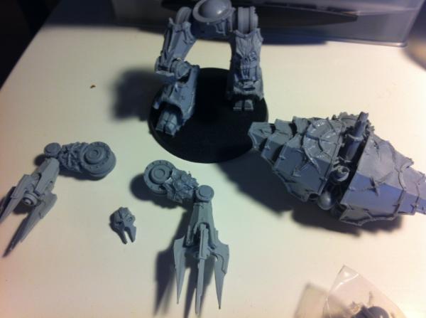
I started building the first one, dual siege claws. I plan on using it as a deamon prince or a dreadnought if my opponent do not want to play with FW rules. I find the head to be a little lackluster. So I assembled down there the options.
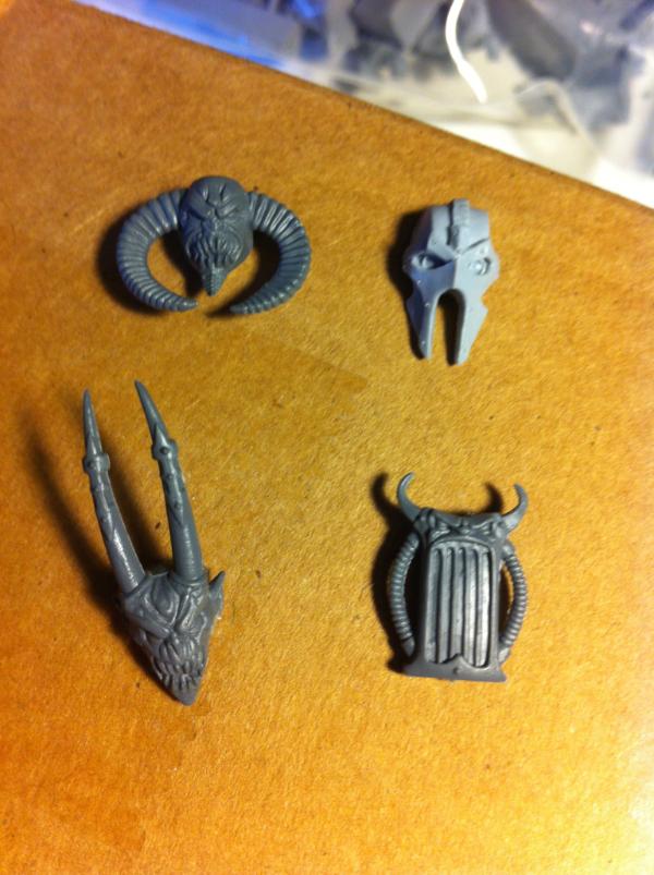 What's your take and why ?
22619
Post by: inmygravenimage
Not really sold on any tbh. Maybe the top right at a push, quite techno. Just to throw a spanner in the works, how about one of the new Bloodthirster heads, or the demon face plate off the vehicle scanner?
52654
Post by: Seb
The top right one is the stock one.
46982
Post by: MrMerlin
I'd personally use the bottom right, it looks quite mad!
Or use plasticard and make your own!
22619
Post by: inmygravenimage
Bottom right kinda forces you down a  path though eh? I had a rummage btw and have a spare Finecast bloodthirster head you can have if you want.
52654
Post by: Seb
Hum, the BT head looks quite wicked, but I'm not sure it will fit between the giant sized shoulders. Automatically Appended Next Post: inmygravenimage wrote:Bottom right kinda forces you down a path though eh?
Yeah, that's right. And I just checked, it does not go between the shoulders. I am down to the DP heads. Automatically Appended Next Post: MrMerlin wrote:I'd personally use the bottom right, it looks quite mad!
Or use plasticard and make your own!
The doom siren one does not fit ! :(
And my plasticard-fu is.... well non-existent. I'll kitebasj one of the DP princes, and use the stock head for the second one I think.
7910
Post by: Lurker
Balrog head if you can get your hands on it.

How does the decimator compare to the dread knight for size? Any idea?
Are these pictures accurate?


36311
Post by: cthulhuchewtoy
don't know if it will fit, but have you considered the Soul Grinder head?
http://www.bitzbox.co.uk/product_info.php/chaos-daemons-soul-grinder-head-p-4013 theyre sold out now, but good things come to those who wait. Personally I think it would look sick. well worth a lil GS love
52654
Post by: Seb
Lurker wrote:
Are these pictures accurate?
Yes they are !
Both soul grinder and balrog sound like good options ! Thanks ! Automatically Appended Next Post: Crop, noticed the balrog horns are getting back. I am sure than will not fit between the giant shouldergards. :(
7910
Post by: Lurker
Good news on the decimator front them. I thought it would make a good base for a dreadknight.
As for the Balrog horns, cut them off each side and switch them over so that they point forward, like this:

Here is the thread that gave me the idea. I'm considering making an exact replica at some stage!
http://midge913.com/?page_id=443
34925
Post by: Hologram
Kinda a late question, but can I get a quick breakdown/tutorial on the pure white you used for the Paladins (I think).
52654
Post by: Seb
Hologram wrote:Kinda a late question, but can I get a quick breakdown/tutorial on the pure white you used for the Paladins (I think).
Pure white was pretty easy honestly :
- prime white
- add a brush coat of skull white
- very very very very (did I mention very?) very light devlan mud wash in the recesses
- correct the devlan mud mistakes with pure white
That's basically it. 
That balrog head is getting sexier by the minute. It would be a great match for a decimator engine. Last problem I can think of : a fully organic piece on a fully mechanic one.
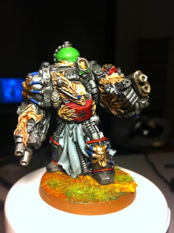
While I'm thinking about that, a brand new Obliterator !
52654
Post by: Seb
I decided on the berzerkers scheme : it will be black, with deep red borders.
Advice : do not test your schemes after boxing training. My arms were so shaking I painted the head while aiming for the foot.
Automatically Appended Next Post:
(sidenote : sad not to have comments on the Obliterator !)
Automatically Appended Next Post:
And vote vote vote on my minis ! ^^
22619
Post by: inmygravenimage
I like the obliterator, he has a certain disco fury about him. I don't know why that's what springs to mind I sympathise, it's a bit sucky when you stick something up and get nothing back. Don't sweat it.
52654
Post by: Seb
Test zerker, speed painted.
As usual with test models, I am not sure I liking it. The dark theme seems not fitting for a brutal unit. I may try a straight white / red model (kidda like the white paladin I made before), but white/red may look like a red cross unit - not very fitting for zerkers. :(
Help me !
54374
Post by: Chemical Cutthroat
You might just need to get a different look to some of the metals going on. Maybe go a little more brassy with the chains and the like for Khorne. Black can look fine as a base-look for armor, but you really need other things around to accent and bring out the model. That's why Death Company are covered in stuff to paint. Nobody will call them boring looking.
40808
Post by: decoste007xt
I paint all of my zerkers gloves a light brown, its like graveyard earth to make it stand out, i do the rivets on the gloves with mithril silver before I wash. I favor dwarven bronze over gold for my metallic symbolism on the khorne bits. I usually pick out all the skulls with white or another opposing metallic color like dwarven bronze if the sword is boltgun or something similiar.
Green eyes, love it! I do the same with mine, infact I pick out the wires on the backpack with green, scorpion green.
52654
Post by: Seb
Chemical Cutthroat wrote:You might just need to get a different look to some of the metals going on. Maybe go a little more brassy with the chains and the like for Khorne. Black can look fine as a base-look for armor, but you really need other things around to accent and bring out the model. That's why Death Company are covered in stuff to paint. Nobody will call them boring looking.
I'm not that sure that it will cut it. I'm afraid only a few brass highlight will not make them stand out. :( Automatically Appended Next Post: decoste007xt wrote:I paint all of my zerkers gloves a light brown, its like graveyard earth to make it stand out, i do the rivets on the gloves with mithril silver before I wash. I favor dwarven bronze over gold for my metallic symbolism on the khorne bits. I usually pick out all the skulls with white or another opposing metallic color like dwarven bronze if the sword is boltgun or something similiar.
Green eyes, love it! I do the same with mine, infact I pick out the wires on the backpack with green, scorpion green.
Good idea... BUT (I know, thinking negative) my PM are exactly that colour. Dunno, might try that though. Maybe light brown / brass highlights. Automatically Appended Next Post: Currently working on Abaddon.
Primary colour will be bone / light brown (between the ivory Paladins and the brown PM). I have yet to decide about the highlight colour.
Currently hesitating between deep red (it works with light main tones) and black or deep blue (coz Abaddon's evil you see).
Toughts ?
22619
Post by: inmygravenimage
Deep red for Abaddon, I think. As for testzerker, maybe bring the black up with some thin red layers, and a gloss finish?
52654
Post by: Seb
Final option : deep red as main, bone for highlights.
44886
Post by: Arm.chair.general
Wow, love the Obliterators!
39666
Post by: GiraffeX
For your test zerker how did you apply the black was over a white undercoat? Might be the light but it doesn't look black black like you would get from a spray undercoat. I'd try from a black undercoat a few coats of Baal Red wash to see if that looks dark and menacing.
I'm planning an elite unit of Berzerkers to go with my Abaddon and I was going to do them red with white helms and brass trim and lots of battle damage.
You can see my different zerkers in my gallery might give you some ideas.
46982
Post by: MrMerlin
Maybe try something red/orange, with the metal being 50% steel/brass? Zerkers have to look agressive!
52654
Post by: Seb
Arm.chair.general wrote:Wow, love the Obliterators!
Cheers ! 4 more to go ! Automatically Appended Next Post: GiraffeX wrote:For your test zerker how did you apply the black was over a white undercoat? Might be the light but it doesn't look black black like you would get from a spray undercoat. I'd try from a black undercoat a few coats of Baal Red wash to see if that looks dark and menacing.
I'm planning an elite unit of Berzerkers to go with my Abaddon and I was going to do them red with white helms and brass trim and lots of battle damage.
You can see my different zerkers in my gallery might give you some ideas.
Black was done with black sprayed and then dry brushed in metal. Your baal red idea is great, it will highlight the metal in red. On the ToDo list !
I like your red / black helm berzerkers. You managed to pull a albeit 'regular' bright and in your face look ! Automatically Appended Next Post: MrMerlin wrote:Maybe try something red/orange, with the metal being 50% steel/brass? Zerkers have to look agressive!
I know Merlin I know ! But red/brass is the default scheme, and as you got by now, I am not a fan of standart schemes !
52654
Post by: Seb
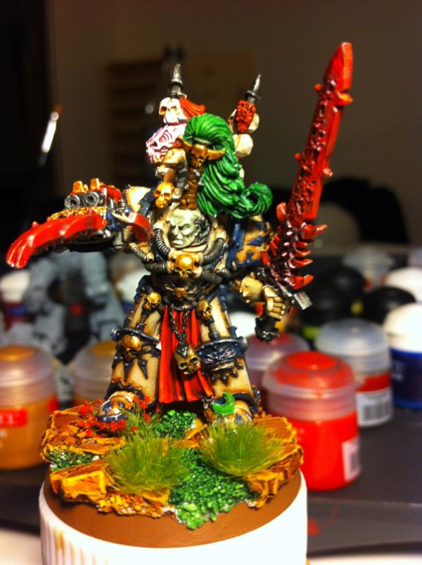
Ok, so final Abbadon is finished.
Need comments !!!!
22619
Post by: inmygravenimage
I like him a lot, can we get a more focused shot though?
52654
Post by: Seb
How about those ?
22619
Post by: inmygravenimage
Really great. Fully on colours and tremendous contrast - love it.
47296
Post by: Biohazard
Liking the look of your GK and CSM's. For the Decimator have you looked at any of the Defiler face plates? Or maybe a combination of the stock head with the teeth from one of the DP heads visible? I think that would add to the whole Daemon engine vibe.
The ideal head from the ones you posted would be the bottom left.
52654
Post by: Seb
inmygravenimage wrote:Really great. Fully on colours and tremendous contrast - love it.
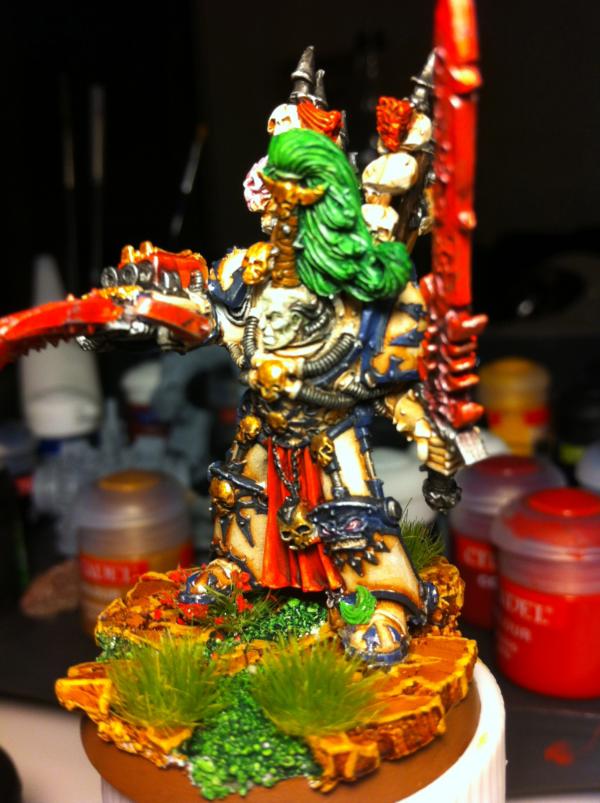
Thanks!
No mention of the crushed flowers? Automatically Appended Next Post: Biohazard wrote:Liking the look of your GK and CSM's. For the Decimator have you looked at any of the Defiler face plates? Or maybe a combination of the stock head with the teeth from one of the DP heads visible? I think that would add to the whole Daemon engine vibe.
The ideal head from the ones you posted would be the bottom left.
Thanks for the suggestion! I think the answer might be a DP face with the stock mask over it. I'll try!
47296
Post by: Biohazard
Look forward to the result
52654
Post by: Seb
Ok. Just so you know, because of the public pressure, I changed Abbadon's hair to dark blue. Was hesitating to do so until I read soul hunter, in wich Abbadin is described as having dark blue hair.
On another note, here's a small WIP of a chaos lord :
Yes, dual LC, combi bolter. I may magnetize his back so that I can wing / JP him when needed.
Thoughts ?
46982
Post by: MrMerlin
I love dynamic poses. Very nice start on that lord!
52654
Post by: Seb
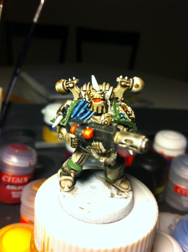
Quick update : the 15 minutes TS. Those, tabletop quality, were painted in 30 mins for the 2 of them. I know it shows, but they look great on the table !
55357
Post by: progreen10
They look really nice!
how did you do the bone?
52654
Post by: Seb
progreen10 wrote:They look really nice!
how did you do the bone?
That was very simple honestly : plain white with a heavy sepia wash.
22619
Post by: inmygravenimage
Nice job mate! Impressive for the time taken. Is that new sepia, or old?
55357
Post by: progreen10
Wow, only 2 layers...
52654
Post by: Seb
progreen10 wrote:Wow, only 2 layers...
I know. I have like 50 CSM to paint rignt now, and the only thing I hate more than a quick and dirty paintjob is seeing them in plastic grey. 
52654
Post by: Seb
inmygravenimage wrote:Nice job mate! Impressive for the time taken. Is that new sepia, or old?
Old one. Automatically Appended Next Post: Squad finished. I think it took a bit over an hour, basing included.
52654
Post by: Seb
Update ! Played 3 games this weekend, against Chaos Demons. Hint : MC > Vehicule. And that's a shame, since I managed to kitbach a whole new dual CCW berzerker dreadnought ! 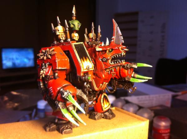 All props goes to GuitaRasmus. I just plainly copied his idea. My CD mate just bought a whole lot of bloodcrushers, so I just took a head and bam, voila ! Feedback wanted : - How's the modeling? (I used more gs than I ever did) - How's painting ? How can I improve it ? - Shall I put decals on the black part over the fire ? Base is on the way, as are last details ! Thanks for the input guys !
54374
Post by: Chemical Cutthroat
The painting is solid, and it looks good. I love the Bloodcrusher heads on Dreads, always looks badass.
You could have eased up a bit on the greenstuffed neck, if you had slimmed it down you could have put the ribs in it like you'd have on the rubber bits of a space marine. Pretty simple to do really. I'd have to see it from the front to get a really good opinion on that though.
No decals. The thing looks boss as is.
54374
Post by: Chemical Cutthroat
Check it out Seb, you're front page!
44886
Post by: Arm.chair.general
The bloodcrusher dread looks epic dude, keep it up!
52654
Post by: Seb
Chemical Cutthroat wrote:Check it out Seb, you're front page!
Automatically Appended Next Post: Arm.chair.general wrote:The bloodcrusher dread looks epic dude, keep it up!
Thanks - a stolen idea though, the original looks much better.
52654
Post by: Seb
Long overdue update !
Need to upload loads of things.
But first, I need advice on how to make this guy more wahoo :
Any tips appreciated !
22619
Post by: inmygravenimage
He's pretty wild just now! Maybe tone down the middle of the brass plates, and highlight up the edges of the red?
52654
Post by: Seb
inmygravenimage wrote:He's pretty wild just now! Maybe tone down the middle of the brass plates, and highlight up the edges of the red?
I dry brushed the edges in metal. :/ If I highlight, it will mess with that, will it not ?
22619
Post by: inmygravenimage
Granted. How about a sepia wash on the bone and rehighligh the light spots afterwards?
52654
Post by: Seb
inmygravenimage wrote:Granted. How about a sepia wash on the bone and rehighligh the light spots afterwards?
Already applied your advice you devil !!!
Current state, with backpack added.
22619
Post by: inmygravenimage
Nice one! Maxmini pack?
52654
Post by: Seb
inmygravenimage wrote:Nice one! Maxmini pack?
Yep ! /w Chapterhouse LC and a GK SB. I do not remember where the head's from though. Automatically Appended Next Post: Lastest images :
54374
Post by: Chemical Cutthroat
The highlighting you did on the backpack looks really nice. I don't know if it just didn't get hit with as much wash as the rest of the model or what, but it looks nice and sharp.
Always love those lighning claws, X-23 would be proud.
52654
Post by: Seb
Hiya !
Long time without updates, work has been killing me lately.
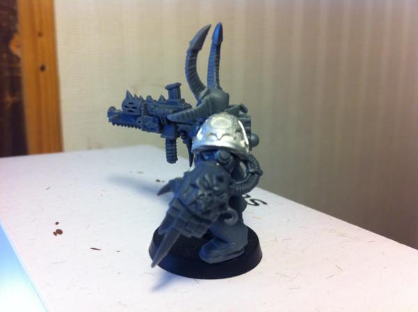
So, I will hold a kill team tournament late this month. I figured I'd field a chaos list, all terminators. Not a lot of bodies, but strong armour and all.
So, my list is decided. It will be five terminators, as follow :
- 2 champs with LC
- 1 with a HF
- 1 with a combi plasma
- 1 regular guy
200 points.
I ordered loads of stuff, and started assembly a few days ago.
Here's what I have so far :
He looks like a fallen chapelain I think. He's one of the 2 champs /w LC.
A bit blurry, but I'm sure you can make out the big ass axe. He's the regular guy. I'll try and have a nice OSL around the eyes.
He's the HF dude. The big knife on his gauntlet looks scary, but it's just a regular PW.
What do you think ?
22619
Post by: inmygravenimage
Very nice. Great builds. as always. What's that last head from, out of interest?
52654
Post by: Seb
Thanks !
The head is from Scibor : http://sciborminiatures.com/en_,shop.php?art=1285
I ordered spare parts (like the axe of the second one). Be careful with the full models, they tower over regular minis. The chaos lord I got is something like 1.5 times the size of a terminator, base EXCLUDED !! So good guess for a lord, but not for a regular guy.
52654
Post by: Seb
And here are the 2 last ones.
Bob and his LC. I really like him. The possessed head goes well with the model.
John with his combi plasma is more standart except for the shoulder pads.
Whadya think ?
22619
Post by: inmygravenimage
Kewl. Paint for the Paint god!
52654
Post by: Seb
First one. Really need feedback though. I feel like the whole metal drybrushing added a "dirty" look to the mini.
Tell me what you think :
I'll post in the showcase for added comments !
22619
Post by: inmygravenimage
I like it, but I think that green's a bit too strong. Are those scibor pads too?
52654
Post by: Seb
inmygravenimage wrote:I like it, but I think that green's a bit too strong. Are those scibor pads too?
Yes these are from Scibor.
(The sword is from bloodletters though)
39666
Post by: GiraffeX
The heavy flamer dude looks really cool, I like the bright green sword its very different to the norm the head and shoulder pads look very nice as well, first time I've seen them on a mini..
52654
Post by: Seb
And another one.
I am not too happy about the colours. The rest of my terminators may well end up in another colour.
52654
Post by: Seb
Finished the demon prince !
I am pretty happy about if - it is my first big size model. C&C appreciated !
46982
Post by: MrMerlin
I like the DP. Nice choice of colors, looks propa mean!
56117
Post by: TH3FALL3N
Those red GK look fecking awesome man!
22619
Post by: inmygravenimage
That's looking ace. Once again, you nail red! The skin looks good but can't really make out how the wings are; can we get a detail pic (maybe a reverse shot)?
52654
Post by: Seb
inmygravenimage wrote:That's looking ace. Once again, you nail red! The skin looks good but can't really make out how the wings are; can we get a detail pic (maybe a reverse shot)?
Yeah, no, I don't know...
They look really ugly, so I'm hesitating.
52654
Post by: Seb
Long overdue update - why do we have to work, again?
1 - test on a power weapon effet. I am pretty happy about it. It is very easy to come by and look good IMHO !
2 - A ravenwing speeder, for a friend who's a Deathwing fanatic, and does not believe in speeder support.
22619
Post by: inmygravenimage
Love the pw, how did you achieve this "super-easy" effect? Also, nice weathering on the speeder.
48291
Post by: Stormtrooper520
This is great!
52654
Post by: Seb
Stormtrooper520 wrote:This is great!
Thanks !
inmygravenimage wrote:Love the pw, how did you achieve this "super-easy" effect? Also, nice weathering on the speeder.
Thanks for the speeder, the new GW dry paints are almost like cheating. If I had that 15 years ago, my first Eldar would not look like a Playmobil...
For the PW supereasy effect :
1 - paint green
2 - paint the edge of the blade lighter green
3 - paint light green/white "lightning" stripes on the blade. Do not be too careful, they should wide enough for 4
4 - take your black micron pen and draw a black line in the white stripes.
(Yeah, micron pens are like cheating too, I know)
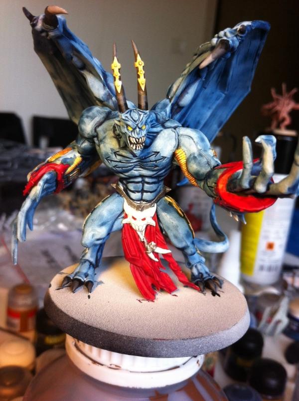
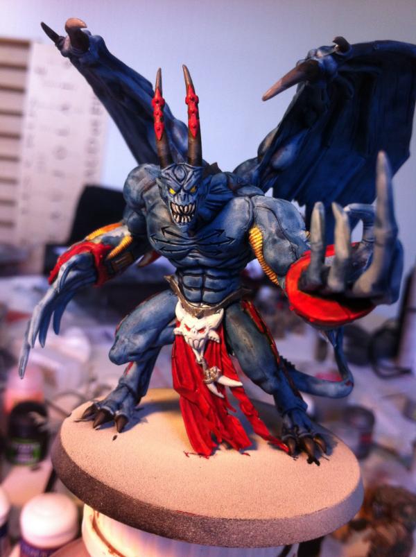
Now, need all the feedback you can give me on this demon prince. I like it, but somehow, something's awry.
46982
Post by: MrMerlin
I definetly like that deamon prince! The blue looks very good, nice and pale.... but the red is a bit too red maybe... it contrasts too strongly. I'd redo it as pale as the bue....
52654
Post by: Seb
v2 - tell me what you think !
The photo is a bit darker, but another coat of wash on the skin got a lot more dark. :/
22619
Post by: inmygravenimage
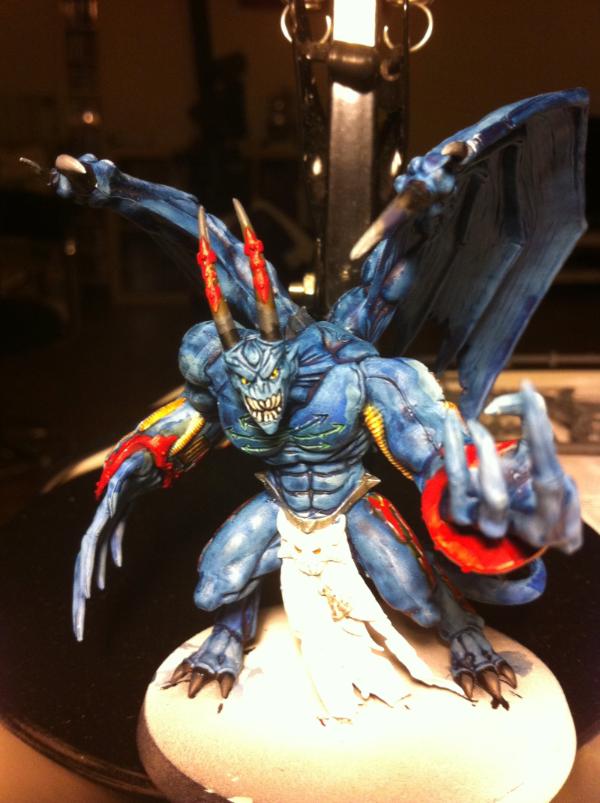
V2 red is better, but v1 blue is better! Sorry if that's Kind of awkward... Really like him regardless, and thanks for tip on dry paint - I'm am avid drybrush fan, but have yet to tread there.
46982
Post by: MrMerlin
I like v2 more... the darker blue looks really good. Now you really have to give him an awesome base!
52654
Post by: Seb
Better lighting on that - you will be able to spot all flaws :
- blending on the horns is crap
- liquid green stuff does not work at all (look at the shoulder joints, I know have 2 lines instead of one...)
- the blue is absolutely not clean
- I completly failed the chaos cross I wanted to have in a spooky green glow.
Any advice on how to salvage the disaster ?
54665
Post by: Sir Calvin
Wow! It has been quite a while since I last looked at this Blog. And I must say, great Work all around. I really like the one hour thousand sons. I wouldnt be able to do something this good in such a short time.
For the deamon princes: They both are great I prefer v2 most. And I think it would look much better if you leave the eyes this glowing yellow, it looks much creepier imho...
52654
Post by: Seb
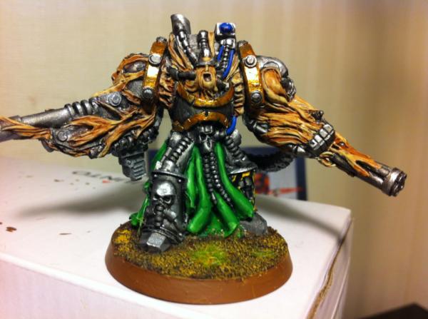
Currently working on this.
I am excited : first time I really paint a large mini before assembling it, and I really like the defiler model.
If you check page one, you can see a little addon I used on a stormraven (the GK firing out of the door). I may use this tip and have a wild CSM hanging from somewhere on the defiler.
52654
Post by: Seb
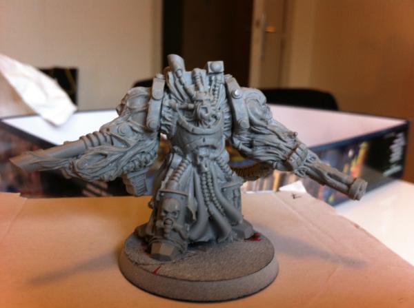
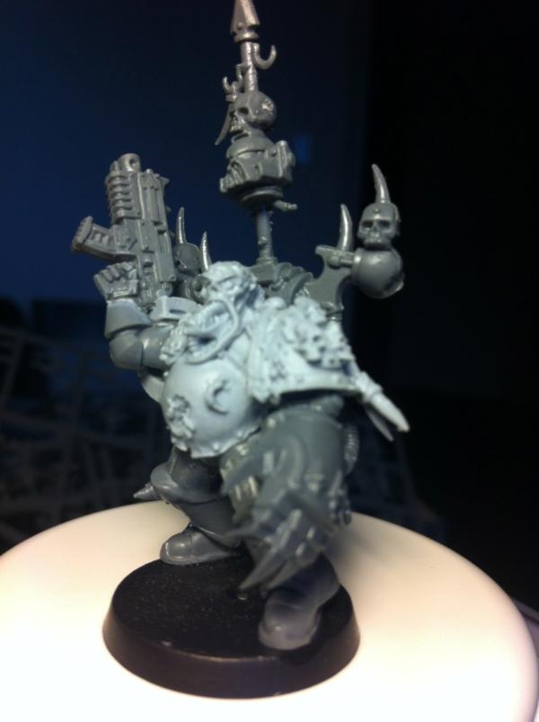
That my friends, is overconfidence.
The beast from the back :
I'll show off in the showcase.
22619
Post by: inmygravenimage
That red is seriously sharp! Very nice indeed, great pose too.
39666
Post by: GiraffeX
The Defiler is looking great Seb as Graven says its an excellent pose.
44290
Post by: LoneLictor
Damn, that is one badass defiler.
Excellent work, as per usual.
52654
Post by: Seb
Thread finnished due to lack of update. A new attempt here:
http://www.dakkadakka.com/dakkaforum/posts/list/487432.page
|
|
