Switch Theme:

Share on facebook Share on Twitter Submit to Reddit  [RSS] 

Dakka Painting Challenge: To INFINITY & Beyond! WINNERS ANNOUNCED, bottom of pg 4 (5/21) @ 2012/05/14 06:33:45


Post by: inquisitorlewis


To Infinity and Beyond. We received an almost overwhelming amount of entries this time around. All 42 entries are now in the gallery and waiting for your vote.

Now it's crunch time. Time for you to decide our winner.

If you want to refresh yourself about what the theme of the Painting Challenge was, you can refresh your memory here: http://www.dakkadakka.com/dakkaforum/posts/list/442989.page

A special thanks to our sponsor Corvus Belli, for their very generous prize support. Lets take a look at the prizes one more time.
First place prize will be €100 euros.
Second place prize will be €65 euros.
Third place prize will be €35 euros.

On top of that, they are even covering shipping. Giving you the most bang for your buck. (or Euro)

Make sure to visit the Infinity site to check out all of their awesome miniatures.


Public Voting lasts for 5 days. You can vote for all your favorite entries. Vote for as many or as few entries as you like!

The winner will then be announced a few days later, chosen from amongst the top 5 entries by a hand-picked panel of Dakka Painting Challenge judges.

All submissions are presented anonymously, so that no favorites can be played (so please do not post which image is yours, or you will be disqualified).

Remember that you can click on any of these images to get a better view of them (and zoom) in the dakka gallery.

You can vote for all your favorite entries. Vote for as many or as few entries as you like!

Now onto the pictures.
Entrant #1. Ariadna Tank Hunter. By Deadgaurd


Entrant #2. Nomad Prowler. By SilverMK2


Entrant #3. Ariadna Line Kazak. By Arakasi


Entrant #4. Knight of Montesa. By CaptainJack


Entrant #5. Myrmidon Officer. By Mechanicum Jon


Entrant #6. Sin-Eater Observant. Nomad Faction. By The CF


Entrant #7. Nomad Hellcat, w/ HMG. By Metsuri


Entrant #8. Saladin. Haqqislam Faction. By bou


Entrant #9. Jotum, Svalarhelma Mechanized Culrassler. By His Master's Voice


Entrant #10. Ninja (Sniper Conversion), Yu- Jing Faction By Sir Calvin


Entrant #11. Al Hawwa. By grenzmord


Entrant #12. Speculo Killer, Combined Army Faction. By zoddozoddo


Entrant #13. Yuan Yuan. By Nachtpfiffel


Entrant #14. Cassandra Kusanagi. By [SO]Rice


Entrant #15. Securiate w/ Combi-Rifle. By heartserenade


Entrant #16. Tokusetsu Butai. Yu Jing Faction. By LeoPelo


Entrant #17. Shasvastii Noctifer. By EndTransmission


Entrant #18. Achilles. By kavika0311


Entrant #19. Haaislam Hassassin Fiday. By Fafnir


Entrant #20. Ariadna Sniper. By MrMerlin


Entrant #21. Morlock. Nomad Faction. By Morathi's Darkest Sin


Entrant #22. Sun Tze. By FullyPainted


Entrant #23. Shang Ji. By Announcer


Entrant #24. Custodier. Nomads Faction. By Dancingronin


Entrant #25. Lizard TAG. Nomads Faction. By Cave_Dweller


Entrant #26. Hexas Sniper. Pan Oceanic Faction. By Marmaduke


Entrant #27. Janissaire, Haqqislam Faction. By wisefaiz


Entrant #28. Obiwaban. Yu Jing Faction. By junex


Entrant #29. Myrmidon Spitfire. By Kanluwen


Entrant #30. Hellcat, Nomads Faction. By adamoaduro


Entrant #31. Haqqislam Janissaire. By Von Skyfury


Entrant #32. Ninja. Yu Jing Faction. By Aosol


Entrant #33. Haqqislam Janissaire. By Pacific


Entrant #34. Wu Ming. Yu Jing Faction. By Perkustin


Entrant #35. Combined Army Skiavoros. By Inanimate


Entrant #36. Haqqislam Hassassin Fiday. By Aurelia


Entrant #37. Senor Massacre. By Chemical cutthroat


Entrant #38. Aleph Marat. By Absolutionis


Entrant #39. 3d Highlander Greys. HMG. By HeavyBolter


Entrant #40. Myrmidon Officer. By Ian Sturrock


Entrant #41. Sun Tze. MK1. Conversion. By InfinityDude


Entrant #42. Naffatun, Haqqislam Faction. By Pointblank

Good Luck everyone.


Dakka Painting Challenge: To INFINITY & Beyond! WINNERS ANNOUNCED, bottom of pg 4 (5/21) @ 2012/05/14 06:51:50


Post by: Arakasi


Awesome work! #28 and #29 are the same image though?


Dakka Painting Challenge: To INFINITY & Beyond! WINNERS ANNOUNCED, bottom of pg 4 (5/21) @ 2012/05/14 06:55:41


Post by: inquisitorlewis


Thanks. I just fixed that.


Dakka Painting Challenge: To INFINITY & Beyond! WINNERS ANNOUNCED, bottom of pg 4 (5/21) @ 2012/05/14 06:55:52


Post by: yakface


Arakasi wrote:Awesome work! #28 and #29 are the same image though?


Pic fixed now, thanks!


Dakka Painting Challenge: To INFINITY & Beyond! WINNERS ANNOUNCED, bottom of pg 4 (5/21) @ 2012/05/14 07:02:45


Post by: SilverMK2


Some awesome looking models - will have a vote when I get home as my phone will not do them justice


Dakka Painting Challenge: To INFINITY & Beyond! WINNERS ANNOUNCED, bottom of pg 4 (5/21) @ 2012/05/14 07:03:29


Post by: Morathi's Darkest Sin


Just for clarification, whats the ruling on voting for your own? I wasn't planning on doing it, but it occurs to me that if its allowed and others are doing it, that one vote might make a difference if by some miracle my piece was near the the top five.


Dakka Painting Challenge: To INFINITY & Beyond! WINNERS ANNOUNCED, bottom of pg 4 (5/21) @ 2012/05/14 07:04:29


Post by: endtransmission


It's great to see so many fantastic entries, good luck everyone!


Dakka Painting Challenge: To INFINITY & Beyond! WINNERS ANNOUNCED, bottom of pg 4 (5/21) @ 2012/05/14 07:38:33


Post by: yakface


Morathi's Darkest Sin wrote:Just for clarification, whats the ruling on voting for your own? I wasn't planning on doing it, but it occurs to me that if its allowed and others are doing it, that one vote might make a difference if by some miracle my piece was near the the top five.


Vote for all you like. If you like your own, then vote for it.


Dakka Painting Challenge: To INFINITY & Beyond! WINNERS ANNOUNCED, bottom of pg 4 (5/21) @ 2012/05/14 07:41:09


Post by: MrMerlin


Oh wow, 41 entries..... that's a lot.
I really like 38 and 16! Awesome guys!


Dakka Painting Challenge: To INFINITY & Beyond! WINNERS ANNOUNCED, bottom of pg 4 (5/21) @ 2012/05/14 09:25:45


Post by: Morathi's Darkest Sin


Cheers for the clarification yakface.

Will vote later at work, as Aura gets voting rights here at home.

Will try to vote for at least five though, as with the top five going through its seems logical in my mind to vote for at least as many figs as finalists.


Dakka Painting Challenge: To INFINITY & Beyond! WINNERS ANNOUNCED, bottom of pg 4 (5/21) @ 2012/05/14 09:54:56


Post by: grenzmord


Lots of good entries, i'll be very exited for the next few days


Dakka Painting Challenge: To INFINITY & Beyond! WINNERS ANNOUNCED, bottom of pg 4 (5/21) @ 2012/05/14 10:00:03


Post by: heartserenade


So arakasi, I think you will really beat me this time around in terms of votes.

...if my guess is right. I think it is.


Dakka Painting Challenge: To INFINITY & Beyond! WINNERS ANNOUNCED, bottom of pg 4 (5/21) @ 2012/05/14 10:03:54


Post by: Pacific


Wow some really beautiful entries!

Also great to have had so many people enter the competition, hopefully everyone enjoyed painting their stuff as much as I did !


Automatically Appended Next Post:
Is there any chance Dakka could place this comp on the front page so it can get more attention?


Dakka Painting Challenge: To INFINITY & Beyond! WINNERS ANNOUNCED, bottom of pg 4 (5/21) @ 2012/05/14 10:12:23


Post by: Mechanicum Jon


Wow. I was thinking that my entry might get blown out of the water by the quality of the other painters. But I didn't expect to still be flying !

There is really some amazing stuff in here, not just the technical skills but also the creativity of the color choices.

This competition has helped me realize that I'm still more comfortable with painting armies than single miniatures, since you can make up for quality with quantity !


Dakka Painting Challenge: To INFINITY & Beyond! WINNERS ANNOUNCED, bottom of pg 4 (5/21) @ 2012/05/14 10:33:31


Post by: grenzmord


Quick question: Do i need a certain numer of posts or something to cast my vote, or am i just blind?


Dakka Painting Challenge: To INFINITY & Beyond! WINNERS ANNOUNCED, bottom of pg 4 (5/21) @ 2012/05/14 10:53:35


Post by: -Loki-


That Saladin is jaw droppingly good.


Dakka Painting Challenge: To INFINITY & Beyond! WINNERS ANNOUNCED, bottom of pg 4 (5/21) @ 2012/05/14 11:53:41


Post by: bou


That Jotum might look simple, but it's one of my favourites. I love the way the arms and legs are repositioned :O

Nice contest, a bunch of cool minis. Infinity guys must be proud!


Dakka Painting Challenge: To INFINITY & Beyond! WINNERS ANNOUNCED, bottom of pg 4 (5/21) @ 2012/05/14 12:10:43


Post by: Chemical Cutthroat


That Saladin is off the hook.

The Securitae is nice, but I don't think she could hang if she wasn't on that ridiculous base.

All I know is that I'm totally and completely out of my league.


Dakka Painting Challenge: To INFINITY & Beyond! WINNERS ANNOUNCED, bottom of pg 4 (5/21) @ 2012/05/14 12:17:11


Post by: Kanluwen


Chemical Cutthroat wrote:That Saladin is off the hook.

The Securitae is nice, but I don't think she could hang if she wasn't on that ridiculous base.

All I know is that I'm totally and completely out of my league.

Yeah, that's the way I'm feeling right now.

I'm glad I didn't end up doing the Ariadna Zouave-Sapper Sniper like I had planned on though, as someone else did a far better job with it.


Dakka Painting Challenge: To INFINITY & Beyond! WINNERS ANNOUNCED, bottom of pg 4 (5/21) @ 2012/05/14 12:39:52


Post by: zoddozoddo


very nice contest! Thank to anyone is voting my *secret* miniature

really nice job by the admins


Dakka Painting Challenge: To INFINITY & Beyond! WINNERS ANNOUNCED, bottom of pg 4 (5/21) @ 2012/05/14 12:39:56


Post by: heartserenade


That Saladin is really, really good. Great blending. Another one of my favorite is the Tokusetsu Butai: love the freehand and subtle OSLs.


Dakka Painting Challenge: To INFINITY & Beyond! WINNERS ANNOUNCED, bottom of pg 4 (5/21) @ 2012/05/14 12:42:44


Post by: Bylak


Really great work guys! Every single one of these entries is above and beyond anything I could put together <.< lol


Dakka Painting Challenge: To INFINITY & Beyond! WINNERS ANNOUNCED, bottom of pg 4 (5/21) @ 2012/05/14 12:46:17


Post by: MrMerlin


Lets take a closer look at everything....

entry #1: Meh. Pic's not that good.... use the macro setting. Also, your model could use some more definition....
entry #2: Looks good, though the awesome terrain distracts from the model a little....
entry #3: Good job, lovely base. The skin is well done, but the pattern on the clotes looks too much like brushstrokes...
entry #4: Looks ok, but the sword looks a little "unclean"....
entry #5: The turquoise sheme and the base are very easily recognizable. I know who did this . Though I have to say, cramping six images on the pic hides the detail.... I think a single shot would have done it more justice, it looks really good!
entry #6: Hmm, not sure about the sheme.... the colors don't fit.
entry #7: Very nicely painted, and the base also looks good! And on top of that, good photo! Kudos!
entry #8: DUDE! That model rules. Awesome blending!
entry #9: What? only three votes for this beauty? Look at that weathering! Give him more votes!
entry #10: Same here. He did a really good job, look at the crisp painting. Why am I the only one who voted for it?
entry #11: Wow! I love this model, very well done in every way!
entry #12: The model looks good, the base looks very good! Well done.
entry #13: Looks like a relative of entrant #11 did this (same setup style.....). It looks amazing!
entry #14: Looks ok, but not a contest winner. The sword is nice though.
entry #15: *stares at it for minutes*...... WHOA! Your skills are amazing! This should win. Definetly. Look at the base.... WOW!
entry #16: Someone's got real talent here as well! I like the model just as much as the one above it, it only lacks the impressive base....
entry #17: This is also really, really good. Very well done!
entry #18: The model looks good, but the base is a little.... corky....
entry #19: A good paintjob, but not a big danger to a few of the others....
entry #20: Nicely painted, the googles look sweet! But its not really close to some of the other entrys....
entry #21: It looks quite good, but the sheme is meh....
entry #22: I'm not sure about what to think of this model.... The armour, the gun, the freehand, they all look really, really good, but I still like some of the other works better.
entry #23: Solid paintjob, well done.
entry #24: Hmm... some parts seem to lack definition, but otherwise its nice.
entry #25: Looks good, though the red is not as well executed as it could be....
entry #26: Naw, it's not above table top quality.... there's no real depth in it. But the inside of the cloak is a nice touch.
entry #27: Oh look, its Iron Man! Good job on the armour, I like the breast-piece.
entry #28: Wow, great definition on the pants! Well done!
entry #29: Meh, the black looks too flat. Sorry. It really needs some highlights.
entry #30: Solid paintjob, very nice base.
entry #31: A little above table top standard, but not that great.....
entry #32: The small images hide the good layering I guess to see there... but I dislike the sheme.
entry #33: Nice greens, but the model seems a little glossy.....
entry #34: The legs look nice, but the gun is just black, which hurts the overall appearance.
entry #35: very nice paintjob
entry #36: The model looks good, but I dislike the green frame of the picture.
entry #37: The yellow is nicley executed, but it needs highlights.
entry #38: Looks amazing ata first glance, but some of the osl is a little messed up, which pulls it down.
entry #39: VERY nice. Great looking cloak, same with the face. Thumbs up!
entry #40: Naa, I don't like this very much.... the colors don't work together, and the base could have used another layer of white, the one you applied so far doesn't cover properly.
entry #41: The freehand on the cloak is great, but the armour isn't as good...
entry #42: Interesting model, though the paint is a little thick in places..... but the gun look good.

Edited because of typos, entry #42 (which got added later) and to add constuctive criticism to the comments that were just plain negative (sorry)


Dakka Painting Challenge: To INFINITY & Beyond! WINNERS ANNOUNCED, bottom of pg 4 (5/21) @ 2012/05/14 12:48:54


Post by: CDK


Well I'm sad. Due to Mothers day stuff this weekend I was not able to get my pic taken and entered :( Well I hope there is one one next year.

I think this really show's off the great Infinity figs and makes some interested in trying out the rules too. It's really a great game and deserves to have more people try it out.


Dakka Painting Challenge: To INFINITY & Beyond! WINNERS ANNOUNCED, bottom of pg 4 (5/21) @ 2012/05/14 12:54:27


Post by: bou


MrMerlin wrote:Lets take a closer look at everything....


entry #41: The freehand on the cloak is great, but the armour isn't as good...


It's not freehand actually. In that model, those decorations are part of the sculpt

(that's not mine, I just know the model )


Dakka Painting Challenge: To INFINITY & Beyond! WINNERS ANNOUNCED, bottom of pg 4 (5/21) @ 2012/05/14 13:10:01


Post by: Inanimate


MrMerlin wrote:
entry #6: Hmm, not sure about the sheme.... the colors don't fit.


It's a sloppy paint job, but I think the colours fit. Maybe some of them are a slightly wrong tone and not highlighted/shaded properly, but there's some merit to it. Not my entry, btw.


Dakka Painting Challenge: To INFINITY & Beyond! WINNERS ANNOUNCED, bottom of pg 4 (5/21) @ 2012/05/14 13:17:03


Post by: heartserenade


MrMerlin, can't guess which one is yours! I'm used to seeing you paint Orks )

Gosh, I didn't vote for the Oniwaban, I should've! Can't believe I missed it. It's really good: black is one of the colors that's hard to pull off, especially on cloth but he did it really well. It deserves more votes!


Dakka Painting Challenge: To INFINITY & Beyond! WINNERS ANNOUNCED, bottom of pg 4 (5/21) @ 2012/05/14 13:19:23


Post by: Erasoketa


There are some really good minis there, it's a good thing we can vote more than one!

I made my choices, good luck everyone


Dakka Painting Challenge: To INFINITY & Beyond! WINNERS ANNOUNCED, bottom of pg 4 (5/21) @ 2012/05/14 13:19:46


Post by: Morathi's Darkest Sin


MrMerlin wrote:Lets take a closer look at everything....

*snip*


Surely that is something best saved till the end once the final five have gone through to judging. I also hope you haven't just bashed a lot of entries, and slipped in how great your own is, as some might see that as trying to influence folks voting wise, which is a tad underhanded.

If one of those you where negative to was your own, kudos for your honesty, but if not, I have to ask, why did you make that post again?


As to myself, I have voted. Went for eleven I think in total, a great mix of entries and very impressive standard overall.


Dakka Painting Challenge: To INFINITY & Beyond! WINNERS ANNOUNCED, bottom of pg 4 (5/21) @ 2012/05/14 13:37:34


Post by: MrMerlin


Morathi's Darkest Sin wrote:
MrMerlin wrote:Lets take a closer look at everything....

*snip*


Surely that is something best saved till the end once the final five have gone through to judging. I also hope you haven't just bashed a lot of entries, and slipped in how great your own is, as some might see that as trying to influence folks voting wise, which is a tad underhanded.

If one of those you where negative to was your own, kudos for your honesty, but if not, I have to ask, why did you make that post again?


I was honest about all of them, including my own, which didn't get more praise than it deserves, and it doesn't deserve very much really. It has a few nice aspects I think, but overall its not that impressive.

I made this post because at the last painting challenenge I was always waiting for someone to make a comment on my stuff. Noone did. In fact, only a few models got commented on. So this time I decided to write an honest comment on everything, so every entrant has at least a little feedback.


Dakka Painting Challenge: To INFINITY & Beyond! WINNERS ANNOUNCED, bottom of pg 4 (5/21) @ 2012/05/14 13:39:28


Post by: Von Skyfury


Your comment on my entry made me happy =P


Dakka Painting Challenge: To INFINITY & Beyond! WINNERS ANNOUNCED, bottom of pg 4 (5/21) @ 2012/05/14 13:46:09


Post by: Cave_Dweller


Great variety here, although I thought for sure we'd see more TAGs. Glad there hasn't been a lot of people painting the same figure.

I knew the competition would be stiff and how! There's some seriously good stuff here. I'm pretty happy with how mine turned out, regardless of how it does!


Dakka Painting Challenge: To INFINITY & Beyond! WINNERS ANNOUNCED, bottom of pg 4 (5/21) @ 2012/05/14 14:15:07


Post by: Alpharius


41 entries - awesome!

Thank you VERY much to everyone who entered - good luck!


Dakka Painting Challenge: To INFINITY & Beyond! WINNERS ANNOUNCED, bottom of pg 4 (5/21) @ 2012/05/14 14:42:50


Post by: Arakasi


heartserenade wrote:So arakasi, I think you will really beat me this time around in terms of votes. ...if my guess is right. I think it is.
A bit early to call *just* yet - assuming my guess for yours is correct as well It will just make round 3 even more interesting


Dakka Painting Challenge: To INFINITY & Beyond! WINNERS ANNOUNCED, bottom of pg 4 (5/21) @ 2012/05/14 15:11:07


Post by: BlueDagger


Whoa.


When we talked about setting this up I figured we would get some great models... but this is amazing. My hat is truely off to the fantastic work done guys. I'm goign to have a really tough time deciding with to vote for.


Dakka Painting Challenge: To INFINITY & Beyond! WINNERS ANNOUNCED, bottom of pg 4 (5/21) @ 2012/05/14 15:11:45


Post by: inquisitorlewis


Somehow in all the hustle and bustle of the contest I missed an entry yesterday. I have since added the entry to the pictures and to the poll.

Entry 42 was turned in on time. I apologize to the member whos picture I failed to list last night.


Automatically Appended Next Post:
inquisitorlewis wrote:Somehow in all the hustle and bustle of the contest I missed an entry yesterday. I have since added the entry to the pictures and to the poll.

Entry 42 was turned in on time. I apologize to the member whose picture I failed to list last night.


Dakka Painting Challenge: To INFINITY & Beyond! WINNERS ANNOUNCED, bottom of pg 4 (5/21) @ 2012/05/14 15:25:19


Post by: heavybolter


Well I have to say that I'm amazed at how incredible the entries are. These miniatures seem to bring out the best effort and skill out of everyone's brushes. The amount of advanced techniques displayed such as blending, osl and nmm is to be commended. They have such a level of detail and style to them that they kind o f force you to go all out to make them look the best they can. And in my opinion they are much more challenging to paint than your run of the mill 40k fare, so everyone's efforts should be commended. I only wish I had more time on my entry since I pulled the trigger pretty late and the army I ordered was out of stock therefore delayed in shipping. Still managed to pull it off to the last minute and I was very happy with the quality of the work.

Everyone should be very proud of themselves.Great Work!


Dakka Painting Challenge: To INFINITY & Beyond! WINNERS ANNOUNCED, bottom of pg 4 (5/21) @ 2012/05/14 15:35:54


Post by: Alfndrate


Too many beautiful entries...

Thank god for multiple votes lol...


Dakka Painting Challenge: To INFINITY & Beyond! WINNERS ANNOUNCED, bottom of pg 4 (5/21) @ 2012/05/14 15:56:45


Post by: darkdm


I just have to say that I am very impressed, a lot of those entries are just fantastic!

Good job and good luck to everyone that entered!


Dakka Painting Challenge: To INFINITY & Beyond! WINNERS ANNOUNCED, bottom of pg 4 (5/21) @ 2012/05/14 16:01:53


Post by: Morathi's Darkest Sin


MrMerlin wrote:
I was honest about all of them, including my own, which didn't get more praise than it deserves, and it doesn't deserve very much really. It has a few nice aspects I think, but overall its not that impressive.

I made this post because at the last painting challenenge I was always waiting for someone to make a comment on my stuff. Noone did. In fact, only a few models got commented on. So this time I decided to write an honest comment on everything, so every entrant has at least a little feedback.


Aye fair dues, oddly after reading through your replies, I think I know which of them is yours, but I'll wait till it ends to see if I'm correct.

I'm also banging my head on the table as you raised a minor thing on mine, and It was a fething blind spot.. you know where you keep looking at a figure and you don't see a glaring issue right in front of your face. Aye, basically I'm still really happy with my figure, and the rest of the group I painted with it, however all of them are having a colour change tomorrow on one of their secondary colours, looking it it for 10mins after your post made me realise it isn't working at all. Do'h.

Cheers for the comments, and I plan on doing the same but after the first round ends.


Dakka Painting Challenge: To INFINITY & Beyond! WINNERS ANNOUNCED, bottom of pg 4 (5/21) @ 2012/05/14 16:18:27


Post by: Casey's Law


Congratulations to every entrant for taking part and for the quality of your work! No one should feel bad about their entry, they all looks sweet from my point of view! I managed to whittle them down to 12 votes but it wasn't easy. Good luck again to everyone who actually finished there model in time.


Mechanicum Jon wrote:my entry

I knew it!


Dakka Painting Challenge: To INFINITY & Beyond! WINNERS ANNOUNCED, bottom of pg 4 (5/21) @ 2012/05/14 16:29:26


Post by: heartserenade


I can safely say my entry is Entry number 46.


Dakka Painting Challenge: To INFINITY & Beyond! WINNERS ANNOUNCED, bottom of pg 4 (5/21) @ 2012/05/14 16:37:37


Post by: SilverMK2


Lots of awesome entries (damn! ).

Found it hard to choose a small number so voted for the ones I liked the most. Didn't vote for my own as I prefer to let my work stand (or in this case, lay down (possibly dig a hole judging from how few votes it has )) on its own.


Dakka Painting Challenge: To INFINITY & Beyond! WINNERS ANNOUNCED, bottom of pg 4 (5/21) @ 2012/05/14 16:45:17


Post by: LeoPelo


It is a great contest... so many beautiful minis here.
I can say that Infinity minis are very interesting pieces to paint... so better than GW's... and so difficult and full of little details.

Thanks for all that voted my miniature.

Oh, Thank MrMerlin... I appreciate your comment !!
We can share comments on minis when competition is over


Dakka Painting Challenge: To INFINITY & Beyond! WINNERS ANNOUNCED, bottom of pg 4 (5/21) @ 2012/05/14 16:48:55


Post by: inquisitorlewis


All missing entry names are now filled in. Thanks to the couple people who helped me out with that.

I believe we now have everything squared away. Sorry for the couple bumps in the road. This contest gathered far more interest than anticipated.

Was this the largest amount of entries in a Dakka painting comp?


Dakka Painting Challenge: To INFINITY & Beyond! WINNERS ANNOUNCED, bottom of pg 4 (5/21) @ 2012/05/14 16:49:56


Post by: oadie


I'm still pleasantly surprised by the number of entries. Five stood out, for me, above the rest, but I'm not sure I could've picked between them - got to love multi-voting.

Sad that I ran out of time, though. Another day and I would've entered, as well. At least I'm not missing out on a prize, considering the strength of the competition! And hey, the comp finally pushed me to take a brush to one of these models. Here's hoping the Infinity painting comp makes a reprisal, prize support or no!


Dakka Painting Challenge: To INFINITY & Beyond! WINNERS ANNOUNCED, bottom of pg 4 (5/21) @ 2012/05/14 17:02:24


Post by: jedi76


Wow these are just great! Had a hard time at the ballot.

Sad my camera took a crap on me so I didn't enter. The contest at least motivated me to start painting my infinity miniatures though
Yes, I do also think they are a more challenging project than your average GW sculpt but still very fun to paint. I knew I didn't have a chance at the prize but didn't realize till now how awesome the entries would be!


Dakka Painting Challenge: To INFINITY & Beyond! WINNERS ANNOUNCED, bottom of pg 4 (5/21) @ 2012/05/14 18:18:42


Post by: Ian Sturrock


I'm reasonably happy to have entered this comp at all, despite not being happy with my finished mini! Absolutely right that these are challenging modles to paint, especially when you look at the official paint jobs. Gotta say that I tried and failed... but it got me painting. First Infinity mini I've actually finished, more or less (by which I mean, I will almost certainly tweak it some more and still not be that happy with it).


Dakka Painting Challenge: To INFINITY & Beyond! WINNERS ANNOUNCED, bottom of pg 4 (5/21) @ 2012/05/14 18:31:59


Post by: Perkustin


I am actually embarassed by my entry :(. Oh well. Some amazing work here, went for the Jotun thing, really like the 'simplicity' of it.


Dakka Painting Challenge: To INFINITY & Beyond! WINNERS ANNOUNCED, bottom of pg 4 (5/21) @ 2012/05/14 18:33:31


Post by: The CF


MrMerlin wrote:Lets take a closer look at everything....
blah blah
blaha blaha
blah


Thank you for putting together that list! I'm sure many others as well as me appreciate getting comment on their work!
I think I've already learned a lesson or two in this competition, the first being that I'm kind of out of my league
Also need to learn the art of photographing...


Dakka Painting Challenge: To INFINITY & Beyond! WINNERS ANNOUNCED, bottom of pg 4 (5/21) @ 2012/05/14 18:45:18


Post by: Perkustin


The CF wrote:
MrMerlin wrote:Lets take a closer look at everything....
blah blah
blaha blaha
blah


Thank you for putting together that list! I'm sure many others as well as me appreciate getting comment on their work!
I think I've already learned a lesson or two in this competition, the first being that I'm kind of out of my league
Also need to learn the art of photographing...


Agreed! And i agree wholeheartedly with your observation Mr merlin, Kinda ran out of steam.


Dakka Painting Challenge: To INFINITY & Beyond! WINNERS ANNOUNCED, bottom of pg 4 (5/21) @ 2012/05/14 18:55:37


Post by: Ian Sturrock


I'm also totally out of my league, though I might have hoped for more... constructive criticism from MrMerlin, rather than just outright dismissal. :p


Dakka Painting Challenge: To INFINITY & Beyond! WINNERS ANNOUNCED, bottom of pg 4 (5/21) @ 2012/05/14 19:34:08


Post by: Empchild


I'm rooting for #8 whoever painted that one!


Dakka Painting Challenge: To INFINITY & Beyond! WINNERS ANNOUNCED, bottom of pg 4 (5/21) @ 2012/05/14 20:17:53


Post by: Decaius


Now I have spent an hour or so, selecting five entries to vote for. It was hard, but great fun. Congrats to all participants! An inspiring competition. I regret a little that I'm not in!


Dakka Painting Challenge: To INFINITY & Beyond! WINNERS ANNOUNCED, bottom of pg 4 (5/21) @ 2012/05/14 20:22:05


Post by: CDK


Since I missed this I'll be posting my pics in a few days in the Infinity thread.


Dakka Painting Challenge: To INFINITY & Beyond! WINNERS ANNOUNCED, bottom of pg 4 (5/21) @ 2012/05/14 20:27:44


Post by: Sir Calvin


Wow, great stoff all around. It took me quite some time to choose the 7
Images I voted. Good luck everyone!


Dakka Painting Challenge: To INFINITY & Beyond! WINNERS ANNOUNCED, bottom of pg 4 (5/21) @ 2012/05/14 20:48:04


Post by: MrMerlin


Ian Sturrock wrote:I'm also totally out of my league, though I might have hoped for more... constructive criticism from MrMerlin, rather than just outright dismissal. :p


Sorry.... I usually try to always add something constructive, I must have missed it there. I'll go back and edit (also to remove some annoying typos....)

Decaius wrote:Now I have spent an hour or so, selecting five entries to vote for. It was hard, but great fun. Congrats to all participants! An inspiring competition. I regret a little that I'm not in!


Its a pity you're not with. You'd have had a good chance of winning something!


Dakka Painting Challenge: To INFINITY & Beyond! WINNERS ANNOUNCED, bottom of pg 4 (5/21) @ 2012/05/14 22:35:03


Post by: Cave_Dweller


Man, I wish I hadn't been so hasty with my voting this morning.


Dakka Painting Challenge: To INFINITY & Beyond! WINNERS ANNOUNCED, bottom of pg 4 (5/21) @ 2012/05/15 00:13:54


Post by: Announcer


MrMerlin wrote:Lets take a closer look at everything....


Thanks for your comment on my entry...


Dakka Painting Challenge: To INFINITY & Beyond! WINNERS ANNOUNCED, bottom of pg 4 (5/21) @ 2012/05/15 01:16:36


Post by: marmaduke


WoW.... this is way out of my league... wow...

i feel astounded... wow

on the other hand good job to everyone

These are some mighty fine minatures


Dakka Painting Challenge: To INFINITY & Beyond! WINNERS ANNOUNCED, bottom of pg 4 (5/21) @ 2012/05/15 12:13:57


Post by: endtransmission


Thanks for the feedback MrMerlin!

I started to do the same as Mr Merlin but got a few entries in and realised they were all coming out as "Great work, might need a bit of a tweak *here*"... which wasn't overly constructive after all. Ok, here's an attempt. My apologies if they aren't constructive enough... just yell if you want more clarification

entry #1: I like the colour scheme, though I think a better photo and some more shading would help make the model pop. At the moment it's too blurred and dark to make out too much.
entry #2: I love the scheme, but as with MrMerlin's comment, the middle image could be a lot bigger so we can see the figure properly, rather than the awesome terrain.
entry #3: Awesome details with the tiny logos, but unlike MrMerlin, I like the patterning on the clothing as I've seen rain coats like it in London.
entry #4: Looks good, though it could do with some more attention to the gun as it currently looks like it;s gunmetal grey washed with black.The sword could also benefit form a couple of stronger lightning bolts painted over the current ones to add some depth
entry #5: The base and scheme do seem very familiar. I'd also agree that there are too many pictures squashed in, so we can't see the model properly. It would have benefitted form one big image and a few smaller detail shots around it.
entry #6: I think the colours are great, though the paint seems a little thick in the photos, making the osl and detailing seem overpowering.
entry #7: I love the subtle blending on this one, though it seems a little too plain to me. It might benefit from a spot colour somewhere on the uniform and more of a glow on the eyes.
entry #8: The blending on the armour is incredible, as are the skin tones… awesome paint job, it's just a shame I don't like the physical model.
entry #9: Awesome weathering; this is kind of how I want mine to come out like. I do feel it could do with another colour on there that isn't blue tones to make it pop. The osl is also very subtle and might benefit from being more prominent.
entry #10:Nice crisp painting, but some of the highlights seem to be in odd places, for example the light grey highlights underneath the legs (though this may be my eyes)
entry #11: Some really nice use of osl on this one, but the camo feels a bit weird. For ages I thought the camp stripes on the arms were highlighting on the cloth ridges. Again, this might be just me.
entry #12: There is some very subtle highlighting on this one; nice work on the base too.
entry #13: Some awesome detail and freehand work on this Yuan Yuan. I just can't tell where painted shadow starts and natural shadows finish…
entry #14: The lighting on this is bleaching the model a bit, making it difficult to see the model properly. The robes look nicely done though.
entry #15: I keep being distracted by all the details on the base… there's a model in there?
entry #16: The freehand on this one is insanely good, as is the osl. mind blowing!
entry #17: The image lacks the punch of a lot of the others due to being bleached out. I'm also not to keen on the brown cloak… it looks a bit grainy. Some nice osl and nmm though.
entry #18: Achilles seems to be overpowered by osl. It could do with being a bit more subtle as it is losing all of the main colours.
entry #19: A good, solid paint job very reminiscent of Spider-woman. It could do with some more definition to make it pop though.
entry #20: I like the subtle, watercolour look to the painting. I think the subtle nature is probably it's weakness as everything else overpowers it.
entry #21: Nice choice of colours on this one, bit the painting looks a little thick and unrestrained. Thinning the paint a bit more would help tidy up things a bit; especially on the white gauntlets
entry #22: I'm in a weird situation with this one. The painting and freehand is top notch… but there's something slightly off about the nmm that isn't quite right.
entry #23: Great colours with some nice shading; though there are a few bits that could be neater, like the shoulder pad.
entry #24: The face mask on this one is excellent, I love the glowing eyes. Some bits of the feet and arms seem under painted though.
entry #25: Some great weathering and markings on here; though some of the red shading looks a bit too much like a rough wash. A bit of chipping on the paintwork would bring this up nicely.
entry #26: Some of the paint looks a bit thick on the white areas, but I like the hexes inside the coat.
entry #27: Very nice job on the armour, especially the glow. I'm not as convinced by the patterning on the sword though I'm afraid; though getting the shine on metal right is notoriously difficult.
entry #28: This one is probably my favourite for it's subtle colour scheme and great definition on the cloth.
entry #29: Pretty sure I know who this one belongs to, even though he doesn't normally advertise his painting. Some fine highlights on the black would make him pop a bit. It would be nice to see a front view as well to see what was done to the visor.
entry #30: Nice choice of colours here as well as an awesome base. I would say the turquoise could do with a few more levels of definition, especially in the shaded areas, but still great.
entry #31: Interesting colour choice that could be awesome with a bit more contrast and study of where light falls. Edge highlighting seems to work fine on space marines, but not quite so well on Infinity level miniatures.
entry #32: Unlike the previous full rundown, I like the colour choice on this one. There's some great levels of contrast int he painting; though a larger photo would have done wonders for the model.
entry #33: Some better lighting on this one would have improved it's chances. The colour selection is good, but the metal on the rifle looks very basic and would benefit form more shading/highlights.
entry #34: Again, better lighting for the photograph would have done wonders. As it is, I can't tell how well the rifle and head are painted, but the which paint looks a bit thick/
entry #35: Some excellent work on this; I love the blue armour and the osl on all the little lights. Stunning
entry #36: Some great work on the visit and rifle, but this doesn't seem to have carried over onto the body suit, which looks a bit flat in the photos?
entry #37: Nice solid colours and brush control. Now it's time to start playing around with shadows and highlights as currently it looks like he's in a comic
entry #38: Really nice work on this one. Some of the transitions, such as on the ears, would be smoother, but it's fine. Some of the osl is a bit uneven, but you could put that down to the lights flaring on the TAG as much as the paint job
entry #39: Really good brush control on this one for the face and tartan. I'd like to see more views though as I'm interested to see how the shoulder pads turned out.
entry #40: This one suffers from a really poor photograph; putting most of the model out of focus or in shadow so it's tricky to tell what's going on. What you can see looks like more brush control is needed in placed; but I'm as guilty of that as the next person.
entry #41: Great cloak, but I think the armour could do with something to break it up a bit. Even something as simple as a few yellow markings not he chest or leg would break up the wall of green; no matter how well the green is painted.
entry #42: Nice additional to the base. Some of the colours look a bit messy around the chest area, but the helmet looks good. Given the flames on the base, the light sources on the shading are wrong, or being thrown off kilter as you have shadows right next to the flames on the base. Some additional highlights in these areas, tinted with reds and yellows would work well.


Dakka Painting Challenge: To INFINITY & Beyond! WINNERS ANNOUNCED, bottom of pg 4 (5/21) @ 2012/05/15 15:06:54


Post by: MrMerlin


Great post, endtransmission! There's much more constructive criticsm in it than in mine..... well done.
I'm also happy about someone commenting on my work, thanks!


Dakka Painting Challenge: To INFINITY & Beyond! WINNERS ANNOUNCED, bottom of pg 4 (5/21) @ 2012/05/15 15:09:18


Post by: Von Skyfury


Thanks Endtransmission !
Every little things help =D


Dakka Painting Challenge: To INFINITY & Beyond! WINNERS ANNOUNCED, bottom of pg 4 (5/21) @ 2012/05/15 15:12:02


Post by: Adrian Fue Fue


Call me crazy. . . But most these guys are wearing flashy armor, standing in dramatic poses. . . . Don't you think their weapons should look equally as dramatic?

In my opinion, too many of these weapons look interchangeable to the characters who arm them.... But yes, these are all very very well painted.

#1, #34, and #40. . . your paintings are great, but I feel you might have gotten more votes had you have used a better camera.


Dakka Painting Challenge: To INFINITY & Beyond! WINNERS ANNOUNCED, bottom of pg 4 (5/21) @ 2012/05/15 16:31:30


Post by: endtransmission


Glad to be of service! I'm looking forward to finding out who owns which models!

It's also interesting writing a mini critique on your own model as you don't normally get the opportunity to rip apart your own work in secrecy


Dakka Painting Challenge: To INFINITY & Beyond! WINNERS ANNOUNCED, bottom of pg 4 (5/21) @ 2012/05/15 18:44:36


Post by: Pacific


Great stuff, think you are completely correct about the critique of mine!


Dakka Painting Challenge: To INFINITY & Beyond! WINNERS ANNOUNCED, bottom of pg 4 (5/21) @ 2012/05/15 18:50:04


Post by: SilverMK2


Thanks for the C&C guys - I think you are both right about my entry and having seen the others, I would agree entirely


Dakka Painting Challenge: To INFINITY & Beyond! WINNERS ANNOUNCED, bottom of pg 4 (5/21) @ 2012/05/16 07:02:09


Post by: Aurelia


Exceptional entries all round guys; with a couple that are utterly above the rest. Well done to all.

Think I'll give any further competitions a miss myself though, I've been given a bump down from seeing myself as a fairly acceptable painter to... well owch.


Dakka Painting Challenge: To INFINITY & Beyond! WINNERS ANNOUNCED, bottom of pg 4 (5/21) @ 2012/05/16 10:07:30


Post by: Ian Sturrock


I'm definitely suffering from lack of a decent camera / lightbox, but also from not being very good at painting. Really appreciated the constructive crit, though, endtransmission!


Dakka Painting Challenge: To INFINITY & Beyond! WINNERS ANNOUNCED, bottom of pg 4 (5/21) @ 2012/05/16 10:35:15


Post by: wisefaiz


Fantastic jobs all round. I can't pick out one without mentioning 10 others, so I'll just say well done to everyone!


Dakka Painting Challenge: To INFINITY & Beyond! WINNERS ANNOUNCED, bottom of pg 4 (5/21) @ 2012/05/16 10:40:30


Post by: zoddozoddo


comments on mine are correct : )

#7 and #35 are little underrated. They pay a bad choice of colour (the nomad) and a too small photo (the combined) but they have smooth paint and good looking. Combined needs more cleaning on the armor (the osl is very nice and with inusual colours). The nomad needed another colour between the yellow tone : \
#39 is also nice and underrated (the sword is not good as the face and tartan) but he needed some more photos

edit: sorry i means UNDERrated


Dakka Painting Challenge: To INFINITY & Beyond! WINNERS ANNOUNCED, bottom of pg 4 (5/21) @ 2012/05/16 12:23:21


Post by: Pointblank


Thanks for the insights....helps us a lot in improving our skills.

Presentation is also a critical factor I believe....quality of pic and the use of photo software to combine several shots and show the fig in different angles.


Automatically Appended Next Post:
Hey look at this moment...the line kazak has 47 votes...and there's a number 47 on its base.


Dakka Painting Challenge: To INFINITY & Beyond! WINNERS ANNOUNCED, bottom of pg 4 (5/21) @ 2012/05/16 12:30:17


Post by: Nachtpfiffel


What would have happened, if the painter would have added an % to the 47?


Dakka Painting Challenge: To INFINITY & Beyond! WINNERS ANNOUNCED, bottom of pg 4 (5/21) @ 2012/05/16 12:32:10


Post by: Chemical Cutthroat


I dunno, I definitely think I paint for pop on the tabletop, and that doesn't translate very well to these painting competitions.

I feel like I'd have to relearn everything to stand a chance in a comp like this, since I prefer models to stand out on the table.

I guess the question is, am I willing to try a bunch of new ways to paint, or have I resigned myself to my ways of painting like a grumpy old hermit.


Dakka Painting Challenge: To INFINITY & Beyond! WINNERS ANNOUNCED, bottom of pg 4 (5/21) @ 2012/05/16 14:46:10


Post by: Pointblank


Nachtpfiffel wrote:What would have happened, if the painter would have added an % to the 47?


What would have happened if he painted 1000 on its base?...he'd win!


Dakka Painting Challenge: To INFINITY & Beyond! WINNERS ANNOUNCED, bottom of pg 4 (5/21) @ 2012/05/16 14:50:55


Post by: BlueDagger


I'm kinda sad that my personal favorite #13 is so underrated :(

Color choice was fantastic, NMM is very clean, and the freehanding is fantastic.


Dakka Painting Challenge: To INFINITY & Beyond! WINNERS ANNOUNCED, bottom of pg 4 (5/21) @ 2012/05/16 14:55:28


Post by: MrMerlin


BlueDagger wrote:I'm kinda sad that my personal favorite #13 is so underrated :(

Color choice was fantastic, NMM is very clean, and the freehanding is fantastic.


Yeah, it deserves more. But I think the most underrated mini here must be 9. I really, really like it, and I think it deserves more votes than it has up to now.

Another underrated one is of course mine ......


Dakka Painting Challenge: To INFINITY & Beyond! WINNERS ANNOUNCED, bottom of pg 4 (5/21) @ 2012/05/16 14:56:21


Post by: Morathi's Darkest Sin


I think the main thing i have learnt from this comp.. is I need a proper camera, lightbox and better background.


Dakka Painting Challenge: To INFINITY & Beyond! WINNERS ANNOUNCED, bottom of pg 4 (5/21) @ 2012/05/16 15:11:39


Post by: Chemical Cutthroat


I think the Jotum looks good, but it also looks boring. It's just a blur of grey, and it's hard to pick anything out on it. I think it looks great and all, but showcasing a model in monochromatic isn't exactly exciting.

But yes, the Yuan Yuan is an amazing bit of work. I love the wings on the wings, and the detail on the lips and face is great. It's a fun model, and really deserves more votes.

Saladin is still king of the litter though.

And I'm still incredibly grumpy in regards to the Securitae, #15. The model looks great! But That base is so over-the-top and uncecessary. It's a painting contest, not a basing contest. I think the model should be able to stand by itself and be judged accordingly, everything else is just a distraction.

Again, I use Saladin as an example. The focus is the model, and that is where I think the focus should be.


Dakka Painting Challenge: To INFINITY & Beyond! WINNERS ANNOUNCED, bottom of pg 4 (5/21) @ 2012/05/16 15:25:41


Post by: bou


Agreed. 13 and 9 are so underated. IMHO 12 does not deserve so many votes. Don't get me wrong, the colours are nice, but the whole miniature seems diffuse, blurred.

13 combines nice colours, excellent freehands and a smooth NMM effect. 9 for example could use some faction logos, numbers or something that could break the greish overall look, since the OSL is too shy.

Thanks for the critics on mine, btw!


Dakka Painting Challenge: To INFINITY & Beyond! WINNERS ANNOUNCED, bottom of pg 4 (5/21) @ 2012/05/16 21:04:19


Post by: BlueDagger


Chemical Cutthroat wrote:
And I'm still incredibly grumpy in regards to the Securitae, #15. The model looks great! But That base is so over-the-top and uncecessary. It's a painting contest, not a basing contest. I think the model should be able to stand by itself and be judged accordingly, everything else is just a distraction.


Main reason I have no issue with #15, that model is UGLY. I mean man faced terrible pose, one of the worst in the nomad range, ugly. However the painter has achieved making her look good, when painter he by selecting skin toning placed that would normally be uniform. Kudos to the painter.


Dakka Painting Challenge: To INFINITY & Beyond! WINNERS ANNOUNCED, bottom of pg 4 (5/21) @ 2012/05/16 21:12:22


Post by: Chemical Cutthroat


That's what I'm saying though! He/she doesn't need that ridiculous base, they did such a great job on the model, I just feel like the base is a distraction.


Dakka Painting Challenge: To INFINITY & Beyond! WINNERS ANNOUNCED, bottom of pg 4 (5/21) @ 2012/05/17 00:03:50


Post by: starsdawn


The Yuan Yuan one is really good, I just have a problem with the color scheme due to personal reasons. It looks... too olive-y? Personally I don't see the combination of those colors as fashionable: haven't seen anyone with a purple + green + blue outfit that works. I do agree that it is underrated: aside from the color choices (and that is mostly subjective) I think everything is top notch.

Now, please don't be offended Entrant 12, but I think yours is overrated. Aside from the color scheme, and yes I really have a pet peeve with purple + green, it just feels lackluster.The weird face-cropping does not help, it is blurred and shows that the applied paint is very much uneven. Lip color bothers me, too.


Dakka Painting Challenge: To INFINITY & Beyond! WINNERS ANNOUNCED, bottom of pg 4 (5/21) @ 2012/05/17 03:42:24


Post by: Cave_Dweller


Good remarks all around, and I agree with most of them. There are many entries here that should have more votes, and a few with oddly too many. But, the people have decided.

I felt confident about mine coming in but there are some here that just blow it out of the water. I suppose though I'll have a great start on a new army, so that's always good.

To do well in one of these you really, really have to step things up. Like, the way the face is done on that Saladin, I could never do a face that well. That is some seriously amazing skill when you consider how tiny of a target it is.


Dakka Painting Challenge: To INFINITY & Beyond! WINNERS ANNOUNCED, bottom of pg 4 (5/21) @ 2012/05/17 05:22:50


Post by: Kanluwen


I usually try not to be too critical, but watching the results makes me realize something.

#15 really is too dependent upon the big display base and diorama it has going on.

The model is well-painted and all, but if it were placed by itself it would not be nearly as impressive.


Dakka Painting Challenge: To INFINITY & Beyond! WINNERS ANNOUNCED, bottom of pg 4 (5/21) @ 2012/05/17 06:19:50


Post by: zoddozoddo


@stardawn @Kanluwen @ cave_dweller

after reading your comment i'm very excited too see your masterwork.

But i will await the end of the votation because i think is not kind to spit on a (maybe) hard work during a votation. Like you have done.


Dakka Painting Challenge: To INFINITY & Beyond! WINNERS ANNOUNCED, bottom of pg 4 (5/21) @ 2012/05/17 07:40:25


Post by: starsdawn


zoddozoddo wrote:@stardawn @Kanluwen @ cave_dweller

after reading your comment i'm very excited too see your masterwork.

But i will await the end of the votation because i think is not kind to spit on a (maybe) hard work during a votation. Like you have done.


Even if I have a really good or a really bad work, it does not invalidate one's comments on the subject matter.


Dakka Painting Challenge: To INFINITY & Beyond! WINNERS ANNOUNCED, bottom of pg 4 (5/21) @ 2012/05/17 08:20:36


Post by: endtransmission


Cave_Dweller wrote:I felt confident about mine coming in but there are some here that just blow it out of the water. I suppose though I'll have a great start on a new army, so that's always good.


I know exactly what you mean, on both counts


Dakka Painting Challenge: To INFINITY & Beyond! WINNERS ANNOUNCED, bottom of pg 4 (5/21) @ 2012/05/17 08:58:18


Post by: zoddozoddo


starsdawn wrote:
zoddozoddo wrote:@stardawn @Kanluwen @ cave_dweller

after reading your comment i'm very excited too see your masterwork.

But i will await the end of the votation because i think is not kind to spit on a (maybe) hard work during a votation. Like you have done.


Even if I have a really good or a really bad work, it does not invalidate one's comments on the subject matter.


If you think something is overrated or is bad i hope you can paint better than that. Or at least you can give advice on painting or colour choice or you can say "i like this one".
If you want to say that something is bad or overrated or a child work you wait (for kindness) till the end of the challenge and then you can say everything.
You will say that this is bad , or the worst paintjob you have seen in your life, or that your orks are better.
You also didn't join the challenge, so you haven't spent lot of hours on something just to see someone coming and say it is bad

Looking at the entries i can say which i prefer and which i don't, but the last thing i shall do is writing a comment that could influence a vote in negative way. I also have respect of everyone has joined the challenge.


Dakka Painting Challenge: To INFINITY & Beyond! WINNERS ANNOUNCED, bottom of pg 4 (5/21) @ 2012/05/17 09:35:35


Post by: Pointblank


I don't know about you guys...but i had fun painting my entry...maybe it's good... maybe not but it was a fun paint ....entered it on a competition...and will use it in games afterwards....and that makes me my own WINNER yeahhhhh!

Votes come from a lot of different people having different preferences...I for one find the color combination and painting of entrant 12 to be perfect.


Dakka Painting Challenge: To INFINITY & Beyond! WINNERS ANNOUNCED, bottom of pg 4 (5/21) @ 2012/05/17 09:57:14


Post by: zoddozoddo


i think the real goal of the challenge is to improve everyone skilling paint. And of course have fun.

i'd like to receive (at the end of the competition) advices on how to improve the paintjob, maybe chosing different color scheme or how to set the overall composition at his best.

It is a good opportunity for all of us


Dakka Painting Challenge: To INFINITY & Beyond! WINNERS ANNOUNCED, bottom of pg 4 (5/21) @ 2012/05/17 10:03:49


Post by: starsdawn


zoddozoddo wrote:
starsdawn wrote:
zoddozoddo wrote:@stardawn @Kanluwen @ cave_dweller

after reading your comment i'm very excited too see your masterwork.

But i will await the end of the votation because i think is not kind to spit on a (maybe) hard work during a votation. Like you have done.


Even if I have a really good or a really bad work, it does not invalidate one's comments on the subject matter.


If you think something is overrated or is bad i hope you can paint better than that. Or at least you can give advice on painting or colour choice or you can say "i like this one".
If you want to say that something is bad or overrated or a child work you wait (for kindness) till the end of the challenge and then you can say everything.
You will say that this is bad , or the worst paintjob you have seen in your life, or that your orks are better.
You also didn't join the challenge, so you haven't spent lot of hours on something just to see someone coming and say it is bad

Looking at the entries i can say which i prefer and which i don't, but the last thing i shall do is writing a comment that could influence a vote in negative way. I also have respect of everyone has joined the challenge.


Last time I saw, giving constructive criticism is still allowed. When you present your work in public, it is open for criticism even if you want it or not. I pointed out the things I have a problem with directly and objectively, and being a better or worse painter does not make one's opinion of someone's work more valid or less valid. I even specified the part of my criticism where I strongly felt that part is subjective. If someone pointed out a valid criticism on your work, would you simply dismiss them because you are better than them in terms of skill level? Does an opinion not matter because someone didn't join the competition? Doesn't that make the opinion lean on the objective side because said party has no stake on the prize? The intention was not to offend someone so I apologize if you interpret is as me being rude. But I was polite, and I was on topic.

And about affecting the votes negatively: you can see that a lot of posters on this thread pointed out negative criticisms on several works, yet you didn't call them out? How come?


Dakka Painting Challenge: To INFINITY & Beyond! WINNERS ANNOUNCED, bottom of pg 4 (5/21) @ 2012/05/17 10:33:49


Post by: zoddozoddo


Starsdawn i apologize too, didn't want to flame.

By the way i didn't point at you, i talked generally.
If you cook for me something, i will say that "is good perhaps you can do better with salt or something else". This is constructive, i'll never say "Oh my god what is this".
Sorry for my english, i hope the meaning is clear.


Dakka Painting Challenge: To INFINITY & Beyond! WINNERS ANNOUNCED, bottom of pg 4 (5/21) @ 2012/05/17 13:49:17


Post by: Pacific


There is one entry on here I am really surprised didn't get more votes! (and no, it's not my own, that isn't a surprise at all! )

When does the voting end by the way, and what happens as the next step?


Dakka Painting Challenge: To INFINITY & Beyond! WINNERS ANNOUNCED, bottom of pg 4 (5/21) @ 2012/05/17 14:44:16


Post by: MrMerlin


@Pacific: Which one is it?
I just looked at #5 again and it seems to be really, really nicely painted. There's only one problem; you have to zoom in to see the deatil.

So there's our most underrated entry!


Dakka Painting Challenge: To INFINITY & Beyond! WINNERS ANNOUNCED, bottom of pg 4 (5/21) @ 2012/05/17 18:55:50


Post by: Pacific


Well actually yes that one as well! Although I was thinking of number 39, the Highlander. I think technically it is pretty much as well painted as the Saladin (especially considering that tartan!)

Also I love the Hellcat (number 30), I am surprised that didn't get more votes. After all, the vote really should be for something that looks good, not 'OMG that blending must have been so difficult!' (at least I think!)


Dakka Painting Challenge: To INFINITY & Beyond! WINNERS ANNOUNCED, bottom of pg 4 (5/21) @ 2012/05/17 19:10:02


Post by: BlueDagger


Well I think the point is all of them "look good", some better then others, but when it's too close to call you delve into the technical aspects and more challenging techniques.


Dakka Painting Challenge: To INFINITY & Beyond! WINNERS ANNOUNCED, bottom of pg 4 (5/21) @ 2012/05/17 20:21:29


Post by: bou


I agree with BlueDagger. Most of the top 10 miniatures look good in general, but then you have to look at the details to decide your favourites (or you can vote them all, its free!). The pattern on the Highlander's tartan looks fantastic, but I bet the freehand on Saladin base was a pain in the ass too. Maybe the Highlander lacks some extreme highlights on the hair and chestplate, but I like it!

But again, there are a bunch of underrated miniatures (9, 13 and 30 for example) that, IMHO, deserve more than some of the ones on the top


Dakka Painting Challenge: To INFINITY & Beyond! WINNERS ANNOUNCED, bottom of pg 4 (5/21) @ 2012/05/17 21:25:05


Post by: Chemical Cutthroat


I think we like the Hellcat for the use of strange colors and the clean painting. The more I look at the model, the more out of focus it looks, which could mean I'm going blind or they just needed a better camera.

It got one of my votes anyway.


Dakka Painting Challenge: To INFINITY & Beyond! WINNERS ANNOUNCED, bottom of pg 4 (5/21) @ 2012/05/17 22:10:27


Post by: yakface


Pacific wrote:There is one entry on here I am really surprised didn't get more votes! (and no, it's not my own, that isn't a surprise at all! )

When does the voting end by the way, and what happens as the next step?


The public voting will stop tomorrow (5 days from when this thread started, probably running a few hours long just to give a few more people a chance to vote). After that the top 5 finalists will be privately judged to determine the final prize winner(s). At which point we'll then post an announcement about the winners, probably in this thread with the subject title updated or start a new thread all together.


Dakka Painting Challenge: To INFINITY & Beyond! WINNERS ANNOUNCED, bottom of pg 4 (5/21) @ 2012/05/18 01:22:35


Post by: Ouze


Geez, what a tough competition.

I love the blending on the Saladin, the diorama on #2, the kickass pose on 7, the model on 9, and the wings on 13. Also like the gun on 19.

Infinity looks like good stuff. Good luck to all the people who entered.


Dakka Painting Challenge: To INFINITY & Beyond! WINNERS ANNOUNCED, bottom of pg 4 (5/21) @ 2012/05/18 02:10:01


Post by: junex


My first post. Although not my first time to enter a painting competition, it is my first time entering here.

Like some of you, I had high hopes when I submitted my entry. Then the photos were posted. As I was looking through the entries I started having a sinking feeling around entry #2. My heart truly sank when I saw entry #8 and that feeling didn't improve as I scrolled down further.

Choosing which mini to enter, the color scheme to use, and the techniques to highlight are pretty hard. But I guess the only thing harder is choosing which mini outshines the others. I don't envy the final judges their position. The other thing both competitor and judge have in common is they won't be able to please everyone specially since the choices will be based on personal likes and dislikes.

Some nice things were said about my entry and I appreciate that. Thanks!

It has been a genuine pleasure and honor to have my mini stand along side everyone else. Good luck to everyone!

I hope the one I am rooting for wins.


Dakka Painting Challenge: To INFINITY & Beyond! WINNERS ANNOUNCED, bottom of pg 4 (5/21) @ 2012/05/18 08:50:35


Post by: Morathi's Darkest Sin


Finished the colour change and I'm much happier with the result, wished I'd spotted it before I entered.

Regardless, not sure it would have made much of a difference, as I have to agree with a comment from endtransmission, and I normally do it, just in a rush and believing the new GW paints are the awesome.

Will do my run down at some point after the comp ends, will be eager to see who actually wins it.


Dakka Painting Challenge: To INFINITY & Beyond! WINNERS ANNOUNCED, bottom of pg 4 (5/21) @ 2012/05/18 09:33:40


Post by: heartserenade


junex wrote:I hope the one I am rooting for wins.


I hope you're rooting for me because, er... go Philippines? Kidding!

One thing to consider in these kinds of competitions is not only to do the best possible paintjob with the mini you're using but also to catch your audience's attention and make your stand out above the rest.


Dakka Painting Challenge: To INFINITY & Beyond! WINNERS ANNOUNCED, bottom of pg 4 (5/21) @ 2012/05/18 16:56:51


Post by: adamoaduro


You guys totally made my day. I'd definitely agree that photography is most definitely not one of my finer skills. I'd love to be able to tell you guys that it looks much better in person but i'm sure that goes for just about all of the models out there. I think its far enough into the competition that i feel comfortable talking about it because i know that i'm not top 5 worthy. Those models look fantastic. Thanks guys.


Dakka Painting Challenge: To INFINITY & Beyond! WINNERS ANNOUNCED, bottom of pg 4 (5/21) @ 2012/05/18 20:31:04


Post by: Jimsolo


I like 5 and 18 best. They need to team up and form a glam rock band.


Dakka Painting Challenge: To INFINITY & Beyond! WINNERS ANNOUNCED, bottom of pg 4 (5/21) @ 2012/05/19 16:48:37


Post by: bou


Is this still up? When is the voting supposed to end?

Can't wait to know the artists behind my favourite entries so that I can see their other paintjobs


Dakka Painting Challenge: To INFINITY & Beyond! WINNERS ANNOUNCED, bottom of pg 4 (5/21) @ 2012/05/19 18:53:13


Post by: inquisitorlewis


bou wrote:Is this still up? When is the voting supposed to end?

Can't wait to know the artists behind my favourite entries so that I can see their other paintjobs


It is now behind the scenes. Keep your eyes out for the official announcement coming from yakface.


Dakka Painting Challenge: To INFINITY & Beyond! WINNERS ANNOUNCED, bottom of pg 4 (5/21) @ 2012/05/20 01:32:18


Post by: yakface


Yeah, public voting is now closed and the winners will be picked out of the top 5 vote getters.

Look for the final announcement probably Monday.


Dakka Painting Challenge: To INFINITY & Beyond! WINNERS ANNOUNCED, bottom of pg 4 (5/21) @ 2012/05/22 04:35:53


Post by: yakface


Okay folks, what a fantastic competition! We received by far the most entries ever in a Dakka Painting Challenge, in fact almost twice as many as ever before.

So that naturally means the final five were some of the most equal we've ever had as well, which meant the task of judging was super-tough...in fact the 3rd place prize winner was so close that we had to go to a tiebreaker!

If you missed the contest rules and wanted to refresh yourself on the contest theme, please check it out here.

But anyway, without further adieu, here are the top 3 final prize winners (you can of course click on these pics to see a larger version of them in the Dakka gallery):


Our overall winner was entry #8: Saladin, Haqqislam Faction by Dakka user bou,
winning a prize of €100 euros worth of product from Corvus Belli (the makers of Infinity):


Our second place winner was entry #16: Tokusetsu Butai, Yu Jing Faction by Dakka user LeoPelo,
winning a prize of €65 euros worth of product from Corvus Belli:


Our third place winner was entry #15: Securiate w/ Combi-Rifle by Dakka user heartserenade,
winning a prize of €35 euros worth of product from Corvus Belli:


And just to round out the judged results for the top 5, our 4th and 5th place finishers were:

fourth place, losing only by tie-breaker points to our 3rd place winner was entry #12: Speculo Killer, Combined Army Faction, by Dakka user zoddozoddo:


Fifth place was entry #28: Obiwaban, Yu Jing Faction, by Dakka user junex:


A big congratulations to our top 3 prize winners as well as a big thanks to everyone who participated...you all did an amazing job!


A massive thanks again goes out to Corvus Belli for their amazing support towards the Dakka community and if you haven't checked out the Infinity website or given the game a chance before, now's the time!


Automatically Appended Next Post:


Oh also, some of the entrants that didn't finish in the final 5 have been talking a bit about their entries in this thread if you're interested in hearing them talk about their entries:

http://www.dakkadakka.com/dakkaforum/posts/list/300/439765.page#4301574


Dakka Painting Challenge: To INFINITY & Beyond! WINNERS ANNOUNCED, bottom of pg 4 (5/21) @ 2012/05/22 04:50:06


Post by: Arakasi


Congratulations to the winners and all participants!

Thank you DakkaDakka and Corvus Belli!

A special congratulations to heartserenade, who really upped his game and totally obliterated my one goal for this painting competition! I will be back for round 3!


Dakka Painting Challenge: To INFINITY & Beyond! WINNERS ANNOUNCED, bottom of pg 4 (5/21) @ 2012/05/22 05:37:26


Post by: heartserenade


Arakasi wrote:Congratulations to the winners and all participants!

Thank you DakkaDakka and Corvus Belli!

A special congratulations to heartserenade, who really upped his game and totally obliterated my one goal for this painting competition! I will be back for round 3!


Thanks! So what entry was yours?


Dakka Painting Challenge: To INFINITY & Beyond! WINNERS ANNOUNCED, bottom of pg 4 (5/21) @ 2012/05/22 06:19:14


Post by: Arakasi


All entries on the first page now have their names next to them - but to help you out, I was entrant #3 (again!) - Ariadna Line Kazak


Dakka Painting Challenge: To INFINITY & Beyond! WINNERS ANNOUNCED, bottom of pg 4 (5/21) @ 2012/05/22 10:03:42


Post by: Inanimate


The Noctifier by EndTransmission is quite interesting in the sense that the model looks pretty good, but the Spitfire is absolutely godly. I don't know if this is because he's better with greyscale than other colours or if it's just because he spent the first 2 weeks on the Spitfire, and then did all the rest with the time left.


Dakka Painting Challenge: To INFINITY & Beyond! WINNERS ANNOUNCED, bottom of pg 4 (5/21) @ 2012/05/22 10:04:49


Post by: Pacific


Well congratulations guys! So many beautiful entries, I'm sure it must have been difficult to choose between them

And well done to Heartserenade for getting into the top 3 as one of the 'regulars'!


Dakka Painting Challenge: To INFINITY & Beyond! WINNERS ANNOUNCED, bottom of pg 4 (5/21) @ 2012/05/22 10:26:55


Post by: LeoPelo


Great result!! I'm so satisfied... Thanks for all that voted me.

Surely I'm not good in doing bases... from the first mini made to this... but I worked so hard on the mini and this result makes me happy.

Many congratulations to all other entries.
I'm preparing a little comment for all entries... I put it online asap

ah... Kanji on right shoulder means GENKI (http://you-sho.com/items/detail/139.html)
- 'genki' means life or cheer. Hope everyone has a healthy and beautiful life -

I choose this kanji because of meaning for a medical japanese unit and, of course, for simplicity of write it.

Kanji on red pouch are real but casual... too little to put something meaningful


Dakka Painting Challenge: To INFINITY & Beyond! WINNERS ANNOUNCED, bottom of pg 4 (5/21) @ 2012/05/22 11:22:01


Post by: endtransmission


Excellent work everyone. It's also nice to see that I can pick out some of your work

Now to work out what I can do to improve mine... all feedback welcome and it's more than useful.


Dakka Painting Challenge: To INFINITY & Beyond! WINNERS ANNOUNCED, bottom of pg 4 (5/21) @ 2012/05/22 11:56:12


Post by: spyguyyoda


You people and your beautiful models have my friends all mad at me...I promised not to start any new game systems, and here we are...all jumping into Infinity.

I blame you.

At any rate, great job everyone!


Dakka Painting Challenge: To INFINITY & Beyond! WINNERS ANNOUNCED, bottom of pg 4 (5/21) @ 2012/05/22 12:14:53


Post by: CDK


Great work to all of you! I'm very excited that so many did a great job on Infinity figures and I hope those of you who painted them for the first time will continue to do so.

zoddozoddo wrote:


thank for your votes - critics


i'm happy to have joined but i'm really sorry for the overall result. I have received some bad comments so i can't say it's a good or bad work.
Maybe the photo was taken too much near, dunno what hasn't worked.
I tried to use a "soft" painting style but it seems to be too much blurred.
She also has lot of little gems i did but they are too small to be seen. A real shame.
Sorry and good job to all


I thought it was excellent. I'd love to see you post more pics. Especially of that Aswang you did.


Dakka Painting Challenge: To INFINITY & Beyond! WINNERS ANNOUNCED, bottom of pg 4 (5/21) @ 2012/05/22 12:57:39


Post by: bou


Now that was a stunning contest!

First of all, I want to thank DakkaDakka for the prize and the contest in general. I'm sure they worked hard to get CB support and in return you've had one hell of a contest. Congratulation guys!

About my Saladin... the base is the part of it that i'm less proud of. It's a scenic desert base from Micro Art Studio with some colour gradient and pigments to make it look like sand. I know I coul've done much more, but it was the last part of the miniature and I was too tired to try something different... at least I decided to paint a freehand with Saladin's logo on the base so that it could somehow catch the eye of the viewer

I would like to comment, at least, the other 4 finalists.

LeoPelo's Tokusetsu: I really love it. Can't think of any way to make it better. Subtle OSL, clean an smooth gradients, nice base... just perfect.

Heartserenade's Securitate: Really nice composition. By adding the demolished wall you got to fix the weird pose on this mini. Nice colour choice even though I would have added some more not-so-reddish colours apart from the blue details.

Zoddozoddo's Speculo Killer: I can see the quality of the technique (clean transitions etc) but, as some other people commented, i'm not feeling the colours. The red OSL you tried on the face does not work either since it looks like she's wearing a mask or sth... I do like the purple-cyan base, but it needs massive highlighting. In such small miniatures you need to outline every joint, armor plate or whatever with a clearer colour to define part by part the whole miniature, otherwise it will look blurry.

Junex's Oniwaban: I really love the scheme. Nice technique, nice colours, simple but cool base... Love it!

Seeing all of the entries, you can see that there's almost no repetition in the models... and even though they're all stunning. That's part of the Infinity beauty. Every single miniature, from cheerleaders to TAGs are astonishing... that's why I love it!

Thanks a lot again. See you in the next contest!!


Dakka Painting Challenge: To INFINITY & Beyond! WINNERS ANNOUNCED, bottom of pg 4 (5/21) @ 2012/05/22 13:51:17


Post by: Casey's Law


Congratulations to everyone who entered and particularly to the top 5 wonderful entries!


Dakka Painting Challenge: To INFINITY & Beyond! WINNERS ANNOUNCED, bottom of pg 4 (5/21) @ 2012/05/22 14:09:16


Post by: zoddozoddo


bou wrote:
Zoddozoddo's Speculo Killer: I can see the quality of the technique (clean transitions etc) but, as some other people commented, i'm not feeling the colours. The red OSL you tried on the face does not work either since it looks like she's wearing a mask or sth... I do like the purple-cyan base, but it needs massive highlighting. In such small miniatures you need to outline every joint, armor plate or whatever with a clearer colour to define part by part the whole miniature, otherwise it will look blurry.


thanks for the comment

to be onest, the red-orange part is not a Osl, but a flesh part. I meant something similar to an insect (or similiar to a Quake 2 's strogg). So a flesh creature with a carapace.
Tried something different but failed.

I agree with the massive highlights but wanted to do something more soft and light. Didn't want to use the "Heavy Metal" highlights with an highlight with brigh color but i tried to "smooth" the color in lighter way.
Hope to do better next time :>>


Dakka Painting Challenge: To INFINITY & Beyond! WINNERS ANNOUNCED, bottom of pg 4 (5/21) @ 2012/05/22 16:04:19


Post by: BlueDagger


Huge congrats guys! Even if you weren't in the top three there was some amazing entries out there. Can't stress enough not to feel bad about your painting because all of the entries up there probably look better then most people's models on the tabletop.


Dakka Painting Challenge: To INFINITY & Beyond! WINNERS ANNOUNCED, bottom of pg 4 (5/21) @ 2012/05/22 16:47:18


Post by: heavybolter


Well here's a few angles of my entry. The fact is I didn't intent to participate until the last minute so I only really put about 6 hours of work on this at the most. I concentrated mostly on the face,hair and tartan, which I honestly think looked better before I added the stripes. Contrary to one comment, there are a number of levels of highlighting done on the hair. The one thing I didn't have too much time to address was the sword, which I would have preferred to airbrush a nice gradient onto. I'll be doing that soon. Thanks for those that voted for it and for the positive comments made by the users who wrote there breakdowns.


Dakka Painting Challenge: To INFINITY & Beyond! WINNERS ANNOUNCED, bottom of pg 4 (5/21) @ 2012/05/22 16:50:07


Post by: CDK


So a question for those who have never played Infinity but entered the painting competition.

Are you more interested in the game now or just like the figs?


Dakka Painting Challenge: To INFINITY & Beyond! WINNERS ANNOUNCED, bottom of pg 4 (5/21) @ 2012/05/22 17:45:30


Post by: inquisitorlewis


Congratulations to every single one of you. Thanks for such great participation, and sportsmanship. You should all be proud of your entries.

Jason.


Dakka Painting Challenge: To INFINITY & Beyond! WINNERS ANNOUNCED, bottom of pg 4 (5/21) @ 2012/05/22 17:58:33


Post by: heavybolter


CDK wrote:So a question for those who have never played Infinity but entered the painting competition.

Are you more interested in the game now or just like the figs?


I'm definitely more interested in the game now. The sheer variety of it alone must make for quite a diverse game, although it does get a little tough deciphering the descriptions of the units, takes a few reads to realize what your looking at.


Dakka Painting Challenge: To INFINITY & Beyond! WINNERS ANNOUNCED, bottom of pg 4 (5/21) @ 2012/05/22 18:15:40


Post by: SilverMK2


Congratulations to everyone who entered, and especially to the top 5. I hope some of the people in the top 5 do some more posting on Dakka (maybe some painting tutorials )

I think we definately need to get some Dakka Infinity meets organised if we can expect to play against such well painted forces


Dakka Painting Challenge: To INFINITY & Beyond! WINNERS ANNOUNCED, bottom of pg 4 (5/21) @ 2012/05/22 18:18:42


Post by: heartserenade


Okay, first off: all my guesses are wrong except for heavybolter's entry. I recognized the background and how the highlights worked. And all my guesses were wrong on the top 5, but seeing that most of them don't have Dakka galleries to compare their works to, I think I can be excused for guessing wrong on those entries.

. I do agree with the criticism that my entry has a very busy base: the story behind that is that I don't own any Infinity models and I borrowed my friend's Nomad minis. Halfway through painting the Securitate, i realized that her pose looks really off without some terrain for her hand to rest on, not to mention she has a very masculine face (and yes, I hated the model too, but I think I made her work. Thanks to girly makeup contouring and highlighting tutorials). If I just let the model stand without a handrest or a way to soften her up and make her more feminine I won't stand a chance. Another thing worth mentioning is that I'm not a fan of a model just standing there doing nothing: I like my models, even single ones, to tell a story. It just doesn't feel right for me to paint them just posing. So when I saw that I can make elaborate bases according to the rules, something clicked in my mind. I wanted it to look like the model is lost in some part of Yu Jing, and I even made the extra effort of making futuristic fake Chinese posters and newspapers that required me to bug my Chinese friends to make sure that the letters are correct. If you will notice the base is made mostly of cool colors while the model is mostly in hues of red to make it stand out, but in hindsight though I could've ket the main elements of the base without making it too busy.

And let me be clear: I am in no way criticizing the judges decisions on the final placing of the Top 5. But I need to point this out, else it'll bug me. I think junex's entry should have taken my top 3 spot (and even the rating on the galleries seem to agree with me). It's hard to pull off a clean, matte black like that and even with a simple color scheme he made it work. Sorry man, if I had Infinity models I would gladly give you my winnings since I feel you deserve it, but I have zero Infinity miniatures and my winnings would help me start with playing the game. Once I have a decent army, though... let's talk about that when the time comes.

Of course, thanks for everyone who voted for me, the judges who thought I was worthy of 3rd place, and Corvus Belli for making such wonderful miniatures.


@Arakasi - We'll meet in round 3, my friend. I won't let my guard down, so be warned!


Dakka Painting Challenge: To INFINITY & Beyond! WINNERS ANNOUNCED, bottom of pg 4 (5/21) @ 2012/05/22 18:25:25


Post by: heavybolter


Time for a new background


Dakka Painting Challenge: To INFINITY & Beyond! WINNERS ANNOUNCED, bottom of pg 4 (5/21) @ 2012/05/22 18:37:30


Post by: SilverMK2


This was my entry (#2, Nomad Prowler):


If I could do things differently? A larger picture of the model in the middle with less of the diorama/terrain.

I have to admit that when I originally set the picture up and assembled the montage, I was really happy with it, but having seen the other entries when the contest was posted, I thought "oh, oh!" - the central picture was just so much smaller when the image was posted on the forum that I think I really suffered for it, even though (I feel), it still looks reasonably good when viewed in the gallery.

So, if I were to do it again, I'd use a larger central picture. Maybe just of the model, or maybe a diorama style display (probably using a background image next time rather than plain white just to make it look better).

In terms of painting? Well, I suck at painting, so who knows


Dakka Painting Challenge: To INFINITY & Beyond! WINNERS ANNOUNCED, bottom of pg 4 (5/21) @ 2012/05/22 18:53:40


Post by: wisefaiz


Congrats to everyone, especially the winners! I thought Iron Janissary would have captured more people's imagination, but regardless I had such a fun time painting it. Not looking forward to games with him though - my best painted figure is surely going to attract a lot of fire!


Dakka Painting Challenge: To INFINITY & Beyond! WINNERS ANNOUNCED, bottom of pg 4 (5/21) @ 2012/05/22 19:50:44


Post by: Inanimate


SilverMK2 wrote:In terms of painting? Well, I suck at painting, so who knows


Far from it.

Anyway, I'm posting my pic in this thread as well. I'd like some criticism. I want to find out why it bombed so hard.


Dakka Painting Challenge: To INFINITY & Beyond! WINNERS ANNOUNCED, bottom of pg 4 (5/21) @ 2012/05/22 20:54:57


Post by: Pacific


Wow.. I really don't know, it's beautiful and way, way better than anything I could produce. Maybe because there were a lot of fans of Knight's Order guys?

As others have speculated, it might be because you were lower down the list (the Ariadna mini with tartan I think got an unfairly small number of votes, and that was also at the bottom).

The only criticism I can really think of is perhaps the photo? It looks brilliantly painted, but perhaps could benefit from some filter-setting changes on photoshop just to make it a bit brighter?


Dakka Painting Challenge: To INFINITY & Beyond! WINNERS ANNOUNCED, bottom of pg 4 (5/21) @ 2012/05/22 21:29:04


Post by: oadie


Inanimate wrote:Anyway, I'm posting my pic in this thread as well. I'd like some criticism. I want to find out why it bombed so hard.
Likely part position, part stiffness of competition. I don't know how everyone else voted, but I decided to limit my votes to my top five models, as I felt that simply selecting everything above a certain standard wouldn't sufficiently distinguish the "best" from the "very good" (and there were so many gorgeous models that I couldn't vote for less than five ). If others did likewise and you weren't in their top [number] models, the votes would reflect how many wanted you to win, not how many thought you painted well. I honestly can't find much of anything to fault with your model, either in composition or execution. I can definitely say that, in your case, the votes seriously misrepresent the quality.


Dakka Painting Challenge: To INFINITY & Beyond! WINNERS ANNOUNCED, bottom of pg 4 (5/21) @ 2012/05/22 22:04:56


Post by: Inanimate


oadie wrote:
Inanimate wrote:Anyway, I'm posting my pic in this thread as well. I'd like some criticism. I want to find out why it bombed so hard.
Likely part position, part stiffness of competition. I don't know how everyone else voted, but I decided to limit my votes to my top five models, as I felt that simply selecting everything above a certain standard wouldn't sufficiently distinguish the "best" from the "very good" (and there were so many gorgeous models that I couldn't vote for less than five ). If others did likewise and you weren't in their top [number] models, the votes would reflect how many wanted you to win, not how many thought you painted well. I honestly can't find much of anything to fault with your model, either in composition or execution. I can definitely say that, in your case, the votes seriously misrepresent the quality.


I completely understand what you mean, and you shouldn't give away 'pity' votes just because a model is well-painted but you don't love it. I'm just looking for tips on how to improve. What was good and bad, what did your favourite do better, do I need a model with a face etc. I still believe it's just a coincidence that the highest scoring ones are bunched together in the top-half. though. A lot of great entries up top received undeservingly low scores, at least in my opinion.

Pacific wrote:Wow.. I really don't know, it's beautiful and way, way better than anything I could produce. Maybe because there were a lot of fans of Knight's Order guys?

As others have speculated, it might be because you were lower down the list (the Ariadna mini with tartan I think got an unfairly small number of votes, and that was also at the bottom).

The only criticism I can really think of is perhaps the photo? It looks brilliantly painted, but perhaps could benefit from some filter-setting changes on photoshop just to make it a bit brighter?


It was mainly the light source's fault. The ceiling lamp casts noticeable shadows because it's so harsh and shines from above. The parts that were lit up are really bright. Further brightening that would just make it look washed out.

I bet it was the guy with the Montesa Knight that started a campaign against me.


Dakka Painting Challenge: To INFINITY & Beyond! WINNERS ANNOUNCED, bottom of pg 4 (5/21) @ 2012/05/22 22:14:50


Post by: CDK


Inanimate wrote:
SilverMK2 wrote:In terms of painting? Well, I suck at painting, so who knows


Far from it.

Anyway, I'm posting my pic in this thread as well. I'd like some criticism. I want to find out why it bombed so hard.


lol I voted for it. It's great. I think it's ugly human bias lol


Dakka Painting Challenge: To INFINITY & Beyond! WINNERS ANNOUNCED, bottom of pg 4 (5/21) @ 2012/05/22 22:44:18


Post by: Arakasi


Currently putting together a critique of all entries, but gee it takes a long time to do 42 entries justice! Will get there eventually...


Dakka Painting Challenge: To INFINITY & Beyond! WINNERS ANNOUNCED, bottom of pg 4 (5/21) @ 2012/05/23 01:49:53


Post by: Cave_Dweller


Congrats to the winners! It really was a competition and must have been hard for the judges to pick the winners. I'll be looking forward to more of these.

Mine was entry 25, the Lizard TAG


Dakka Painting Challenge: To INFINITY & Beyond! WINNERS ANNOUNCED, bottom of pg 4 (5/21) @ 2012/05/23 06:11:18


Post by: junex


Congratulations everyone specially the winners!

I agree with heartserenade, give me the 3rd place win...just kidding! I appreciate the sentiment, man, I really do. That's really nice of you, but I wouldn't want to take anything away from you. You won fair and square. Like I said earlier, I had high hopes entering the competition but after seeing the other entries I'm extremely happy just being judged as good enough to be one of the top 5. I did my best and I believe I was beaten by better painters.

I also think that several entries deserved more votes but again sometimes it comes down to presentation and personal preference.

I do hope bou makes a tutorial on how to do freehand.

@CDK
I still just like the figs but that's not due to any fault by Infinity, I don't really play any of the games. I just like collecting and painting figs better.


Dakka Painting Challenge: To INFINITY & Beyond! WINNERS ANNOUNCED, bottom of pg 4 (5/21) @ 2012/05/23 08:56:02


Post by: bou


Actually I have some pics of the process. The easier way is painting a big white circle, then a black one a bit smaller inside that previous circle. Then, same process with the squares, but for the details you need patience and a 00000 brush

In this pictures it was halfway even though it looks like almost finished. I ended up touching up here and there, darkening the skin tone, cleaning the lines of the freehand (it's quite easy when it is just a one colour simbol over a black surface... you just have to use black to fix that areas where you messed up the white lines)


Dakka Painting Challenge: To INFINITY & Beyond! WINNERS ANNOUNCED, bottom of pg 4 (5/21) @ 2012/05/23 10:23:22


Post by: heartserenade


@junex Well, let's just have a painting session someday in the future: I think I'll learn a lot from you.


Dakka Painting Challenge: To INFINITY & Beyond! WINNERS ANNOUNCED, bottom of pg 4 (5/21) @ 2012/05/23 11:13:56


Post by: Pointblank


bou wrote:Actually I have some pics of the process. The easier way is painting a big white circle, then a black one a bit smaller inside that previous circle. Then, same process with the squares, but for the details you need patience and a 00000 brush

In this pictures it was halfway even though it looks like almost finished. I ended up touching up here and there, darkening the skin tone, cleaning the lines of the freehand (it's quite easy when it is just a one colour simbol over a black surface... you just have to use black to fix that areas where you messed up the white lines)


I am at awe looking at your work...knowing how small the fig and its details really are.

heartserenade wrote:

and my winnings would help me start with playing the game.


See you soon at the game table bro!


Dakka Painting Challenge: To INFINITY & Beyond! WINNERS ANNOUNCED, bottom of pg 4 (5/21) @ 2012/05/23 13:16:26


Post by: heartserenade


@Pointblank: see you soon! I'll also be making terrain specially for Infinity, I'm just wondering where we can store it since Bunker will be closing soon.

For those who are fans of the basing I did, here's some of the details I didn't include much on my montage. Artwork on the posters were made by my friend Mark Hontucan: his work is the closest to the Infinity aesthetics from all the local artists I know personally.


Zoom in to get a good look at them!


Dakka Painting Challenge: To INFINITY & Beyond! WINNERS ANNOUNCED, bottom of pg 4 (5/21) @ 2012/05/23 14:22:08


Post by: LeoPelo


Inanimate wrote:
SilverMK2 wrote:In terms of painting? Well, I suck at painting, so who knows


Far from it.

Anyway, I'm posting my pic in this thread as well. I'd like some criticism. I want to find out why it bombed so hard.


I'm still writing a word for all 42 entries, but I want to reply something specifically on your mini...

It's something like YuanYuan photo.
Looking only at the photo it doesn't come out. I had to see it a lot of times to understand the huge work on mini, the blendings ,orange and green osl, reflexes on blue armor and white part of it (white it's difficult!), but on first (and second) look it doesn't be impressed in my mind.
After I have looked at all 42 entries... after the first quick look on every model... (I had only a hour at work, during lunch break...) some minis remained impressed in my eyes but yours....lesser than others.
I wait to see all minis some other times and after I compiled my list of votes... and I voted yours in my list... but If I had to vote after the first look only, maybe I did not vote you.

Dark background in some way steal colors, don't help (YuanYuan as the same problems and also Al Hawwa) and of course, photo is too little!! The first up it's ok but two on bottom are very little and don't help to catch particulars...
Maybe gore is a little bit flat.
It's impossible ...but I'd like to see it real in my hands.
It's a very good work but real problems are only in photo I think...

p.s. Sorry for y english, it's not simple to write what I have in my mind, translated in other language. Hope you can understand... if not , feel free to write me so I can explain better


Dakka Painting Challenge: To INFINITY & Beyond! WINNERS ANNOUNCED, bottom of pg 4 (5/21) @ 2012/05/23 16:00:46


Post by: heartserenade


As I have said in the previous post, it's just like art contests I joined when I was in college and my professor pointed this out: if you want to win you need to consider how you will stand out in comparison with the other entries. Yours might be the best paintjob but if it doesn't capture attention right away, you may lose some points. Like if everyone else is using pastel and/or monochromatic colors and your entry used bright colors (without sacrificing the quality of the paintjob itself), yours will stand out.


Dakka Painting Challenge: To INFINITY & Beyond! WINNERS ANNOUNCED, bottom of pg 4 (5/21) @ 2012/05/23 17:30:07


Post by: Inanimate


LeoPelo wrote:
Inanimate wrote:
SilverMK2 wrote:In terms of painting? Well, I suck at painting, so who knows


Far from it.

Anyway, I'm posting my pic in this thread as well. I'd like some criticism. I want to find out why it bombed so hard.


I'm still writing a word for all 42 entries, but I want to reply something specifically on your mini...

It's something like YuanYuan photo.
Looking only at the photo it doesn't come out. I had to see it a lot of times to understand the huge work on mini, the blendings ,orange and green osl, reflexes on blue armor and white part of it (white it's difficult!), but on first (and second) look it doesn't be impressed in my mind.
After I have looked at all 42 entries... after the first quick look on every model... (I had only a hour at work, during lunch break...) some minis remained impressed in my eyes but yours....lesser than others.
I wait to see all minis some other times and after I compiled my list of votes... and I voted yours in my list... but If I had to vote after the first look only, maybe I did not vote you.

Dark background in some way steal colors, don't help (YuanYuan as the same problems and also Al Hawwa) and of course, photo is too little!! The first up it's ok but two on bottom are very little and don't help to catch particulars...
Maybe gore is a little bit flat.
It's impossible ...but I'd like to see it real in my hands.
It's a very good work but real problems are only in photo I think...

p.s. Sorry for y english, it's not simple to write what I have in my mind, translated in other language. Hope you can understand... if not , feel free to write me so I can explain better


I understand what you're saying. It wasn't memorable; fair enough. I agree that many models suffered from the same problem. They were nice, but they did not catch my attention.

The gore is quite flat, I admit. I don't paint gore and blood on my minis, so it was definitely something that I didn't understand well enough. I will fix that sometime. I chose the dark background because I had so much white details on the model. I will look in to alternative backgrounds.


Dakka Painting Challenge: To INFINITY & Beyond! WINNERS ANNOUNCED, bottom of pg 4 (5/21) @ 2012/05/23 20:21:27


Post by: zoddozoddo


i like that charontid, he suffers the little photos but it was nice, Also good choice of colours.
I also think imagination is better than a copy. The risk is high, in fact i maybe chosed too much different tones of colours.
Your colours seems good

Jotun is nice painted, he suffers a lack of attractive feeling

Scottish is also nice, some parts are excellent, other parts are quite poor but he needed better photos

Japan is nice, really similar to the giraldez one but with better base

Saladin is very nice on distant range, nice on medium range and .... not too much clean on short range (the problem of the massive highlights is the zoom distance, they are horrible). Eyes are very good, difficult to do. Base is ok, focus is the model

Yuan Yuan was technically the best miniature, far beyond all 42. But choise of colours in my opinion was terrible :(


Dakka Painting Challenge: To INFINITY & Beyond! WINNERS ANNOUNCED, bottom of pg 4 (5/21) @ 2012/05/23 21:25:56


Post by: bou


How can you judge the miniature at short range if the pictures I posted are WIPs from the middle part of the process? There were lots of things to clean and polish, so don't take that huge pictures as a reference

This kind of miniatures, with such small details need massive highlights and outlining in order to separate the different parts, otherwise it's just a bunch of details that you cannot see at first sight. This is really important for painting contests, your miniature needs to outstand over the rest. Clear backgrounds and simple bases (maybe not as simple as mine xD) are the best choice to (unless your miniature is painted with really clear colours, in which case, you may want to use a dark background)

PS: IDK guys, I do like the Yuan-Yuan. Colours work for me. I definitely want to try some cyan-ish hair


Dakka Painting Challenge: To INFINITY & Beyond! WINNERS ANNOUNCED, bottom of pg 4 (5/21) @ 2012/05/25 22:55:26


Post by: LeoPelo


Here are my comments for all minis, as I said...
I think that comments with only words like "good! yeah! ok! I like it!" are appreciated but also useless... so I tried to write a little critic, some opinions, maybe suggestions that could be useful (I hope).
If something seems offensive, please don't think so, it was not my intention.

First general thing... almost all photos (mine is first, sure!!) could be better!!! Some is very bad and some others are good but if we confront these with photos of great painters (Giraldez's in case of Infinity ones...) we have no hope
A large group of these miniatures could be on same level of finalist 5 with a better photo... (I need a light box...and better macro-lens for my nikon).

Second general thing... There are a lot of good minis and I did not think to see so many miniatures of this level.Great!!
Multiple votes was a good idea. Almost all are above "tabletop level", so better than normal standard of "minis to play with". Good competition and many thanks to Dakka and Corvus Belli of course.

entry #1: Pic dark and blurred. It seems that some zenital lights are missing and you should paint terraina also, instead of glue it and stop.
entry #2: You should let's see the model instead of the building (great work on building!!). The model seems to be dipped (as the building), so it's missing some details and light but it's a good start.
entry #3: Good piece and base! But... push the lights more. Maybe some more lights (especially on rifle) could improve overall result! I like pattern on cloth.
entry #4: It's a good work but the sword put it down. It's seems only a "orange with Y white unclean marks". You could try to start from dark red near hilt and grow until yellow on peak. After you can put a white lightning theme (not only Y) on all surface.
entry #5: I can't see the mini. Too little. Hair seems good but base it's a little poor (great rock but some details would help)
entry #6: Colour scheme don't help (ok for him, ugly for rifle!). Paint seems thick (add some water could help) and osl is too strong (MORE MORE water)
entry #7: (voted)One of the best minis in the group, Great blendings and smooth colors... but where are details that personalize all? A symbol, a flag, writings on wings, some dirt almost, something!! It's great but it could be stunning.
entry #8: (voted)Other stunning piece, one of the best, surely podium. Two little considerations... Missing some blendings on right arm (dark green with only a line og highlight) and on brown cape (if you don't focalize on yellow decoration). THE BASE!!! A miniature like this without the base loses half of his potential!! (I'm learning it deeply on my skin... I have to do better bases!!! sigh)
White Freehand is stunning! Bravo!!
entry #9: (voted) It has great potential. A good piece but some shadows are missing and sure some details and ligths (as for #7). Great weathering, great! Also this mini lack on base... maybe some rocks or a little dry tree could help a lot!
entry #10: Good piece, I love gun. The critic that I want to do is : you can't use only lines to put in evidence borders. Overall look is good but I can't understand where light come from. Is it from above? So the head (for example) should fade from grey to black from top of head to the zone near blu mask. Here it's reversed.
entry #11: I love your osl !! Great base too !!! Maybe camo white lines are too strong and burden the model.
entry #12: (voted) Great smooth model with good blendings and beautiful base. I love the sword (better than original infinity photo). Some overall lights or highlight lines could improve all. You said that red part is flesh instead of OSL. It's strange, it seems more osl than flesh, the only "doubtful" part of mini.
entry #13: (voted) Ok, it's the best for me. Golden medal for technique (blendings, freehand and lights... maybe gold cross-guard on hilt has wrong light but it's a little note. It should be from above). It's a cacophonic color scheme!! It has too many colors!! It should win if not so "caotic".
entry #14: Photo don't help (made by cellphone?) but seems ok. Good sword.
entry #15: (voted) Great work. It needs more light zones, more blendings, not only highlights with a clear line. The base is beautiful (I have to learn something!!). A little critic: mini seems out of contest on this base. A red soldier in a green-brown-mud zone seems little irrealistic. If you made her with camo militar realistic outfit it could be the best!! Maybe too much base for a mini contest. It distract.
entry #16: (voted of course) It's my baby. I love it. I've to learn to make good bases (not only put few casual things on it) and a little originality in color scheme instead of a copy of Giraldez way (infinity-site picture), though White it's not a simple color. I'm satisfied with overall result. I lost some eye-ability to make kanji symbols
HAVE YOU NOTICED THAT RIGHT HAND HAS 6 FINGERS ???? The sculpture has a bug!! (Also on giraldez picture you can see 6 fingers)
entry #17: Really good piece. But...it seems to me too much drybrushed (skin and cloth). Am I wrong? I like weapons and osl! I don't like this kind of turf on base.
entry #18: Too much of corky "unpainted-look" base. Model is too little in photo to judge. It's seems interesting with his osl.
entry #19: It's ok, but some lights are missing. It seems only washed. Maybe a little painting on base will help.
entry #20: It's good but it seems drybrushed too much. Great goggles and face. Maybe only two dominant colors not help.
entry #21: Too much colors... cacophonic. Is it dipped? It's glossy! The work on skin and scars is ok.
entry #22: (voted) It's a strange work. Freehand amazing. Great color scheme...but... something is wrong. Maybe highlights too heavy? Little chalky?
entry #23: Good result but ...it seems drybrush abused. Maybe it lacks of something to stand off... a symbol, osl effect, something.
entry #24: Some parts are hidden because of color scheme. Rifle and legs for example. The face is great. More lights on red parts and shadows on white/bone robe will help.
entry #25: great piece... but still missing some lights. Red seems flat. Overall it's a good table piece. If symbols on legs are freehanded, chapeau!
entry #26: Black it the worst color to make. And white is the second. It seems only primered. Exagons are interesting. The base? It's missing...
entry #27: I like Iron Man!! Great. But.. Why gold seems unclean? Maybe brown lines gives this effect. Only white lines could be better. A good piece.
entry #28: (voted) I love it!! Maybe pants seems dusty, chalky. Drybrush or photo? They seems too gray instead of black. Again... black it's so difficult to render!! Great altought.
entry #29: Sorry but it's only primered in black... with some dots.
entry #30: Good paintjob, also on the base. Some details could improve overall result also on the base (the white part is too white-only). Needs some lights and blendings on green parts of rifle too.
entry #31: A tabletop drybrushed standard. A little bit anonymous. Some vivid colours (red or clear green or cyan) could help to stand out.
entry #32: Photos too little. It seems a good blending on yellow but a wrong light scheme on "hairs" (are there hairs? a pony tail?) It's lighty on final piece and darky on highest part of wave. Au contraire.
entry #33: It's a good work but is lack of something to stand out... some red or yellow or violet details. Eyes for example...symbols. Too dark overall, it seems flat (but I don't think it's flat in real...)
entry #34: Missing base and rifle. Yellow and white parts are little flat but interesting.
entry #35: (voted) It's very good... but something does not help. Maybe photos too little and background is too dark. Still very good. Photo doesn't help.
entry #36: It's good for a table game (better than most), but if you want to paint for better level, you could use some more blendings and not only a flat parts with a clear border lines. Beautiful hairs.
entry #37: Good color choice and clean work but, as for #36 , you have to blend and highlight parts. It seems too flat.
entry #38: It's not so bad, but there are spots and points of osl color that stain on other parts.Lights on white parts are not correct. Dark grey parts are above white light parts... but dark parts should be under clear parts.
entry #39: Great model. You said that you make it too quickly. I can see this... tartan is stunning, face almost perfect and great green armor, but sword and gun too flat with only highlights.
entry #40: Maybe on a table it could work but you have to put some layers of white on base, clean various parts (purple rifle it's not wanted i think) and use more water on paint...it seems too thick. Use "macro" feature to take photo. It's blurred and we can't see details to help you.
entry #41: Cape is great, so green parts and yellows. There are good blendings on them but it's monotonous. It is all green with no details. It's seems WIP. Face seems flat and gun with only some lines to highlight. Photo is low resolution, it seems "ruined" in some way.
entry #42: Good idea, but thick paint, green parts seems dirty and there are some errors in flame colors. Flame is white/yellow on center in the hearth of fire, and goes orange, red and black when flame tongues go out. The opposite of normal way of put lights.


Dakka Painting Challenge: To INFINITY & Beyond! WINNERS ANNOUNCED, bottom of pg 4 (5/21) @ 2012/05/26 02:09:54


Post by: Cave_Dweller


Fair enough on the comments for #25, that was mine. I was experimenting with the red by glazing it with artists oils. I really think it adds depth and makes the red look richer, but I do realize by not doing edge highlighting etc it deviates me from the established standards that tend to be favored.

But I'm ok with that and I'd like to further develop my own style rather than just going for the Eavy Metal look. I tried a lot of advanced techniques on that mech, weathering powders, and a tech base rather than a natural planetary surface like,I always do, so it was new grounds all the way for me.

The markings are decals by the way. My hands aren't that steady. Wish they were!


Dakka Painting Challenge: To INFINITY & Beyond! WINNERS ANNOUNCED, bottom of pg 4 (5/21) @ 2012/05/26 14:09:20


Post by: MrMerlin


Finally found some internet acess! (I'm travelling around the UK for a few weeks)

Congrats to the winners! Saladin really deserves the first prize!
However, I think the fifth place deserved more.... I realy like the pants!

LeoPelo wrote:
entry #20: It's good but it seems drybrushed too much. Great goggles and face. Maybe only two dominant colors not help.


Thanks for commenting on my work. Though I might want to point out that only the base is drybrushed, the model is layered from head to toe....

and yeah, I was also concerned about the maybe too subtle color choice, but I figured the plain green fits a camo-y sniper.....


Dakka Painting Challenge: To INFINITY & Beyond! WINNERS ANNOUNCED, bottom of pg 4 (5/21) @ 2012/05/26 17:50:45


Post by: LeoPelo


@Cave_Dweller and MrMerlin
Yeah exactly what I wrote as first general thing
Photos don't help to catch olis and pigments of C.D. and layers of MrMerlin... it's our big problem

@C.D. follow your style (I'm trying to find mine) because Eavy Metal is not so high (when I started their minis appear me like dreams...now I know that I can do better )
What kind of pigments do you used? M.I.G. ones? I'd like to try MIG but I'm not sure to do it on minis to play with :/

@MrMerlin maybe for a more realistic soldier a "camo spots" outfit could be better than only a type of green ... another thing could be brown boots... green ones seems irrealistic


Oh .. thanks for your comments and replies


Dakka Painting Challenge: To INFINITY & Beyond! WINNERS ANNOUNCED, bottom of pg 4 (5/21) @ 2012/05/26 20:45:44


Post by: Arakasi


Arakasi's "Dakka Painting Challenge: To INFINITY & Beyond!" Commentary

Prologue
Welcome!

There were two commentaries during the competition, and so far one afterwards, and a number of people said they would do one afterwards as well. I can't remember if *I* said I would, but I certainly planned to, and here it is at long last - hopefully just one in many to follow...

42 entries, 1739 votes. I was in the previous Duel competition, but that was nothing compared to this! I've presented my commentary in reverse placement order - and included the pictures - I think this makes for an interesting way to see how the results turned out. But mostly it is because I wanted to make sure I gave enough focus to the heroes at the wrong end of the voting spectrum - and you are heroes - you actually managed to submit an entry - no mean feat in itself!

It became apparent while writing this mega post that some comments and ideas kept reoccurring - so I present my template for critique!

Presentation:
Presentation is just as important, if not more important, than your painting. Poor presentation directly effects how well your painting is received - and how helpful any advice can be.

1. Lighting Your model needs to be well lit before anyone can even begin to appreciate and/or critique your painting. This is especially important for dark palettes and models that cast shadows over themselves. It applies to all pictures in your montage! You also do not want to be over lit, as it will wash out the colours, which is a larger problem for lighter palettes - but few people manage to over light their entries
2. Layout You can't appreciate or critique what you can't see - which is automatically 50% of the model if you don't make use of some form of montage. Different viewpoints will also allow you to overcome issues with models that cast shadows over themselves as discussed above, but probably more importantly, allow you to highlight areas of interest. It also allows for finer control over magnification levels as discussed below. Lastly, your choice of backdrop can be important. Lighter tends to appear better, especially for darker palettes. You definitely don't want your model to blend in with it! I tend to include focus issues here too.
3. Magnification Although all aspects of presentation can be a double edged sword, magnification tends to be more so. The larger the representation of the model, the more details - and flaws - someone can see. Conversely, smaller representations will reduce details - and help hide flaws (and consequently, make appreciation and critique harder…). A single, full sized picture of the model is going to be many times the size of the actual miniature and highlight the tiniest of flaws. Note that only 2 of the top 10 entries use this format, whilst only 2 of the bottom third (14 entries) don't.
4. Orientation You have the option of submitting your entry in landscape (1000x800 pixels) or portrait (800x1000 pixels) orientation. Due to the nature of how the entries are presented for voting (they all have a fixed width of 600 pixels) - landscape entries will appear smaller, which reduces your magnification as discussed above. Obviously this has no effect on clicking through to see the full images in the Dakka Dakka gallery - but how many voters are going to click through 42 images? Or even realise that the orientation is affecting their appraisal of your work? Note that only 1 of the top 10 entries uses landscape orientation.

Painting:
Ideally, your model would be judged on its painting alone. Realise, however, that all painting judgements are made through the filter of your presentation above. The better the presentation, the more accurate the appreciation and critique.

1. Palette Are your colour choices light or dark (dark is harder to make "pop"), vibrant or subdued/pastel/matt/realistic (subdued/pastel/matt/realistic is harder to make "pop")? How many main colours have you used? (One or two colours are harder to make "pop", large numbers of colours can become too busy and lose focus) Do they complement or clash with each other? Any spot colours, and how do they fit with the rest? Does it include difficult colours - black, white and/or grey?
2. Neatness & Coverage The basics really - can you paint within the lines, is the coverage neither too thin, too thick or showing obvious brush strokes?
3. Highlighting & Shading Advanced stuff - is there visible highlighting and shading? Drybrushing? Bending? How many levels etc.
4. Details Any specific details worth mentioning - eyes, mouth, icons, glyphs, writing etc
5. Base Your base should complement your model, highlighting it without distracting from it. Otherwise, most of the above applies.

Anyway - enough blabbering - to the entries!

42nd - Entrant #40. Myrmidon Officer. By Ian Sturrock 0% [2]
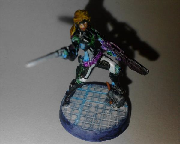
First of all - congratulations for making an entry. Unfortunately we will never know how many tried and failed.

Presentation:

1. Lighting Your entry needs to be much better lit. The top half is in shadow, and worse still, being a dark palette, blends in with its own shadow on the background.
2. Layout The focus seems to have locked onto the better lit base and legs, drawing attention there (presumably unintentionally) and resulting in a loss of focus on the head and torso. Additionally, the viewpoint of the model has left the sword completely out of focus. With only a single viewpoint, the focus and previously mentioned lighting issues are not compensated for.
3. Magnification The high magnification gives us a good view of the legs and base, barely compensates for the unfocused head and torso and can't save the unfocused sword.
4. Orientation Any negative to using a landscape orientation is dwarfed by the above issues.

Painting:

1. Palette A dark, subdued palette makes for a challenging starting point (especially when it includes black and coupled with the aforementioned lighting issues), but some lighter (if still subdued/pastel/matt) colours add interest (although the white is another challenging proposition).
2. Neatness & Coverage What I can see appears to be mostly neatly painted (not including the base - see later)
3. Highlighting & Shading Black and white appears flat, without shading or highlights. Blue, green, yellow and purple appears at least washed, but again without highlights.
4. Details Eyes appear pupil-less. Small details do not appear to have been picked out, most noticeably the buckle and other belt details as these are central, lighter and in focus.
5. Base The base is the poorest aspect of the model, showing coverage issues (and perhaps splashing a little onto the left foot). It needs to be brought up to the same level as the rest of the model. It is not helped by the presentation - which draws attention to it for being large, light and in focus.

Conclusion
Improving the presentation will go a long way to improving your results and also the quality of your feedback. Try to ensure the quality is consistent across the whole model (in this case, the base). Highlights and perhaps lighter and less challenging colours would be a good next step, followed by trying to pick out some of the smaller details.

41st - Entrant #6. Sin-Eater Observant. Nomad Faction. By The CF 0% [3]
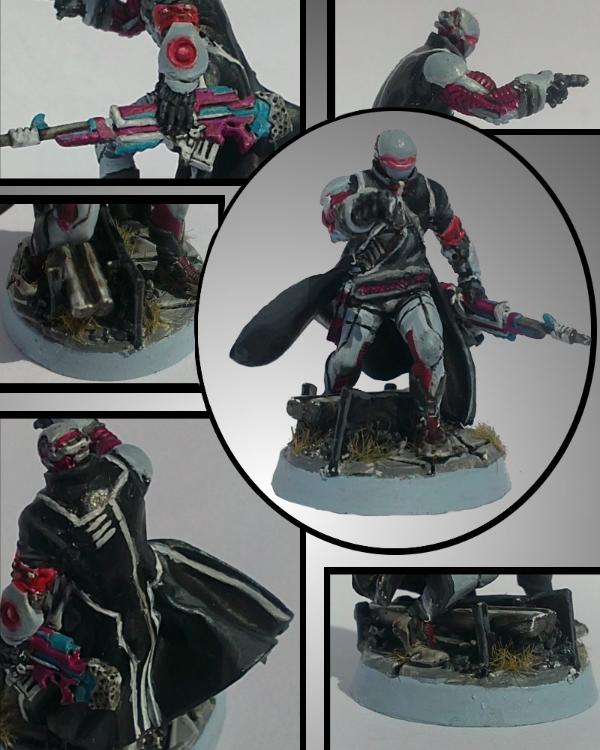

Presentation:

1. Lighting Like most, could be slightly better lit, but otherwise acceptable - I can see what I need to.
2. Layout A great selection of viewpoints and details. May have benefited from a slightly lighter background ie a bit further removed from the grey of the model.
3. Magnification Good sizing - I can see everything clearly.
4. Orientation Perfect.

Painting:

1. Palette A darkish, subdued, challenging palette (black and grey with a red spot colour) with an interesting addition of pastel purple and blue on the gun.
2. Neatness & Coverage Block colours are solid, though appear a little too thick in some places - the gun and the grey above the hand holding it most noticeably. Neatness needs the most improving however , particularly the red on the visor eye slit (or, if this was an OSL attempt, it needs to have a much less defined edge to it), the white lines on the cloak (which spill over onto the black), the grey shoulder pad and the base edge where it meets the top.
3. Highlighting & Shading The highlighting appears to be very thick - it would benefit from being thinner and using more graduations in colour. The black in particular looks too flat for the most part, and where it has been highlighted, it has been done too heavily. Other items, like the gun and helmet, don't look highlighted at all.
4. Details Details appear to have been picked out and some simple camouflage applied to the legs.
5. Base Acceptable. Matches the model, including its highlights and flaws.

Conclusion
Personally I think your entry should have done a bit better just on the presentation alone. I imagine the model looks great at normal tabletop size though, where the above issues are less glaring.

36th - Entrant #14. Cassandra Kusanagi. By [SO]Rice 0% [ 5 ]
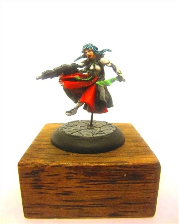
First of the group at 36th - just going in entry order

Presentation:

1. Lighting It is a little difficult to tell as I think the background has been touched up. Gun details are hidden in shadow. Left and right extremes look almost a little washed out.
2. Layout Blank space and pedestal add nothing to the presentation.
3. Magnification Good, potentially a bit on the small side.
4. Orientation No impact.

Painting:

1. Palette Brighter, primary colours have a positive impact. Black and white make things more challenging.
2. Neatness & Coverage I can't quite tell from the photo whether the eyes and mouth need better control. Otherwise, everything seems quite neat.
3. Highlighting & Shading The skin looks as good as the photo will allow. The hair may be slightly over highlighted - or just in relation to the rest of the model. The sword looks possibly a bit thick - but this is where a closeup or another viewpoint would be helpful (and better show off the pattern). The black isn't helped by the lighting or viewpoint. The white simply doesn't look smooth. Red and green look great - the red could probably uses some more highlighting - but not to the level of the sword or hair. Probably the biggest issue is consistency - each colour appears to have been highlighted in a different fashion.
4. Details Difficult to adequately make out for comment due to presentation.
5. Base Simple and adequate.

Conclusion
I suspect this is mostly let down by presentation and looks a lot better in person.

36th - Entrant #21. Morlock. Nomad Faction. By Morathi's Darkest Sin 0% [ 5 ]
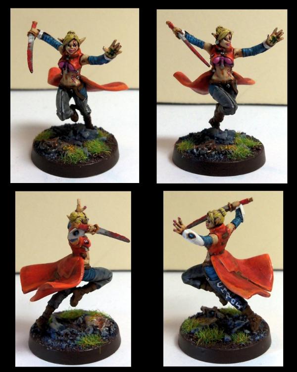
The other female skin model

Presentation:

1. Lighting Possibly could use more light - especially the top two pictures - predominantly to areas that are dulled by shadow, like around the legs and boots. Although this is offset a bit by the four photos.
2. Layout Good presentation - I can see all aspects of the miniature. A close up of the tattoos and writing may have helped and drawn attention to them.
3. Magnification Perfect.
4. Orientation Perfect.

Painting:

1. Palette Colourful, vibrant, primary colours. White and grey add a bit of challenge.
2. Neatness & Coverage Painting looks neat.
3. Highlighting & Shading Looks like probably a little too much reliance on washes, which may have pooled a little too heavily without enough highlighting (or done on top of the highlighting) resulting in a dirtying down of the otherwise vibrant colour choices - mostly on the clothing. Combined with the less than ideal lighting, it is probably bringing the whole tone down a bit too much. The skin looks quite good. White appears plain and is a bit of a let down.
4. Details Eyes and mouth look good. Tattoos and writing perhaps a little heavy handed - closeups would have been helpful here, and would have helped draw attention to them.
5. Base The base looks good.

Conclusion
I'm surprised this one didn't do a little better as well.

36th - Entrant #26. Hexas Sniper. Pan Oceanic Faction. By Marmaduke 0% [ 5 ]
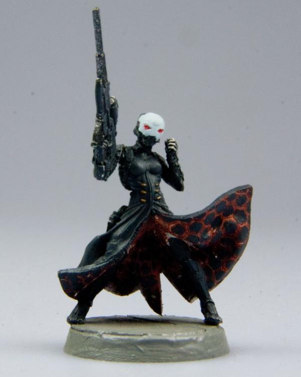

Presentation:

1. Lighting Could use more light under the cloak, otherwise fine.
2. Layout Does not show off the gun or hand, and we can only assume nothing interesting behind.
3. Magnification The higher magnification is probably more detrimental than beneficial.
4. Orientation Low impact.

Painting:

1. Palette Dark, mostly black palette with red and white spot colours.
2. Neatness & Coverage The white face mask and red eyes, being the face and lighter in colour, are the main focus of the miniature and unfortunately let this entry down. They could be improved with more attention to neatness, coverage and highlighting. Similarly, the cloak underside pattern is the next attention grabber and also lets this entry down, looking dirty or messy rather than the glow or OSL that I suspect was the intention. You probably need to build that up in neater, finer layers. Is that missed white under there?
3. Highlighting & Shading Black, although difficult, actually looks quite nice on the front of the cloak, and I would say is the miniature's best feature - which is a pity as, being darker, it has trouble drawing my attention away from the lighter, less well implemented areas.
4. Details Details are picked out, though most are not visible from the one viewpoint - especially the gun and hand details.
5. Base The base is not only plain, but appears to have been painted very thickly.

36th - Entrant #29. Myrmidon Spitfire. By Kanluwen 0% [ 5 ]
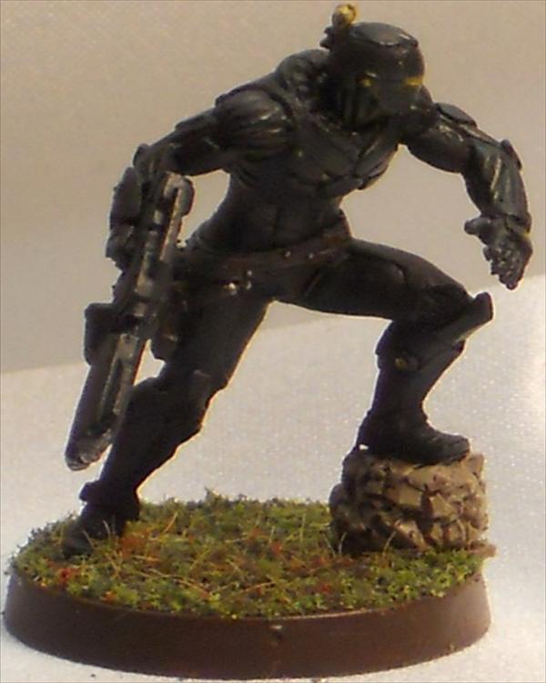
One of the two entries I managed to guess correctly (though only because I recently stumbled upon your blog).

Presentation:

1. Lighting Not enough light, especially for a dark, predominantly black paint job - the black is lost in the dull light and more so in the shadows.
2. Layout None.
3. Magnification Too big!
4. Orientation No impact.

Painting:

1. Palette If you are going for some dark spec op trooper who blends into the shadows - awesome. It is just completely at odds with a painting competition - unless black is a specialty of yours. The dark, black palette is both challenging and not helped by lighting issues.
2. Neatness & Coverage What I can make out looks fine.
3. Highlighting & Shading The black is simply too flat - and not helped by the lighting. If there is any differentiation between the cloth, armour and other accoutrements, it is not obvious. The gun looks like it might be a dark metallic as well. The eyes could be brighter, even OSL, to compensate.
4. Details It looks ilk some details have been picked out, but again, very subdued and at the mercy of the lighting and single viewpoint.
5. Base The base looks good though.

Conclusion
I'm starting to see another common thread here - your (anyone's) army scheme probably isn't going to cut it for a painting competition...

36th - Entrant #31. Haqqislam Janissaire. By Von Skyfury 0% [ 5 ]
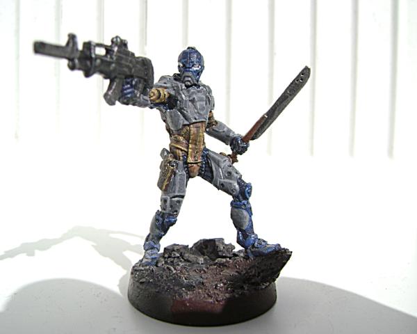

Presentation:

1. Lighting Good lighting, possibly almost a little washed out. Watch those photographer shadows!
2. Layout Single viewpoint has left the gun out of focus.
3. Magnification Would probably benefit from being smaller (and more viewpoints)
4. Orientation Landscape is probably benefiting your entry as per magnification above.

Painting:

1. Palette Three main colours, and on the bland side.
2. Neatness & Coverage The painting looks neat - at least as far as the colour boundaries go.
3. Highlighting & Shading The highlighting is thick - especially on greys. The yellows look dirty. Overall, the effect appears dirty, almost messy.
4. Detail Details do not appear to have been picked out.
5. Base The base is fine.

Conclusion
I would have expected this to do a little better - but I have a thing for presentation

33rd - Entrant #1. Ariadna Tank Hunter. By Deadgaurd 0% [ 7 ]
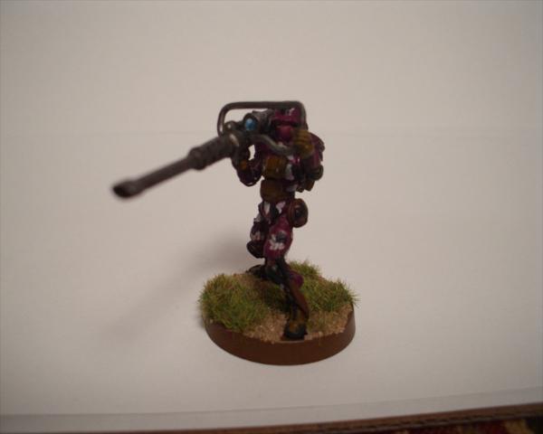

Presentation:

1. Lighting Not enough light makes seeing the paint job hard - especially with a dark palette.
2. Layout The single viewpoint has resulted in focus issues - the focus appears to be on the lower legs and base meaning the torso and head are slightly out of focus. Additionally, the auto cannon barrel is extremely out of focus. Extra empty space serves no benefit.
3. Magnification Perfect (could just use more viewpoints)
4. Orientation No impact.

Painting:

1. Palette A dark palette is challenging, doubly so for the poorly lit photo.
2. Neatness & Coverage From what I can make out, the paint job looks neat.
3. Highlighting & Shading The sight gem and black and white camouflage appear a bit thick. It is hard to make out the colours or any highlighting or shading.
4. Detail Sight gem, some camouflage on the legs. Anything else can't really be made out.
5. Base The base looks good.

33rd - Entrant #4. Knight of Montesa. By CaptainJack 0% [ 7 ]
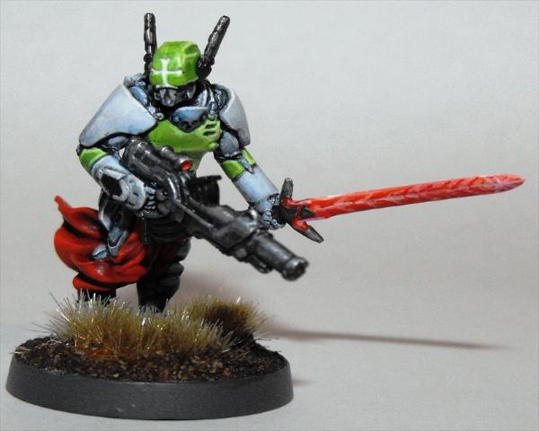

Presentation:

1. Lighting Lighting is okay, but a third of the model is in shadow.
2. Layout Limited to a single view point.
3. Magnification Would probably benefit from less magnification.
4. Orientation Low impact.

Painting:

1. Palette Three bright primary colours are a positive to grab attention.
2. Neatness & Coverage Generally good except for the sword pattern - the brush strokes are too visible, cheapening the effect - though this may simply be a by product of the magnification. A wash may have helped too.
3. Highlighting & Shading The highlighting looks neat, though it could probably use more layers. The white cross visor is too clean - where the rest of the mini appears to be black lined.
4. Detail Minimal details have been picked out - like the gun sight.
5. Base The base looks good.

33rd - Entrant #42. Naffatun, Haqqislam Faction. By Pointblank 0% [ 7 ]
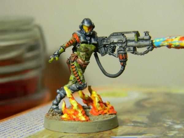

Presentation:

1. Lighting Almost perfect - the right side of the head is in shadow.
2. Layout The image is missing the rest of the flame to the right, whilst unused space exists to the left.
3. Magnification The model would probably benefit from less magnification.
4. Orientation Landscape orientation suits the model.

Painting:

1. Palette Three primary colours plus spot colours, and relatively vibrant are all pluses for drawing attention. Grey is challenging.
2. Neatness & Coverage Neatness is lacking (especially the orange on the uniform and gun). The flames and the main green uniform appear messy (I expect that was meant to be camouflage). Coverage around the base edge could be better.
3. Highlighting & Shading Highlighting is thick (especially on the dark grey of the helmet and uniform, and also one the base flames - though noticeably less so on the gun) The grey of the gun is probably the best feature (a hard colour to do - so well done!)
4. Detail Some details have been picked out, but nothing too fancy.
5. Base Base is interesting due to flames.

Conclusion
This was a late entry due to a stuff up, so potentially may have done slightly better.

32nd - Entrant #19. Haaislam Hassassin Fiday. By Fafnir 1% [ 9 ]


Presentation:

1. Lighting Would benefit from being slightly better lit.
2. Layout Some shadowing due to single viewpoint.
3. Magnification Too large - it is highlighting a dirtiness to the painting - caused by either washes or not quite enough coverage - both of which are probably not visible in real life.
4. Orientation Suits the model, though adding to magnification issues above.

Painting:

1. Palette A dark palette, quite matt, dirty in areas (especially bone) - as mentioned above, is probably just the sizing.
2. Neatness & Coverage Neat, though you didn't paint the uniform lines (I thought it was a mold line until I checked the official model!) As mentioned previously, the dirtiness could be coverage issues.
3. Highlighting & Shading The model is very matt and would benefit from more highlighting. The gun appears to be the best part.
4. Detail No details appear to have been picked out.
5. Base The base is lovely - too some extent it shows up the model - being bright and clean.

Conclusion
I imagine this looks better in person at its natural size.

28th - Entrant #5. Myrmidon Officer. By Mechanicum Jon 1% [ 10 ]
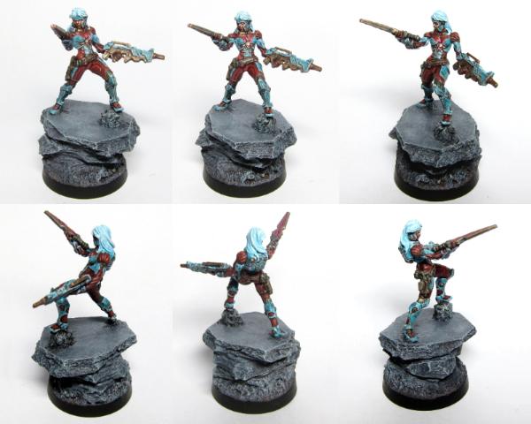
The other entrant I guessed right - who could mistake a certain Dark Eldar colour scheme and basing?

Presentation:

1. Lighting Photos appear well lit.
2. Layout Your presentation suffers from too many viewpoints of the entire model, which reduces the space allocated to each image, which is then further reduced by the massive base! With out any extra detailing on the base, I only really needed to see it once. I think this would have really presented better as two to four large viewpoints in portrait (with only one showing the complete base) - perhaps with close ups of any particular details you wished to highlight.
3. Magnification Too small due to layout issues above! Only the cleanest, most well defined areas are remotely assessable, and any subtle colour differences are lost.
4. Orientation Impact overridden by layout/magnification issues.

Painting:
Unfortunately, any critique of your painting is heavily filtered by your presentation - it is too hard to determine how well painted the model is.

1. Palette A mixture of bright and darker, contrasting colours should have worked well, though the layout and corresponding magnification issues nudge this towards a less interesting two tone scheme. Spot colours are mostly lost at this magnification.
2. Neatness & Coverage Hard to tell due to magnification, but looks good where visible - mainly the hair.
3. Highlighting & Shading The hair and some of the blue highlighting stand out, even at this size, but the red is too subdued.
4. Detail Can't tell, borders on a mess.
5. Base Large and plain.

Conclusion
It certainly looks like your entry could be really nice, and I think with improved presentation would have gone a *lot* further.

28th - Entrant #24. Custodier. Nomads Faction. By Dancingronin 1% [ 10 ]
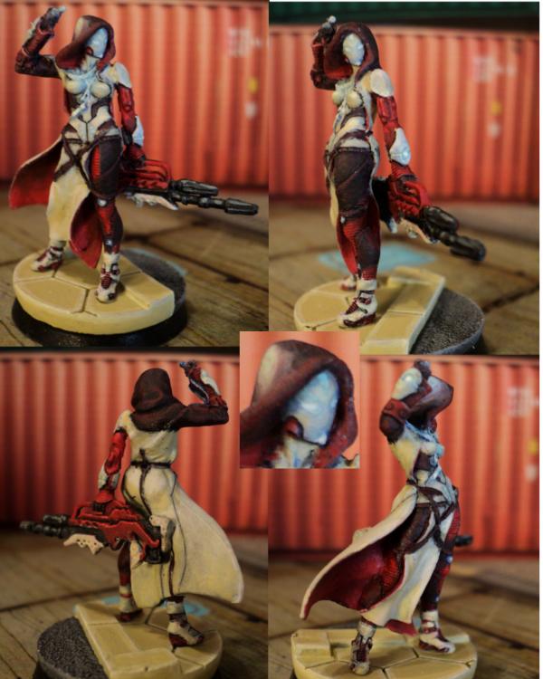

Presentation:

1. Lighting Could be a bit better lit, but not a major issue.
2. Layout All aspects of the model can be easily inspected.
3. Magnification Model size is good.
4. Orientation Perfect.

Painting:

1. Palette Nice contrasting colours. Though subdued, this had the potential to come out very nicely. A different shade for the base or cloak would have provided more contrast - perhaps white?
2. Neatness & Coverage Neatness, thickness and coverage come to mind first for improvement.
3. Highlighting & Shading From there, it is still a little bland and could use more highlighting and shading.
4. DetailsSome nice glowing details add a bit of flair.
5. Base The base actually appears to be painted to a higher standard than the model.

28th - Entrant #34. Wu Ming. Yu Jing Faction. By Perkustin 1% [ 10 ]
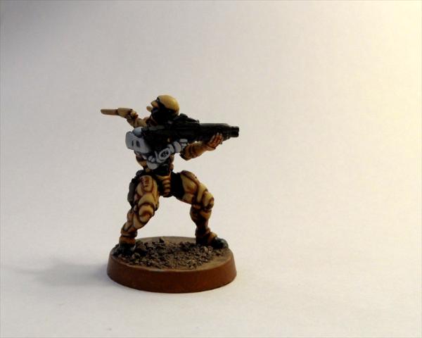

Presentation:

1. Lighting Poor lighting means a darker picture with a harder to see paint job - especially the black gun and shadows around it.
2. Layout One viewpoint if often a negative, but I don't feel I am missing out on much here.
3. Magnification Perfect.
4. Orientation No impact.

Painting:

1. Palette SImple three colour palette is a bit on the boring side. Colours are light but not vibrant. No spot colours visible.
2. Neatness & Coverage Painting looks neat.
3. Highlighting & Shading Colours appear blocked in, with minimal shading and no highlighting. Can not make any judgement on the gun or face due to lighting, shadows and dark coloration.
4. Detail No details appear to have ben picked out.
5. Base The base is nothing special - minimal.

28th - Entrant #41. Sun Tze. MK1. Conversion. By InfinityDude 1% [ 10 ]
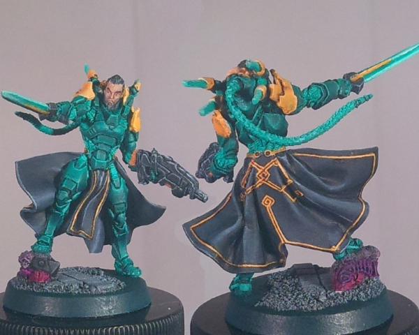

Presentation:

1. Lighting Lighting appears fine.
2. Layout Good - I can see most aspects of the model.
3. Magnification Perfect.
4. Orientation Works for the chosen layout.

Painting:

1. Palette Two lighter colours (yellow and turquoise/green) contrast nicely with black - though aren't particularly vibrant, keeping the palette mostly subdued. There is too much green/turquoise however, turning this into almost a single colour scheme.
2. Neatness & Coverage Mostly neat, clean and well covered. The yellow trim on the cloak looks good, although the yellow on the back of the shoulders and sword look a bit patchy.
3. Highlighting & Shading Nice work on the black and turquoise/green. Skin looks a bit flat in comparison.
4. Detail I see pupils and eyebrows and the cloak trim has been picked out.
5. Base Simple but adequate.

Conclusion
This is a hard one to pin down - it is nicely painted, and yet, just doesn't come across as well as the individual aspects would suggest. Mostly, I suspect, from the predominant single colour.

26th - Entrant #18. Achilles. By kavika0311 1% [ 13 ]


Presentation:

1. Lighting Needs better lighting, especially so as to not have the base cast shadows over the model.
2. Layout The secondary images are too small and too similar to the main image to really achieve anything other than effectively leaving all of the hard work to the main image. The viewpoint of the main image does not do the model justice - being obscured and in the shadow of the base and only presenting a narrow frontage in focus. There is very little special about the base, so it only needs to be included in its entirety once - if completely at all.
3. Magnification Main image could have been a bit larger, ignoring the base. Secondary images are too small.
4. Orientation

Painting:

1. Palette Colour choice, while limited, contrasts bright with dark and seems well suited to the technological nature of the model.
2. Neatness & Coverage Painting looks nicely done from what the photograph allows to be seen.
3. Highlighting & Shading Blues look good. Black and white is harder to tell.
4. Detail OSL appears to have been over done and appears to be the best place to target for improvement.
5. Base Overly large, appears unfinished and too plain against the model.

Conclusion
Presentation let you down the most - additional left and right side images would have added a lot. After that, overdoing the OSL. Adding some small details to the base (perhaps some small patches of static grass) would probably have lifted the base presentation immensely as well.

26th - Entrant #33. Haqqislam Janissaire. By Pacific 1% [ 13 ]
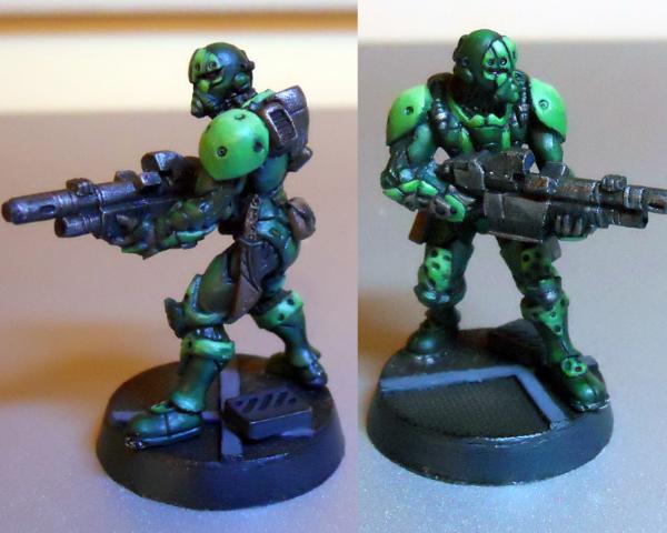

Presentation:

1. Lighting Picture could have been better lit, but a minor point.
2. Layout Good. I can see most aspects of the model.
3. Magnification Good.
4. Orientation Suits layout.

Painting:

1. Palette A dark pallet (dark green and black/metal) with some lighter green contrast come across subdued, realistic - but not vibrant. Very green and perhaps less interesting because of it. No contrasting spot colour.
2. Neatness & Coverage Nice clean and neat green paint job.
3. Highlighting & Shading Looks like mainly washes and could use more visible highlights.
4. Detail If details have been picked out, they don't stand out.
5. Base Simple and effective.

Conclusion
A very nicely painted model that I suspect looks awesome on the table top - just the ticket for not being singled out as a target in game. Just not vibrant or colourful enough for a painting competition.

25th - Entrant #32. Ninja. Yu Jing Faction. By Aosol 1% [ 16 ]
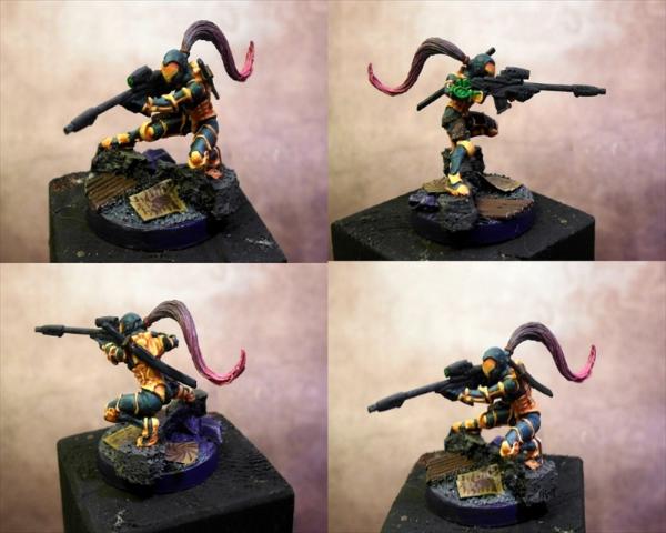

Presentation:

1. Lighting Needs better lighting - only the bottom left image seems to be adequate.
2. Layout Top left and bottom right images are too close in viewpoint to be both needed. As will be mentioned next, there is a magnification issue. Possibly dropping this to three images in portrait orientation (one above the other) may have been a better layout given the width of the model.
3. Magnification Too small. The model really needs to take up more of the space in each quarter.
4. Orientation Given the model and the chosen layout, I can understand the choice, but it isn't helping the magnification issue.

Painting:

1. Palette Two bright primary contrasting colours, alternated, make for a striking combination. Additional spot colours add interest, although the green (that is green right?) looks bait out of place.
2. Neatness & Coverage Painting looks neat and clean.
3. Highlighting & Shading Shading appears to have been done mainly through washes and could use additional highlighting, especially the hair.
4. DetailCan't make out any details that have been picked out.
5. Base Base looks fine.

Conclusion
Another entry that may have done a lot better with better presentation, specifically more magnification.

24th - Entrant #36. Haqqislam Hassassin Fiday. By Aurelia 1% [ 19 ]
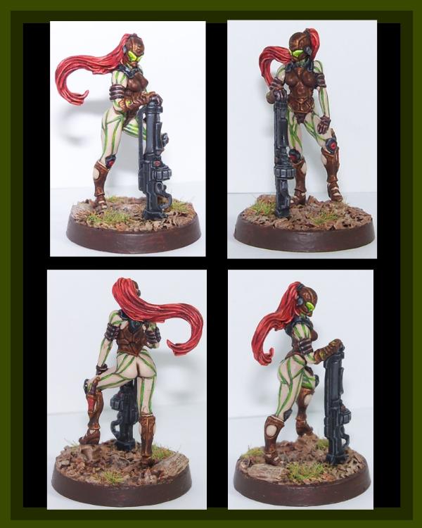

Presentation:

1. Lighting Good.
2. Layout Good. Top left and bottom right right side viewpoints are very close. There is no left side viewpoint.
3. Magnification Perfect.
4. Orientation Perfect.

Painting:

1. Palette An "interesting" palette choice. Light, vibrant colours contrasted with darker metallics make for a good eye catching combination though.
2. Neatness & Coverage Generally neat and tidy, although the green looks a touch messy.
3. Highlighting & Shading Cream is very plain. Hair could use more contrast - darker shading and lighter highlights. The brown/bronze loos good and the gun looks great.
4. Detail Some small details have been picked out.
5. Base The base looks great. Out does the model by a whisker.

Conclusion
Another entry that is hard to pin down why it doesn't quite feel right - I'm going to settle on the combination of interesting palette choice and combination of techniques and level of implementation...

22nd - Entrant #2. Nomad Prowler. By SilverMK2 1% [ 23 ]
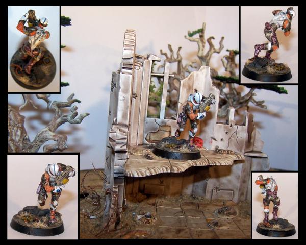

The entry I mistakenly guessed as heartserenade's - which is either a great compliment for you, or a severe under estimation of heartserenade by me. Or just misplaced hope on my part…

Presentation:

1. Lighting Generally good. Top images could use more.
2. Layout Not enough focus on the model! Scenery is nice, but it's not what we are being judged on (well, shouldn't be….)
3. Magnification Too small! While probably the most accurate presentation of how the model appears in real life, there is no way we can judge the finer details of your paining - which, if I believe you, is a good thing If the paint job is excellent - it would have placed higher with larger images. If the paint job is amateur - it would have placed lower with larger images. The double edged sword.
4. Orientation Superfluous due to issues with layout and magnification.

Painting:

1. Palette The palette is bright and eye catching.
2. Neatness & Coverage The colours look neat and solid.
3. Highlighting & Shading Can't comment due to size.
4. Detail Details appear to have been picked out.
5. Base The base looks lovely.

Conclusion
Certainly a nicely presented entry, even if I can't see the model in all it's glory

22nd - Entrant #38. Aleph Marat. By Absolutionis 1% [ 23 ]
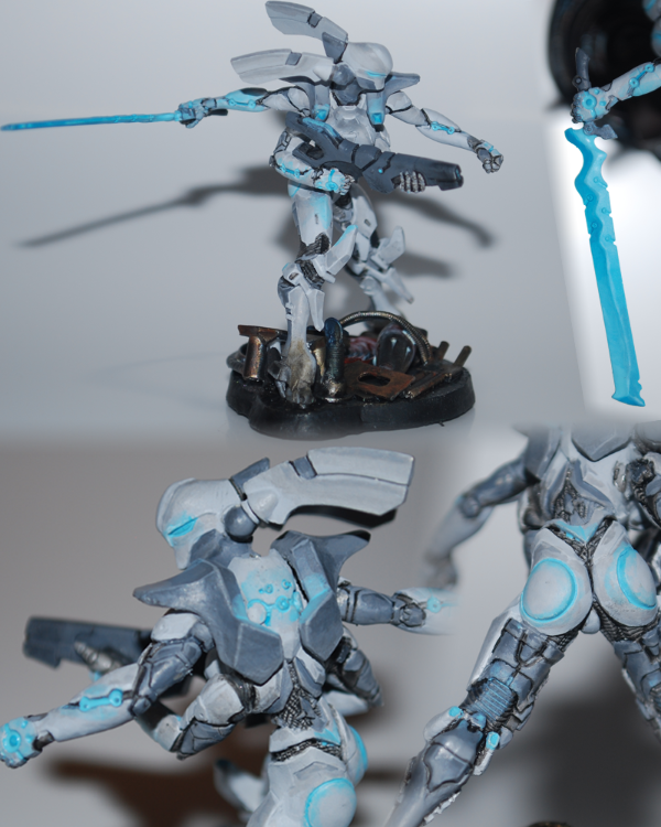

The entry I mistakenly guessed as endtransmission's. Can you blame me? It's the best represented Aleph miniature in the competition

Presentation:

1. Lighting Could use better lighting, but that's a common theme now...
2. Layout Good. Possibly a case where a darker background may have suited.
3. Magnification Good. Perhaps too large in some cases - it really highlights the issues with the OSL.
4. Orientation Perfect.

Painting:

1. Palette Subdued, but technological feeling palette seems appropriate. May have attracted more attention with some clean whites. The OSL blue may have been more striking if it wasn't in the same tone as the greys.
2. Neatness & Coverage Appears neat.
3. Highlighting & Shading Greys and whites are not easy, and this appears to have been done well - and on a larger model no less. However, the dark grey of the gun seems flat in comparison to the rest.
4. Detail The blue OSL is over done and messy. The colour is good, but the application is too heavy handed in places, and the OSL needs to be lightly feathered.
5. Base Acceptable.

Conclusion
A good entry spoilt by poorer OSL.

21st - Entrant #30. Hellcat, Nomads Faction. By adamoaduro 1% [ 24 ]
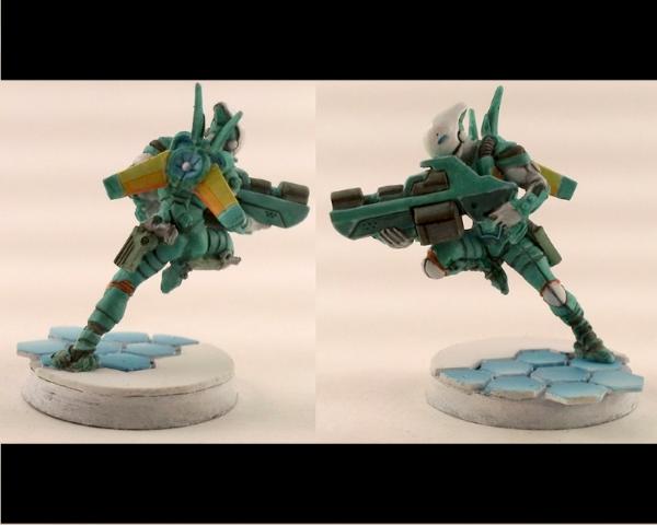

And now into the top half of the field…

Presentation:

1. Lighting Lighting could have been brighter, the model is suffering a little from its own shadows.
2. Layout Good.
3. Magnification Perfect.
4. Orientation Suits layout.

Painting:

1. Palette A very pastel palette, predominantly one colour with several spot colours, which combined don't provide much presence. I expect it could be improved with more variation in the main colour.
2. Neatness & Coverage Model itself appears neat and clean. The base is poorer - lack of neatness on the edges of the hexes and poor coverage on the base edge itself.
3. Highlighting & Shading Turquoise, black and yellow appear shaded and minimally highlighted. White is very plain.
4. Detail Minimal details appear to have been picked out.
5. Base Simple, suffering from neatness and coverage issues, not to the same high standard as the model.

20th - Entrant #10. Ninja (Sniper Conversion), Yu- Jing Faction By Sir Calvin 1% [ 25 ]
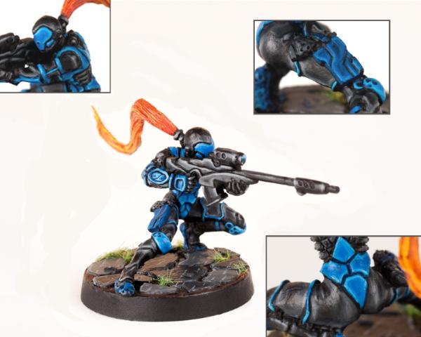

Presentation:

1. Lighting[/u Reasonable.]
2. [u]Layout
Good. I don't feel like I am missing any aspect of the model.
3. Magnification Perfect.
4. Orientation Low impact.

Painting:

1. Palette A simple two colour scheme, bright blue contrasted with black, with a spot colour for the hair. Colours alternate providing interest, but two colours is always going to be a challenge to make interesting.
2. Neatness & Coverage Very neat, no coverage issues.
3. Highlighting & Shading Black is hard and done well. Blue is also done well, but could perhaps use more levels of highlighting on the larger pieces. There is a bit of a mismatch between the hair and the rest of the model - it could probably use some deeper shadows.
4. Detail Detail does not appear to have been picked out.
5. Base The base is fine.

Conclusion
Nice model, nicely painted and presented in a simple bright, yet contrasted scheme.

19th - Entrant #23. Shang Ji. By Announcer 1% [ 26 ]
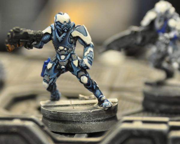

Presentation:

1. Lighting Good.
2. Layout The single viewpoint has resulted in the blurring of the gun.
3. Magnification Good. Perhaps on the large side.
4. Orientation Low impact.

Painting:

1. Palette Mostly two shades of blue and white make for a bright, technological feel that is quite striking. Spot colour of grey keeps the tone down - it may have benefited from a more vibrant spot colour.
2. Neatness & Coverage Painting generally looks neat, but the white is the let down - I can see a combination of paint too thick and brush strokes in some areas, while not enough coverage in others.
3. Highlighting & Shading The blues look good, though it could probably use some more highlighting. Gun can't be judged due to focus and angle. White appears flat (where not suffering from issues previously mentioned)
4. Detail Details appear to have been picked out, but all in the same colour (metallic?)
5. Base The details of the base can't really be seen, but what does appears adequate.

17th - Entrant #17. Shasvastii Noctifer. By EndTransmission 2% [ 28 ]
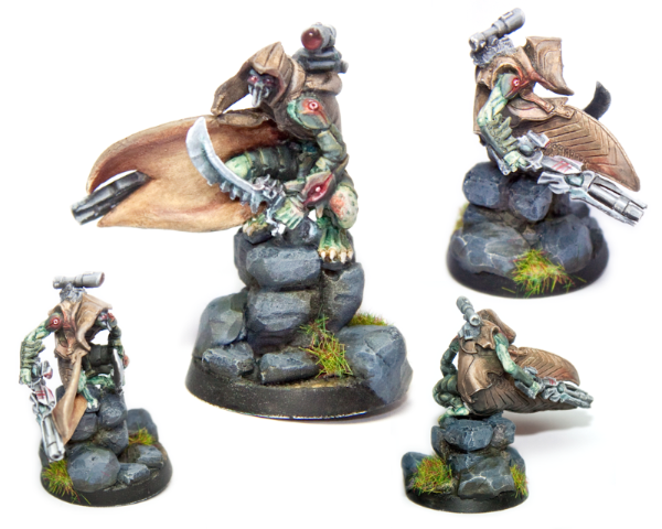

My good friend EndTransmission's entry, which I failed to guess due to his sneaky entry of a Combined Army model instead of an Aleph one. The NMM should have given it away…

Presentation:

1. Lighting Appears fine, although some areas of the model are in its own shadow.
2. Layout The main picture is good, the top right leaning towards too small and the final two aren't helping much at all - although they do look nice. Probably would have been better to have four same sized pictures in a portrait image. While the base is nice, it isn't the focus - only one image really needed to show it in its entirety, which would have given even more space to show off the miniature or add closeup shots of interesting elements - of which there are undoubtably a few here. Instead, the layout focuses on the less stellar aspects - the inside of the cloak (very plain), the rocks (plain again) and the sword.
3. Magnification Main image is good. Top right may be bordering on too small. Remaining are definitely too small.
4. Orientation Low impact.

Painting:

1. Palette Palette is a lovely combination of natural browns and greens with red as a spot colour.
2. Neatness & Coverage Generally neat and well covered.
3. Highlighting & Shading Love the greens, the claws and the mottling and the NMM on the gun and targeter. The greens suffer from the presentation - the main part being in shadow in the largest picture. I am not sure if the red is supposed to be fleshy or OSL - the piece on the knee looks too hard for OSL and out of place for fleshy. While the NMM on the sword is very nice (from what I can make out), it probably should have been done differently to the gun.
4. Detail Eyes and teeth(?) are picked out. Targeter gem looks good.
5. Base The grass on the base where it overhangs the edge looks a bit messy.

Conclusion
Painting is very nice, but requires the time to appreciate it and note its subtleties due to presentation issues - made harder by being number 17 in a list of 42 no doubt. All in all, my second prize for the entry which could have improved the most with better presentation.

And what did EndTransmission have to say about his own entry during the competition?

EndTransmission wrote:The image lacks the punch of a lot of the others due to being bleached out. I'm also not to keen on the brown cloak… it looks a bit grainy. Some nice osl and nmm though.


17th - Entrant #20. Ariadna Sniper. By MrMerlin 2% [ 28 ]
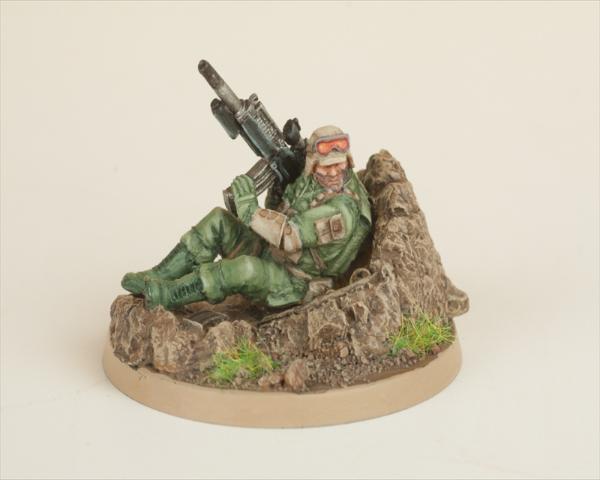

Ahhh… MrMerlin… almost seems fitting that you and EndTransmission, as first to do overall critiques, end up together in the rankings

Presentation:

1. Lighting A bit more light might help, but then the painting is already very pastel/washed out, so that may not have helped.
2. Layout Fine. I don't feel like I'm missing anything awesome on the other side of the model
3. Magnification Perfect.
4. Orientation No impact.

Painting:

1. Palette Limited and pastel palette makes for great realism, but doesn't draw attention to itself - I guess the object of a soldier in war, but not a painting competition entry… The funny thing here is that the gun appears to draw my attention, being the strongest visual element. I think a few more colours, even just variations on what you already have, would have gone a long way to help this stand out - using a different, perhaps darker brown for the clothing elements - to distinguish them from the base/dirt, perhaps black boots - though like the gun, this may just draw more attention away from the torso/face.
2. Neatness & Coverage Painting looks neat and tidy.
3. Highlighting & Shading Highlighting and shading all look good.
4. Detail No details appear to have been picked out.
5. Base The base is good in isolation, but, being in the same tone as the model, is competing for attention with it, rather than simply providing a backdrop or background to the model.

Conclusion
And what did MrMerlin have to say about his own entry during the competition?

MrMerlin wrote:Nicely painted, the googles look sweet! But its not really close to some of the other entrys....


16th - Entrant #27. Janissaire, Haqqislam Faction. By wisefaiz 2% [ 30 ]
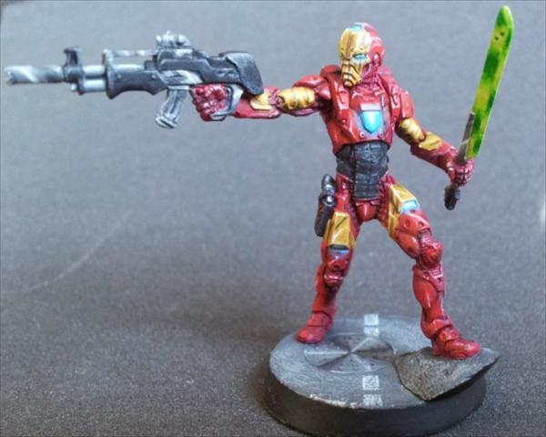

Iron Man huh?

Presentation:

1. Lighting Appears acceptable.
2. Layout Has lost some focus to the left of the gun, though not terribly so. Are there any interesting back details?
3. Magnification Good. May have looked better at slightly less magnification.
4. Orientation Low impact.

Painting:

1. Palette If the colour choice is good enough for Iron Man, it's good enough for me!
2. Neatness & Coverage Painting looks neat and tidy.
3. Highlighting & Shading The sword looks particularly nice. The yellows look good and worn. Black is hard, and yours looks over done (gun, sword handle - though this could just be the magnification) or underdone (stomach) - they need to be toned down/up to the level of the yellow. Similarly, the red is perhaps slightly on the underdone side - this may be an issue with just how much of the model is red. It would have paid to better accentuate all of the detail it is covering. The OSL looks a bit forced, but again, this could be the magnification.
4. Detail Some details are picked out.
5. Base The base is presentable.

Conclusion
One of those entries I suspect looks much better at its actual size.

15th - Entrant #25. Lizard TAG. Nomads Faction. By Cave_Dweller 2% [ 31 ]
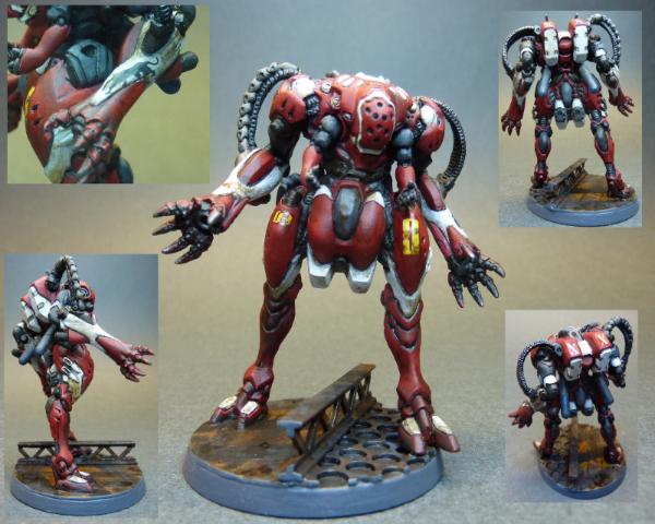

Our second large model as we make our way up the rankings.

Presentation:

1. Lighting Better lighting comment comes as standard - what we can see, a third of it is in it's own shadow.
2. Layout Three of your five images are not accomplishing much - being too small, especially on a model of this size. Like EndTransmission's work - there is some nice detail here, but you have to go looking for it, first impressions are just a big red thing… closeups of these details would have gone a long way. Even the one closeup you do have doesn't make it obvious what you are focusing on - it took me too long to see it - and in 42 entries, first impressions count.
3. Magnification
4. Orientation

Painting:

1. Palette Palette is simple, mostly one colour (red) and subdued - realistic perhaps, but not eye-catching - and not helped by insufficient lighting. Actually, from what I can make out of the back from the smaller images, the back looks a lot more interesting and varied.
2. Neatness & Coverage Painting looks neat and well covered.
3. Highlighting & Shading Any blending of the red or white is lost in the layout and is looking plain. What I can see of the blue/black blending looks excellent though - one of the best parts of the paint job.
4. Detail Details appear to have been picked out and added. The yellow details add interest and probably should have been highlighted with a closeup, as they look good. Whatever design is on the top at the back (white on red) probably could have used a close up too - I just can't make it out.
5. Base Base is fine.

14th - Entrant #22. Sun Tze. By FullyPainted 2% [ 37 ]
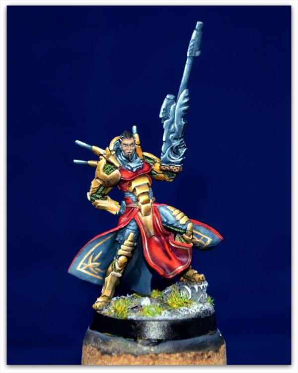

The votes start to disperse from here as we head into the top third…

Presentation:

1. Lighting Lighting appears fine.
2. Layout What is hidden behind?
3. Magnification Good. Probably would have benefited from less magnification.
4. Orientation Low impact.

Painting:

1. Palette Rich, bright colours.
2. Neatness & Coverage At this point in the rankings, neatness and coverage should be going without saying
3. Highlighting & Shading High (and good) use of NMM. The blue/black NMM may be just a bit overdone, especially in comparison to the superior yellow, off balancing the overall effect a touch. This could also just be a factor of the magnification - I imagine it looks a lot more impressive at its correct size. The skin just can't compare with the rest, which is a downside (alongside the eyes) for what should be the focal point of the model.
4. Detail Details appear to be picked out and freehand added to inside the cloak. Eyes look wrong - crazy staring?
5. Base The base, like most of the rest of the model, is lovely.

Conclusion
High (and good) use of NMM and freehand, rich colours, I would have expected this to do better. Two smaller images (back and front) would probably have hidden the few over done highlights and softened the freehand without obscuring any of the lush NMM. But mostly, I think the face needs to be brought up to the same standard as the rest of the model.

13th - Entrant #37. Senor Massacre. By Chemical cutthroat 2% [ 42 ]
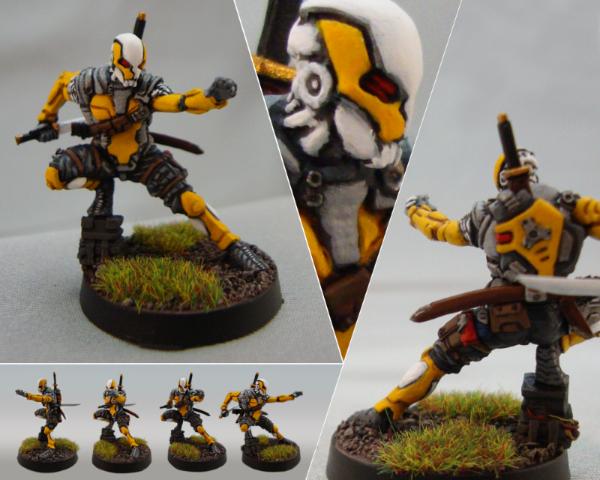

Presentation:

1. Lighting Left image could use better lighting.
2. Layout Layout is all over the shop here. The left image is great, if suffering from lighting issues. The right image is also good, although suffering from focus issues - it seems to be focussed more on the base. The bottom left image seems almost useless - it is just too small to be of any benefit. The middle image is a close up of - what exactly? As an extreme close up, all it appears to do is degrade the quality of the paint job.
3. Magnification Left and right images are perfect. Top image is too large. Bottom images are too small.
4. Orientation Low impact.

Painting:

1. Palette Bright, crisp colours make sure to grab attention.
2. Neatness & Coverage Paint job looks clean and neat (ignoring massive zoom in top middle image!) and striking - probably the reason it is up so high.
3. Highlighting & Shading Highlighting appears minimal though, it appears to be painted very neatly in block colours with just black lining for shading.
4. Detail Details appear picked out.
5. Base The base is fine.

Conclusion
Given the presentation, I'm a little surprised to see this so high. More colour variety makes up for this compared to earlier entries I suppose, and it doesn't hurt that the miniature looks awesome too

12th - Entrant #7. Nomad Hellcat, w/ HMG. By Metsuri 3% [ 47 ]
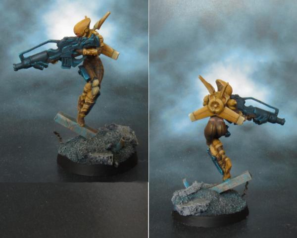

Presentation:

1. Lighting Left image requires more light, especially where the models creating shadow for itself.
2. Layout The background colour and less light in the left image is making the gun harder to see.
3. Magnification Perfect.
4. Orientation No impact.

Painting:

1. Palette Another simple, subdued, almost pastel palette, with little variation and no spot colours to provide interest. Some additional colours, and brighter ones, would have done this entry wonders.
2. Neatness & Coverage Given at this point.
3. Highlighting & Shading Blending and highlighting - what I can see - appears sublime.
4. Detail No details appear to have been picked out, adding to the lack of interest.
5. Base The base is also simple, but gorgeous.

11th - Entrant #35. Combined Army Skiavoros. By Inanimate 3% [ 50 ]
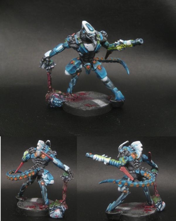

Presentation:

1. Lighting Lighting in the bottom two smaller pictures is better than the top picture, which is unfortunate, as it means the top picture doesn't pop out from the background as well - and suffers from casting a shadow on itself.
2. Layout It is hard to see how four images would have helped such a large miniature - as the bottom ones seem a bit small - possibly a back and front, as large or a bit larger than the main image with some highlighted features surrounding. Even the current image could have had highlighted features to the left and right of the main image. The dark background detracts further without proper lighting too.
3. Magnification Top image is good, may have benefited from being a bit larger. Bottom images are too small.
4. Orientation Perfect.

Painting:

1. Palette Bright, vibrant and colourful. A bit dulled by lighting in the top image.
2. Neatness & Coverage Yeah, I'm removing this from now on - it's a given!
3. Highlighting & Shading The painting, what I can see of it, is a high standard, with more defined and refined highlighting than we have seen previously - especially, well, pretty much everything except the white - which appears a bit flat - especially in the main larger image.
4. Detail There looks like there is some OSL - green and red from the gems - which would have appreciated a closer view - especially as the red looks a bit messy at this distance.
5. Base Does its job.

10th - Entrant #9. Jotum, Svalarhelma Mechanized Culrassler. By His Master's Voice 3% [ 56 ]
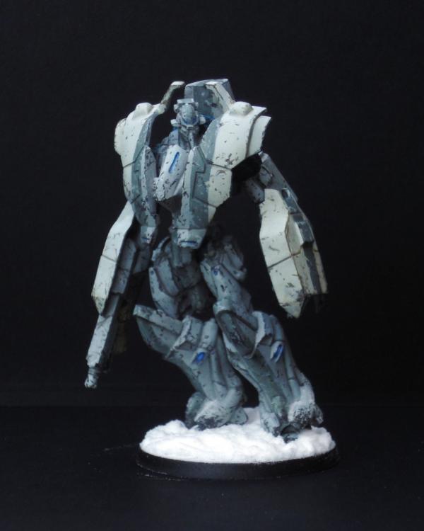

The top ten. Only a single vote separates this entry from my own, and I am under no illusion that, given a day or two more voting, our positions would probably have been reversed.

Presentation:

1. Lighting Possibly use a touch more lighting.
2. Layout The second last single viewpoint. One might argue the model size requires it. I don't expect a rear view - or even closeups - would add any more to this entry, possibly only detract. Although, the legs appear slightly out of focus.
3. Magnification Perfect.
4. Orientation Perfect.

Painting:

1. Palette A simple, light palette. Large weathered surfaces, clean lines with some blue spot elements - of the "realistically" painted miniatures in the competition, this is one of the best as the scheme, while not "popping", is not trying to hide either. But, I think that is still its reason for being in the top 10 and not the top 5 - it's the best of the plain models, but it is still - weathering aside - plain. Some markings, a bright spot colour (I think red would have gone nicely - perhaps in limited stripe markings), anything - may have lifted this even further.
3. Highlighting & Shading It's not obvious, but I expect it is not meant to be
4. Detail Details are not picked out - it's hard to be stealthy with brightly coloured bits.
5. Base Simple and adequate.

9th - Entrant #3. Ariadna Line Kazak. By Arakasi 3% [ 57 ]
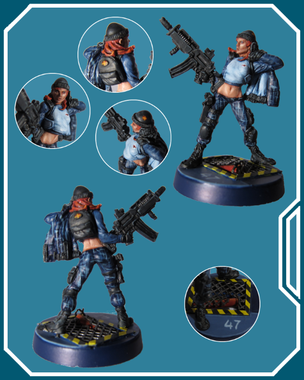

How did I get here? There have been some remarkable entries - and my entry isn't without it's own drawbacks - but thank you to everyone for putting me in the top 10!

Presentation:
Of course, presentation was the last step, but I've presented it first to match my other commentary

1. Lighting The photos were taken in a poor home made light box with not enough lights - after I couldn't find enough daylight without shadows - and with the Tungsten setting - which achieved the best result by far - but still no where near where I want to be - room for improvement there!

2. Layout My chosen miniature is very 2 dimensional - the front and back weren't adding much, except shadows - so a large left and right was chosen. I then had some space for the closeups - which allowed me to take some of the best of my other images and clip them to focus on particular aspects whilst ignoring (for the most part) shadows and unfocussed areas.

Rudimentary graphic skills (I'm a programmer, not a graphic artist!) were then applied to compose the images into the final result, adding a bit of futuristic border because it seemed like a good idea at the time. (Originally I was going to add the title and Ariadna symbol - but given the competition rules stated no text or logos - I thought better of it) I played around with some hologram designs too, but they just tended to get in the way - or at least, with my mediocre skills they did - and anyway, the focus should be on the miniature, not my mediocre graphic art skills…

3. Magnification I knew I wanted a large clear picture of my model, perhaps surrounded with some choice highlights, but it soon became apparent that, at full image size, my poor model was blown up at least by a magnitude of four, and, well, *every* defect was blatantly apparent. On the other hand, scaling it down to 4 images started hiding the detail of the paint job that I wanted to display.

4. Orientation I had already decided from the last Dakka Paint Competition that portrait was the way to go if at all possible!

Painting:

1. Palette I had an idea for my Ariadna that they would be an off world (off Dawn) team operating in the technological cities of the Human Sphere. Therefore I wanted a futuristic urban camouflage scheme, with futuristic city bases. I looked up camouflage and decided a digital camouflage pattern in blue/greys would be neat. Special forces appeared to use the camouflage for their clothing, with accoutrements, straps, guns etc in black - so that is what I went for. I constructed my bases, the models, undercoated and began the painting!

3. Highlighting & Shading
I've learnt to paint inside out, so the skin was up first - which I was particularly worried about as I haven't done human skin in a long time. What I *should* have done first was the eyes… However, I am very happy with how the skin turned out and consider it the best feature of my entry.

When it came to doing the camouflage, I figured a criss cross of the colours would build up to the digital pattern I was looking for. It looked good on my first model (not the female Line Kazak) and so I applied it to the rest. Knowing the black straps, armour, boots and sidearms would cover any mess/obvious brushstrokes (apparently not 100% successful )

Once I got to the black, I started to see a problem… Black is hard. Lots of black is hard and boring. And my blue NDD (not digital digital) camouflage was too dark. Had I had the Infinity books then, I would have made the base camouflage lighter, and added the lighter and darker blue/greys in similar patterns to the artwork - which would have allowed me to highlight them. Instead, not only was the model darker than what I wanted *personally*, it was having trouble "popping" too. Oh, and the thing about good camouflage (as opposed to stylistic camouflage) - its aim is to break up edges and obscure things. Excellent - I had broken up and obscured my detailed Infinity model

Not one to back out, I continued as planned - but even at this early stage I realised two things - which would apply to any future scheme I devised, but also to painting competitions:

1) Real life is boring and hard to make "pop".
2) Infinity miniatures are not meant to be painted to obscure their details.

I thought the red hair turned out well, even if I had to touch it up after dropping it I was happy with my black, but it doesn't photo well.

I couldn't for the life of me get the light grey/blue of her shirt smooth.

4. Detail I ended up painting the Kazak and Ariadna symbols on her shirt, hat and backpack for some extra details.

5. Base
The border of the broken grate on the base was originally in the same light blue/grey colour, but I felt there was too much blue, too boring and changed it at the last minute to the hazards stripes. The fact there are three pipes including the burst one under that grate, each painted, is wasted on anyone who can't hold the miniature...

Conclusion
Although I had bought the Ariadna Starter Pack with the idea of painting all six up and submitting the best, I think I had already subconsciously picked the female Line Kazak and she currently remains my only completed Infinity miniature - though the other 5 are in various states of painting - mainly to the skin and camouflage stage. My focus was still on "finishing" (being notoriously slow/without much hobby time) - hence a basic trooper. I also didn't want any delays choosing a model and having to acquire it. I don't think my choice of model severely impacted my end placing either way, but I do think that next time I will be choosing something for the competition first and myself second, rather than the other way around. Where this really comes to the fore though, is in the painting - and more specifically, the colour scheme.

So, while I will continue my current Starter Pack in the same style, they will be the last. I will be creating a new style for my future Ariadnian forces - I think I will go for "undercover" clothing - bright, futuristic colours - meant to camouflage in the crowd, not the infrastructure, using a more stylised and lighter camouflage for just the weapons perhaps. For future competitions, I will not be looking to use my entry in an existing army or faction, but will paint something specifically chosen for the competition, in colours specifically chosen for the competition. Heartserenade watch out! If it is a different model line, I may need to paint a non entry one first to get a feel for the differences...

I submitted my entry with a week to spare. As it would turn out, I read the closing date wrong and actually submitted it with two weeks to spare - which need up a good thing because work and holiday preparation in that last week would have written off further work anyway.

I still need to finish the other five...

I'm happy to have achieved 9th. I felt I was doing better earlier on, but as time passed my entry continued to slowly move down the ladder - hence why, given another day or two, I think I would have fallen to tenth. I obviously still have a long way to go - but I think I have now proven to myself that I can spend more time and patience on my entry without concerning myself so much with the deadline (in addition to everything else in this post!) The size of this competition gives an entrant a much better perspective of where they are at - and where they need to be - than smaller ones - I'm especially glad to have participated.

Comments
MrMerlin wrote:Good job, lovely base. The skin is well done, but the pattern on the clotes looks too much like brushstrokes…


EndTransmission wrote:Awesome details with the tiny logos, but unlike MrMerlin, I like the patterning on the clothing as I've seen rain coats like it in London.


LeoPelo wrote:Good piece and base! But... push the lights more. Maybe some more lights (especially on rifle) could improve overall result! I like pattern on cloth.


Thanks for your comments guys. I didn't think the base would attract so much attention. I didn't want to over do the black, but I can see that was probably a mistake.

8th - Entrant #11. Al Hawwa. By grenzmord 4% [ 71 ]
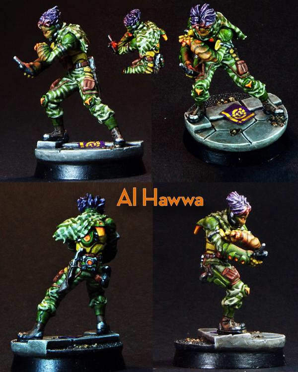

As we approach the top five, the votes continue to diverge and my ability to make meaningful comments decreases

Presentation:

1. Lighting Slightly better lighting may have offset the dark background better.
2. Layout Good. I can pretty much see everything I need to see. A light background may have worked better here - the miniature is colourful, but not *that* bright.
3. Magnification Perfect.
4. Orientation Perfect.

Painting:

1. Palette The palette is colourful, and if anything, is just not to my personal taste.
3. Highlighting & Shading The green is very nicely done, the white a bit heavy in areas I think, and a bit plain, but it's hard to find flaws past that.
4. Detail Eys, details, OSL - its all here.
5. Base Good.

Conclusion
Should this entry be above mine? Probably. Should it be this high? Well, apparently

7th - Entrant #39. 3d Highlander Greys. HMG. By HeavyBolter 5% [ 82 ]
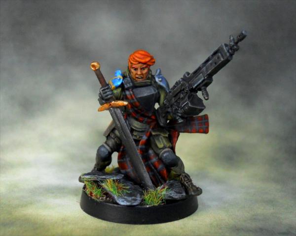

I voted for, with the able assistance of my wife, four entries (including my own of course!). This was one of them.

Presentation:

1. Lighting Better lighting may have helped.
2. Layout The last of the large single viewpoint entries - though not so large as to highlight mistakes - assuming there are any of course. Some closeups at least would have been beneficial. Those colourful shoulder pads mock us as we strive to determine what secrets await there. A lighter background may have helped.
3. Magnification Perfect.
4. Orientation No impact.

Painting:

1. Palette The best (and last) of the "realistic" entries, it "pops" with realism, not colour - except maybe the hair
3. Highlighting & Shading Eyes, mouth, skin, tartan, blacks, greens - it is all sublime - only the sword doesn't seem to quite match the same level of detail - and of course the shoulder pads are only hinted at whilst who knows what secrets the back might reveal.
4. Detail What details we can see have been picked out and added to (shoulder pads, tartan)
5. Base Good.

6th - Entrant #13. Yuan Yuan. By Nachtpfiffel 6% [ 103 ]
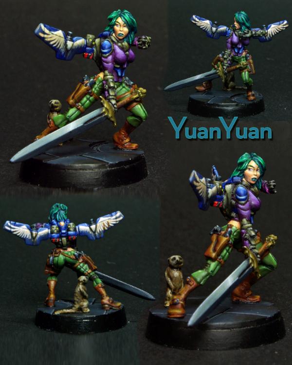

Presentation:

1. Lighting The bottom images appear better lit, so the top images could use more light.
2. Layout The layout may have suffered from trying to fit four images in - certainly the size of the smaller images doesn't add much, and the bottom left may have been a better one to have larger - if only for the wings, and perhaps the butt too I think a lighter background and/or better lighting may have lifted this further. Close ups of some of the details would have helped.
3. Magnification Top left and bottom right images are perfect. Other two are too small.
4. Orientation Perfect.

Painting:

1. Palette Multicoloured! Perhaps a few too many main colours.
3. Highlighting & Shading There are certainly a lot of nice things about this entry, as one would expect of an entry making it this far, but particularly the face, hair and jump pack are very well done. The greens, browns and blues are all nicely done, though the purple is an odd choice and I think just takes things a tad too far. Apart from the colour, the clothing is rather plain - the problem with not being able to paint to this level is that I can't put my finger on what my issue is…
4. Detail Details have been picked out and freehand design added.
5. Base Simple yet adequate.

5th - Entrant #28. Obiwaban. Yu Jing Faction. By junex 7% [ 126 ]
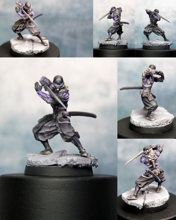

Welcome to the top 5… where my comments lose any meaning they had left...

Presentation:

1. Lighting Looks good.
2. Layout Some of the smaller images are not really helpful, but otherwise, not much to whinge about here.
3. Magnification Large image, perfect. Medium images, good. Small images - too small.
4. Orientation Perfect.

Painting:

1. Palette If anything, the palete suffers from being matt, but that requires a lot of pickiness on my part.
3. Highlighting & Shading Black and grey is hard - but you wouldn't believe so looking at this. The highlighting of the purple in the smaller images also looks superb.
4. Detail Small details appear to have been picked out.
5. Base Simple and adequate.

Conclusion
Basically, this is above my ability to improve really. I suspect this will become an ongoing theme now that we are in the top 5...

4th - Entrant #12. Speculo Killer, Combined Army Faction. By zoddozoddo 8% [ 133 ]
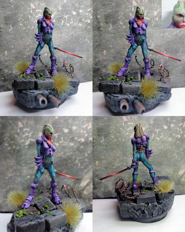

Presentation:

1. Lighting The top two images appear sightly darker and therefore could use better lighting.
2. Layout The entry suffers from the model in the images being too small. The model appears tall and thin - which doesn't help, but then neither does the size of the base. There is minimal difference between the viewpoints of the top two images. I would almost suggest using three images side by side in landscape just to get the size needed to fully appreciate the subtle work done here. A large front and back (bottom two images) with some more closeups on specific details may have worked better too… The large base, as gorgeous as it is, probably only needs to be shown in its entirety once.
3. Magnification Model itself is not displayed large enough. See above.
4. Orientation Perfect.

Painting:

1. Palette A pastel, unusual palette would seem a bit risky, but here we are. It doesn't do much for me.
3. Highlighting & Shading The subtle shading make this hard to appreciate without close inspection - and is not helped by the magnification issues mentioned above.
4. Detail Any details are hard to make out due to magnification issues.
5. Base Gorgeous. I think the natural colours detract from the model, but what would I know?

Conclusion
I would have suspected most (like me) to have dismissed this entry due to palette and magnification issues - but *something* has made enough impact to put it fourth - so perhaps the real disappointment is that, with better presentation, this could have placed even higher. At 5 places higher and over double the votes of my entry though - feel free to ignore anything I say!

3rd - Entrant #15. Securiate w/ Combi-Rifle. By heartserenade 9% [ 151 ]
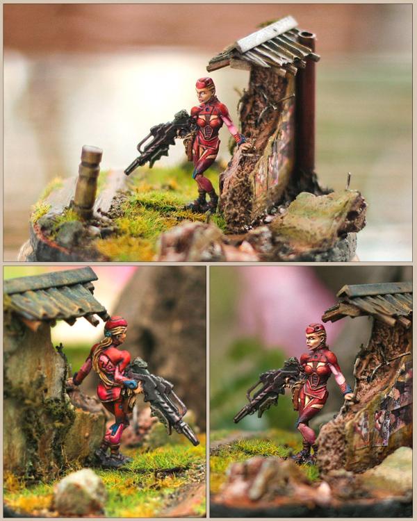

I either didn't give you enough credit for your Duel entry, or you seriously lifted your game here - I guessed your entry completely wrong - and you also garnered one of my votes!

Presentation:

1. Lighting Excellent.
2. Layout Flawless. The scenic base really helps.
3. Magnification Perfect.
4. Orientation Perfect.

Painting:

1. Palette Although mostly red, there are elements of lighter shades (pink?), skin and spot colour of blue. The more natural palette of the scenery/base helps to further emphasise the more synthetic nature of the model.
3. Highlighting & Shading Clean and neat shading and highlighting. If anything, a slightly higher magnification would have shown this better assuming is is as good as it looks.
4. Detail I think my only "real" negative would be the one visible eye white - which appears to be missing a pupil.
5. Base The base/scenery is simply gorgeous. Done in such a natural style, it helps focus on the model itself, almost at odds with it, but not quite.

Conclusion
Is the background supporting an excellent miniature, or compensating for an above average one? Unfortunately, without seeing it in person, we will never know.

I would have been happy to see this come in second. Well done!

2nd - Entrant #16. Tokusetsu Butai. Yu Jing Faction. By LeoPelo 9% [ 162 ]
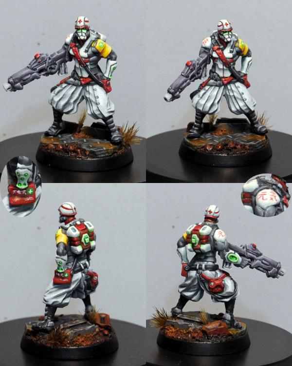

Not sure I'm qualified to say much on this one either - I didn't even vote for it! (Though it was in my consideration…)

Presentation:

1. Lighting Maybe could use slightly more light, but whose couldn't? You would want to be careful not to wash out the light colours though…
2. Layout Excellent - and with pertinent details highlighted!
3. Magnification Perfect.
4. Orientation Perfect.

Painting:

1. Palette Bright, lighter colours and spot colours. Perhaps a little too much grey, or a bit more differentiation between the gun and other black/grey areas.
3. Highlighting & Shading Is this the first white I can make out actual shading? I guess I wasn't sure whether the gun and boots were meant to be over highlighted black or very nice grey. In fact it may have been more striking if the black/grey had been a sharper black, it would have contrasted nicely with the white and red.
4. Detail Details are picked out, some subtle OSL, script is clean, neat and tiny!
5. Base Base is great!

Conclusion
Who cares what I think? Congratulations on second!

1st - Entrant #8. Saladin. Haqqislam Faction. By bou 13% [ 223 ]
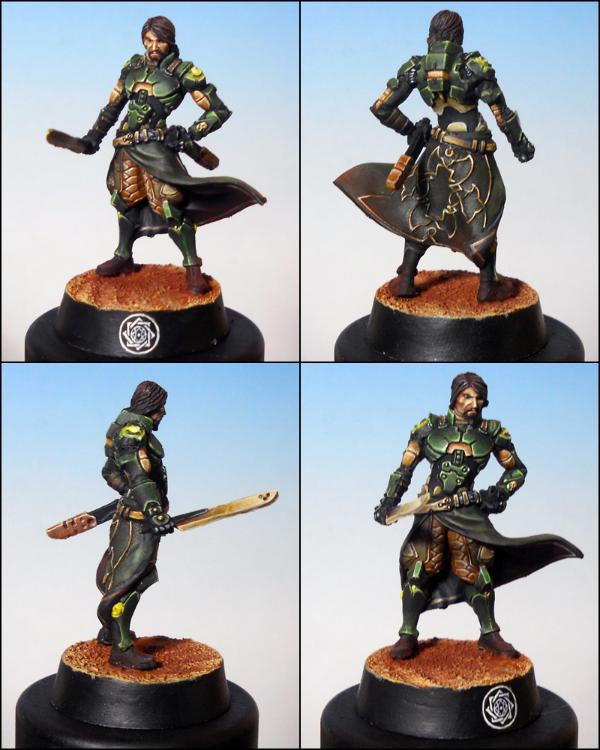

My last vote, and my pick for winner overall.

Presentation:

1. Lighting Perfect.
2. Layout Perfect.
3. Magnification Perfect.
4. Orientation Perfect.

Painting:

1. Palette Nice choice of colours and application.
3. Highlighting & Shading Awesome!
4. Detail Excellent picking out and highlighting of detail. I thought the symbol on the base was a decal!
5. Base If anything negative could be said, maybe the plain base? But even then, you wouldn't want it to detract from the fine work above it.

Conclusion
Congratulations on a well earned first place!

Epilogue
Well, that was a lot of effort - so I hope you all enjoyed/got something out of it!

Thanks again to Corvus Belli, Dakka Dakka, yakface, inquisitorlewis and all of the participants.

See you next time!


Dakka Painting Challenge: To INFINITY & Beyond! WINNERS ANNOUNCED, bottom of pg 4 (5/21) @ 2012/05/26 21:13:43


Post by: Ian Sturrock


Thanks, Arakasi! Much appreciated.


Dakka Painting Challenge: To INFINITY & Beyond! WINNERS ANNOUNCED, bottom of pg 4 (5/21) @ 2012/05/26 21:26:58


Post by: endtransmission


LeoPelo wrote:Here are my comments for all minis, as I said...
entry #17: Really good piece. But...it seems to me too much drybrushed (skin and cloth). Am I wrong? I like weapons and osl! I don't like this kind of turf on base.


Thanks for the comments, unfortunately there isn't any drybrushing on the model at all.. it's all carefully wet blended with about 12 ultra thin layers of paint and includes mottling like a frog's skin :(

I do agree with the grass effect; it was a last minute thing at 3am... wish I hadn't done it now. I'm glad the nmm and osl worked for you though.

arakasi wrote:17th - Entrant #17. Shasvastii Noctifer. By EndTransmission 2% [ 28 ]


My good friend EndTransmission's entry, which I failed to guess due to his sneaky entry of a Combined Army model instead of an Aleph one. The NMM should have given it away…

Presentation:

1. Lighting Appears fine, although some areas of the model are in its own shadow.
2. Layout The main picture is good, the top right leaning towards too small and the final two aren't helping much at all - although they do look nice. Probably would have been better to have four same sized pictures in a portrait image. While the base is nice, it isn't the focus - only one image really needed to show it in its entirety, which would have given even more space to show off the miniature or add closeup shots of interesting elements - of which there are undoubtably a few here. Instead, the layout focuses on the less stellar aspects - the inside of the cloak (very plain), the rocks (plain again) and the sword.
3. Magnification Main image is good. Top right may be bordering on too small. Remaining are definitely too small.
4. Orientation

Painting:

1. Palette Palette is a lovely combination of natural browns and greens with red as a spot colour.
2. Neatness & Coverage Generally neat and well covered.
3. Highlighting & Shading Love the greens, the claws and the mottling and the NMM on the gun and targeter. The greens suffer from the presentation - the main part being in shadow in the largest picture. I am not sure if the red is supposed to be fleshy or OSL - the piece on the knee looks too hard for OSL and out of place for fleshy. While the NMM on the sword is very nice (from what I can make out), it probably should have been done differently to the gun.
4. Detail Eyes and teeth(?) are picked out. Targeter gem looks good.
5. Base The grass on the base where it overhangs the edge looks a bit messy.

Conclusion
Painting is very nice, but requires the time to appreciate it and note its subtleties due to presentation issues - made harder by being number 17 in a list of 42 no doubt. All in all, my second prize for the entry which could have improved the most with better presentation.


Wow. Thanks for taking the time to do such a thorough review of all the models, very nice! I've a few comments back in return.

I couldn't help snigger a bit at the "some areas are in it's own shadow". It's actually painted like that; the photo was a bit bleached out as I was trying to avoid all natural shadows. Looks like it backfired on me a bit there...

I take it you've no comment about orientation?

There are a couple of comments about the knife being wrong or needing to be different; out of curiosity... what do you feel is out of place with the knife?


Dakka Painting Challenge: To INFINITY & Beyond! WINNERS ANNOUNCED, bottom of pg 4 (5/21) @ 2012/05/26 21:44:34


Post by: SilverMK2


Epic post Arakasi - thanks for the comments

I was planning to get some magnified pictures of my entry today but ended up being out for most of the day - you will certainly be able to see from them (when I take them) that a higher magnification on my model would have cut down the number of votes I got

I will certainly get some better lights next time and may even rig up some kind of light box. Unfortunately one of my 3 lamps got broken a couple of days before the pictures were taken (wife wanted to move the room around and one of the lights got knocked off the table ) so they are a little less well lit than I would have liked anyway.


Dakka Painting Challenge: To INFINITY & Beyond! WINNERS ANNOUNCED, bottom of pg 4 (5/21) @ 2012/05/26 22:03:45


Post by: Arakasi


endtransmission wrote:I take it you've no comment about orientation?
Doh! I was forever fixing typos and stuff - something was bound to get through/missed I have updated to "Low impact" - basically the orientation didn't end up mattering much due to other presentational issues
endtransmission wrote:There are a couple of comments about the knife being wrong or needing to be different; out of curiosity... what do you feel is out of place with the knife?
By itself, nothing I have the skill to comment on. Combined with the rifle and targeter done in the same style, it doesn't look right. I think the problem is I can feasibly see the rifle and targeter "painted" in that colour, and not as a NMM technique - but then my mind goes - why is the sword blade "painted". I guess to explain it better - consider if you had painted the rifle and targeter red. My mind doesn't balk at a red rifle or targeter - someone just painted over the metal. Now paint the knife red. I'm expecting to see a metal blade, or perhaps even an energy blade, but a plain red blade? Suddenly it seems... odd. I think even simply a different shade of NMM - perhaps a darker grey or bone - for the knife would have avoided my mental hangups


Dakka Painting Challenge: To INFINITY & Beyond! WINNERS ANNOUNCED, bottom of pg 4 (5/21) @ 2012/05/26 22:31:39


Post by: Cave_Dweller


Wow thanks for the super detailed critique, arakasi. That is actually very helpful and some of your points totally escaped my notice. Seems to obvious now.

Thanks for the work in reviewing all those models!


Dakka Painting Challenge: To INFINITY & Beyond! WINNERS ANNOUNCED, bottom of pg 4 (5/21) @ 2012/05/26 22:47:30


Post by: Inanimate


Arakasi, that was thorough...

The OSL on the gems was a little sloppy, so I'm not sure a close-up would help much. It was really something that I had to rush to get finished.

Lighting was a bulb in the ceiling. No way to re-position it, and yeah... The pictures of the model's back look better lit because it's angled perpendicular (close to at least) to the source. I agree, it's badly lit. This really has a negative effect on the white (which you commented on). If you look at the chest, then you might pick out what the true white really looks like. Look closely, that's not shadows (except the shadow cast by it's chin ofc ). The helmet and everything else looks chalk-white manily because of their angle to the source. The fin looks pretty much ok, but it's still very bright. I know this sounds very apologetic, but I just wanted to vent (not that I'm blaming your judgement and opinions).

I like your entry as well. It felt quite alive, which is a great accomplishment if you consider that it's a pewter model with some pigments slapped on. The face... there's life there (looks a little weird from the front, but side-view is excellent). I didn't care much for the black parts or the hair, which looks slightly like putty. It's really difficult, and I seldomly see hair done well, so you shouldn't take my criticism too seriously. The camo pattern looks cool as well. I saw that you got some negative comments, but I like it.


Dakka Painting Challenge: To INFINITY & Beyond! WINNERS ANNOUNCED, bottom of pg 4 (5/21) @ 2012/05/26 22:48:21


Post by: Chemical Cutthroat


Why was I voted so high? I guess people like bright colors?

If I find myself in another competition, I may try some of the crazy techniques out there. For me, it just goes to show that people appreciate a clean, purty paintjob.


Dakka Painting Challenge: To INFINITY & Beyond! WINNERS ANNOUNCED, bottom of pg 4 (5/21) @ 2012/05/27 02:53:12


Post by: Kanluwen


I think Arakasi hit the nail on the head with something I was worrying about from the very start.

In painting competitions, it's the "wow factor" which will win it for you not the overall cohesiveness of it within an army which isn't seen.

My original plan was to do a Zouaves Sapper-Sniper with an OSL effect to make it appear as though he was taking cover in his dugout with a chemical light next to him.

After several attempts--I realized it would be a nightmare to make it fit within an army, and so I decided to do that Myrmidon Spitfire. I experimented for too long with a homemade lightbox and ended up not having enough time to really get some "Wow!" pictures, as the Spitfire ended up arriving the day or so before the timeframe to enter was over. It really did look better in person, but that's not exactly going to win you an internet painting competition now is it?


Dakka Painting Challenge: To INFINITY & Beyond! WINNERS ANNOUNCED, bottom of pg 4 (5/21) @ 2012/05/27 06:11:24


Post by: Arakasi


Cave_Dweller wrote:...some of your points totally escaped my notice. Seems to obvious now.
Inanimate wrote:I didn't care much for the black parts or the hair, which looks slightly like putty. The camo pattern looks cool as well. I saw that you got some negative comments, but I like it
We are, at the same time, our best and worst critics - beating ourselves up for things no one else notices because they don't know how it was "supposed" to look, and overlooking issues with things we are completely happy about! I love my reds - but then perhaps they look better on Ork shootas than hair
Inanimate wrote:The face... there's life there (looks a little weird from the front, but side-view is excellent).
Don't get me started... too late... I stuffed up the eyes and had to redo parts of the skins afterwards, but still never got the eyes right. The left side of the face, visible from the front, is where the mold line runs, and I apparently didn't clean that up/smooth it out as well as I thought I had, which had an "interesting" effect on that side...
Chemical Cutthroat wrote:it just goes to show that people appreciate a clean, purty paintjob.
You were expecting something else?
Kanluwen wrote:I think Arakasi hit the nail on the head with something I was worrying about from the very start.
Well - at least you worked that out beforehand! It took me two painting competitions!
Kanluwen wrote:It really did look better in person, but that's not exactly going to win you an internet painting competition now is it?
It's not your paint job, it's your presentation?


Dakka Painting Challenge: To INFINITY & Beyond! WINNERS ANNOUNCED, bottom of pg 4 (5/21) @ 2012/05/27 08:32:44


Post by: MrMerlin


Arakasi wrote:17th - Entrant #20. Ariadna Sniper. By MrMerlin 2% [ 28 ]


Ahhh… MrMerlin… almost seems fitting that you and EndTransmission, as first to do overall critiques, end up together in the rankings

Presentation:

1. Lighting A bit more light might help, but then the painting is already very pastel/washed out, so that may not have helped.
2. Layout Fine. I don't feel like I'm missing anything awesome on the other side of the model
3. Magnification Perfect.
4. Orientation No impact.

Painting:

1. Palette Limited and pastel palette makes for great realism, but doesn't draw attention to itself - I guess the object of a soldier in war, but not a painting competition entry… The funny thing here is that the gun appears to draw my attention, being the strongest visual element. I think a few more colours, even just variations on what you already have, would have gone a long way to help this stand out - using a different, perhaps darker brown for the clothing elements - to distinguish them from the base/dirt, perhaps black boots - though like the gun, this may just draw more attention away from the torso/face.
2. Neatness & Coverage Painting looks neat and tidy.
3. Highlighting & Shading Highlighting and shading all look good.
4. Detail No details appear to have been picked out.
5. Base The base is good in isolation, but, being in the same tone as the model, is competing for attention with it, rather than simply providing a backdrop or background to the model.

Conclusion
And what did MrMerlin have to say about his own entry during the competition?

MrMerlin wrote:Nicely painted, the googles look sweet! But its not really close to some of the other entrys....


THANKS!

Yeah, you're probably right about the mute palette..... I'll remember to paint my next painting-challenge entry bright and shiny!


Dakka Painting Challenge: To INFINITY & Beyond! WINNERS ANNOUNCED, bottom of pg 4 (5/21) @ 2012/05/29 12:11:35


Post by: Pointblank


Arakasi wrote:Arakasi's "Dakka Painting Challenge: To INFINITY & Beyond!" Commentary

Prologue
Welcome!


33rd - Entrant #42. Naffatun, Haqqislam Faction. By Pointblank 0% [ 7 ]


Presentation:

1. Lighting Almost perfect - the right side of the head is in shadow.
2. Layout The image is missing the rest of the flame to the right, whilst unused space exists to the left.
3. Magnification The model would probably benefit from less magnification.
4. Orientation Landscape orientation suits the model.

Painting:

1. Palette Three primary colours plus spot colours, and relatively vibrant are all pluses for drawing attention. Grey is challenging.
2. Neatness & Coverage Neatness is lacking (especially the orange on the uniform and gun). The flames and the main green uniform appear messy (I expect that was meant to be camouflage). Coverage around the base edge could be better.
3. Highlighting & Shading Highlighting is thick (especially on the dark grey of the helmet and uniform, and also one the base flames - though noticeably less so on the gun) The grey of the gun is probably the best feature (a hard colour to do - so well done!)
4. Detail Some details have been picked out, but nothing too fancy.
5. Base Base is interesting due to flames.

Conclusion
This was a late entry due to a stuff up, so potentially may have done slightly better.


You're absolutely right! Thanks for the comments.


Dakka Painting Challenge: To INFINITY & Beyond! WINNERS ANNOUNCED, bottom of pg 4 (5/21) @ 2012/05/29 21:11:06


Post by: Nachtpfiffel


Thanks for all the comments about my miniature (YuanYuan)
Well next time I guess I have to use a reduced palette.
I chose bluish colors, I still don't think there are too many, but I guess different people different preferences.
The little animal is sculpted by me, not the best sculpt but I was really glad about the way it turned out.
Before starting to paint I asked if I am allowed to paint her even if I posted pictures of the unpainted miniature many years ago.
If I would have not been allowed to paint her for the contest, I would have painted Saladin with a fennek, but that miniature would have been much closer to the original. I guess maybe because I was able to paint a miniature outside my normal paint sheme I chose a much more colorful painting style.
Thanks again for the competition, it made me paint after a three year infinity break.


Dakka Painting Challenge: To INFINITY & Beyond! WINNERS ANNOUNCED, bottom of pg 4 (5/21) @ 2012/06/11 18:34:44


Post by: heartserenade


Any chance that these entries be uploaded in our respective galleries? how does one do that?