37819
Post by: LilLoser
The Horus Heresy
"Sometimes the only victory possible is to keep your opponent from winning."
The Emperor of Mankind
Dramatis Personae
The Master of Mankind; The Emperor
The Custodian Guard
The Primarchs
I Lion El’Johnson
II [DELETED FROM IMPERIAL RECORD]
III Fulgrim
IV Perturabo
V Jaghatai Khan
VI Leman Russ
VII Rogal Dorn
VIII Konrad Curze
IX Sanguinius
X Ferrus Manus
XI [DELETED FROM IMPERIAL RECORD]
XII Angron
XIII Robute Guilliman
XIV Mortarion
XV Magnus The Red
XVI Horus Lupercal
XVII Lorgar Aurelian
XVIII Vulkan
XIX Corvus Corax
XX Alpharius Omegon
The Legionaes Astartes
I Dark Angels
II [DELETED FROM IMPERIAL RECORD]
III Emperor’s Children
IV Iron Warriors
V White Scars
VI Space Wolves
VII Imperial Fists
VIII Night Lords
IX Blood Angels
X Iron Hands
XI [DELETED FROM IMPERIAL RECORD]
XII World Eaters
XIII Ultramarines
XIV Death Guard
XV Thousand Sons
XVI Luna Wolves / Sons of Horus
XVII Word Bearers
XVIII Salamanders
XIX Raven Guard
XX Alpha Legion
+++++++++++++++++++++++++
The aim of this thread is to collect all the Heresy era plogs I have scattered throughout time and space into one cohesive space. I’ve been fortunate enough to have been commissioned to create several Astartes forces and I hope to collect all 18 with accompanying characters and auxiliary forces. Instead of creating a new plog for each individual piece I will have this one thread and keep it updated with completed images.
- But how to go about displaying such a vast array of miniatures neatly in one thread? I’ve decided to have an index (above) and have a couple of empty slots below and hyperlink individual posts of note to the above. I will also provide links to my blogsite (I do so not to spam the forum: my photobucket accounts tend to attract a lot of attention expending my bandwidth allocation with alarming speed). Over the coming days I will be updating this page with my previous work and adding all relevant links.
The Architects of Betrayal.
Erebus and Kor Phaeron


It seemed apt tot start the blog with the two instigators of the treachery.
I think this release has been a little overshadowed by the release of Ferrus Manus at Games Day. Personally, I was looking forward to painting these miniatures more. Whereas Ferrus represents the fulfillment of the martial/ ideological ideal of humanity as envisaged by the Emperor, Erebus and especially Kor Phaeron, represent humanities frailty. Frailty, greed, lust and decrepitude are much more interesting subjects than perfection (fans of Fulgrim may disagree).
Does anyone else think that Kor Phaeron looks like Prince Phillip? I'd love to know the kind of visual ques Edgar Skormorowski used to create this model. Although you cannot see this from the photos, the underside of the gauntlets have Kor Phaeron's bare hands hard wired into the suit. You can also see the characters back legs from behind poking out from this false terminator suit. I glued the head a little father back in the suit to reinforce the unease of the character. Curiously, the white dwarf preview in white dwarf seems to be a different head from the one put into general release. I wonder if there is a story there?
[URL="http://loserstudio.blogspot.co. uk/2013/10/kor-phaeron-and-erebus.html"]
Blog Entry[/URL]
+++++++++++++++++++++++++++
Myles
[URL="http://loserstudio.blogspot.co. uk/"]
Lil'Legend Studio[/URL]
Facebook
62692
Post by: PandaMango141
I will be the first to say HOLY S***
The runes and scriptures look amazing. I have a feeling this will be moved across to P&M blogs, but woowowowowowoww. I am in love and will follow this project.
44341
Post by: tyrannosaurus
Superb painting but I'm really not a fan of these sculpts. Not even your skills can stop Kor Phaeron looking like he's just gakked his armour, and Erebus looks as though he's going to fall over. Worst of the character sculpts IMO. Thanks for sharing though! 
56494
Post by: Omfgorzzz
Dam dude. Those look awesome. Can't wait to see more.
74327
Post by: Skimask Mohawk
Ugh...every time I see the Erebus model  . There was so much potential for it and whoever sculpted it decided to with crazy hobo in power armour
24443
Post by: Blitza da warboy
 Skimask Mohawk wrote: Skimask Mohawk wrote:Ugh...every time I see the Erebus model . There was so much potential for it and whoever sculpted it decided to with crazy hobo in power armour
So in other words...Erebus?
Looke awesome, although kor phaerons head looks strange. Almost as if it was miscast or poorly sculpted
53002
Post by: Tibbsy
Does anyone else think that Kor Phaeron looks like Prince Phillip?
Cannot unsee! 
Great stuff here; I can't wait to see the rest!
37819
Post by: LilLoser
Cheers guys. I'd like to make it clear that this is a showcase thread. It will not contain WIP work or development. This is the finished product and reflection.
Well, what shall we have for the second installment? How about the first of the fallen primarchs?
The Gorgon, Ferrus Manus, Martyred Father of the X legion, Iron Hands


This was a beautiful model to paint. The final photos for the Iron Hands Legion Primarch, Ferrus Manus. This is my first Primarch project and I'm relieved to have one under my belt. I own Angron and Fulgrim but indecision has forced me to put off the projects to later dates. Still wrapped up in the enthusiasm of Games Day I broke the seal and put primer to resin before I could let doubts settle.
I've written up a reflection on the piece for the blog. I hope you enjoy the pictures and any feedback would be warmly received (unless your a dick about it...)
Blog post
Ferrus Manus X
Facebook
Myles
37819
Post by: LilLoser
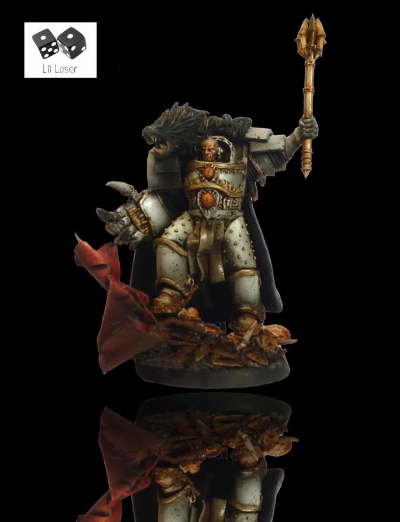
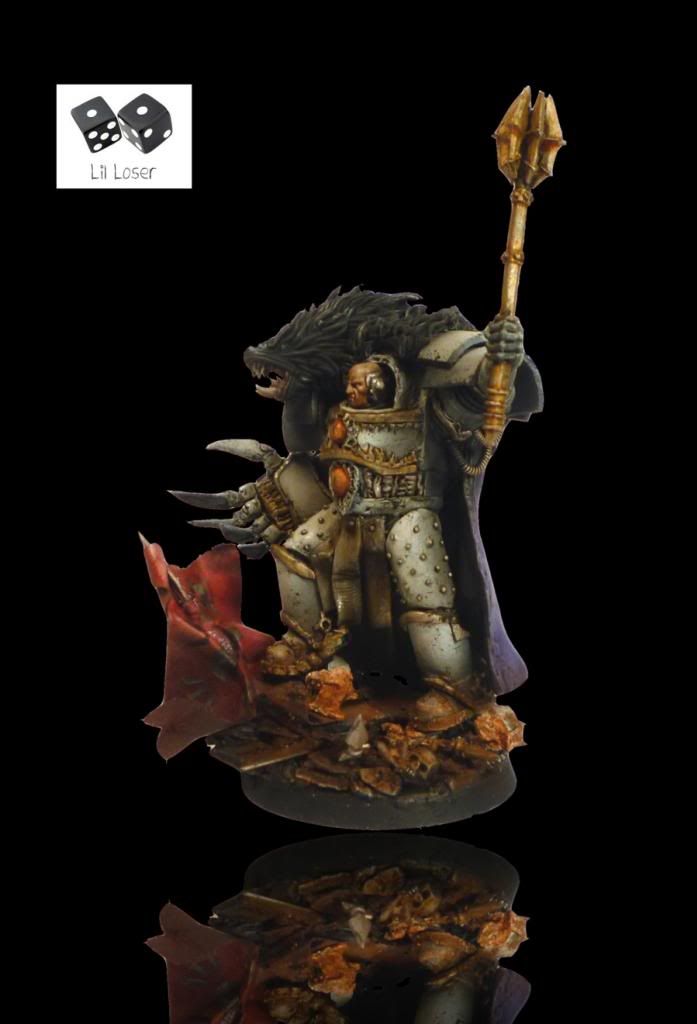
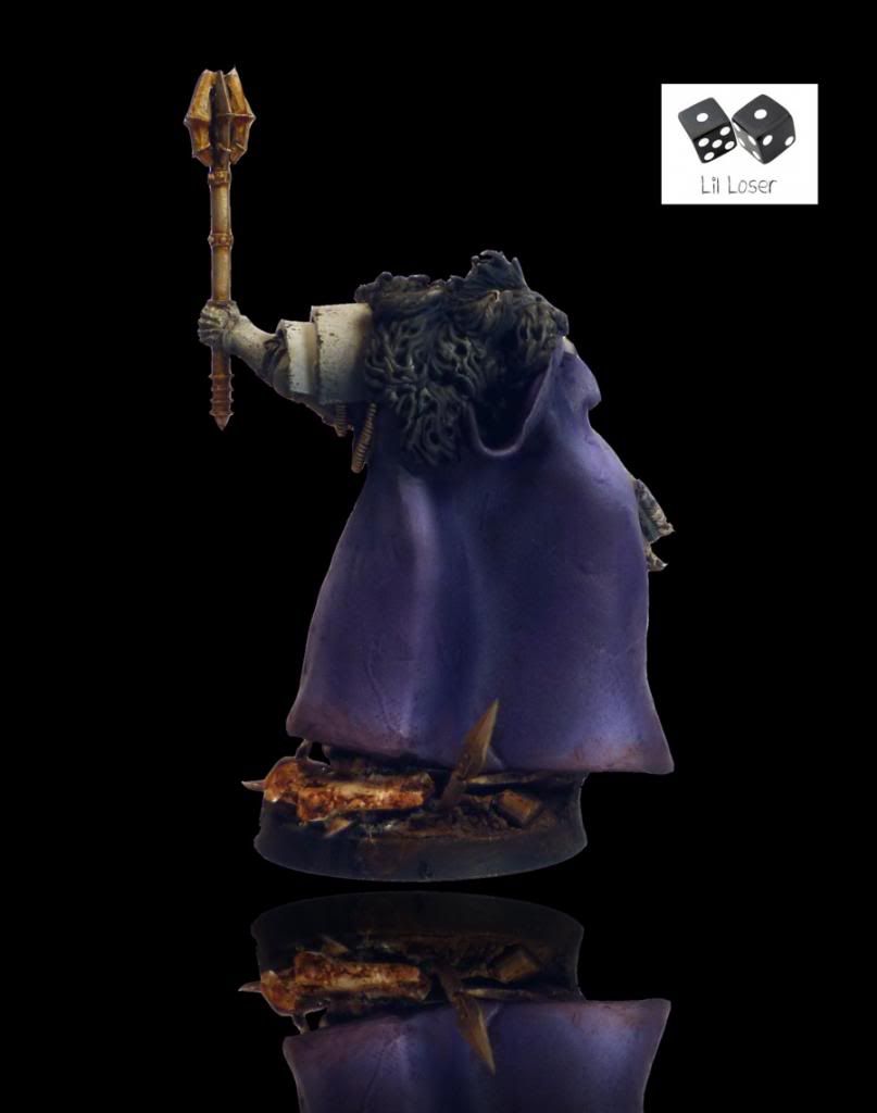
The Phoenician Fulgrim, Primarch of the Emperor's Children, The Perfect Son.
 “I have no faith in human perfectibility. I think that human exertion will have no appreciable effect upon humanity. Man is now only more active - not more happy - nor more wise, than he was 60,000 years ago.”
Intimations on Perfection, unpublished treatise. Author Unknown.
Fulgrim's character is one of intense darkness and light. On the one hand he is the most idealistic (although Lorgar may disagree) of the Emperor's sons, striving for the perfection he believes humanity is capable of. His legion bore that responsibility until its disintegration, where each soldier chose what his personal ideal of perfection would be rather than the prescribed divinity of the Emperor.
I wanted to reflect this duality in the painting and modeling of the miniature. I painted Frulgrim in pristine armour, untroubled by the dirt and battle around him. He is above such things. The gold is a good foil to the purple armour. I decicded to paint the inside of Fulgrims cloak cream to further highlight the rich purple of the Emperor's Chidlren Livery. I changed Fulgrim's position of the base, putting him in a more central position. I couldn't imagine Fulgrim being content on the periphery of any scene, he dominates the centre stage.
For more photos & text
Facebook
Myles
42470
Post by: SickSix
Great job on Ferrus. I hope to get one, but fear it will never look that good.
18690
Post by: Jimsolo
I thought your Fulgrim was much better than the Forgeworld one.
59092
Post by: BrotherVord
I'm not sure I care for the emo makeup on fulgrim but your skill is undeniable
68667
Post by: Squidbot
Fulgrim is described as having a lot of make up on in the book, nice to see you pull it off.
37819
Post by: LilLoser
Cheers for the feedback guys. I really appreciate the comments. Fulgrim's face has been a point of contention whereever I have posted him.
Ok, after getting some critical feedback on Fulgrim I decided to re-shoot the miniature. The original photo's have a weird unfocussed, greeny tint to the skin tone which doesn't match the real life equivalent. So here are the second set of photographs. Let me know what you think.
74327
Post by: Skimask Mohawk
He just looks old imo
30668
Post by: erratyk
Ya, I love the rest of the model, but the face just looks like he's really sickly.
I always thought he was a prettyboy. It hurts to give criticism on your work because it's really well done, I'd advise redoing the face though.
37819
Post by: LilLoser
Cheers for the feedback guys. I like how the face has turned out so I will not be changing it. Must be a personal preference thing.
Cheers for the positive comments guys.
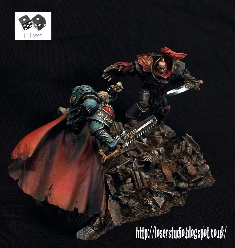
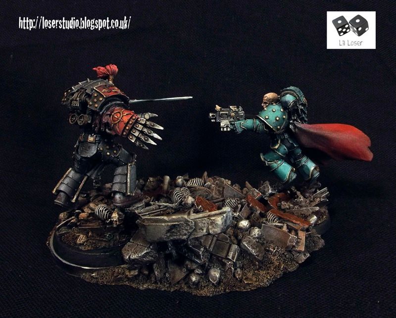
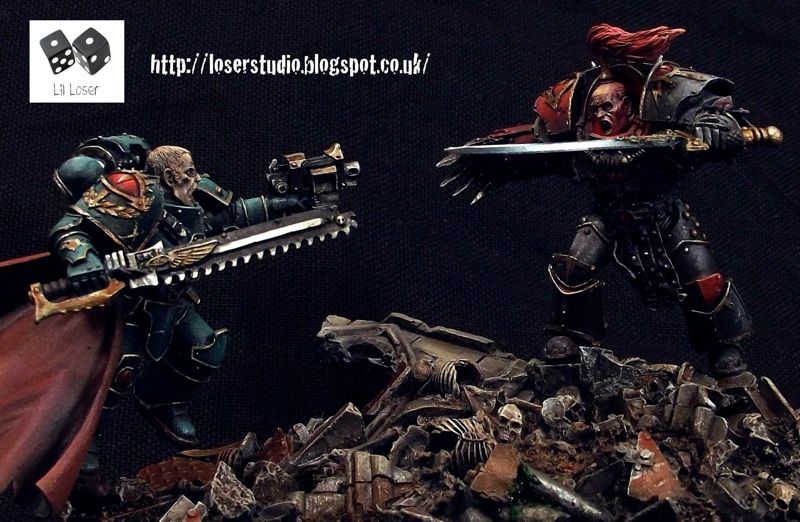
The Phoenix & The Gorgon. Ferrus Manus and Fulgrim Diorama.

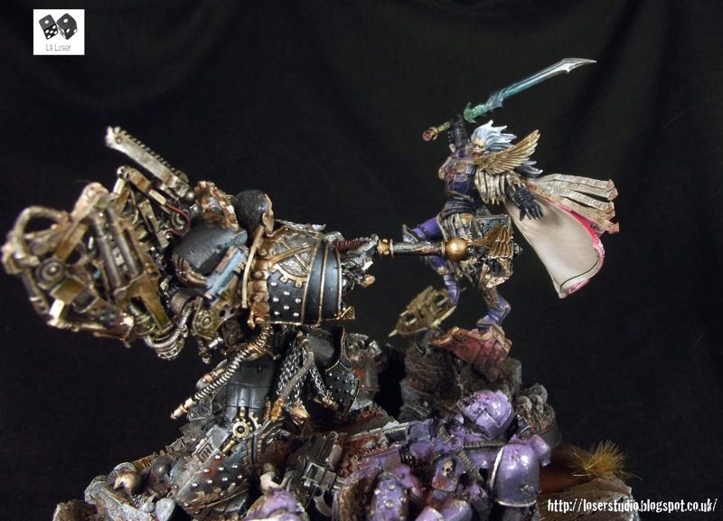
“I incline to Cain's heresy," he used to say quaintly: "I let my brother go to the devil in his own way.”
Blog Entry (with more photo's)
Facebook links
Phew...what a piece. This felt more like a battle than a painting exercise. This was a difficult piece to attempt - not only are both miniatures exceptionally detailed but they can act as centerpieces all by themselves. I couldn't shake the idea that both Ferrus and Fulgrim were miniature suns exerting their individual gravity on the scene. The space marines littering the base are reduced to spectators (space particles if I were to belabour the metaphor) destroyed by the two titans dueling for the fate of Mankind's future.
I have another Primarch to paint by the end of the year. I have re-created one of my previous conversions and will be painting the First Child of the Emperor.
Cheerio!
Myles
30668
Post by: erratyk
After reading your reasoning behind the look of the face, I retract my previous statement lol. I think it captures what you were trying to convey perfectly.
Also, that diorama is brilliant. I love it. keep up the great work
37819
Post by: LilLoser
@ erratyk - no need to apologise, really. I find loads of miniatures online that I don't like, but I can appreciate the skill behind the pieces. When tackling characters like the Primarchs people will have very strong views on their looks and I accept that.
Cheers again for the comment - i'd like your opinion on the other work I produce; whether you like it or not. That goes for everyone reading this.
Myles
58262
Post by: Xavian
Like what you did with his sword, its an interesting effect. Unfortunate that Fulgrim's face looks so old and wrinkled, kinda reminds me of Doc from back to the future films. Looks awesome when there both put together though.
37819
Post by: LilLoser
Original Horus Conversion:
++++++++++++++
 "You are like a son and together we have all but conquered the galaxy. Now the time has come for me to retire to Terra. My work as a soldier is done and now passes to you for I have great tasks to perform in my earthly sanctum. I name you Warmaster and from this day forth all of my armies and generals shall take orders from you as if the words cam from mine own mouth. But words of caution I have for you for your brother Primarchs are strong of will, of though and of action. Do not seek to change them, but use their particular strengths well. You have much work to do for there are still many words to liberate, many peoples to rescue. My trust is with you. Hail Horus! Hail the Warmaster!"
The Emperor of Mankind
The final photos of Horus, Warmaster of the Imperium. There is a full write up of the miniature here as well as a ton more pictures and inspiration file.
You can also see a new conversion of Horus Lupecal on my website. A painted version will be available soon and of course will be posted here.
Myles
LilLgend Studio
Facebook
67119
Post by: BaconUprising
Truly insane stuff here! I would add a few details to Horus' armor to improve him
18690
Post by: Jimsolo
I think that the armor looks amazing! Personally, I think that the transition from the high-detail armor to the relative openness of the back of the cloak is a little jarring. Nevertheless, amazing conversion.
77159
Post by: Paradigm
Both versions of Horus are looking stunning, and the green version on your website really shows the level of work that went into it.
The other SOH stuff is looking great, love the banner bearer.
Can we expect to see the new Lorgar any time soon?
69427
Post by: Demigod
Your work is always amazing, a pleasure to look at for long periods of time. 
37819
Post by: LilLoser
Cheers guys! @ Jimsolo - I've sent you a PM, not sure if you have received it.
@ Paradigm - oh yes indeedy.
Of the primeval Priests assum'd power,
When Eternals spurn'd back his religion;
And gave him a place in the north,
Obscure, shadowy, void, solitary.
Eternals I hear your call gladly,
Dictate swift winged words, & fear not
To unfold your dark visions of torment.
The First Book Of Urizen, William Blake.
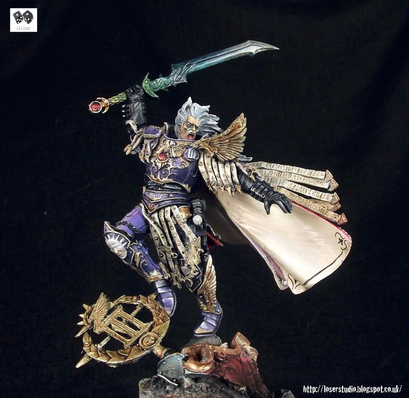
I painted Aurelian's face as if it were underlit by his suit. This gives the skin a golden tone before I start painting the Scripture, but also halos the Primarchs head quite nicely. I decided to go for yellow over a more contrasting blue to represent fire (Lorgar's head is a bright yellow, the under light is organge, his armour is red and the base is gret/ black). I also had Willaim Blake's Book of Urizen plates in my head and I couldn't escape trying to represent the damnation of the character through the painting.
For more pics, analaysis and a little bit of back story check out the blog. There are also a few W.I.P's on the facebook page
Otherwise enjoy the pictures.
Myles
Lil'Legend Studio
Facebook W.I.P
37819
Post by: LilLoser
Cheers guys! I have anther Lorgar that I'm debating whether or not to paint up in red or grey. Any thoughts?
Myles
39297
Post by: Cave_Dweller
He looks great, I really love the underlighting on his jaw, very nice touch.
I vote for grey, maybe with some red hints?
Keep it up I love your primarch series!
33919
Post by: Moltar
Great painting, again, Myles! I have to say I hate that model for Lorgar, though. It's so un-impressive for a guy that should look very inspiring. I do like the under lighting. It works out to help achieve a different approach to his "gold" skin too. Obviously, you have done a great job all around on the painting side of things. The under lighting and skin tones are my favorite parts.
67119
Post by: BaconUprising
 Moltar wrote: Moltar wrote:Great painting, again, Myles! I have to say I hate that model for Lorgar, though. It's so un-impressive for a guy that should look very inspiring. I do like the under lighting. It works out to help achieve a different approach to his "gold" skin too. Obviously, you have done a great job all around on the painting side of things. The under lighting and skin tones are my favorite parts.
Agreed he looks like a space marine sergeant holding a power maul. Great painting though!
51365
Post by: kb305
BaconUprising wrote: Moltar wrote:Great painting, again, Myles! I have to say I hate that model for Lorgar, though. It's so un-impressive for a guy that should look very inspiring. I do like the under lighting. It works out to help achieve a different approach to his "gold" skin too. Obviously, you have done a great job all around on the painting side of things. The under lighting and skin tones are my favorite parts.
Agreed he looks like a space marine sergeant holding a power maul. Great painting though!
that would be GWs fault since they blinged everything out so much that nothing stands out anymore.
77159
Post by: Paradigm
Once again, stunning work, and again better than the FW original. The subtle lighting effects and the superb effect on the armour are amazing.
I'd be interested to see what you'd do with a grey one, seeing two different versions of a mini is always interesting.
Keep up the amazing work.
67119
Post by: BaconUprising
kb305 wrote:BaconUprising wrote: Moltar wrote:Great painting, again, Myles! I have to say I hate that model for Lorgar, though. It's so un-impressive for a guy that should look very inspiring. I do like the under lighting. It works out to help achieve a different approach to his "gold" skin too. Obviously, you have done a great job all around on the painting side of things. The under lighting and skin tones are my favorite parts.
Agreed he looks like a space marine sergeant holding a power maul. Great painting though!
that would be GWs fault since they blinged everything out so much that nothing stands out anymore.
Not really, this just isn't a fantastic sculpt. The big GW stuff is flashy, rank and file not so much.
79241
Post by: Brother Payne
Lorgar 
80817
Post by: JSoul
BaconUprising wrote:kb305 wrote:BaconUprising wrote: Moltar wrote:Great painting, again, Myles! I have to say I hate that model for Lorgar, though. It's so un-impressive for a guy that should look very inspiring. I do like the under lighting. It works out to help achieve a different approach to his "gold" skin too. Obviously, you have done a great job all around on the painting side of things. The under lighting and skin tones are my favorite parts.
Agreed he looks like a space marine sergeant holding a power maul. Great painting though!
that would be GWs fault since they blinged everything out so much that nothing stands out anymore.
Not really, this just isn't a fantastic sculpt. The big GW stuff is flashy, rank and file not so much.
I actually think this is my favourite primarch sculpt so far. It's nice to see a poignant stance. It's sometimes a little predictable to do a simple "in the midst of battle" pose. The look on Lorgars face is one of absolute hopeless dissolution and despair.. For me at least, this has more impact than the other figures. I sincerely hope we get more like this.
Lovely painting by the way!
76036
Post by: TheEyeOfNight
What he said. Twice.
62516
Post by: Warpig1815
My first impression of the Lorgar sculpt was 50/50, whilst I found the sculpt itself to be generally pleasing (but not great), the FW grey/gold scheme massively let it down for me. That said, what you've done with the red/gold scheme takes the model to a whole different level. Despite Lorgar being my least favourite sculpt so far, viewing your take on Lorgar, up-lighting, red armour and all, has completely reversed my opinion - I'm no fickle person, but seeing this has put a whole new perspective on how I view that model. Excellent work mate!
67648
Post by: Commander_Nightflier
 LilLoser wrote:The Phoenician Fulgrim, Primarch of the Emperor's Children, The Perfect Son. LilLoser wrote:The Phoenician Fulgrim, Primarch of the Emperor's Children, The Perfect Son.
“I have no faith in human perfectibility. I think that human exertion will have no appreciable effect upon humanity. Man is now only more active - not more happy - nor more wise, than he was 60,000 years ago.”
Intimations on Perfection, unpublished treatise. Author Unknown.
Fulgrim's character is one of intense darkness and light. On the one hand he is the most idealistic (although Lorgar may disagree) of the Emperor's sons, striving for the perfection he believes humanity is capable of. His legion bore that responsibility until its disintegration, where each soldier chose what his personal ideal of perfection would be rather than the prescribed divinity of the Emperor.
I wanted to reflect this duality in the painting and modeling of the miniature. I painted Frulgrim in pristine armour, untroubled by the dirt and battle around him. He is above such things. The gold is a good foil to the purple armour. I decicded to paint the inside of Fulgrims cloak cream to further highlight the rich purple of the Emperor's Chidlren Livery. I changed Fulgrim's position of the base, putting him in a more central position. I couldn't imagine Fulgrim being content on the periphery of any scene, he dominates the centre stage.
For more photos & text
Facebook
Myles
I really like the face actually, helps to bring about the duality of the character. almost as if his quest for perfection has stretched him thin
78848
Post by: disdamn
This is great work. Really amazing calibre. I was hoping to see Lorgar with his gold painted skin covered in runic script like you always read about in the books though.
37819
Post by: LilLoser
Cave_Dweller wrote:He looks great, I really love the underlighting on his jaw, very nice touch.
I vote for grey, maybe with some red hints?
Keep it up I love your primarch series!
Grey does seem to be the popular choice. I have a couple of ideas of how to make it stand out because plain grey is deathly boring. As an aside I really like what the Forge World artist done with the Lorgar model - adding grey into the armour's liturgy reminds me of the stones on the floor of a church.
Moltar wrote:Great painting, again, Myles! I have to say I hate that model for Lorgar, though. It's so un-impressive for a guy that should look very inspiring. I do like the under lighting. It works out to help achieve a different approach to his "gold" skin too. Obviously, you have done a great job all around on the painting side of things. The under lighting and skin tones are my favorite parts.
Thank you very much dude.
BaconUprising wrote: Moltar wrote:Great painting, again, Myles! I have to say I hate that model for Lorgar, though. It's so un-impressive for a guy that should look very inspiring. I do like the under lighting. It works out to help achieve a different approach to his "gold" skin too. Obviously, you have done a great job all around on the painting side of things. The under lighting and skin tones are my favorite parts.
Agreed he looks like a space marine sergeant holding a power maul. Great painting though!
Thank you. I must be one of the few people who love this sculpt. Perhaps it is better in the flesh?
kb305 wrote:BaconUprising wrote: Moltar wrote:Great painting, again, Myles! I have to say I hate that model for Lorgar, though. It's so un-impressive for a guy that should look very inspiring. I do like the under lighting. It works out to help achieve a different approach to his "gold" skin too. Obviously, you have done a great job all around on the painting side of things. The under lighting and skin tones are my favorite parts.
Agreed he looks like a space marine sergeant holding a power maul. Great painting though!
that would be GWs fault since they blinged everything out so much that nothing stands out anymore.
You may have a point there. The Primarch is known for his passivity (at least at the outset of The First Heretic). A philosopher foremost - not the general his father wishes him to be. A passive, static stance suits the character.
Paradigm wrote:Once again, stunning work, and again better than the FW original. The subtle lighting effects and the superb effect on the armour are amazing.
I'd be interested to see what you'd do with a grey one, seeing two different versions of a mini is always interesting.
Keep up the amazing work.
Thank you, I shall try.
BaconUprising wrote:kb305 wrote:BaconUprising wrote: Moltar wrote:Great painting, again, Myles! I have to say I hate that model for Lorgar, though. It's so un-impressive for a guy that should look very inspiring. I do like the under lighting. It works out to help achieve a different approach to his "gold" skin too. Obviously, you have done a great job all around on the painting side of things. The under lighting and skin tones are my favorite parts.
Agreed he looks like a space marine sergeant holding a power maul. Great painting though!
that would be GWs fault since they blinged everything out so much that nothing stands out anymore.
Not really, this just isn't a fantastic sculpt. The big GW stuff is flashy, rank and file not so much.
True.
Brother Payne wrote:Lorgar
Haha Thank you.
JSoul wrote:BaconUprising wrote:kb305 wrote:BaconUprising wrote: Moltar wrote:Great painting, again, Myles! I have to say I hate that model for Lorgar, though. It's so un-impressive for a guy that should look very inspiring. I do like the under lighting. It works out to help achieve a different approach to his "gold" skin too. Obviously, you have done a great job all around on the painting side of things. The under lighting and skin tones are my favorite parts.
Agreed he looks like a space marine sergeant holding a power maul. Great painting though!
that would be GWs fault since they blinged everything out so much that nothing stands out anymore.
Not really, this just isn't a fantastic sculpt. The big GW stuff is flashy, rank and file not so much.
I actually think this is my favourite primarch sculpt so far. It's nice to see a poignant stance. It's sometimes a little predictable to do a simple "in the midst of battle" pose. The look on Lorgars face is one of absolute hopeless dissolution and despair.. For me at least, this has more impact than the other figures. I sincerely hope we get more like this.
Lovely painting by the way!
Agreed - I love this model. This has been my favourite Primarch to paint so far.
TheEyeOfNight wrote:
What he said. Twice.
Cheers...Twice! Haha.
Warpig1815 wrote:My first impression of the Lorgar sculpt was 50/50, whilst I found the sculpt itself to be generally pleasing (but not great), the FW grey/gold scheme massively let it down for me. That said, what you've done with the red/gold scheme takes the model to a whole different level. Despite Lorgar being my least favourite sculpt so far, viewing your take on Lorgar, up-lighting, red armour and all, has completely reversed my opinion - I'm no fickle person, but seeing this has put a whole new perspective on how I view that model. Excellent work mate!
Grey armour is incredibly challenging to inject interest into. For my next Lorgar I think I'll have to cheat again (like I did with the face).
Commander_Nightflier wrote: LilLoser wrote:The Phoenician Fulgrim, Primarch of the Emperor's Children, The Perfect Son.
“I have no faith in human perfectibility. I think that human exertion will have no appreciable effect upon humanity. Man is now only more active - not more happy - nor more wise, than he was 60,000 years ago.”
Intimations on Perfection, unpublished treatise. Author Unknown.
Fulgrim's character is one of intense darkness and light. On the one hand he is the most idealistic (although Lorgar may disagree) of the Emperor's sons, striving for the perfection he believes humanity is capable of. His legion bore that responsibility until its disintegration, where each soldier chose what his personal ideal of perfection would be rather than the prescribed divinity of the Emperor.
I wanted to reflect this duality in the painting and modeling of the miniature. I painted Frulgrim in pristine armour, untroubled by the dirt and battle around him. He is above such things. The gold is a good foil to the purple armour. I decicded to paint the inside of Fulgrims cloak cream to further highlight the rich purple of the Emperor's Chidlren Livery. I changed Fulgrim's position of the base, putting him in a more central position. I couldn't imagine Fulgrim being content on the periphery of any scene, he dominates the centre stage.
For more photos & text
Facebook
Myles
I really like the face actually, helps to bring about the duality of the character. almost as if his quest for perfection has stretched him thin
One for the purist maybe? I tried pushing the contrast, deepning the folds of the face to try and show the emotion of the moment.
disdamn wrote:This is great work. Really amazing calibre. I was hoping to see Lorgar with his gold painted skin covered in runic script like you always read about in the books though.
Take a closer look dude. The gold script is there.
+++++++++++++++++++++++++++
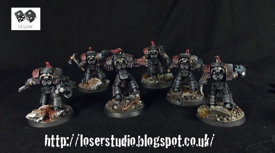
Time for a big blob of legionaires!
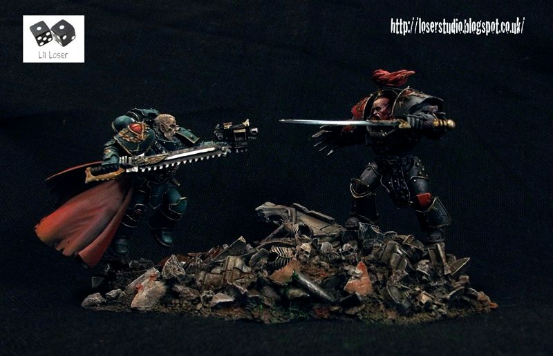
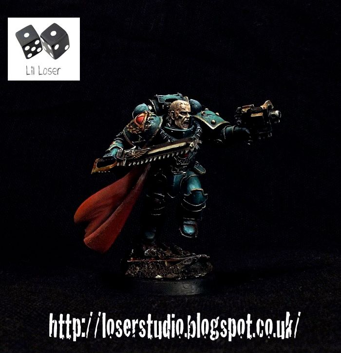
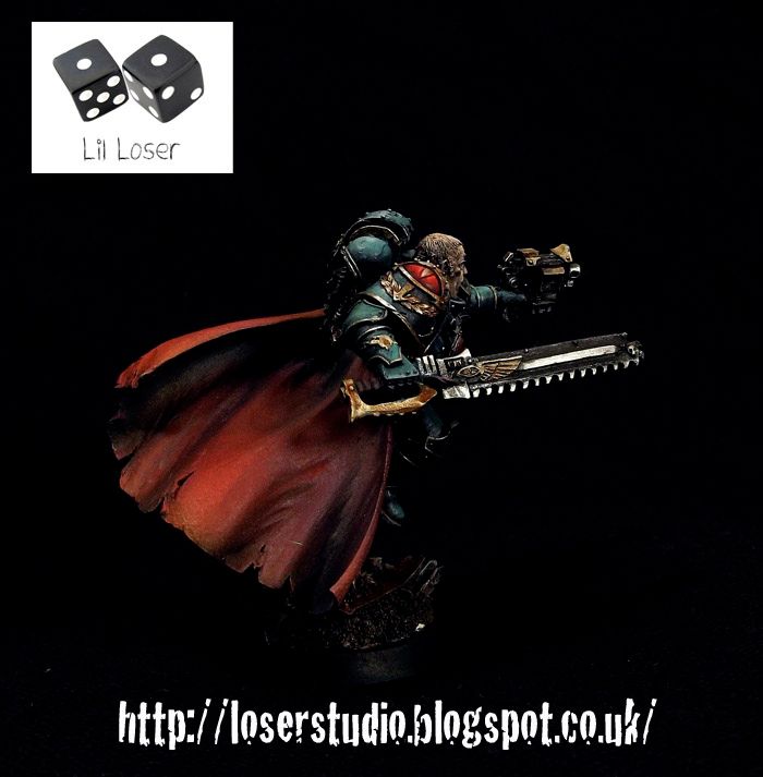
Luna Wolves Legion, Tenth Company, Fourth Cohort
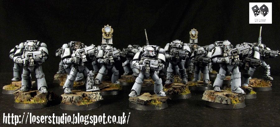
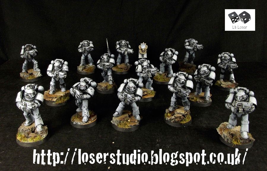
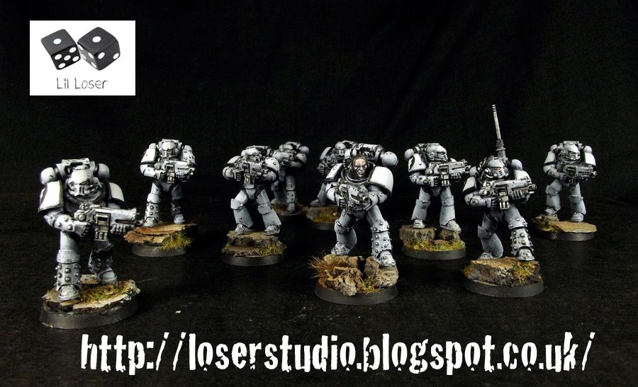
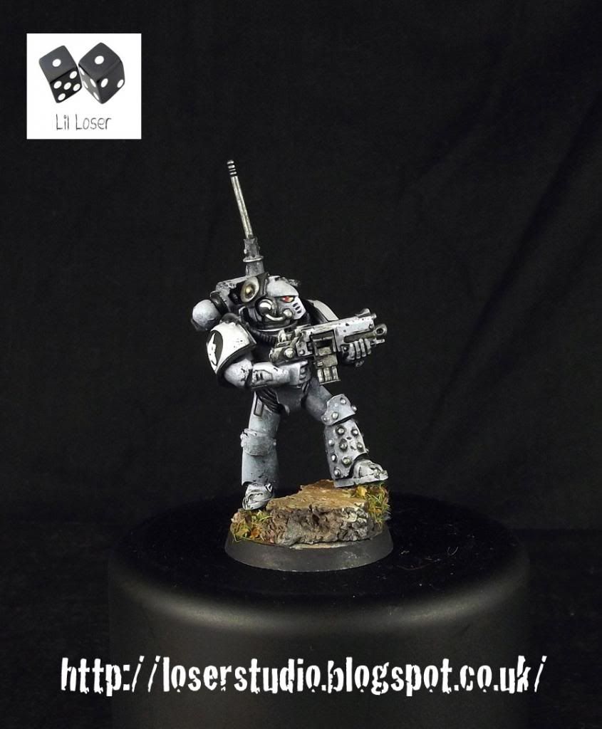
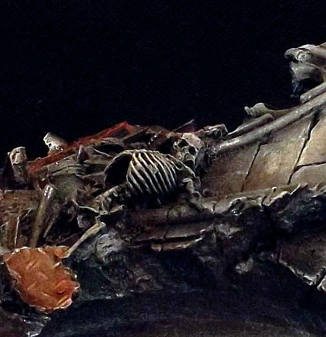
Fourth cohort, here depicted at the Fall of Balan adopt the unusual practice of swapping their legionary symbol onto the right pauldron. This tradition follows on from their stalwart captain, Loken who wears a studded pad on the left to better deflect small arms fire. This practice can be seen to espouse the wider philosophy of the legion; of unsentimental warfare and savage battle acuity.
++++++++++++++++++++
79241
Post by: Brother Payne
Nice. The mini standards are nice touch
67119
Post by: BaconUprising
Their insaaaaaaanneeee! I love Luna Wolves! Almost as much as I love Sons of Horus. Do you have any idea if you will be doing some SoH in the forge world upgrade packs?
115
Post by: Azazelx
Outstanding work on Aurelian. The images make him look like a 120mm figure that you've painted - simply amazing. I think he's my favourite of the lot so far.
37819
Post by: LilLoser
Brother Payne wrote:Nice. The mini standards are nice touch
Cheers Brother!
BaconUprising wrote:Their insaaaaaaanneeee! I love Luna Wolves! Almost as much as I love Sons of Horus. Do you have any idea if you will be doing some SoH in the forge world upgrade packs?
Haha, thank you. There will indeed be Sons of Horus stuff in the very near future. In fact Forge World displayed a banner bearer I painted on their facebook page.
Azazelx wrote:Outstanding work on Aurelian. The images make him look like a 120mm figure that you've painted - simply amazing. I think he's my favourite of the lot so far.
Cheers dude. Really means a lot.
The Warmaster's Own
[URL=http://s1280.photobucket.com/user/Lilloser2014/media/DSCF6131_zps94615db9.jpg.html]
 [/URL]
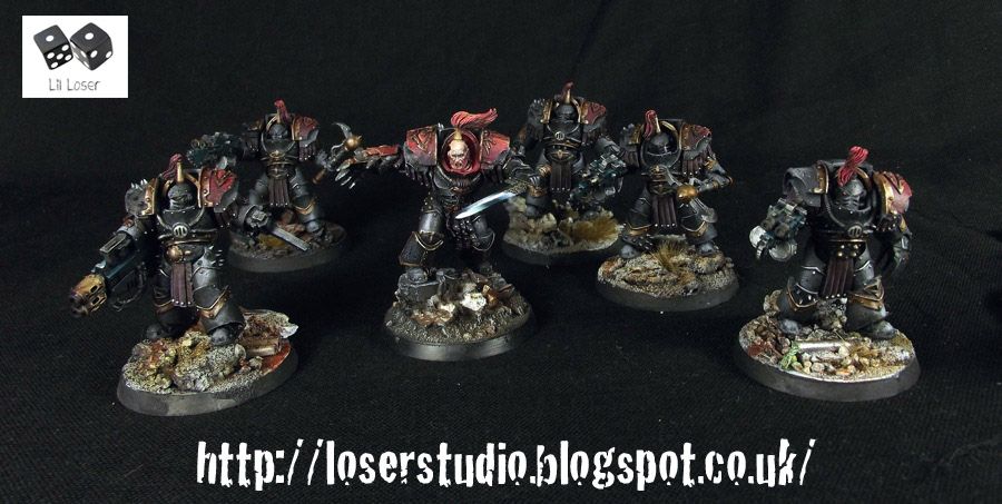
"The Warmaster's Own" Justaerin Terminators, first company, Sons of Horus
[Pict-capture Istvaan V Massacare]
The unbroken point of the spear, the Justaerin were the vaunted first of Horus' Legion. The Warmaster's Own has the honour of accompanying the higher echelons of the Legionary command staff to battle, gaining their name by the amount of teleport assaults performed alongside Horus.
The squad displays a wide array of weaponry preferring tactical flexibility to battle field specialization. Equally adept at engaging mass infantry to dense armoured formations, The Warmaster's Own have reeved a bloody path through the Great Crusade and have taken their dark legacy into the Heresy with gusto.
Three members of the The Warmaster's Own survived Terra and formed the core bodyguard of Abaddon post heresy. Known for their loyalty, the remaining members would be deceived by more ambitious Traitor Legionaries and put to the Sword M.33.
+++++++++++++++++++++++++
P.S There's a Valdor conversion on my Facebook & blog page - just thought I'd throw that in the mix.
Myles
33919
Post by: Moltar
Constatin Vadldor looks beast mode, but so much gold and red. Aren't you just sick of it yet?
77159
Post by: Paradigm
A couple of days! I don't check this for just a few days, and BAM, more awesomeness. Great stuff as always, love the neat but weathered look of the SOH and the Justerain.
37819
Post by: LilLoser
Thanks guys!
@ Moltar - Not just yet, they are seasonal colours afterall!
New Year, new starts, old themes. The Pre-Heresy commissions keep rolling in. I'm still making up my mind on what my hobby resolutions are for this year, but one thing I am determined to do is create, paint and play at least one game with a blood bowl team.
Ancient Varris, Emperor's Children Legiones Astartes.

Revered Ancient Atronius
Ancient Atronius, Dreadnought of the Emrperor's Children Legion
[Pict-capture Vanhel's Gorge, Principad campaign]
A Former Champion of the 8th Millenial, Atronius died at Istvann V by the hands of the Iron warriors Legion. Atronius was born on Terra and was one of the very few Emperor's Children to be united with Fulgrim at the outset of the Great Crusade. The Terran Aquila adorns Ancient Atronius' armour, carrying the light of the Imperial Truth and the Might of Terra to the stars.
+++++++++++++++++++
For a lot more bigger picturtes please hit up my page:
http://loserstudio.blogspot.co.uk/2013/05/ancient-atronius-emperors-children.html
Myles
79241
Post by: Brother Payne
Love the dreads dude! Where are their heads from?
77159
Post by: Paradigm
Awesome work on the dreads, nicely done.
79241
Post by: Brother Payne
55909
Post by: gianlucafiorentini123
Loving the armour on the Justaerin one of the best blacks I've ever seen.
62565
Post by: Haighus
Ur welcome. There are a lot of unique dreads hanging around on FW now
18690
Post by: Jimsolo
Just got done reading The First Heretic, so I was expecting a less Chaos-y Lorgar, but this one is still really good! I definitely like the way the armor shows the depth of his corruption from his original form.
37819
Post by: LilLoser
Paradigm wrote:Awesome work on the dreads, nicely done.
Thanks man! I was still trying to figure out how to work my camera when I took a couple of snaps of the second dread.
Brother Payne wrote:
Ah sweet. Cheers
yup what he said. They've also used the same helmet design for the Phoenix Guard Terminators which I thought was a nice touch.
gianlucafiorentini123 wrote:Loving the armour on the Justaerin one of the best blacks I've ever seen.
Thank you.
Jimsolo wrote:Just got done reading The First Heretic, so I was expecting a less Chaos-y Lorgar, but this one is still really good! I definitely like the way the armor shows the depth of his corruption from his original form.
It's funny you mention that as I was listening to Betrayer while painting Lorgar. If you enjoyed First Heretic I think you'll be besotted by Betrayer - I certainly was.
++++++++++++++++++++++
[I]“These fragments I have shored against my ruins”
 [/I]
"For all you know is a heap of broken images"


+++++++++++++++++++++++++++++++
[URL="http://loserstudio.blogspot.co. uk/2013/03/for-all-you-know-is-heap-of-broken.html"]
More Photos[/URL]
Latest Work - Calas Typhon
77159
Post by: Paradigm
Great work on the duel. I've loved those pieces since they came out and you've certainly done them justice.
79241
Post by: Brother Payne
As always, nice work
What colours did you use for Logan's armour? I can find a SoH scheme that works... Well until now
23810
Post by: Flippa
Jubbly as always.
37819
Post by: LilLoser
Thank you guys!
@ Brother Payne: I believe it was a mix of reaper master series Peacock green and a cool grey (can't remember which one). But the trick to making this armour really work is GW's Coelia shade. This stuff really makes the armour sing.
Myles
79241
Post by: Brother Payne
LilLoser wrote:Thank you guys!
@ Brother Payne: I believe it was a mix of reaper master series Peacock green and a cool grey (can't remember which one). But the trick to making this armour really work is GW's Coelia shade. This stuff really makes the armour sing.
Myles
Thanks, that helps heaps 
82460
Post by: Alfonz
++Priority Transmission++
++Thought for the Day: Death to the False God Emperor++
This is awesome.
Would love to see more.
++End Transmission++
38154
Post by: Astroman
The gold skin effect really is very nicely done. You did an impressive job with the red of the armor as well. Unfortunately, Lorgar is so totally under-welming and just plain lame that painting it well can only do so much. Forge World better up their game on the next Primarch. They've been flagging ever since Angron dropped.
123
Post by: Alpharius
I don't know about that - Ferrus was pretty spectacular!
37819
Post by: LilLoser
Alfonz wrote:++Priority Transmission++
++Thought for the Day: Death to the False God Emperor++
This is awesome.
Would love to see more.
++End Transmission++
Okie dokie.
Astroman wrote:The gold skin effect really is very nicely done. You did an impressive job with the red of the armor as well. Unfortunately, Lorgar is so totally under-welming and just plain lame that painting it well can only do so much. Forge World better up their game on the next Primarch. They've been flagging ever since Angron dropped.
I think Lorgar is a spectacular sculpt. One of Lorgar's defining attributes was passivity (earning him the chastisement of the Emperor). He's smaller than the other Primarchs and less dynamic sure but that's his character - the contemplative soul that doesn't want to be the general. That's how I see him anyway. When Forge World go back and produce the second version of the primarch perhaps we will see a more fiery vocal version.
Alpharius wrote:I don't know about that - Ferrus was pretty spectacular!
Agreed. Horus looks pretty awesome too.
++++++++++++++++
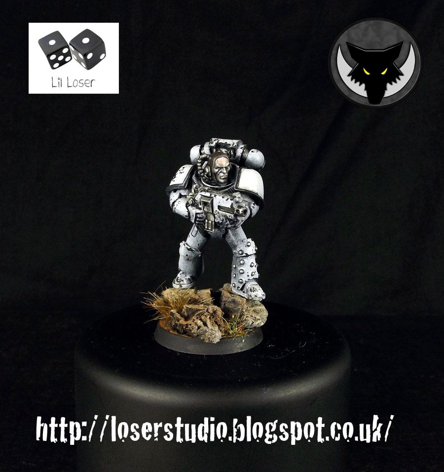
Loken Captain of the Tenth, renounced Son of Horus, Luna Wolf.


I've written up a retrospect in the character on my blog:
http://loserstudio.blogspot.co.uk/2013/03/garviel-loken-luna-wolf-son-of-horus.html
A little controversial for staunch imperial but there you go.
What do you guys think of the gif? It's quite clunky and it was a bitch to make. May only reserve this for special items like this diorama.
Lil'Loser
62565
Post by: Haighus
Awesome Typhon! Although I've just spent 5 mins trying to work out if that is 2 models of Typhon painted remarkably similar, or one model where you have managed to swap the heads (the terminator armour looks quite restrictive on swapping them round)
Currently leaning towards one model with 2 heads.
79241
Post by: Brother Payne
That's craaazy! How'd you do the cream w all the pink and green tinting?
@ Haighus - definitely one model
37819
Post by: LilLoser
Cheers guys. That is indeed one model.
79241
Post by: Brother Payne
How'd you do the cream w all the pink and green tinting
55909
Post by: gianlucafiorentini123
Great looking Typhon.
37819
Post by: LilLoser
Brother Payne wrote:How'd you do the cream w all the pink and green tinting
Oops, sorry for not answering this first time around. It was done with inks to simulate bruising on the flesh. Try purples, browns blues and reds with a little matt medium. Allow each layer to dry before washing any more ink on.
gianlucafiorentini123 wrote:Great looking Typhon.
Cheers dude!
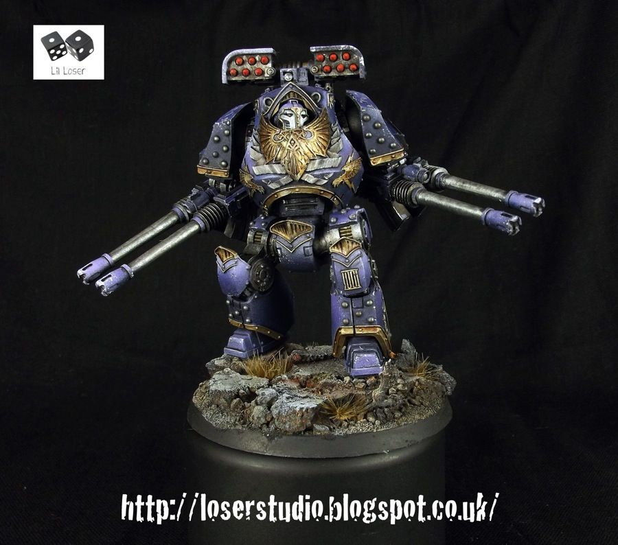
Sons of Horus Legion Sicaran Battle Tank
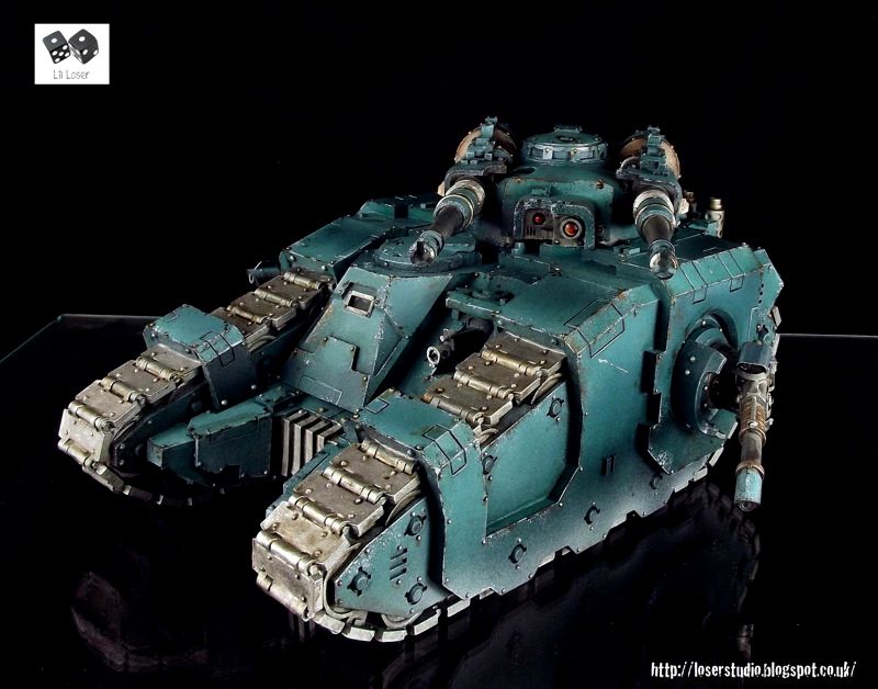
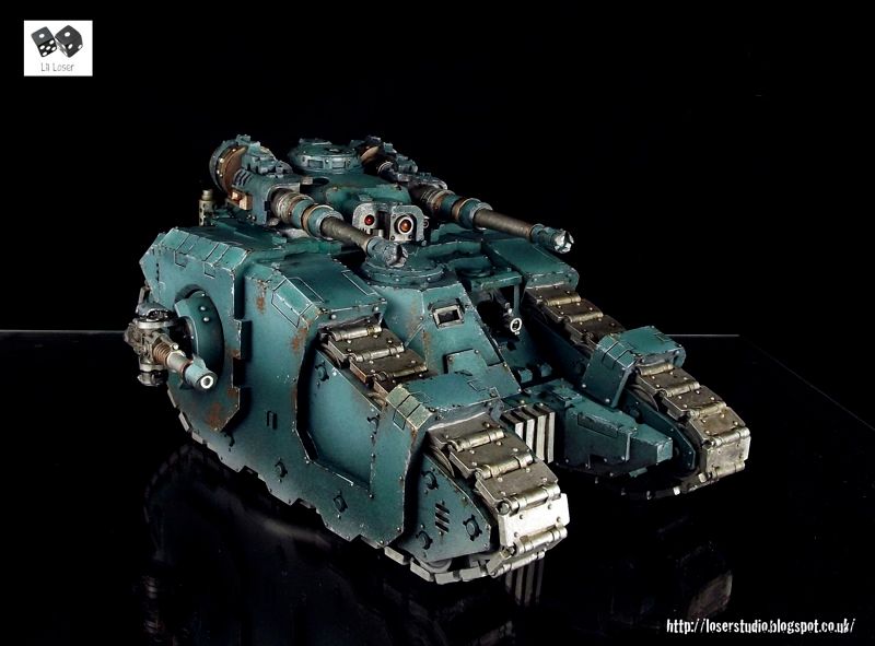
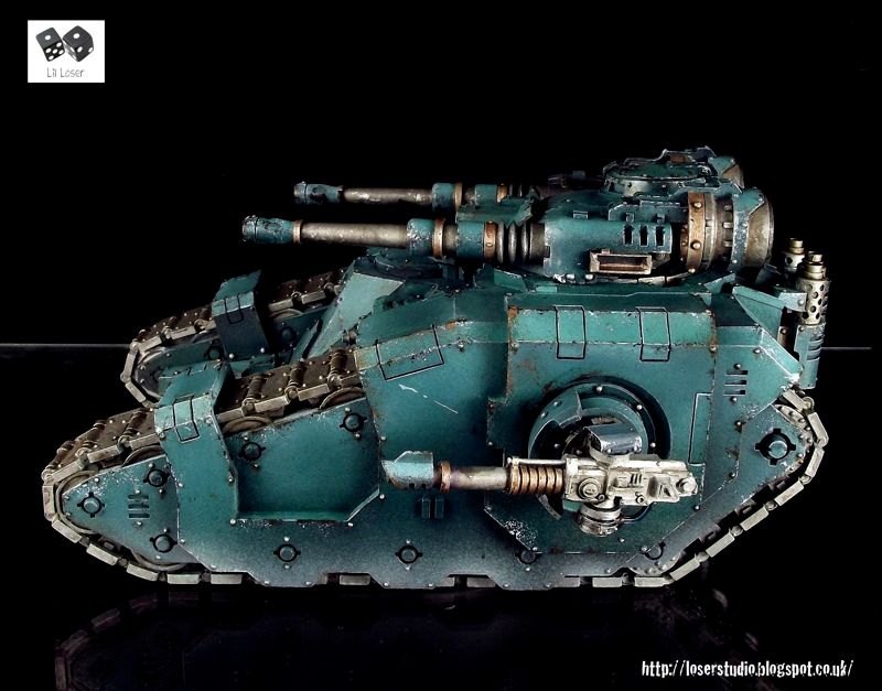
Sicaran Tetras, The Bastard of Beltragh. Heavy Ordnance of the Sons of Horus, Eighth Millenial
[Pict-capture Twelve Emperor's Insurrection]
Fogred at Mars the machine spirit of Teras had a reputation as having a bilious disposition. It would continue to exhibit malfunctions of an esoteric nature until its unconfirmed destruction in M37.
However this war machine had several notable kills before and during the Heresy. Agemenom, Captain of the Raven Guard's Shrike Legion, Vakaris the Glutton and the Xenos Lord Brakka Noin all fell to Tetras. Its last days saw it in the service of Iron Warriors annexing the Prmary Star system of Fell [Cross REF. The Bastard of BeltraghXXXIIII - Inquisitorial Seal Magenta].
**************************
Myles.
More photos
W.I.P's
26416
Post by: Young_Logan
Loving Typhon, definitely prefer the helmeted head version though. As always everything looking wonderful
Young Logan
79241
Post by: Brother Payne
Cheers for the tips on cream that tank though!
52425
Post by: Elnibbus
Ermagherd...
74327
Post by: Skimask Mohawk
I'm curios as to why you didn't put both shoulder guards on kharn, it really makes him look skinny
77159
Post by: Paradigm
Awesome work as always.
79241
Post by: Brother Payne
Not a fan of the model but awesome paint job!
Nice anecdote at the end 
26416
Post by: Young_Logan
Awesome work much prefer the helmeted head though, all the Horus heresy bare heads seem a little odd to me.
Keep up the good work though, looking forward to the next up date
Young Logan
38632
Post by: Deacis657
Your work always has me in awe so do me a favor. Keep it up!
62565
Post by: Haighus
Awesome as ever
23810
Post by: Flippa
Have you been altering the lighting in photoshop on some of these? Loken and Abaddon seem to have no outline and are really hard to make out.?
37819
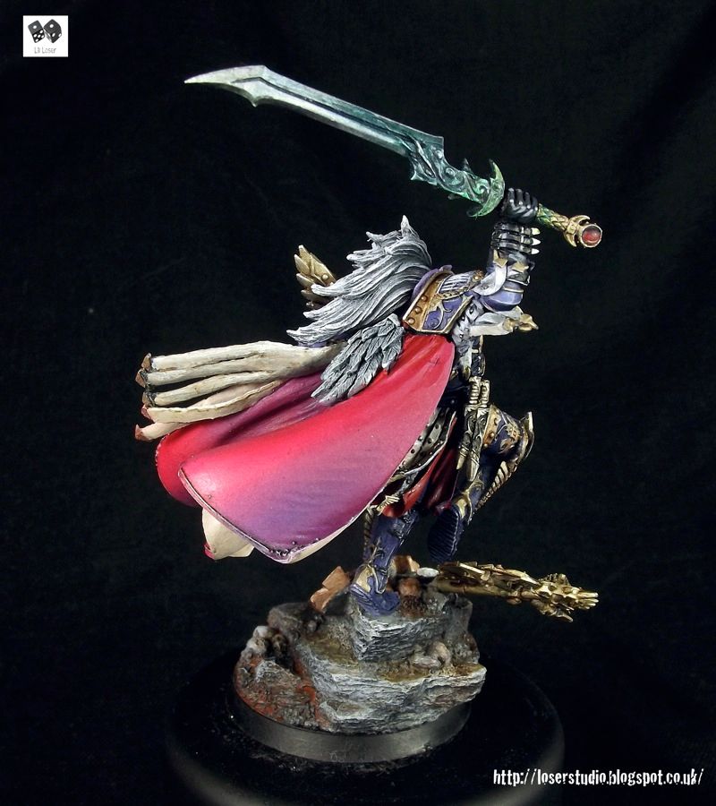
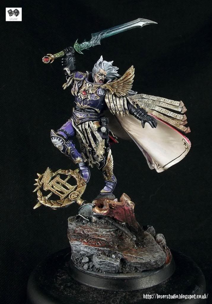
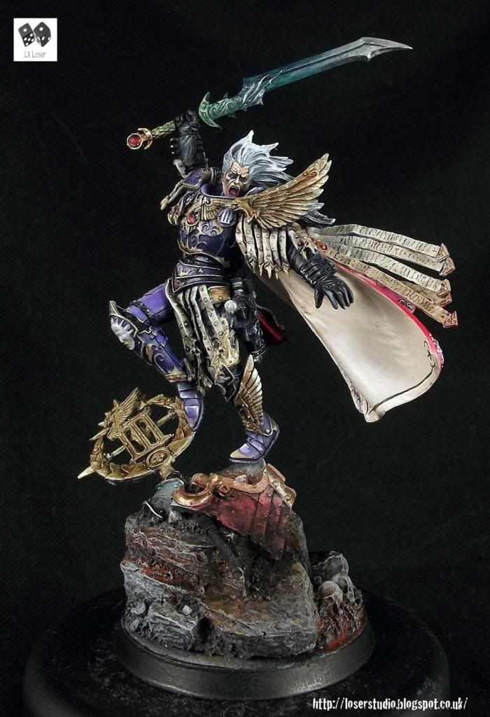
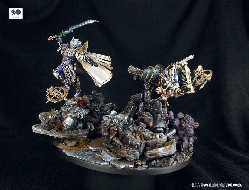
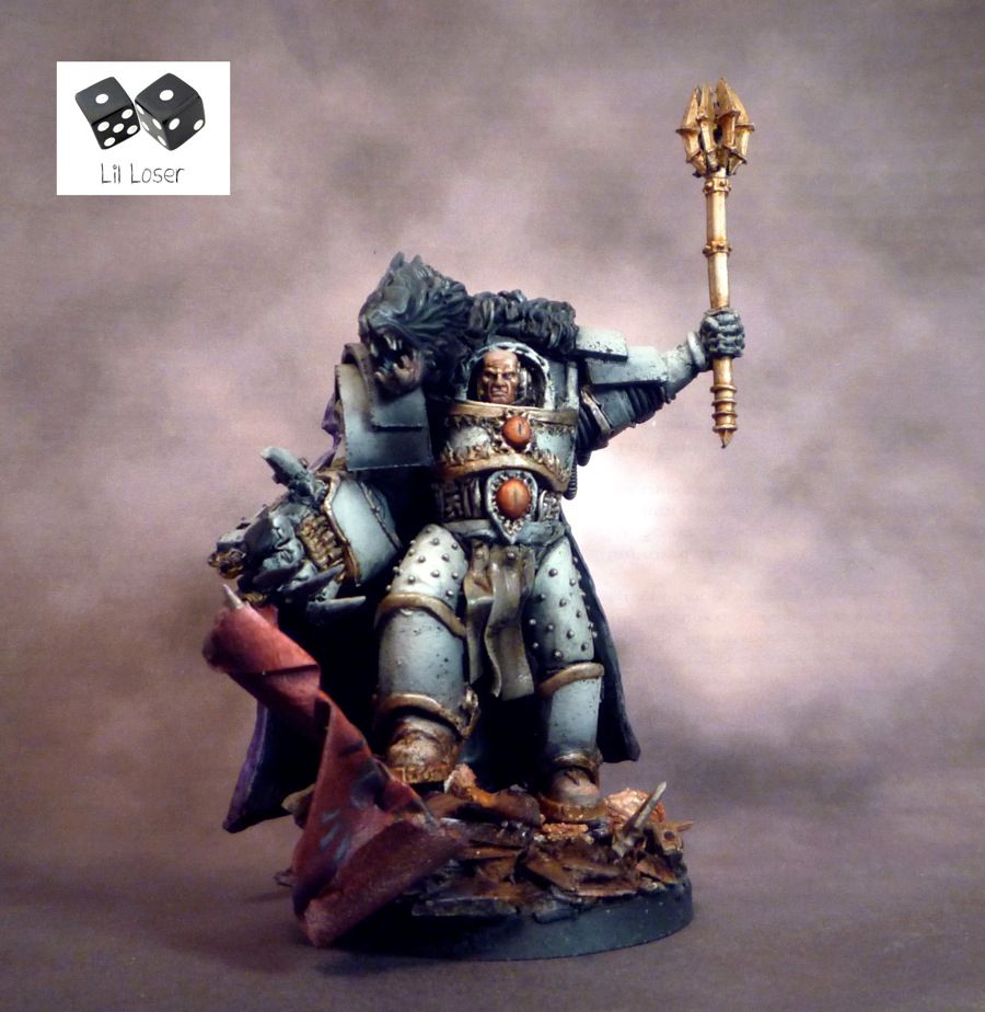
Post by: LilLoser
Mortarion The Lord of Decay. Primarch of the Death Guard
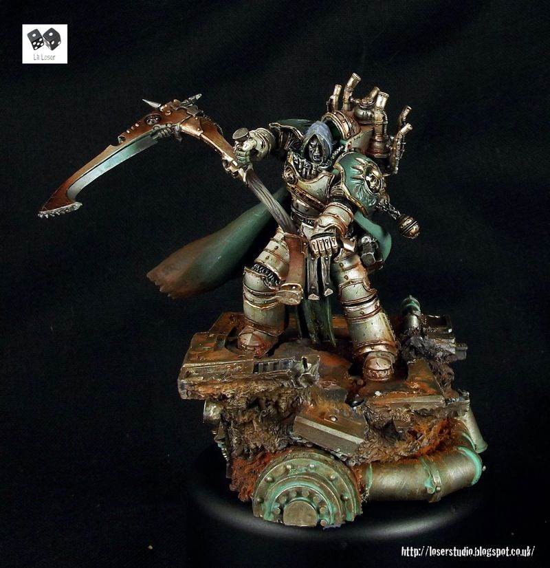
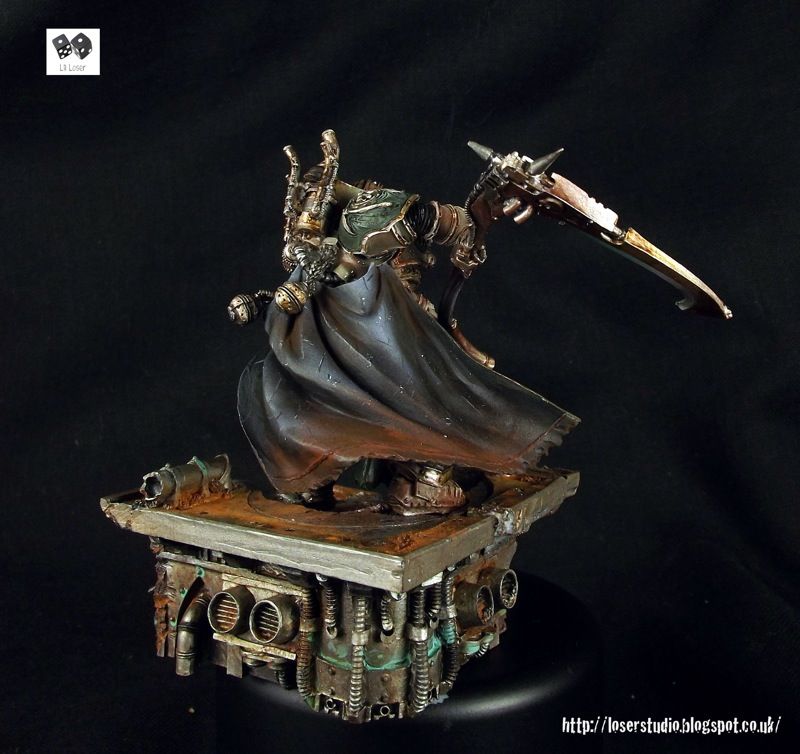 
“But, you know, I feel more fellowship with the defeated than with saints. Heroism and sanctity don't really appeal to me, I imagine. What interests me is being a man."
Attributed to Mortarion [Unverified]
[URL="http://loserstudio.blogspot.co. uk/2014/05/dont-fear-reaper-mortation-primarch-of.html"]
More pics[/URL]
W.I.P
Myles
@ Flippa - It's my own fault, I wasn't familiar with the camera at the time and the photos came out awfully dark. When I tried to adjust them...well, you can see the results for yourself. Any tips on how to improve my photography or presentation would be great.
22192
Post by: whalemusic360
Man, that was quick!
4179
Post by: bubber
SOOOOO much better than the ones FW did. Great job!
77159
Post by: Paradigm
I still hate that model, but the execution of the painting is great as ever. Abbadon is epic too.
37819
Post by: LilLoser
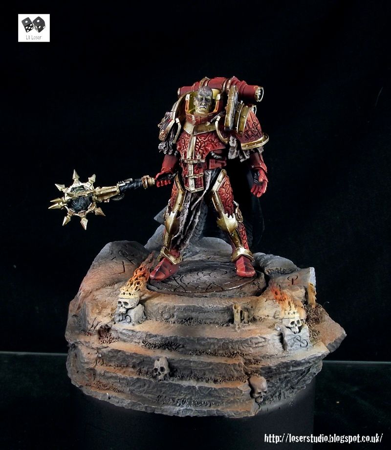
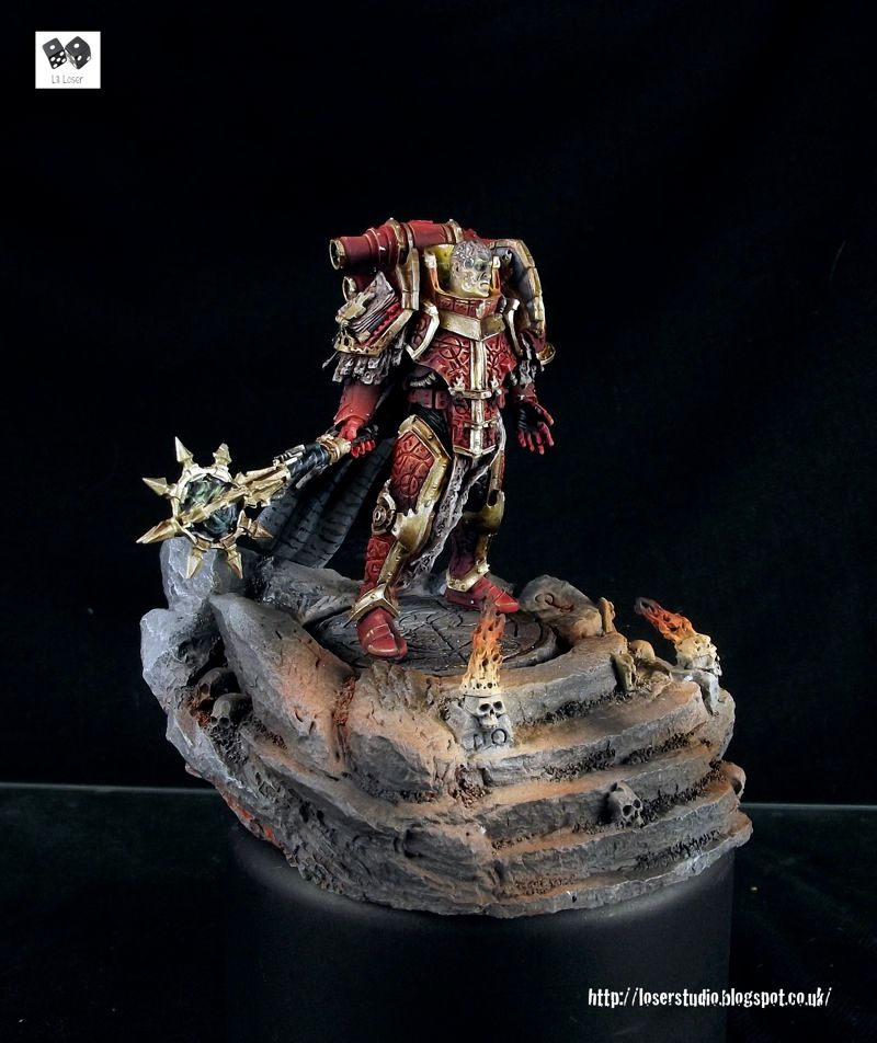
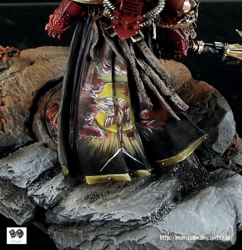
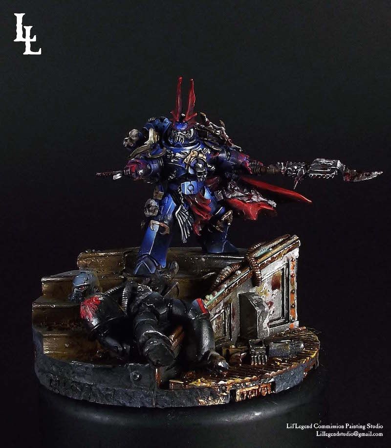
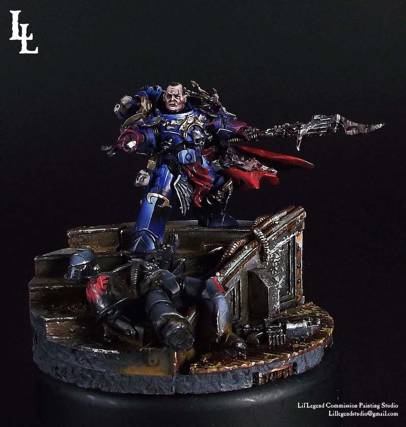
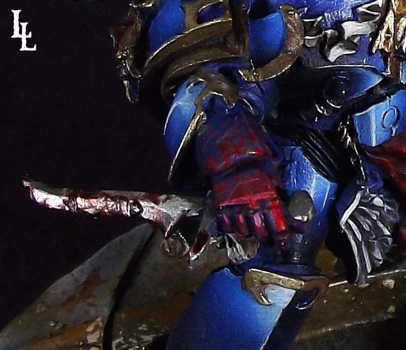
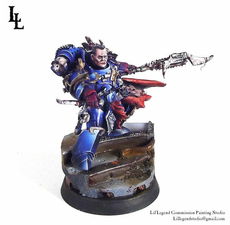
Kharn the Crimson
 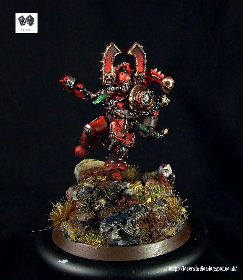
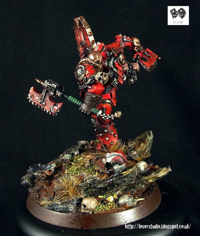
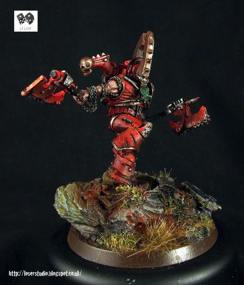
Vae Victis
More pics
Show the Love
77159
Post by: Paradigm
Very nice! Not seen him in red before!
39666
Post by: GiraffeX
Now thats what the Kharn model should have looked like.
Lovely painting and converting.
19650
Post by: shingouki
You make me sick.......
No just joking,damn there is some real beautiful painwork in this blog.Kharn and Mortarion are fantastic imo,as are the rest.
79241
Post by: Brother Payne
 GiraffeX wrote: GiraffeX wrote:Now thats what the Kharn model should have looked like.
Lovely painting and converting.
Totally.
Love it!
62565
Post by: Haighus
Just Incredible. The cloak in particular for me is stand out. Love the choice of colours- I don't think many people would go for an almost crystalline pale blue.
Your painting talents match the artisanry of the XVIII well.
77159
Post by: Paradigm
Exceptional as always!
79241
Post by: Brother Payne
Absolutely stunning! Love the skin colour and the hammer (and the armour and the cloak and well... all of it)!
I didn't even think he was out yet - how'd you get our hands on him?!
46466
Post by: San76
Phenomenal mate! love the vulkan - the skin tone and the green are very nicely done. the cloak on mortarion is so classy as well, you really captured a real sense of movement there!
33919
Post by: Moltar
Another knockout, Myles! That looks incredible.
62565
Post by: Haighus
People who went to one of the recent FW events could buy him there as a pre-release, along with a few other upcoming models.
79241
Post by: Brother Payne
Haighus wrote:
People who went to one of the recent FW events could buy him there as a pre-release, along with a few other upcoming models.
Oooh any idea where/if I can see pics of said models?
62565
Post by: Haighus
You can find them on the FW news and rumours thread, but it is a bit of a mess to find the pre-release models on it. I think they were Vulkan, the Gal Vorbak (which have gone on general release today), Imperial Armour 4 and the Tyranid Dimachaeron which I think have already been released. Talking of Gal Vorbak, they look like a great opportunity to turn up on this page in a painted form....
41573
Post by: Small, Far Away
I think I should probably give up painting.
Your work is fantastic.
88439
Post by: Macharius.
Amazing work mate! Vulkan has to be my favorite. I love your take on his skin color as well. Best Vulkan I have seen.
70132
Post by: Skillingspree
How on earth did you paint Kharn's white armour? It's incredible!
70572
Post by: Kr00gZ
Exceptional work as always, Myles. I continue to enjoy following your work. Never disappointed. Keep it up!
85353
Post by: UnboundFlame
I can't wait for this model to be released on FW, I'll definitely add Vulkan to my ever-expanding Salamanders force. Nice paint job too!
37819
Post by: LilLoser
Cheers for all the wonderful comments guys!
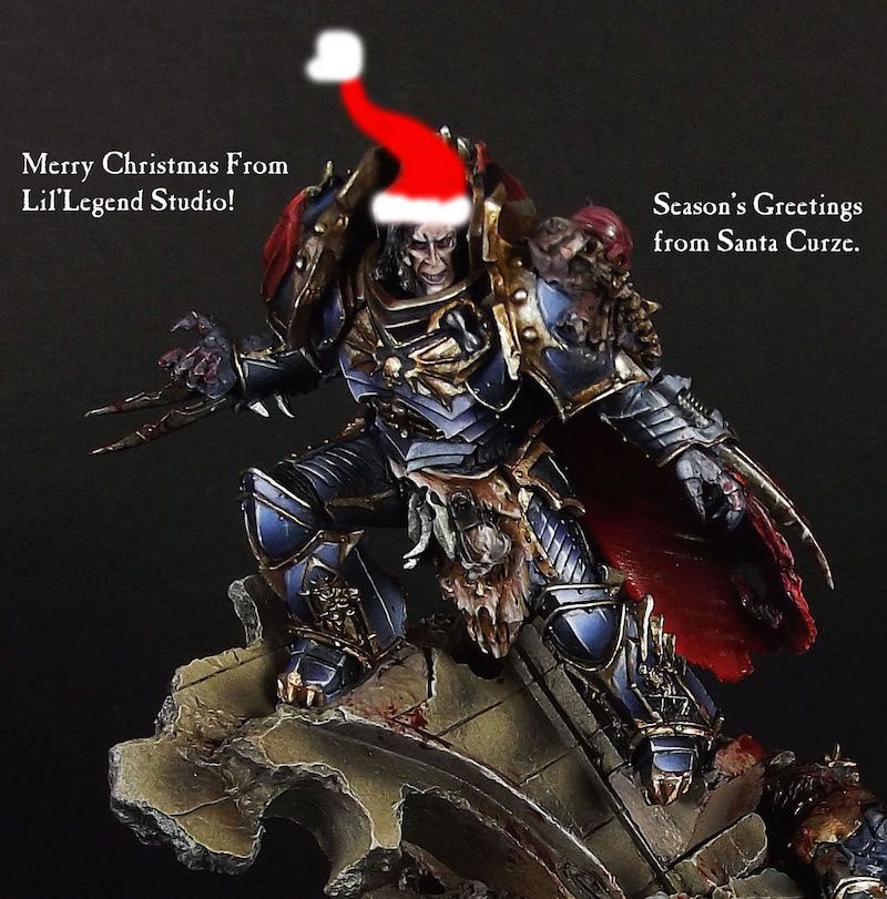
Konrad Curze, The Night Haunter
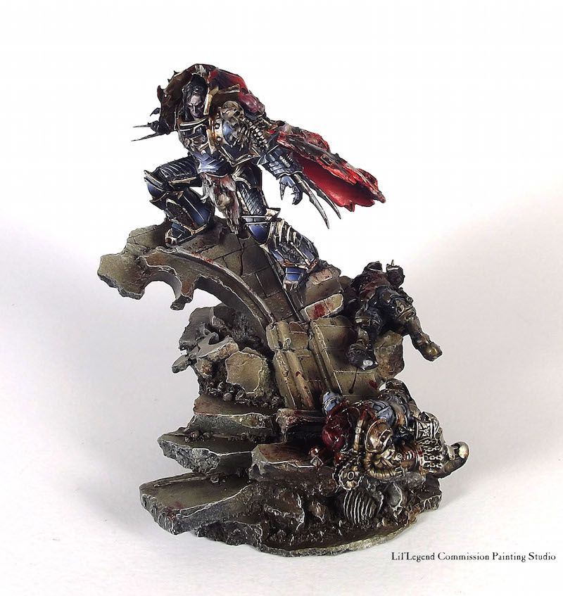
Happy Christmas from the Night Haunter!
Paints used: Vallejo, Reaper Master Series, Games Workshop Washes, Com Art Medea Airbrush Paints
Airbrush: Iwata CR Plus High Line
Paint Brushes: Rosemary & Co. Raphael 8040, Broken Toad Brushes
Bigger pics
W.I.P
Myles
77159
Post by: Paradigm
Amazing in every way, but the face and armour really stand out!
39666
Post by: GiraffeX
Santa Curze is looking really excellent, love the way it looks like the bodies have slid down by the blood trail.
4179
Post by: bubber
Erh - WOW. Another great paint job!
How much for a paint job like that (on a primarch)?
PM me if you don't want to do a public post - cheers!
Also do you use the Com Art through the airbrush or for hand painting?
Automatically Appended Next Post:
ta
90911
Post by: horuslupercal1988
Awsome models very inspiring
84004
Post by: Jinx Magiga
That's amazing
49496
Post by: Great White
Great work man, can't wait to see the whole character series
18474
Post by: Darth Bob
All the models in this thread are phenomenal, but Kurze is a step above the rest. The highlighting on the armor is incredible and that sinister, wicked, and insane smile he's got? Perfect. You've accented all the biggest parts of the model perfectly. I especially like the gory red cloak.
74327
Post by: Skimask Mohawk
Did you find vulcan and curze's faces to trickier to do?
I find on vulcan that his face is a much lower quality compared to the rest of your paintjob, that might be due to the nature of trying to make "pitch black skin" still look like skin. I have a feeling on curze that your camera is washing a bit of detail out since its already so pale.
Otherwise your transitions are fantastic , especially on vulcan's armour
37819
Post by: LilLoser
Cheers for the responses guys!
 bubber wrote: bubber wrote:Erh - WOW. Another great paint job!
How much for a paint job like that (on a primarch)?
PM me if you don't want to do a public post - cheers!
Also do you use the Com Art through the airbrush or for hand painting?
Automatically Appended Next Post:
ta
This model is currently for sale on eBay
http://m.ebay.co.uk/itm/271715855334?nav=SEARCH
I am a commission artist my trade and if you'd like one paints duo don't heaitate to contact me via;
Lillegendstudio@gmail.com.
Hope you are all having a wonderful Boxing Day.
Myles
4179
Post by: bubber
Cheers for the reply Myles.
Hope you had a great day - I did.
Checked out the auction - bit out of my price range unfortunately. Maybe this will help me dig out my paints & actually do some stuff myself.
84410
Post by: queen_annes_revenge
curze looking sick. i just bought him online. cant wait to get started.
44465
Post by: FeindusMaximus
sweet
79241
Post by: Brother Payne
Oh my lord Conrad looks amazing!!
Love the pun btw
84410
Post by: queen_annes_revenge
I have a question, how do you assemble his base fully amd still allow for the smaller base to be removed? No ones answered on my thread about it so i'll ask you.
37819
Post by: LilLoser
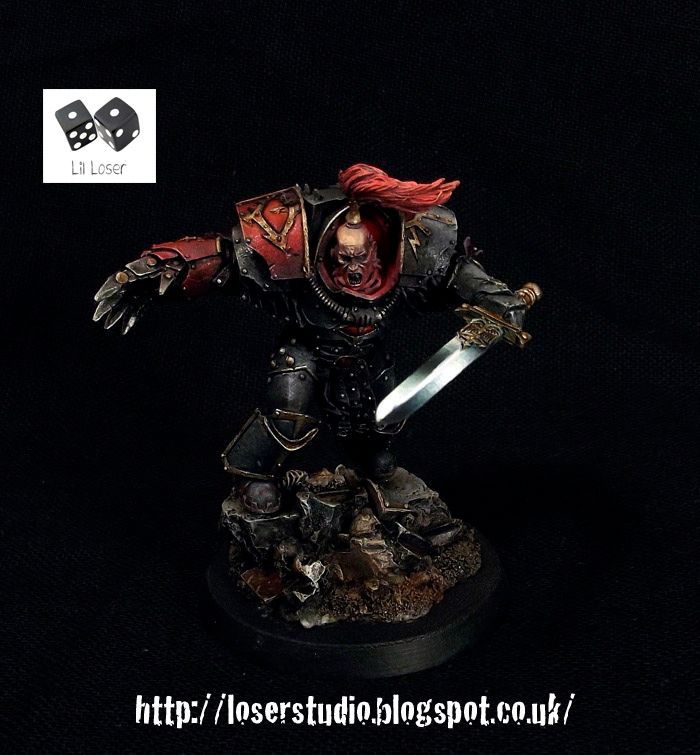
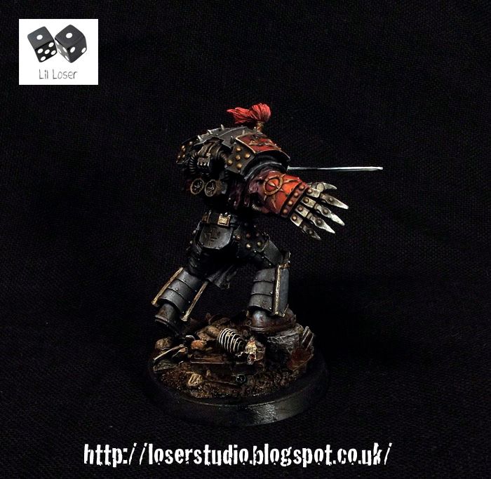
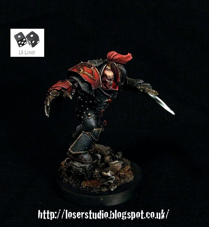
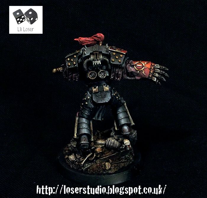
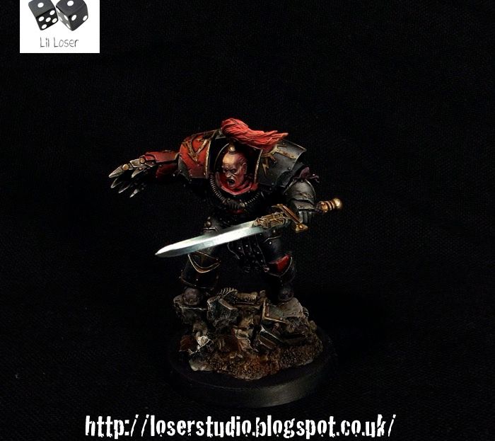
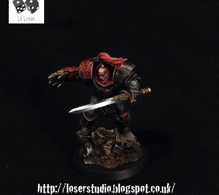
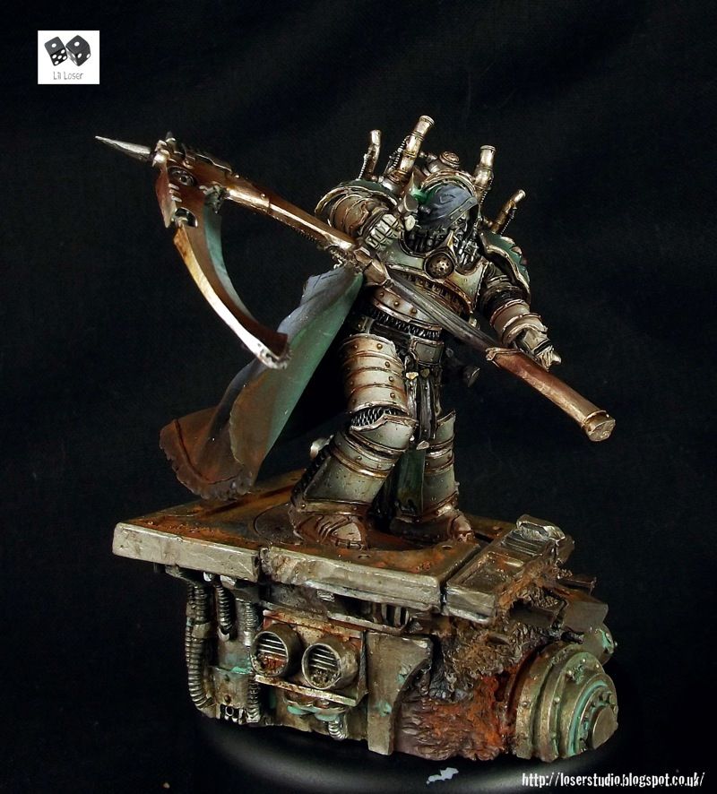
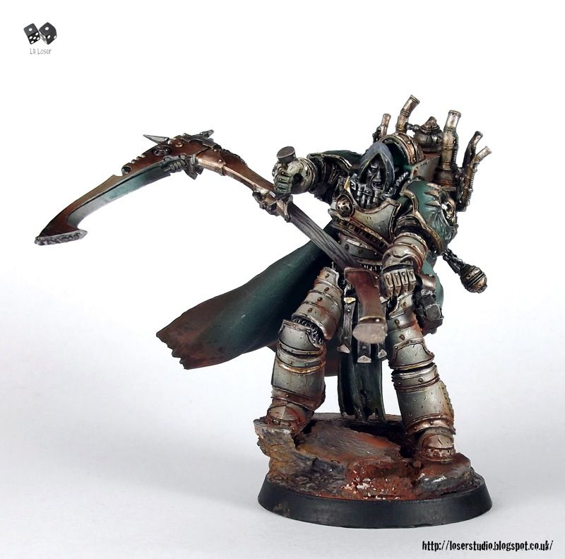
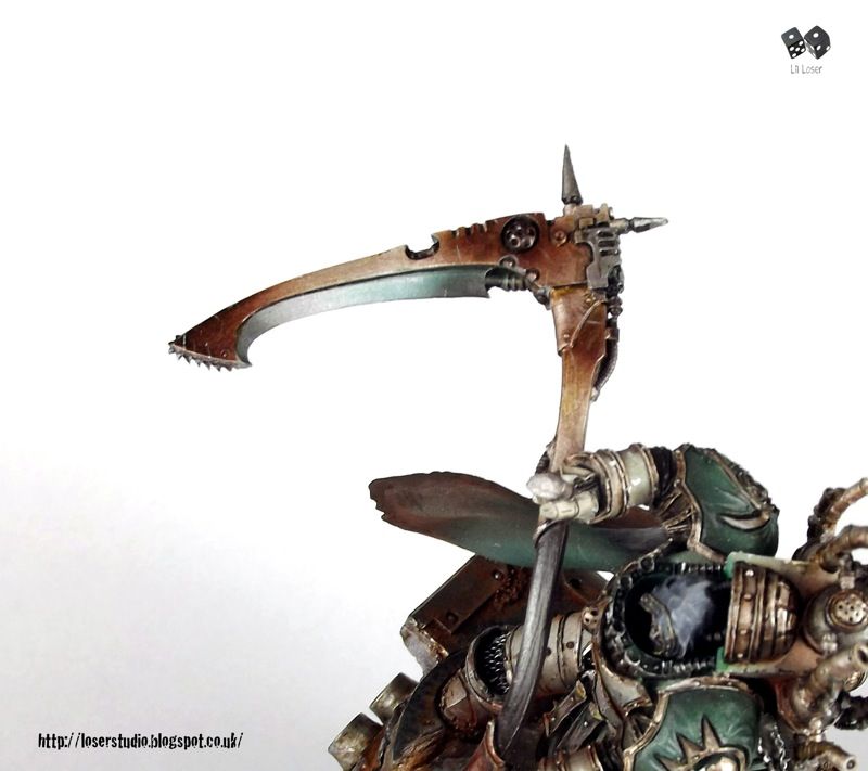
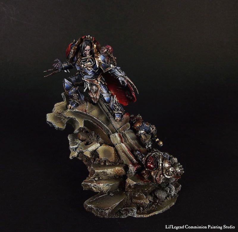
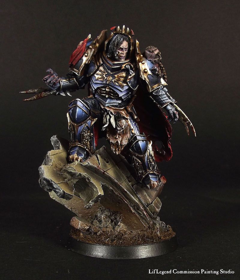
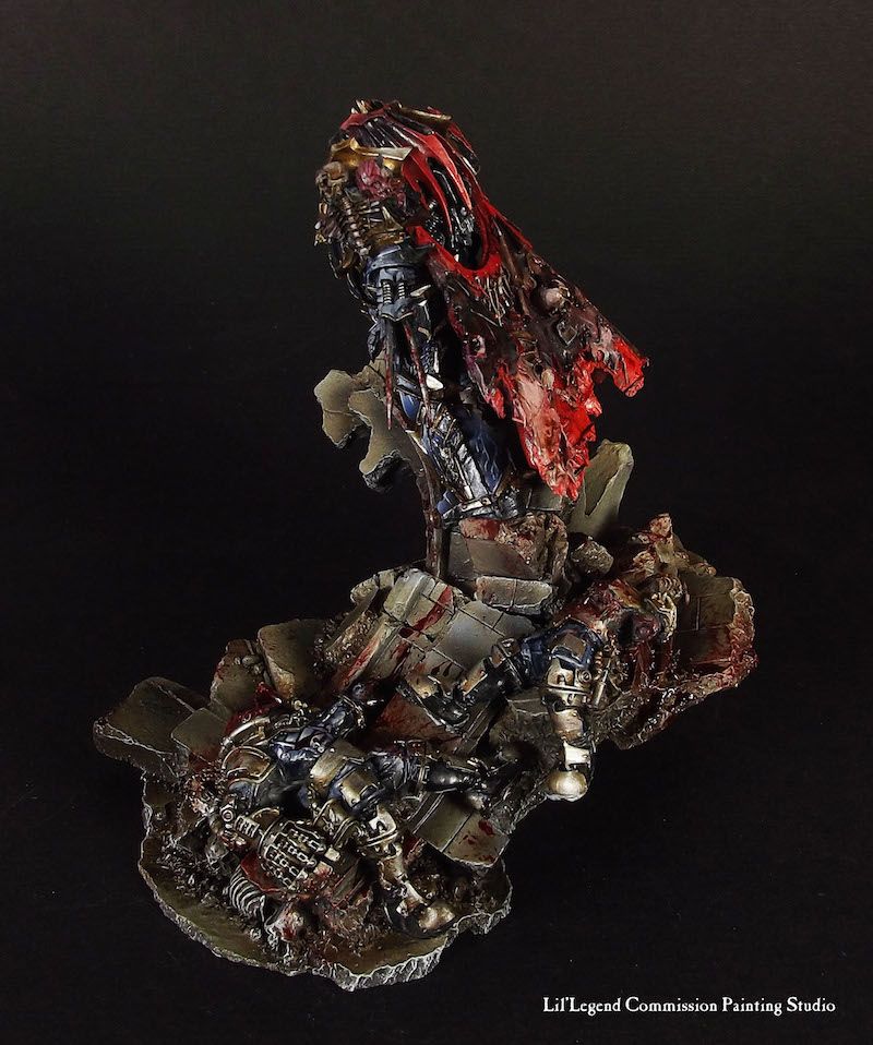
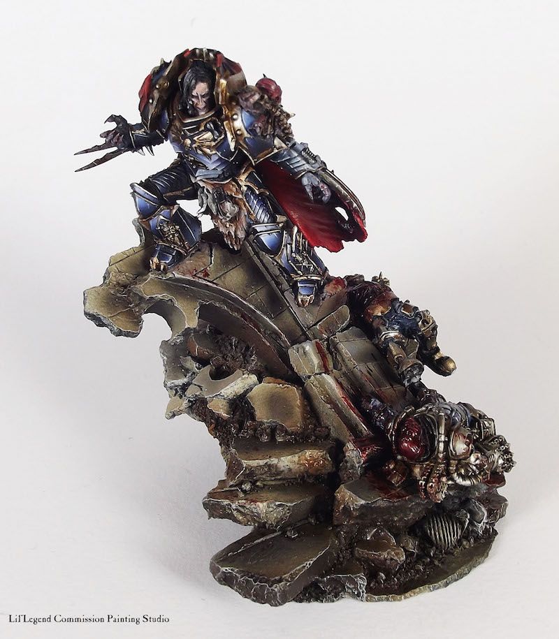
Sevatar the Prince of Crows
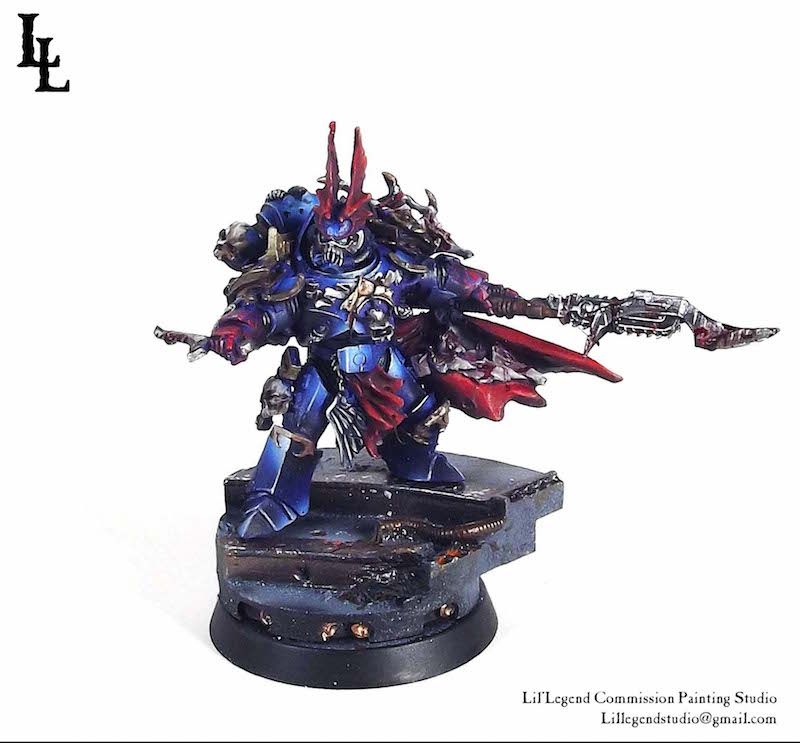
These figures keep getting better and better. It's ridiculous.
Paints used: Vallejo, Reaper Master Series, Games Workshop Washes, Com Art Medea Airbrush Paints
Airbrush: Iwata CR Plus High Line
Paint Brushes: Rosemary & Co. Raphael 8040, Broken Toad Brushes
Bigger pics
W.I.P
Myles
@Queen Annes Revenge. They just slide out.
44181
Post by: Commissar41.0
one thing they forgot to mention in the fluff is that Vulkan suffered from serve case of Cyanosis...ugh of all the Primarchs you had to mess up it had to be my Legion......every other picture is amazing beyond words.....but last time i checked Vulkan was a Space Marine..not a Tau
53630
Post by: deadairis
Painfully awesome. Vulcan's skin tone and Lorgar's underlighting? Blown away. Hurts my heart.
And while I'm potentially in the minority, I love the Lorgar sculpt. Human and worn down. Actually really love the whole character set for the Word Bearers.
78425
Post by: SweaterKittens
 Commissar41.0 wrote: Commissar41.0 wrote:one thing they forgot to mention in the fluff is that Vulkan suffered from serve case of Cyanosis...ugh of all the Primarchs you had to mess up it had to be my Legion......every other picture is amazing beyond words.....but last time i checked Vulkan was a Space Marine..not a Tau
Vulkan and the Salamanders have black skin. With highlighting, in the bright light, surprise surpise, looks gray. Last time I checked, this guy was a commission painter, not painting for your personal amusement, so why don't you pack in the 'He messed up MYYYYY legion " crap. Good lord.
81831
Post by: SRSFACE
 queen_annes_revenge wrote: queen_annes_revenge wrote:I have a question, how do you assemble his base fully and still allow for the smaller base to be removed? No ones answered on my thread about it so i'll ask you.
That's how all the Horus Heresy miniatures are designed. They are both play pieces, that come with an expanded diorama base for displaying. You can fully build them while still having access to the smaller gaming miniature.
Anyway:
I am blown away by everything in this thread. I wish I could just sit down with you and pick your brain or even just watch you work to see how you do it. I aspire to your level of painting, LL.
37819
Post by: LilLoser
Thanks guys!
@ srsface- fire away with questions! I'd love more interaction withy the community. I have pictures detailing the step by step of a few pieces now but finding the time to lay it out and write it up is proving to be a challenge. If you have any questions though I'm happy to help.
@sweaterkittens - yup, you nailed it. My fear was by simply painting the face black against such a vibrant green armour that it wouldn't stand out and that the viewer would struggle to really see the face. Different lighting, sweating etc can cause all different kind of effects. I'm glad you can appreciate this, really makes painting worth while.
@deadaris couldn't agree more. I have thought of swapping lorgar a head for horus' for an experiment.
Myles
37819
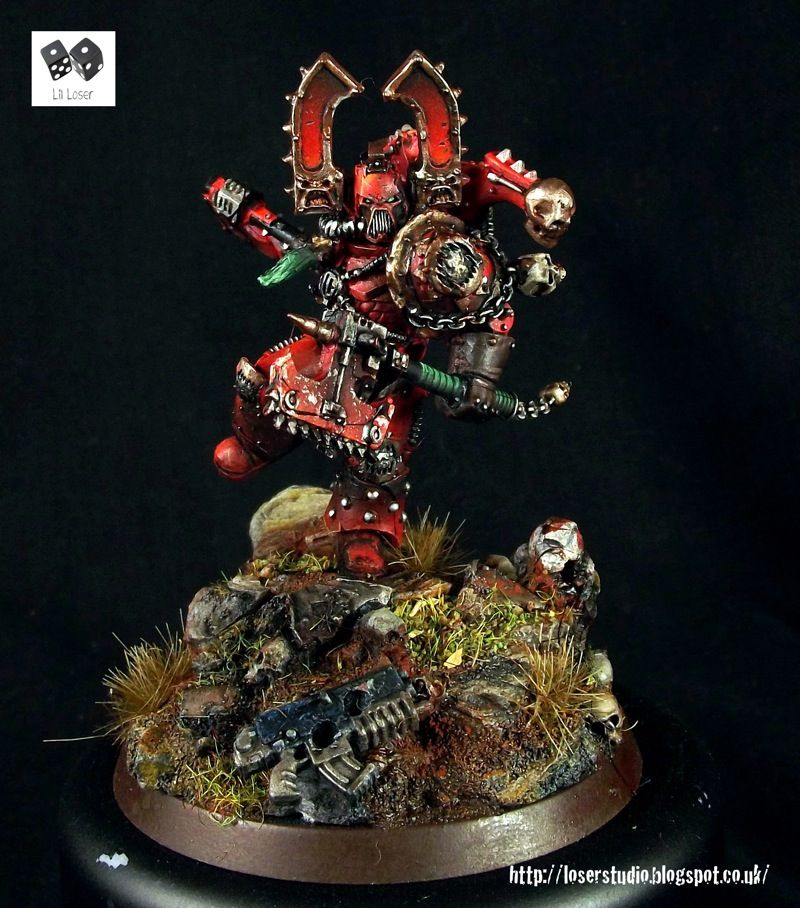
Post by: LilLoser
Today we throw some light onto the Mhara Gal, the unholy union of rampant biological growth and Dark Age Technology.
Enjoy!
Mhara Gal
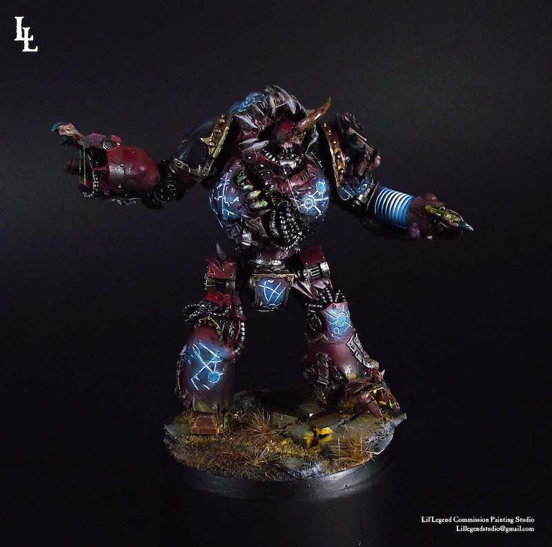
Myles
62565
Post by: Haighus
I like the saliva strings on the claw, really makes it look organic. How did you do those?
|
|