| Author |
Message |
 |
|
|
|
|
Advert
|
Forum adverts like this one are shown to any user who is not logged in. Join us by filling out a tiny 3 field form and you will get your own, free, dakka user account which gives a good range of benefits to you:
- No adverts like this in the forums anymore.
- Times and dates in your local timezone.
- Full tracking of what you have read so you can skip to your first unread post, easily see what has changed since you last logged in, and easily see what is new at a glance.
- Email notifications for threads you want to watch closely.
- Being a part of the oldest wargaming community on the net.
If you are already a member then feel free to login now. |
|
 |
2007/03/14 21:17:30
Subject: Problems with rocks on Dire Troll Mauler. Need some advice!
|
|

Trollkin Champion
Scottsdale, AZ
|
Hi all, So I've been plugging away at my Dire Troll Mauler (my first hordes mini) and I was cruising along at a good clip until I got to the point where I needed to paint the rock protrusions sticking out of his skin. I just can't get a good looking setup for the rocks. They either look too messy, or unrealistic, and I couldn't get that "brown rock" effect that you see on the box picture/Privateer model. I've come to the conclusion that I just have no idea how to properly paint stone. Here's a link to my blog where there are several large sized pics showing the problems I am having with it. If you click on them it will blow up to a fairly large size. Linky I would really appreciate any tips or advice on how to paint stone and make it look nice! I've spent a few days on this already and am just plain out of ideas.  " style="vertical-align: middle;" src="http://forums.privateerpress.com/style_emoticons/default/sad.gif" /> Thanks!
|
|
|
|
 |
|
2007/03/14 22:46:44
Subject: RE: Problems with rocks on Dire Troll Mauler. Need some advice!
|
|

Regular Dakkanaut
|
To be honest these look fine to me. Really I don't know why you don't like them. The highlights are nicely done and they are in keeping with the rest of the paintwork on the character. Seriously don't beat yourself up over it. You have a good level of painting skill, the mini looks great.
|
|
|
|
|
2007/03/15 04:40:07
Subject: RE: Problems with rocks on Dire Troll Mauler. Need some advice!
|
|
[DCM]
Gun Mage
|
I think yours looks great, but if you want the rock highlights to be more subtle you could try closer shades to the base color. Perhaps a couple duller shades of gray mixed with black. I went for the brown (tan) rocks on mine with a bit of mixing of colors. I don't consider myself an exceptional painter, but I do like how it came out. 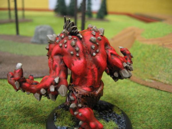
|
|
|
|
|
|
2007/03/15 05:22:17
Subject: RE: Problems with rocks on Dire Troll Mauler. Need some advice!
|
|
Fresh-Faced New User
|
I think those rocks look just fine. As said already, they fit the style of the rest of the figure. Maybe this will help if you're looking for a more "dusty" look: www.necrotales.com/necroTutorials/tut_base_rock01.php 3 pages total, last page probably more helpful than the first. Kep
|
|
|
|
|
2007/03/15 08:56:59
Subject: RE: Problems with rocks on Dire Troll Mauler. Need some advice!
|
|
Trollkin Champion
Scottsdale, AZ
|
Hmm I think you may be right Russ, and I do like the look of your rocks more than what I've got so far. I will try taking the rock up in lighter shades before the final highlight. By duller shades of grey, what specific paints did you have in mind for that? For example, would codex grey work? It's a little less blue, but seems more "grey." Thanks for the website link E-Arkham. I would never have thought to layer browns and greys over each other...but now that I think of it, it really does seem to make more sense, especially with how rocks look in the real world. I'll give this technique a try later, maybe on some of the rocks on the underside of his hand so if I screw it up and have to paint over them, it won't really be a problem 
|
|
|
|
|
|
2007/03/16 02:39:22
Subject: RE: Problems with rocks on Dire Troll Mauler. Need some advice!
|
|
Incorporating Wet-Blending
|
I am with the crowd- they look fine. Perhaps they do not contrast enough with the base color for your taste? In that case, 2 suggestions.
1) Lighten them more. Use a warm medium grey basecoat and highlight from there.
2) Use a contrasting color. A warm brown (ie orange based brown) would likely do the trick and tie in with the head spines. Maybe start with a burnt brown, then bestial and highlight with bubonic with a bit of bleached bone at the points. Mixing the paints and using washes will smooth transitions.
Good luck.
|
-James
|
|
|
|
|
2007/03/17 04:13:48
Subject: RE: Problems with rocks on Dire Troll Mauler. Need some advice!
|
|
Fresh-Faced New User
Vallejo, CA
|
It's been a while since I've used Citadel paints, but I think you'd want to go from black to scorched brown to vermin brown to get a similar look to the official PP scheme:
http://privateerpress.com/images/hordes/gallery/trollblood/mauler.jpg
I think they look alright the way you have them. Have you considered stippling instead of traditional highlighting? That may give you the more natural look you're aiming for without the messiness of drybrushing.
|
|
|
|
|
|
|
|
