I have to agree with HFJor, the similar colours mean no contrasts, which equals not as pretty of a model.
I really like the turquoise, been considering it myself for various thingss, but it needs a contrast colour.
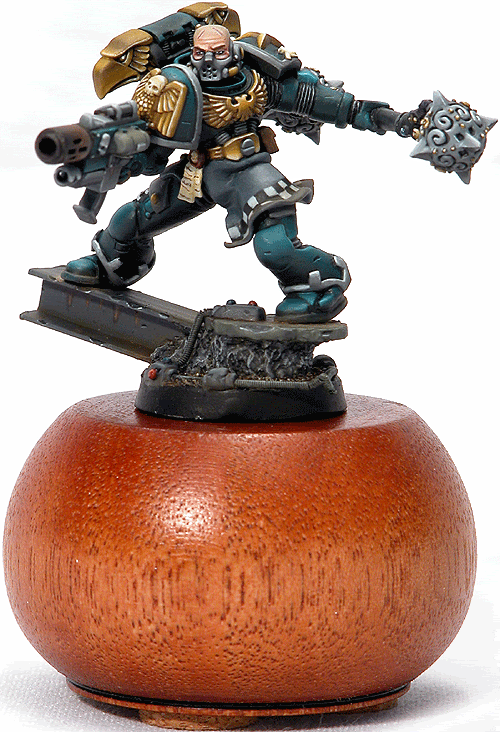
Here is a marine who did well in a Golden Demon competition (sorry to the original artist of the model, I'm afraid I didn't put down anywhere whose it was or what chapter it is), used turquoise really well with primarily gold and secondarily silver as contrast colours:
Maybe try something similar?


