Forum adverts like this one are shown to any user who is not logged in. Join us by filling out a tiny 3 field form and you will get your own, free, dakka user account which gives a good range of benefits to you:
No adverts like this in the forums anymore.
Times and dates in your local timezone.
Full tracking of what you have read so you can skip to your first unread post, easily see what has changed since you last logged in, and easily see what is new at a glance.
Email notifications for threads you want to watch closely.
Being a part of the oldest wargaming community on the net.
If you are already a member then feel free to login now.
2018/01/25 21:20:39
Subject: Re:(Not) Santas Workshop of the Strange, Wierd, and Wonderful - 25 Jan - GOTHICA - pg 69!
Anvildude wrote:That's a fair answer. I think that, like, 50% of working as an artist is figuring out how much is 'enough'- in price, work, quality... After all, an artist is their own worst critic.
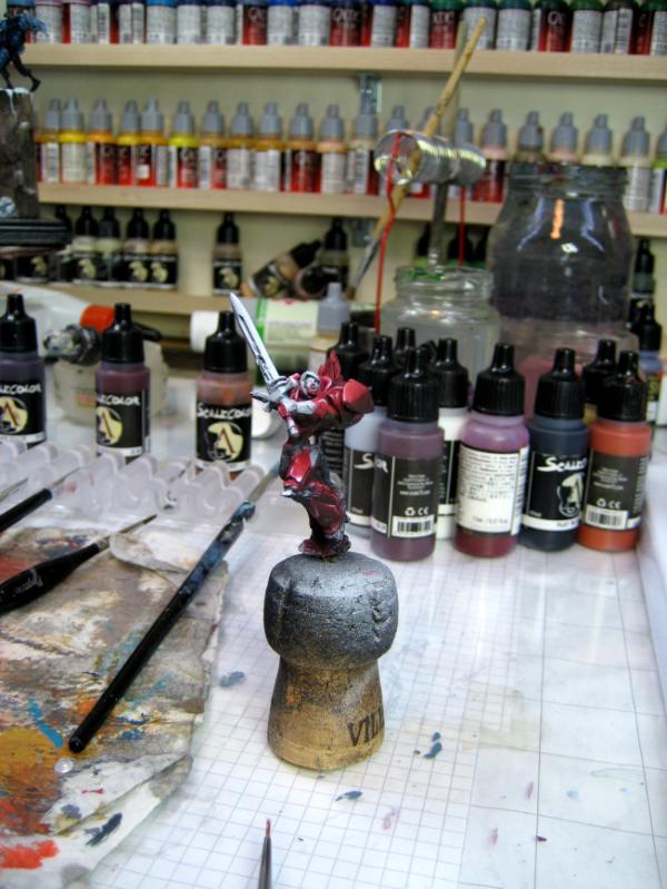
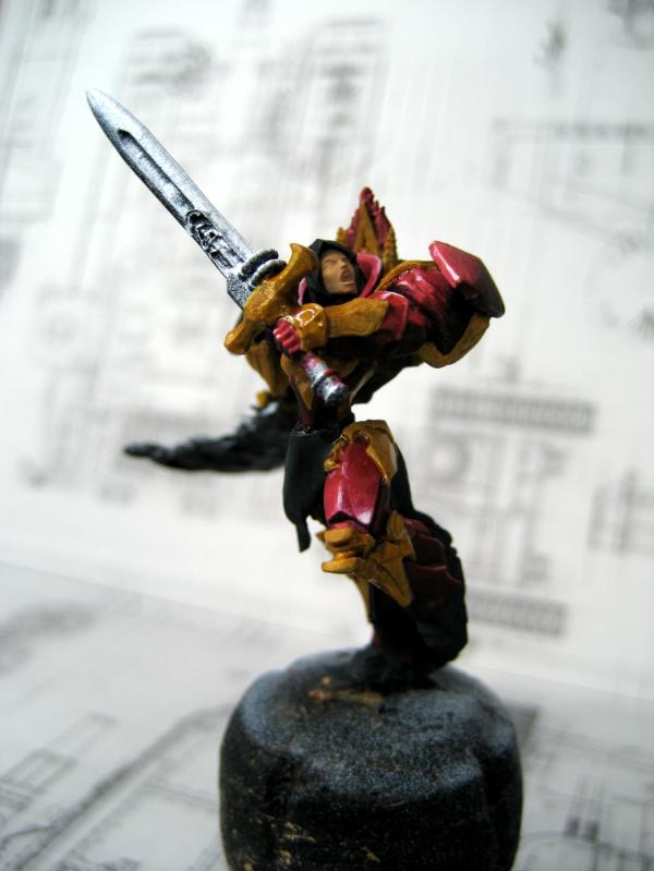
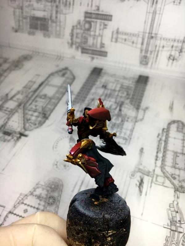
Now, on to the Boudicca.
I might have missed this further back, but are you specifically casting this version of her as a Vampire queen? Or something otherworldly? Because the perfectly smooth skin tone is suggestive of that. If that's not the goal, then a little bit of blush in the cheeks, forehead and nose would go far to bringing some life into her skin.
A beautifully rendered shadowed base, though. I'm looking forwards to seeing it with full lighting and background.
Yeah at this time the skin was only the base Color - I had not started the shading and highlighting yet
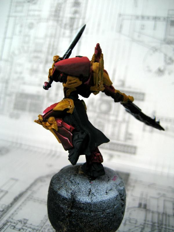
Meer_Cat wrote:I very much like this next stage in Gothica's emergence, Klaus, very, very, good work. The shield particularly is striking- it puts me almost in mind of Eastern Orthodox iconography, but- of course- with a very vampy twist!
Hah! You immediately grasped my Inspiration for the shield Yeah I had a "black Madonna" in mind when I started it.
CommissarKhaine wrote:'Added a freehand to the shield'... That's some amazing work, I love the colouring on that shield.
Honestly I swore myself never to combine hobby and job/making-money again. I tried it before and it completely destroyed my hobby for me.
Pyschology has tons of studies on that subject. Smart move not to try it again!
Thank you Mate!
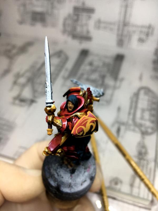
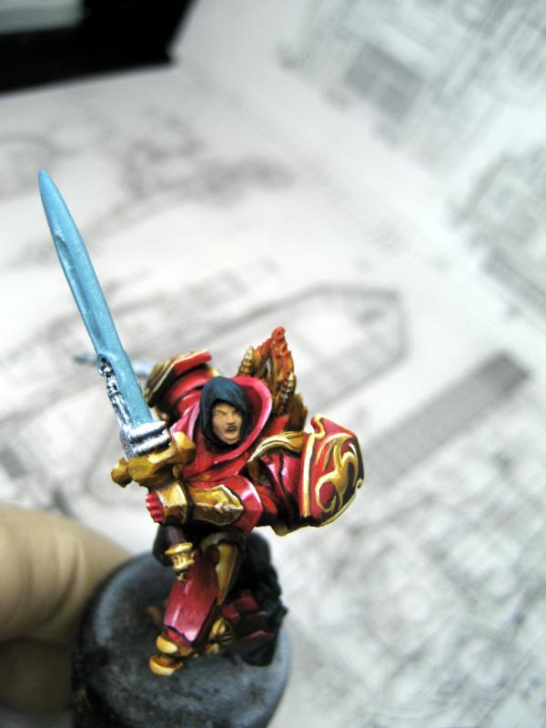
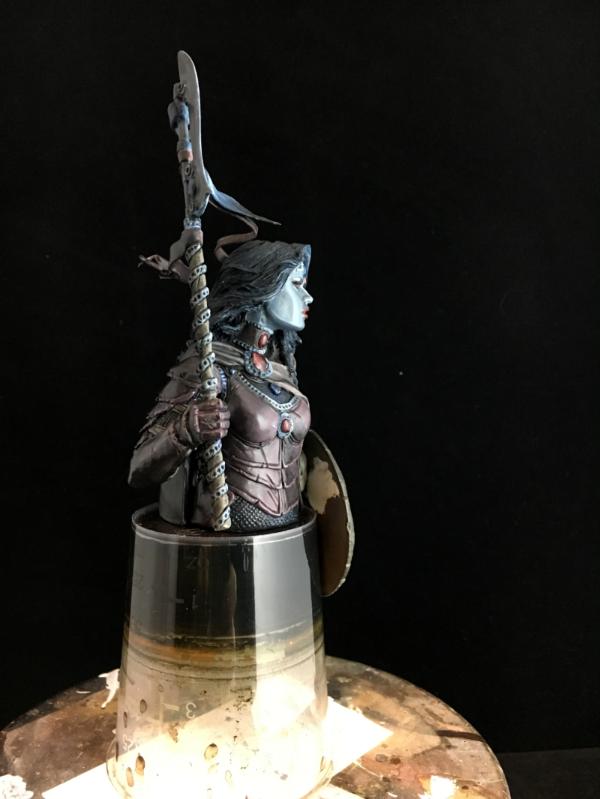
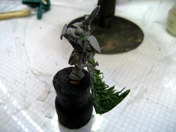
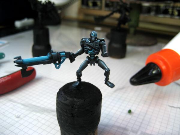
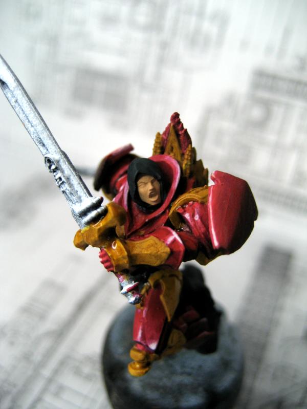
in the last update all that was left was pretty much the face.
I was thinking of adding a kind of a tear-ish black make-up around her eyes.
I thought it could emphasize the vampiric look.
But before the make-up had to come the actual face The first try looked kind of messy
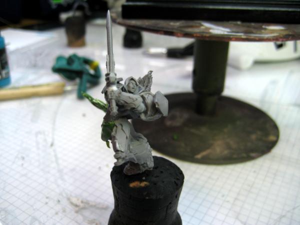
The second try was a bit smoother
the eyes began to glow
But it was really hard to get convincing shadows and smooth transitions
This is where I stopped
I think she looks good
And the light situation is convincing
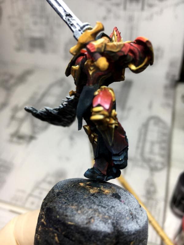
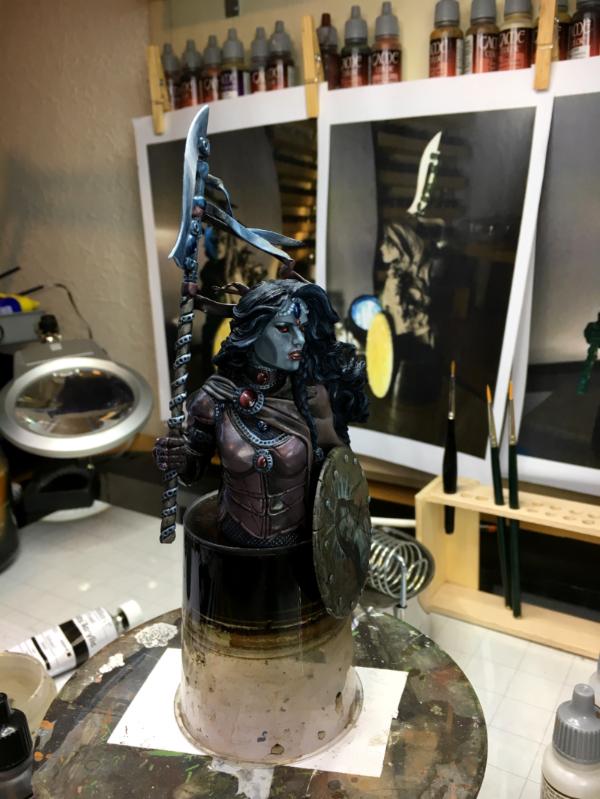
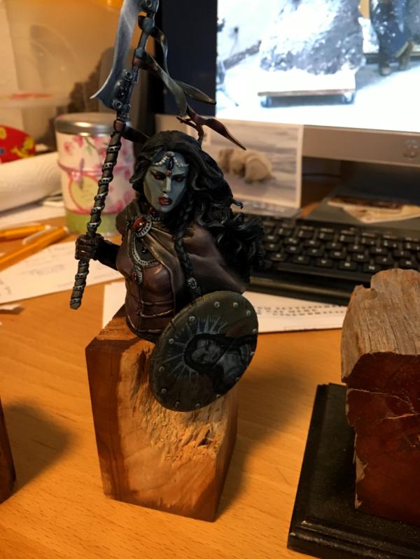
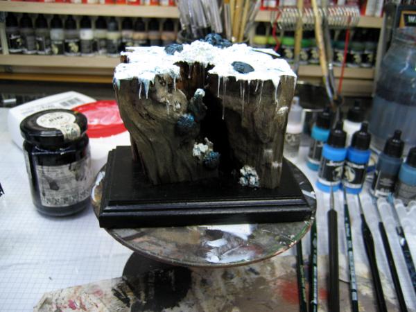
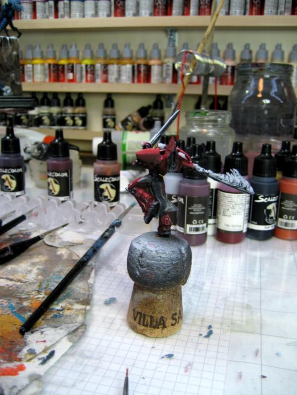
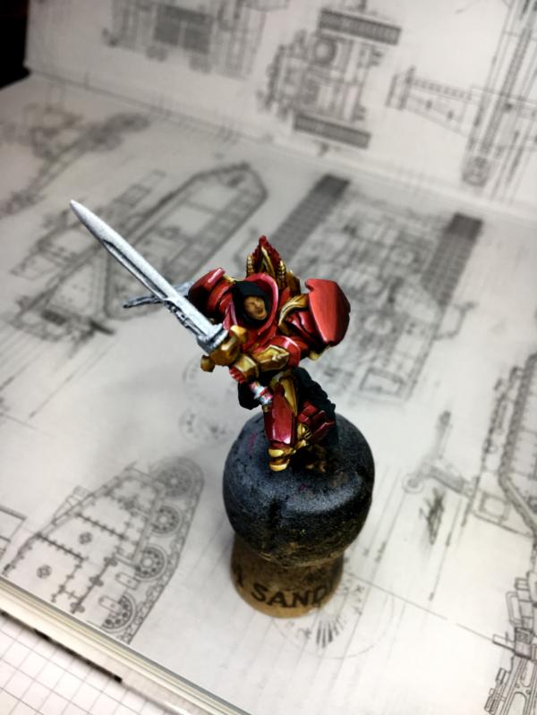
To get a little distance I looked into plinths.
I ordered 4 different ones from Ulrich "Der Zwerg vom Nettenscheid" - aka www.sockelandbases.de They look really great - even though only 2 will fit the Gothica
The first one is the ordinary cube
and the second is this wonderful piece of wood
It would look well in the display cabinet
Since I felt it was too bright (and distracting) I gave it some black washes
So what do you think?
I look forward to your Feedback and suggestions.
Cheers
Klaus
This message was edited 1 time. Last update was at 2018/01/25 21:20:51
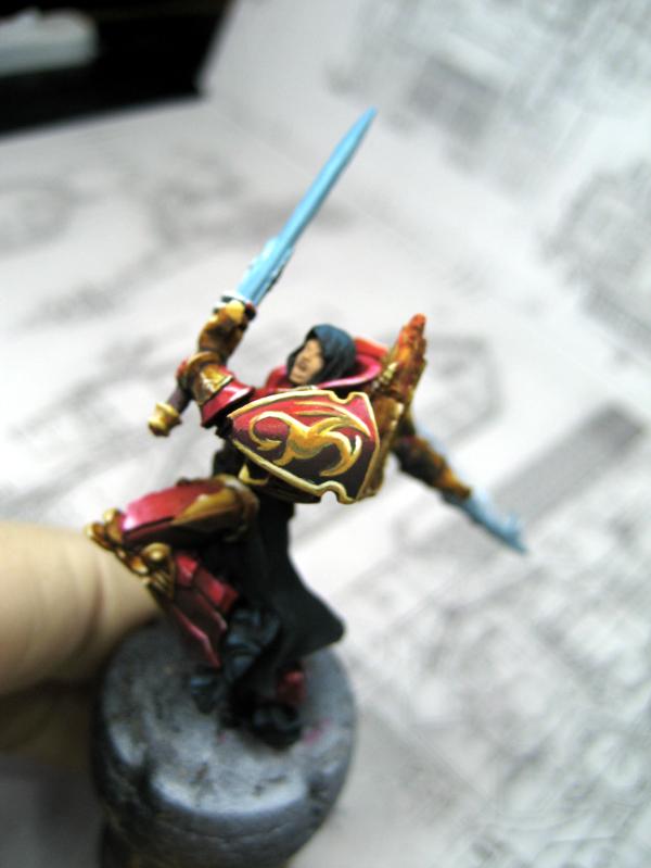
Honestly? That harsh shadow starting after the cheekbones looks not good...it is crisp, but even for a vampire too dramatic and unrealistic...i pe personally liked the tear makeup, but the twelve o'clock shadow needs a conceptional review...in my opinion...sorry mate...
I get Viktor's point about the shadow line, but I think that it really depends on the point of view and the illumination that the piece receives. Seen head on, as in the one picture, and with more-or-less omni-directional lighting the line between chalk-white, death-like face and greyish underlayment _is_ somewhat stark.
But I liked the shot in the display case, seen from the left front quarter and with the light seeming to come in from the left side- this made the dark/light areas really balance out, in my opinion, and enhanced the sense of her coming out from a dark place into an almost-as-dark place. I think the base is perfect, especially after the washes on the lighter colored section and I'm wondering if the figurine was underlit, as with an LED spotlight mounted at the base and trained upward, to illuminate the underside of the face, how that might look.
My observations fall into the 'unskilled general market' category, however, as I haven't anywhere near the skill to create anything close to this kind of work. Your ability to create depth through use of lighting and shading is phenomenal, and I very much like this piece as it is (even with the 'Black Madonna!).
Wow, just- wow!
"He fears his fate too much, or his desserts are small, who will not put it to a single touch; to win- or lose- it all."
Montrose Toast
2018/01/26 23:57:29
Subject: Re:(Not) Santas Workshop of the Strange, Wierd, and Wonderful - 25 Jan - GOTHICA - pg 69!
I think the shading is spot on. For what you appear to have been going for. I like it.
It gives a feeling of relatively harsh lighting. Stepping from the shadows as I believe you were going for.
Some of the photo angles and lighting conditions do make it look harsher than it should (from front on). It's one of those pieces that need to be looked at from one angle with very specific lighting (like the side-on shot).
Mastodon: @DrH@warhammer.social
The army- ~2295 points (built).
* -=]_,=-eague Spruemeister General. * A (sprue) Hut tutorial * Dsteingass - Dr. H..You are a role model for Internet Morality! // inmygravenimage - Dr H is a model to us all Theophony - Sprue for the spruemeister, plastic for his plastic throne! // Shasolenzabi - Toilets, more complex than folks take time to think about!
2018/01/28 11:43:16
Subject: (Not) Santas Workshop of the Strange, Wierd, and Wonderful - 25 Jan - GOTHICA - pg 69!
Viktor von Domm wrote:Honestly? That harsh shadow starting after the cheekbones looks not good...it is crisp, but even for a vampire too dramatic and unrealistic...i pe personally liked the tear makeup, but the twelve o'clock shadow needs a conceptional review...in my opinion...sorry mate...
Hi Vik,
no sorry here Yes on the phots provided it looks harsh, but on one hand side it is intentional (with the light situation) and on the other too strong from the photos - as Meer_Car and Dr H write - it will be up to me making a proper photo with the light setting properly. This will take some while though.
Meer_Cat wrote:I get Viktor's point about the shadow line, but I think that it really depends on the point of view and the illumination that the piece receives. Seen head on, as in the one picture, and with more-or-less omni-directional lighting the line between chalk-white, death-like face and greyish underlayment _is_ somewhat stark.
But I liked the shot in the display case, seen from the left front quarter and with the light seeming to come in from the left side- this made the dark/light areas really balance out, in my opinion, and enhanced the sense of her coming out from a dark place into an almost-as-dark place. I think the base is perfect, especially after the washes on the lighter colored section and I'm wondering if the figurine was underlit, as with an LED spotlight mounted at the base and trained upward, to illuminate the underside of the face, how that might look.
My observations fall into the 'unskilled general market' category, however, as I haven't anywhere near the skill to create anything close to this kind of work. Your ability to create depth through use of lighting and shading is phenomenal, and I very much like this piece as it is (even with the 'Black Madonna!).
Wow, just- wow!
Thank you Meer_Cat Yes, getting a good photo done will be just as much work as the actual paint process
b-tone wrote:Just impressed by your overall skills, amazing work!
Thak you b-tone!
Dr H wrote:Great work, Klaus.
Good choice of base. Works really well.
I think the shading is spot on. For what you appear to have been going for. I like it.
It gives a feeling of relatively harsh lighting. Stepping from the shadows as I believe you were going for.
Some of the photo angles and lighting conditions do make it look harsher than it should (from front on). It's one of those pieces that need to be looked at from one angle with very specific lighting (like the side-on shot).
YEah, as written above - just as much work to get the photo done as painting itself But it will be fun
Camkierhi wrote:Beautiful work. Excellent execution. Considering what you started with, you are really becoming a true master.
I think the doc has it. She needs that golden angle to look perfect, but that's like saying you need to see Michelangelo's David from only one spot.
Brilliant work. More please.
Thank you Cam!
I really love your feedback!
Really, thank you for your feedback and support. You guys keep me going!
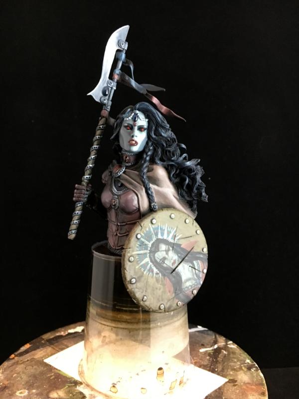
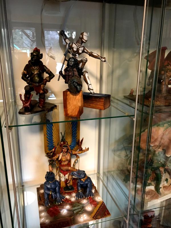
For now the Gothica is finished - I will leave her alone for about a week and then revisit her and see. I will most likely add another black wash to the plinth - make it look more charcoal - and also decide on the make-up.
I'm sure most of you have by now seen the new Imperial Knight, the Knight Armiger.
I'm quite excited.
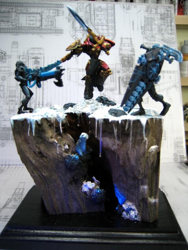
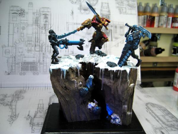
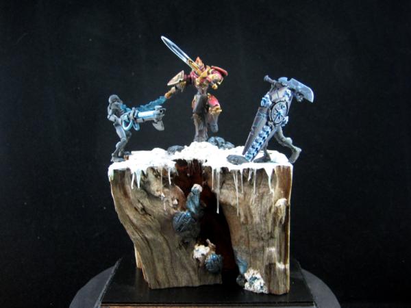
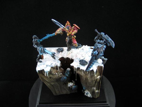
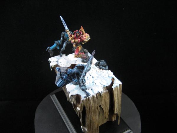
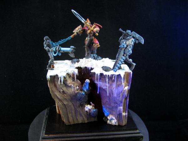
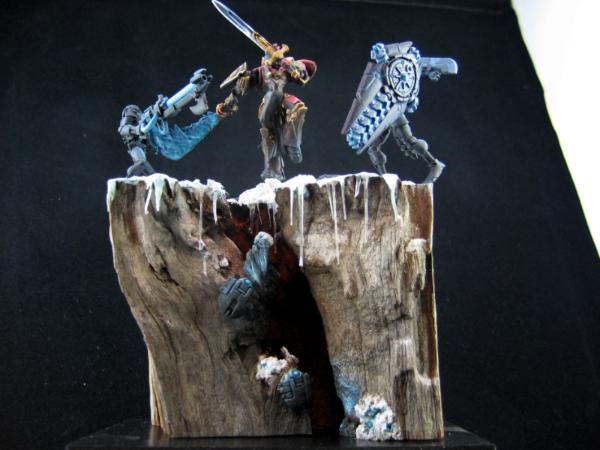
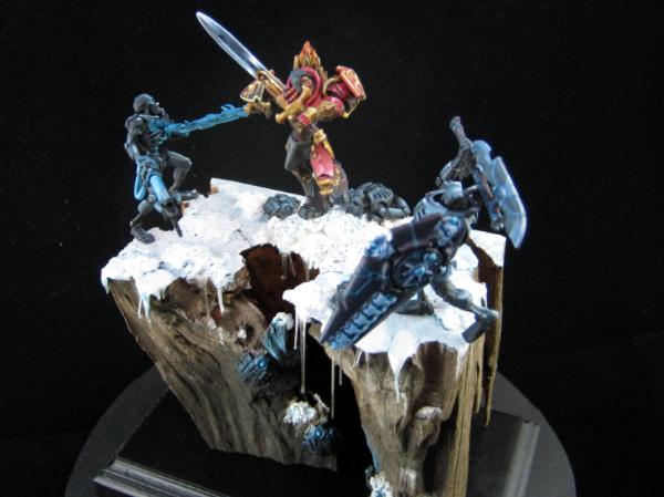
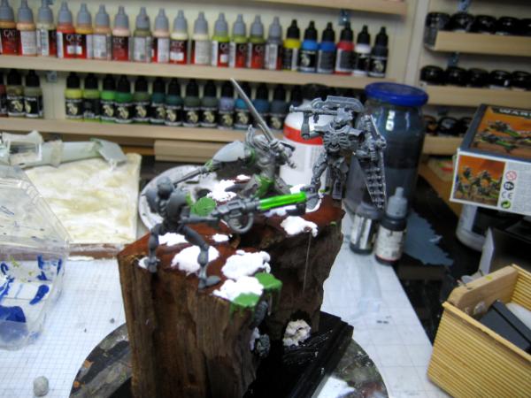
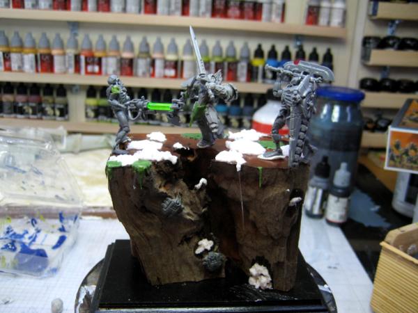
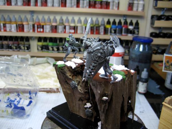
So, now that the Gothica is pretty much done I have already started a new (well actually two) project.
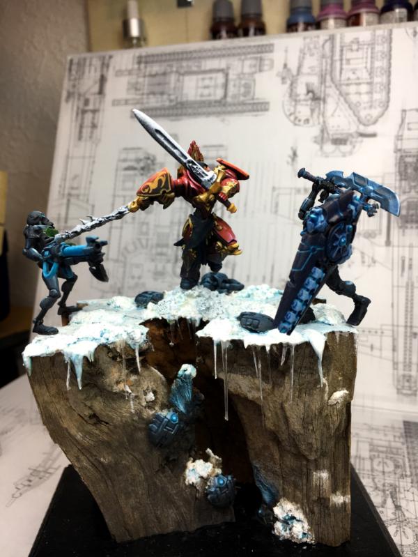
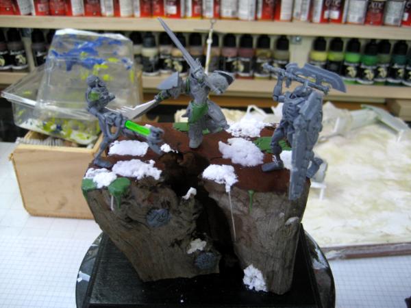
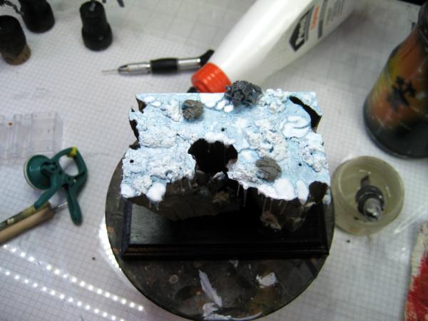
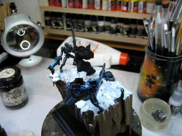
This one will be called "Ice Warriors" and is inspired by the wonderful plinth I got from Ulrich "Der Zwerg vom Nettenscheid" - aka www.sockelandbases.de I immediately fell in love with the plinth and was thinking what I could do with it. And quite early I had the image of a female swords warrior launching herself over the "chasm" onto her enemies.
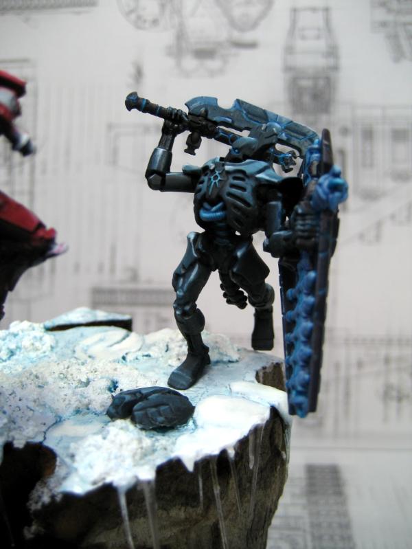
The initial setup was against Tyranids - I still have the 'Nids from Space Hulk - but that didn't work as planned, so I then tried it with Necrons.
This seems to work better.
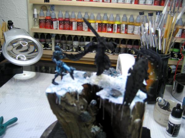
I also decided to make it a snow/ice base.
with some icy patches made of Greenstuff.
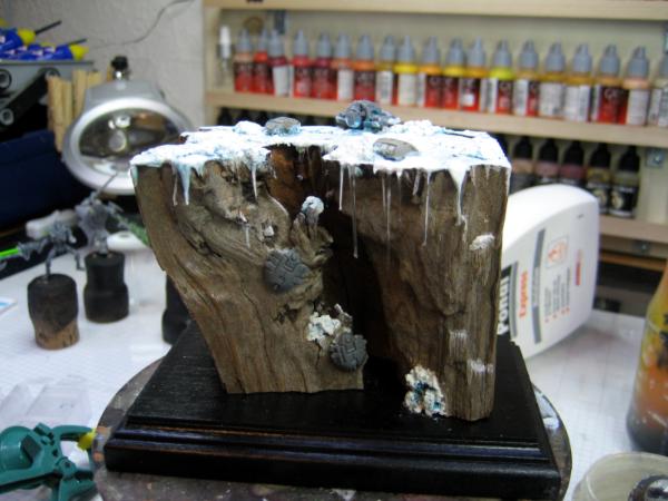
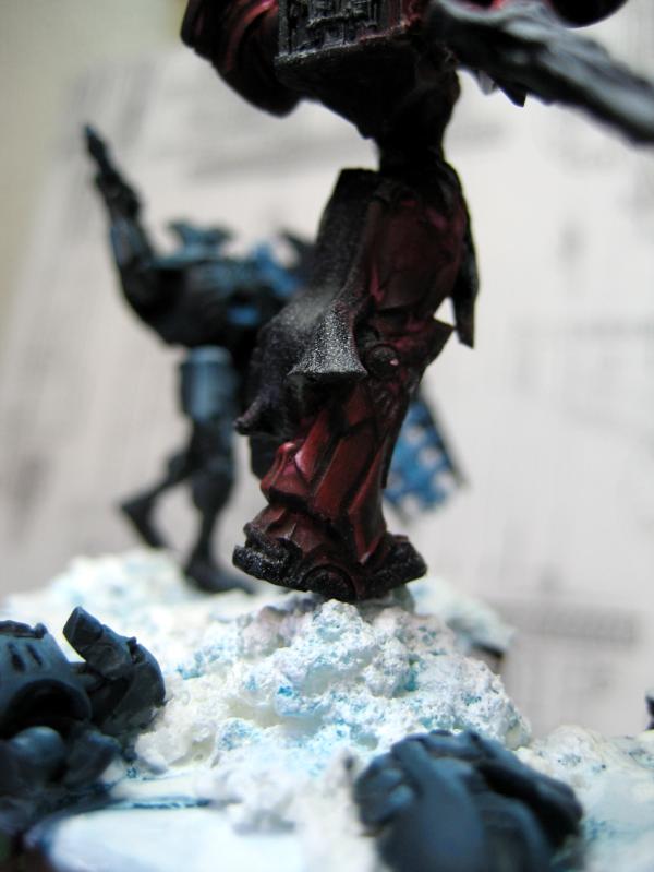
One part of the scene is a bit slasher like - I want her one sword to just have slashed the one Necron. So I cut the basic shape if the slashing motion from Plastic Card.
Gives it a bit of dynamic.
I then covered that basic form with Greenstuff
and formed with the remaining Greenstuff some more ice patches and some icicles.
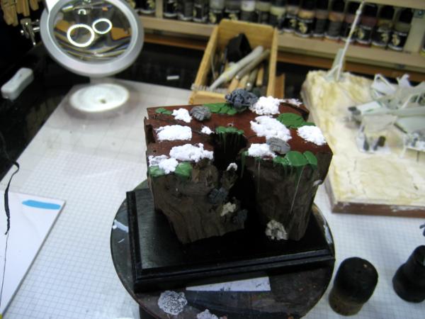
Unfortunately they reacted to the very dry wood and cured erratic, thus warping quite strongly.
For the landscape itself I used baking soda and PVA glue to create the snow patches, then Greenstuff for the sheets of ice. Everything was then base coated with an icy blue. the non-snow and non-sheets areas were then covered with crackle medium.
Once this was just about cured I gave it a coat of very light blue. During the curing process it then creates nice cracks - with the darker blue beneath showing in the cracks.
Finally everything received a coat to drybrushed white.
Since those bent and warped icicles were very annoying to me, I cut most of them off and re-created them from clear sprue.
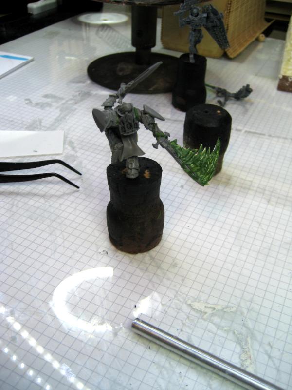
Here is the swords knight just before final cleanup.
The sword broke off several times, so I pinned it and added some PVA glue also.
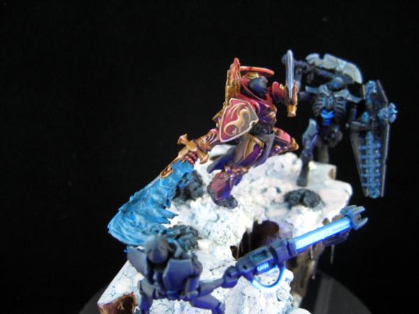
I also realized that the scene was a bit flat - everything on one pane - so I added another pile of snow from which the knight will hurl herself at the second Necron.
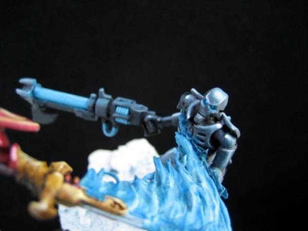
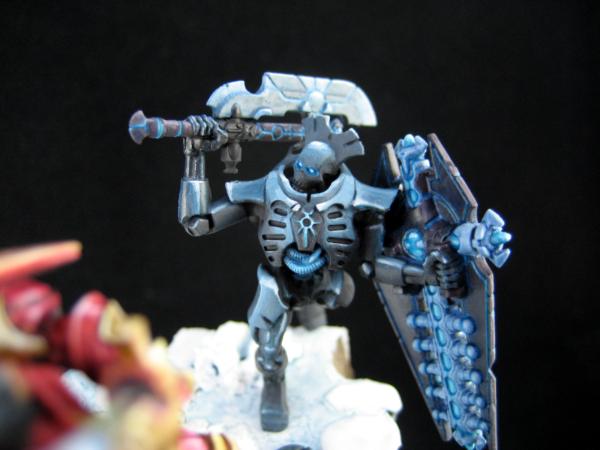
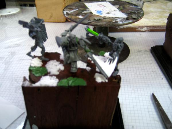
This is the first Necron I ever started to paint It's still work in progress, but I like it.
I still need to add a bit of Greenstuff to the "wound" - a bit more splatter
Sorry for the lacking focus...
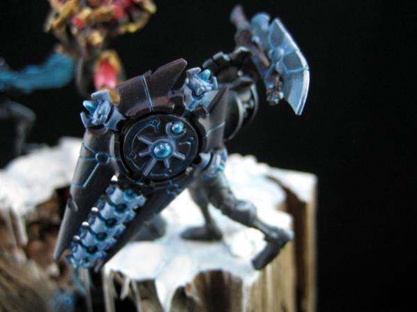
And I also started the second Necron.
This is as far as I got over the last 5 days.
So what do you think of the new project?
Ideas, suggestions, feedback?
I look forward to your comments.
Hi Vik,
no sorry here
Yes on the phots provided it looks harsh, but on one hand side it is intentional (with the light situation) and on the other too strong from the photos - as Meer_Car and Dr H write - it will be up to me making a proper photo with the light setting properly. This will take some while though.
fair point, guv...but now you´re one pic still short then...eh?
the new project iwas instantly sold on... in fact the slashing effect hooked me up...even without the additional GS effect it was working for me...just the plain plasticcard and this then later on painted in a more manga-esque methode...just a thought
the plinth of the new project looks ace...a very good choice, and the ide and snow looks also already very near perfect... only some small icicles are a bit too pointy at the lowest...
will the necron get lowy eyes? love your light effects!
This vignette is going to be fun to watch develop! As with others, I'm very impressed with the 'motion work' in the sword. That wonderful crevice in the plinth is just begging for something to highlight the dark- a severed necron head prhaps, in which the eyes have not yet lost their glow? Or some other bit of detritus that has fallen down from the fight above?
Wonderful work as always, Klaus!
"He fears his fate too much, or his desserts are small, who will not put it to a single touch; to win- or lose- it all."
Montrose Toast
2018/01/30 20:15:06
Subject: (Not) Santas Workshop of the Strange, Wierd, and Wonderful - 30 Jan - ICE WARRIORS - pg 69!
Honestly, the warped icicles were a lot more realistic. Often, you'll see that sort of strange shape from icicles in nature, especially in chasms like that, due to wind interfering with the dripping water.
GENERATION 8: The first time you see this, copy and paste it into your sig and add 1 to the number after generation. Consider it a social experiment.
If yer an Ork, why dont ya WAAAGH!!
M.A.V.- if you liked ChromeHounds, drop by the site and give it a go. Or check out my M.A.V. Oneshots videos on YouTube!
2018/02/06 11:32:54
Subject: (Not) Santas Workshop of the Strange, Wierd, and Wonderful - 6 Feb - ICE WARRIORS - pg 69!
the new project iwas instantly sold on... in fact the slashing effect hooked me up...even without the additional GS effect it was working for me...just the plain plasticcard and this then later on painted in a more manga-esque methode...just a thought
the plinth of the new project looks ace...a very good choice, and the ide and snow looks also already very near perfect... only some small icicles are a bit too pointy at the lowest...
will the necron get lowy eyes? love your light effects!
looking forward to more on this and that then!
cheers, vik
Thank you Vik!
Yeah, glowing eyes are just cool - I even expreimented (below) with flourescent colors and black light Thanks Mate
Meer_Cat wrote:This vignette is going to be fun to watch develop! As with others, I'm very impressed with the 'motion work' in the sword. That wonderful crevice in the plinth is just begging for something to highlight the dark- a severed necron head prhaps, in which the eyes have not yet lost their glow? Or some other bit of detritus that has fallen down from the fight above?
Wonderful work as always, Klaus!
Thank you Meer_Cat!
Thank you for the idea - I added another crawler - a bit more inside the chasm, and light (effects) should turn out cool
Thank you!
Camkierhi wrote:Fantastic work. Stunning as always. Clear sprue icicles...brilliant. Really like the concept, can see the inspiration and can't wait to see more.
Thank you Cam!
Anvildude wrote:Honestly, the warped icicles were a lot more realistic. Often, you'll see that sort of strange shape from icicles in nature, especially in chasms like that, due to wind interfering with the dripping water.
Yeah I know...
there are still one or two bent ones - but it was just a bit too much and too distracting. I think the new mix of icicles is better now (hoepfully )
Thanks Anvildude!
Hi all,
thank you for your feedback and suggestions!
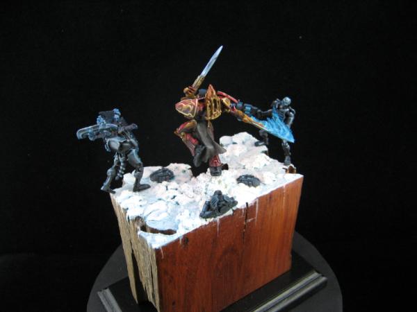
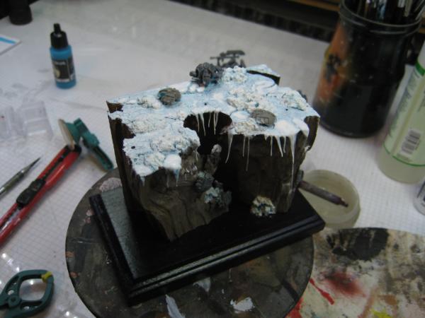
Since the last update I completed the body of the second Necron.
The little chasm got several washes with black, giving it some depth.
Now the lights on the little crawlers get a bit more focus.
I even added a third crawler all the way down.
And I experimented some with a fluorescent color and black light
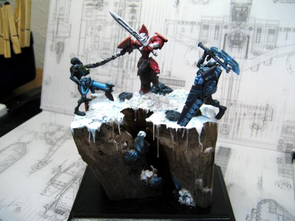
Works on the Gothica too
I admit I got sidetracked with the fluorescent color for two days and had to re-paint the entire shield...
But the result seems to be OK
So the Necrons are now mostly done.
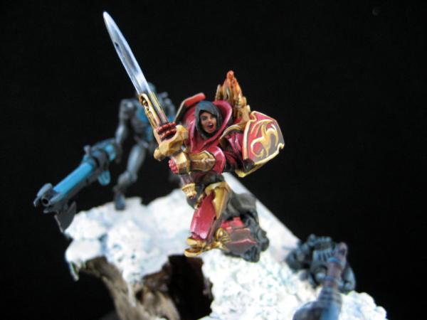
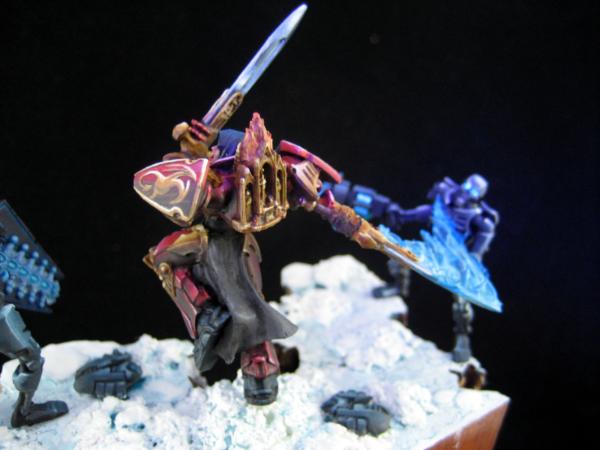
And now it is time for the Knight.
I gave her another spray of white to simulate zenithal light.
and then painted the red armour.
It was a very frustrating experience and I stripped the whole paint once already.
(my camera doesn't like the new room - many of the images out of focus - this didn't happen in the old workroom... )
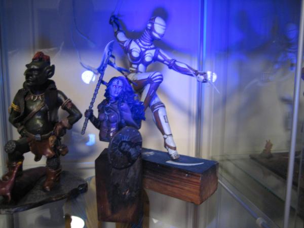
The lighting effects are terrific- I can't believe how much the Gothica is helped by the low light- this is exactly how I envisioned the end state when you described the effects you were trying for.
Really like how the ice warriors vignette is picked up by the lighting too- conveys a sense of isolation and loneliness for the fighter, and a sense of waiting (crypt-like) for the Necrons.
Love it.
"He fears his fate too much, or his desserts are small, who will not put it to a single touch; to win- or lose- it all."
Montrose Toast
2018/02/06 21:07:27
Subject: (Not) Santas Workshop of the Strange, Wierd, and Wonderful - 6 Feb - ICE WARRIORS - pg 69!
Camkhieri: "And another very cool thing, my phones predictive text actually gave me chicken as an option after typing robot, how cool is that."'
Meercat: "All eyes turned to the horizon and beheld, in lonely and menacing grandeur, the silhouette of a single Grot robot chicken; a portent of evil days to come."
From 'The Plucking of Gindoo Phlem'
2018/02/07 11:00:02
Subject: (Not) Santas Workshop of the Strange, Wierd, and Wonderful - 6 Feb - ICE WARRIORS - pg 69!
All looking great, nice progress, coming together really nicely.
Thank you Cam!
I hope todays images make things look better
Meer_Cat wrote:The lighting effects are terrific- I can't believe how much the Gothica is helped by the low light- this is exactly how I envisioned the end state when you described the effects you were trying for.
Really like how the ice warriors vignette is picked up by the lighting too- conveys a sense of isolation and loneliness for the fighter, and a sense of waiting (crypt-like) for the Necrons.
Love it.
Thank you Meer_Cat, now I just hope I can carry this over to the Knight, so that it really comes together
CommissarKhaine wrote:Lovely effect, and I love how you'll always add more layersof detail to bring things to life.
Thank you CommisarKhaine Let's see if we can make some of those details visible today
OK, so I realized the images were not up to par with what I usually deliver. Once reason is the background. In the new work room I'm taking the photographs against the shelf with the color bottles and it seems my good old trusted Canon Ixus 65 doesn't agree with it and has a hard time setting the focus properly.
So I tried to take some shots in front of a different background.
So here is the complete scene as of yesterday evening
and a closer shot of the 2nd Necron
As I mentioned the red was really frustrating to paint
but I think the current status is promising
The dark red areas worked pretty good
the brighter ones will need some more glazing I'm afraid
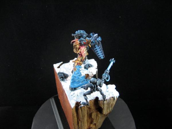
So last night I cleaned the surroundings to the red a bit and applied the first base color for the gold
It'll be interesting to get all the dark gold areas
like that little shrine on her back
with zenithal lighting pretty much all of the lower gold will be dark
You are being to harsh on yourself with the red, it looks amazing, has a really nice different tone to the usual orange/red we see. The blends are staggeringly good.
All the glow is stunning, and the Necrons are looking fantastic.
2018/02/08 23:07:01
Subject: Re:(Not) Santas Workshop of the Strange, Wierd, and Wonderful - 8 Feb - ICE WARRIORS - pg 69!
Mastodon: @DrH@warhammer.social
The army- ~2295 points (built).
* -=]_,=-eague Spruemeister General. * A (sprue) Hut tutorial * Dsteingass - Dr. H..You are a role model for Internet Morality! // inmygravenimage - Dr H is a model to us all Theophony - Sprue for the spruemeister, plastic for his plastic throne! // Shasolenzabi - Toilets, more complex than folks take time to think about!
2018/02/10 07:25:00
Subject: Re:(Not) Santas Workshop of the Strange, Wierd, and Wonderful - 8 Feb - ICE WARRIORS - pg 69!
The gold is magnificent bud. Really great job on the NMM, whole scene is looking spectacular.
One thing is slightly bothering me. The figures are a bit dark, the base is pristine and white by comparison. I do not know what I am talking about here, so please ignore me, but would there be light reflected from the snow? Maybe the upper highlights need to be taken up just one notch! The problem is the figures are truly spectacular to me, they look so perfect, wonderful contrast, amazing blend and tone. The base is stunning and a true masterpiece. It is just that to my eyes they do not quite match when together. To stark a contrast. But it is only just, it is very small, and I am probably talking through my bum.
Please remember, you are the Master here, we mere mortals are but pupils, you inspire me every day.
2018/02/10 13:06:02
Subject: (Not) Santas Workshop of the Strange, Wierd, and Wonderful - 8 Feb - ICE WARRIORS - pg 69!
Great scene! That knotty log really looks great holding that epic scene up!
"dave you are the definition of old school..." -Viktor Von Domm My P&M Blog : It's great how just adding a little iconography, and rivets of course, can make something look distinctly 40K-adamsouza
"Ah yes, the sound of riveting.....Swear word after swear word and the clinking of thrown tools" "Nope. It sucks do it again..."- mxwllmdr
"It puts together more terrain, or else it gets the hose again...-dangledorf2.0
"This is the Imperium, there is no peace, there are only rivets" -Vitruvian XVII
"I think rivets are the perfect solution to almost every problem"- Rawson
More buildings for the Building God! -Shasolenzabi
2018/02/10 14:27:27
Subject: (Not) Santas Workshop of the Strange, Wierd, and Wonderful - 8 Feb - ICE WARRIORS - pg 69!
Good Monday morning I hope you all had a good weekend.
Despite German Fastnacht (Carnival) season, I did get some painting done - one advantage of cats over kids: they don't want to celebrate Fastnacht
So I was able to finish the freehand on the shoulder
slight 3D effect
just an embossed-like little dragon
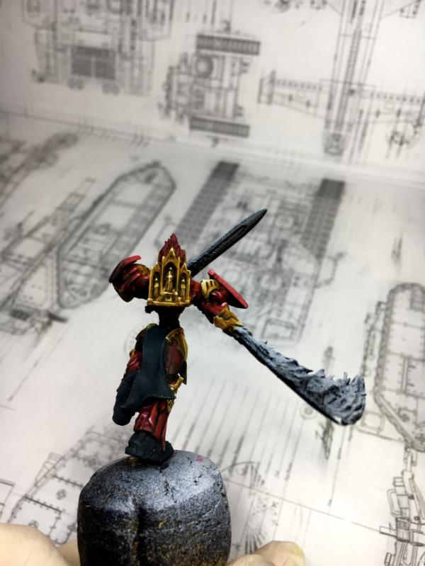
I also finished the shrine
and did a bit more on the snow reflection
and then I did the sword
it was a lot of work
but I think it turned out well
and with the slash effect it fits nicely
I may have to add a bit of blue reflection to the snow underneath - or what do you think
Together with the crawlers
I think the scene looks quite well
I still have to do the face and I have to decide on the color of the tabbard - any ideas or suggestions?
Thanks
Klaus
Beautiful work, Klaus- I can feel the power in the sword strokes, the animation is very good.
My thoughts on the color for the tabard are these:
* Can't be metallic, because of the trim on the armor
*Can't be red, because of the armor- should contrast somehow
*Can't be white, because of the terrain
*Can't be blue, because of the Necrons
I think that really leaves either a pattern- something Gothic, but even a paisley, believe it or not I think would work, or some form of imagery- a large figure in the middle and front panels, with some sort of decorative border (Cretan pattern?)- this might let you get away with a white or cream background on the panels, with royal blue as the primary color for the design in the middle. Trim could be black or gold, (or black AND gold).
My two cents, and I'm still the journeyman who should be listening, not talking.
I'm really enjoying this piece.
"He fears his fate too much, or his desserts are small, who will not put it to a single touch; to win- or lose- it all."
Montrose Toast
2018/02/13 08:03:54
Subject: Re:(Not) Santas Workshop of the Strange, Wierd, and Wonderful - 11 Feb - ICE WARRIORS - pg 69!
Meer_Cat wrote: Beautiful work, Klaus- I can feel the power in the sword strokes, the animation is very good.
My thoughts on the color for the tabard are these:
* Can't be metallic, because of the trim on the armor
*Can't be red, because of the armor- should contrast somehow
*Can't be white, because of the terrain
*Can't be blue, because of the Necrons
I think that really leaves either a pattern- something Gothic, but even a paisley, believe it or not I think would work, or some form of imagery- a large figure in the middle and front panels, with some sort of decorative border (Cretan pattern?)- this might let you get away with a white or cream background on the panels, with royal blue as the primary color for the design in the middle. Trim could be black or gold, (or black AND gold).
My two cents, and I'm still the journeyman who should be listening, not talking.
I'm really enjoying this piece.
Thank you!
But you know you're way beyond journeyman Just looking at your latest scout car Well, you're right, the tabard can't take away too much of the scene - and even some pattern would distract, besides that from the position, very little would be visible.
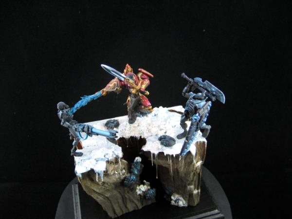
So I decided to rather go with a dark grey.
I hope I can post an update later today.
Thanks!
That is truly stunning work, the effects on the swords the gold free hand work the fantastically subtle lighting effects, master class right here.
Agree with the choice of grey, was going to say grey or beige, to add a slight hint of warmth.
This is a wonderful scene, well thought out and brilliantly executed. More , now , please.
*BLUSH*
Thank you Cam!
Well, I call this baby done Here are the 15 final images - I hope you can enjoy them.
Thank you for being part of the ride
I hope you all enjoyed this build and paint as much as I did - I tried new things and learned a lot, maybe it was helpful and inspiring for you too.
Cheers
Klaus


 // inmygravenimage - Dr H is a model to us all


 My P&M Blog :