| Author |
Message |
 |
|
|
|
|
Advert
|
Forum adverts like this one are shown to any user who is not logged in. Join us by filling out a tiny 3 field form and you will get your own, free, dakka user account which gives a good range of benefits to you:
- No adverts like this in the forums anymore.
- Times and dates in your local timezone.
- Full tracking of what you have read so you can skip to your first unread post, easily see what has changed since you last logged in, and easily see what is new at a glance.
- Email notifications for threads you want to watch closely.
- Being a part of the oldest wargaming community on the net.
If you are already a member then feel free to login now. |
|
 |
2007/12/02 19:50:56
Subject: My first attempt at shading, w/pictures
|
|

Wicked Warp Spider
|
I have some photos of some models I have done up recently. If anyone has any suggestions hints, about either the models or my photography, please go ahead. This is my first attempt at using shading/highlighting methods other than drybrushing or inking. Also, I'm aware the exarch isnt finished, as I dont have the metallic paints right now that I want, and there is no way I'm even trying NMM at this point, because I dont think I could make it look like anything but crap. My personal opinion is that the FDs are the best, but the photos turned out better with the mortar crew. Here goes:
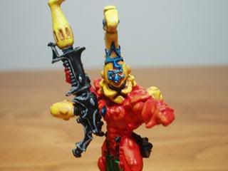
First, a fire dragon.

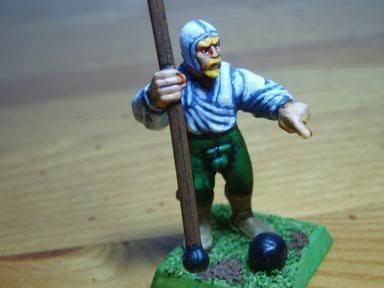
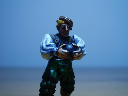
Next, I have a empire cannon/mortar crew guy
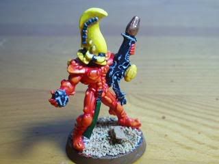
The exarch
Another cannon crew, I think the eyes are a bit large
One more FD
I have more I have questions and more photos but the photos are larger than what I would like so I wont post them.
|
|
This message was edited 1 time. Last update was at 2007/12/02 19:52:36
|
|
|
 |
|
2007/12/02 20:05:12
Subject: Re:My first attempt at shading, w/pictures
|
|

Executing Exarch
|
Those look quite nifty. I won't exaggerate my praise, but I will say that I would definitely not have known these were your first attempts at shading and highlighting if you hadn't said so. Creditable work--I think I'm around where you are right now, except your faces are much better and you're actually able to finish paintjobs. 
|
Wehrkind wrote:Sounds like a lot, but with a little practice I can do ~7-8 girls in 2-3 hours. Probably less if the cat and wife didn't want attention in that time.
|
|
|
|
|
2007/12/02 20:30:10
Subject: Re:My first attempt at shading, w/pictures
|
|
Wicked Warp Spider
|
Heh, thanks. I read a lot of internet resources and read some books prior to doing this, so I guess I have experience with the theory if not the practice. Also, about finishing paintjobs, there is no way my entire eldar army is going to be like this. I have a 20 man guardian squad, and its pretty much three colours, which are green, white, and black.
|
|
|
|
|
2007/12/02 20:55:42
Subject: Re:My first attempt at shading, w/pictures
|
|
Nasty Nob on Warbike with Klaw
|
I can't speak on the Eldar model too much. the images just aren't good enough to show much detail... no disrespect.
If these are you first attempts, you should be proud. You are STARTING at a definite tabletop standard. When I first started painting I was at more of an "in a shoebox, buried in the bottom of the closet" standard.
My advice om the Cannon crew... Lighter shade of paint for the shade. It's just TOO blue. What brand of paints are you using? If was want a CLEAN, CRISP looking white (which is what I think you went for), Space Wolf Grey (or an equivalent) is a better shade color. It has a touch of a blue hue to it. It looks nice.
It might just be the pictures, but it LOOKS like, for the eldar, you painted it red, then highlighted it with orange.
(if that is the case, read on)
That is definitely a way to hit tabletop standard... but you won't surpass it like that. You're best off starting at a base color, using a darker color for shading, and a brighter color for highlight. Did you use an ink wash on it? It kind of has that look.
Also, it looks kind of glossy. If that's the look you're going for, fine. If not, then you want to matte seal the minis before photographing them. You'll get better pics.
Hope this helps. Keep up the good work.
Eric
|
Black Fiend wrote: Okay all the ChapterHouse Nazis to the right!! All the GW apologists to the far left. LETS GET READY TO RUMBLE !!!
The Green Git wrote: I'd like to cross section them and see if they have TFG rings, but that's probably illegal.
Polonius wrote: You have to love when the most clearly biased person in the room is claiming to be objective.
Greebynog wrote:Us brits have a sense of fair play and propriety that you colonial savages can only dream of.
Stelek wrote: I know you're afraid. I want you to be. Because you should be. I've got the humiliation wagon all set up for you to take a ride back to suck city.
Quote: LunaHound--- Why do people hate unpainted models? I mean is it lacking the realism to what we fantasize the plastic soldier men to be?
I just can't stand it when people have fun the wrong way. - Chongara
I do believe that the GW "moneysheep" is a dying breed, despite their bleats to the contrary. - AesSedai
You are a thief and a predator of the wargaming community, and i'll be damned if anyone says differently ever again on my watch in these forums. -MajorTom11 |
|
|
|
|
2007/12/02 21:14:09
Subject: Re:My first attempt at shading, w/pictures
|
|
Veteran Inquisitorial Tyranid Xenokiller
|
For a first attempt, these look great.
Ditto on the comments for the white. I'd start your base color a little lighter, just to make the jumps in color less drastic. On the other hand, for the dragons, try adding a little dark brown to the base color. Pure red just sort of blends into the orange. Not a lot, but they could use a little more contrast in the deep lines.
|
New Career Time? |
|
|
|
|
2007/12/03 06:33:38
Subject: My first attempt at shading, w/pictures
|
|
[ADMIN]
Decrepit Dakkanaut
|
I'm going to disagree a bit with what has been said here.
When you're doing a fairly simple highlighting job having starkly contrasting base vs. highlight colors can look a bit bad up close and personal (like in these pictures), but from a distance on a tabletop the highlight will be very pronounced and make the model look very good.
If you take the high contrast colors out and use more similar tones you get something like your Fire Dragons, which looks pretty good in these pictures, but on the tabletop the orange on the red will be indistinguishable from four feet away (where most people will see it).
My advice to you would be:
For a simple scheme that looks really 'highlighted' for tabletop play go with a *very* dark version of the color and make that your basecoat. Then paint a medium bright version of the color over almost the whole area except for the very cracks of the mini. Finally use a very bright version of the color and carefully paint the very edges or tips of your surfaces.
With your cannon crew you seem to have the dark crevices, but your 'main' color is too bright and you have no 'highlights' added to strategic edges.
The Fire Dragon has an 'orange' highlight, but it is too similar to the red and their is no darker red in the crevices to contrast the main red and help make the orange stand out.
Great start, and keep it up!
|
|
This message was edited 3 times. Last update was at 2007/12/03 06:35:40
|
|
|
|
|
2007/12/03 18:38:24
Subject: My first attempt at shading, w/pictures
|
|
Assault Kommando
|
Hmmm.... Yes.. I like it. Good job so far. I think the shirt colors work really nicely but I do agree that you need a visible high light. I know that can be hard to pull of on white. I have a whole army of white armoured sisters. I think shadow grey (citadel) or sombre grey by Vallejo is a good base for whites.
|
Now playing    & &  at Guardian Games or Ordo Fanaticus Club Night at Guardian Games or Ordo Fanaticus Club Night
|
|
|
|
|
2007/12/03 18:40:35
Subject: My first attempt at shading, w/pictures
|
|
Assault Kommando
|
Also Vallejo has a color ghost grey that no longer has a citadel analog that is great for a fake out midtone for whites. It looks white on the table but you can still hit it with skull white for neat highlights.
|
Now playing & at Guardian Games or Ordo Fanaticus Club Night
|
|
|
|
|
2007/12/04 14:05:42
Subject: Re:My first attempt at shading, w/pictures
|
|
Wicked Warp Spider
|
Yak is right, I don't really see the orange highlights at three or four feet distant, where as the cannon crew does stand out. So you're thinking use a light grey for white shirts and what not, with a deeper grey as a shade and a white highlight?
I didnt use inking except on the faces and hands of my cannon crew.
I dont know why I'm getting a little glossiness. I actually used Vallejo matte varnish, so it shouldnt be happening. It could also be because I was using a fairly intense light bulb that was fairly close to the models. Incidentally, all the paints I'm using are Vallejo game color. If you have any criticisms of this paint, tell me now, because I'm strongly considering getting their complete set in the very near future. I dont care for their dark green, but of the ones I've used so far, that is the only one ive had a problem with.
|
|
|
|
|
2007/12/04 14:16:04
Subject: Re:My first attempt at shading, w/pictures
|
|
[ADMIN]
Decrepit Dakkanaut
|
Grignard wrote:Yak is right, I don't really see the orange highlights at three or four feet distant, where as the cannon crew does stand out. So you're thinking use a light grey for white shirts and what not, with a deeper grey as a shade and a white highlight?
Bingo. Pure White should almost only ever be used as the highest highlight. A light grey or bone with said white highlight will give the illusion of a white color but will allow you to still add depth through highlights up to a pure white.
|
|
|
|
|
|
2007/12/05 17:47:02
Subject: My first attempt at shading, w/pictures
|
|
Fixture of Dakka
|
Yak described pretty much exactly what I do for a lot of my minis. For the tau in my thread (which I am terribly fond of) I even got away with merely 2 different color layers.
One other random thing I found: Black can be highlighted two ways, with blue or grey. I like to use blue for shiney, lustrous things, like Sisters of Battle power armor. A light blue really looks right.
For dull things like cloaks, pants, ninja suits, a grey looks better to my eyes. Just one of those things.
A good habit, which you should never bring up in conversation at work, is looking at random things and making mental note of the colors they highlight to. My keyboard here highlights a grey to white due to the rough texture black, but the black BMW I parked next to has a slight bluish tint (perhaps due to the sky.) Some other colors have this tendancy as well, and you can really change the perception of the base color by picking which highlight color to use. Just remember that how the eye perceives the final result can be vastly different from the inprogress version, so plan ahead a little so when you are half way through you know a wierd brain trick will make it look great after that final brush stroke.
|
|
|
|
|
|
|
|