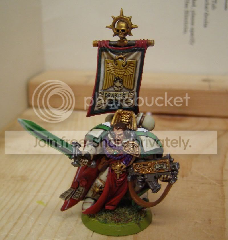
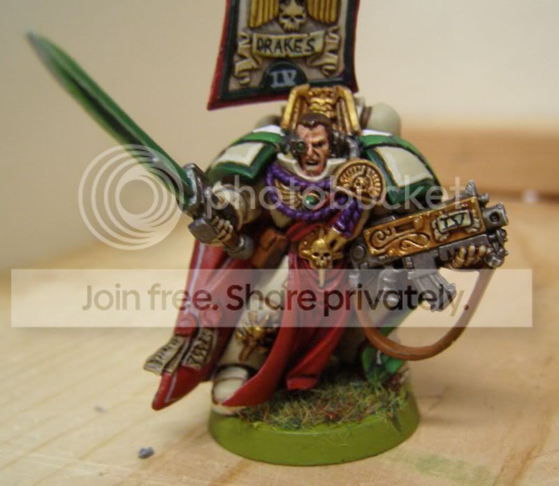
I like the front,
really do.
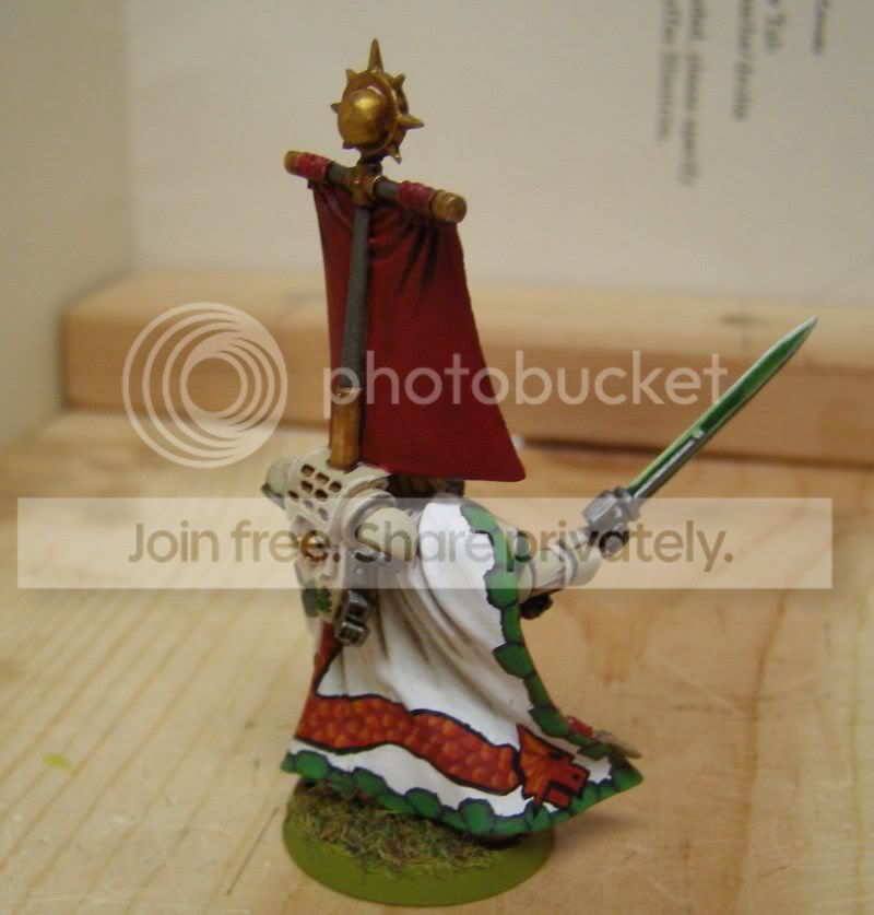
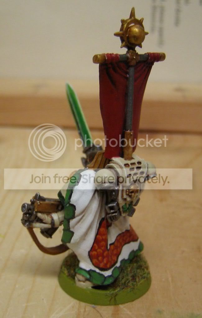
But the freehand at the back is REALLY hard to make it look good. The green is nice, but the drake looks a little odd on the model, just a tad to cartoony, but that's just me.
The rest looks nice,
haven't seen this colour scheme before (or that I remember) and you've done a good job on kepping it clean and tidy.
Would recommend that the base be a different colour,
it pulls from the model as it is so bright, say a deeper green.
Keep the posting