Forum adverts like this one are shown to any user who is not logged in. Join us by filling out a tiny 3 field form and you will get your own, free, dakka user account which gives a good range of benefits to you:
No adverts like this in the forums anymore.
Times and dates in your local timezone.
Full tracking of what you have read so you can skip to your first unread post, easily see what has changed since you last logged in, and easily see what is new at a glance.
Email notifications for threads you want to watch closely.
Being a part of the oldest wargaming community on the net.
If you are already a member then feel free to login now.
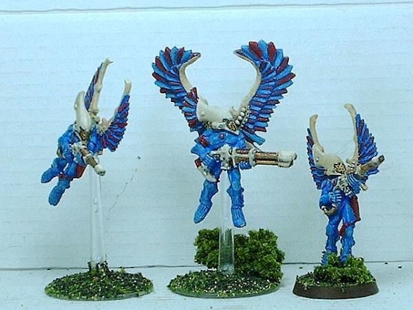
Just finished up some Eldar Swooping Hawks. What do you guys think? Too bland? Not enough color? I was thinking about painting the blue feathers yellow but that might end up being too bright and gaudy. Any other suggestions?
umm the lighting on the camera makes it a little bringht. but umm i think they look ok maybe some yellow symbols on arms or something but they look good nuff fer me
"When life gives you lem-BLOOD FOR THE BLOOD GOD" 1500 pt nurgle daemons bleeeeh 2/0/2 but what fun they are when they win
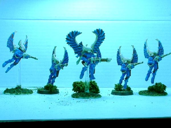
Youll have problems with the flock on the bases. It does look nice but that ALWAYS falls off. It get annoying. I is hard to tell what youve painted on there. Not sure if its bad lighting or what. Try and take a few pics a few different ways and seeing what comes out the best.
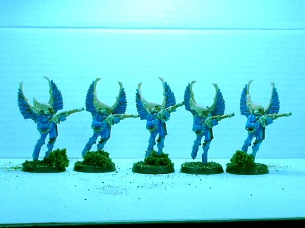
LMAO wow you redid those WHILE I was posting my comment lol.
Those look pretty good. Id say a wash or two would make them pop. Specially on the helms, that would add some definition and really make those look alot better. BUT they look table ready for sure.
1Tip tho, water down your paints. They look a little thick in those pics. Itll make the paint lay down better.
This message was edited 1 time. Last update was at 2009/04/22 01:21:07
Part of the problem is the crappy pics. They turned out kinda grainy. Also, I dry brushed the last shade of blue on instead of highlighting. I actually did two washes on the helms. I started with a black wash on white primer. Then I did a layer of bone white (I guess that's the equivalent of the GW color I used Anita's). Then I did a flesh wash and went over it again with the bone white and finished it off with a lighter shade of bone.


 bleeeeh 2/0/2 but what fun they are when they win