| Author |
Message |
 |
|
|
|
|
Advert
|
Forum adverts like this one are shown to any user who is not logged in. Join us by filling out a tiny 3 field form and you will get your own, free, dakka user account which gives a good range of benefits to you:
- No adverts like this in the forums anymore.
- Times and dates in your local timezone.
- Full tracking of what you have read so you can skip to your first unread post, easily see what has changed since you last logged in, and easily see what is new at a glance.
- Email notifications for threads you want to watch closely.
- Being a part of the oldest wargaming community on the net.
If you are already a member then feel free to login now. |
|
 |
2010/06/07 23:56:04
Subject: WIP for me
|
|

Hubcap
|
Ok so I wanted to change the topic I already started into a more generic WIP topic but couldn't work out how to do it so have started a new one.
ATM I have four large projects on the go, and have just started painting again after a period of not doing so
ORKS - I got given a tonne and none were painted
Khador - experimenting with NMM in a manageable size force
Eldar - Just playing around with painting techniques at the moment
SOB - Finding out these old models and slowly repainting them all!
Started a WIP Farseer today...
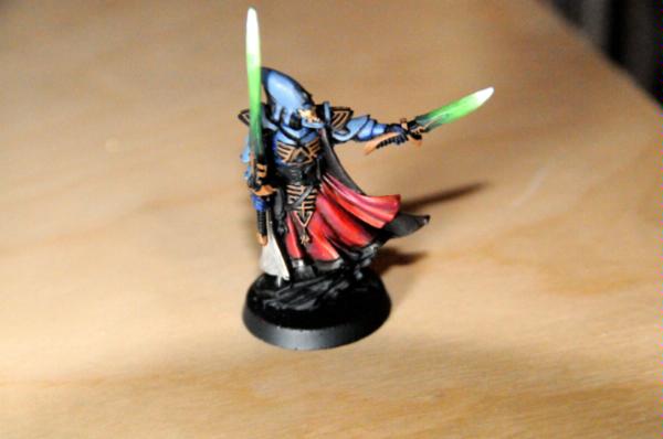
[ 
The sword I got a bit angsty with and realise now that the paint wasn't watered down as much as it should have been.
feel free to let me know what you think
|
|
|
|
 |
|
2010/06/10 18:02:39
Subject: Re:WIP for me
|
|

Storm Trooper with Maglight
|
I think this looks great man. The folds on the red could use just a bit more pop, maybe a dash of yellow mixed with the red, keep it focused on the very top and bottoms of each fold. Maybe start at the bottom and slowly carry the paint up the folds. This way you have the reflective appearance of cloth. I do like the swords though, they really add a good appearance to the whole model. Much more character.
Keep it up.
|
___________________________________
Andy |
|
|
|
|
2010/06/10 18:15:38
Subject: WIP for me
|
|

Fresh-Faced New User
|
The transition between colours is quite clear yes, though mostly from white-lighter green (on the weapons). I don't really like those colours together, to be honest. It's probably just me.
Although I am very curious to how you achieved the colour on that cape! Please do tell us your trick.
Sincerely, Izirath.
|
|
|
|
|
2010/06/10 18:27:54
Subject: WIP for me
|
|

Arch Magos w/ 4 Meg of RAM
|
looks very nice, like the swords. Big up!
|
|
|
|
|
|
2010/06/11 01:26:51
Subject: Re:WIP for me
|
|
Hubcap
|
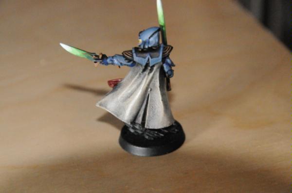
kk the farseer is more closer to being finished. Have added in Gems and added more highlights to the cloth.
Sorry the front is a little blurred
 Automatically Appended Next Post: Automatically Appended Next Post: thanks for the advice and the big up. I'm gonna assume that you mean the back of the cape which looks completely different in last picture although it's not changed any. except for a more extreme highlight.
It was (if i remember rightly and I hope so as I have heaps to do!)
Base of Scorched earth , then a very wet brush build up to Kommando Khaki, then a up to bleached bone working towards the edges, followed by an extreme highlight of skull white.
Painting update, have decided to rework faces on my khador assassins as I wasn't really happy with them, Sprayed up some more far-seers and some Harlequins. ready to start when i get back off my honeymoon.
|
|
This message was edited 1 time. Last update was at 2010/06/11 01:36:42
|
|
|
|
|
2010/06/11 02:33:14
Subject: WIP for me
|
|

Mutated Chosen Chaos Marine
In a Toyota, plotting revenge.
|
Awesome!
|
metallifan said: I almost wonder is "Matt Ward" another pen name for C.S. Goto?
metallifan said: The Imperium would probably love Hitler...
Play KoL! Click my sig to go to the main website and sign up!
 |
|
|
|
|
2010/06/11 05:00:54
Subject: Re:WIP for me
|
|
Nimble Pistolier
|
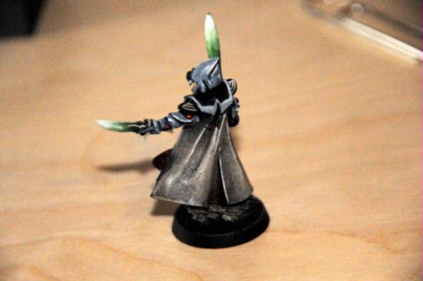
Looks Awesome! I really like the back of the cape, it looks just like light shining off of a leather coat.
Keep it up! 
|
|
|
|
|
|
2010/06/11 05:19:25
Subject: WIP for me
|
|

Black Templar Recruit Undergoing Surgeries
|
Izirath wrote:The transition between colours is quite clear yes, though mostly from white-lighter green (on the weapons). I don't really like those colours together, to be honest. It's probably just me.
Although I am very curious to how you achieved the colour on that cape! Please do tell us your trick.
Sincerely, Izirath.
i have to agree man... maybe a bright blue instead of green would've been better.
|
|
|
|
|
|
2010/06/11 05:19:43
Subject: Re:WIP for me
|
|
Storm Trooper with Maglight
|
There you go man! That looks great now. I dont really have anything to criticize. I too like the gray cape. It definitely has a great color in it. Great job man.
Oh and I must say i think the green works very well. The contrast is well done. Green to blue seems to fit to me.
|
|
This message was edited 1 time. Last update was at 2010/06/11 05:22:01
___________________________________
Andy |
|
|
|
|
|
|


 1000pts
 1500pts

