| Author |
Message |
 |
|
|
|
|
Advert
|
Forum adverts like this one are shown to any user who is not logged in. Join us by filling out a tiny 3 field form and you will get your own, free, dakka user account which gives a good range of benefits to you:
- No adverts like this in the forums anymore.
- Times and dates in your local timezone.
- Full tracking of what you have read so you can skip to your first unread post, easily see what has changed since you last logged in, and easily see what is new at a glance.
- Email notifications for threads you want to watch closely.
- Being a part of the oldest wargaming community on the net.
If you are already a member then feel free to login now. |
|
 |
2011/04/03 19:56:33
Subject: ::Izanagi's Phantom Forge:: (April 3- Battle Damage Technique Test- Advice/Critique, Please!)
|
|

Longtime Dakkanaut
|
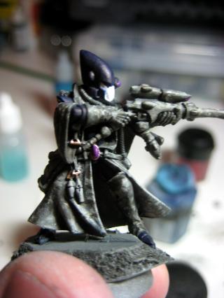
That guardian looks much better now it's gun is bleached bone. Well done
|
|
|
 |
|
2011/04/03 19:56:41
Subject: ::Izanagi's Phantom Forge:: (April 3- Battle Damage Technique Test- Advice/Critique, Please!)
|
|

Ghastly Grave Guard
The cold reaches of space
|
Hey Yggs! Thanks for stopping by! I was sorry to have to stop it too, but it was getting impossible to update and move on into actually playing... I'll still paint up my guys... but I think the game concept is dead. Dead, dead... dead.
But I'm happy to hear that I've got you on board for this one too! I'll be posting up redo-pics of Maugan Ra, he got "clean" robes instead of the frays. I'll also be taking a tip from your OSL light-sourcing for their jet-packs...
Also, I've got a Ranger Autarch conversion planned for this month as well!
Stay tuned, and thanks for stopping by!
Automatically Appended Next Post:
@ Moonshine- I totally agree! Thanks for helping pick out the color!
|
|
This message was edited 1 time. Last update was at 2011/04/03 19:57:25
|
|
|
|
|
2011/04/18 17:04:17
Subject: Re:::Izanagi's Phantom Forge:: (April 18- Autarch Jetbike WIP and Ranger Camo Test! Advice Please?)
|
|
Ghastly Grave Guard
The cold reaches of space
|
Hello again and sorry for the long absence! Saturday evening and all of Sunday was relax time with the wife/dog and hobby time for some semi-neglected work.
Originally, my return post was supposed to be a guide for the Eldar Guardian weathering that a I received a few PMs about. I’ll try to get to that tonight before I disappear again! 
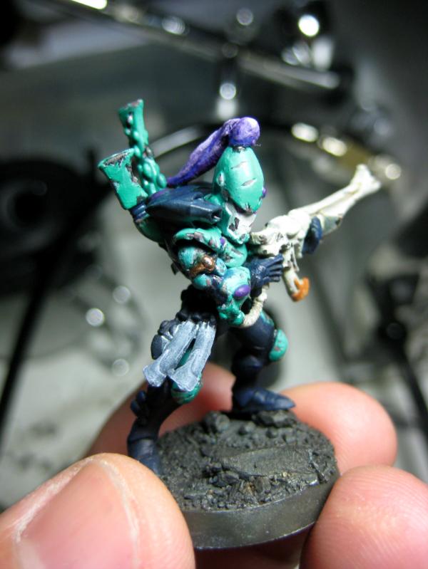
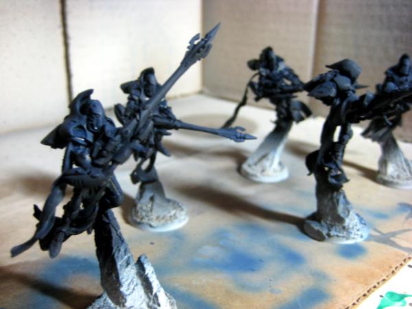
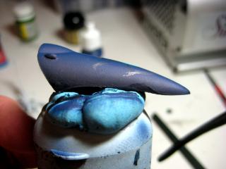
This post is my test camo-scheme for my rangers (inspired by a video I saw of camo’d troops popping up, and confirmed that the concept to mini-RL would work by Migsula’s Pathfinders- credit where credit is due!  ). Unlike most of the other gorgeous eldar snipers who have coats/rifles with camo (but the standard armor/helmets underneath) I decided my rangers go fully covered. Here’s the test guy –
I wanted to make sure that the camouflage wouldn’t just look like I was slapping paint to get him finished. He’s based with Charadon Granite, airbrushed first HL with a personal mid-gray mix I concocted a year or so ago for painting up WHQ Gate props, and finally airbrushed second HL with Fortress Grey. The only things to be colored will be his helmet’s eyes, and gun lense, as well as his Spirit Gem on his waist. (as yet, unfinished)
THEN, I applied the pattern. I actually looked up an urban-camo pattern and determined the colors to be a bone-grey, an olive-grey, and fortress grey. I wanted it to look random, but didn’t trust myself with a paintbrush. So I took my pristine GW stippling brush (that was bought last year and has yet to see action) and used the edge to lay down the pattern, color by color.
I’m overall very pleased with the effect, although I may use a regular brush and not the stippling one for a bit more control. My only rule was that the patterns laid down would be going in one direction… the stippling brush seemed to suck up the watered down paint, but didn’t release properly- loading it up with extra in frustration only lead to nasty blotches..
Question time-
What do you think? Realistic? Stupid-looking? Any ideas for improvement?
**Addendum- the only thing to add will be to put a bit of wash and color into the recesses of the gems, hands, folds, etc- to add to the separation and shadow effects.
Currently using a GW stippling brush (piece of crap), might consider using a brush, and possibly a sponge, but I’m afraid of what patterns it might come up with… Any tips for making camo?
I’m thinking of repainting the “face mask” area of the helmet a subdued grey, but without the pattern… thoughts? Or should I just leave it as-is?
In addition, I’d like to present my WIP on my Autarch on bike… the rider will probably be later saved for later posts, as he’s had only minor prep and GS work done..
I wanted to give the bike a bit more “pop”, without totally biggerizing a viper for his chariot. So, I looked into my bits-box and found a Eldar (titan?) bits from a conversion I bought over 10 years ago… it broke through no fault of my own, but I kept the wings. I hate the little soulgem nubs… and in order to get it to fit, I stripped it of paint/primer and shaved off the nubs before sanding them.
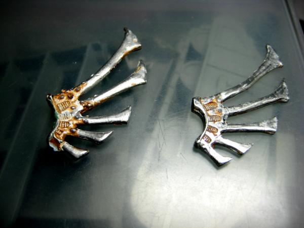
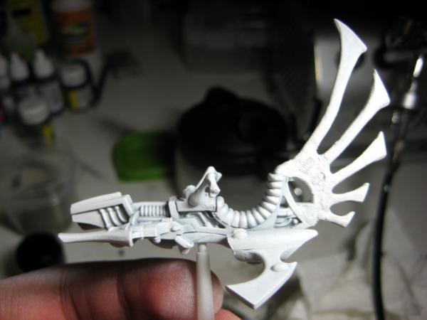
Here’s the bike primed. I’m actually considering doing a bit more GS work- it came to light after priming that the fit wasn’t 100% between the parts and the engines… and the work to the fin, although extensive, doesn’t look as good… I might add a thin layer of GS to smooth it out and make it as similar to the body of the bike as possible.
Questions for the bike-
Any idea how to “salvage” the fin from here? My current idea is to use a thin roll of GS to build a thicker layer closer to the base of the fin, get rid of the ribbed texture area and cover some of the more unsightly bumps from the cut gems.
Stay tuned for the requested guardian weathering tutorial, and in the near future… a new MERCS miniature team… picked up the rulebook, but haven’t decided yet which team yet (Zakkennaya had to go and pick out the CCC/Yellow Jackets with the epically-posed mini-gun Heavy miniature…). Currently in the running are Kemvar for midnight/limited palette/ OSL opportunities, up and coming Sedafu because they look like samurai, or Keizai Waza which is the Japan/Indochina/Australia Megacorp, who are supposed to be out later this year... 
Thanks for stopping by! Leave a comment, critique or suggestion!
|
|
This message was edited 1 time. Last update was at 2011/04/18 17:05:40
|
|
|
|
|
2011/04/19 02:02:42
Subject: Re:::Izanagi's Phantom Forge:: (April 18- Autarch Jetbike WIP and Ranger Camo Test! Advice Please?)
|
|
Fresh-Faced New User
|
Hey dude,
Very cool stuff. I do like the granite/marble like camo effect quite a bit. My only comment would be this: It looks like what I would expect a real world camo'ed sniper to look like (once we get active camo, and ignoring the gems), but I feel like you need to step back a little bit away from reality due to the nature of your subject. They're Eldar, fantasy space elves. I personally would like to see more accent and color on this guy, like maybe the clothes beneath the cloak. Darker colors or different shades to your judgment, does it have to be everything that's camo'ed or would the clothes underneath be like normal dress uniform not so combat color oriented? You already have that idea going on with the purple jewels which act as a great accent. Otherwise, again, love the look as is.
Onto the next subject, bike looks great. I can't wait to see it completed.
You've really inspired me, and I look forward to our painting tutorial later this week. Guard might not be so pretty, but let's see what I can rustle up. Also, was thinking of starting up a thread of my own, documenting my work. Might not be as pretty, but hey, might as well show the world (or just Dakka ) what I've got.
Ja! Keep up the good work!
|
It matters not how strait the gate,
How charged with punishments the scroll,
I am the master of my fate:
I am the captain of my soul. |
|
|
|
|
2011/04/19 02:39:39
Subject: Re:::Izanagi's Phantom Forge:: (April 18- Autarch Jetbike WIP and Ranger Camo Test! Advice Please?)
|
|
Ghastly Grave Guard
The cold reaches of space
|
Hey Z! Thanks for stopping by!
As to your critique- thanks for the ideas... jerk.
I hear what you're saying, and I agree to a certain extent. I might consider it, (and good that I only did one test)- I'll sit on it for a few more days (weeks??) before picking another one up. I'm still intrigued with the idea of the full-on multicam going... especially with the rest, but I might have to scale it back to just being the cloaks? Or perhaps I can take a not-so-real-looking pattern for the cloak? Still, it's good I just tried it on one.
My original idea was to reverse the colors of my guardians- dark blue for the coat, aqua-green gem accents, purple body-plates, white face-mask.... perhaps I might revert to it. We shall see...
The bike... the rider is going to be a pathfinder as well- look at the original model... I just went after his hair with my wire-cutter and sealed his mouth shut with GS... but.. him being a pathfinder, that means I'll probably have to invest in the expensive guardian bikers to create a squad of pathfider jetbikes too... ugh...
That'd be pretty cool if you could post your stuff too- we barely have face time as-is, so it'd be nice to see what you're working on. And when do we start MERCS, man? WELCOME TO THE CAUSE and all that? If it's sooner rather than late this year, I might have to do Kemvar to play with...
Either way, thanks for stopping by and thanks for the honest critique... I'll be sure to spit in your food when next we meet... I mean... wait, what??
Anyways, lemme know what models you want to practice with too- text/ PM/whatever, before next weekend so I can prepare material for you. Thanks again and stay tuned!
|
|
|
|
|
|
2011/04/19 17:17:58
Subject: Re:::Izanagi's Phantom Forge:: (April 19- Battle Damage Tutorial Request!)
|
|
Ghastly Grave Guard
The cold reaches of space
|
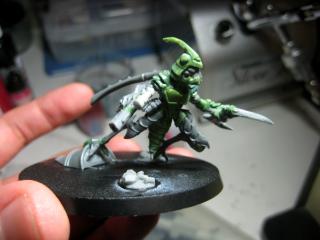
Hello yet again! Today I’d like to address a few similar requests regarding the weathering test on my guardians, first from a Dakka member called Oreo_Golem. This one’s for you!
So, to start it off…
HF IZ’S WEATHERING TUTORIAL (feel free to add to it!)
This was all trial and error, and many other painters have solid techniques- if any of the Dakka^2 community want to share a tip/add insight, please do!
So to start, I assume that you’ve painted and highlighted your miniature to a fair-to-almost-finished standard. The reason for doing so is because the 2nd weathering stop is easier to figure out when you have the highlighting to guide you. Or, if you’re completely clueless about lighting and light reactions to multiple surfaces/depths (like me) then it just makes it a bit more convincing! The first two colors chosen below are standard for light-to-medium colored areas, and the final Inner color was to give a more “organic” look to the under-armor of my Eldar. It will change depending on what you paint. (aka dirty/rusty boltgun for SM under-armor)
Colors Used:
BASE (Charadon Granite w/ Chaos Black Mix @ roughly 1.5:1)
HL (Fortress Grey w/ Skull White @ roughly 1:1.5)
INNER (Scorched Brown w/ Bleached Bone @ 1:2)
, all watered down to skim milk consistency.
Base- I’ve seen this done with sponges and with brushes. I prefer the control of the brush rather than the random patches put down by a sponge. You might also want to look into reference pictures- either other models done in this way or real .
Start by taking the BASE mixture and hitting the edges with knicks (lines) and chips and/or chunks (mixture of random shapes). Here’s where the references come in: if you have no idea what shapes you want, you can copy what you see onto the model. Alternately, think about the contours of the model’s armor to add whatever weathering shapes make the most sense in terms of what/where you’re putting them on. For example, chunks from the center of a SM’s ceramite shoulder plates makes sense, but chunks from an Eldar’s bodysuit… not really. Any area is fair game, with most damage will be on the edges and/or highest points of the armor.


Next, take the HL color and add a thin line along the contours of the black shape, close to the edge, and closer to the bottom of the marked-areas. This gives the illusion of depth. For some areas, it won’t be so much lines, but small stippled “dots” along the edge, giving the look of a portion that was torn off, instead of a more clean break.


Finally, take the INNER mixture and layer it inside the black shape, leaving a thin black lip and the highlight intact. How much, how far- that’s on you. For example, I imagine that guardians’ armor is wraithbone-grown... So for my Eldar, underneath the nice bright armor colors would be a natural marrow-like or even bone-like color. And the color layer I imagine isn’t that thick, so the Inner-color covers a lot of the Base, giving the impression the color shell is only a few centimeters thick. In case that didn’t make sense, the more BASE color (“lip”) you leave visible in relation to the INNER color, the thicker the outer shell (that got torn off) will look due to the HLs.

 **Note: Some of the BASE and HLs on this guy are too thick- Thin them down using the final armor highlight color to clean up the look. **
  That's why you do the weathering last!
I’m not as pleased with this guy as I am with the first guardian. I believe I used slightly thicker paint the first time around, not quite skim-milk. That kept the stippled dots consistent and small, instead of bleeding out into inaccurately wide, white splotches. It also kept the initial Base color knicks and chips small.  SO.. with that in mind, I’ll repair him to look like this guy- using the colors of the armor to manipulate the size of the BASE/ HL shapes to be smaller. This is what it should look like with slightly-thicker paint. Note on the back antennae, the thicker paint allows for dot-textures.
One more thing to note is that this is only the beginning- the weathering on these Guardians is far from complete, for me, anyway. I plan to use some washes on the gem areas to simulate built-up grime. I also plan to drybrush browns onto their boots (possibly use some weathering powder on their legs) to simulate dirt and dust from the battlefield. For other ideas, you could very lightly stipple/dry brush on some brownish-orange in the exposed metal of SMs, black for added scorch, or even weathering powders for dirt that the created-chips/pits are catching.
… and that’s where the tutorial ends… lol. I am pretty clueless for darker colors, so for any other painters out there- Question time!
What can I use for darker colors- say, I want to damage his dark-blue backpack?
Did I miss anything? Any other questions that popped up from the tutorial?
And so ends my first tutorial! Questions? Feedback?- I'd appreciate it!
Hope that answers the original requesting-parties, and thanks for stopping by!
|
|
This message was edited 1 time. Last update was at 2011/04/19 17:19:16
|
|
|
|
|
2011/04/20 23:20:57
Subject: ::Izanagi's Phantom Forge:: (April 19- Battle Damage Tutorial Request!)
|
|
Rampaging Reaver Titan Princeps
|
How'd i miss this thread?? Love all your work bud.
The WHQ characters look boss, the barbarian especially but the wizard still looks good despite the obvious modelling flaws (loving the green blending and his calfskin? boots)
The Shadow spectre --> Maugan conversion is bootiful, i like the rips but do agree it doesnt quite gel with the current cloth. The gun/blade is awesome.
The Guardian's battle damage is sweet, i love Charadon for this (in fact i use it on all my chipped damage). Love the aqua, bone and the topknot but cant help but feel the dark blue seems a bit out of place. As youve been looking at Ifalna's thread, how about a hardlined black (either highlighted grey or that funky blue she used on the marine commission) sort of Tron style.
LOVE the Ranger guy, sweet camo!
And, ive said it before and i'll say it again im sure. COLOUR SHAPERS!!! The best way to sculpt with GS, you definitely wont regret it.
Oh, and you're a lucky boy to have an Eclipse!! I love my airbrush to bits, but its only a fairly cheap one (bout £30). It does the job for basecoats and subtle vehicle highlighting but i wishj it was a bit more precise. Had my eye on a Paasche Talon for a while now, just need a bit of spare cash! 
Glad to see you're back again! Hope your course goes alright (im starting my masters degree in Chemistry in Oct, took a year out, bit nervous!) and that all your connections in Japan are coping fine.
Regards,
Vitruvian
|
|
|
|
|
2011/04/21 02:37:56
Subject: Re:::Izanagi's Phantom Forge:: (April 19- Battle Damage Tutorial Request!)
|
|
Ghastly Grave Guard
The cold reaches of space
|
Hey Vitruvian! Thanks for stopping by! There are so many great threads out there right now (both newcomers like Baiyuan's work, Flinty's Starcraft-Terran team... and oldies like Migs/Les/Gits/etc.- and apologies if they're not new, I've not seen their work before) that it's hard to see everything... I could spend a day looking at everything I want to, but I would probably end up losing my job doing so...
And in regards to your critiques- Thanks, first and foremost. Now, for the details...
1) Thanks for the WHQ guys, you'll see the rest of the defunct =I=Men here too. If you've seen any of the TV series Spartacus: Blood and Sand, you'll see a hopefully-similar team of Pit Fighters...
2) Maugan "Spectre" Ra - I thought about it after- the rips did look pretty sweet, but I didn't trust my bludgeoning meathooks to gouge the resin loin-streamers ( LOL... that sounds really bad...) to match. He's been redone... looks more like a wizard than a ripped up wraith... to mixed feelings and results. 
3) Dark Blue doesn't look so hot- Hmm... I think I understand what youre saying. I'm actually putting a dry-brushed muddy brown on the leg portions... it almost makes them look like they have boots, and fills in the dark, it looks better than the clean look right now. I'll post him up later when he's about 95% finished, and we can revisit this conversation yet again.
4) Battle-Damage - Yup, I love clean Eldar... but I love the crapped out look more than I do the pristine... Hopefully after damaging all of these guys, my technique'll improve that I can actually make a newsworthy guide or article... by the way, any ideas of showing wear for dark-colors...? It looks good on light because you can see the darker paint you lay down... but when it's dark... you can barely see it, causing the transition to be more abrupt and less-believable... thoughts?
5) Ranger- Thanks! I actually like him too- it's a great concept I modified from Migs' pathfinders- check em' out... how's that for awesome? I'm still thinking... don't know if I want to keep him as is, or perhaps give him colored armor to pull him back into the grimdark universe rather than the more realistic-take.
Colour shapers- ditto. I'm always looking for more tools to complete my kit!
The Eclipse is pretty good, and I'm trying to get practice in. The Zenithal Lighting article by MajorTom11 and AwesomePaintJob channel on youtube have been a big help learning how to use it. Lol... turns out I'm not a natural with an airbrush. Go figure.
It is good to be back, although I'll inevitably disappear for a bit for finals prep and/or HW... Good for you for your Master's as well! Here's hoping you have an easier time! Aha ha ha ha...
And thank you for your thoughts on my Japanese friends/family. They're alright, thank God, but it's been hard to not just drop everything I'm doing and go "home" to help my wife's family and her friends... or any of my family or friends overseas, for that matter. Didn't stop me from donating a hefty sum of savings though... my only regret is that I ran out of money to give. 
But enough of that- Thank you again for the visit and your thoughts! Stay tuned for more later!
|
|
|
|
|
|
2011/04/21 14:37:14
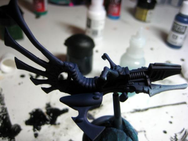
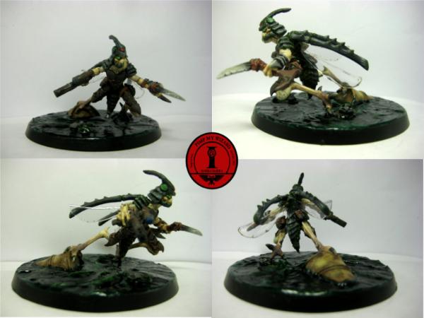
Subject: Re:::Izanagi's Phantom Forge:: April 21- FW Shadow Specters WIP!
|
|
Ghastly Grave Guard
The cold reaches of space
|
Good morning yet again! For some god-awful reason, I couldn’t sleep at all yesterday… so instead of laying in bed staring at the ceiling, I upped and got to work on my FW Shadow Specters! In order to prep and try zenithal HLs (which I don’t think I quite got, but practice makes perfect!) I finally got the chance to look at MajorTom11’s Zenithal Highlighting article. Don’t know if you read this, MajorTom, but many thanks and great work!
Check it out if you haven't seen it yet! I’d be surprised if you haven’t though, it’s Dakka home page material- with a gorgeous zenithal HL, OSL Grey Knight pic!
----------
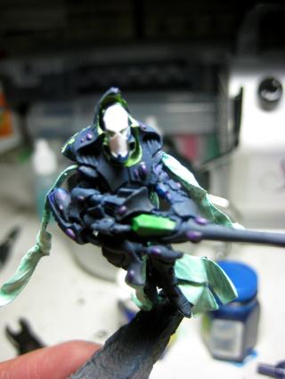
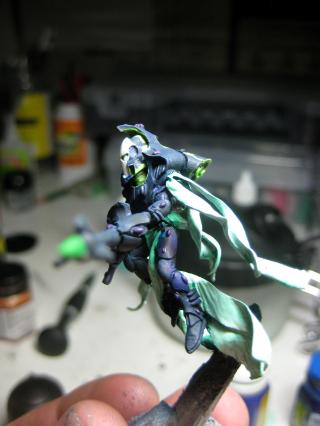
So, without further ado, the nightmare of building the Shadow Specters finished last month, I primed and airbrushed them. I actually use a white primer, as I enjoy the brighter colors, but Z- HL works with black… so, started by first airbrushing GW Chaos Black onto the model, followed by a layer of my Midnight Blue variation mix, and a layer of Vallejo Dark Prussian Blue. One final highlight was that same D Prussian Blue with a bit of white… came out sky blue and screwed the whole thing up. LOL… so, a few washes of oldskool GW blue ink and Badab Black Wash got it back down the colors I originally wanted. Ta-daaaah!
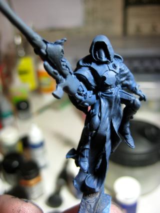
For colors, I wanted to tie the group to the rest of the army in some way… mainly the aqua-green tinge, or purple… so I tried it on the streamers… and that was probably a mistake. I am however, pleased with the start of the OSL around the eyes, hood, and jetpack.. For this, I’m using Yggdrasil’s OSL guide to help me with color and transition correction for this team, as I really like the test colors.
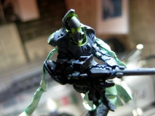
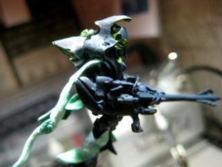
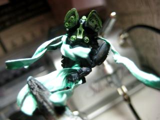
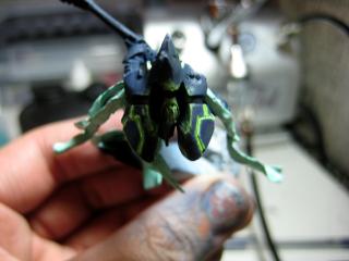
I also decided to inch them closer to actual Reapers, which is what they’re designed to represent in-game (if I ever play).. so I slapped on a white facemask… I really like the original reiteration of the black-blue face with the glowing green eyes and halo hood… so I’m saving that idea for Maugan Ra, his armor will be a reverse of theirs so I can use the awesome blue face and OSL green eyes.
And now that I look at the model again… I can imagine this color scheme being really awesome for Necrons. These Specters are very reminiscent and lend themselves well to OSL with so many potential energy sources.
And that's it for now... actually, no it's not. There was work done til the break of dawn on the converted Pathfinder Autarch (rider), more paint on the Rangers... but yea, that'll be for later. This time, just one question-
What do you think about the streamers? Should I keep the aqua-colored? Or should I paint them grey/white?
Thanks for stopping by! I love the views, but would love a comment/critique for guidance even more!
-Remi
|
|
This message was edited 1 time. Last update was at 2011/04/21 14:39:50
|
|
|
|
|
2011/04/21 15:43:48
Subject: ::Izanagi's Phantom Forge:: April 21- FW Shadow Specters WIP!
|
|
Rampaging Reaver Titan Princeps
|
I think they look pretty nice! The front on shot makes the model look a bit messy, but that final pic is just gorgeous!
Lovely work.
It took me a while to get my OSL to a respectable level. Using the GW VerminLord masterclass really helped, as did thinning my paints right down to glazes and applying loadsa layers. You seem to be getting the hang of it nicely, but it does seem a tad stark where the glow stops (if that makes sense?)
|
|
|
|
|
2011/04/22 13:35:42
Subject: Re:::Izanagi's Phantom Forge:: April 21- FW Shadow Specters WIP!
|
|
Ghastly Grave Guard
The cold reaches of space
|
Thanks! I'm still not quite sold on the aqua-white streamers... I might redo them to be just white/grey? Not entirely sure yet.
And yea, I'm trying to figure the fine line between the "stark" look (totally understood what you mean) and the softer Yggs' style OSL... I'm definitely going to find a happy medium between them, hopefully before I finish all 5 Specters.
I'll give it a go though and thin them down even more... the only thing I dislike about thinning (in general, not just for OSL) is having less control on the paint flowing around... but yes, I'll definitely thin them even more- at least there's groove for it to follow for the jetpack!
Anyways, thanks for stopping by!
-Remi
|
|
This message was edited 1 time. Last update was at 2011/04/22 13:38:32
|
|
|
|
|
2011/04/22 16:01:59
Subject: ::Izanagi's Phantom Forge:: April 21- FW Shadow Specters WIP!
|
|
Veteran Wolf Guard Squad Leader
|
This is such a cool thread, amazing painting and GSing, good luck with finishing the eldar army
|
30K Blog: hobbyfromtheaett.blogspot.com
  Bran Redmaws Great Company - 5500pts Bran Redmaws Great Company - 5500pts
30K Space Wolves - 1500pts
  Deathguard -2300 pts Deathguard -2300 pts  |
|
|
|
|
2011/04/25 14:33:52
Subject: ::Izanagi's Phantom Forge:: April 21- FW Shadow Specters WIP!
|
|
Ghastly Grave Guard
The cold reaches of space
|
Thanks, Logan! I'll be starting up again next weekend after midterms! It won't be just Eldar, but expect MERCS minis WIPs starting next week, among others!
Stay tuned!
|
|
This message was edited 1 time. Last update was at 2011/05/02 17:55:09
|
|
|
|
|
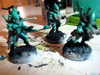
2011/05/03 18:14:49
Subject: Re:::Izanagi's Phantom Forge:: May 3 – Ranger + Guardian WIP, and Jetbike Hood Freehand WIP!
|
|
Ghastly Grave Guard
The cold reaches of space
|
Hello and sorry for the long absence! With Midterms over, I decided to do a bit more painting. And with the following update, I believe I’m exhibiting signs of ADD, starting many different aspects of the project but not finishing any of them… 
Ranger Paint-Scheme Mod: I took the advice of my cousin and decided to pull the look back to the “fantasy” side a bit more… For the Ranger armor, I decided to reverse the colors, and make the dark-blue color dominant, and keep the familiar coppers and signature white face-place. Still deciding on a color for the innards of the gun, the janglies on his belts, his belts and pouches (probably a rustic brown-ish leather?), and wiring. I’m thinking maybe a black color for the wires and gun, but again, still haven’t decided yet- “definitely not metallic” is the only boundary I’ve got at the moment.
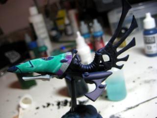
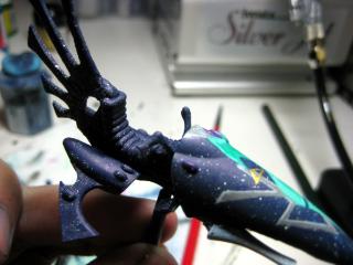
Next, I present progress on the Autarch Jetbike and Assembly-Style Guardians
Not too much done on this guy- just gave it a base spray of my blue mix, with two successively brighter highlights. Hope to get more work done on it later this week.
These guys are a pain in keister, as in-game, they’re worth less than the paint used to color them, but they’ve got a more complicated scheme than even the FW Specters or Rangers I’m making. Easiest to hardest (to paint) – Rangers, Specters and a far, far back would be these guys.
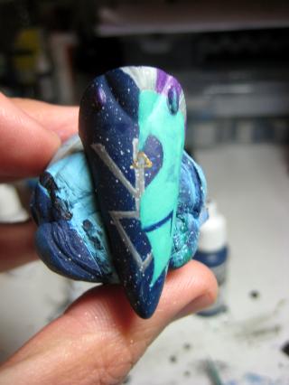
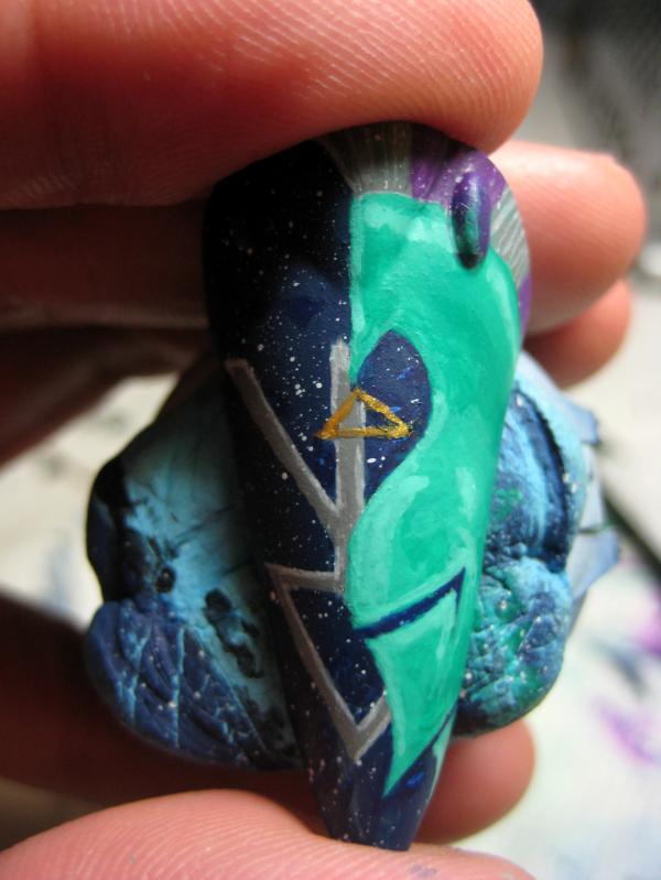
And finally, WIP on my Autarch’s (for the moment?- might end up just being another Guardian-Ranger Bike-Leader) Jetbike Hood. In changing the ranger back to more “fantasy”, I got the ridiculous idea to do the hood in an 80s style Tekkaman star-knight motif. Praise the emperor for battle damage, I don’t know if I could stomach it if it was totally clean…
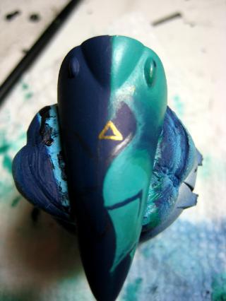
Used an ebony pencil to mark out the design...
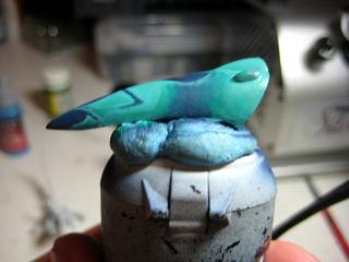
I’m adding a bit more detail, as it was just too-plain being 2 colors… I’m added the Ranger symbol, which needs a few more layers of highlights. I’ve got a few more ideas to make it a bit cheesier.
 Freehand Questions
I’m absolutely zero for color theory or even color painting/freehand. The original sketch was created while listening to a riveting lecture about accounting cash flow statements… ugh. Any suggestions about how to make the image “pop” a bit more- colors, where to hit it for light spots…? As much as people are going to hate the design (I know because I’m laughing and crying as I paint it) I’m going to stay with it- it says “flamboyant” to me, and I’m hoping it’ll come together when I get a few more jetbikes with different star-knight designs and battle damage.
Comments and critiques are always welcome! Love it? Hate it? How can I improve it? Let me know!
Also, in other news… I’ll be doing yet ANOTHER project log to satisfy my short attention span… Look for it towards the end of May, my start on Pre-Heresy Thousand Sons, with a suitably snazzy title that accurately describes the indescribably slow way I paint and produce miniatures… something like “A Thousands Sons… is a bit too ambitious, how about a squad of 10 for now?”… or “The First of a Thousands Sons… (the rest are slogging behind)”
|
|
|
|
|
|
2011/05/03 19:28:22
Subject: ::Izanagi's Phantom Forge:: May 3 – Ranger + Guardian WIP, and Jetbike Hood Freehand WIP!
|
|
Sneaky Kommando
|
Not sure what to make of the freehand. What is it supposed to be? I read through your blog and i'm not sure i get it. From what i can tell your highlighting on it seems good, the blending could use some more time, i would reccomend getting a wet pallet and take your time with it. Also the eldar ranger symbol edges seem a bit choppy. Very good first attempt though.
When you say you want it to "pop" could you clarify? which portion do you want to pop. As of right now its difficult to discern whats going on in the freehand
|
|
|
|
|
2011/05/03 19:35:38
Subject: ::Izanagi's Phantom Forge:: May 3 – Ranger + Guardian WIP, and Jetbike Hood Freehand WIP!
|
|
Ghastly Grave Guard
The cold reaches of space
|
Hey Chrono, thanks for stopping by. Basically, it's a crested helmet on one side, with the symbol behind it. Symbol is not quite complete yet.
I'd like the helmet to "shine", and this probably goes along the lines with NMM or some variation thereof, but I've not worked with a wet palette before. I want it to stick out more- more contrast, more projection instead of the flat-look that it has right now. Doing freehand symbols isn't that bad, but when it comes to outright pictures, I'm a bit lost.
Thanks for stopping by and thanks in advance for your advice!
|
|
This message was edited 1 time. Last update was at 2011/05/03 19:59:30
|
|
|
|
|
2011/05/03 20:20:07
Subject: Re:::Izanagi's Phantom Forge:: May 3 – Ranger + Guardian WIP, and Jetbike Hood Freehand WIP!
|
|
Sneaky Kommando
|
Always happy to help. Take a look at this image, not the best representation but may aid you.

Notice how the eyes are a bit more rounded, and also how the brow of the helmet sticks out farther.
Bear with me while i throw out some pointers.

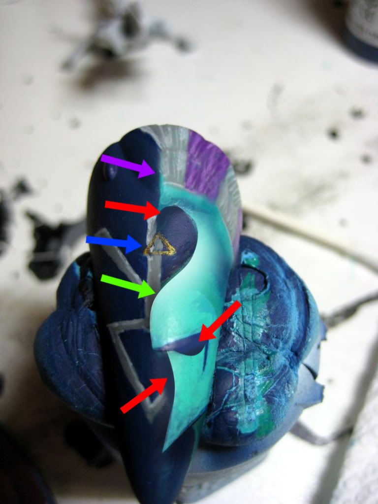
Here is a before and after thingy i was working on for you, may help out a bit. Or it may be nonsense
So the red arrows point to where i think you should take away portions of the helmet to make it appear more as a.... well helmet.
The green arrow is where i added some highlighting to make it pop, i also added some shading along the entire profile of the image to make it stand apart and almost appear as if floating above the ranger symbol.
The purple arrow is pointing to where i believe you should extend the "hair" on the helmet, as you had it before it looked to short and not how it would appear on a spartan/crested style helm.
And lastly the blue arrow, wasnt sure what this gold triangle was, but i believe it should be removed, it distracts from the image overall and is difficult to discern what it is. Also i wouldnt recommend using gold on a freehand, its hard to percieve depth, use a nmm style if you want to achieve a gold look.
I really hope this helped, and sorry for the slow response, i had to photoshop up my thoughts
~ Chris
|
|
|
|
|
2011/05/03 20:24:10
Subject: ::Izanagi's Phantom Forge:: May 3 – Ranger + Guardian WIP, and Jetbike Hood Freehand WIP!
|
|
Ghastly Grave Guard
The cold reaches of space
|
LOL... holy hell! Thanks for the treatment, Chrono/Chris! That'll definitely help! I was expecting a verbal explanation, but yea, a picture is worth a thousand words! I appreciate the work for the response!!
I'll try to give it a go tonight, and I'll post results hopefully tomorrow?
Thank you again! You've been most helpful!
-Remi
|
|
This message was edited 1 time. Last update was at 2011/05/03 20:25:03
|
|
|
|
|
2011/05/03 20:34:28
Subject: ::Izanagi's Phantom Forge:: May 3 – Ranger + Guardian WIP, and Jetbike Hood Freehand WIP!
|
|
Sneaky Kommando
|
No problem
Looking forward to what you have to show
|
|
|
|
|
2011/05/03 21:36:57
Subject: ::Izanagi's Phantom Forge:: May 3 – Ranger + Guardian WIP, and Jetbike Hood Freehand WIP!
|
|

Grovelin' Grot
|
I really like what you are doing, I don't think i've seen battle damage on Eldars before. I had the same problem as you mentioned before, when thinning paints it tends to get runny. I just found a produkt (from a tip here on Dakka, sorry I don't remember from who), Liquidex Acrylic Medium. I just started experimenting whith it, but it thins the paint without loosing it's consistence. You can still add water to make it more runny. And, good luck whith your freehanding on the bike!
|
|
This message was edited 1 time. Last update was at 2011/05/03 21:40:36
|
|
|
|
|
2011/05/04 15:24:47
Subject: Re:::Izanagi's Phantom Forge:: May 4- LOL... My Wife Decided to Help Me Paint...
|
|
Ghastly Grave Guard
The cold reaches of space
|
Lord J - Thanks for stopping by! I'll be putting the Liquitex on my list to buy this month, along with some colour shapers. I also like the battle-damaged look. I know Eldar probably keep their stuff very neat and clean, but it seems a bit out of place after the first hour of engagement on the 40K battlefield. Stay tuned! There's more to come!
-----------------------------------------------
Hello again! It’s an update that’s both up and down. The good thing was, for once, the lady showed an interest in my work rather than indifference or outright scorn for my hidden-geek… pah! Woman, away with you! It’s ART!!! 
Now, this isn’t a crack at female-painters. The ones on Dakka I’ve seen/followed and some of the ones on CMoN kick ass at this stuff, and definitely have better technique and vision than I do. No… this was a lesson in… patience. 
On this certain occasion, my wife found whatever I was doing interesting at the moment. I was painting guardians, the hood and body of my jetbike (with a lot of help from ChronoTrigger- thanks again, bro!). Here's the work on the hood below-
Didn't get to follow the advice Chrono gave me yet- my computer decided yesterday was the day that it wouldn't be able to find it's own Operating System... I decided to do fleck a bit of paint on the blue portion to create stars... might keep them, might not. I think they look pretty cool, but i'm not entirely sold on them yet.
---------------------------
It was at this time that she enlightened me to the fact that she is, in fact, an excellent painter! I present our conversation below... with pictures!
(wife comes up behind me/my desk)
Me: Something wrong?
Wife: That looks fun. Can I try?
Me: *cringing* Umm… yea, I guess. Do you know how to do this? I thought you didn’t like my hobby stuff…
Wife: Remi, I’m an excellent painter. I think I paint better than you- did you know…  (proceeds to tell me story about winning an award for painting neatness during grade school)
At this point, I’m resigned, but I want to be a “good” guy… and I don’t want to be sleeping on the couch for something “trivial” like my models… Patience. Pass it on!
Me: (proceeds to tell me story about winning an award for painting neatness during grade school)
At this point, I’m resigned, but I want to be a “good” guy… and I don’t want to be sleeping on the couch for something “trivial” like my models… Patience. Pass it on!
Me: Ok. (I’ll probably end up regretting this, but) Sounds like you know what you’re doing. I want a certain look to this- it’s not that hard, but it’s not like pencil.
Took a bit of time to teach her the incorrect but effective way of using a stippling brush filled with watery paint, using a nail to fleck paint onto a surface to make “stars”.
Me: Remember, you can’t take it away if you mess up… I want it to have small white flecks… like stars… I think it’ll look nice if we do that, but don’t overdo it so it looks like we just flecked a lot white paint on it. Just take it nice and slow. Sound good?
 Wife:
Wife: No problem. You’ll see. You’ll like it!
(30 minutes later)
Wife: Remi… I think I’m done… How did I do?

 Me:
Me: Michiyo … you tried to fix it, didn’t you?
Wife:… yes… yes, I did.  I thought I put too much, so I wanted to fix it… Is it messed up?
Me: No… no, it’s not messed up. You did... good. Let’s… watch a movie or do something else. Together.
Wife: (smiling) Really? But I can-
Me: No… no really, it’s ok. We’ll continue later. I’ll go out for a cigarette for just a second… when I get back, we’ll watch Rome or something, ok?
Wife: Ok.
LOL… comments and critiques about our work? I’m probably going to have to redo it, but I thank/love the wife for her momentary interest in my hobby…
Thanks for stopping by!
-Remi (and Michiyo)
|
|
This message was edited 2 times. Last update was at 2011/05/04 15:32:23
|
|
|
|
|
2011/05/04 17:04:01
Subject: Re:::Izanagi's Phantom Forge:: May 4- LOL... My Wife Decided to Help Me Paint...
|
|
Sneaky Kommando
|
Haha nice story. My fiance (now wife) had a go at painting. It was very entertaining. She painted my orks with pink shoes, purple guns, yellow shirts and metallic green skin. Interesting to say the least.
I do like the stars, adds a nice depth to the piece. However i would recommend continuing that star effect throughout your whole army. I think it would give each piece a nice unique touch and a sense of unity. As well as looking pretty cool. Maybe even adding some color to your splatter effect to better emulate stars. Also, if you wanna have another go at it possibly mix a swirl of colors before you add the splatter stars. Don't be afraid to use references, like this picture

|
|
|
|
|
2011/05/04 19:02:19
Subject: Re:::Izanagi's Phantom Forge:: May 4- LOL... My Wife Decided to Help Me Paint...
|
|
Horrific Howling Banshee
|
I've been away for awhile and you've been busy!!! Looks fantastic man. I really like it all. The bike and Spectres are awesome. The rangers are my fav so far though, the Urban Camo is some of the best I've seen.
|
 "We shall purge the Maiden Worlds of all who dare try to invade and infect our sacred worlds of salvation" - King Yvenaurael of the Lileath-Aean Exodites. "We shall purge the Maiden Worlds of all who dare try to invade and infect our sacred worlds of salvation" - King Yvenaurael of the Lileath-Aean Exodites.
Listen to "The Receiving End Of Sirens" they are GREAT

|
|
|
|
|
2011/05/05 02:50:21
Subject: Re:::Izanagi's Phantom Forge:: May 4- LOL... My Wife Decided to Help Me Paint...
|
|
Ghastly Grave Guard
The cold reaches of space
|
@ Chris/Chrono- LOL.. thanks man. And I like how they have a vision of what they want... and it's NOTHING like what we've been indoctrinated with. Love it when they show interest though, I guess I should pay it back in spades and make dinner... go shopping.. something! As to the rest of it, I think I will- especially for vehicles.. I'm almost excited to see how this is going to finish up with the battle damage.
- Reference pictures... a MUST. I realize that the stars now have no depth, no swirls, purples to break it up... yep. Let's try it... one more time!
@BtMask- Welcome back! I gotta agree with you too- the Rangers are not only my favorite sculpts of the Eldar line, it's the only set of models for this group that I felt I nailed on the head. (for now)...
Just had a thought... not to keen on the old P.Lords... they're great, no doubt, but the sculpts are starting to show their age... perhaps a mini-project to rebuild their images (or at least the ones I like- Jain Zar... not so much, as with the Banshees) from standard guardians and crazy greenstuff work... resulting in taller, more proportional, but perhaps not as masterfully detailed P.Lords...
Per Vitruvian's recommendation... colour shapers are on order!
Stay tuned!
|
|
This message was edited 1 time. Last update was at 2011/05/05 02:51:54
|
|
|
|
|
2011/05/05 02:57:45
Subject: ::Izanagi's Phantom Forge:: May 4- LOL... My Wife Decided to Help Me Paint...
|
|
Sneaky Kommando
|
If you want a cool sculpt check out the new elder model chapterhouse released. It's pretty sweet. But I hear ya, my wife can't cook so I got that in the bag, as long as I keep plugging out meals she let's me play with my plastic army men haha
|
|
|
|
|
2011/09/12 18:53:50
Subject: Re:::Izanagi's Phantom Forge:: Sept 12, Pimp My Wizard Entry Final Pics
|
|
Ghastly Grave Guard
The cold reaches of space
|
Whew... it's been a while since I've been been back on my own "random" blog. One is dedicated to my 1K sons, another to =I= Munda with fellow friends and ninja-dakkaites Evinyr + Zakkenaya, and this one for my Eldar and random works.
Let's see... started this one up in May... then got caught up with a job change, joined Baiyuan and PDH's "Pimp My Wizard" competition, and started a slow build-up of a Pre-Heresy 1K Sons force. But I've got a few models here that don't quite fit in any of the other two threads for =I= or 1K Sons... SO... here it is! My entry for the PMW group project!
Finished GS Work/Conversion sans wings
 Final Entry
 - for a closer look, check the gallery, the medium-sized view squashes the pic and makes it kinda grainy...
Comments and critiques are always welcome!
Coming up will be a Monkey King figure, as I'm currently on a Sun Wukong phase... and an Anima Tactics shinobi figure to be used as an Imperial Assassin (taking "Imperial" to mean Cathayan, not Empire) for WHQ! Stay tuned!
-Remi
|
|
|
|
|
|
2011/09/27 20:10:05
Subject: Re:::Izanagi's Phantom Forge:: Strider Hiryu conversion begins 9/27!
|
|
Ghastly Grave Guard
The cold reaches of space
|
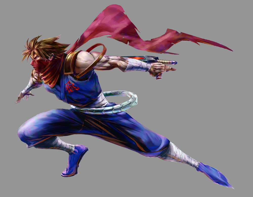
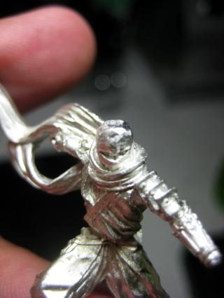
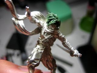
Good afternoon! I FINALLY got one of my products ordered over Labor Day Weekend from the Fantization website… My order was languishing til October when I could get my Monkey King mini as well, but I talked to the sales team over there and they shipped my Anima Tactics guy Friday and received it yesterday.
The figure I got in the mail (as painted by the Anima Tactics team)
" target="_new" rel="nofollow"> 
He comes with a Ninja magic two-fingers up ( LOL… I see you trying it out there  ) with one hand or a kunai-wielding hand for one option and a katana or kusari/sickle for the other. Originally, he was just to be another member of my group’s WHQ band, and a simple single-mini level paintjob… a break from conversion and the work I put into the PMW competition. However, upon staring at the options and the pose… the thought came to me to turn him into this guy ..
I don’t play Marvel vs Capcom, but he’s my all-time favorite of the line-up. Now… the purpose of the mini has not changed- To represent an Imperial Assassin (rules found here http://wquest.free.fr/warriors/Imperial%20Assassin.pdf) but I don’t like his head… and I don’t really like the sword. Question is, how much of Strider Hiryu should this model channel? 100% conversion (requiring a resculpt of the arm, as Strider has no shoulder armor) or simply a “likeness”…?
Currently leaning towards “likeness”. But stay tuned, progress to come on the weekend! (or sooner if I get tired of studying finance  ) Thanks for stopping by!
-Remi
|
|
|
|
|
|
2011/09/27 21:05:59
Subject: ::Izanagi's Phantom Forge:: Strider Hiryu conversion begins 9/27!
|
|
Rampaging Reaver Titan Princeps
|
I dont think you should copy it completely, after all the base model is amazing!
|
|
|
|
|
2011/09/28 01:07:43
Subject: ::Izanagi's Phantom Forge:: Strider Hiryu conversion begins 9/27!
|
|
Ghastly Grave Guard
The cold reaches of space
|
Vitruvian XVII wrote:I dont think you should copy it completely, after all the base model is amazing!
Very true. I really like the sculpt... aside from the head, I think it's perfect. I'm almost certain it'll only be a hair-swap, as the Cypher (tonfa-blade-thingy) the real Strider carries doesn't really mesh too well with WHQ. I just got finished drilling out both arms of the body to put pins into it... does anyone know if they make drills smaller than the GW one? This one was bit tricky and didn't leave me with a lot of material on the OD of his forearm...
-Remi
|
|
|
|
|
|
2011/10/02 23:29:42
Subject: Re:::Izanagi's Phantom Forge:: Strider Hiryu conversion complete! Oct 2nd Update!
|
|
Ghastly Grave Guard
The cold reaches of space
|
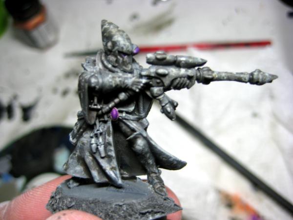
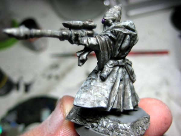
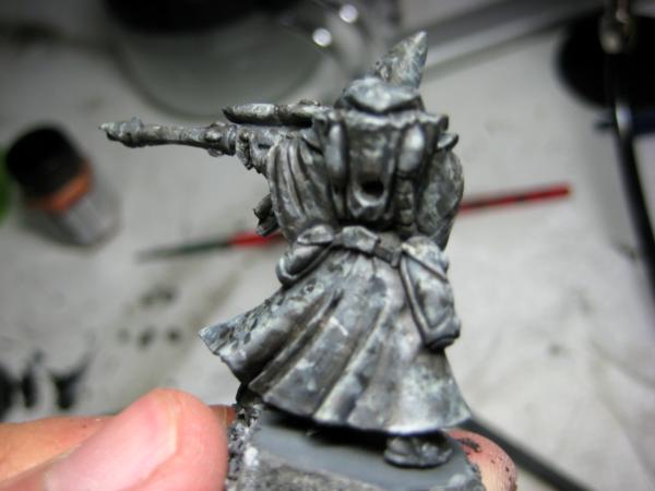
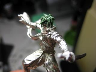
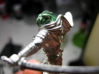
Good evening! With my midterm finished for finance, I finally had a little bit of time to hobby. Did a bit of work on my newest WHQ miniature. From the previous posts, you can see the original model from the Anima Tactics line. It's an excellent sculpt, but I just wasn't feeling the head. I decided to make him look Strider Hiryu-ish, and not a complete copy, as this is supposed to be a "relax" mini, and not supposed to take forever to do. That being said, here's the results.
Started out by taking a rough file to his dome, and I gotta admit... he kinda looks cool without the four-point hat thingy, and more the wrap-around mask we're all familiar with.
Next came the reconstruction of his brow bone-structure and added eyebrows, as it was all covered by the hat-piece and headband that got filed off.
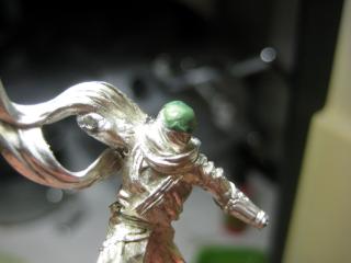
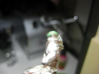
And finally, I sculpted the hair in two parts, the shorter, shaggy under-stuff, followed by laying and positioning GS strands to make his anime-cut. I took a look at him and figured this was where I was going to stop modelling and start painting.
Anyways, that's it for me! Painting progress pics probably tomorrow? Comments, critiques or questions are always welcome!
-Remi
|
|
|
|
|
|
|
|
|