| Author |
Message |
 |
|
|
|
|
Advert
|
Forum adverts like this one are shown to any user who is not logged in. Join us by filling out a tiny 3 field form and you will get your own, free, dakka user account which gives a good range of benefits to you:
- No adverts like this in the forums anymore.
- Times and dates in your local timezone.
- Full tracking of what you have read so you can skip to your first unread post, easily see what has changed since you last logged in, and easily see what is new at a glance.
- Email notifications for threads you want to watch closely.
- Being a part of the oldest wargaming community on the net.
If you are already a member then feel free to login now. |
|
 |
2016/11/06 22:24:59
Subject: Need help improving
|
|

Decrepit Dakkanaut
|
Looking good! And don't worry about things looking bad zoomed in. A great majority of minis do. 
|
|
|
|
 |
|
2016/11/06 23:18:00
Subject: Need help improving
|
|
Crazed Spirit of the Defiler
Newcastle
|
You're doing great. That's a really nice cultist unit
A word on practicality though... when you paint your first models consider the size of the project you're starting. Plenty of times I've started painting my first troop unit and really went for it, getting results I was really happy with, but then when I've been painting the second, third etc. units I've found I'd set the bar too high and to paint the entire army was going to take far too much time. Now I generally go for simple and fast on the bulk of a model and mostly put the effort into the details that are going to draw the eye
|
Hydra Dominatus |
|
|
|
|
2016/11/07 17:04:25
Subject: Need help improving
|
|

Been Around the Block
|
I appreciate the positive feedback. What are everyone's thoughts on swapping the colors for the next four cultists? or thematically would it be better to stick to mirrors of what I already painted? Gramd scheme of things; I plan to paint one squad of cultists for each god (these being khorne) to go into the core formation of the black crusade detachment.
|
|
|
|
|
2016/11/07 17:32:10
Subject: Need help improving
|
|
Dakka Veteran
|
Looking good, CDShaddock! They're coming along really well.
I think Lance misunderstood what I was talking about before, so in case I garbled my post, I was talking about painting the lenses on the eyes like gems, not the metals. I think you got it looking at the cool eerie eyes you've got on them now.
Regarding flipping the paint scheme, it's really down to what you want to do, and what you think will look good. For example, I painted all my cultists different colours, so they looked like a rabble rather than an army. It offends some player's' sensibilities, but that's just how I saw them. It depends how uniform you want them to look.
|
|
This message was edited 1 time. Last update was at 2016/11/07 17:33:13
|
|
|
|
|
2016/11/07 18:14:14
Subject: Re:Need help improving
|
|

Ancient Venerable Black Templar Dreadnought
|
Well, I would start with colour wheel theory:
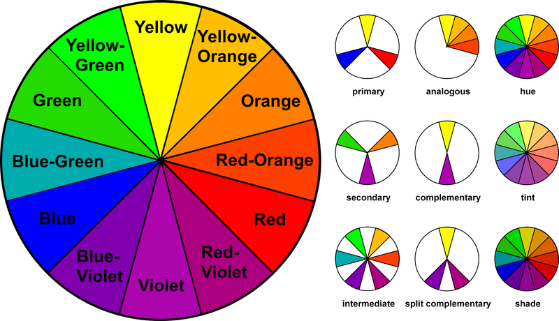
I am a fan of Split Complimentary when it comes to settling on army colours.
Using the "blue-green" with "red", "orange" is the natural choice to go with it.
What can be fun is get the main colours as a direct complimentary and apply a bit of split.
Like: Blue as primary colour, Orange as the main trim, Yellow-Orange for boots and pouches, Red-Orange for lenses.
I noticed your edge highlights are one colour (I think).
If you go up in tint it has a "pure" brighter colour to it:

Funny, I tend to pick a "tone" below the base colour to prime with.
The shade is a good guide for the shader/washes paint out there for painting into the crevices.
Try for fun a 3-step for glowing items, highly reflective surfaces or to make things really pop:
Highlight a bit wide just a shade lighter than the base colour. (From red to red-orange)
Highlight about 1/2 to 1/3 of the above highlight lighter more (Red-orange to Orange).
Final Highlight try to pick the extreme edge or corners (Orange to Yellow-Orange).
Remember yellow-orange is really a light type of brown/gold so experimenting with that around red makes for some neat combinations.
|
A revolution is an idea which has found its bayonets.
Napoleon Bonaparte |
|
|
|
|
2016/11/07 19:07:35
Subject: Need help improving
|
|
Been Around the Block
|
I am not sure I fully understand the color wheel or theory. So currently for Khorne I am using Red (obvious) after shades I have been highlighting with red going up in shade to orange on the very edges. I have been using complimentary colors of grey (as a dirty woolen) white and accents of black, bronze, and obligatory metallics. For my slannesh cultists I was predominantly going to use purple as the replacement for red Keep the black as is and then do a weathered gold more than copper/bronze. For the complimentary color should I go woth the grey again to tie in the army or something brighter according to the theory like a red l?
|
|
|
|
|
2016/11/07 19:34:03
Subject: Need help improving
|
|
Norn Queen
|
Looking great! Automatically Appended Next Post: Color wheel theory says the colors on the opposite sides of the color wheel compliment each other the best. When you sticks golds/yellows next to purple your purples get ore purpley and your golds get more gold. Look at screenshots of the first castlevania game. The direct compliment of blue is orange. https://www.google.com/search?q=castlevania&source=lnms&tbm=isch&sa=X&ved=0ahUKEwiF6ue8spfQAhWEw1QKHWeHAMUQ_AUICSgC&biw=1280&bih=706#tbm=isch&q=castlevania+nes  It's all oranges on blue. The same goes for almost all movie posters today. By using split complimentary colors you don't use the direct compliment (the color exactly opposite), you instead use the colors to either side of your direct compliment. So if blue is your primary color you don't use orange, you use red and yellow (and any tint/tone/shade of those hues (hue is the real word for colors of the rainbow)). My necrons are kantor blue on their armor. Deep rich golds (almost orangy) and red for all the energy stuff. A split complimentary color scheme. The reason those neon green eyes pop so much on your cultist is because it's more yellowy green and one of the compliments of your red robes and very warm reddish skin tones. Likewise, compare your grey pants/shawls in their clothing to the green/blue color on the color wheel. Add some grey to it to mute it... that is your color. You are already kind of using a split complimentary color scheme.
|
|
This message was edited 4 times. Last update was at 2016/11/07 19:49:29
These are my opinions. This is how I feel. Others may feel differently. This needs to be stated for some reason.
|
|
|
|
|
2016/11/07 21:22:39
Subject: Re:Need help improving
|
|
Fresh-Faced New User
|
These look great, tidy painting and the burn on the flamer looks awesome. You say they are only half done, what's left?! I would add some weathering / dry brush highlights to the leader's axe to make it look well used.
|
|
|
|
|
2016/11/13 00:42:57
Subject: Re:Need help improving
|
|
Been Around the Block
|
Cultist #7 let me know what you think about the inverted colors. I changed the skin tone as well since its a duplicate sculpt.
|
|
|
|
|
2016/11/15 01:15:32
Subject: Re:Need help improving
|
|
Been Around the Block
|
Cultist #8. On the home stretch. I still feel like my painting is too messy. I can't figure out how people get such clean lines and transitions. Lucky cultists are forgiving of being a little dirty.
|
|
|
|
|
2016/11/18 02:28:22
Subject: Re:Need help improving
|
|
Fresh-Faced New User
|
One word: contrast
Everyone else has given great examples of this, so no need to repeat it. But it's a concept I failed to realize for a long time. Making subtle shades and highlights is great and all, and seems intuitive at first. But really contrast is how you make a model pop. Ben Komets, an awesome painter, said that for red color specifically it's best to start with the brightest color you want then shade downwards, as opposed to starting dark and shading up. Reason being is that when most people shade up with red, they often use oranges and yellows to highlight -- which is fine -- but will make your model more "apricot" or pink. I followed his advice and it works amazingly.
Watch this and it will change your life: https://www.youtube.com/watch?v=E7dmPDrWfuI
|
|
|
|
|
2016/11/19 10:06:11
Subject: Need help improving
|
|
Fresh-Faced New User
|
That last cultist is really starting to pop.
Especially the highlighting on the grey. I really like what you've achieved there and if you wanted to go one step further you could add another almost white highlight to the very corners of the grey
|
|
|
|
|
2016/11/19 18:52:01
Subject: Re:Need help improving
|
|
Been Around the Block
|
Cultist #9 base coat and wash. Hopefully I will get to do layers today and post him tonight or tomorrow. I think once the ten are all done I will go back over and a another layer of highlighting and maybe some weathering before figuring out bases. What is the paint that does the oxidation on cooper/brass? Again I appreciate the guidance everyone is chipping in. Hope to make the next squad better with what you have taught me.
|
|
|
|
|
2016/11/20 23:16:28
Subject: Re:Need help improving
|
|
Been Around the Block
|
Cultists done! Number 9 and 10. With their same sculpts for contrast
Automatically Appended Next Post:
Why did it post the same photo 4 times
|
|
This message was edited 1 time. Last update was at 2016/11/20 23:17:30
|
|
|
|
|
2016/11/20 23:20:57
Subject: Re:Need help improving
|
|
Been Around the Block
|
All 10 together.
|
|
|
|
|
2016/11/21 00:31:07
Subject: Re:Need help improving
|
|
Regular Dakkanaut
|
Looking good. I like how you've done the flesh tones on Mr. Shirtless, and I really like the guys were grey is the primary color.
Don't judge your models fully till you base them. A good base goes a long way in giving a figure that "wow" factor
|
|
This message was edited 1 time. Last update was at 2016/11/21 00:32:06
|
|
|
|
|
2016/11/21 01:51:24
Subject: Need help improving
|
|
Been Around the Block
|
So quick question. In light of the new legion supplement I was thinking of doing some Khorne Beserkers (go-go world eaters). The thing is when I sized up some on the shop today they are the same size as my cultists. I guess they will look consistent on the table but they don't scream 8' tall screaming maniacs.
|
|
|
|
|
2016/11/21 03:05:27
Subject: Re:Need help improving
|
|
Regular Dakkanaut
|
GW plays a little fast and loose with scale sometimes. Marines (of all stripes and loyalties) generally are not that much bigger then other models. This espshally holds true for older sculpts which tend to run a little smaller then newer stuff.
|
|
|
|
|
2016/11/21 11:31:48
Subject: Need help improving
|
|
Been Around the Block
|
Do you think the old bezerker scults will look ok on 32mm bases or should i keep them on 25?
|
|
|
|
|
2016/11/21 14:47:58
Subject: Need help improving
|
|

Troubled By Non-Compliant Worlds
|
CDShaddock wrote:Do you think the old bezerker scults will look ok on 32mm bases or should i keep them on 25?
The models are going to look a tiny bit largers when they're on a 32mm base, and the bigger base allows for more modelling opportunities. I prefer the larger bases for SM primarily for the modelling opportunities.
|
Revenge is a dish best served with mayonnaise and those little cheesy things on sticks. |
|
|
|
|
2016/11/21 17:14:08
Subject: Need help improving
|
|
Irked Necron Immortal
|
Always go big on bases is my preference. As said above, the models look like they have more of a presence and you get more space to get creative with your basing!
|
|
|
|
|
|
2016/11/21 18:02:31
Subject: Need help improving
|
|
Been Around the Block
|
So I am thinking the basing theme will be armageddn dust texture. With a agrax wash and karak stone dry brush. Steel legion drab ring and then some burnt grass to break it up.
|
|
|
|
|
2016/11/22 01:09:37
Subject: Re:Need help improving
|
|
Been Around the Block
|
Well let's give it a try. First two test bezerkers; cut out, cleaned, hope to put glue and primer tomorrow. Wish me luck moving into the power armor.
|
|
|
|
|
2016/11/22 08:20:13
Subject: Need help improving
|
|
Irked Necron Immortal
|
Main thing that will help you is to remember that when doing your base layer, you don't need to be perfect, you can always tidy up at a later stage.
Keep us posted 
|
|
|
|
|
|
2016/11/28 02:58:30
Subject: Re:Need help improving
|
|
Been Around the Block
|
I finished building and priming the zerkers but decided to try out a few different techniques with paint consistency and did these guard. This how they look after base coat and wash. I was using all water color consistency; thickening it for more pigment as needed. What does everyone think? I should have at least the missile launcher guy finished tomorrow. If this produces better results I might ap,y this to my zerkers in lieu of my previous technique.
|
|
|
|
|
2016/11/29 00:41:37
Subject: Re:Need help improving
|
|
Been Around the Block
|
Finished
|
|
|
|
|
2016/12/10 21:17:29
Subject: Re:Need help improving
|
|
Been Around the Block
|
Today is a hobby day. Finished my Company command squad for my catachans. Going to start on a wyrven as well
Automatically Appended Next Post:
Quick shot of my Catachan CC squad and Vet squads.
|
|
This message was edited 2 times. Last update was at 2016/12/10 21:29:34
|
|
|
|
|
2016/12/10 21:30:58
Subject: Re:Need help improving
|
|
Been Around the Block
|
Herenit is
|
|
|
|
|
2016/12/10 21:34:12
Subject: Need help improving
|
|
Powerful Phoenix Lord
|
So nice to see someone actually painting Imperial Guard (even if the Catachans are my least favourite!). Nice work.
|
|
|
|
|
2016/12/12 18:55:59
Subject: Need help improving
|
|
Been Around the Block
|
Thank you. I started with guard as my first army this year because I thought they would be easier to paint and had a pretty decent balance as far as rules go for a beginner. Simple enough to learn but with at least some special rules (orders and various weapon profiles) to expose me to other facets of the game. I am obviously not competitive as a play and barely competent as painter but they are fun. I like catachans because they have personality compared to bland cadians. With this complete i now have 1505 points of painted guard this year.
Automatically Appended Next Post:
I will post up the whole army tonight maybe
|
|
This message was edited 2 times. Last update was at 2016/12/12 18:57:26
|
|
|
|
|
|
|