| Author |
Message |
 |
|
|
|
|
Advert
|
Forum adverts like this one are shown to any user who is not logged in. Join us by filling out a tiny 3 field form and you will get your own, free, dakka user account which gives a good range of benefits to you:
- No adverts like this in the forums anymore.
- Times and dates in your local timezone.
- Full tracking of what you have read so you can skip to your first unread post, easily see what has changed since you last logged in, and easily see what is new at a glance.
- Email notifications for threads you want to watch closely.
- Being a part of the oldest wargaming community on the net.
If you are already a member then feel free to login now. |
|
 |
2019/02/08 20:31:18
Subject: Titanomachina: Fun with Real Estate
|
|

Decrepit Dakkanaut
|
It's a good point about the design principles of having primary and secondary features (gribbles) to make them more visually interesting. I'll have to fiddle around and see what I can do. I was trying a big satellite-style dish for a Comms/Sensors top, but something in between that, your mock-up, and the original masts-and-bunkers thing may work too.
Thanks, by the way, it's really great having your input here.
|
|
|
 |
|
2019/02/08 23:38:35
Subject: Titanomachina: Fun with Real Estate
|
|

Decrepit Dakkanaut
|
Glad to help! As far as satellite dishes go, they want to have negative space underneath them, which creates a challenge if you want plastic cast using metal tool & die. It is for that reason that I went with antenna towers, knowing that they could be sturdy enough and still be produced using hard tooling. WRT the masts-and-bunkers, it was a good start for concept. It may be helpful put a 2mm tall x 1mm diameter cylinder on the corner of whatever topper you are working on, as a visual reference of how big (small) a person is. It's helpful to ensure that whatever you sculpt "makes sense" visually, so that any gribbles are "in scale". Also, completing my set, here's my take on a Shield Generator - reworked: 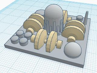 And a rework of the Turret: 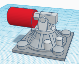 Completing the entire set together: Power Generator 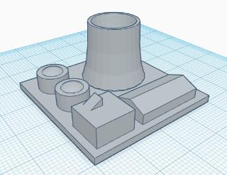 Comms / Sensors 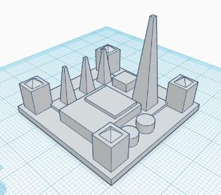 ____ I updated the Shield to have what is visually an elevated sphere as counterpoint to the Power Plant. Mostly, it gives the player a "handle" for the rooftop. 
|
|
This message was edited 4 times. Last update was at 2019/02/10 09:06:20
|
|
|
|
|
2019/02/11 16:00:09
Subject: Titanomachina: Fun with Real Estate
|
|
Decrepit Dakkanaut
|
Apparently 1:1000 scale is known as "Architectural Scale" according to a grognard of my acquaintance.
Cool design pointers about making visually-pleasing pieces.
Automatically Appended Next Post:
Okay, finally managed to some work in on the building tops.
Updating the Shield Generator

Updating the Power Generator:

Updating the Comms/Sensors:

The printed versions, for QA:

|
|
This message was edited 6 times. Last update was at 2019/02/19 20:49:26
|
|
|
|
|
2019/02/20 18:32:34
Subject: Titanomachina: Fun with Real Estate
|
|
Decrepit Dakkanaut
|
I like the updates!
Comments:
* Shield Generator is fine, but the generator itself is a bit to blobby - I'd "deflate" it by about 20%, give it more space to breathe on the top.
* Power Generator is the best of the 3 designs; however, those 4 tall stacks are super fragile-looking. I'm guessing that they're 1mm diameter, but 15mm tall? If your material isn't rubber-like, they're going to snap off in play. Also, as your antennae can be fine, then the tower wall can be a *lot* thinner - you can push a bigger parabaloid into it. In the real world, a cooling tower's walls are like an eggshell in proportion.
* Sensors is not quite right. To me, the main building looks like the Taj Mahal, and I'm pretty sure that wasn't what you were going for. Aside from the super-think minarets, everything seems chunky, where comms and sensors should be lighter and more airy, aetherial. To me, it feels more like a military command post / bunker, which might also be a thing.
Question: is there a conceptual reason why some connectors are pitched roof vs rounded? You can have lots of 1mm "pipes" on the ground (or walls) for surface detail/texture.
Finally, think about how human fingers are going to pick the item up and handle it. The Taj Mahal is going to have the minarets broken off immediately, because the natural action will be to pick it up as the handle.
|
|
This message was edited 2 times. Last update was at 2019/02/20 18:35:35
|
|
|
|
|
2019/02/21 13:38:41
Subject: Titanomachina: Fun with Real Estate
|
|
Decrepit Dakkanaut
|
Thanks for the feedback John!
Interesting point about the Shield Generator. I can see that.
Regarding the Power Generator: The stacks are 2mm diameter at their base, I think. The material is supposed to be a tough vinyl plastic. It'll be interesting to see how the printed versions survive play. The cooling tower is supposed to be a bit more ST:TNG warp-core that than, and I've been toying with the idea of filling in the middle with concentric rings or something. The cooling tower shape screams 'power plant' but I'm trying for something more Transformers (1984) futuristic.
The Sensor Station is supposed to look like a bit of a bunker, and the Taj Mahal looking bit is supposed to look more like a radar installation, although the masts around it may confused getting that across. The masts haven't broken off yet, but again we'll see.
Some connectors I was thinking of as armoured conduits for cabling/pipes/etc, and the pitched roofs as hallways connecting bunkers.
|
|
|
|
|
2019/02/21 16:44:37
Subject: Titanomachina: Fun with Real Estate
|
|
Decrepit Dakkanaut
|
All good, glad to help.
 Nurglitch wrote: Nurglitch wrote:The cooling tower shape screams 'power plant' but I'm trying for something more Transformers (1984) futuristic.
There is nothing wrong with stealing existing visuals for faster player identification of pieces a la GW WYSIWYG. Just be aware that you're stealing it, and make it your own.
OTOH, there are issues when nothing is identifiable. If you went with abstract circle - triangle - square - hexagon shapes, and told people to guess which was which, they'd not remember so clearly. Importing existing elements is very helpful to forestall players having to stop and wonder "what is a hexagon, again?"
|
|
|
|
|
|
2019/02/22 14:10:38
Subject: Titanomachina: Fun with Real Estate
|
|
Decrepit Dakkanaut
|
The notion of the abstract circle/hexagon/etc was to tie into the iconography on the cards and on the dashboards.
Hexes were intended to feature on the cards and the dashboards to indicate charging. That was when charging was about when discarded cards would go back on the bottom of the Titan deck, and the dashboard featured sections for cards to go in to track how close they were to being put back in. It was clunky though, and got replaced with
Squares with rounded corners are used to indicate Effect dice on the cards. I tried a mock-up where the number of Effect dice was literally illustrated on the card, but it was really crowded and people hated counting the number rather than just reading it.
Squares with sharp corners are used to indicate the range of weapons, given that's how may squares away on the board a weapon can engage. Not obvious, but it seemed logical. I should probably include a [1] on the Limb systems to indicate that they have a range of 1 for any attacks made when they're activated.
Circles are the shape of the shield tokens, rather like the pin-point defence shields on the Macross in Macross, and therefore the Shield Breaker trait on some weapons that allowed them to force those Shield tokens to be discarded before they cancelled effect dice.
Triangles indicate the Armour Piercing trait that laser weapons share, and a triangle is used in the laser warning symbol.
Diamonds indicate High Explosive because I didn't want them confused with triangles, and sometimes the diamond is used in caution signs indicating explosives.
Exploding stars indicate Shock because I was kind of running out of ideas at that point, and it seemed like it might convey the notion of something shocking. I tried a lightening bolt, but that was difficult to put a number inside.
The little flag thing at the bottom of the cards is intended to be unlike the others enough that the cost information they'd contain would be a footnote to game-play, but available for scoring purposes.

|
|
This message was edited 1 time. Last update was at 2019/02/22 14:53:52
|
|
|
|
|
2019/02/22 18:01:51
Subject: Titanomachina: Fun with Real Estate
|
|
Decrepit Dakkanaut
|
You are creating iconography and using it in a certain way, not unlike Lucky Charms' red hearts, yellow stars and green clovers, although an abstract shape on its own has no particular meaning - it has to be imbued with meaning within context, which you are doing.
A wet draft cooling tower is a "form follows function" design that people are familiar with, so it has inherent meaning. Same with an antenna mast (although I am wary of designing breakable "needles" on playing pieces that get handled).
|
|
|
|
|
|
2019/02/25 17:13:42
Subject: Titanomachina: Fun with Real Estate
|
|
Decrepit Dakkanaut
|
It's an interesting point about iconography. It might be an idea to create a thread about future-proofing design (defining a library of elements before going about making a recipe out of them, for example).
Mixing iconography with practical game elements is pretty tricky - I need to design a print-and-play version of the game though, so I think my next order of business is to figure out how to do it all with chits and 2D images.
|
|
|
|
|
2019/03/01 13:48:33
Subject: Titanomachina: Fun with Real Estate
|
|
Decrepit Dakkanaut
|
I had posted a link to the Facebook group, but I don't think it works for people that don't want to be part of the Facebook warp storm, so I've posted the Rules and Print'n'Play on the development blog, on Blogger.
https://titanomachina.blogspot.com/2019/03/titanomachina-printnplay.html
|
|
This message was edited 1 time. Last update was at 2019/03/18 17:00:18
|
|
|
|
|
|
|
 -- $k
-- $k  -- 9k
-- 9k  -- 6k
-- 6k  -- 4k
-- 4k  --
--