| Author |
Message |
 |
|
|
|
|
Advert
|
Forum adverts like this one are shown to any user who is not logged in. Join us by filling out a tiny 3 field form and you will get your own, free, dakka user account which gives a good range of benefits to you:
- No adverts like this in the forums anymore.
- Times and dates in your local timezone.
- Full tracking of what you have read so you can skip to your first unread post, easily see what has changed since you last logged in, and easily see what is new at a glance.
- Email notifications for threads you want to watch closely.
- Being a part of the oldest wargaming community on the net.
If you are already a member then feel free to login now. |
|
 |
2020/01/23 17:26:21
Subject: Re:New to painting - Please critique!
|
|

Ancient Venerable Black Templar Dreadnought
|
A good alternate colour for the trim would be Orange since that is a direct contrast to blue on the colour wheel.
|
A revolution is an idea which has found its bayonets.
Napoleon Bonaparte |
|
|
 |
|
2020/01/23 17:54:05
Subject: New to painting - Please critique!
|
|

Thane of Dol Guldur
|
You could paint the trims orange if you wanted to make them look like a box of jaffa cakes..
Whilst orange is indeed the complimentary colour to blue, it doesn't mean it belongs on everything as a contrast colour. A better use of orange as a spot colour would be orange red eye lenses or somewhere in the basing, which is what I'd probably do, use a rust powder worked into the base, possibly with a little earth mixed in.
It's the same with red and green, if you go too mental with bith colours then your models will look like Christmas cards.
|
|
This message was edited 2 times. Last update was at 2020/01/23 18:01:27
  Heresy World Eaters/Emperors Children Heresy World Eaters/Emperors Children 
Instagram: nagrakali_love_songs |
|
|
|
|
2020/01/23 22:39:40
Subject: New to painting - Please critique!
|
|
Buttons Should Be Brass, Not Gold!
|
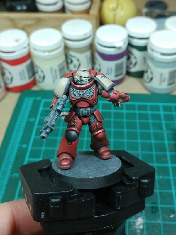
limakilo wrote:I would be looking for this type of standard below. The major difference would be the shoulder trim colour, as I would like it to be Company-specific. All ranks within the company would have full squad and role markings also. I guess, what you see on the box. minus the gold shoulder trim. Obviously these models I have painted have got gold trims (2nd Company?), but that is just because they came with that paint. These three guys here will probably be used to test methods of making the model unique despite the canon-style pattern. For example, I'm interested in making the eyes insanely real and glow rather than looking glassy. As I grow my company, I want each model to have that hero finish. They are most likely for display rather than play purposes.
The main reason why the GW boxart looks so crispy is because they are able to keep the recesses of the details dark (either a very dark color, or black). This separates the volumes of the model. Many other posters have already made suggestions that you use a dark wash on the model. This has the benefit of adding shadows to the lower parts of the volumes on the model AND flowing into the recesses - creating the blackline.
The other part of this is that they are using a light color to line the tops of the adjacent volume. Having a dark color next to a bright color generates the maximum contrast which lets the eye perceive the difference in the volumes on the model from far away. This is the often heard "use more contrast" feedback that is thrown around. The key thing to know about getting the right contrast between highlight and shade is that they need to be roughly the same number of shades away from your midtone. That means that if you have a lime green... the maximum brightness you can go is white. You don't want to shade to black, because the difference in brightness between lime green and black is huge, but the difference between lime green and white is a lot smaller. In this case, the shadow needs to be a color that matches the brightness difference between midtone and highlight.
I think that this would be the thing I would concentrate on first. If you are able to blackline the details to keep the volumes separate, and edge-highlight to increase separation, this will greatly increase the pop of your model. There are other techniques that will further raise its standard to display level, but this seems like a good place to start. Using sweet blends across surfaces is really the next step after to link together the bright and dark spots on the model.
I am no expert by any means, but on this Blood Raven, where I have tried to use a bright highlight against the black lines between panels to accentuate the volumes:
Happy Painting.
|
|
|
|
|
2020/01/24 14:21:10
Subject: Re:New to painting - Please critique!
|
|
Ancient Venerable Black Templar Dreadnought
|
Wow, yeah, that Blood-Raven is a fine example of how to do things well!
I think that is a two-step red lightening/gradient and then picking out the sharp edges (flesh tone colour I think).
I assume this is done after shading?
I have to feel really brave before I start painting over shade: you only get one shot at it: cleanup/correction can be difficult.
I like seeing the shoulder on the left: paint near the trim as wide as you like, then fill in the shoulder staying away from the trim.
Keezus, would you mind posting the back of that model?
The picture looks like a fantastic guide for where to highlight.
I have been lately "cheating" and doing a 3-step zenithal highlight in blue over the whole model and (carefully!) painting details and only doing a very thin edge highlight hoping not fix afterward.
|
A revolution is an idea which has found its bayonets.
Napoleon Bonaparte |
|
|
|
|
2020/01/24 15:05:37
Subject: New to painting - Please critique!
|
|
Buttons Should Be Brass, Not Gold!
|
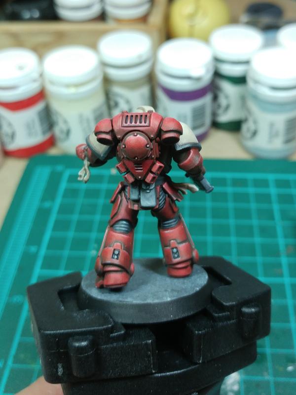
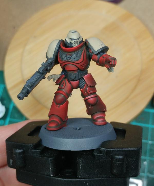
@Talizvar: I put it under a spoiler tag: The model was done for the 3 color challenge back in 2018. My entire "training" sub gallery is sort of my painting journey to go from table top to try and achieve a display standard. I'm happy to share my experiences. Still have a long way to go however. There are some problems with the final product. In particular, I'm very happy with the white highlight on the knee pad. That same level of contrast needs to be exhibited across the entire figure. As it stands now... the contrast levels are not consistent across the model, making the presentation wonky as it strangely draws the eye to the knee. This would be most easily fixed by knocking the contrast level down so that it is in line with the rest of the torso.
Regarding the top highlight... It is added after the red is shaded. Here is a WIP before:
I'm still not getting the right level of saturation for the red. I think that the top coat needs to be more orange. I talked with Dallas Kemp ( PP's staff painter) and they indicated that they highlight with a "peach" for the Khador red models, up to white and then many thin layers of red to bring up the saturation. I haven't tried it yet.
|
|
This message was edited 3 times. Last update was at 2020/01/24 15:11:49
|
|
|
|
|
2020/01/24 16:46:46
Subject: Re:New to painting - Please critique!
|
|
Thane of Dol Guldur
|
 Talizvar wrote: Talizvar wrote:Wow, yeah, that Blood-Raven is a fine example of how to do things well!
I think that is a two-step red lightening/gradient and then picking out the sharp edges (flesh tone colour I think).
I assume this is done after shading?
I have to feel really brave before I start painting over shade: you only get one shot at it: cleanup/correction can be difficult.
I like seeing the shoulder on the left: paint near the trim as wide as you like, then fill in the shoulder staying away from the trim.
Keezus, would you mind posting the back of that model?
The picture looks like a fantastic guide for where to highlight.
I have been lately "cheating" and doing a 3-step zenithal highlight in blue over the whole model and (carefully!) painting details and only doing a very thin edge highlight hoping not fix afterward.
Corrections are easy. If you mess up, just rebase then reshade.
You should practice applying thin layers of your base coat over your shade to bring back up the lighter areas. Start your strokes in the dark section, and draw them towards the lighter areas. Automatically Appended Next Post:  keezus wrote: keezus wrote:
I'm still not getting the right level of saturation for the red. I think that the top coat needs to be more orange. I talked with Dallas Kemp ( PP's staff painter) and they indicated that they highlight with a "peach" for the Khador red models, up to white and then many thin layers of red to bring up the saturation. I haven't tried it yet.
You could try using some layers of bugmans glow to achieve the final light stage, mix with a lighter flesh tone if you really need, then you can add your white points.
|
|
This message was edited 2 times. Last update was at 2020/01/24 16:50:49
Heresy World Eaters/Emperors Children
Instagram: nagrakali_love_songs |
|
|
|
|
2020/01/24 16:52:08
Subject: Re:New to painting - Please critique!
|
|
Ancient Venerable Black Templar Dreadnought
|
Wow, that is a level of detail that I would find extremely difficult to stick to for an army, but I cannot argue for the results: it looks awesome.
|
A revolution is an idea which has found its bayonets.
Napoleon Bonaparte |
|
|
|
|
2020/01/24 18:07:54
Subject: Re:New to painting - Please critique!
|
|
Buttons Should Be Brass, Not Gold!
|
Talizvar wrote:Wow, that is a level of detail that I would find extremely difficult to stick to for an army, but I cannot argue for the results: it looks awesome.
Haha. I'd never try to paint to this level for a 40k army. Maybe a skirmish game like Infinity or Malifaux where you top out at 20 guys. I don't have Modok's level of mad-level painting.
|
|
|
|
|
2020/01/26 01:45:28
Subject: Re:New to painting - Please critique!
|
|
Regular Dakkanaut
|
Great start! You seem focused and interested in learning, which is the most important part of improving.
Your colors seem solid and in the correct areas. What I see in your images is what I would personally consider a base coat. You lack some of the details of the figure, especially metals (painting them blue or black instead), but I guess that´s due to the lack of paints. If you mix your paints with white and black you can get everything you need without spending a lot of pots. Blue, red, brown, gold, metal, white and black, and a black wash is everything you really need to get to a good standard for this specific minis.
Moving on I would suggest at least one level of highlights, and add some cenital lighting (bright at the top, dark at the bottom). There are many ways to do that, but the simplest one could be just mix some black with water and carefully apply it on the bottom areas of the miniature. This is not exactly wet blending or feathering since the opacity of the application is really low. If you have some decals, those help a lot to rase the finish of the minis, which otherwise might seem a bit simple.
Weathering, scratch marks and other effects are fun too, although they depend on what you like as a final result.
I would recommend you to get a homemade wet palette. It is a miracle that you will not be able to live with after you use it for a week. It keeps your paints wet, it allows you to mix paints easely and you can control the density of you paint, allowing you to paint better, faster, and with more advanced technics.
I am painting ultramarines recently and I will be uploading some "tutorial" progress of my paint scheme.
500 point army painted photos here:
https://www.dakkadakka.com/dakkaforum/posts/list/0/784655.page#10693876
My first unit was intercessors too.
I have painted in the past, but I have put some real effort this time to improve my skill and get an army painted to a standard that I am proud of.
What I would recommend is first choose what do you want to achieve, and set up small achievable goals that improve your skills as a whole.
I would make a folder of images of what you want in your scheme, not only as inspiration but as a reference and as goals. It is hard to start walking if you don´t know where are you going first.
Then you need to dissect what you have to do. If you see that a lot of the images you are attracted to use a particular painting technic, look for tutorials and practice that specific thing. It is good if you can set a roadmap for yourself, using specific units to practice a specific skill. For example, if you want to improve how to paint your golds, maybe a venerable dreadnought is a good choice to get a good swing at that.
There are a lot of ways to paint, especially what order and what technics do you use. There is no right way, so you will need to figure that out and get to a more personalized method.
|
|
This message was edited 1 time. Last update was at 2020/01/26 01:46:21
Serve the Emperor today, for tomorrow you may be be dead.
Painting blog:
https://www.dakkadakka.com/dakkaforum/posts/list/793314.page
 |
|
|
|
|
2020/05/24 09:48:32
Subject: Re:New to painting - Please critique!
|
|
Adolescent Youth on Ultramar
|
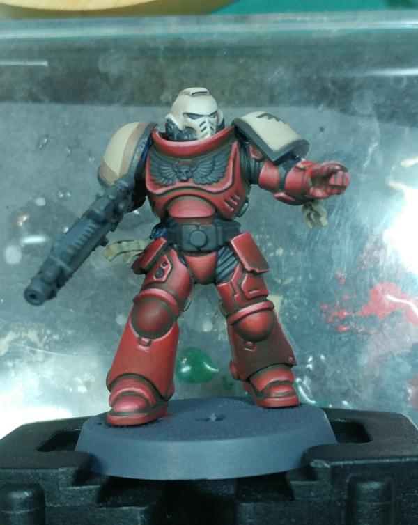
Okay guys, it's been a bizarre few months. I was recently drafted to a new unit, and then all this virus business kicked off. This meant I had to wait for a very long time to get my squad, paint etc. Anyway, I got my first squad of Intercessors and around 20+ of the paints I thought I would need to get it where I want.
I've completed my first model. I plan to do them all in step, so I would build, undercoat, base, etc all at the same time, but I wanted a prototype/template so I knew what exactly I would need to do. I learnt some important lessons, and thanks to many of the replies on here that was more straightforward for me.
This guy was going to be the sergeant, it may change. I remember how unforgiving a camera shot of miniatures are, but wow I was not prepared to see the highlights like that.
I got nuln oil for the recess shade, however after using it, I feel like drakenhof nightshade would be better. Also, for the edge highlight on the blue armour, I used calgar blue as prescribed by citedal. Mainly because of my skill, I did not think I would be able to as a further highlight on top of it and make it worthwhile, and I also feel it would be missing an initial highlight of mccragge/calgar, then calgar, then fenrisian for the final bits. I think this would make a more gradual shade. But there you go.
The head was a disaster, I actually threw one in the bin in frustration.
Pattern is 4th Coy, Ultramarines. The green shoulder trim, I went for those colours on a hunch.
|
|
|
|
|
2020/05/24 11:22:43
Subject: New to painting - Please critique!
|
|
Thane of Dol Guldur
|
I was going to ask about the green shoulder trim, then I saw your explanation. personally, I'd get rid of it. it clashes with the blue, and not in a positive way. I'd stick with a golden yellow for the trim. the rest looks alright. definitely improving!
|
Heresy World Eaters/Emperors Children
Instagram: nagrakali_love_songs |
|
|
|
|
2020/05/25 20:41:02
Subject: New to painting - Please critique!
|
|

Dakka Veteran
South Africa
|
 queen_annes_revenge wrote: queen_annes_revenge wrote:I was going to ask about the green shoulder trim, then I saw your explanation. personally, I'd get rid of it. it clashes with the blue, and not in a positive way. I'd stick with a golden yellow for the trim. the rest looks alright. definitely improving!
Eh, I like that it isn't a Smurf or 2nd Company. (This being said as a person who mained 2nd Company for ages). The lower tiers need some love. I think this is epic.
|
KBK |
|
|
|
|
2020/05/25 20:42:36
Subject: New to painting - Please critique!
|
|
Humming Great Unclean One of Nurgle
|
You're new to painting? Well don't I feel bad now-I was and am not nearly as good!
It's an awesome job you've done! Keep working on getting better, but be proud of what you've accomplished!
|
Clocks for the clockmaker! Cogs for the cog throne! |
|
|
|
|
2020/05/28 22:43:22
Subject: New to painting - Please critique!
|
|
Adolescent Youth on Ultramar
|
queen_annes_revenge wrote:I was going to ask about the green shoulder trim, then I saw your explanation. personally, I'd get rid of it. it clashes with the blue, and not in a positive way. I'd stick with a golden yellow for the trim. the rest looks alright. definitely improving!
I get it about the colours. I was looking for another chapter, but I have to be honest, for various reasons the Ultramarines really appeal to me as a chapter. The issue, is obviously they're the Smurfs or newbie models. With that it mind I looked through the companies and decided on the 4th. After I have finished a squad I may change depending on how they look. I'm not applying the shoulder pads until they are painted, as in, torso complete and shoulders have their base colour on. I might switch at that stage, but unlikely.
Thanks for the reply, I do appreciate it. Automatically Appended Next Post:  JNAProductions wrote: JNAProductions wrote:You're new to painting? Well don't I feel bad now-I was and am not nearly as good!
It's an awesome job you've done! Keep working on getting better, but be proud of what you've accomplished!
Since I got that starter pack, I have done nothing but read tutorials and watch videos on painting until my models and paints finally arrived. This one model took much longer than I expected though, I should really point that out. I am hoping that doing all the models one stage at a time will improve the speed, and allow me more time to get solid practice doing a particular colour/technique for prolonged periods in order to improve.
I am pleased with it, but once I took a picture of it and zoomed in, I got annoyed. The only other minis I see are in pictures also, so this is what I compare to.
|
|
This message was edited 1 time. Last update was at 2020/05/28 22:49:13
|
|
|
|
|
2020/05/29 06:13:18
Subject: New to painting - Please critique!
|
|

Regular Dakkanaut
|
I would try to tidy up your edge highlights a little bit. Take a teeny brush, some diluted blue and just try to smooth them out. Like on the backpack exhaust your blue line looks like a heart rate monitor in spots.
Maybe do one shade lighter of green on the trim. Or better yet try a metallic green
But not bad for first try. Nice to see something other than 2nd Co. I guess 2nd Co. is the only one that fights battles, the others sit and play tiddlywinks.
|
|
|
|
|
2020/05/30 11:52:45
Subject: New to painting - Please critique!
|
|
The Marine Standing Behind Marneus Calgar
|
3rd company gets a little love, (as it should, being the best company painted by all the coolest marine players). but the 2nd is the poster boy of the poster boys. I’ve seen maybe 2? people paint 4th company, and one 5th. There are a handful of us with the 3rd, and countless 2nds.
From a color theory perspective, the yellow and red of the 2/3rd pair very nicely with the blue. The green not so much. I think the black of the 5th could work, but that would depend on the shade of blue you use for the armor.
What the 4th company does is give you something unique. You might be playing Ultras, but you stand apart from the masses of the 2nd company. It also gives you more room to make them your marines. By being off the beaten path a bit, you have more space to tell your story.
You are doing a great job painting them. One thing to remember is that these guys are designed to be fighting battles on the table top. Remember the arm’s length rule. I didn’t edge highlight for years (decades, really) due to how crappy I thought it looked up close. But on the table? Pretty nice.
But the ultra zoom on the camera pics can go get stuffed.
|
|
|
|
|
|
|
|
 Ultramarines, 3rd Co. and friends, 16k+
  4k
4k  4k Points
 Competition Index