| Author |
Message |
 |
|
|
|
|
Advert
|
Forum adverts like this one are shown to any user who is not logged in. Join us by filling out a tiny 3 field form and you will get your own, free, dakka user account which gives a good range of benefits to you:
- No adverts like this in the forums anymore.
- Times and dates in your local timezone.
- Full tracking of what you have read so you can skip to your first unread post, easily see what has changed since you last logged in, and easily see what is new at a glance.
- Email notifications for threads you want to watch closely.
- Being a part of the oldest wargaming community on the net.
If you are already a member then feel free to login now. |
|
 |
2011/01/11 05:43:29
Subject: AoBR Ork Shootas: First time painting Orks
|
|

Sacrifice to the Dark Gods
Colorado, United States
|
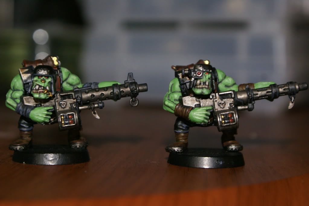
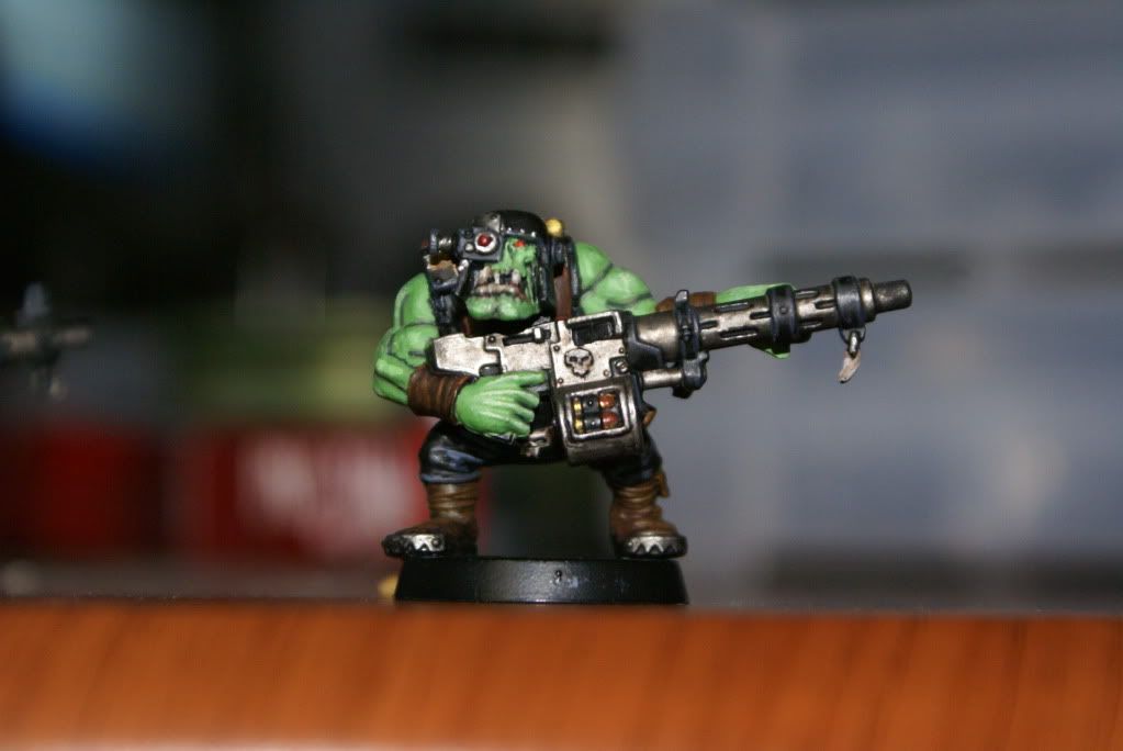
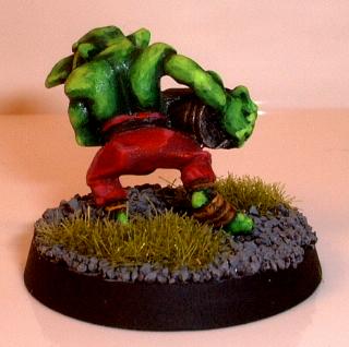
So these are my first attempt at painting Orks. I haven't picked up a brush in almost 4 years but have been doing my research and trying to learn new techniques. These looks SOOOO much better than the first attempts I made at painting mini's and even those were a basic table top quality.
I don't really like the shade lines on the arms and the shoulder armors Dags and checks were choppy I think because I didn't water down my white...then again I don't really water my paint down.
So please, tell me what you think. Don't try to hold back much, I can take the criticism just make it constructive  I hope and plan on being around here a lot more, posting and such instead of lurkin
|
|
|
 |
|
2011/01/11 06:18:09
Subject: Re:AoBR Ork Shootas: First time painting Orks
|
|
Stabbin' Skarboy
|
Love the detail on the ammo.
|
ChrisWWII wrote:
My reaction to this thread is still 'Why, Flying Spaghetti Monster, why?"
asimo77 wrote
Then we're all going down in a blaze of glory and ork milk
Sir Pseudonymous wrote
A pasty, barrel shaped, acid-drooling, balding mutant wearing the jumpsuit version of an Abrams.
|
|
|
|
|
2011/01/11 06:49:10
Subject: AoBR Ork Shootas: First time painting Orks
|
|
Fixture of Dakka
On a boat, Trying not to die.
|
This is much better than me. Good job!
|
Every Normal Man Must Be Tempted At Times To Spit On His Hands, Hoist That Black Flag, And Begin Slitting Throats. |
|
|
|
|
2011/01/11 07:24:38
Subject: AoBR Ork Shootas: First time painting Orks
|
|

Sinewy Scourge
|
They look really good, congratulations. I actually like "simple" schemes (palette-wise), but if I may be (nit)picky...
-Use a wash like devlan mud/gryphonne sepia/badab black (personally, I've used the three separately, and mixed up) and it really brings out the detail. Thing is, you'd probably have to repaint the base skin color if you apply liberally, but I'm saying this because you can bring out some more detail on their face and give a bit more depth on their skin.
-Thinner highlighting lines; they'll look much better up close. This would also be noticeable on the skin.
-"lining" on teeth (on the face and weapon); using brown, they'd look a bit nicer and "realistic"
-gun highlighting; a bit of boltgun metal, really thin, on the gun holes would make them really stand out.
Don't be put off by my comments, though, your orks do look great. The dags and other bits here'n'there look excelent, and I like the skin-tone very much (I'm a bit tired of yellowing orks :b).
Hope it's helpful, keep it coming.
|
|
|
|
|
|
2011/01/11 07:49:34
Subject: AoBR Ork Shootas: First time painting Orks
|
|
Awesome Autarch
|
Those look great! Nicely done.
|
|
|
|
|
|
2011/01/11 08:07:43
Subject: Re:AoBR Ork Shootas: First time painting Orks
|
|
[ADMIN]
Decrepit Dakkanaut
|
Yeah, those are really nice considering your time away from the hobby (and being your first Orks), so any advice given would just be nit-picking really.
The one thing I'd personally suggest is that you use a darker 'medium' step for your skin tone. The recesses are a pretty dark green (like Dark Angles Green), and I can see you did a highlight on the very tops of the muscles, but the medium level skin tone is so light that you can barely even see the highlights at all.
You need to feel comfortable leaving a bit more 'dark space' in the recesses and then only using the brightest colors on the very tops of the muscles.
An example of what I'm talking about is my grot here:
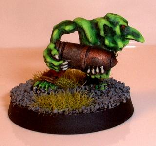
Now, this actually doesn't look all that great so close-up, but I can tell you that when you look at this grot in person, the difference in contrast from the recesses to the extreme highlights is really stark and looks great ( IMHO, of course). While your models look great, from the tabletop, their skin tone is just going to look like a single shade, which is a shame because I think I'm counting at least 4 steps of highlighting on the skin (tell me if I'm wrong).
Now, my skin tone method is more than 4 steps (although probably not many more), but even with 4 steps of skin painting you can get a much more dynamic looking skin tone simply through better choice of green shades for each step and having the confidence to leave more 'dark area' than you are when you paint each new highlighting step.
Good luck!
Automatically Appended Next Post:
Oh, and of course, you need to get those bases finished!!!
|
|
This message was edited 1 time. Last update was at 2011/01/11 08:11:25
|
|
|
|
|
2011/01/11 15:20:28
Subject: AoBR Ork Shootas: First time painting Orks
|
|

Freelance Soldier
Bristol, UK
|
You say you don't water your paint down and that's probably the first thing I'd advise if you want to increase the quality of your painting. I was amazed at how much better my own stuff looked when I started doing it. That and buying good quality Kolinsky sable brushes are the two things that allowed me to jump in quality quite quickly.
Still, you've got a good result there so far, better than average tabletop I'd say. Try taking some of yakface's advice on shades and highlights and I think you'll be well on your way to a great Ork army after a few years away.
Good luck!
|
Can I suggest skipping forward 10 years to the age where you don't really care about what people say on the internet. Studies show that it decreases your anger about life in general by 37%. - Flashman |
|
|
|
|
2011/01/11 20:22:32
Subject: Re:AoBR Ork Shootas: First time painting Orks
|
|
Sacrifice to the Dark Gods
Colorado, United States
|
Thanks folks. I don't see it as nit picking, I want others opinions as to what I can do to get better, because...I want to get better 
I have been toying with the thinning the paint but I just can't get the proportions right and I end up wasting a lot. I have been using a few GW brushes for fine detail and my small dry brush and my old crappy brushes for washes and larger drybrush.
The shading on the arms is what has vexed me SOO much to this point. I did a 5 stage Orkhide shade - Kgnarloc Green - Goblin green - 50/50 Goblin Green/Bleached bone - Bleached Bone skin tone. I pretty much copied the GW sites instructions but seemed to end up a tad...off. I think I will add a thin Devlin Mud wash or maybe go grab a pot of Thrakka Green. I went too light on the bleached bone highlight though I think, you can barely see it.
I was also thinking about highlighting those holes on the guns too, thank you for reaffirming that for me  I only did 3 stage highlights on everything else other than the skin, I think I will just do 4 stages from here on out.
Hmm, I noticed a trend here... GW has me whored out lol
Thanks again guys and please feel free to k eep giving your opinions.
|
|
This message was edited 1 time. Last update was at 2011/01/11 20:23:40
|
|
|
|
|
2011/01/11 22:40:50
Subject: AoBR Ork Shootas: First time painting Orks
|
|

Growlin' Guntrukk Driver with Killacannon
|
Great looking Big Shoota Boyz, nicely done! 
|
  Waaagh! Skarshak - Back after being lost in the Warp, an' ready to Krump sum 'eads! Waaagh! Skarshak - Back after being lost in the Warp, an' ready to Krump sum 'eads!  |
|
|
|
|
2011/01/12 03:03:31
Subject: Re:AoBR Ork Shootas: First time painting Orks
|
|
[ADMIN]
Decrepit Dakkanaut
|
Lizard King wrote:
The shading on the arms is what has vexed me SOO much to this point. I did a 5 stage Orkhide shade - Kgnarloc Green - Goblin green - 50/50 Goblin Green/Bleached bone - Bleached Bone skin tone. I pretty much copied the GW sites instructions but seemed to end up a tad...off. I think I will add a thin Devlin Mud wash or maybe go grab a pot of Thrakka Green. I went too light on the bleached bone highlight though I think, you can barely see it.
I was also thinking about highlighting those holes on the guns too, thank you for reaffirming that for me I only did 3 stage highlights on everything else other than the skin, I think I will just do 4 stages from here on out.
You can stick with 5 stages (although it obviously takes longer)...the more the better it looks. The big problem here is that when you get to Goblin Green you're covering way too much of what you've done before so basically the skin tone now looks completely goblin green with only the deepest recesses still showing the darker shades underneath.
If you don't want as bright a skin tone, start doing the mixing earlier in the process...do a step of 50/50 Gnarloc Green/Goblin Green for example, and leave out the final bleached bone highlight (make the 50/50 Goblin Green/Bleached Bone your final step).
However, if you like the really bright skin tone you have here, you just wish it just had more definition then keep the steps you have here but just make a concerted effort to leave a little more of both the Orkhide Shade showing when you paint the Gnarloc Green and then when you go to paint the Goblin Green leave a little more of the Gnarloc Green showing.
You have to remember that when paint is 'wet' it tends look like it is a lighter shade then it actually will be when it dries, so most people's natural instinct is to freak out a bit and paint RIGHT UP to the point where they painted the darker shade because at first glance it looks like the new 'step' you've painted is just TOO BRIGHT compared to the last one. But once it dries, you realize that this isn't the case. So resist your guy instinct and leave a bit more of each step showing and you will find that when you're done your model will look MUCH better.
|
|
|
|
|
|
2011/01/12 03:18:04
Subject: AoBR Ork Shootas: First time painting Orks
|
|
Sinewy Scourge
|
I must add that the way GW suggest, going from Orkhide to Goblin Green + Bleached bone, is that the greens are a bit different.
You can have orkhide shade (1/5 black, 3/5 blue, 1/4 yellow, hipotetically) and then you have another green that's got different proportions and it'll look off. The best comparison I can think of is comparing purple and blue, sometimes the difference between colours is too accentuated.
I wouldn't recommend bleached bone though... Maybe rotting flesh, it's got a greener tone to it.
There's a great guide on the GW site, called Painting Faces (redux), that has some great info about painting orks that did it for me, even though I didn't follow it to the last stage. I definitely recommend if you want to start with Knarloc Green!
As for thinning paint... I usually mix some paint (ex., Knarloc Green and Rotting Flesh) in order to paint a model.
Since I'm using it to highlight, I use a thin brush (Newton III 000, I think), put some paint on, and then gently put the tip into some water.
Then I carefully apply it, and if it doesn't cover or the paint looks too thick (the line has small strokes/it only covers a small distance), I try again with some more water. Sometimes even from my mouth :b
This is a bit hard to explain, but I also suggest you paint a small line or dot on your nail to see how much paint is leaking from the brush.
If you can't find the PDF, PM me. I might be able to send it thursday (I don't have my main laptop with me).
EDIT: don't be afraid of getting the painting proportions a bit off on any kind of skin. If they were, say, Marine or Guard, and you were painting the armour/uniform, having different hues would look off because you want something uniform. In skin, I think it's actually an advantage.
Keep it up!
|
|
This message was edited 1 time. Last update was at 2011/01/12 03:22:53
|
|
|
|
|
2011/01/12 04:02:38
Subject: AoBR Ork Shootas: First time painting Orks
|
|
[ADMIN]
Decrepit Dakkanaut
|
Destrado wrote:I must add that the way GW suggest, going from Orkhide to Goblin Green + Bleached bone, is that the greens are a bit different.
You can have orkhide shade (1/5 black, 3/5 blue, 1/4 yellow, hipotetically) and then you have another green that's got different proportions and it'll look off. The best comparison I can think of is comparing purple and blue, sometimes the difference between colours is too accentuated.
I wouldn't recommend bleached bone though... Maybe rotting flesh, it's got a greener tone to it.
There's a great guide on the GW site, called Painting Faces (redux), that has some great info about painting orks that did it for me, even though I didn't follow it to the last stage. I definitely recommend if you want to start with Knarloc Green!
That's a really good point that I should have brought up. Just using lighter shades of green doesn't always work well as highlights because some of them are different hues, so they don't look like a natural progression from each other.
Another problem is that when painting highlights, you want thin paints that don't entirely cover the color below. You're using Gnarloc Green as a 2nd step. Correct me if I'm wrong, but this is a foundation paint which means it will entirely obscure the color below it, which is less than ideal. You actually want the colors underneath what you're painting to affect the highlight above (slightly) when you're doing multi-stage highlighting like this.
FYI, for my skin I use:
1) Dark Angels Green
2) then give it a green wash
3) Go back over the raised areas with Dark Angels Green
4) Dark Angels Green/Snot Green 50/50
5) Snot Green
6) Snot Green/Goblin Green 50/50
7) Goblin Green
|
|
|
|
|
|
2011/01/12 04:51:20
Subject: Re:AoBR Ork Shootas: First time painting Orks
|
|
Sacrifice to the Dark Gods
Colorado, United States
|
Yeah, the Gnarlok Green IS a foundation paint. I always wondered why that was the second stage on the stage-by-stage for the orks in that set. Even when I water it down a tad, it still masks over the colors underneath. Then again that IS kind of what they were aiming for with those paints I am assuming.
Yak, you are correct in that I really didn't leave enough, if any, of the Gnarlok Green showing when I applied my Goblin green. Also, the Gobo Green/BB highlight was pretty weak too while the BB on top of that was just too... bright. I think I will try the Rotting Flesh as I have some of that lying around for my CSM and DE.
So, I tried adding a TAD more BB to the final highlight on the flesh and then washed it all with a light Devlen Mud wash. I got a more acceptable tone for the end but the BB got all "gloopy" and left a undesireable texture so it looks...funny now. I only did it to one of them so I can fix it on the other one, hopefully.
Oh, and I forgot to mention this WAAY up top but these were the "test run" for painting my Boyz so I could knock out any quirks before I put my nose to the grindstone. Regardless, I know they will look better and better as I go on so that when I get to the Nobz and the Warboss I should have the technique down. Well In theory anyways 
Thanks again for your help guys, really.
:Edit: So I tried putting destress marks on the armor and helm and it just ended up looking like small paint slpotches and lines. How can I make my knicks and dings look better and more authentic? I plan on basing all the Orks at the same time as well. Mainly because I want them to match the table I plan on making but I have yet to decide what kind of table lol
Oh, and is it common for ALL GW paints with a white pigment in it to be all "gloopy"? I have noticed it with the pots I have and I have to water it down a bit to get it to be even but at that point it's too translucent and I need multiple layers... Ahh, I digress.
|
|
This message was edited 2 times. Last update was at 2011/01/12 04:58:00
|
|
|
|
|
2011/01/12 04:58:53
Subject: AoBR Ork Shootas: First time painting Orks
|
|
Space Marine Scout with Sniper Rifle
|
Its funny when i started painting some orks, i thought painting their muscled green arms and such would be easy and fun, but found it alot more complex then i first anticipated
|
 Where you require death, I shall dispense it Where you require death, I shall dispense it |
|
|
|
|
2011/01/12 05:22:19
Subject: Re:AoBR Ork Shootas: First time painting Orks
|
|
[ADMIN]
Decrepit Dakkanaut
|
Lizard King wrote:
:Edit: So I tried putting destress marks on the armor and helm and it just ended up looking like small paint slpotches and lines. How can I make my knicks and dings look better and more authentic? I plan on basing all the Orks at the same time as well. Mainly because I want them to match the table I plan on making but I have yet to decide what kind of table lol
Oh, and is it common for ALL GW paints with a white pigment in it to be all "gloopy"? I have noticed it with the pots I have and I have to water it down a bit to get it to be even but at that point it's too translucent and I need multiple layers... Ahh, I digress.
Paint shouldn't be gloopy but it sometimes can be...especially when you paint with it over time, since the GW pots remain 'open' when you paint the water evaporates making the paint thicker. My trick is that everytime I finish painting with a paint I clean my brush by dipping it in water several times and then I let this 'drip' fall into my paint before I close the pot back up (of course, you can't let your cleaning water get too dirty if you want to do this). In short, you should regularly add a little bit of water or thinning agent into your paints to compensate for the moisture that is lost through evaporation.
This is on top of the normal amount of water/thinner that you should be adding to it on the palette when you're painting.
As for the paint becoming translucent when you water it down so it requires a couple layers...THIS IS GOOD! I know its kind of a pain to have to go back over an area more than once, but once you start painting this way your models will look sooooo much better. And you don't have to wait until it is completely dry either...just paint an area, then paint another part of the model and come back to the first area and paint it again. If the paint is thin enough you can kind of put another layer on the semi-dry area...this is actually how you do 'wet-blending' (but that's another technique you don't need to worry about now).
In short, thin your paints out and don't worry if the first layer of the thin paint doesn't cover it all that well...that's why you're highlighting with other colors later as well!
And as for your distress/damage marks, I think you'd need to post a pic to really have us be able to critique it.
|
|
This message was edited 1 time. Last update was at 2011/01/12 05:22:53
|
|
|
|
|
2011/01/12 06:17:17
Subject: AoBR Ork Shootas: First time painting Orks
|
|
Sinewy Scourge
|
@Doxs - yeah, painting the orks' muscled arms is harder than it seems, in order for it to look good you have to keep highlighting to a mininum, going for carefully mixed quantities at a time.
Yakface sums it up pretty well, the trick for some painters is having it almost like a "glaze", i.e. the highlights are slowly built when the paint is very thinned, but the end result is most rewarding
(also, I began tearing my hair over different hues when drying to decide a suitable crimson fists scheme; I decided early on that I wanted to use Necron Abyss, but highlighting it was infuriating because I thought all the other blues I used came out wrong - now I think I'll be using NAbyss -» Mordian B -» Fortress G -» Codex Grey. It worked because the greys were thin enough, so they show the blue underneath)
|
|
|
|
|
|
|
|