Switch Theme:

Sons of Orar Librarian (Sevrin Loth)  [RSS] Share on facebook Share on Twitter Submit to Reddit
»
Author Message
Advert


Forum adverts like this one are shown to any user who is not logged in. Join us by filling out a tiny 3 field form and you will get your own, free, dakka user account which gives a good range of benefits to you:
  • No adverts like this in the forums anymore.
  • Times and dates in your local timezone.
  • Full tracking of what you have read so you can skip to your first unread post, easily see what has changed since you last logged in, and easily see what is new at a glance.
  • Email notifications for threads you want to watch closely.
  • Being a part of the oldest wargaming community on the net.
If you are already a member then feel free to login now.


Made in fr
Numberless Necron Warrior


Hello. I'm slowly building up a Sons of Orar army and I've just finished a Librarian, which I'm using the FW Sevrin Loth model for. Lovel model, easily the best Librarian model produced so far in my opinion. Anyway, looking to get some criticism or suggestions on areas I can improve on. First attempt at trying some OSL around the eyes, hand and force weapon - would love to get some input.


Here he is, fearlessly leading the men in battle by the fruit bowl.

Made in fr
Numberless Necron Warrior


Bullfrog wrote:Nice, you got the hard edge highlights spot on.

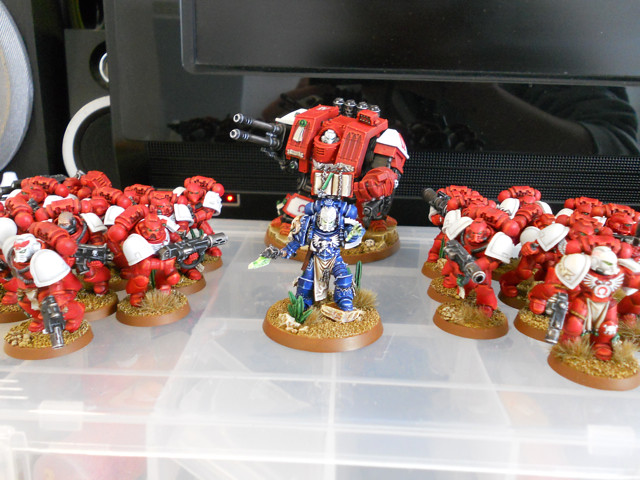
I have a question, how much Red Scorpion iconography is on those five models and are they on separate sections like shoulder pads that could be easily replaced?

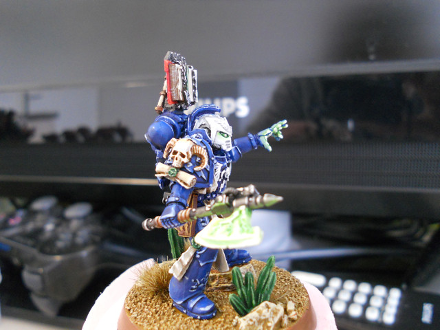
I must confess, I bought the Sevrin Loth model separately from a bits site. However, on him, the only Red Scorpion symbol is on the left shoulder pad, which I easily filed off and replaced with a Brass Etch omega symbol (Ultramarines).

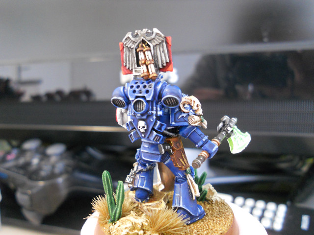
NoBaconz4You wrote:Love the cactus plants on the bases, where are they from?

From a company called 
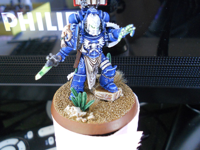
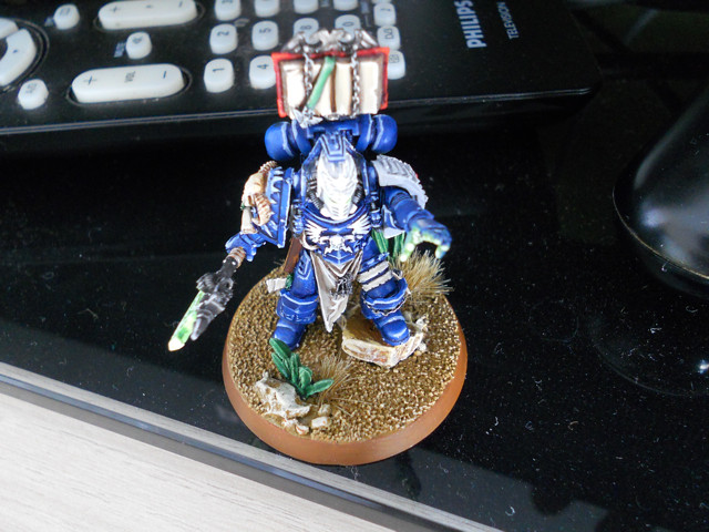
Pegasus Hobbies. Check around as lots of miniature retailers stock them. There are two boxes, one with slightly larger cacti. In each box you get two large sprues full of differently sized and shaped cacti. They're basically the reason I decided to go with desert bases, as they add to them so much - breaks up the "Oh god, this desert is full of sand!" feeling, ya know?

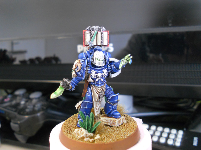
Element206 wrote:fantastic figure. I love the tone of the blue (and for that matter the red tone on the sons). I like the subtle illumination as opposed to the model being oversaturated with it as if he is running into battle holding glowsticks from a rave. Your highlighting is great and the desert themed base is excellent! Incredible work!

Thanks!

karmaiko wrote:He needs to man up as a librarian and write something in his book!

Haha, yeah I hear that. Don't trust myself with such tiny details yet, so decided to leave it blank rather than ruin a decent paint job.

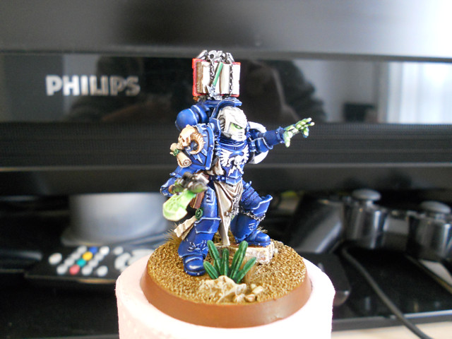
Ssgt Carl wrote:Beautiful. I especially like the illumination on his hand.

BTW, I am totally stealing that Dred pose for the next one I build

I called that the 'come get some' pose, until it was pointed out to me it looks more like a 'please sir, can I have some more?'. :(
Made in fr
Numberless Necron Warrior


warboss wrote:very nice work in both painting and changing him to an ultramarine.

It's not an Ultramarine. All Librarians are blue.
Made in fr
Numberless Necron Warrior


Darth Bob wrote:I like it alot. The OSL is well done. My only compaints are that I think the white shoulderpad and helmet need slightly starker highlights to make them show up better. From far off the head just looks like a white blob with two green dots.

I don't have a very good photo setup here, so it's a little overexposed. The helmet is painted in a 50/50 Fortress Grey/Skull White, washed with Fortress Grey in recesses and highlighted with Skull White. I'll try and take a better picture, because the helmet isn't as bright as it looks here.
Made in fr
Numberless Necron Warrior


The Ravening Jaw wrote:Very nice looking librarian and overall the army looks really nice, would love to see more pics of the whole army. Keep up the great work.

Thanks. I'm not sure what the rules are on linking to other forums on Dakka. However, I have a running Sons of Orar project log on B&C here if you would like to check it out.

Bitz_Addict wrote:Wow. Like the bright colors. How do you get the red and white to look so good?

I use a red primer for the regular red-armoured marines. Everything else gets primed white to start off with, pretty simple really.

SCC wrote:Agreed Sevrin is a lovely model, just finished painting him up for my RG army myself.

Having done so I'm wondering why you did a couple of things - first, why not paint the Aquila & lightning bolts on the forehead a different colour? I admit the detail was a little soft there but I think that'd really help break up the white on the helmet.

Second, is the banding on the left thigh, I painted it like parchment, figuring it was (yet another) purity thing for the figure as a Librarian. I take it you've decided it was part of the armour itself?

Having said all that you've done a lovely job here, beautiful crisp highlights ( and I love a nice clean Marine too, too many battered, beaten weathered ones out there these days) and the OSL is just right too (again, crisp, neat and not OTT)

Hey buddy! Nice to see you here too. I debated for a long time whether to paint the forehead detail or leave it white. On one of the Tactical Squad Sergeants (seen on the left in the picture above) I did paint it red, but was disappointed with the results. Because the head (in both cases) is one of the few white areas on the model, it really stands out and your eyes are drawn to it (like other Codex-Astartes based armies the white helmet in this case designates Veteran status). Yes, painting the aquila would help break up the white. But in this case, that is the opposite of what I'm trying to do. Does that make sense?

Yes, at first I assumed that banding was part of the armour. But in retrospect this should probably be parchment. Thanks for bringing it to my attention!


Automatically Appended Next Post:
So, after SCC's suggestion, I decided to re-paint the banding on the leg as parchment instead. If I'm honest, I think it looks better now.


This message was edited 3 times. Last update was at 2011/03/23 16:22:02


Forum Index » Painting & Modeling Showcase
Go to: