| Author |
Message |
 |
|
|
|
|
Advert
|
Forum adverts like this one are shown to any user who is not logged in. Join us by filling out a tiny 3 field form and you will get your own, free, dakka user account which gives a good range of benefits to you:
- No adverts like this in the forums anymore.
- Times and dates in your local timezone.
- Full tracking of what you have read so you can skip to your first unread post, easily see what has changed since you last logged in, and easily see what is new at a glance.
- Email notifications for threads you want to watch closely.
- Being a part of the oldest wargaming community on the net.
If you are already a member then feel free to login now. |
|
 |
2011/03/26 00:09:27
Subject: GW 'artists', please read about proportion
|
|

Blood-Drenched Death Company Marine
|
bushido wrote:dbsamurai wrote:It's a mockery of good art to then go and ruin those proportions.
Yeah, or...you know...it could be his style.
The first time I went to school, I was working on a painting that involved something on fire. The professor came by and said the fire needed to be fixed.
"But that's my style" I replied.
That pissed of the professor greatly, and I got a stern lecture about pulling that crap in front of the class.  
Of course there is style, and that comes with time- knowing how to really draw something well and making changes to it. When I see someone who is drawing/painting in a realistic manner, and I see something grossly out of proportion, it looks like a problem. Or worse a mistake. I don't care if that's "Supposed to be like that", if it LOOKS WRONG IT IS WRONG. There's plenty of examples of this in the GK codex, the worst offender being the Grand Master picture. Horribly tiny head that ruins the peace, which is doublebad because the artist took time to render other parts of the piece nicely, but the head makes you ignore the rest of the hard work.
|
|
This message was edited 3 times. Last update was at 2011/03/26 00:19:13
|
|
|
|
2011/03/26 00:38:47
Subject: GW 'artists', please read about proportion
|
|
Blood-Drenched Death Company Marine
|
It's still a bad choice if the client signs off on it, but the end user doesn't like it. Those choices are made all the time, and products are pulled/ ad campaigns are dropped because of it. "Client sign- off" does not automatically equal a good call.
And yes, I agree that opinions will always be wide and varied.
|
|
|
|
2011/03/26 01:28:24
Subject: GW 'artists', please read about proportion
|
|
Blood-Drenched Death Company Marine
|
Since this is revolving around the topic of proportions here's a great resource from the sadly departed Andrew Loomis.
http://escapefromillustrationisland.com/2010/01/07/free-andrew-loomis-art-intstruction-downloads/
|
|
This message was edited 1 time. Last update was at 2011/03/26 01:28:51
|
|
|
|
2011/03/26 02:00:32
Subject: GW 'artists', please read about proportion
|
|
Blood-Drenched Death Company Marine
|
Ultrafool wrote:I hate when people bash on an artist when most of them don't even have the talent to draw a stick figure.
A complete argumentative fallacy- being able to draw has nothing to do with the right to critique.
|
|
|
|
2011/03/26 02:36:46
Subject: Re:GW 'artists', please read about proportion
|
|
Blood-Drenched Death Company Marine
|
I do agree that there are better ways to critique someone's work.
Bad "It sucks because it's wrong."
Good: "It doesn't work because of xxx and yyy.", and then give suggestions and examples of how to make it better or point to other pieces (preferably not your own so you don't look like an egotist) where the idea does work. Suggestions that lead to solutions.
There are some who can't take critique because they're too wrapped up in their art- they take it as you are attacking THEM personally instead of commenting on their work. There are those who can't critique because they're too rude (I do not count being direct as being rude), or can't communicate their ideas effectively.
It's a dance where feet can get stepped on.
|
|
This message was edited 1 time. Last update was at 2011/03/26 02:40:06
|
|
|
|
2011/03/26 02:45:41
Subject: Re:GW 'artists', please read about proportion
|
|
Blood-Drenched Death Company Marine
|
Ultrafool wrote:
100% true. Sorry if my intial post came out too strong.
No worries. 
|
|
|
|
2011/03/26 02:54:29
Subject: Re:GW 'artists', please read about proportion
|
|
Blood-Drenched Death Company Marine
|
Chibi Bodge-Battle wrote:The "pinhead" look is not one that screams "superhuman warrior". It is more reminiscent of that scene in Men in Black where the guys head opens up and there is a tiny pilot inside.
The pinhead look is based on the fluff as far as I can tell.
Okay you don't like true scale heads, but what is the objective criteria of your dismissal of the drawings?
ie why is it incorrect in terms of proportion and perspective?
FWIW I have already outlined a counter critique to your judgement.
Ultimately it boils down this: if it looks/feels wrong, then it is wrong. It doesn't matter if that's the way, "it's supposed to be". I have heard this from a variety of artists and professors and I agree with them.
In this case we see a human and the regular human proportions instantly jump into our mind; this image recognition has been imprinted into us as babies. So when we see a human shape with an abnormal head, we instantly think something is wrong. Not only that, it's the first thing we see in the entire image- we zip right by all the other beautifully rendered armor. Example:
This feels right: 
This feels wrong: 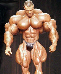
Now it doesn't matter that image 2 really exists, it simply feels wrong. And it's warning signs that as artist, we should be avoiding.
|
|
This message was edited 3 times. Last update was at 2011/03/26 02:58:51
|
|
|
|
2011/03/26 03:02:48
Subject: GW 'artists', please read about proportion
|
|
Blood-Drenched Death Company Marine
|
I think #2 works great as a monster or a mutant- a great template for a villain because it has that "off feeling". I'd play that up because at that point the feeling is perfect for the subject: something should be "wrong" or "off" for the bad guy.
However, in the hero we see part of ourselves, and we do not like that warning feeling associated with us.
|
|
|
|
2011/03/26 03:15:13
Subject: GW 'artists', please read about proportion
|
|
Blood-Drenched Death Company Marine
|
More specifically if it "feels" wrong, then it's generally wrong, and that idea should be avoided. For a lot of folks seeing a man with a pinhead feels wrong, and thus this thread was started. ;D
#2 feels wrong as the hero (unless you're Rob Liefield). However it feels great a monster.
WTF in this case means: What's This For? Hero? Thumbs down. Monster? Thumbs up.
I bet if you took the WD Blood Angel cover, converted it over to say a Word Bearer chaos marine, people would actually like it more because chaos is deformed.
|
|
This message was edited 4 times. Last update was at 2011/03/26 03:18:22
|
|
|
|
2011/03/26 03:28:24
Subject: GW 'artists', please read about proportion
|
|
Blood-Drenched Death Company Marine
|
it also means your a bad person. ;D
|
|
|
|
2011/03/26 04:32:15
Subject: GW 'artists', please read about proportion
|
|
Blood-Drenched Death Company Marine
|
@Chibi
What you say makes a lot of sense and you have excellent observations.
"Due to our CONDITIONING, the small head looks and feels wrong, but is in fact correct. "
Exactly, and this is my point. Because we have been conditioned to see something someway, it looks off when it's not. That feeling often makes people inherently not like a piece even if they can't put their finger on it. As artists, we should learn to avoid that feeling or use it to our advantage depending on the subject (see previous post examples). Since this is supposedly the hero, we have part of ourselves invested in the image and don't like it when things feel off.
So, even though the fluff would say it's right, we should avoid it since it feels wrong. I've seen many shadows that are a warm green, but if I were to paint them, people would think I'm nuts, so I avoid it.
|
|
This message was edited 1 time. Last update was at 2011/03/26 04:33:02
|
|
|
|
2011/03/26 22:28:24
Subject: GW 'artists', please read about proportion
|
|
Blood-Drenched Death Company Marine
|
Mark1130 wrote:
Why does everything have to be realistic? Why cant artists exagerated things?
While not the OP, I'll chime in on this one.
Regardless of the genre, artwork works really well when you set up rules. You are visually telling the audience these "rules" through your art and they're accepting it. The rules could be: using a very tight color pallet, using strong value contrast, using specific compositional elements, etc. When you draw the vast majority of the art work realistically, you've set up another rule- you've set the audience's expectation for a realistic piece. Then you give them the out of proportioned head they say, "Huh" because you broke the rule. In this case it's magnified because the face is a primary compositional element that they eye goes to first.
That said, every rule can and has been broken and created great art because of it. However you have to be careful because it can be jarring to your audience; some people don't like broken rules. I think I said everything else in my previous posts in the discussion with Chibi, which I greatly enjoyed.
I don't take issue with the artist, but with the art director. If your boss tells you to paint something, you paint it.
|
|
This message was edited 6 times. Last update was at 2011/03/27 00:32:22
|
|
|
|
2011/03/29 07:12:43
Subject: GW 'artists', please read about proportion
|
|
Blood-Drenched Death Company Marine
|
sourclams wrote:With the full authority of my completely irrelevant credentials, I safely say that there is literally no tinyhead/huge body violation worse than the Grey Knight Grand Master pic in the 'unit fluff' section of the GK codex. It literally looks like a mutated midget piloting a giant GK Terminator battlemech.
Amen.
|
|
|
|
2011/03/30 06:38:27
Subject: GW 'artists', please read about proportion
|
|
Blood-Drenched Death Company Marine
|
hemingway wrote: if you look at the photoshop the above poster made with the closer-to-scale head, the more 'realistic' head actually looks hokier than the original because it detracts from the grandiose, over the top nature of marines in power armour.
That is a mater of opinion, I do not a agree. The only way to truly show how bulky and massive that suit of power armor is to put it next to a regular sized human, such as a guardsman.
hemingway wrote: criticisms revolving around things like proportion in a realm where proportion doesn't really apply to either the imaginative schema informing the universe or the suspension of disbelief as part of the artist-perceiver dialogue are kind of baseless and speak more to the limitations of the critic than to any failing of the artist.
Are you trying to start a flame war here? I really hope not, since this thread has been civil until your post. It's obvious you weren't reading Chibi & my discussion about the reasons behind our opinions.
Proportion has EVERYTHING to do with humans and marines in 40k, so that's a blatantly false statement with nothing to back it up. There is NO mention in the fluff of marines having pin heads.
Automatically Appended Next Post:
solkan wrote:Except for the fact that GW's published plenty of diagrams and such illustrating that the armor is worn like a medieval knight's armor.
So there are legitimate grounds to complain that the cover looks bad in comparison to established artwork and proportions.
Thank you.
|
|
This message was edited 4 times. Last update was at 2011/03/30 08:39:15
|
|
|
|
|
|