Switch Theme:

Requesting gretchin skin critique  [RSS] Share on facebook Share on Twitter Submit to Reddit
»
Author Message
Advert


Forum adverts like this one are shown to any user who is not logged in. Join us by filling out a tiny 3 field form and you will get your own, free, dakka user account which gives a good range of benefits to you:
  • No adverts like this in the forums anymore.
  • Times and dates in your local timezone.
  • Full tracking of what you have read so you can skip to your first unread post, easily see what has changed since you last logged in, and easily see what is new at a glance.
  • Email notifications for threads you want to watch closely.
  • Being a part of the oldest wargaming community on the net.
If you are already a member then feel free to login now.


Made in us
Hollerin' Herda with Squighound Pack


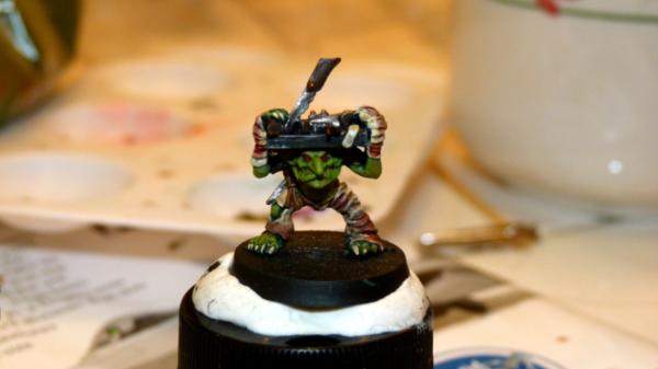
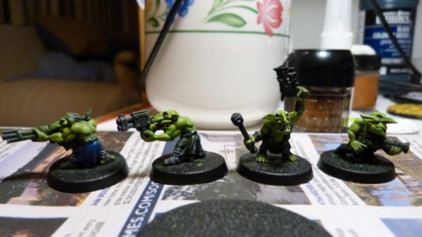
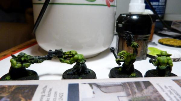
I'm painting a bunch of grots, and am hoping for some criticism/advice on the paint scheme I'm using for the skin and tips on technique. Only the orderly is fully painted, the rest I've only done the skin. Questions are:

1. How does this basic color scheme grab you?
2. Any tips for making it look nicer?
3. What looks really bad here?

Harsh/strong criticism requested...I have a lot of orks and grots to paint, am pretty new at this, and would like to get better. And I'm not sensitive. =)

Details on painting: skin on all of them is black gesso primer, P3 Gnarls Green basecoat, Citadel Gretchin Green highlight on everything but deep recesses, Citadel Scorpion Green drybrush.


Made in ca
Plastictrees


Calgary, Alberta, Canada

It looks solid. It looks like you're getting some nice definition even with only two highlights.
It's hard to give more in depth commentary without seeing close ups or knowing if you have specific concerns/goals.
   
Made in us
Hollerin' Herda with Squighound Pack


Thanks! Sorry, I should be more specific.

One thing I wasn't sure about was using three really different colors for base/highlights. The basecoat green is pretty dark, Gretchin Green is basically a really light brown, and Scorpion Green is a really radioactive light green. They're nowhere close to three shades of the same color. I like that the extreme contrast between basecoat and highlights makes the muscles stand out from several feet away, but up close I'm not sure whether it looks kind of insectile and weird.

I'm also wondering if the Gretchin Green/Scorpion Green pairing works or just looks stupid. They're really different from each other, and I go back and forth between liking how it looks and thinking it looks really bizarre.

Finally, I was doing the final highlight by drybrushing, but I'm not sure if it looks too random and messy or looks OK. Since it's a light color over a light color it doesn't have that chalkiness that you sometimes get from drybrushing, but it still seems messy.
   
Made in nl
Raging Ravener


Rijswijk, Netherlands

From what I can see your skin looks awesome! And as for your final highlight, I prefer layering over drybrushing, it gives your models a neater look in my opinion. From your pictures they look very neat already though
   
Made in au
Morphing Obliterator


rAdelaide

Nice skin tone, clear muscle definition, smooth appearance.

Good work!
   
 
Forum Index » Painting & Modeling
Go to: