| Author |
Message |
 |
|
|
|
|
Advert
|
Forum adverts like this one are shown to any user who is not logged in. Join us by filling out a tiny 3 field form and you will get your own, free, dakka user account which gives a good range of benefits to you:
- No adverts like this in the forums anymore.
- Times and dates in your local timezone.
- Full tracking of what you have read so you can skip to your first unread post, easily see what has changed since you last logged in, and easily see what is new at a glance.
- Email notifications for threads you want to watch closely.
- Being a part of the oldest wargaming community on the net.
If you are already a member then feel free to login now. |
|
 |
2011/06/21 02:07:19
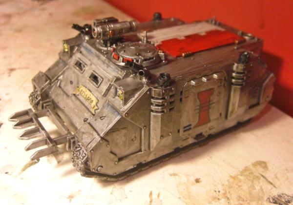
Subject: Grey Knights Rhino
|
|

Paladin of the Wall
|
|
 Badork Magthugs 2000Pts WAAAGH Wins: 23 Loses: 4 Draws: 4 Badork Magthugs 2000Pts WAAAGH Wins: 23 Loses: 4 Draws: 4
Ork Tournament Wins: 2
 Purge the Unclean 5000Pts Wins: 33 Loses: 7 Draws: 5 Purge the Unclean 5000Pts Wins: 33 Loses: 7 Draws: 5
Castellan Crowe used to be good, then he took a Lascannon to the face. |
|
|
 |
|
2011/06/21 02:28:01
Subject: Grey Knights Rhino
|
|
Krielstone Bearer
|
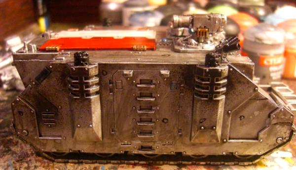
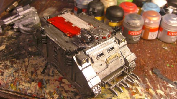
i like it!
a little streaky on the paintjob, but still nice
|
|
|
|
|
|
2011/06/21 22:56:46
Subject: Grey Knights Rhino
|
|
Bonkers Buggy Driver with Rockets
|
looks great
|
        
looted moonz 6000 pts and still growing and building |
|
|
|
|
2011/06/22 05:06:24
Subject: Grey Knights Rhino
|
|
Ultramarine Master with Gauntlets of Macragge
|
The silver is too streaky. Try building up a few coats of Boltgun Metal or whatever metallic color you're using instead of just going with one or two.
|
Check out my Youtube channel!
 |
|
|
|
|
2011/06/22 05:39:27
Subject: Grey Knights Rhino
|
|

Ork Boy Hangin' off a Trukk
Newcastle, Australia
|
Looks good. I cant tell exactly what method you've used, but taking a stab I'd say that the dark ink wash has been applied a little too heavily over the silver armored areas. Try instead going for a lighter wash and several layers, instead of the single thick layer.
Nice model otherwise
|
|
|
|
|
|
2011/06/23 03:04:42
Subject: Re:Grey Knights Rhino
|
|

Lit By the Flames of Prospero
|
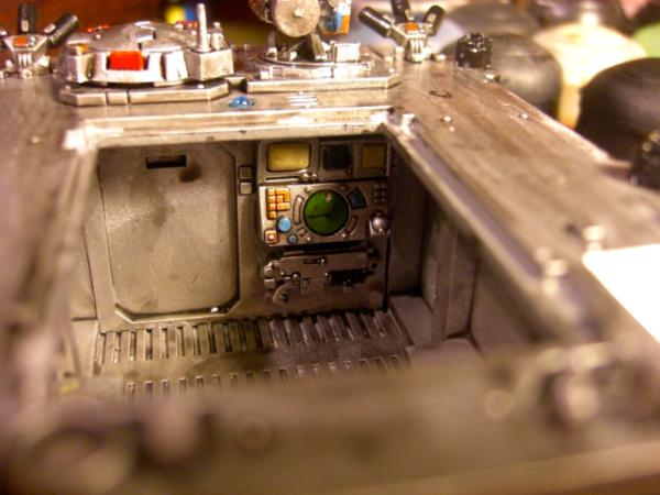
Looks good i really like the interior, i think the streakyness mentioned is as the above poster said, it looks like the black wash was not so even.
Still looks nice to me though.

|
|
|
|
|
2011/06/23 05:45:38
Subject: Re:Grey Knights Rhino
|
|
Bane Thrall
|
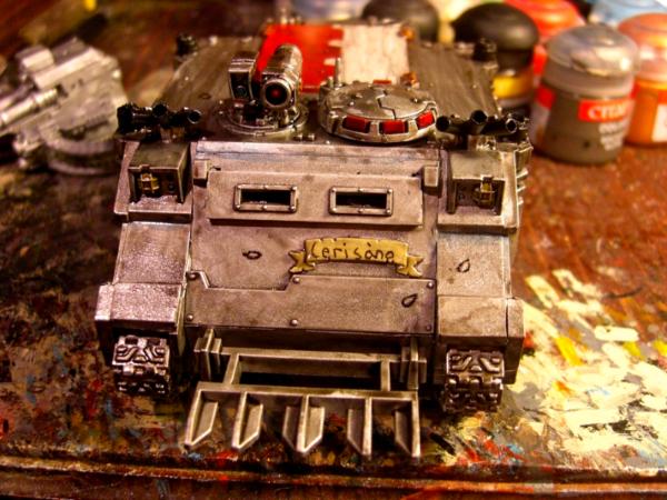
This is the better frikin Rhino I have ever seen. It makes me want to go buy one. You should be soooooo proud.
|

They stare into your soul.
|
|
|
|
|
2011/06/24 18:11:43
Subject: Grey Knights Rhino
|
|
Bane Thrall
|
I didnt write the above comment....?
|
They stare into your soul.
|
|
|
|
|
2011/06/24 18:17:12
Subject: Grey Knights Rhino
|
|
Grey Knight Purgator firing around corners
|
I'm just going to assume Surfboard hopped on your account and wrote that? Anyways looks a bit to streaky. And the black wash or ink or whatever you used was allowed to pool up to much. But It's a good start.
|
|
|
|
|
2011/06/24 18:24:16
Subject: Re:Grey Knights Rhino
|
|
Kid_Kyoto
|
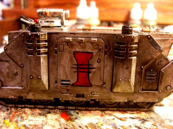
I think overall I like it. I don't normally care for the "I dipped this vehicle in shiny!" look, but it's been dulled down a lot by the wash you put on it. The areas around the stacks looks pretty good, however, I do agree with most comments in that it seems streaky. I like some of the streakyness, because it looks like places where something scratched or rubbed against the rhino, such as on the door next to the Inquisition ][. While I'm on the topic of it, your ][ feels a little too obviously hand-drawn on. It kind of looks Orkish, and I think takes away from the whole piece. My advice would be to try doing it again, but use a pencil to sketch the shape you want on there before actually painting it on, and then you just have to paint inside the lines. Also, I feel like the Red/White on top of the rhino needs a little bit more work. Some thin layers of paint on top ought to fix the issue.
|
|
|
|
|
|
|
|