| Author |
Message |
 |
|
|
|
|
Advert
|
Forum adverts like this one are shown to any user who is not logged in. Join us by filling out a tiny 3 field form and you will get your own, free, dakka user account which gives a good range of benefits to you:
- No adverts like this in the forums anymore.
- Times and dates in your local timezone.
- Full tracking of what you have read so you can skip to your first unread post, easily see what has changed since you last logged in, and easily see what is new at a glance.
- Email notifications for threads you want to watch closely.
- Being a part of the oldest wargaming community on the net.
If you are already a member then feel free to login now. |
|
 |
2011/07/06 14:14:37
Subject: Trying to take my painting to the next level
|
|

Changing Our Legion's Name
Guildford, Surrey / High Wycombe, Bucks
|
I have been painting for approx a year and a bit and Im finding my learning curve and my difference in quality is getting smaller. I have a photo of my latest model...
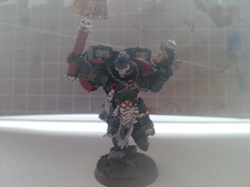
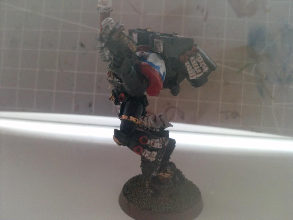
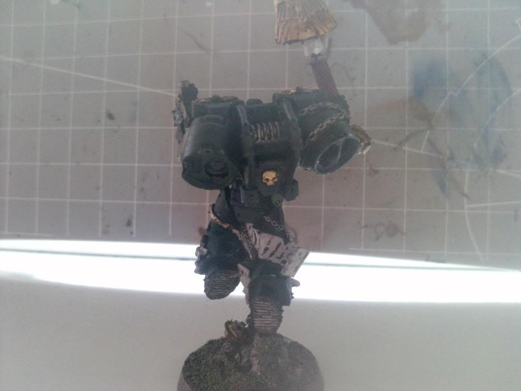
My personal feel is the model lacks character. I do not know how to add this to a model. Please help on that.
Also I feel maybe Im not spending enough time on the model. Even though I do spend a lot of time on each model. I average 8-12 depending on if it a special character or a mass production model.
As I said constructive critigue bellow. Saying its crap is no help but saying you could do X better and here is an article that can help... is fantastic for me.
Cheers guys!
|
|
|
|
 |
|
2011/07/06 14:40:01
Subject: Trying to take my painting to the next level
|
|

Regular Dakkanaut
|
it's really hard to see if you highlighted the model. if not use highlights to add depth to the figure.
in my opinion the easiest way to make a model look good is to use mutiple colors to achieve one specific color. start with a darker version of the color and then make each layer a little bit brighter than the one before, until you reach the color you want.
|
|
|
|
|
2011/07/06 14:43:36
Subject: Trying to take my painting to the next level
|
|

Tail Gunner
|
ash1986 wrote:
Also I feel maybe Im not spending enough time on the model. Even though I do spend a lot of time on each model. I average 8-12 depending on if it a special character or a mass production model.
8-12 what? Minutes? Hours? Days? MONTHS!?!
|
1 loss
0 wins |
|
|
|
|
2011/07/06 14:44:27
Subject: Trying to take my painting to the next level
|
|

Boom! Leman Russ Commander
|
8-12 what? minutes, days hours?
tactical marines? Spend 20 minutes on 'em. they don't need to look great.
Chaplain is a little lacking in persona, but there's not much to it. you've literally painted him by the book - it is good, clean. but I know what you mean. you feel that the model doesn't look like he's about to make his opponent soil his pants. he looks like an average joe marine with a bit of black paint.
Consider battle damage. on a small model, it can look stupid, but simple chipped armour suggests that he's been through the wars, and is an experienced veteran.
In all seriousness, at your and my level, the best way we can make a model come to life is to use white undercoat.
you're thinking "is he on crack?", right? But a white undercoat makes the model brighter [seriously.] and colour stands out better. [which isn't something you want on tactical marines, but on such an important model, he should stand out.]
that, truly is the next step for you: Chip the armour and spray it white. Automatically Appended Next Post: AnotherNoob wrote:ash1986 wrote:
Also I feel maybe Im not spending enough time on the model. Even though I do spend a lot of time on each model. I average 8-12 depending on if it a special character or a mass production model.
8-12 what? Minutes? Hours? Days? MONTHS!?!
ninja'd
|
|
This message was edited 1 time. Last update was at 2011/07/06 14:45:31
|
|
|
|
|
2011/07/06 15:03:11
Subject: Trying to take my painting to the next level
|
|
Changing Our Legion's Name
Guildford, Surrey / High Wycombe, Bucks
|
rubirub wrote:it's really hard to see if you highlighted the model. if not use highlights to add depth to the figure.
in my opinion the easiest way to make a model look good is to use mutiple colors to achieve one specific color. start with a darker version of the color and then make each layer a little bit brighter than the one before, until you reach the color you want.
Is this in combination of blending? I feel highlighting is not my strongest point and I do not like to do it on its own. I did it on a dred and the lines just made it look like it was too artificial if that makes sense?
I plan to go over the model to improve it and then purchase a second model to paint twice as good as the old one.
Thanks  Automatically Appended Next Post: Automatically Appended Next Post: AnotherNoob wrote:ash1986 wrote:
Also I feel maybe Im not spending enough time on the model. Even though I do spend a lot of time on each model. I average 8-12 depending on if it a special character or a mass production model.
8-12 what? Minutes? Hours? Days? MONTHS!?!
sorry It's 8-12 hours from grey to fully painted. I know that maybe slow for quality but I try to do it slowly to try my hardest to get the technique right. Automatically Appended Next Post: Scipio Africanus wrote:8-12 what? minutes, days hours?
Chaplain is a little lacking in persona, but there's not much to it. you've literally painted him by the book - it is good, clean. but I know what you mean. you feel that the model doesn't look like he's about to make his opponent soil his pants. he looks like an average joe marine with a bit of black paint.
Consider battle damage. on a small model, it can look stupid, but simple chipped armour suggests that he's been through the wars, and is an experienced veteran.
In all seriousness, at your and my level, the best way we can make a model come to life is to use white undercoat.
you're thinking "is he on crack?", right? But a white undercoat makes the model brighter [seriously.] and colour stands out better. [which isn't something you want on tactical marines, but on such an important model, he should stand out.]
that, truly is the next step for you: Chip the armour and spray it white.
Automatically Appended Next Post:
AnotherNoob wrote:ash1986 wrote:
I have used white undercoat on my eldar but never considered it on a black model. I feel it would of been easier in black but I will try it on the second Chaplain model. battle damagae is a good idea. I have experience on that with tanks so I will try and apply this onto my model
Also I feel maybe Im not spending enough time on the model. Even though I do spend a lot of time on each model. I average 8-12 depending on if it a special character or a mass production model.
8-12 what? Minutes? Hours? Days? MONTHS!?!
ninja'd
|
|
This message was edited 2 times. Last update was at 2011/07/06 15:10:46
|
|
|
|
|
2011/07/06 15:16:47
Subject: Re:Trying to take my painting to the next level
|
|
Tail Gunner
|
Yeah I would definitely try to wash and highlight every model. It makes them much better. If you feel your highlights have looked to harsh and artificial in the past then try doing them with a much closer color to the base coat. Also it isprobably just the picture but your paint looks a little thick.
|
1 loss
0 wins |
|
|
|
|
2011/07/06 15:26:30
Subject: Trying to take my painting to the next level
|
|
Napoleonics Obsesser
|
A year? Hoo-boy. I've been doing this for about a year too. And personally, I don't feel like that looks spectacular....
Get yourself some really good brushes. Your coats are messy and thick. I see what you're doing. Just take longer strokes, and only move the brush in one direction. Run over the still-wet paint with the brush until it looks smooth and even. I still have that problem with things like yellow and white, but I've mastered it for everything else.
Learn to drybrush. It helps a lot.
Understand color balance, saturation, hue, and just the general mood of your subject. Those reds are much too bright, and don't match the subdued black at all.
Wash, if you must. I tend to avoid washing entire models, unless I use a thinned-down wash, which is more of a 'mood' augmentation thing.
Foundations. Take advantage of them. But learn to drybrush first, and make sure you get a nice coat with them, or they're useless.
It's not horrible. In brutal honesty though, I think someone who's been painting for a full year could do better. But I don't know you, and I don't know how much painting you've been doing, but when I was a year into it, I was doing commissions and getting paid for my skills. Which is funny, because I still don't have a single picture in my gallery 
I didn't tackle highlights because I don't feel like I can give great advice about them. I'll try though.
Use a small brush, and only get enough paint on it for a single stroke. Delicacy is the key. They need to be straight and not at all jagged, or the whole thing is thrown off. That's gradual though. you'll learn that in time. Use common sense. You don't need to highlight every single raised edge, just the ones that stick out to you. If you must, use a mid-light before you start the actual highlighting.
A midlight is like... A color that's slightly lighter than the base, so it presents a subtle effect that indicates a raised edge, rather than a highlight. For example:
Black -> 1:1 black and adeptus battlegrey -> Adeptus Battlegrey
Scab Red-> Mechrite Red -> 1:1 Mechrite Red and Bleached Bone/Kommando Khaki
The latter is more complicated, because the midlight is a foundation, which could turn out messy if you didn't know what you were doing. But there you go. It's worth a mention that you could just use a midlight without a highlight, if you're a beginner. The term 'midlight' is just something I use to describe it. Most painters would just call it a highlight, and then the highlight would be and extreme highlight. But.... when you do multiple highlights, it's easier to give them all different names
|
|
This message was edited 1 time. Last update was at 2011/07/06 15:34:12

If only ZUN!bar were here... |
|
|
|
|
2011/07/06 15:45:55
Subject: Trying to take my painting to the next level
|
|
Changing Our Legion's Name
Guildford, Surrey / High Wycombe, Bucks
|
Samus_aran115 wrote:A year? Hoo-boy. I've been doing this for about a year too. And personally, I don't feel like that looks spectacular....
Get yourself some really good brushes. Your coats are messy and thick. I see what you're doing. Just take longer strokes, and only move the brush in one direction. Run over the still-wet paint with the brush until it looks smooth and even. I still have that problem with things like yellow and white, but I've mastered it for everything else.
Learn to drybrush. It helps a lot.
Understand color balance, saturation, hue, and just the general mood of your subject. Those reds are much too bright, and don't match the subdued black at all.
Wash, if you must. I tend to avoid washing entire models, unless I use a thinned-down wash, which is more of a 'mood' augmentation thing.
Foundations. Take advantage of them. But learn to drybrush first, and make sure you get a nice coat with them, or they're useless.
It's not horrible. In brutal honesty though, I think someone who's been painting for a full year could do better. But I don't know you, and I don't know how much painting you've been doing, but when I was a year into it, I was doing commissions and getting paid for my skills. Which is funny, because I still don't have a single picture in my gallery
I didn't tackle highlights because I don't feel like I can give great advice about them. I'll try though.
Use a small brush, and only get enough paint on it for a single stroke. Delicacy is the key. They need to be straight and not at all jagged, or the whole thing is thrown off. That's gradual though. you'll learn that in time. Use common sense. You don't need to highlight every single raised edge, just the ones that stick out to you. If you must, use a mid-light before you start the actual highlighting.
A midlight is like... A color that's slightly lighter than the base, so it presents a subtle effect that indicates a raised edge, rather than a highlight. For example:
Black -> 1:1 black and adeptus battlegrey -> Adeptus Battlegrey
Scab Red-> Mechrite Red -> 1:1 Mechrite Red and Bleached Bone/Kommando Khaki
The latter is more complicated, because the midlight is a foundation, which could turn out messy if you didn't know what you were doing. But there you go. It's worth a mention that you could just use a midlight without a highlight, if you're a beginner. The term 'midlight' is just something I use to describe it. Most painters would just call it a highlight, and then the highlight would be and extreme highlight. But.... when you do multiple highlights, it's easier to give them all different names
I prefer to have brutal constuctive crtigue so Im pleased you did point things out so I can be aware on this for when I next paint a new Chaplain. Painting in one direction is something I did not think about. I will keep this in mind. At the moment Im using Citadel brushes not bought from GW I have a independent stockest I get my stuff from.
My painting history was when I started pump out colours n just get them blue to be on the table to play. About 6-9 months in Ive seen how a nicely painted army is more rewarding than winning for me. Im developing my painting as I go.
As I said thanks I will take this into my painting. Why cant GW staff say this rather than "Its good" lol.
|
|
|
|
|
|
2011/07/06 15:50:08
Subject: Trying to take my painting to the next level
|
|
Arch Magos w/ 4 Meg of RAM
|
Note: I am a bad painter, but things are recently starting to click.
1. it looks to me like you are using way too much paint, this didn't click for me until recently i started painting with transparent airbrush paints, once I started I realized that by undercoating and then using your colors you can blend and do many effects much easier, and I use less paint!
These transparent paints are very watery, giving the added bonus of letting you sap up any mistakes with an extra brush!
2. Drybrushing, as above, its hard to describe but it will eventually click, you need a balance of not much paint on the brush, very little water/moisture on the brush, and a brush with stiff bristles (or an old brush)
3. washes: your purity seals need a wash of brown to even out the color, the eyes need a wash of a darker red to shade them, ect. ect.
4. do purty seals with a micro pen, not a paintbrush, your text seems way too thick and far apart
|
Godforge custom 3d printing / professional level casting masters and design:
https://www.etsy.com/shop/GodForge |
|
|
|
|
2011/07/06 15:55:54
Subject: Trying to take my painting to the next level
|
|
Napoleonics Obsesser
|
Some things I did like were the purity seals. They look very good. A bit of devlan mud would really make them stick out. The chains are good. Not too messy. And the webbing between armour plates. Nice and crisp.
From what I can tell, you excel at detail, but lack the fundamental ability to make the model look as fantastic as the details! That's not an insult, By the way. It might have sounded like one.
Oh, almost forgot. Don't worry about taking enough time. Just stay focused. Put yourself to only doing a certain part of it a day, if that helps. I rarely ever paint a model in one, or even two sittings. You shouldn't have to force yourself to paint, in other words.
|
If only ZUN!bar were here... |
|
|
|
|
2011/07/06 16:18:03
Subject: Trying to take my painting to the next level
|
|
Changing Our Legion's Name
Guildford, Surrey / High Wycombe, Bucks
|
Samus_aran115 wrote: From what I can tell, you excel at detail, but lack the fundamental ability to make the model look as fantastic as the details! That's not an insult, By the way. It might have sounded like one.
No insult took. Im like that in person anyway I try to be detailed. Like in my sport I do (Karate) my advanced stuff is amazing whilst my fundamentals are quite weak. I have a box of scouts lying about the practise fundamentals on. I painted the sargent before posting the chaplain with camo cloaks and looking under a lamp I can see about thick paint. I've gone for catachan green on the cloak with Scorched Brown patches. The armour is black with white/dheneb stone crest.
I'll post it up when finished. Automatically Appended Next Post: Grundz wrote:Note: I am a bad painter, but things are recently starting to click.
1. it looks to me like you are using way too much paint, this didn't click for me until recently i started painting with transparent airbrush paints, once I started I realized that by undercoating and then using your colors you can blend and do many effects much easier, and I use less paint!
These transparent paints are very watery, giving the added bonus of letting you sap up any mistakes with an extra brush!
2. Drybrushing, as above, its hard to describe but it will eventually click, you need a balance of not much paint on the brush, very little water/moisture on the brush, and a brush with stiff bristles (or an old brush)
3. washes: your purity seals need a wash of brown to even out the color, the eyes need a wash of a darker red to shade them, ect. ect.
4. do purty seals with a micro pen, not a paintbrush, your text seems way too thick and far apart
1.) I see this on a previous scout I painted under my band new lamp. I have a second scout which I placed 2 foundation coats and 2 catachan green coats on top and It looks more smooth.
2.) I did have a go on my  on the sargent by painting it with dheneb stone and then drybrushing a 50/50mix of skull white on the top and it added a lot more debth to the model.
3.) a brown wash? I have the standard set from Citadel. Are you talking Devlan Mud.
4.) Micro Pen is not a bad idea. I will see how that works and how cheap I can pick up one.
|
|
This message was edited 1 time. Last update was at 2011/07/06 16:25:06
|
|
|
|
|
2011/07/06 17:29:26
Subject: Trying to take my painting to the next level
|
|
Stalwart Veteran Guard Sergeant
|
Don't paint the Space marine,paint the many parts of the Space Marine.Each Body part is its own canvas in a way.
Also try painting inside out.Start with the deepest part.I always start with my guardmens eyes.Then face then gas mask then helmut etc etc...I paint Steel legion.Good luck.
|
http://www.dakkadakka.com/core/gallery-search.jsp?u=41398
http://www.facebook.com/pages/PALEHORSE/117277948287076?ref=tn_tnmn |
|
|
|
|
2011/07/06 21:34:44
Subject: Re:Trying to take my painting to the next level
|
|
Fresh-Faced New User
|
Your Chaplain might not be the best example for demonstration purposes, because he's not painted up in your Chapter colours. Black is a bit of a hard colour to do properly.
You say you paint your marines blue? OK, here's a quick recipe for the armour plates themselves:
(1) Prime your minis with either grey or white primer. Black primer can be quite forgiving if you don't use techniques to their full advantage, and its quicker to do metallics over, but I'm of the opinion that grey or white is the superior option.
(2) Get some Citadel Mordian Blue foundation paint. This stuff has a very high pigment content, and is very opaque, meaning that it's not see through (as an aside, it's important to understand that most paints are transparent to a degree, and you can use this to your advantage, especially when highlighting). Put a nice dollop on your palate (always use a palate, even if its a spare tile or whatever!), and then grap your brush, dip it in your water and introduce the water to your palate. Mix your foundation paint with the water until its about the same thikness as semi-skimmed milk. Not so thin that the pigment separates, but not so thick that it looks like a pile of goo. (As a rule, always thin your paints, especially if you are highlighting.)
(3) Coat the model in Mordian Blue. Get it into all the recesses. This is especially important when using white undercoat, since you don't want flashes of white appearing.
(4) Wait until the paint is dry!
(5) Take some Citadel Badab Black wash, and, using a moist brush, apply all over the model. Pull it into the recesses. Don't worry too much about how the model "looks" at this stage. The purpose of this wash is, as a "guide coat", it identifies the areas that you need to paint over, and the areas that are in the recesses (the areas that would be left in shadow)
(6) Wait until dry!
(7) Take the blue that you would normally use, I would suggest Ultramarines blue for this, remembering to thin it with some water apply to the armour plates of the model. Apply this coat to 95% of the armour plating, whilst leaving the recessed areas (panel lines, the areas where 2 plates overlap, the area between the plate and the shoulder pad rim, etc)
(8) Mix some ultramarines blue with just a touch of ice blue, mix with a decent amount of water so that the paint doesn't dry on your brush, and put just a little of the paint on your brush, you don't want to take too much on because if you load your brush with too much thinned paint, you'll end up with a wash, when you actually want a highlight. Then just gently drag the brush over raised areas and edges of all armour plates to achieve your simple highlights.
(9) Your highlights might look a bit too harsh. If they do, get some asrumen blue wash, mix with some water and apply to the model to take the highlights down a notch or 2. This will also provide more shading.
All colours follow the same principle! try and get down at least three layers per colour. This example basically has 4 (mordian, badab, ultramarines, and ultramarines/ice). Display models can have up to 20-30 layers of shading and highlights!
|
|
|
|
|
2011/07/06 22:07:09
Subject: Re:Trying to take my painting to the next level
|
|
Changing Our Legion's Name
Guildford, Surrey / High Wycombe, Bucks
|
blrhous wrote:Your Chaplain might not be the best example for demonstration purposes, because he's not painted up in your Chapter colours. Black is a bit of a hard colour to do properly.
You say you paint your marines blue? OK, here's a quick recipe for the armour plates themselves:
(1) Prime your minis with either grey or white primer. Black primer can be quite forgiving if you don't use techniques to their full advantage, and its quicker to do metallics over, but I'm of the opinion that grey or white is the superior option.
(2) Get some Citadel Mordian Blue foundation paint. This stuff has a very high pigment content, and is very opaque, meaning that it's not see through (as an aside, it's important to understand that most paints are transparent to a degree, and you can use this to your advantage, especially when highlighting). Put a nice dollop on your palate (always use a palate, even if its a spare tile or whatever!), and then grap your brush, dip it in your water and introduce the water to your palate. Mix your foundation paint with the water until its about the same thikness as semi-skimmed milk. Not so thin that the pigment separates, but not so thick that it looks like a pile of goo. (As a rule, always thin your paints, especially if you are highlighting.)
(3) Coat the model in Mordian Blue. Get it into all the recesses. This is especially important when using white undercoat, since you don't want flashes of white appearing.
(4) Wait until the paint is dry!
(5) Take some Citadel Badab Black wash, and, using a moist brush, apply all over the model. Pull it into the recesses. Don't worry too much about how the model "looks" at this stage. The purpose of this wash is, as a "guide coat", it identifies the areas that you need to paint over, and the areas that are in the recesses (the areas that would be left in shadow)
(6) Wait until dry!
(7) Take the blue that you would normally use, I would suggest Ultramarines blue for this, remembering to thin it with some water apply to the armour plates of the model. Apply this coat to 95% of the armour plating, whilst leaving the recessed areas (panel lines, the areas where 2 plates overlap, the area between the plate and the shoulder pad rim, etc)
(8) Mix some ultramarines blue with just a touch of ice blue, mix with a decent amount of water so that the paint doesn't dry on your brush, and put just a little of the paint on your brush, you don't want to take too much on because if you load your brush with too much thinned paint, you'll end up with a wash, when you actually want a highlight. Then just gently drag the brush over raised areas and edges of all armour plates to achieve your simple highlights.
(9) Your highlights might look a bit too harsh. If they do, get some asrumen blue wash, mix with some water and apply to the model to take the highlights down a notch or 2. This will also provide more shading.
All colours follow the same principle! try and get down at least three layers per colour. This example basically has 4 (mordian, badab, ultramarines, and ultramarines/ice). Display models can have up to 20-30 layers of shading and highlights!
My army I will be working on is Raven Guard so it's black and white for me. The guide here is simple to follow and adabt to it. I did that Chaplain the same as the one on the new finecast box. So would the instructions be...
1.) grey/white primer
2-3.) same but Dark foundation paint (even undercoat black?)
4.) Same
5.) Same wash?
6.) same
7.) use Chaos black?
8.) possibly fortress grey? or a mix of chaos black to skull white?
9.) same?
|
|
|
|
|
|
2011/07/06 22:47:59
Subject: Re:Trying to take my painting to the next level
|
|
Fresh-Faced New User
|
ash1986 wrote:blrhous wrote:Your Chaplain might not be the best example for demonstration purposes, because he's not painted up in your Chapter colours. Black is a bit of a hard colour to do properly.
You say you paint your marines blue? OK, here's a quick recipe for the armour plates themselves:
(1) Prime your minis with either grey or white primer. Black primer can be quite forgiving if you don't use techniques to their full advantage, and its quicker to do metallics over, but I'm of the opinion that grey or white is the superior option.
(2) Get some Citadel Mordian Blue foundation paint. This stuff has a very high pigment content, and is very opaque, meaning that it's not see through (as an aside, it's important to understand that most paints are transparent to a degree, and you can use this to your advantage, especially when highlighting). Put a nice dollop on your palate (always use a palate, even if its a spare tile or whatever!), and then grap your brush, dip it in your water and introduce the water to your palate. Mix your foundation paint with the water until its about the same thikness as semi-skimmed milk. Not so thin that the pigment separates, but not so thick that it looks like a pile of goo. (As a rule, always thin your paints, especially if you are highlighting.)
(3) Coat the model in Mordian Blue. Get it into all the recesses. This is especially important when using white undercoat, since you don't want flashes of white appearing.
(4) Wait until the paint is dry!
(5) Take some Citadel Badab Black wash, and, using a moist brush, apply all over the model. Pull it into the recesses. Don't worry too much about how the model "looks" at this stage. The purpose of this wash is, as a "guide coat", it identifies the areas that you need to paint over, and the areas that are in the recesses (the areas that would be left in shadow)
(6) Wait until dry!
(7) Take the blue that you would normally use, I would suggest Ultramarines blue for this, remembering to thin it with some water apply to the armour plates of the model. Apply this coat to 95% of the armour plating, whilst leaving the recessed areas (panel lines, the areas where 2 plates overlap, the area between the plate and the shoulder pad rim, etc)
(8) Mix some ultramarines blue with just a touch of ice blue, mix with a decent amount of water so that the paint doesn't dry on your brush, and put just a little of the paint on your brush, you don't want to take too much on because if you load your brush with too much thinned paint, you'll end up with a wash, when you actually want a highlight. Then just gently drag the brush over raised areas and edges of all armour plates to achieve your simple highlights.
(9) Your highlights might look a bit too harsh. If they do, get some asrumen blue wash, mix with some water and apply to the model to take the highlights down a notch or 2. This will also provide more shading.
All colours follow the same principle! try and get down at least three layers per colour. This example basically has 4 (mordian, badab, ultramarines, and ultramarines/ice). Display models can have up to 20-30 layers of shading and highlights!
My army I will be working on is Raven Guard so it's black and white for me. The guide here is simple to follow and adabt to it. I did that Chaplain the same as the one on the new finecast box. So would the instructions be...
1.) grey/white primer
2-3.) same but Dark foundation paint (even undercoat black?)
4.) Same
5.) Same wash?
6.) same
7.) use Chaos black?
8.) possibly fortress grey? or a mix of chaos black to skull white?
9.) same?
The principles for painting black are a little different unfortunately, as I encountered with my Templars. To get the model to "pop", we need to work more on edge highlighting, and less on basic principles of shading (since there is nothing darker than black! When it comes to black models, edge highlights really need to be the same thickness across the model, or else it will look sloppy. The black background really shows up any mistakes! The only way to get better is to practice, practice, practice.
Anyways, this is how I would go about painting black armour:
(1) Spray white.
(2) Water down some chaos black. get it pretty thin and coat the model with it a few times. Shouldn't take too long, as thin paint flows quickly. Look at the model. See the lighter bits? Those are the parts you need to hit with highlights, memorise those parts for later. Once the initial black coat has dried, give it another thin black coat, until the model is well and truly black.
(3) Mix chaos black with some codex grey and some water. Make fine lines with your brush-strokes along the raised areas you memorised from step (2), along with the upper surfaes of panel lines, etc. Once this has dried, lightly load some thinned fortress grey on your brush, and, using the flat edge of your brush, drag it along certain edges of armour plates, etc.
(4) Once everything is dry, give the model a light wash with thinned badab black.
(5) You might want to try using "Klear" (a type of varnish) at this point to give the armour a nice sheen.
|
|
|
|
|
2011/07/06 23:15:21
Subject: Re:Trying to take my painting to the next level
|
|

Death-Dealing Ultramarine Devastator
|
Just at a glance it seems like you need to highlight the black armor with some grey. It also seems that you aren't using any washes. Maybe its the quality of the photo that obscures this. Using washes will add a lot of depth especially on the scroll work.
|
There is no such thing as innocence, only varying levels of guilt. |
|
|
|
|
|
|
|
 A.Rowe

 also Raven Guard
