Switch Theme:

Imperial Fist Veteran....  [RSS] Share on facebook Share on Twitter Submit to Reddit
»
Author Message
Advert


Forum adverts like this one are shown to any user who is not logged in. Join us by filling out a tiny 3 field form and you will get your own, free, dakka user account which gives a good range of benefits to you:
  • No adverts like this in the forums anymore.
  • Times and dates in your local timezone.
  • Full tracking of what you have read so you can skip to your first unread post, easily see what has changed since you last logged in, and easily see what is new at a glance.
  • Email notifications for threads you want to watch closely.
  • Being a part of the oldest wargaming community on the net.
If you are already a member then feel free to login now.


Made in gb
Impassive Inquisitorial Interrogator


Wanted a go at painting yellow, and so made this fellow and pained him pre-heresy Imperial Fists colours. Not quite sure why i gave him a crozius..... but I'm proud of making it, nonetheless.

C&C?


"I found Rome made of bricks ; I leave it made of Marble." 
   
Made in us
Stoic Grail Knight


I like the conversion and the yellow but I think he needs to look battle damaged and worn. As Imperial Fist are.

Hydra Dominatus

World Wide War Winner  
   
Made in us
Gargantuan Gargant


Binghamton, NY

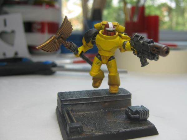
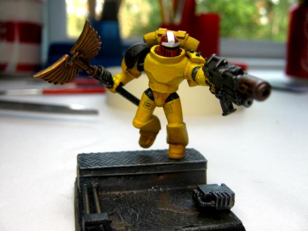
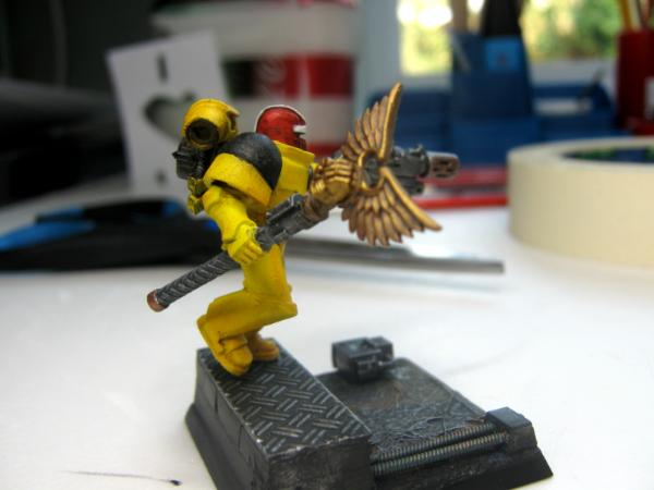
Can't say I'm a big fan of the colors or the sculpt, honestly.

The chest is too broad and the waist slopes out too steeply, so he ends up looking a bit like Superman with stubby legs (I realize SM aren't exactly well-proportioned, but the lack of surface detail and open pose really exaggerate the issue). The extended cabling for the repositioning of his right arm also places his shoulder somewhere well beyond the assumed end of his already widened chest (or he has an extra joint tucked up there, in which case there's a mutant on our hands - inform the Inquisition).

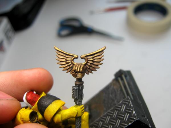
As for the colors, the yellow is too bright for my tastes. Barring mere personal preference, I can say that the main colors on the body look rather flat. I can see edgelining there, but I really have to look for it - at a casual glance, there's no highlighting discernible on the body, at all. I'd recommend upping the contrast there (perhaps keeping the current work as a midtone to provide a bit of a transition into brighter and finer edgelining). The washes/drybrushing on the base and equipment, however, are perfectly effective tabletop fare.

Absolutely nothing here is done terribly, by any means, but nothing really feels quite right either, at least to my eye.

The Dreadnote wrote:But the Emperor already has a shrine, in the form of your local Games Workshop. You honour him by sacrificing your money to the plastic effigies of his warriors. In time, your devotion will be rewarded with the gift of having even more effigies to worship.
 
   
Made in us
Stalwart Veteran Guard Sergeant


THE CUT!

Looks good.Think about putting a decal on his chest.


http://www.dakkadakka.com/core/gallery-search.jsp?u=41398

http://www.facebook.com/pages/PALEHORSE/117277948287076?ref=tn_tnmn 
   
 
Forum Index » Painting & Modeling Showcase
Go to: