| Author |
Message |
 |
|
|
|
|
Advert
|
Forum adverts like this one are shown to any user who is not logged in. Join us by filling out a tiny 3 field form and you will get your own, free, dakka user account which gives a good range of benefits to you:
- No adverts like this in the forums anymore.
- Times and dates in your local timezone.
- Full tracking of what you have read so you can skip to your first unread post, easily see what has changed since you last logged in, and easily see what is new at a glance.
- Email notifications for threads you want to watch closely.
- Being a part of the oldest wargaming community on the net.
If you are already a member then feel free to login now. |
|
 |
2011/11/15 13:52:02
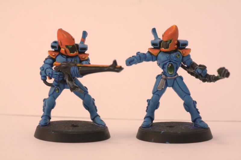
Subject: Two Craftworld Eldar, hows the sheme?
|
|

Ragin' Ork Dreadnought
Ingelheim am Rhein, Germany
|
Here are my brothers best-painted Guardians. How do you like the sheme?
|
|
|
|
 |
|
2011/11/15 14:02:34
Subject: Two Craftworld Eldar, hows the sheme?
|
|

Angry Blood Angel Assault marine
Close to Maddness, Far from Safe
|
Hey, I like! Orange and blue go well together in small amounts.
|
Check out my little ork story I am working on here!
http://www.dakkadakka.com/dakkaforum/posts/list/632365.page
|
|
|
|
|
2011/11/15 14:51:55
Subject: Two Craftworld Eldar, hows the sheme?
|
|
Pulsating Possessed Chaos Marine
|
The colors look great togeather, the only thing i dont really like though, is the large gem on the one guardian, just looks out of place to me.
|
 Oh stop complaining, its for the greater good... Now get in the box! Oh stop complaining, its for the greater good... Now get in the box!
Owner of R.S. Commission Studios. PM For a quote. Link in profile. |
|
|
|
|
2011/11/15 15:03:56
Subject: Two Craftworld Eldar, hows the sheme?
|
|
Regular Dakkanaut
|
I would exchange the orange for golden or bronze.
Other than that, from a technical POV: Lovely.
|
I don't want to be human! I want to see gamma rays! I want to hear X-rays! And I want to - I want to smell dark matter! Do you see the absurdity of what I am? I can't even express these things properly because I have to conceptualize complex ideas in this stupid limiting spoken language! But I know I want to reach out with something other than these prehensile paws! And feel the wind of a supernova flowing over me! And I can know much more! I can experience so much more. But I'm trapped in this absurd body! |
|
|
|
|
2011/11/15 16:13:26
Subject: Two Craftworld Eldar, hows the sheme?
|
|
Ragin' Ork Dreadnought
Ingelheim am Rhein, Germany
|
stratassj wrote:The colors look great togeather, the only thing i dont really like though, is the large gem on the one guardian, just looks out of place to me.
My brother doesnt like the gem too much as well, but he had to put something over the stomach of that dude after he messed him up (dont know what he did)
|
|
|
|
|
|
2011/11/15 16:25:05
Subject: Two Craftworld Eldar, hows the sheme?
|
|

Norn Queen
|
I really like the gem, not sure on the orange, never really worked as a color for me and in combo with the blue.....Hmmm not sure.
|
Dman137 wrote:
goobs is all you guys will ever be
By 1-irt: Still as long as Hissy keeps showing up this is one of the most entertaining threads ever.
"Feelin' goods, good enough". |
|
|
|
|
2011/11/15 22:21:27
Subject: Two Craftworld Eldar, hows the sheme?
|
|

Fresh-Faced New User
|
Nice. The painting is very crisp.
Wasn't orange on blue the main theme for the screens in Mass Effect?
|
|
|
|
|
2011/11/15 23:02:41
Subject: Two Craftworld Eldar, hows the sheme?
|
|
Longtime Dakkanaut
|
Looks nice! Quite often complimentary colors like blue and orange, red and green, or yellow and violet can produce too much contrast against one another and look gaudy, but this is a good example of when it works.
I think the blue armor could be highlighted slightly on the armor plate using a blue-grey mix, maybe fortress grey and ultramarine blue? This would give it a little more definition on those hard edges and make the shading blend a little better.
The position and size of the gem threw me at first, but I've decided I like it, especially with how well it was painted. Helps make that gunner stand out in his squad, something that's often overlooked in troop units. Pass my compliments on to your brother, he did a great job!
|
What harm can it do to find out? It's a question that left bruises down the centuries, even more than "It can't hurt if I only take one" and "It's all right if you only do it standing up." Terry Pratchett, Making Money
"Can a magician kill a man by magic?" Lord Wellington asked Strange. Strange frowned. He seemed to dislike the question. "I suppose a magician might," he admitted, "but a gentleman never could." Susanna Clarke Jonathan Strange & Mr. Norrell
DA:70+S+G+M++B++I++Pw40k94-D+++A+++/mWD160R++T(m)DM+
 |
|
|
|
|
2011/11/15 23:04:30
Subject: Two Craftworld Eldar, hows the sheme?
|
|
Longtime Dakkanaut
|
I like it, but like Gavin said I think the blue armor could use some highlights. Clean painting overall though!
|
I RIDE FOR DOOMTHUMBS! |
|
|
|
|
2011/11/16 01:01:26
Subject: Two Craftworld Eldar, hows the sheme?
|
|
Brainy Zoanthrope
|
Very crisp. Your brother did well on them.
I would cast another vote for adding a highlight to the blue. The gems are well done and the orange is highlighted so the contrast to the blue makes the blue seem unfinished imho.
|
DC:80S--G+MB++I++Pw40k93-D++A+++/wWD166R++T(T)DM+
|
|
|
|
|
2011/11/16 01:26:25
Subject: Two Craftworld Eldar, hows the sheme?
|
|
Deranged Necron Destroyer
|
I would add orange on the calves to give it a better balance. (Inside and outside on both legs)
|

malfred wrote:Buy what you like.
Paint what you love.
|
|
|
|
|
|
|