| Author |
Message |
 |
|
|
|
|
Advert
|
Forum adverts like this one are shown to any user who is not logged in. Join us by filling out a tiny 3 field form and you will get your own, free, dakka user account which gives a good range of benefits to you:
- No adverts like this in the forums anymore.
- Times and dates in your local timezone.
- Full tracking of what you have read so you can skip to your first unread post, easily see what has changed since you last logged in, and easily see what is new at a glance.
- Email notifications for threads you want to watch closely.
- Being a part of the oldest wargaming community on the net.
If you are already a member then feel free to login now. |
|
 |
2012/01/06 14:56:31
Subject: OSL - how can I improve the look?
|
|

Dipping With Wood Stain
|
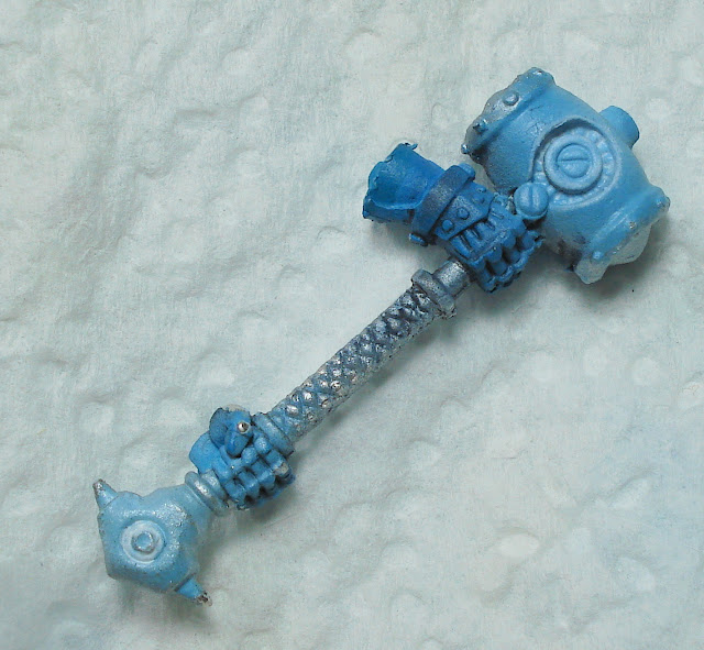
Hey guys,
I was just experimenting a bit with OSL and can't quite pin down what I am doing wrong. I basecoated the piece with VMA Steel and gave it a Soft Body Black Wash.
For the Glow I used VMC Sky Blue, thinned 4:1 with Vallejo Thinner and applied with my airbrush. I concentrated on areas, where the light would be strongest and feathered the paint out to the edges of the light.

On the Source areas, I just applied a thinned Asurmen Blue Glaze

Somehow it all seems very flat - any tips what I could do better? BTW, excuse the mold lines - I tried getting them off with my hobby knife but on the curved surfaces it would have cause more damage then it would have been worth.
Cheers,
IK-Painter
|
|
|
|
 |
|
2012/01/06 15:08:36
Subject: Re:OSL - how can I improve the look?
|
|

Jovial Plaguebearer of Nurgle
|
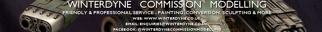
Very nicly painted, but where is the light source? and what is being illuminated?
Here is a very clear example... the flames are the light source and the Killa Kan and SoB are being illuminated by the flames.

|
|
|
|
|
|
2012/01/06 15:13:14
Subject: OSL - how can I improve the look?
|
|

Arch Magos w/ 4 Meg of RAM
|
he's got it
it looks really good, the only issue is you cant tell how the light is being cast.
the cheater (my) way to doing it is using an airbrush and firing from one direction then lightening up the actual source up to white manually.
|
Godforge custom 3d printing / professional level casting masters and design:
https://www.etsy.com/shop/GodForge |
|
|
|
|
2012/01/06 15:24:02
Subject: OSL - how can I improve the look?
|
|

Lady of the Lake
|
If the light source is meant to be that ring it needs to be swapped around by the looks of it. The source is the brightest then it gradually fades and gets darker as you move away from it.
For the ring it'd probably be different to the usual shading, the recesses being white and the raised parts being a bright blue.
|
|
|
|
|
|
2012/01/06 15:49:59
Subject: OSL - how can I improve the look?
|
|
Dipping With Wood Stain
|
Thanks for the pointers so far. What would you suggest?
Maybe a second "Glow" color, like a darker blue nearer to the "Source"? And then making the "Source" more distinguishable by adding maybe white to the Sky Blue, so it pops a bit more?
My plan is for the rings on the hammer to be the source of the light.
Cheers,
IK-Painter
|
|
|
|
|
|
2012/01/06 15:55:33
Subject: OSL - how can I improve the look?
|
|
Willing Inquisitorial Excruciator
|
You might need to invert things a bit. The bright white should be the source i.e. the rings, the duller blue is the OSL.
Look at the picture provided in the previous picture again. Notice the starting point and hottest points of the fire are bright yellow, almost white. The actual OSL is red and orange.
|
|
This message was edited 1 time. Last update was at 2012/01/06 15:57:02
|
|
|
|
|
2012/01/06 16:00:32
Subject: OSL - how can I improve the look?
|
|
Sister Oh-So Repentia
|
Not a bad effort there, I like it!
But just keep in mind that the source of the lighting needs to be the brightest. Where the light eventually bounces off whatever model you intend to attach this to, you should mute it a little bit. You never want the OSL to be brighter or the same colour as the source.
Keep up the good work!
|
Peace through superior firepower. |
|
|
|
|
2012/01/06 16:06:32
Subject: OSL - how can I improve the look?
|
|

Longtime Dakkanaut
|
You need to go in and work contrast edges by hand. For OSL an airbrush is well and good for coarse work or bloom, but generally fails for the directional aspect (unless you have a single fixed major direction).
Taking that killa kan as an example, you could airbrush the red tone of the lighting on the kan (separately to the SoB), then toward the SoB. This provides a pretty good guide for the rest of the OSL work. The flame streams themselves then get painted by hand and put in (that is you paint the model as 3 parts if possible; kan, flames, SoB), but all further highlighting up through orange up to yellow/white for the OSL should be blended by hand to ensure that edges are caught correctly or the light goes where it concentrates as a 'specular' reflection.
|
|
This message was edited 1 time. Last update was at 2012/01/06 16:07:27
|
|
|
|
|
2012/01/06 16:09:51
Subject: OSL - how can I improve the look?
|
|
Arch Magos w/ 4 Meg of RAM
|
One other thought: when you progress on this or take another try take a picture of it on a background that doesn't match the lighting 
|
Godforge custom 3d printing / professional level casting masters and design:
https://www.etsy.com/shop/GodForge |
|
|
|
|
2012/01/06 16:10:06
Subject: Re:OSL - how can I improve the look?
|
|
Lady of the Lake
|
IK-Painter wrote:Thanks for the pointers so far. What would you suggest?
Maybe a second "Glow" color, like a darker blue nearer to the "Source"? And then making the "Source" more distinguishable by adding maybe white to the Sky Blue, so it pops a bit more?
My plan is for the rings on the hammer to be the source of the light.
Cheers,
IK-Painter
Yeh that seems to be the key to it, the source stands out by being the brightest part of it. This doesn't necessarily mean it has to be white just the glow needs to look like it is coming from it. When I do it I generally use at least three colours; one for the source (can be used for highlights for the initial fading), one for the initial fading and the last for the very edges of the fading,. For example, though I'm by no means a painting expert. 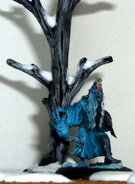 Colours here being ice blue, enchanted blue and regal blue. It has a gentle tone to the light by stopping at the ice blue rather than going up to white, the distance it spreads also gives the model the appearance of being in a darker area. Where as this doesn't have the same effect yet the way they were both done is the same. 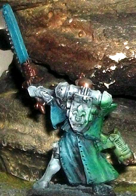 The point being most of the time the technique seems to be to taste. Also what I find helps is if you have an LED of the colour you want or even a torch. Shine it across the source and it'll help you find where to put the actual fading colours to crating the glow.
|
|
This message was edited 1 time. Last update was at 2012/01/06 16:10:55
|
|
|
|
|
2012/01/07 15:08:54
Subject: Re:OSL - how can I improve the look?
|
|
Dipping With Wood Stain
|
Hey you guys,
I just reworked the hammer and was wondering if I done better or worse, comparing to the first try, in your opinion.


Cheers,
IK-Painter
|
|
|
|
|
|
2012/01/07 17:19:31
Subject: OSL - how can I improve the look?
|
|
Longtime Dakkanaut
|
Still wayyy too much bloom. Start shading back around where the light shouldn't hit... Don't know if you can rescue this easily tbh...
|
|
|
|
|
|
2012/01/07 20:41:36
Subject: OSL - how can I improve the look?
|
|
Dipping With Wood Stain
|
winterdyne wrote:Still wayyy too much bloom. Start shading back around where the light shouldn't hit... Don't know if you can rescue this easily tbh...
That's what I was thinking too - I just stripped the part and will give it another go tomorrow.
|
|
|
|
|
|
2012/01/07 23:09:36
Subject: OSL - how can I improve the look?
|
|
Slippery Scout Biker
|
Look at the tutorials by nuclealosaur on YOUTUBE. He
is the best at airbrushed OSL on the net.
|
|
|
|
|
2012/01/17 11:19:23
Subject: Re:OSL - how can I improve the look?
|
|
Dipping With Wood Stain
|
Hey guys,
I gave OSL another shot. Let's recap:
First attempt:
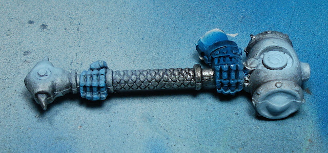
Second attempt:
And finally, my third attempt:

It's far from perfect, but a definitive improvement over the first two, or what do you guys think?
Cheers,
IK-Painter
|
|
|
|
|
|
2012/01/17 11:21:25
Subject: OSL - how can I improve the look?
|
|
Lady of the Lake
|
Much better. You've basically got it now. 
|
|
|
|
|
|
2012/01/17 11:38:21
Subject: OSL - how can I improve the look?
|
|
Possessed Khorne Marine Covered in Spikes
The Royal Tunbridge Wells
|
i don't like it too much, mostly because the blue on blue doesn't really work that much. with OSL you really should have a contrasting colour for the light. but other than that it looks like you have got it right
|
|
|
|
|
|
|
|
 8500p Plague Marines
 1500
1500  1500
1500