Switch Theme:

First Tzeentch Demon: Changeling  [RSS] Share on facebook Share on Twitter Submit to Reddit
»
Author Message
Advert


Forum adverts like this one are shown to any user who is not logged in. Join us by filling out a tiny 3 field form and you will get your own, free, dakka user account which gives a good range of benefits to you:
  • No adverts like this in the forums anymore.
  • Times and dates in your local timezone.
  • Full tracking of what you have read so you can skip to your first unread post, easily see what has changed since you last logged in, and easily see what is new at a glance.
  • Email notifications for threads you want to watch closely.
  • Being a part of the oldest wargaming community on the net.
If you are already a member then feel free to login now.


Made in gb
Preacher of the Emperor


Manchester, UK

Without further ado..


I'm pretty happy with how this turned out, although now it has been blown up to 4x it's regular size i can see loads of dodgy brushwork :S

C&C appreciated, especially the negative stuff

1500pts

Gwar! wrote:Debate it all you want, I just report what the rules actually say. It's up to others to tie their panties in a Knot. I stopped caring long ago.


Made in us
Longtime Dakkanaut


Charleston, SC

I think this came out well. The blue on the robes looks really good. I think a different color for the skin (instead of pink) would offset the balance in a positive way. Right now I think the pink skin is too close to the pink at the bottom of the robes and it doesn't pop the way it should. Still, a solid effort. Robes look really good. The bone on the staff and the scrolls turned out good. I think the flames could use a little work. They seem to be reversed (i know it Tzeentch, but...). Flames are whitest/brightest at the center, where there is more heat, and black or darker at the tips.

Just some constructive criticism. Hope I don't come off to harsh, I think you did a solid job. You just said, "C&C appreciated, especially the negative stuff," so

   
Made in us
Hellish Haemonculus


Boskydell, IL

I like it. I agree about the flames, but I didn't really notice it until you pointed it out, Moltar. Honestly, flames never look right on a mini anyway, so I wouldn't sweat it too hard. It's a very dynamic, flowing model, and I think it looks pretty sweet.

Welcome to the Freakshow!

(Leadership-shenanigans for Eldar of all types.) 
   
Made in fr
Tzeentch Veteran Marine with Psychic Potential


France

Tzeentch. Heresy. Too much colors for my taste! Though I must admit the pink is gorgeous.

(How did you do the scriptures on the scroll? Micron pen?)

   
Made in gb
Preacher of the Emperor


Manchester, UK

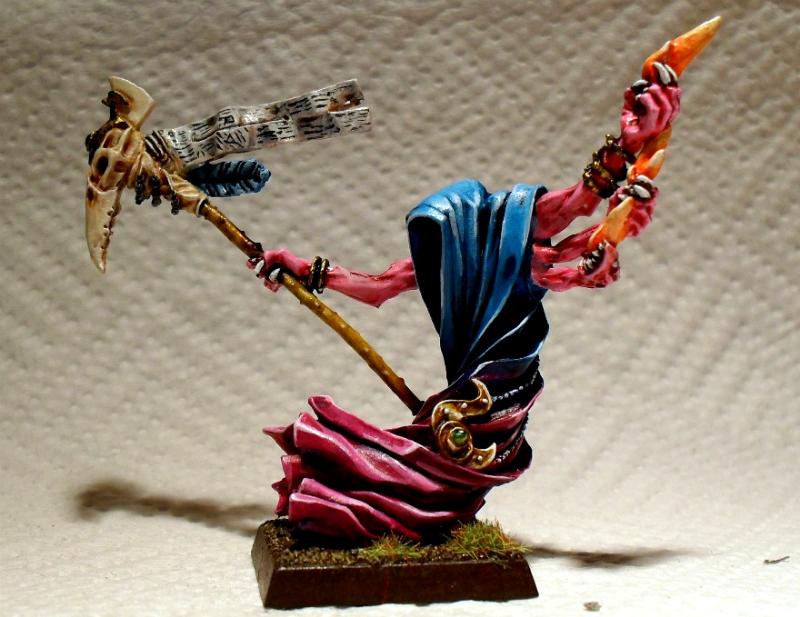
Moltar wrote:I think this came out well. The blue on the robes looks really good. I think a different color for the skin (instead of pink) would offset the balance in a positive way. Right now I think the pink skin is too close to the pink at the bottom of the robes and it doesn't pop the way it should. Still, a solid effort. Robes look really good. The bone on the staff and the scrolls turned out good. I think the flames could use a little work. They seem to be reversed (i know it Tzeentch, but...). Flames are whitest/brightest at the center, where there is more heat, and black or darker at the tips.

Just some constructive criticism. Hope I don't come off to harsh, I think you did a solid job. You just said, "C&C appreciated, especially the negative stuff," so


The pink doesn't look as bright in real life as it does in the photo, maybe i should have spent a bit more time mucking about with the camera before posting the pics i had taken already. I agree about the flames though, they were the last thing i painted and just wanted to get the mini finished
You don't come off harsh at all.
Too many replies in this forum are just simple one-liners 'great work mate!' or 'Nice one '. I think it would be much better if people criticised more.... in a constructive way of course

Seb wrote:Tzeentch. Heresy. Too much colors for my taste! Though I must admit the pink is gorgeous.

(How did you do the scriptures on the scroll? Micron pen?)


What's a micron pen? I used a standard brush and very thinned down black paint for the scriptures. The only trick to getting nice thin streaks of black on parchment is to not press too hard with the brush: Yes, it's annoying when it looks like nothing is actually being painted on but trying to 'force' the paint onto the surface will just leave you with big smudges. And no-one likes big smudges :S

1500pts

Gwar! wrote:Debate it all you want, I just report what the rules actually say. It's up to others to tie their panties in a Knot. I stopped caring long ago.


Forum Index » Painting & Modeling Showcase
Go to: