It's amazing how you get better sometimes if you take a long break from something. Maybe you just get re-energize.
I finally picked a brush back up yesterday for the first time in almost year, and I'm excited about having time for the hobby again. I had been working on a space marine crusade army of sorts (brief fluff if you like in the spoiler below) and now I want to improve their color scheme and quality in general.
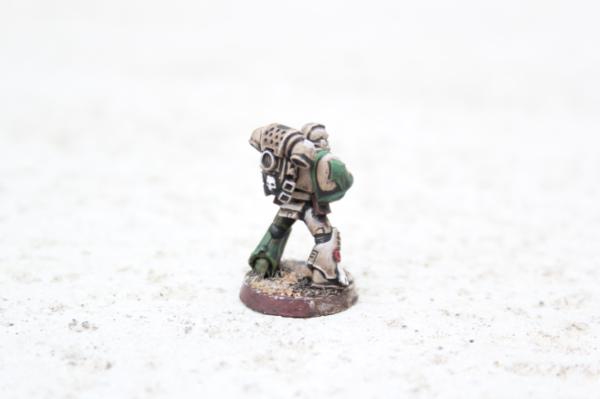
The Old Color Scheme:
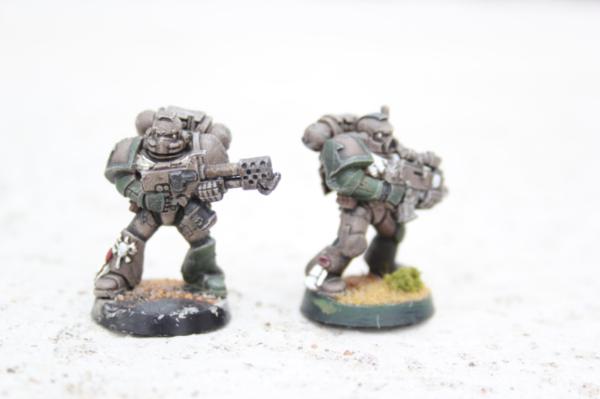
When I first chose the crusade style it fit the fluff and I liked that it was "gritty" and relatively quick to paint up. At the time, I thought the dark colors and the over-all gray drybrush were a really cool look, especially for such an easy model. What I realized looking back at them though was just how... bland they were. What I thought was great up close just looks gray from table distance. I'm not even sure anyone would know there were green details at all if they just glanced in passing. So, since hindsight is twenty-twenty and I don't have any impending games to rush me (wish I did, but I'm kind of out in the sticks
atm.)
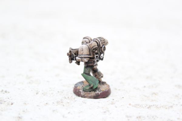
The New Look
Better contrast, brighter colors. More "pop" overall which is pretty much what I was going for. Still kept some subdued grittyness I hope. Wanted to keep away from the plastic power armor look.
Comparisons:
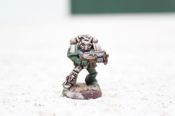
 Highlights:
I'm still learning... and wont up doing all the grey highlights with foundation paint which was NOT forgiving of mistakes (I'm sure you noticed the awful thick band at the top of the knee with the skull.) Still, this is probably the best highlighting job I've done to date, so I hope I'm heading in the right direction.
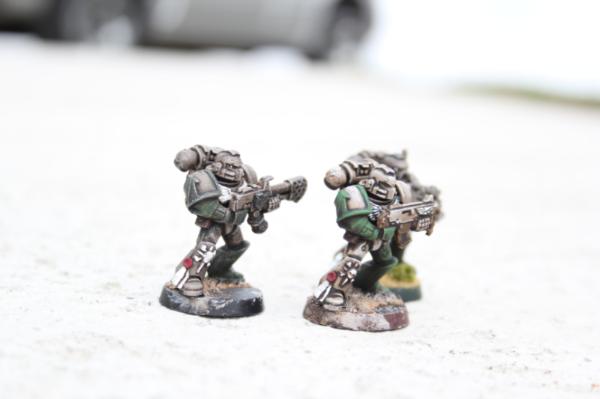
Here's highlights looking great! (For me anyway.)
And here's not so great...
Ugh that arm!
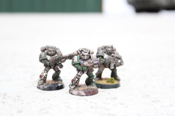
Overall, gotta say I'm pretty happy with it. Gotta get the process streamlined and start painting in batches though or I will loose my patience and go back to drybrushing
fast.
Critique, encouragement, advice, opinions, etc are all appreciated.
I would especially like opinions on the white. The wings and purity scrolls are built up from shades of blue. The skulls have a brown base instead. (Of course the white at the top is good-old-awful-fat-thick-white so it's opaque, but you see the shading around it a bit.) Any opinions on which base is better?
Oh and speaking of "bases" he's of course not based yet. In fact, I burn out on basing faster than anything else... Anybody have self motivation tips in that department?


