Switch Theme:

Ork Dreds, Buggies, and Kans. Need C&C. Help me get better! (Pic Heavy!)  [RSS] Share on facebook Share on Twitter Submit to Reddit
»
Author Message
Advert


Forum adverts like this one are shown to any user who is not logged in. Join us by filling out a tiny 3 field form and you will get your own, free, dakka user account which gives a good range of benefits to you:
  • No adverts like this in the forums anymore.
  • Times and dates in your local timezone.
  • Full tracking of what you have read so you can skip to your first unread post, easily see what has changed since you last logged in, and easily see what is new at a glance.
  • Email notifications for threads you want to watch closely.
  • Being a part of the oldest wargaming community on the net.
If you are already a member then feel free to login now.


Made in us
Battlefortress Driver with Krusha Wheel


Boulder, CO

Hi all,

I've been painting for about a year and a half now, and feel like I have a pretty solid understanding of the basics. But now I'd like to take it up a notch. I would love to be able to paint at "high" tabletop quality by the end of the year.
Could you guys take a look at the pics below and crit the hell out of them so that I might start working on my weak points? Obviously, any positive responses are welcome as well!

So, here we go.

Trukk


Kustom Big Mek with KFF


Kans


Dreds


Buggies (Scratch Built Wartrakks)


Warboss on Bike


Thanks for taking the time to help me out!

This message was edited 1 time. Last update was at 2012/06/15 22:53:47


Made in gb
Possessed Khorne Marine Covered in Spikes


I really like the way you do your paint weathering on the kans & dreds, so it looks like there's a primer coat underneath. Really nice work.


Made in us
Decrepit Dakkanaut


Burtucky, Michigan

The chipped paint looks fantastic. Ive tried it before and never liked the look, apparently I just needed to outline it with white. Very nicely done. Not to mention you have rokkit buggies, I love rokkit buggies

This message was edited 1 time. Last update was at 2012/06/16 02:26:08


Made in us
Gargantuan Gargant


Binghamton, NY

I think your biggest weakness right now is overly stark transitions. It's especially apparent in the skin, which suffers from what I like to call "watermelon syndrome" - bright green highlights and deep shadows with little to no transition between them, resulting in a pattern like the rind of its namesake fruit. I can see evidence of a midtone here and there, especially in the closeup shots, but it's a mere sliver between the two extremes. Consider making the midtone more dominant, at first, then increasing the number of transitional layers for models you want to paint to a higher standard. The bigger the gap between the lightest and darkest colors, the smoother the transition needs to be for it to look natural.

In a similar vein, look back at the gob on your KFF mek. Some of the edge highlights look quite smooth, while others stand out very starkly (e.g. compare those on the top and bottom edges). The armor plates look like they've received a heavy overall wash and were likely left upright to dry. The result is heavier pooling and, thereby, darker shading towards the bottom of vertical surfaces, which makes the same highlight color suddenly seem unnaturally bright. Ideally, you want a relatively smooth gradient, like that on the upper surface, possibly with a slightly starker line on the edge. This means practicing controlling your washes more carefully and/or using blending to soften the transitions before highlighting.

I would recommend practicing both skills, as they're pretty much invaluable. Granted, the former only applies if you make use of washes, but most folks seem to and you definitely do. This would also allow you to decide whether you want shading or staining. Looking at various armor plates, it's difficult to tell which effect you were going for. Some are so heavily washed that they look caked in dust (e.g. dread's legs) or smeared with oil (e.g. entire buggy, more or less). It can be a nice weathering effect, but it also destroys pretty much any sense of light and shadow. You'll have to play around with it and decide what you want to achieve. You can have the best of both worlds, but it's going to require more effort, as you'll have to "over-paint" your lighting effects to have them show through the layer of grime.

Well, that's as far as my energy will allow me to "crit the hell out of [these]." Hopefully, you find at least some of that useful. Watermelon syndrome is a bit of a pet peeve of mine (personal tastes vary - some folks intentionally go for the effect), but even with that, these leave a nice overall impression. There's always room for improvement, of course, but you aren't in bad shape, as things stand.

The Dreadnote wrote:But the Emperor already has a shrine, in the form of your local Games Workshop. You honour him by sacrificing your money to the plastic effigies of his warriors. In time, your devotion will be rewarded with the gift of having even more effigies to worship.
 
   
Made in us
Battlefortress Driver with Krusha Wheel


Boulder, CO

Thanks oadie!
That's exactly what I'm looking for. I'll consider what you have said and try and figure out how to approach each change.
I really do want to improve over the rest of this year, and "watermelon skin" is exactly the type of thing I've been scowling at, wondering what the answer was.
I'm looking forward to more of this critical treatment, from anyone willing to bash on my painting skills.
Thanks all for checking my work out, and keep the comments coming.
   
Made in gb
Wicked Ghast


Carmarthen, Wales

yeah i wold say a softer transition on your metal it needs a mid tone and since your using a bright scheme like yellow i would darken your orks skin tones down a lot,

try and just use darker shades of green as this has a good contrast and will make your yellows and reds seem brighter aswell
   
Made in gb
Ragin' Ork Dreadnought


Ingelheim am Rhein, Germany

What a cool thread! There are some really cool models here, like that biker boss. Also, the weathering on the kans looks great and the buggys look snazzy. Kudos on that!

However, I agree with oadie on the watermelon skin. I had the same problem. A good way to avoid it is to mix medium and bright browns into the green, or use something like the old Knarlock green. I use it and just mix more bleached bone into it at each highlight.

LOOK!! a shameless self-promotion! (gasp!)
My ORK!-Blog here on dakka And if you need a good conversion or a paintjob... My commission blog

[

Looking for Painting & Modelling advice? Click here! 
   
Made in gb
Painting Within the Lines


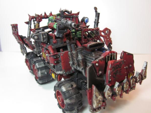
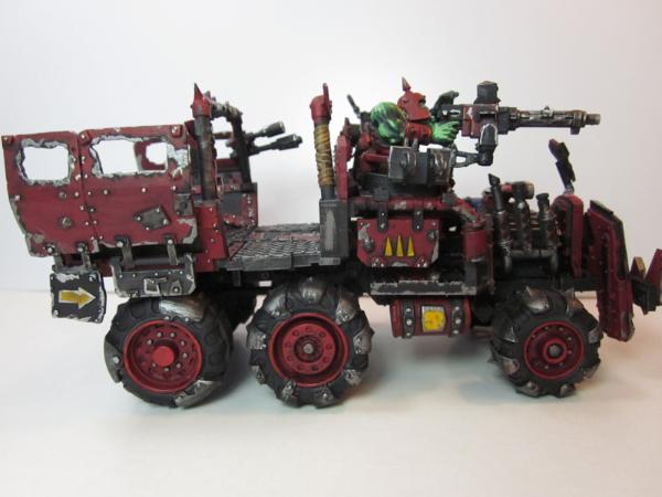
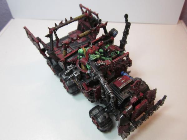
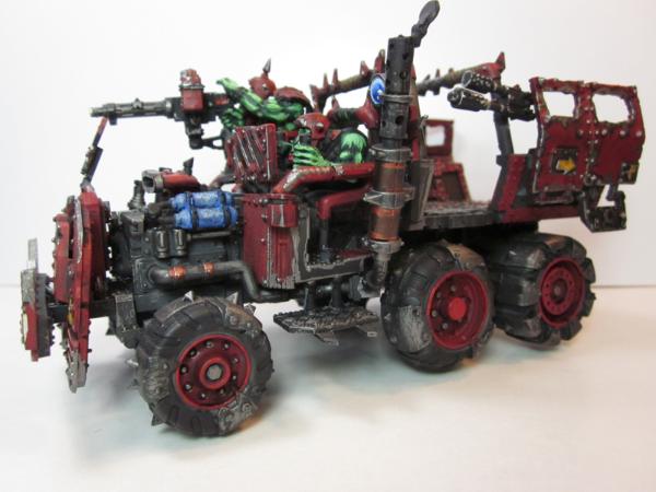
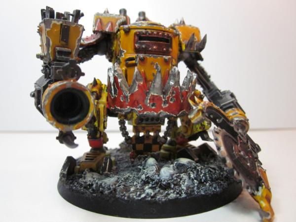
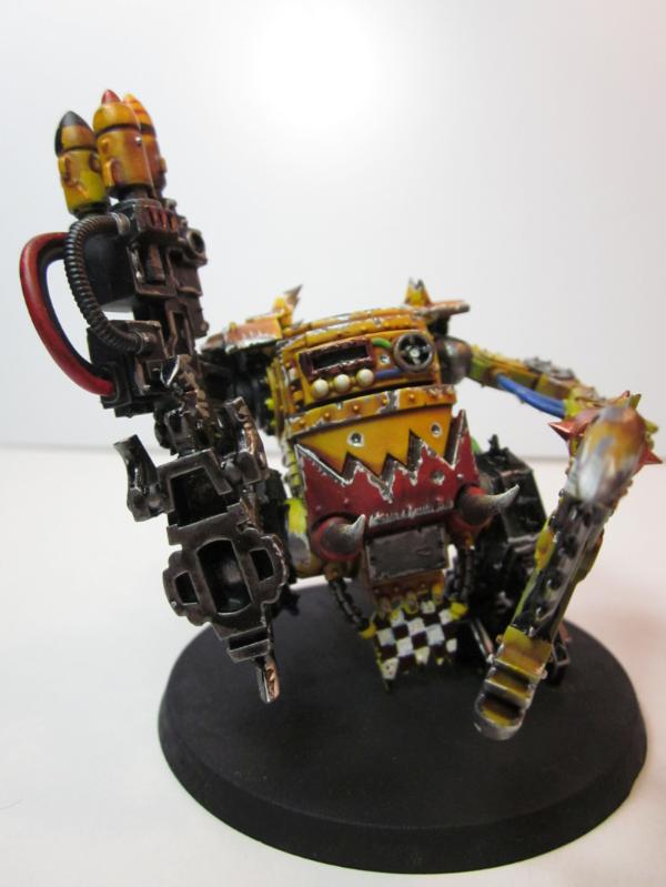
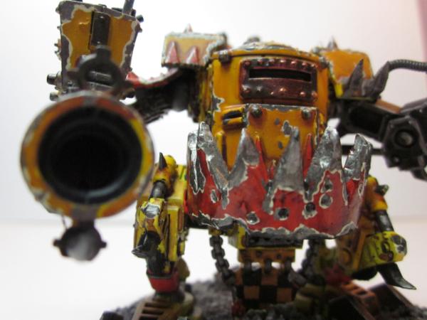
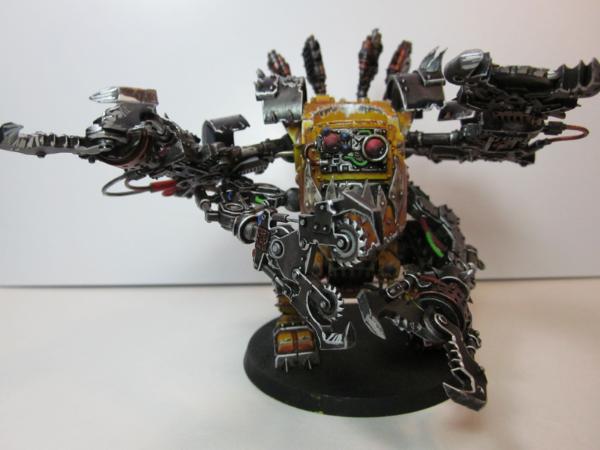
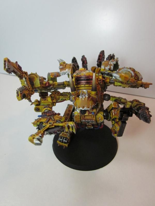
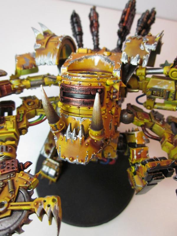
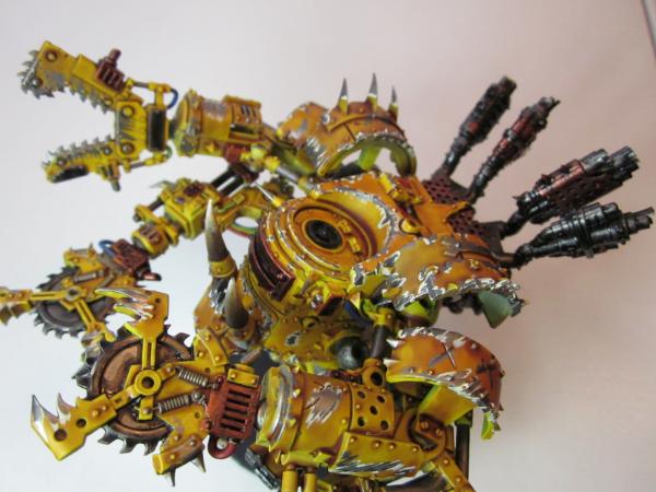
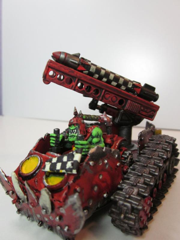
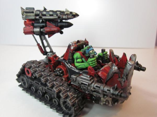
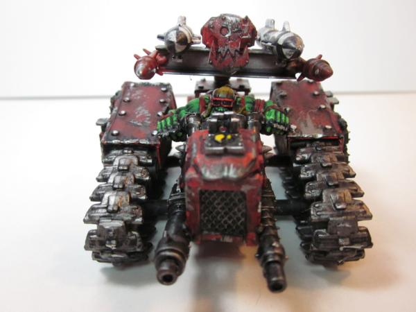
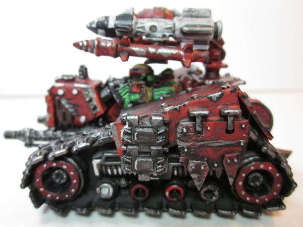
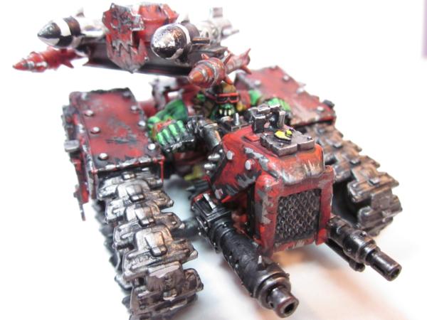
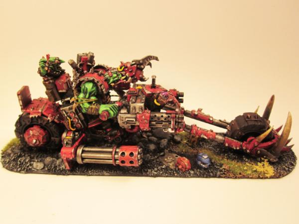
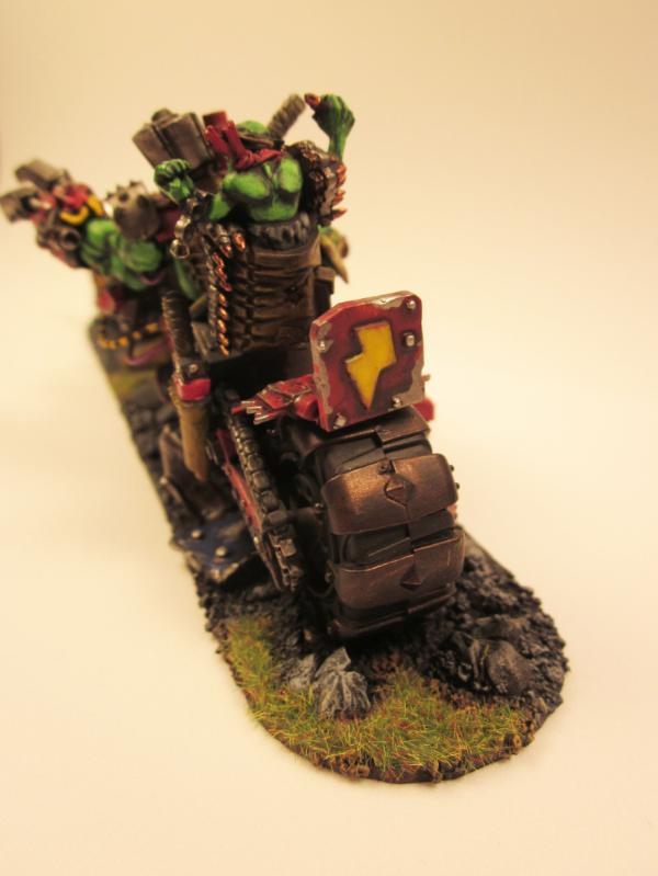
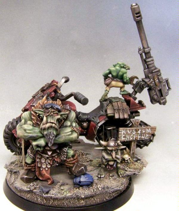
The vehicles look good, I think you've put a tad to much weathering as it hides some detail and makes the model look tabletop, but not display.
I would suggest looking and photographing different shapes of metal (Or finding some online) and then imagine a light source, the direction of this light source will either have to be the same for every model or each squad/squadron.
Now look where the shadow falls upon on the metals and make that your starting point. Slowly add a bit more white to the mixture (Tiny amounts almost non-visble) and slowly put each layer on until the extreme (As bright as you want the colour, don't go all the way to white unless it's pure un-painted metal.

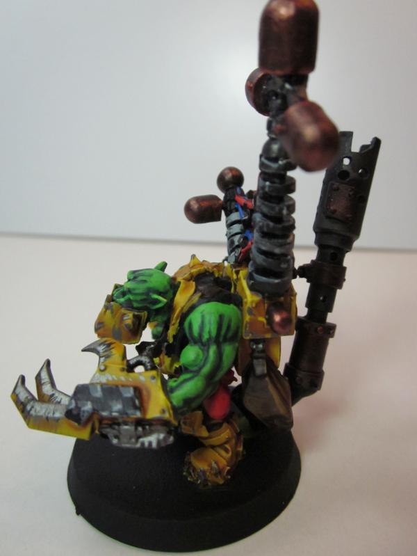
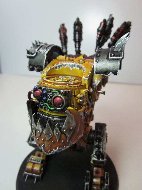
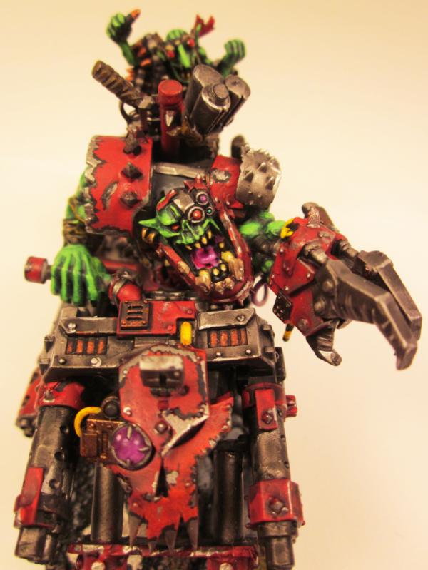
Now do the same with the orks skin but with green. one thing to notice which is done by this ork below. Is that the ork shoulders are flat detail and going for what you would with the muscles doesn't work well there.
The majority of painters would stripe that area, it breaks up the flat and looks very sinew like if the contrast is correct. Or it looks like you've pinstriped a orks arm

Spoiler:


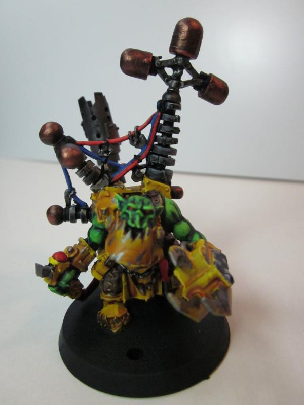
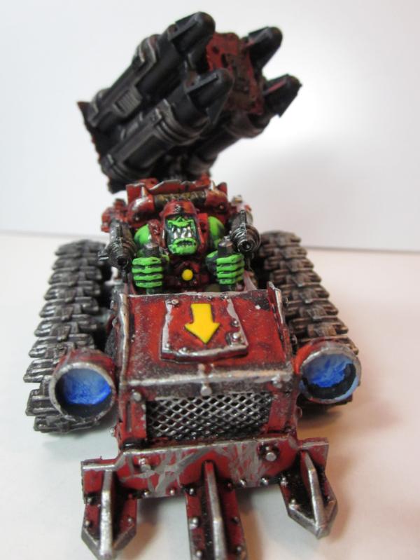
The spotlights on the buggies need more work, they should look like your trucks. Secondly as a added part, assuming you want to be above high tabletop (Who doesn't) I would do some OSL. Object source lighting takes a while to learn and get the brightness right.

In short you mix the colour it's reflecting on with the colour of the light source in this case blue. This is your darkest bit that the light hits, gently paint this on don't lather it. Then slowly but surely add more white to the mix until like before it looks right.

Someone posted a good article about it, perhaps you could fish it out if your intrested?

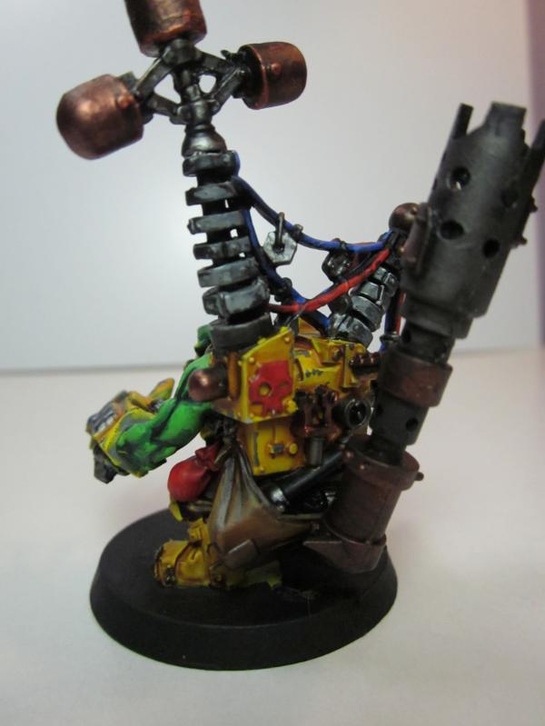
Orks look great with bits of freehand pick a symbol and make it universal across all your orks, for example checks on the boyz. The majority of boyz have a shoulder plate or a loin cloth, put some checks on then if on the shoulder pad do some weathering if required. Another good buy would be the forgeworld rust pigments. (You will need to seal them with lahmein medium, but be careful it spreads around a bit when applied, wait a day or two before sealing)

The wires on the KFF don't look dangerous enough and are extremely flat, I would suggest throwing the cliched yellow and black danger wire.
It's just black with some coats of yellow then a darker coat of yellow highlight to bring them closer together and make it more seamless.

This all assumes brushwork.
Mastering a airbrush is what gives the majority some amazing results fast. Check nucleorsaur. (Hope I spelt his name right)
Nards nids are also a good example, the amount of layers required for what he does works. Watermelon effect isn't bad if controlled and done properly his are a good example (It's not true watermelon though )

Anyway hope this rambling helps!

(Edit)

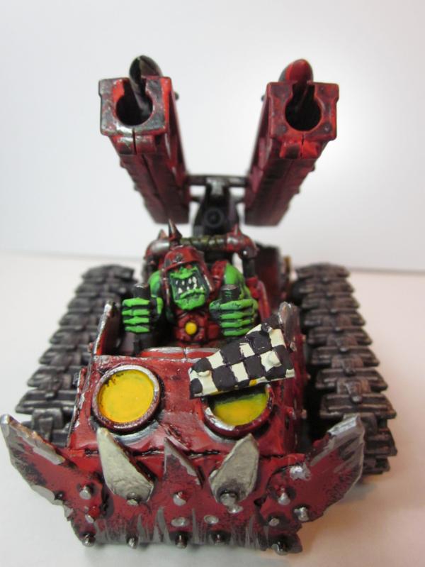
I forgot to talk about veins in ork arms, which the photo also demonstrates well, it's pretty much the same as OSL. You get the green a mix in a bit of blue and paint that on the applied area, it's got to be subtle and not stand out though. The eye and sub-brain (Brain fart moment) will pick up on it and it makes it more "real"

This message was edited 1 time. Last update was at 2012/06/29 10:22:11


Forum Index » Painting & Modeling
Go to: