Switch Theme:

Looking for some thoughts/advice  [RSS] Share on facebook Share on Twitter Submit to Reddit
»
Author Message
Advert


Forum adverts like this one are shown to any user who is not logged in. Join us by filling out a tiny 3 field form and you will get your own, free, dakka user account which gives a good range of benefits to you:
  • No adverts like this in the forums anymore.
  • Times and dates in your local timezone.
  • Full tracking of what you have read so you can skip to your first unread post, easily see what has changed since you last logged in, and easily see what is new at a glance.
  • Email notifications for threads you want to watch closely.
  • Being a part of the oldest wargaming community on the net.
If you are already a member then feel free to login now.


Made in us
Homicidal Veteran Blood Angel Assault Marine


Los Angeles

Hey there all. So quick backstory, I'm going back through my army and improving my painting. I'm putting the Blood Angel shoulder pads on every model now, I think they look great. Anyway, the conundrum is the BA symbol on the left shoulderpad. The teardrop in the center 'should' be red, though I think it'll be kinda washed out against the red armor, so I decided to go blue instead. Still unsure whether I like it or not. I'm also looking for some advice on just how to do it, as I've never really painted a curved surface like this before. There's some pictures below to help illustrate what I mean.

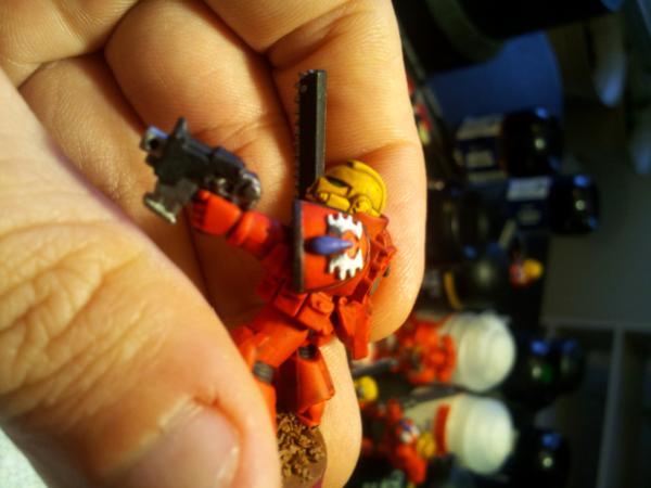
The first picture is a half-completed shoulder pad. The wings are done (Codex grey, to fortress, to white. It's REALLY hard to tell in the picture, but its there). The teardrop is just Ultramarines Blue. Not sure where to go from here.


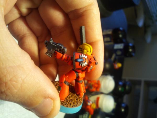
This second picture is a shoulder pad that I've completed. It goes from Ultramarine, to Enchanted to Ice Blue, then a white dot. Not sure if I like this finished product much at all though.


So, my questions are: Should I stick with the blue? If so, whats the best way to go about getting it really look good? If I should go with red, what's the best way to make the teardrop stand out and not just 'disappear' with all the other red around it?

Thanks for looking!


This message was edited 1 time. Last update was at 2012/07/17 15:40:35


I play

I will magnetize (now doing LED as well) your models for you, send me a DM!

My gallery images show some of my work
 
   
Made in gb
Deadly Dark Eldar Warrior


UK

The blue works, however i cant help thinking that green gems mite work better as a contrast with the red, just something to consider.

If youwant to stick with blue, might be start with a deeper blue such as regal blue then build up.

Dc0 
   
Made in us
Longtime Dakkanaut


Pa, USA

Deathcult0 wrote:The blue works, however i cant help thinking that green gems mite work better as a contrast with the red, just something to consider.

If youwant to stick with blue, might be start with a deeper blue such as regal blue then build up.


Precisely my sentiment. Blue works, but green would look good too. I also agree that it should be a deeper shade.

Something you may want to try would to paint it like a gem?
http://www.paintingclinic.com/clinic/guestarticles/paintgems2.htm
http://www.nicolecadet.com/blog/painting-gems

Just a thought. Good luck either way

Why is it that only those who have never fought in a battle are so eager to be in one? 
   
Made in us
Homicidal Veteran Blood Angel Assault Marine


Los Angeles

Green? Hmm, didn't think of that. Would match the eyes then...May try that on one and see how it comes out.

Thanks for the links to the tutorials, will be reading those in a bit.

I play

I will magnetize (now doing LED as well) your models for you, send me a DM!

My gallery images show some of my work


Forum Index » Painting & Modeling
Go to: