Switch Theme:

Collect Visions some strange pictures...  [RSS] Share on facebook Share on Twitter Submit to Reddit
»
Author Message
Advert


Forum adverts like this one are shown to any user who is not logged in. Join us by filling out a tiny 3 field form and you will get your own, free, dakka user account which gives a good range of benefits to you:
  • No adverts like this in the forums anymore.
  • Times and dates in your local timezone.
  • Full tracking of what you have read so you can skip to your first unread post, easily see what has changed since you last logged in, and easily see what is new at a glance.
  • Email notifications for threads you want to watch closely.
  • Being a part of the oldest wargaming community on the net.
If you are already a member then feel free to login now.


Made in gb
Lieutenant Colonel


I really like the Horus heresy Collected Visions book, it is very inspirational and makes for great conversions and context to any Pre-Heresy force.

I know that these pictures have a certain style, and it was for a Card based game etc, but I have to say there are one or two images that make me go "JUST NO....NO", it's almost like someone who has never even seen 40k has had it described to them and then painted it (like some cheap Chinese knock off the 40k Universe).


Top 2 offenders, there is so much wrong with these two it hardly needs highlighting. Seems that 1980's Cellphones are all the Rage in the 41st Millennium.

This message was edited 1 time. Last update was at 2012/07/22 17:58:56


Made in gb
Lieutenant Colonel


How about their slim figure hugging snug armour? Or the complete lack of geometric form of their armour?
Made in gb
Lieutenant Colonel


Lets not try and over tech this, the whole point of 40k is that it doesn't matter if it works or is sensible, it just works.

Like Power Armour communications, they talk to each, no need for big whip aerials, or vox casters, it's all built into their armour.

The whole point I'm making is how, Un-40k those pictures are. They literally look like an artist (maybe the art equivalent of Matt Ward) has painted pictures from peoples descriptions without ever having looked at a real miniature or piece of artwork.

This message was edited 1 time. Last update was at 2012/07/22 19:30:05


Made in gb
Lieutenant Colonel


I would refer you to my 1st point, these don't fit with the rest of the Art in the Horus heresy Collected Visions book.

The 1000 plus pieces of Art in the book, these two stand out as being poor representations of the Universe. They don't even fit particularly well with the other pictures in the book (which are pretty amazing actually). Bearing in mind I started 40k in 93, and remember the 
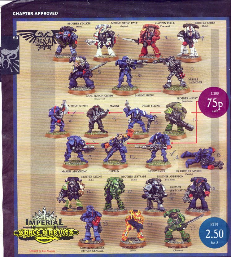
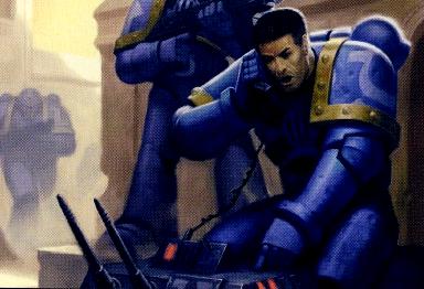
RT Marines, I don't remember alot of marines with Lasguns, nor do I remember many with "1940's Field Radio's / Telephones". Nor do I ever remember power armour that looks like a Wetsuit, ala the youthful ultramarine on his VoIP telephone.

If I remember rightly scouts turned up in MILTON BRADLEYS "Tyranid Attack". A now long forgotten game, with Termies and Scouts fighting a boarding action on a Bioship and it was a bit crazy, fun but ultimately a bit weak and was the successor to Space Crusade.


It was then revamped to "Advanced Space Crusade" by Jervis and Co to be a GW game.


Which was like a Skirmish based with elements of Space Hulk and Space Crusade thrown in. But actually had little to do with its spiritual successor Space Crusade because it played nothing like it.

Anyway back on the subject, The scale of the suits are wrong, yes the Jes Goodwin resculpt changed them but even the old RT era marines had a nice look to them, they look fundamentally wrong compare to both Modern and RT era marines..

This message was edited 8 times. Last update was at 2012/07/22 19:56:40


Made in gb
Lieutenant Colonel


That's pretty cool that you are still using them, Gitsplitta has a good thread "Re-building the Mantis Warriors".

I concede your point on diversity being good for the hobby and inspiration et al. But specifically these are supposed to be marines, and marines have a certain look, certain character traits and a distinctive look that makes them marines. If it looks like a duck, acts like a duck, it is probably (with the exception of it possibly being an Alpha Legionnaire) a duck. The problem is they don't really look like ducks e.g what they should look like, they look like a slightly off cheap imitation of the original...

Like a bad version of Mickey Mouse, it has all the element but looks completely wrong.


The look is wrong, It is like painting IG miniatures Ultramarine blue and calling them astartes, they aren't. You can go "Count's As" at a friendly game then fine. But this is official artwork, okay it was originally produced for a none GW game (believe it was Fantasy Flight Games or Sabresooth Games?) but there are other pictures of scouts in the book (World Eaters) which fit more closely with their original concepts and give a nice nod to the older games and RT models.

Like these


Tyranid Attack scouts


So for me, alot of the stuff in the Vision's Book pulled together alot of separate strands and wove quite a nice cohesive concept of the Heresy. I particularly like the HH book series as this fleshes this out further (except for that Abyss story that was awful).

This message was edited 8 times. Last update was at 2012/07/22 20:11:16


Forum Index » 40K General Discussion
Go to: