| Author |
Message |
 |
|
|
|
|
Advert
|
Forum adverts like this one are shown to any user who is not logged in. Join us by filling out a tiny 3 field form and you will get your own, free, dakka user account which gives a good range of benefits to you:
- No adverts like this in the forums anymore.
- Times and dates in your local timezone.
- Full tracking of what you have read so you can skip to your first unread post, easily see what has changed since you last logged in, and easily see what is new at a glance.
- Email notifications for threads you want to watch closely.
- Being a part of the oldest wargaming community on the net.
If you are already a member then feel free to login now. |
|
 |
2012/09/17 19:20:10
Subject: First try at Non Metallic Metal
|
|

Secretive Dark Angels Veteran
UK - Warwickshire
|
So.. as the title suggests, this is the first time I've tried to do the NMM effect, on the power sword of this guy (He's the old Anniversary ltd edition Emperors Champion)
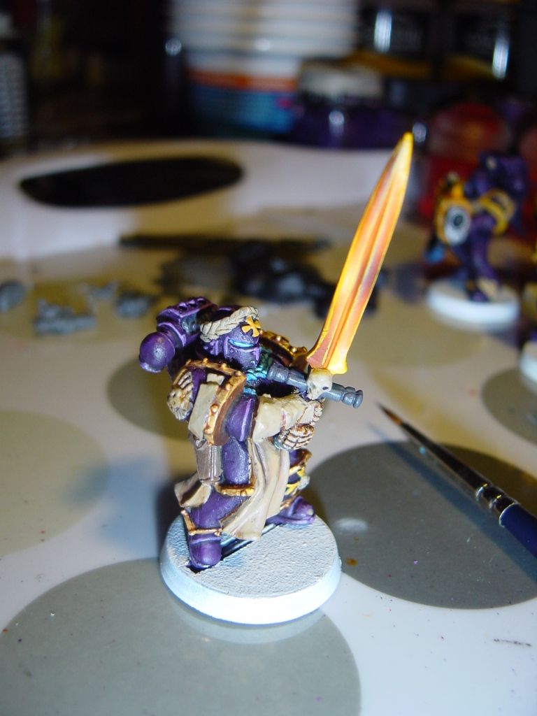
He's purple I know, I don't actually collect Templars, but have been using the shoulder pads for my own purple chapter (which is remarkably similar to Hawk Lords too; I've done yellow weapon casings instead of black)
The sword has been done with an Averland sunset base coat, then a layer of Yriel Yellow, then White, then seraphim sepia, cassandora yellow, white again, sepia again and finally cassandora yellow again before an edge highlight with Yriel yellow. I used a Harder & Steenbeck Evolution 0.2mm Airbrush for most of this.
What do you think? I followed some youtube tutorials and changed the colours up slightly to suit me.
The model isn't finished yet by any means, but I wanted to get some feedback on the sword  (that somewhat sloppy edge highlight is annoying me.. but I dont wan't to spray the whole lot again just now)
|
'Ain't nothing crazy about me but my brain. Right brain? Riight! No not you right brain! Right left brain? Right!... Okay then lets do this!! |
|
|
 |
|
2012/09/17 20:34:56
Subject: First try at Non Metallic Metal
|
|
Long-Range Land Speeder Pilot
|
Hey dude that looks impressive! If I were to critique it I would say the contrast could be pushed further (down to black and up to white) as that is what makes NMM really POP!
By the way if you're interested, we (Golem) are running a NMM painting event in our studio in Manchester: http://www.golempaintingstudio.co.uk/events/index.htm
|
|
|
|
|
2012/09/17 21:08:46
Subject: First try at Non Metallic Metal
|
|
Secretive Dark Angels Veteran
UK - Warwickshire
|
Thanks.
Captain Hindsight says I should've got some spare swords out of the bits box and found a technique I like before putting it on my model! 
Ahh well, Its just the sword, it can take a repspraying without gakking up details I guess.
I'l try again tomorrow taking the gradient down much darker and much brighter.
|
'Ain't nothing crazy about me but my brain. Right brain? Riight! No not you right brain! Right left brain? Right!... Okay then lets do this!! |
|
|
|
|
2012/09/17 21:30:45
Subject: First try at Non Metallic Metal
|
|
Long-Range Land Speeder Pilot
|
I dont think you need to completely redo it! Just working some darker tones down to black into the darker areas by glazing on paint and paint the very edges in white
|
|
|
|
|
2012/09/18 18:51:10
Subject: Re:First try at Non Metallic Metal
|
|
Secretive Dark Angels Veteran
UK - Warwickshire
|
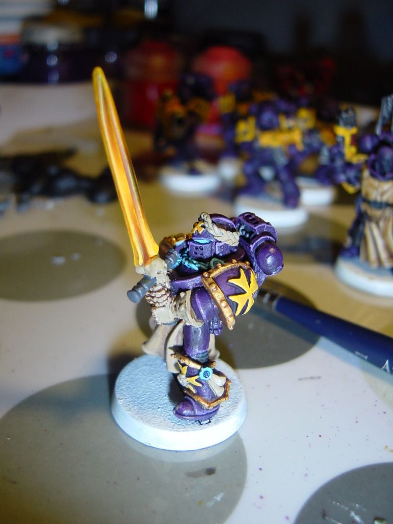
So I've had another go at this
I didnt respray the entire thing, just white and black, then a little inbetween with cassandora yellow.
Is there anything obvious I could do to improve this further?
Edit; Photobucket seems to be giving me problems just now, sorry if the piccy isn't working.
|
|
This message was edited 1 time. Last update was at 2012/09/18 18:52:35
'Ain't nothing crazy about me but my brain. Right brain? Riight! No not you right brain! Right left brain? Right!... Okay then lets do this!! |
|
|
|
|
2012/09/18 19:10:47
Subject: First try at Non Metallic Metal
|
|
Regular Dakkanaut
|
The addition of the black is perfect. The white is too heavy.
Go grab a knife, be it butter or stanley or bowie.
The white reflections are hard and thin - with hardly any blend.
|
|
|
|
|
|
2012/09/18 19:46:11
Subject: First try at Non Metallic Metal
|
|
Long-Range Land Speeder Pilot
|
I think it looks great! I would just run a white edge highlight around it now and it will look spot on!
|
|
|
|
|
2012/09/19 11:01:08
Subject: Re:First try at Non Metallic Metal
|
|
Secretive Dark Angels Veteran
UK - Warwickshire
|
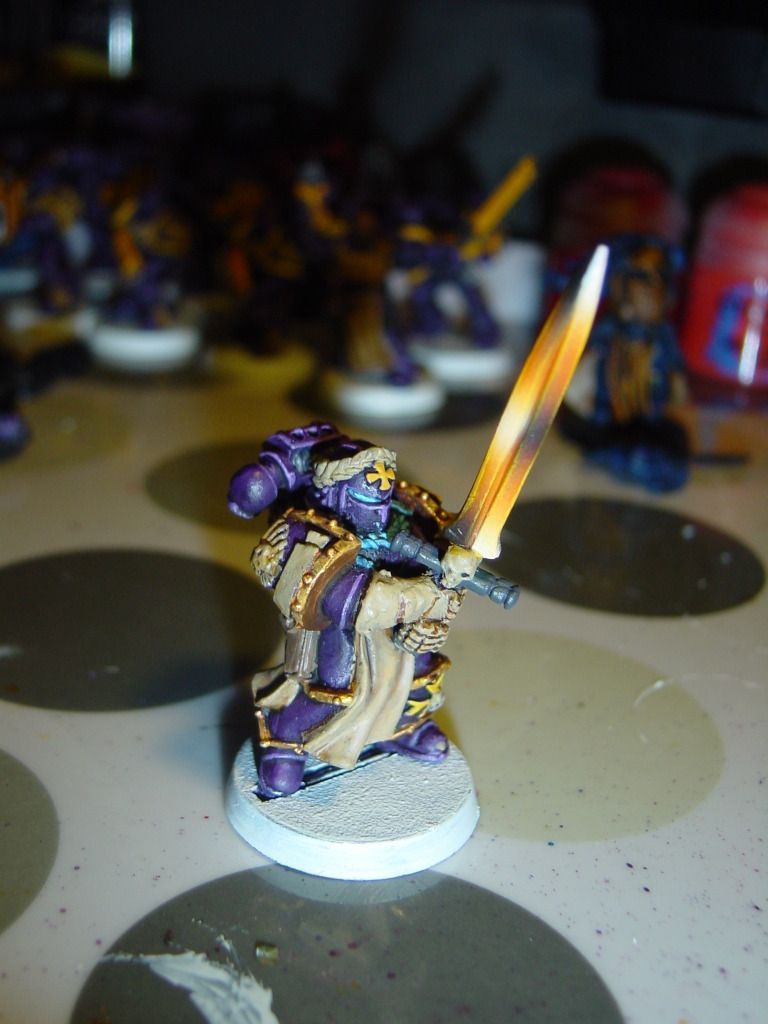
I have dulled the white down a little bit with some of the Cassandora yellow wash. Am still thinking about trying to go further, finding it hard to put into words, but I feel now that the method is largely unrealistic.


Theres hardly any actual black in the first knife up there, and the 2nd one is in really low lighting and has the whole lower edge in shadow.
Captain Hindsight strikes again! What I've got on my figure now with the exagerated black looks okay and I'm alright with keeping it, but I have made a mental note that realistic reflections on polished blades tend to be much more on the lighter side of the gradient scale with very little to no black, just dark greys (largely depending on the lighting in each situation - in this instance with my emporers champion, his sword is in the air so would have more lighting hitting it than it looks to have currently)
We could say it is a power sword of some description and thus is not actually the same material as a polished metal blade to explain the darker gradient. Or it could be said to be a result of 40k's over exageration of just about everything. Either way, I thought I would put it out there that the generally accepted method that I have tryed to emulate here doesn't seem as realistic as it did at first. (maybe its my poor execution, at some point I might try some different looks on spare blades and post my findings)
|
'Ain't nothing crazy about me but my brain. Right brain? Riight! No not you right brain! Right left brain? Right!... Okay then lets do this!! |
|
|
|
|
2012/09/20 02:20:33
Subject: Re:First try at Non Metallic Metal
|
|

Longtime Dakkanaut
|
Your observations on right. The sword being held up would be rather bright and have no blacks because there is nothing to cover the sword from all light.
And the two photos (of the knifes) are not helping too much as the upper image is a matte bright silver with a brighter light and the second one is a blade that is matte black with just the edge being silver (and a less bright light).
---
Wow, so I was just fixating on the last image (where you added more contrast) that I over looked the first one: Here is the really short version. See that first image, just take the left side's gradient and apply in on the right side, and take the right side's gradient and apply in to the left. In addition make the left side overall a bit lighter (because it is nearer to the light source) and add some final edge highlights with and even brighter colour (mix in some more white) at the tip (of the left side), at the lower curvy thing near the cross-guard on the left side, and sort of just below the half sword mark on the right side.
---
Here is the original full text (if it helps):
If you want to make it more realistic (well more realistic for miniatures) then you would need to change a few things (these observations are based on the last photo):
All this is based on the assumption that there is a light above the marine's head somewhere up there.
The basic gradients of the swords two sides (left and right) need to be exchanged. The tip of the sword on the side that is nearer to the marine's head would probably reflect more light (thus being white and not black). This would also be true for the little part that bends out at the base near the cross-guard. And the darker part of the left side would be a bit below half of the sword.
So the result for the left side of the sword could work a bit like this: See that yellow just above the white (it's a result of the mixing with white) about half way up the sword blade. Try that for the upper third of the blade (only the left side). Then use the basic casandora yellow for the next third. And for the last third add some brown to darken it. with a final application of the first and brightest (casandora yellow pus white) for the little tail. It would probably be easier to work from the cross-guard to the tip (with an airbrush).
And the right side would look a bit different. You would need to replicate the gradients of the left side just shift them about 1/4 of a sword down and make them overall a bit (but still noticeable) darker (that side of the sword is pointing away from the light source so it gets a not less light). To simplify it you could paint the whole right blade part casandora yellow with a third of it being a bit darker located a bit under the middle third of the blade.
Then you could add some final edge highlights in white on the top edge and the left curvy part (where it gets brighter near the cross-guard) and just a tiny bit below the dark part on the right side to imply some more contrast. It's all a bit wibbly wobbly but you have to fuse the idea of painting the idea of realistic lighting and the idea of exaggerating what you are painting because it's a miniature. And the gradients should not be mirrored on the two sides of the blade (like the white/black in the middle of your sword) and be more like the two parts of the tip on your sword (left part with a longer gradient (just in a bright colour and not black) and right part of the tip with a shorter and darker gradient).
That way you have multiple things that can influence your contrast. First you have the basic colour (lighter on the left, darker on the right) as an indicator of the distance and orientation in relation to the light source. Then you have the roughly 1/4 sword length shift of the gradient on the right side plus the shift in how fast you change from one colour to another (like the tip where the gradients flow more with the blades curvature, not the middle part where the colour mirror each others position). And at last you have the final (specular) highlights in white on some parts for the sparkly parts.
The fuller (groove) in the middle you could just paint in a darker colour with a light gradient towards the top (brighter towards the top). But it's relatively tiny to just using a dark colour should work good enough.
Of course painting all the four sides of the blade at the same time should be easier than going at it one at a time. And the edge of the blade (which is thick because of casting issues) just flows with the corresponding sides of the blade.
|
|
|
|
|
2012/09/20 08:15:06
Subject: Re:First try at Non Metallic Metal
|
|
Regular Dakkanaut
|
Just so you know, that knife has a blackened blade, so the blacks aren't all shadow.
Remember that in miniature painting we over-emphasise highlights and lowlights so that they look good at a small scale. That is why people are saying to go down to black, even though in real life a reflective surface would gather even the tiniest bit of light and appear grey.
|
|
|
|
|
|
2012/09/20 14:17:12
Subject: First try at Non Metallic Metal
|
|
Secretive Dark Angels Veteran
UK - Warwickshire
|
Thanks for the detailed input guys.
Totally agree about the black on the face nearer the marines head. What I've done is followed a tutorial step for step where the guy alternates around the blade. Not really giving much thought to it untill afterwards! Silly me.
When I've next got time I'l give it another go and post what I come up with
|
'Ain't nothing crazy about me but my brain. Right brain? Riight! No not you right brain! Right left brain? Right!... Okay then lets do this!! |
|
|
|
|
|
|