Switch Theme:

Necromancer Tester  [RSS] Share on facebook Share on Twitter Submit to Reddit
»
Author Message
Advert


Forum adverts like this one are shown to any user who is not logged in. Join us by filling out a tiny 3 field form and you will get your own, free, dakka user account which gives a good range of benefits to you:
  • No adverts like this in the forums anymore.
  • Times and dates in your local timezone.
  • Full tracking of what you have read so you can skip to your first unread post, easily see what has changed since you last logged in, and easily see what is new at a glance.
  • Email notifications for threads you want to watch closely.
  • Being a part of the oldest wargaming community on the net.
If you are already a member then feel free to login now.


Made in gb
Huntsman


Newry

Just posting up a few images of my latest piece to get some feedback on my painting style. I've found some success offering a painting service in my local area but want to get feedback from the wider community to see what improvements I can make. So lets have it, hit me with your best criticisms! Apologies for the poor pictures!


Painting Service available for all UK residents. Contact us at spectralpaintingni@gmail.com
Our blog should resume shortly after the Uni term 
   
Made in us
Longtime Dakkanaut


Florida

It looks good but I think close ups would really help.

He reminds me of skeletor.
   
Made in us
Gargantuan Gargant


Binghamton, NY

Two points of criticism:

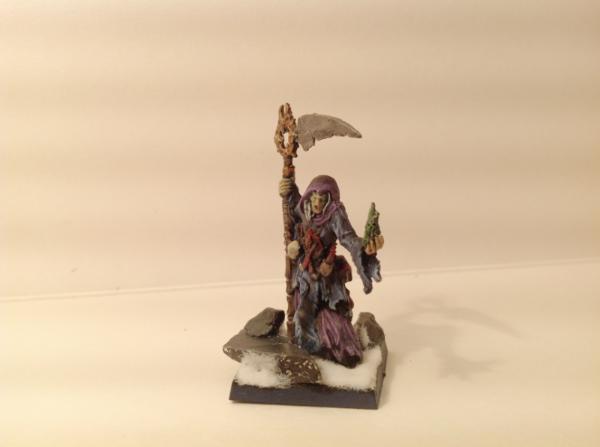
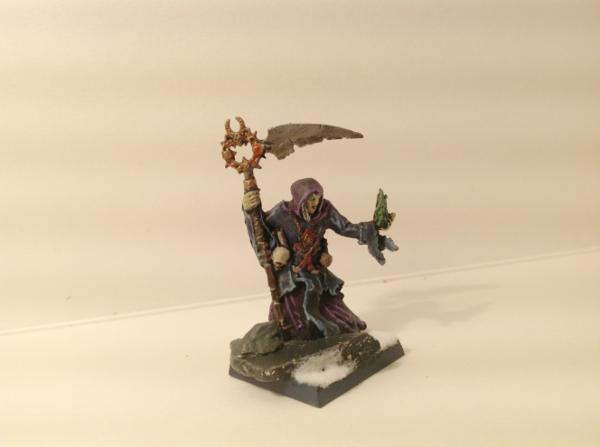
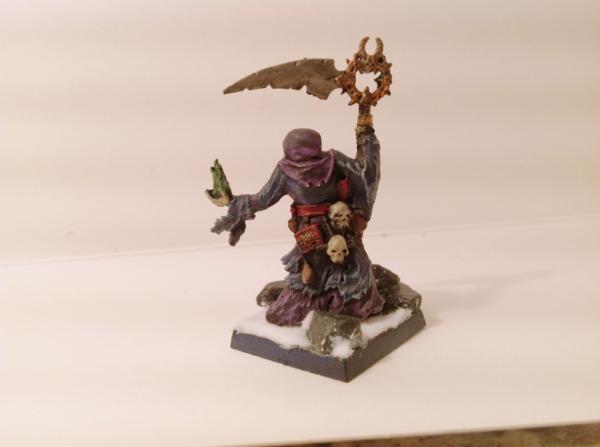
Snow - That's the GW snow, correct? I'd try and get my hands on another brand that uses actual grains, instead of white static grass. No matter what you do to it, it will always look like white static grass. The bits that have settled outside of the main drifts make it all the more obvious. It's serviceable enough from a distance, but always irks me upon even moderately close inspection.

Contrast - The darker colors make sense for a necromancer model, but the contrast of the highlights is so low (looks like very soft drybrushing?) that they get lost, more or less. I'd suggest either taking the base darker or the highlights lighter (or both, but to a lesser degree) to make them pop a bit more. The eye will still "fill in the blanks" and assume the proper colors, even if you take the base down to a near-black, so long as the highlights are sufficiently saturated. Actually, I think darker base colors and more vivid highlights would enhance the atmosphere of the model, as well as the visual impact.

Off-topic, quickly - your bookshelf threw me for a loop. I was trying to recognize that purple book - something just felt off about it - without checking your location flag, first. There's a George Atwood (with only one "t") who teaches clinical psych at Rutgers University, my alma mater. I had no idea there was a British Atwood, too, let alone an Attwood, all in the same field.

The Dreadnote wrote:But the Emperor already has a shrine, in the form of your local Games Workshop. You honour him by sacrificing your money to the plastic effigies of his warriors. In time, your devotion will be rewarded with the gift of having even more effigies to worship.
 
   
Made in gb
Huntsman


Newry

Sorry for the delayed response, Uni has been hectic lately!

Just adding some better images, hopefully they help. I've redone the highlights at attempted to darken the main areas somewhat, what do you guys think?


@oadie, the books are actually my fiancée's, she's the psychology buff! I'm an archaeologist by trade myself but texts on the Black Death aren't quite as photogenic!

This message was edited 1 time. Last update was at 2012/12/17 21:19:37


Painting Service available for all UK residents. Contact us at spectralpaintingni@gmail.com
Our blog should resume shortly after the Uni term 
   
Made in us
Paramount Plague Censer Bearer


Cool stuff!

Meet Arkova.

or discover the game you always wanted to:

RoTC
   
 
Forum Index » Painting & Modeling Showcase
Go to: