| Author |
Message |
 |
|
|
|
|
Advert
|
Forum adverts like this one are shown to any user who is not logged in. Join us by filling out a tiny 3 field form and you will get your own, free, dakka user account which gives a good range of benefits to you:
- No adverts like this in the forums anymore.
- Times and dates in your local timezone.
- Full tracking of what you have read so you can skip to your first unread post, easily see what has changed since you last logged in, and easily see what is new at a glance.
- Email notifications for threads you want to watch closely.
- Being a part of the oldest wargaming community on the net.
If you are already a member then feel free to login now. |
|
 |
2013/03/02 13:07:46
Subject: Blood Angels Colour Schemes/Questions
|
|

Secret Inquisitorial Eldar Xenexecutor
|
I've recently been working some more on the 40K (as opposed to 30K) elements to my blood angels forces and between painting sessions had two different colourschemes for them arise, initially I used alot of darker reds and shades in my models that has left them looking darker and more gritty, however with the second squad I moved onto some more highlights that have made them pop alot more. However in order to continue with the force I ideally need to settle on a single way of painting them to make the force more cohesive. The second purpose of this thread is to try and gauge the level at which I am painting, I know this is asked by maaany people many times and can be something of an annoyance but to know what level of TT my painting stands at would be nice.
For the colour schemes here is tactical combat squad 1:
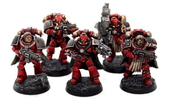
And Tactical combat squad 2:

Cheers for any help,
Melcavuk
|
|
|
|
 |
|
2013/03/02 13:23:16
Subject: Blood Angels Colour Schemes/Questions
|
|
Perfect Shot Ultramarine Predator Pilot
|
For what it's worth, I like the darker one ( option 1)
|
|
|
|
|
|
2013/03/02 13:26:12
Subject: Blood Angels Colour Schemes/Questions
|
|

Raging-on-the-Inside Blood Angel Sergeant
Alexandria, VA
|
You can't go wrong with either one, they both look great. Are the base reds the same just different highlights? Squad 2 looks like a brighter red.
I like the subtle highlights on the first squad more but the overall feel is more a Flesh Tearer scheme to me, while Squad 2 is more BA.
For me, it's Squad 2 but with the more subtle highlighting of the first squad.
|
|
|
|
|
2013/03/02 14:03:34
Subject: Blood Angels Colour Schemes/Questions
|
|

Mutilatin' Mad Dok
|
Blood angels are always so bright and jock-like. I like the darker tone 1st one.
Go rock the boat.
|
|
|
|
|
|
2013/03/02 14:26:02
Subject: Blood Angels Colour Schemes/Questions
|
|
Regular Dakkanaut
|
Mate i'd use both simpley because armour weathers at different rates depending on how much it's used . Mix them all together gives the untis a realistic look . epic work man .
|
|
|
|
|
2013/03/03 11:45:12
Subject: Blood Angels Colour Schemes/Questions
|
|
Secret Inquisitorial Eldar Xenexecutor
|
Thanks guys, colour scheme one is missing the orange edge highlighting in places and is generally washed alot more heavily later into the painting process. Colour scheme two isnt washed after an early stage to keep the reds bright and visible.
Combining the two might work, I was also trying to think of how to add battle damage as a uniting factor however that isnt one of my strong points.
|
|
|
|
|
|
2013/03/03 12:19:06
Subject: Blood Angels Colour Schemes/Questions
|
|
Regular Dakkanaut
|
These are looking awesome. What's your red recipe?
I love the modelling on the first squad. A lot of 30k models look lacking in poses to me but you've really got the best out of the kits.
Painting wise I'd def go for first squad. It totally looks realer and grittier. I understand your desire to make them pop more and this is a dilemna i face with my dark angels, but if your trying to improve, its often less pop that makes a better artistic have you glossed those black shoulder pads? Nice.
Also your metals are hard to see in these pics so can't say much on that.
As to level is say your a high 7. I'm quite harsh though and reserve 8 upwards for golden demon finalists upwards.
|
I do commissions - PM me or visit Half God Studios:
https://www.facebook.com/Halfgodstudio
https://www.youtube.com/channel/UCQiFhvvF_uFWRVhZLBqr8Hg
half_god@hotmail.co.uk |
|
|
|
|
2013/03/03 13:56:56
Subject: Blood Angels Colour Schemes/Questions
|
|
Secret Inquisitorial Eldar Xenexecutor
|
Red goes Khorne Base - Wazadakka Layer - Evil Sunz layer - Earthshade shade and evil sunz to rehighlight. Orange used liberally to edge.
Shoulder pads arent glossed they're currently a highlighted black (grey scales)
As for the 7 its where I hope to reach/be there are a plethora of techniques I havent used or mastered yet that would give a better finish however I'm only slowly working on them (OSL, NMM, Airbrushing etc). My golds are usually fairly solid on the models, I have other mini pictures with golds but there is so little on these ones the closeups were blurred.
|
|
|
|
|
|
2013/03/03 14:26:25
Subject: Blood Angels Colour Schemes/Questions
|
|
Regular Dakkanaut
|
Yes those techniques might help. Also some work on the eyes. One guy on the right looked a bit bug eyed. Looked at your metal on th other guys. It's nice but still a bit flat. Look at Tmm tuts as well.
Thanks for the recipe. Me copy )
One other thing. Some basing work could improve the look. I see you've gone fw mini but even a lil more detailing us good. All these thu bs are just my opinion 
|
I do commissions - PM me or visit Half God Studios:
https://www.facebook.com/Halfgodstudio
https://www.youtube.com/channel/UCQiFhvvF_uFWRVhZLBqr8Hg
half_god@hotmail.co.uk |
|
|
|
|
|
|